
The Best Color Combinations for Living Rooms That Make You Never Want to Leave
There’s a moment — you’ve probably experienced it — when you walk into someone’s living room and feel an inexplicable sense of calm wash over you. The colors are just right. Something about that space pulls you in, slows your breath, and makes you want to curl up and stay forever. That feeling isn’t magic. It’s intentional color design — and you can recreate it in your own home.
—
1. Why Color Combinations Matter More Than Individual Colors
Most people make the same mistake when decorating their living room: they fall in love with a single paint color and build everything around it. But here’s what professional interior designers quietly understand — no color exists in isolation. Every shade you introduce into a room is in constant conversation with every other shade around it.
Think about it this way. A soft sage green on your walls might feel peaceful by itself, but pair it with warm terracotta accents and suddenly that same green comes alive with energy and depth. Pair it instead with cool grey furniture and it reads as modern and serene. The individual color didn’t change — the relationship between colors did. That relationship is everything.
Color combinations affect how large your room feels, how warm or cool the temperature reads, how formal or relaxed the mood becomes, and even how hungry, sleepy, or energized you feel while sitting in the space. When you understand this, color stops being a decoration decision and starts being a design tool.
“The right color combination doesn’t just decorate a room — it transforms how you feel inside it.”
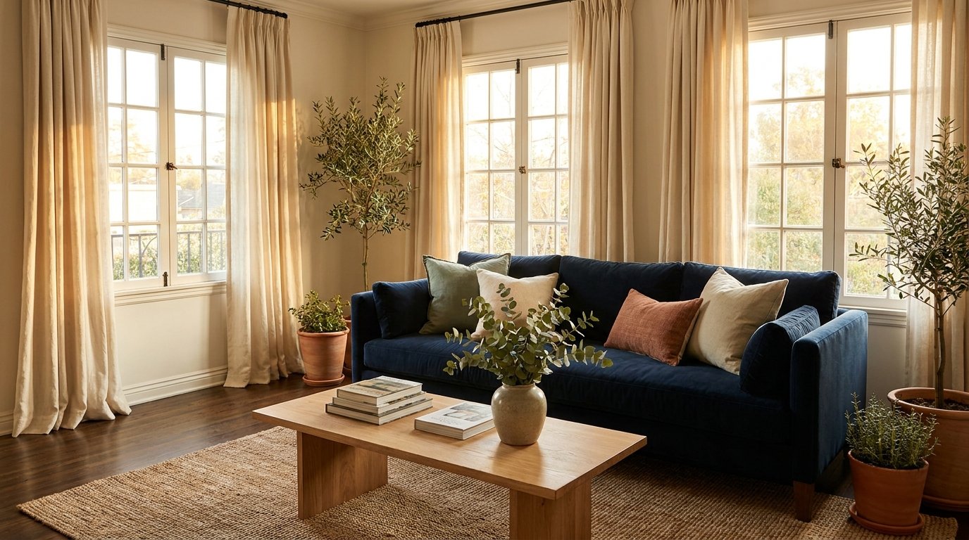
2. The Timeless Elegance of Navy Blue and Warm White
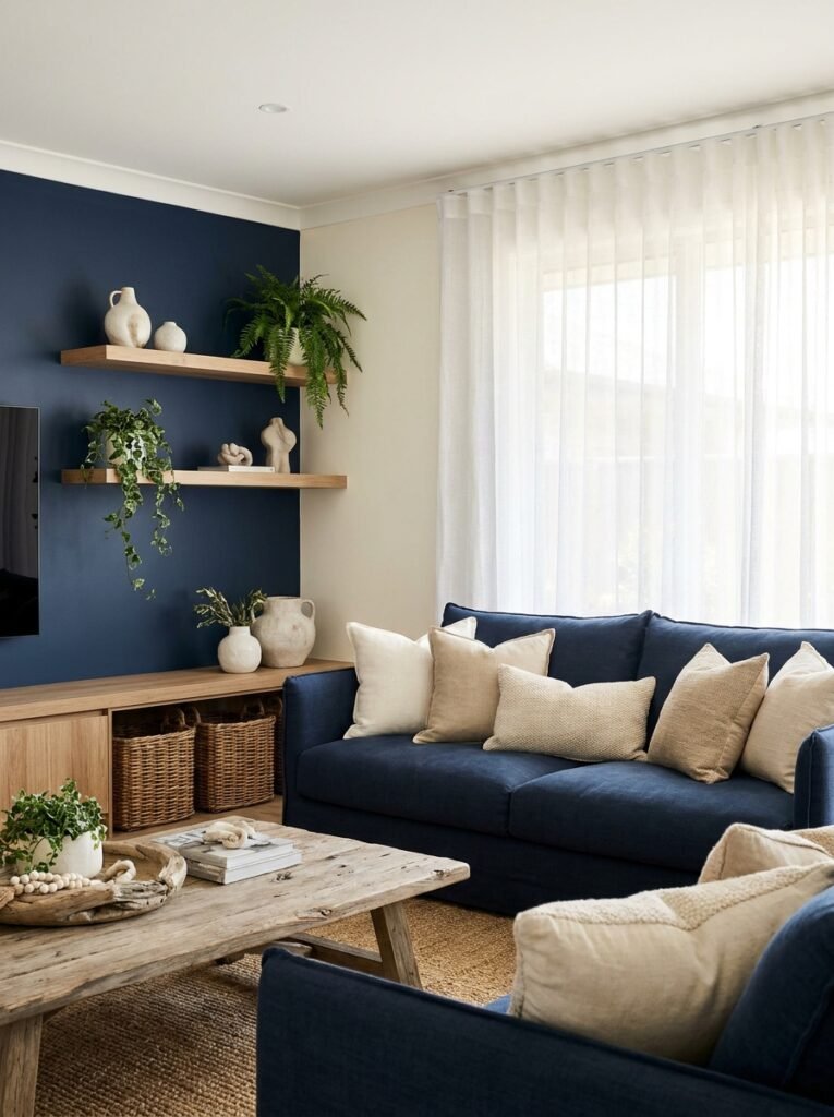
If there is one color pairing that has stood the test of time and continues to top design charts year after year, it is navy blue paired with warm white. Not stark, cold white — but the kind of creamy, slightly golden white that makes you think of linen napkins and summer porches.
Navy grounds a living room. It brings weight, richness, and a sense of quiet confidence to the space. Warm white then lifts that heaviness — introducing brightness, openness, and a breath of air. Together, they strike a balance that feels both polished and deeply livable.
This combination works beautifully in a variety of styles. In a coastal-inspired living room, it nods to the ocean and sea salt. In a traditional home, it feels refined and classic. In a contemporary space with clean lines and minimal furniture, it reads as crisp and sophisticated. Add natural wood tones — a driftwood coffee table, wicker baskets, raw oak shelving — and the whole room gains warmth and texture.
For implementation, consider painting one accent wall navy and keeping the remaining walls warm white. Layer in navy through a sofa, throw pillows, or drapery, and let warm white breathe throughout the rest of the room.
3. Warm Terracotta and Cream — The Combination That Feels Like Home
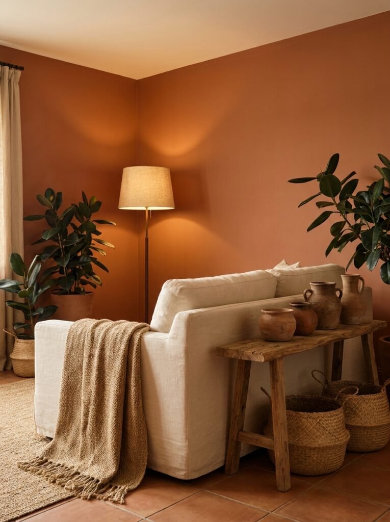
There’s something deeply comforting about terracotta. Maybe it’s because the color has been used in human dwellings for thousands of years — fired clay pots, Mediterranean stucco walls, the warm earth tones of ancient homes. When you bring terracotta into your living room, you’re tapping into something ancestral. Something that says shelter and warmth at the cellular level.
Paired with cream — not white, not beige, but true warm cream with yellow undertones — terracotta becomes soft and inviting rather than overwhelming. The combination is earthy, grounded, and genuinely cozy without sliding into darkness.
This pairing thrives when you include natural materials. Jute rugs, linen cushions, clay pottery, woven baskets, raw wood furniture. Plants — particularly those with deep green or warm-toned leaves — tie the whole palette together and add the life that every earthy room craves.
Terracotta and cream are particularly powerful in living rooms that don’t receive much natural light. Where cooler colors like grey or blue might feel dim and cold in a shaded room, warm tones absorb the available light and reflect it back as coziness.
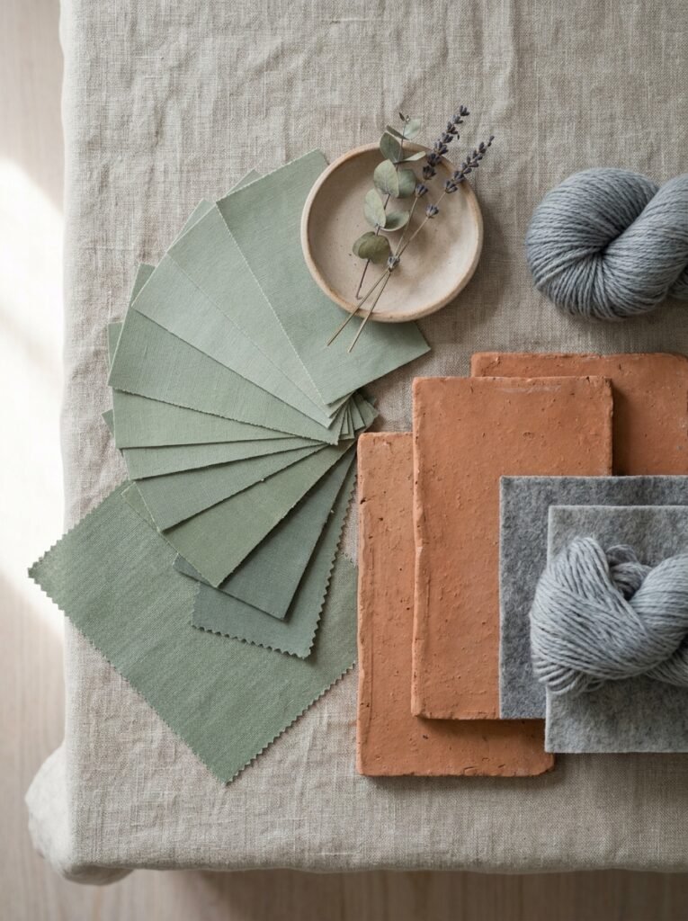
4. Sage Green and Soft Blush — Quiet, Romantic, and Utterly Pinterest-Worthy
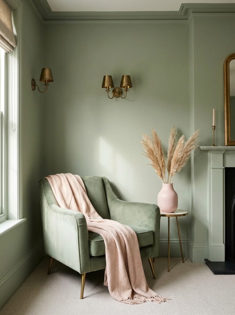
Walk through any interior design account on Pinterest and you’ll see this combination everywhere right now — for good reason. Sage green and soft blush occupy adjacent positions in the warm-neutral spectrum, which makes them inherently harmonious. But there’s something more going on here than just color theory.
This combination feels like a conversation between the garden and a Sunday morning. Sage brings the outdoors in — evoking herbs, leaves, and quiet meadows. Blush adds a touch of romance, warmth, and human softness. Together they create a living room that feels simultaneously fresh and welcoming, modern and timeless.
To pull this off without making the room feel overly feminine or trend-dependent, balance is everything. Let sage lead — on walls or as the primary furniture color — and allow blush to appear in accents: a velvet throw pillow, a ceramic vase, a piece of abstract artwork, a delicate woven blanket draped over an armchair.
Add matte gold or antique brass hardware and light fixtures to give the palette a grounded, sophisticated edge. Keep patterns minimal and let texture do the heavy lifting.
“Sage and blush together feel like the first warm day of spring — gentle, hopeful, and quietly beautiful.”
5. Charcoal Grey and Mustard Yellow — Bold Without Being Loud
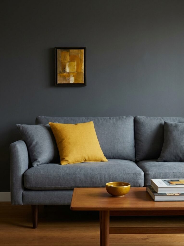
For those who love drama but not chaos, charcoal grey and mustard yellow might be the most thrilling combination on this list. It is confident, energetic, and visually striking — yet when handled correctly, it never feels aggressive or exhausting.
Charcoal grey is the anchor. It’s sophisticated, modern, and strong — the kind of color that makes furniture look intentional and architectural. Mustard yellow, positioned as an accent rather than a dominant force, injects joy and vibrancy into what might otherwise feel like a cold, overly serious space.
The key with this combination is restraint on the yellow. A mustard sofa with charcoal walls? Potentially overwhelming. But charcoal walls with a mustard throw, a small yellow-toned artwork, and a single mustard cushion among a sea of grey pillows? Absolutely stunning.
Mid-century modern and Scandinavian-influenced living rooms are particularly well-suited to this palette. The clean lines, tapered furniture legs, and minimal ornamentation of these styles let the color dialogue take center stage without visual clutter competing for attention.
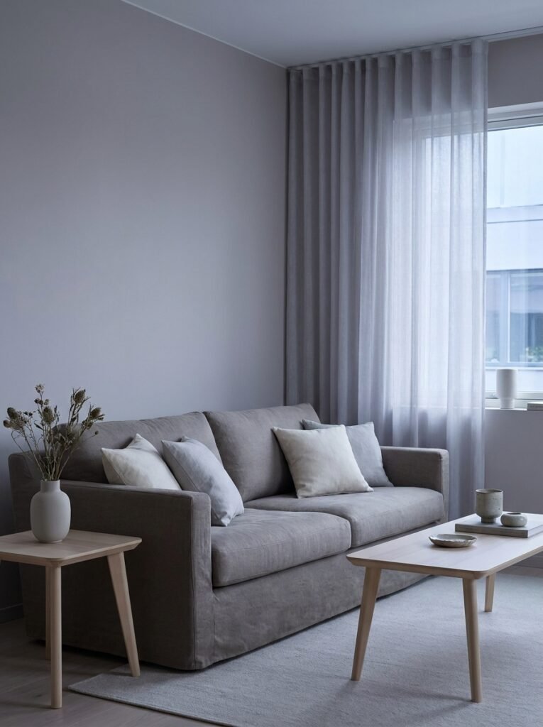
6. Warm Greige and Deep Forest Green — The Sophisticate’s Neutral
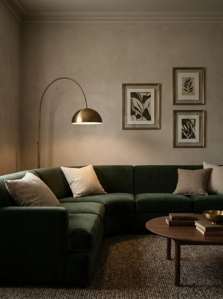
Greige — that perfect hybrid of grey and beige — has become the backbone of modern neutral living rooms. And while greige alone can sometimes feel a little flat, pair it with a deep, saturated forest green and something extraordinary happens. The room gains depth, richness, and a quiet drama that feels genuinely luxurious.
Forest green is having a remarkable cultural moment in interior design, and it shows no signs of slowing down. It references nature, old libraries, gentleman’s studies, and the lush outdoors all at once. It has weight and gravitas without the coldness of navy or the intensity of black.
Against warm greige walls, forest green furniture or millwork pops with confidence. A deep green velvet sofa in a greige living room, accented with brass fixtures and natural linen textiles, is one of those combinations that photographs beautifully and lives even better.
7. All-White With Bold Terracotta Accents — Modern Meets Warm
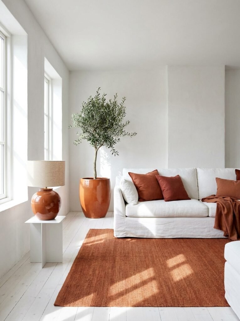
The all-white living room has long been a Pinterest staple — clean, airy, and endlessly customizable. But pure white rooms often feel cold, sterile, and difficult to actually live in. The solution? Keep the white base but punctuate it aggressively with terracotta accents.
Bold terracotta pillows against a white linen sofa. A terracotta-glazed ceramic lamp. A burnt orange area rug against white-painted floors. A large terracotta pot housing an olive tree in the corner. Each element punches warmth into the white canvas without disrupting the sense of brightness and space.
This is a combination that adapts beautifully across seasons — in winter the terracotta reads as fire-warm and cozy; in summer it nods to sun-baked landscapes and feels effortlessly cool and bohemian.
8. Dusty Blue and Warm Brass — The Unexpected Pairing That Works
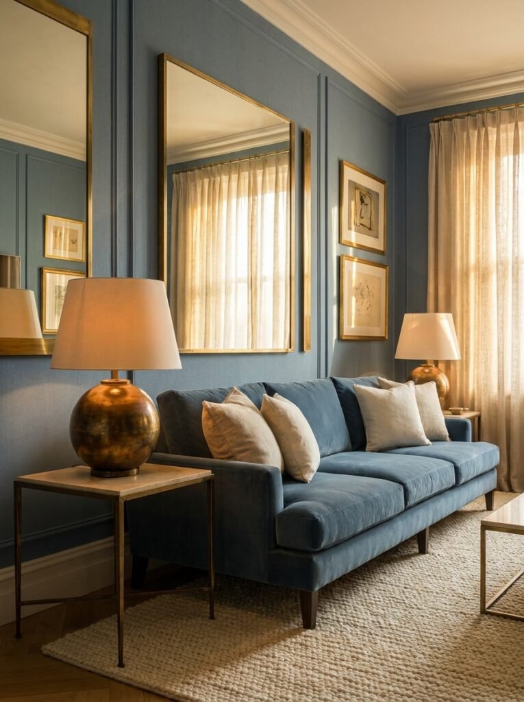
Blue and gold have a long history in design — think royal crests and cathedral ceilings. But dusty blue and warm brass are a thoroughly modern interpretation of this classic relationship. Dusty blue brings a softness that more vivid blues lack — it reads as calming, almost muted, with a gentle weariness that feels collected and grown-up.
Warm brass, meanwhile, is not the cold gold of the 1980s. It’s rich, burnished, and organic — it glows rather than gleams. Against dusty blue walls or upholstery, brass fixtures, frames, and lamp bases look like they were always meant to be there.
This pairing works equally well in traditional living rooms and in more contemporary spaces. The dusty blue keeps the brass from reading as overly ornate; the brass keeps the dusty blue from feeling cold or withdrawn.
“Dusty blue and warm brass together create the kind of living room you describe to strangers at dinner parties.”
9. Cream, Camel, and Ivory — The Art of Tonal Dressing
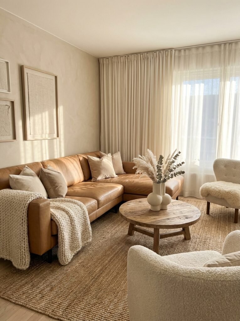
Not every powerful color combination requires contrast. Some of the most sophisticated living rooms on Pinterest are built entirely within a single warm family of hues — cream, camel, ivory, and oat. This approach is called tonal dressing, and when done well, it creates a living room of extraordinary warmth and visual peace.
The secret is texture. When contrast comes from fabric and finish rather than color — a cream wool throw against a camel leather sofa, ivory linen curtains against oat-toned walls, a jute rug against warm white plaster — the eye moves around the room with quiet pleasure rather than visual noise.
This combination photographs beautifully in natural light, which is exactly why it dominates Pinterest aesthetic boards. It also ages gracefully — because it’s built on neutrals, it accepts trend-forward accents easily, allowing you to refresh the room each season with new cushions, artwork, or greenery without repainting a single wall.
10. Midnight Black and Natural Linen — For the Brave and the Beautiful
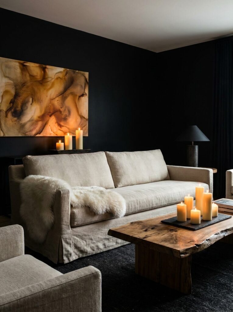
There is a category of living room that requires real confidence to create: the dark, moody, deeply dramatic space anchored by midnight black or near-black tones. When people first hear “black living room,” they imagine a cave. What they fail to picture is how transformative it can look when paired with natural linen, warm wood, and candlelight.
Black walls in a living room make the space feel intentional, enveloping, and theatrical. Natural linen — the color of raw cloth, undyed cotton, and honest materials — prevents the darkness from consuming the room. It brings light, breath, and organic naturalness to a potentially oppressive palette.
Add a genuine sheepskin throw, a live-edge wooden coffee table, cream candles in various heights, and a large piece of artwork with warm tones, and you have created one of the most distinctive and memorable living rooms imaginable.
11. Lavender and Warm Grey — Unexpected Serenity
Lavender in a living room? For some people, the idea sounds immediately too sweet, too young, too much. But muted, desaturated lavender — the kind that reads almost like a grey with a purple soul — is one of the most serene and sophisticated colors you can introduce into a living space.
Paired with warm grey furniture and walls, lavender recedes beautifully. It reads as a whisper of color rather than a statement — adding personality and softness without dominating. This combination works especially well in living rooms used for winding down: those evening spaces where you watch films, read, and let the day fall away.
Keep the palette cool and soft throughout. Pale wood furniture. Light linen. Simple, clean forms. The restraint is the whole point — lavender and warm grey together are about subtlety and peace, not drama.
12. Burnt Orange, Cream, and Olive Green — The Autumnal Trinity
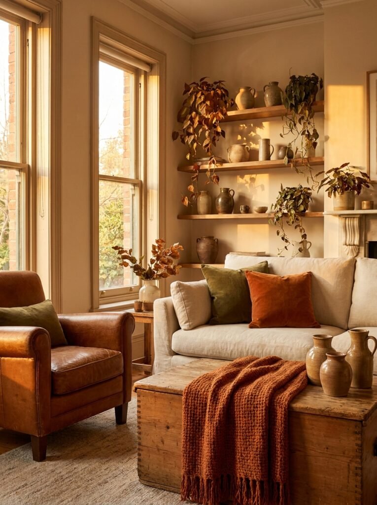
If there is a color combination that feels like the best version of autumn — crisp air, changing leaves, hot drinks in warm kitchens — it is burnt orange, cream, and olive green. This three-color palette is rich, layered, and deeply satisfying in a way that perfectly balanced two-color combinations sometimes aren’t.
Burnt orange brings energy and warmth. Cream provides breathing room and stops the palette from feeling heavy. Olive green grounds the whole composition with an earthy, botanical quality. Together, they create a living room that feels abundant, seasonal, and genuinely welcoming.
This combination has a particular magic in rooms with natural materials and vintage or antique furniture. Aged leather, worn wood, handwoven textiles, and ceramic objects all speak the same language as this palette — making the room feel like it was assembled over years of careful, loving curation rather than one weekend at a furniture store.
—
🌿 How to Choose the Right Color Combination for Your Living Room
Choosing the right palette for your specific space requires a little more than scrolling Pinterest and picking the prettiest board. Here’s how to think through it practically.
First, observe how light moves through your room. North-facing rooms receive cool, indirect light all day — they need warm colors to feel inviting. South-facing rooms are flooded with warm, golden light, meaning they can handle cooler, more complex palettes without feeling cold.
Second, consider the room’s purpose. A living room used primarily for entertaining can handle bolder, more dramatic choices. A living room that doubles as a quiet retreat calls for softer, more restful combinations.
Third, always test paint colors in your actual room before committing. Buy sample pots, paint large swatches directly on the wall, and observe them at multiple times of day — morning, midday, golden hour, and artificial evening light. Colors behave completely differently across those conditions.
Fourth, keep the 60-30-10 rule loosely in mind: let your dominant color fill about 60% of the room (walls, large furniture), your secondary color occupy around 30% (secondary furniture, drapery), and your accent color pop in the remaining 10% (cushions, artwork, accessories).
Finally, trust your instincts more than trends. Trends come and go — you have to live in this room every single day.
—
❓ FAQ
Q: What color combinations make a small living room look bigger? A: Light tonal combinations — cream and warm white, pale greige with ivory accents, soft sage with cream — visually expand a small living room by reflecting light and reducing visual clutter. Avoid using too many contrasting colors in a small space, as high contrast creates the impression of boundaries and makes walls feel closer.
Q: Are dark colors like navy or charcoal a bad choice for living rooms? A: Not at all. Dark colors used thoughtfully can make a living room feel intimate, cozy, and luxuriously sophisticated. The key is balancing dark walls or furniture with lighter accents, plenty of natural light, and warm-toned textiles. Dark colors work particularly well in larger living rooms with high ceilings.
Q: How often should I repaint or update my living room color combination? A: There’s no rule, but most interior designers suggest that a well-chosen, timeless palette should feel good for five to ten years. If your current combination is trend-driven rather than genuinely loved, consider refreshing sooner. Often, you don’t need to repaint at all — simply updating accent colors through pillows, art, and accessories can completely transform the feel of a room.
—
💭 Final Thought
Color has an almost miraculous ability to transform not just a room, but the quality of the hours you spend inside it. The best color combinations for your living room aren’t necessarily the trendiest or the most technically perfect — they’re the ones that make you exhale a little when you walk through the door. They’re the ones that feel like you, assembled in light and shade and pigment on four walls.
So here’s the question worth sitting with today: if your living room’s color combination could tell the world one thing about who you are and how you want to feel at home, what would it say?