
The Warm Neutral Living Room: How to Create a Space That Feels Like a Hug
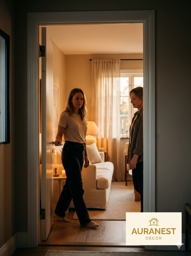
There’s a moment — maybe you’ve felt it — when you walk into someone’s living room and your entire body exhales. The tension in your shoulders drops. Your eyes soften. Something about the space just feels right, without you being able to explain exactly why. Chances are, that room was built on warm neutrals. This guide will show you exactly how to recreate that feeling in your own home, from the first paint swatch to the final throw pillow.
—
1. Why Warm Neutrals Feel Emotionally Different From Cool Ones
Not all neutrals are created equal — and your nervous system knows the difference, even when your brain doesn’t.
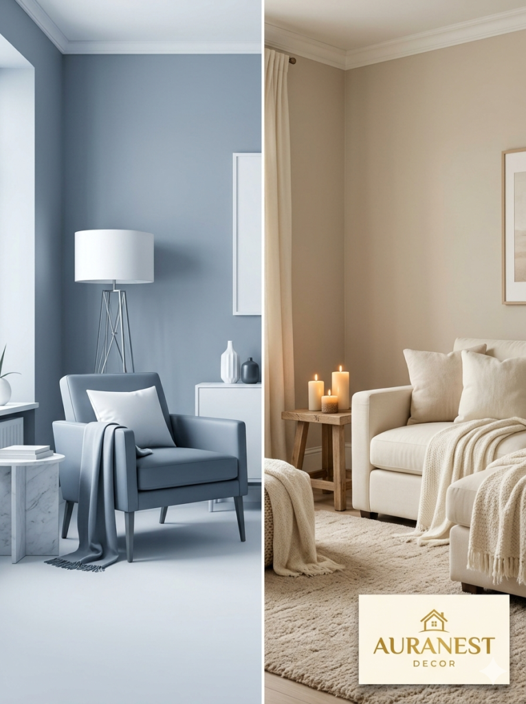
Cool neutrals, the crisp whites and blue-grays and stark greiges, create spaces that feel clean, minimal, modern. Beautiful, yes. But warm? Not usually. They tend to push people slightly away, the way a formal dining room makes you sit up straighter without anyone asking.
Warm neutrals do the opposite. Colors like sandy beige, soft camel, creamy ivory, dusty terracotta, warm taupe, and blush mushroom tone carry undertones of red, yellow, and orange — the same hues found in candlelight, in autumn leaves, in freshly baked bread. Our brains have been responding to those tones as signals of warmth and safety for thousands of years. There’s nothing trendy about that association. It’s ancient and instinctive.
When you build a living room on a warm neutral palette, you’re not just decorating. You’re essentially programming the room to feel like a place where people can rest.
“A warm neutral room doesn’t just look beautiful — it gives people permission to actually relax.”
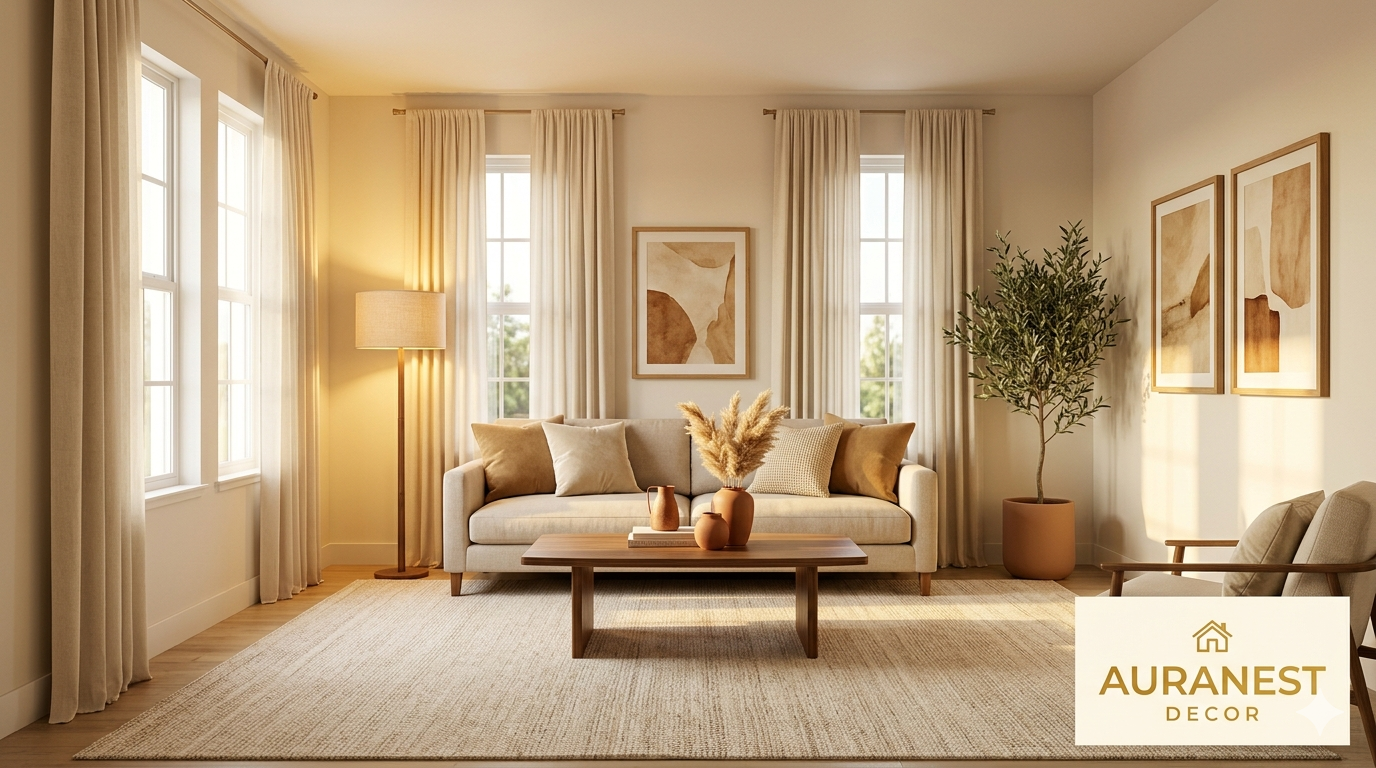
2. The Foundational Color Palette: More Than Just Beige
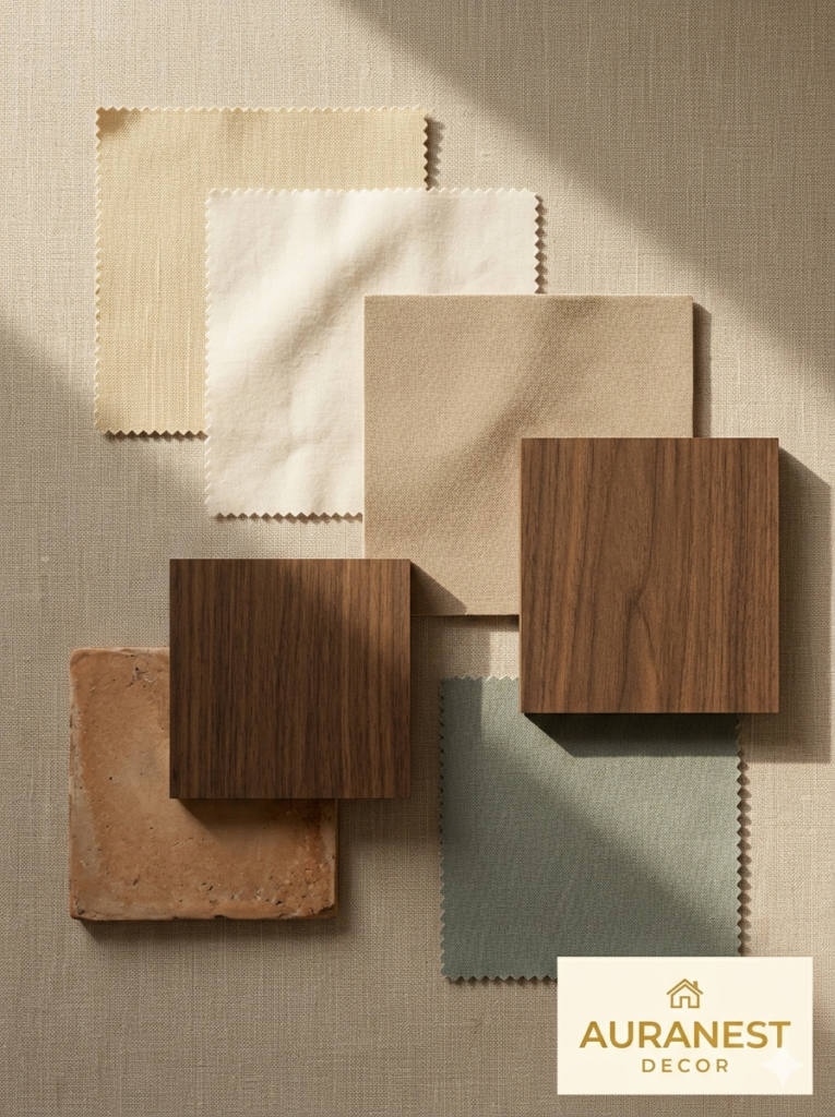
People hear “warm neutrals” and immediately picture a single flat beige wall and a sand-colored sofa. That version exists, and it’s the one that gives the whole palette a boring reputation. The real magic of warm neutrals lies in layering them — using five to seven tones that are all in the same family but distinct enough to create visual depth.
Think about a forest floor: the colors there span pale wheat to deep espresso, and every shade belongs. Your living room can work the same way. Start with a warm white or soft ivory as your dominant wall color — something like a warm linen white rather than a stark cool white. Then layer in a mid-tone sandy beige through upholstery or a large area rug. Add a deeper tone — a rich walnut, an aged terracotta, or a deep camel — through wood furniture or accent pieces. Finally, bring in one or two almost-neutral accent tones: dusty sage, cloudy lavender, or muted rust can all live inside a warm neutral palette without disrupting the harmony.
The goal is a room that looks cohesive when you glance at it, but rewards you with layers of texture and tone the longer you look.
3. Choosing the Right Warm White for Your Walls
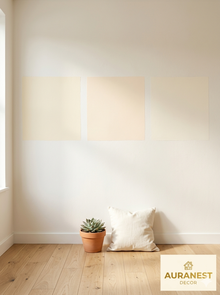
This is where most people get tripped up, and honestly, it derails the entire project. Not all “warm whites” at the paint counter are actually warm. Some are deceptively cool under certain lighting conditions, and they’ll fight everything else in the room.
The trick is to look at the undertones in the context of your specific room — its orientation, its natural light exposure, its existing fixed elements like flooring and trim. A warm white in a north-facing room with limited natural light can turn slightly greenish or gray. The same paint in a south-facing room might glow beautifully.
Some consistently beloved options include Benjamin Moore’s White Dove, Sherwin-Williams’ Accessible Beige (technically a greige but reads warm in most lights), and Farrow & Ball’s Elephant’s Breath. When you’re sampling, always paint a large swatch — at least twelve inches square — and observe it at different times of day, under both natural and artificial light. Never choose from a small chip held under fluorescent store lighting.
The right warm white will make your room feel bigger and brighter while still wrapping it in that unmistakable coziness. The wrong one will make the whole space feel vaguely dingy — and you’ll spend months wondering what’s off without being able to name it.
4. The Role of Natural Texture in a Warm Neutral Room
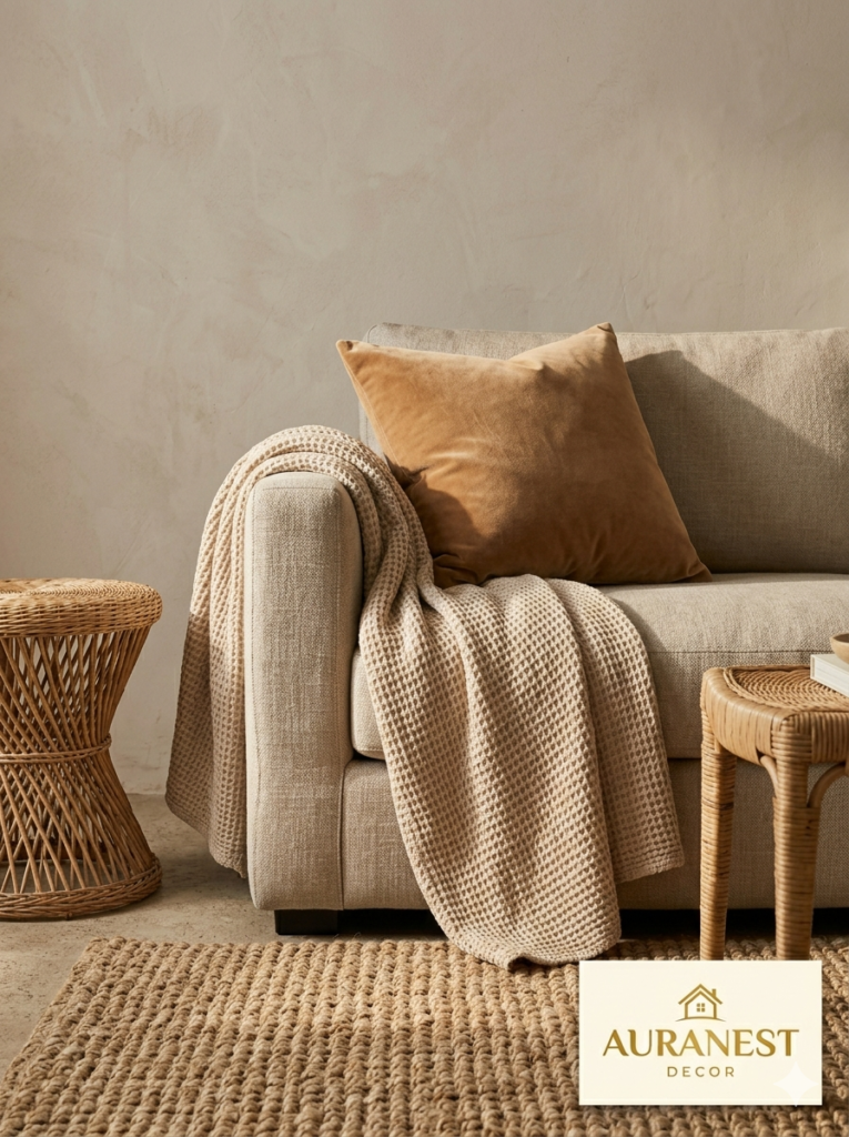
Here’s a truth that interior designers quietly rely on: in a low-color palette, texture becomes the color. When you’re working in warm neutrals and not adding a rainbow of hues, the visual interest has to come from somewhere — and that somewhere is the rich variation of surfaces.
Imagine a room where everything is smooth. The sofa upholstery is flat, the walls are flat, the rug is flat, the throw pillows are flat. Even in the warmest tones, that room feels sterile and lifeless. Now imagine the same layout, but the sofa is linen with a visible weave. The rug is a chunky jute or a hand-knotted wool with slight pile variation. One throw pillow is velvet, another is waffle-knit cotton, another is woven rattan with fabric. The walls have a slightly matte finish that absorbs and reflects light differently throughout the day.
Now the room breathes. Every surface catches light differently. The eye has somewhere to land, somewhere to linger, and somewhere to travel next. Texture is what keeps a warm neutral room from feeling like an architectural rendering and starts making it feel like an actual home.
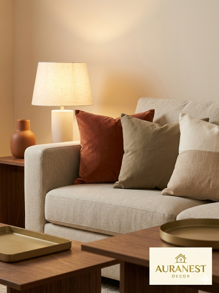
5. Furniture Choices That Ground the Space Without Weighing It Down
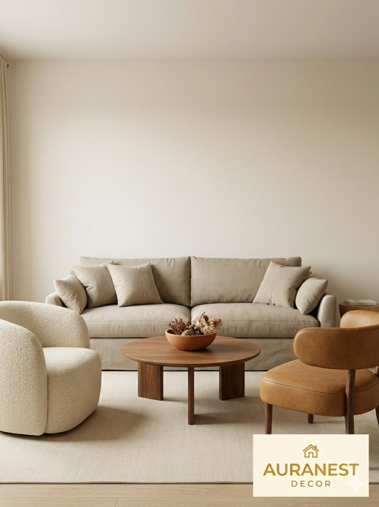
The furniture you choose in a warm neutral living room carries enormous visual weight — or at least it can, if you’re not thoughtful about scale and proportion. The best pieces for this palette tend to share a few qualities: natural materials, soft rounded silhouettes, and tones that complement without matching.
A linen or cotton sofa in a warm putty or oatmeal tone is practically a cornerstone of this aesthetic — and for good reason. It’s adaptable, timeless, and plays beautifully with almost every accent choice. Pair it with a coffee table in warm-toned wood rather than cold metal or glass, which can sever the warmth of the space immediately.
Chairs with curved backs — boucle accent chairs, barrel chairs in camel leather, or rattan-framed seats with cushioned linen seats — add softness without formality. Avoid overly angular, sharp-edged furniture in a space that’s trying to feel welcoming. The geometry of warm, nurturing spaces tends toward the curved and organic.
“Choose furniture the way you’d choose a good friend — reliable, warm, and easy to be around.”
6. Layering Rugs the Right Way
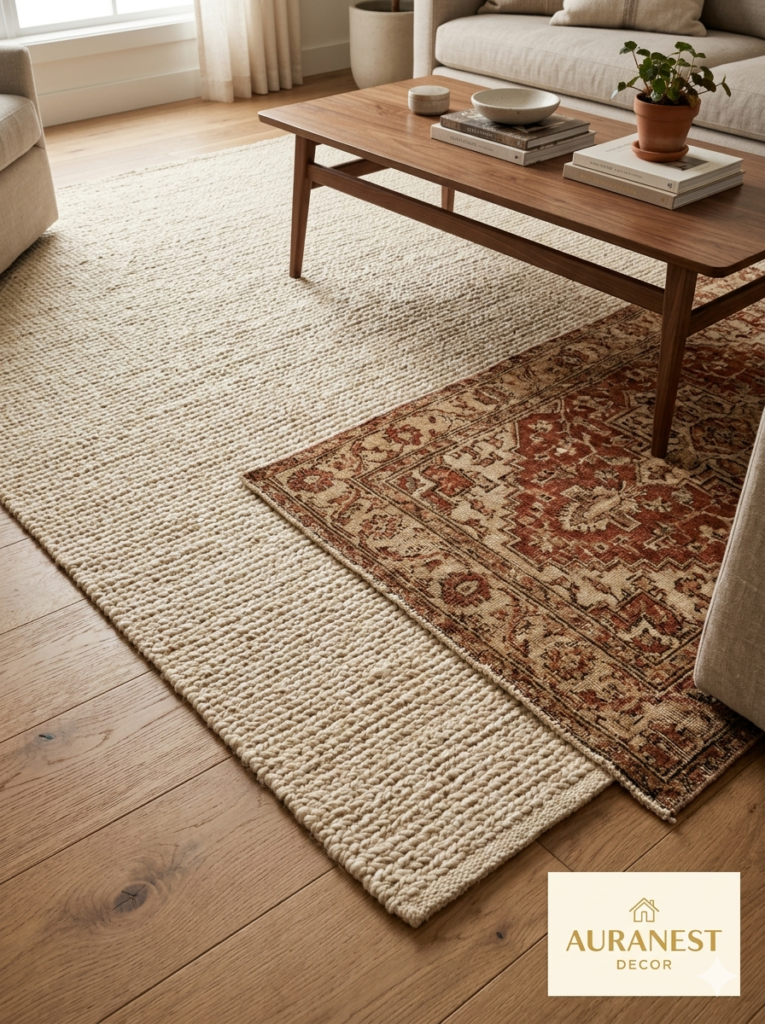
A warm neutral living room without a layered rug situation is a missed opportunity. The floor is one of the largest visual surfaces in any room, and what you put on it — or how you layer it — dramatically shifts the warmth level of the entire space.
The classic approach is a large, neutral-toned area rug as your base: jute, sisal, or a wool flatweave in a warm ivory or sand. This anchors the seating area and grounds all the furniture. Then, layered over one corner or beneath the coffee table, a smaller patterned rug — something with a subtle geometric or a worn vintage-style Persian in rust, camel, and cream — adds depth and personality without fragmenting the palette.
What you want to avoid is choosing a rug that’s too cool in tone (cool gray or blue-tinged) — it will sink the warmth of the entire room even if everything else is perfectly calibrated. Always hold rug samples against your sofa and wall swatches before committing.
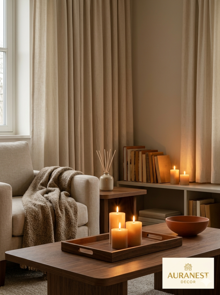
7. Lighting: The Single Most Important Element Nobody Talks About Enough
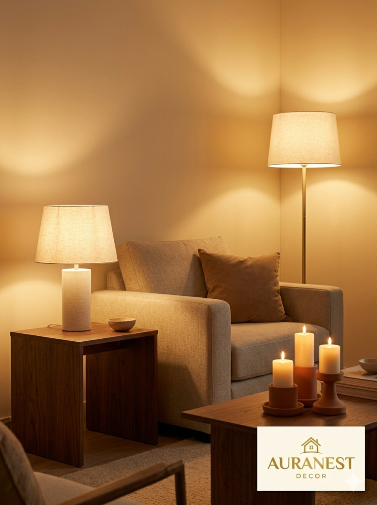
You could have the perfect warm neutral paint, the ideal linen sofa, the most beautifully layered rugs — and then install the wrong lightbulbs and watch all of it collapse. Lighting isn’t an accessory in a warm neutral room. It’s the invisible hand that either holds the whole design together or unravels it.
Warm white bulbs — in the 2700K to 3000K range — are non-negotiable in a space like this. Cool daylight bulbs (5000K and above) will strip the warmth right out of your carefully chosen neutrals. Layer your light sources: overhead ambient light supplemented by table lamps with fabric shades, floor lamps with warm-toned bases, and candles or candlelight-style fixtures wherever possible.
The lampshades themselves matter too. White or off-white linen shades diffuse light beautifully and cast a warm glow. Avoid metal or rigid plastic shades — they create harsher, more directional light that flattens the coziness you’ve worked so hard to build.
8. Plants and Greenery That Complement Rather Than Compete
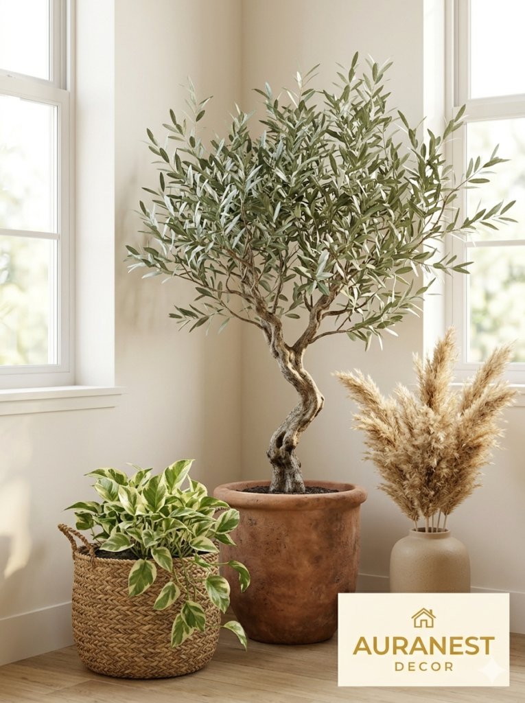
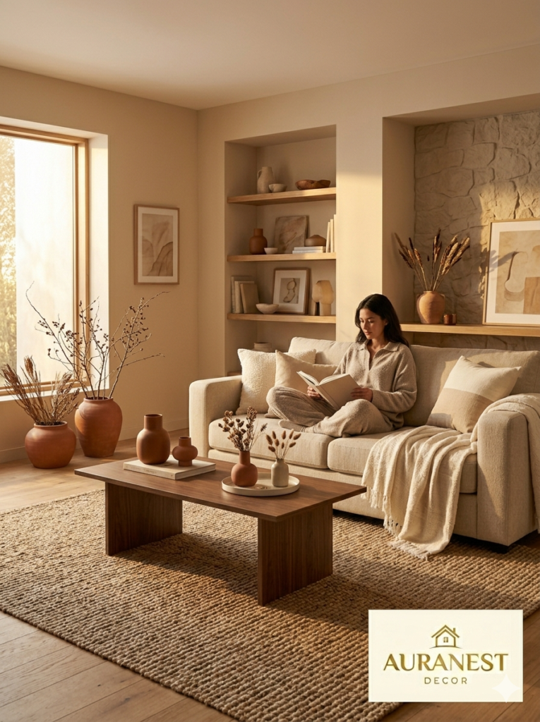
The addition of live plants to a warm neutral living room walks a careful line. Too much greenery in too-vivid a green can suddenly push the palette cooler or more saturated than intended. The goal is to choose plants whose colors and textures feel organic and earthy — as if they grew there naturally.
Olive trees, with their silvery-green leaves and gnarled sculptural trunks, are almost perfectly designed for this palette. Fiddle-leaf figs bring rich dark green that’s warm-toned enough to feel right. Trailing pothos in variegated cream-and-green reads almost neutral. Dried pampas grass, dried eucalyptus, and bleached botanicals bring texture without color.
The pots and planters you choose also matter. Terracotta — whether aged, matte, or glazed in warm sand — is essentially the native container of the warm neutral world. Woven basket planters in seagrass or rattan echo the textural layering of the room itself.
9. Artwork and Wall Decor: Curating Without Cluttering
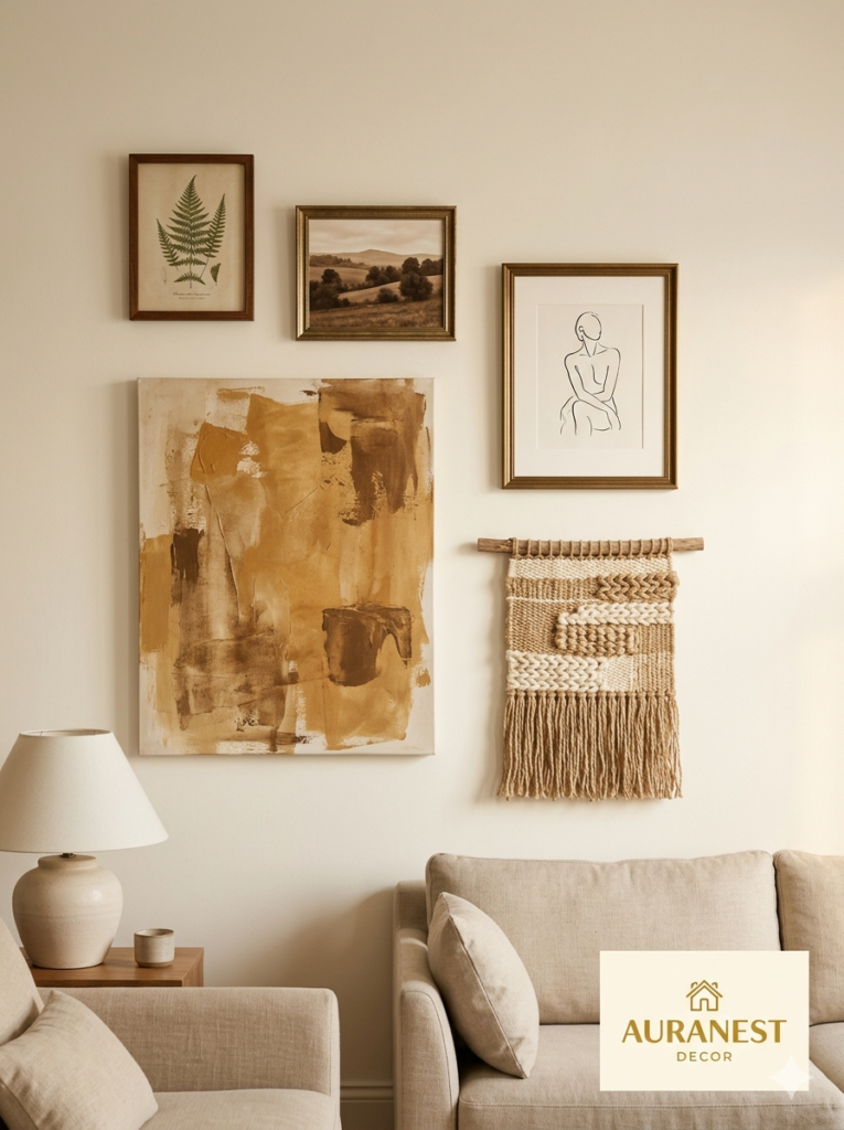
A warm neutral room invites artwork that adds depth without demanding attention. The goal isn’t a gallery wall that shouts — it’s a curated selection of pieces that feel like they were gathered thoughtfully over time, each one meaning something.
Abstract work in warm earth tones — ochre, burnt sienna, creamy white, raw umber — integrates beautifully. Landscape photography in warm-toned sepia or golden-hour light does too. Line drawings with simple warm frames. Vintage botanical prints. Textured fiber art in natural jute or undyed wool.
The frames themselves deserve consideration. Natural wood, warm antique brass, matte black (used sparingly), and warm gold all work. Chrome, bright silver, and high-gloss white can introduce a coolness that punctures the palette.
Leave generous breathing room around artwork. Overcrowded walls in any color scheme tend to feel anxious rather than inviting — and anxiety is precisely what a warm neutral living room is built to dissolve.
“Great art in a warm room doesn’t demand to be noticed. It simply makes you feel glad it’s there.”
10. How to Introduce Accent Colors Without Breaking the Warmth
A warm neutral palette doesn’t mean a color-free one. The question is which accent colors belong in this world and which ones will feel jarring.
The safest accents are the ones that share warm undertones: deep terracotta, dusty olive, aged navy (which reads warm when balanced correctly), muted gold, warm rust, blush rose. These feel like they emerged from the same earth as the neutral base.
Colors to approach with caution: bright cobalt, electric turquoise, cool lavender, lime green, or any highly saturated primary color. They can work, but they require very careful handling — a small dose in one pillow or a single ceramic vase — otherwise they’ll visually separate from the rest of the room rather than enriching it.
The foolproof approach is to introduce accent colors through small, swappable elements first: a pair of throw pillows, a vase, a single candle. Live with them for a week before committing to anything larger.
11. Scent and Atmosphere: The Layer People Forget
Interior design, at its most profound, engages all five senses — not just sight. A warm neutral living room is incomplete if it only looks warm. It should feel warm, smell warm, sound soft and hushed.
In terms of scent, candles and diffusers in warm, grounded fragrances — sandalwood, amber, vanilla, cedar, white musk — reinforce the visual palette through a completely different sensory channel. When someone walks into your living room and it smells like warm wood and vanilla, their brain begins to relax before their eyes have fully registered the room.
Sound matters too. Hard surfaces — concrete, glass, high-gloss wood — amplify and bounce sound, making a room feel louder and more alert. Soft surfaces — rugs, upholstered furniture, curtains, throw pillows, bookshelves filled with books — absorb sound and create the hushed, held quality that cozy rooms have. A warm neutral living room with fully layered textiles will naturally sound softer. That’s not an accident. That’s the design working on a level most people never consciously notice.
12. The Mistakes That Flatten a Warm Neutral Room (And How to Avoid Them)
Even with the best intentions and a beautiful mood board, certain missteps consistently deflate warm neutral living rooms from cozy to forgettable. Knowing them in advance is the fastest way to sidestep frustration.
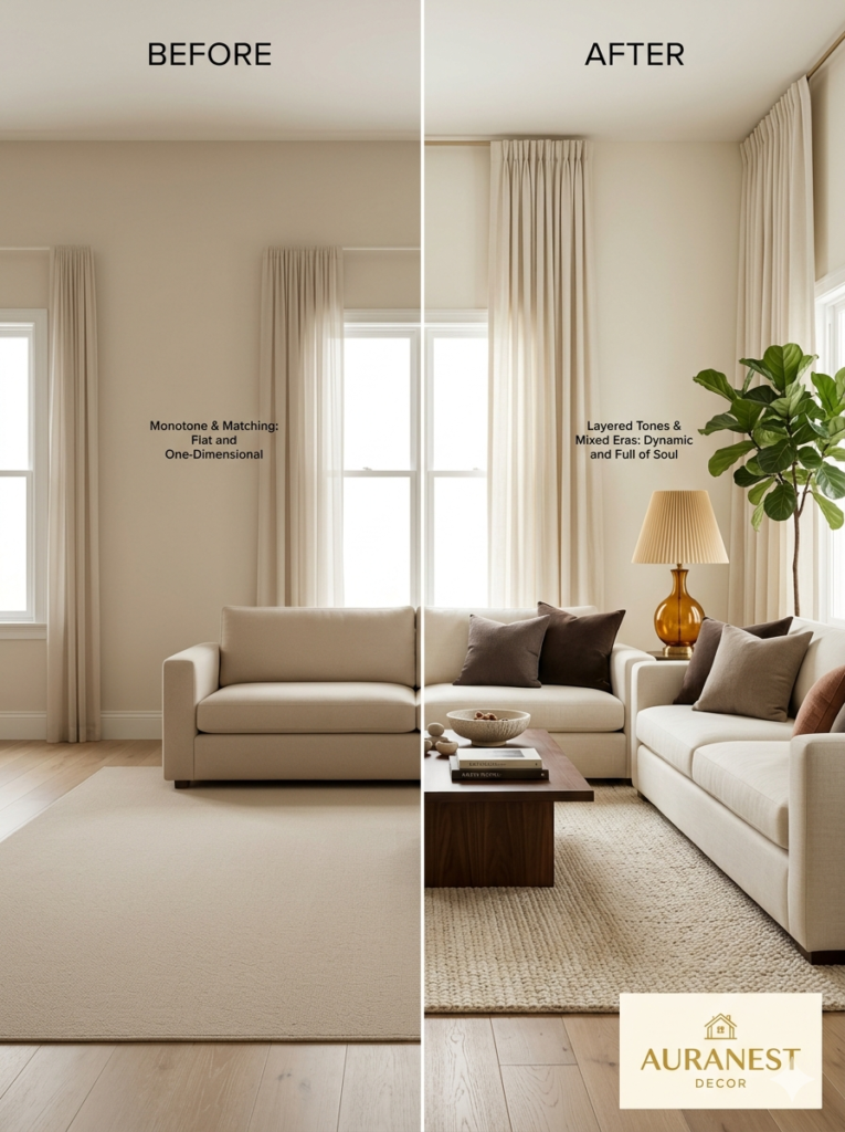
Matching everything too precisely is one of the most common traps. When all your tones are too close — a sofa, rug, walls, and curtains all in nearly identical beige — the room reads as flat and monotone rather than layered and rich. Introduce enough variation in depth and tone that each element is distinct, even while staying within the same warm family.
Ignoring window treatments is another. Bare windows in a warm neutral room let in beautiful light, but they also remove a crucial layer of softness and framing. Floor-to-ceiling curtains in linen or cotton in a warm ivory or sand, hung high and wide, add a finishing softness that transforms the room.
Buying everything new and matching is the third. Warm neutral rooms look their best when they feel collected over time — a vintage lamp, an inherited side table, a secondhand print discovered at a flea market. Mix eras, mix sources. New pieces alongside old ones give the room a soul that a fully catalog-purchased room simply can’t replicate.
—
🌿 How to Take Care of Your Warm Neutral Living Room
Maintaining the warmth and visual harmony of a warm neutral living room over time takes a little intentionality — but nothing overwhelming.
Rotate your textiles seasonally. Swap heavier woven throws and deeper camel tones in autumn and winter for lighter linen textures and softer ivories in spring and summer. The palette stays consistent; only the weight changes. This keeps the room feeling current without requiring a redesign.
Refresh your accent pieces rather than your whole color scheme when you want a change. New throw pillows, a different centerpiece bowl, a switched-out set of candles — these small rotations are often all a warm neutral room needs to feel energized again.
Clean your textured surfaces regularly. Jute rugs, boucle upholstery, and linen curtains can collect dust in ways that flat surfaces don’t, and in a room where texture is doing so much visual work, keeping those textures looking and smelling clean matters more than you’d expect.
Watch your lightbulbs. Bulbs burn out at different rates, and replacing a warm 2700K bulb with a leftover cool 4000K bulb “for now” is the kind of thing that subtly disrupts the room’s warmth without you immediately identifying the cause. Keep spare warm white bulbs on hand.
Trust the slow build. The most beautiful warm neutral living rooms weren’t assembled in a weekend. They were gathered over months and years — one meaningful piece at a time. Give yourself permission to live with the bones of the space and add layers as the right things present themselves.
—
❓ FAQ
Q: What is the most popular warm neutral paint color for living rooms right now? A: Among designers and homeowners, Sherwin-Williams’ Accessible Beige, Benjamin Moore’s White Dove, and Farrow & Ball’s Elephant’s Breath consistently rank as favorites. They all share warm undertones that read differently depending on your room’s light exposure, so always sample them in your specific space before committing to a full wall.
Q: How do I add warmth to a living room without repainting? A: Textiles do the most heavy lifting here. Adding a warm-toned area rug, swapping to linen or cotton throw pillow covers in sand and cream tones, introducing warm-white bulbs, and layering in some natural wood and woven accessories can transform the perceived warmth of a room without touching the walls.
Q: Can a warm neutral living room feel modern, or does it always look traditional? A: Absolutely modern. The warm neutral palette is fully adaptable to contemporary design — the key is pairing it with clean-lined furniture, minimal clutter, and intentional negative space. Warm neutrals with mid-century modern furniture profiles, for example, result in a space that feels both current and deeply inviting.
—
💭 Final Thought
A warm neutral living room is, at its heart, an act of generosity — a space designed so that the people who enter it feel welcome before a single word is spoken. There’s something quietly powerful about a room that takes care of people, that wraps the ordinary moments of daily life in softness and beauty and ease. You don’t need a large budget or a designer’s eye to achieve it. You need patience, intentionality, and a willingness to trust that the slow accumulation of the right elements — chosen with care — will eventually add up to something that feels unmistakably like home.
So the question worth sitting with is this: what does your version of warmth look like, and what’s the one thing you could add or change tomorrow to begin bringing that feeling into the room where you spend the most time?