Why Emerald Green Is the Living Room Color That Actually Stays Interesting
You paint a room. You love it for two weeks, then start wondering if you made a mistake. Emerald green is the exception — the color that somehow gets better the longer you live inside it.
—
1. The Moment Everyone Stopped Being Scared of Emerald Green
There was a point, maybe five or six years ago, when suggesting emerald green for a living room felt slightly unhinged. People were still deep in the greige era. Everything was “warm white” or “soft taupe” or some variation of beige with a hint of ambition. And then, slowly, things shifted. Not because some trend declared it so, but because people started noticing what emerald actually DOES in a room. It doesn’t sit there quietly. It pushes back. It makes your cream sofa look intentional, makes your gold accents look expensive, makes your wooden floors look like they belong in a boutique hotel in Edinburgh or a beautifully cluttered brownstone in Brooklyn.
The fear was always that it would feel too much. Too dark. Too dramatic. But the thing nobody tells you is that drama — the right kind — is exactly what makes a living room feel like somewhere you actually want to be.
“Emerald green doesn’t just sit on your walls. It makes every other thing in the room look better.”
2. The Specific Shade That Separates a Good Emerald Room from a Great One
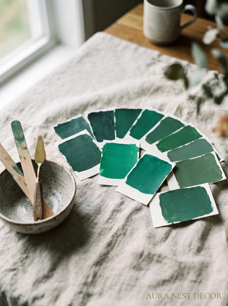
Not all emerald greens are equal. This matters more than people think.
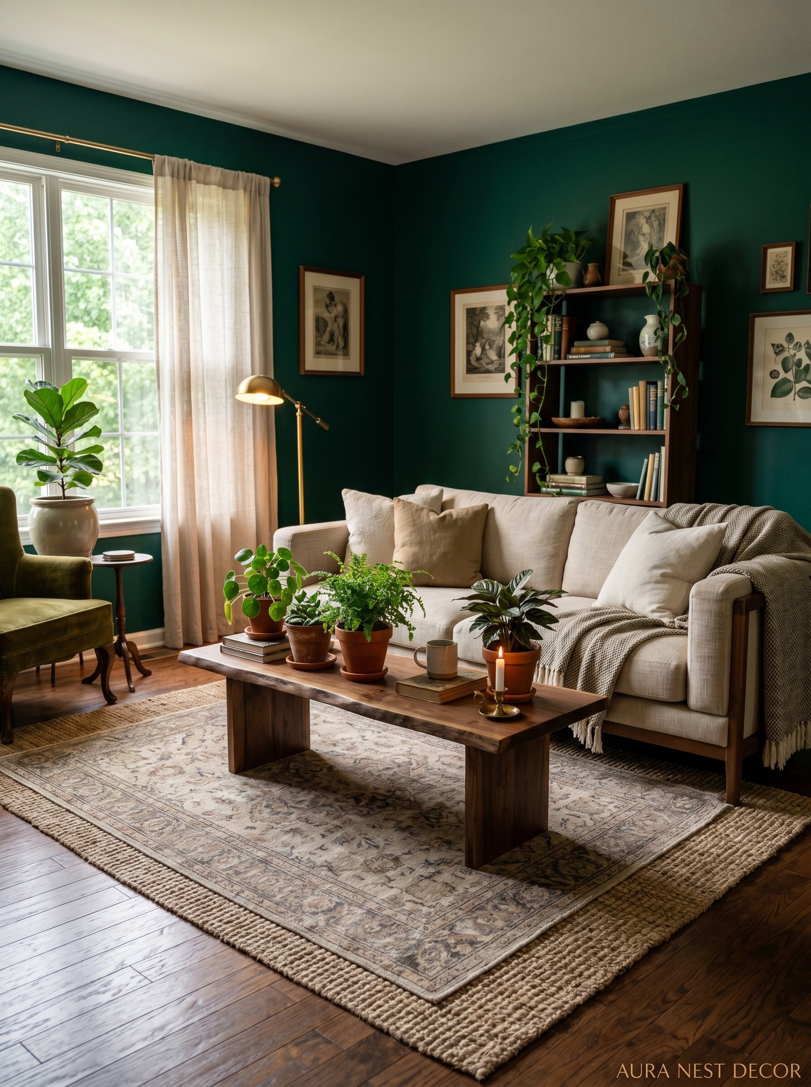
There’s a blue-leaning emerald that reads almost teal in certain lights — gorgeous in Scandinavian-style spaces, but it can feel a little cold in older British terraces or American craftsman homes with a lot of warm wood. Then there’s a yellow-leaning emerald, which is richer and heavier, the shade that’s practically glowing in dim lighting and pulls you toward forest and velvet and something properly luxurious. Most of the well-loved emerald greens — Farrow & Ball’s Emerald No. 97, Sherwin-Williams Shade-Grown, Little Greene’s Jewel — tend to land somewhere between the two. Warm enough to feel inviting. Deep enough to feel deliberate.
My personal preference, and I’ll defend it: go slightly warmer. Rooms that get afternoon light can handle a cooler emerald, but rooms that face north — which is most rooms in UK homes, honestly — need that warmth or it starts looking more like a hotel corridor than a living room.
The key thing to do before committing is paint a big swatch, like genuinely big, at least A3, and look at it at different times of day. Morning light, midday, and then evening with your lamps on. Those are three completely different walls.
3. The Wall Configuration Nobody Talks About (And Probably Should)
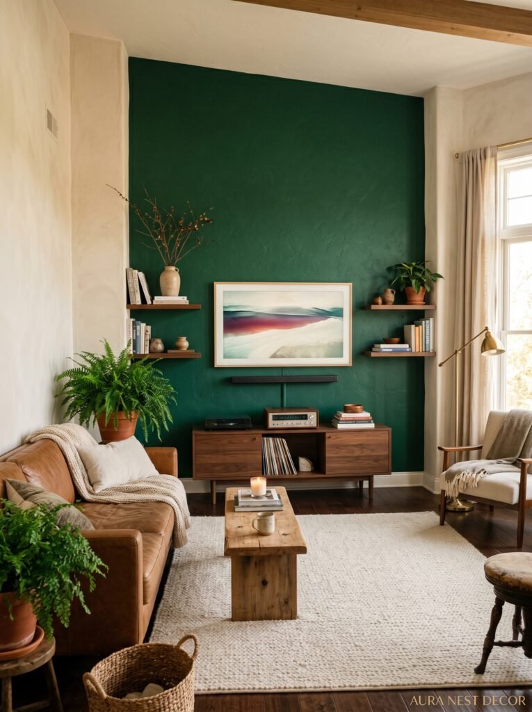
Everyone immediately pictures four emerald green walls and panics. That’s understandable but limiting.
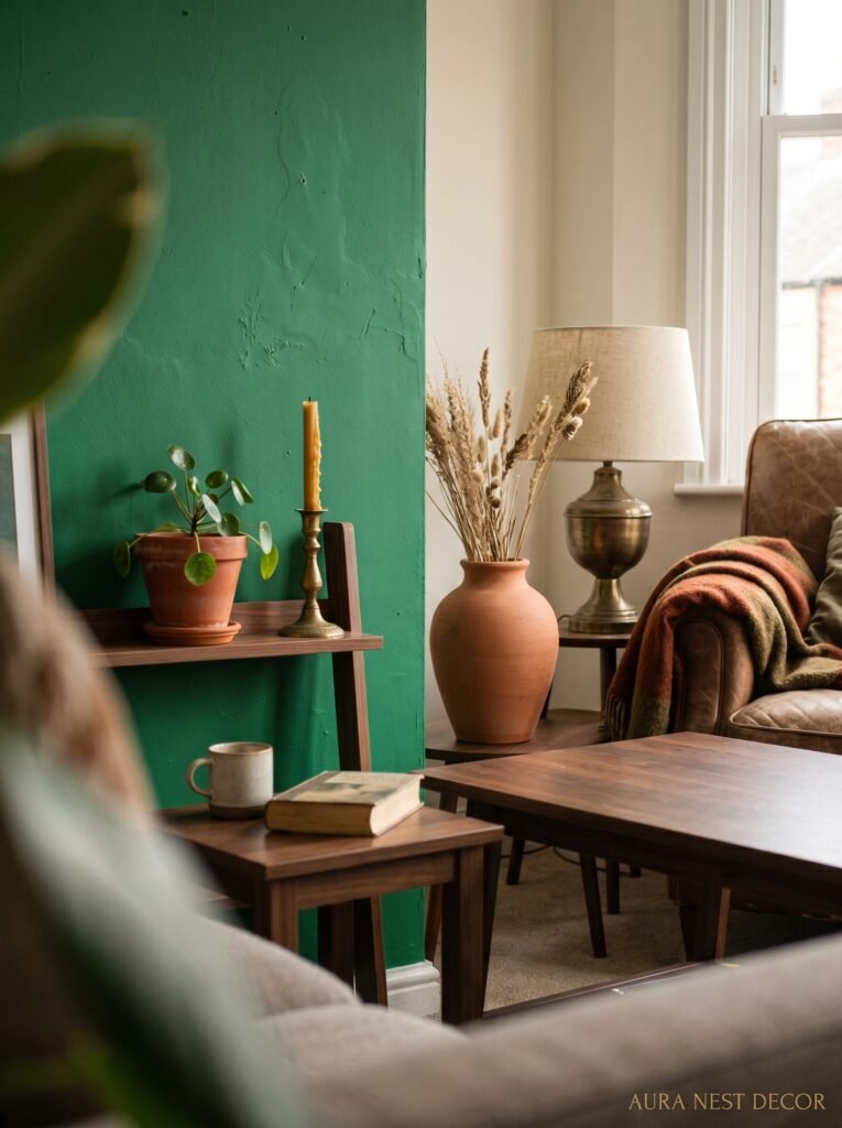
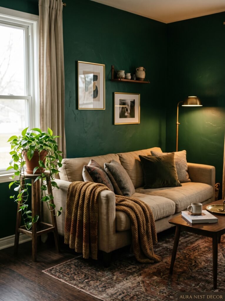
The single accent wall has been discussed to death and honestly feels a bit dated now, but there are other configurations that are so much more interesting. One is the three-quarter approach — paint the lower three quarters of the room in emerald and finish with a picture rail and crisp white or cream above. This is everywhere in Georgian-style rooms and period properties right now, and it just works. The color grounds the space without swallowing it.
Another one I love: just the chimney breast. If you’ve got a fireplace — and a lot of UK homes do, and plenty of older American homes too — paint that alcove and chimney breast deep emerald and leave the rest of the room neutral. The fireplace becomes an event. You can style a mantel in front of it and the whole thing looks like a magazine layout without trying.
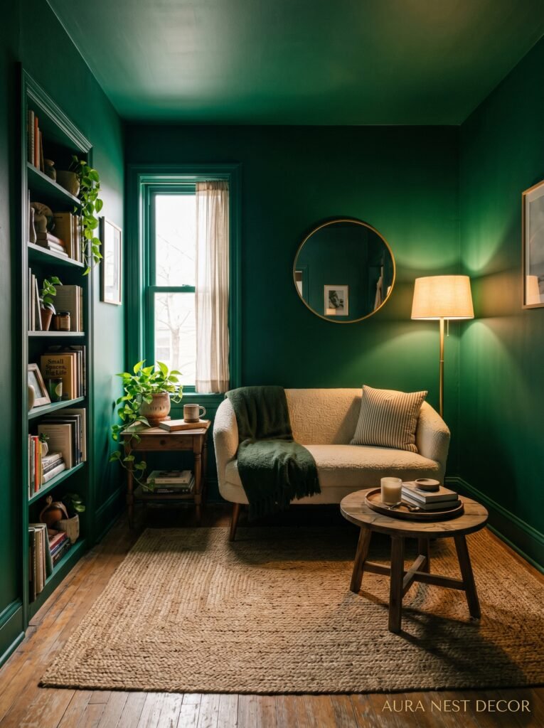
And then there’s the all-in approach. All four walls, ceiling included. This sounds terrifying. It isn’t. A room painted fully in emerald, especially with the right lighting, feels like being inside a jewel box. Cozy in a way that genuinely can’t be replicated by any neutral.
4. The Lighting Situation That Will Actually Determine Whether Your Room Looks Good
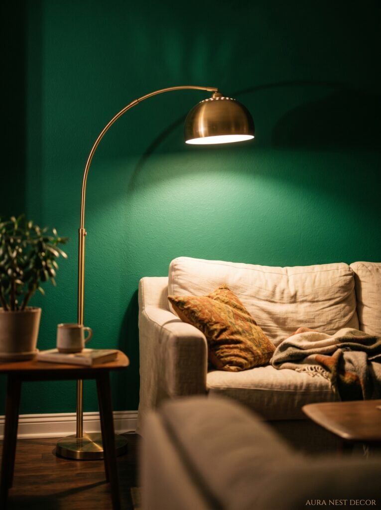
Here’s where emerald green gets tricky, and also where most online articles completely let you down.
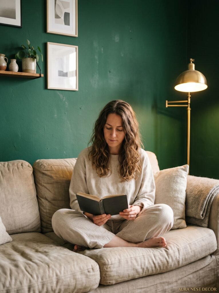
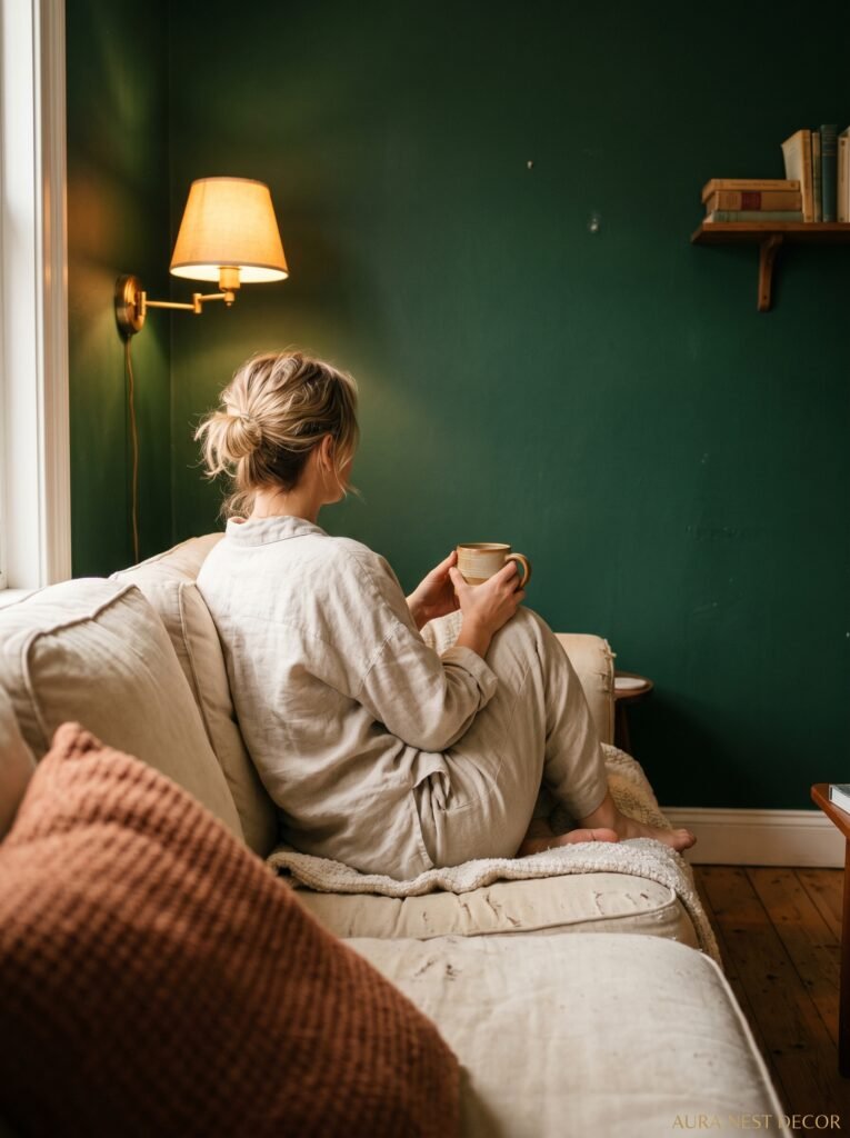
Emerald under cool white LED light looks flat. Sometimes even a bit institutional. There, I said it. The color that looked so rich and beautiful on the tin can look disappointingly lifeless if you’ve got the wrong bulbs overhead. This isn’t the paint’s fault. It’s physics, but it’s fixable.
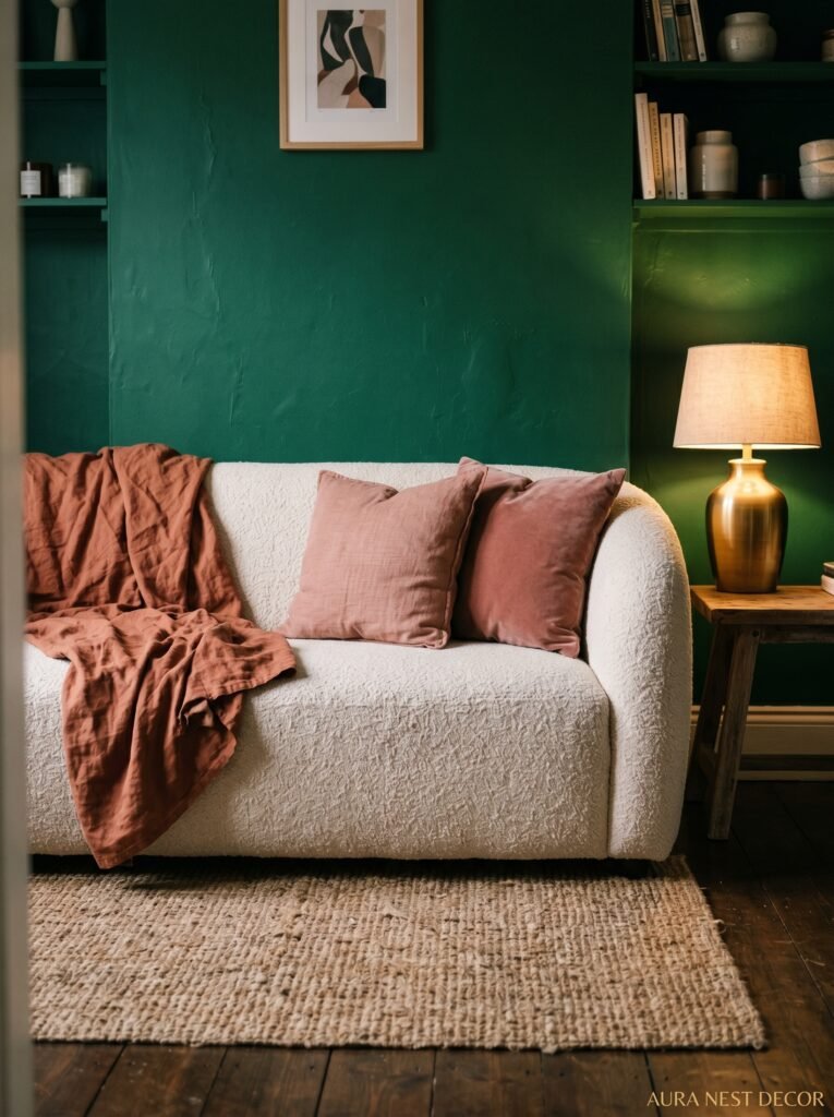
The amber glow of an Edison bulb at 7pm with two table lamps on either side of the sofa — THAT’S when emerald comes alive. It’s the difference between looking at a gemstone in a shop window under fluorescents and holding it up to sunlight. Same stone, completely different experience.
Go for warm white bulbs, around 2700K. Avoid cool white and daylight bulbs entirely in an emerald room. Add lamp layers — floor lamps, table lamps, maybe sconces if your room allows it. And if you’ve got a dimmer switch, brilliant. If you haven’t, seriously consider it. The way emerald behaves at 40% light is different from 100%, and it’s almost always better.
“The wrong lightbulb can undo a thousand-dollar paint job. The right one makes a five-dollar can look like something special.”
5. What to Put on an Emerald Wall (Because This Is Where People Freeze)
You’ve committed. The walls are emerald. Now you’re standing there with a gallery wall’s worth of frames and you’re not sure anything’s going to work.
Good news: emerald is one of the most forgiving gallery wall backgrounds that exists. Dark walls hide the mistakes — the slightly off-center frame, the small hole from the last attempt. And they make light-colored art absolutely pop. Black and white photography on emerald? Stunning. Botanical prints? Obviously. Warm-toned portraits or abstract work with terracotta and ochre in them? Even better.
What to avoid is anything with a lot of cool blue or grey in it. Those shades tend to disappear into the green rather than contrast against it. And very dark or heavily saturated artwork can get a bit lost, depending on your specific shade of emerald. You want contrast.
Gilt frames — the real ornate ones, or good-quality knockoffs from places like Anthropologie or HomeGoods — look incredible against emerald. So do simple natural wood frames with a light finish. What doesn’t work as well: the ubiquitous black frame. Fine, workable, but it doesn’t give you anything that emerald wasn’t already doing.
6. The Sofa Question, Because It’s Always the Sofa Question
Everyone asks this. “What color sofa goes with emerald green walls?”
Cream or off-white linen. That’s the answer nine times out of ten. It’s a cliché because it genuinely works — the contrast is clean, the palette feels rich but not heavy. If you’ve already got a cream sofa or are planning to get one, don’t second-guess yourself.
But there are other options that are arguably more interesting. A deep caramel or cognac leather sofa against emerald walls is something else entirely — very warm, very rich, the kind of combination that looks like money without needing to spend it. Burgundy or rust velvet is another one I keep coming back to. Not salmon-y pink, but proper brick-adjacent rust. It sounds like it shouldn’t work and then somehow completely does.
What about another shade of green? Carefully. Sage or olive as accent cushions, sure. But a second strong green in a sofa or large armchair risks making the room feel like you couldn’t make a decision.
And navy? It can work if there’s enough contrast between your emerald and the blue. But navy-and-green is a close-value combination and can feel a bit flat and heavy without a LOT of bright accents to break it up.
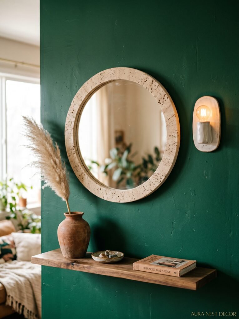
7. The Specific Textures That Make Emerald Rooms Feel Expensive, Not Overwhelming
Color alone isn’t what makes an emerald room feel intentional. Texture is doing half the work, maybe more.
Velvet and emerald green have an almost unfair relationship. Velvet in any color — sage, burgundy, camel, even cream — catches the light in a way that plays beautifully off a deep wall color. A velvet cushion on a cream sofa in an emerald room costs almost nothing to add and makes the whole space feel considered.
Natural textures are equally important and often overlooked. Rattan, jute, woven wool, raw linen. These break up the intensity of a strong wall color and remind the eye that not everything needs to be polished. A jute rug on hardwood floors in an emerald room is quietly perfect. A wicker pendant light brings warmth. These things matter.
And then there’s brass. Everyone knows by now that brass and emerald are a perfect pairing — the yellow-gold against the blue-green creates contrast that reads as antique and luxurious. Door hardware, lamp bases, picture frame edges, side table legs. Even small amounts of brass in an emerald room have an outsized effect.
“Velvet and emerald have an almost unfair relationship. Add one velvet cushion and suddenly the room knows what it is.”
8. How to Use Emerald Green Without Committing to a Full Paint Job
Not everyone’s ready to commit. That’s completely fine. Emerald works in doses.
A large emerald velvet sofa in a white or neutral room is genuinely one of the more dramatic and beautiful things you can do with living room furniture. The color becomes the design. Everything else can be simple.
Emerald curtains are another way in — especially full-length linen or velvet curtains that pool slightly at the floor. They bring the color in vertically, which elongates the room visually, and you can take them with you when you move.
Wallpaper is worth mentioning here. There are botanical and maximalist emerald wallpapers — House of Hackney’s Plantain, for instance, or similar options from Anthropologie — that bring the color in with pattern and complexity. One wallpapered wall can do as much as an entirely painted room, sometimes more, with the advantage that it’s slightly more landlord-friendly to reverse.
Even smaller: emerald green throws, side tables, or a single large leafy plant in a terracotta pot against a white wall. Doesn’t need to be a statement. Can just be a hint.
9. The Plants That Actually Belong in an Emerald Green Living Room
This one’s more specific than it sounds.
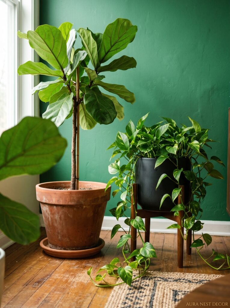
The obvious answer is “lots of plants, greenery!” But here’s the thing — if your walls are already emerald, adding a lot of mid-green trailing plants can make the whole room blur into itself. You lose definition. What you actually want in an emerald room is plants with interesting contrast — very dark leaves, very waxy surfaces, or those deep burgundy-tinged varieties that push back against the wall color rather than disappear into it.
Rubber plants with their near-black leaves. Birds of paradise with graphic, architectural silhouettes. Fiddle leaf figs with waxy depth. The Burgundy rubber plant variety specifically is stunning against emerald walls, the dark maroon leaves making the green look even richer.
And honestly? A single large, beautifully potted plant does more for an emerald room than eight small ones. There’s something about scale in these rooms. Big gestures.
10. Rooms That Are Actually Small (And Why Emerald Might Help More Than Hurt)
The conventional advice is to keep small rooms light and neutral. And I get it, I do. But hear me out.
Small living rooms painted in a dark, rich color — emerald, navy, deep plum — can actually feel MORE spacious than the same room in magnolia. This sounds backwards but it has to do with where the eye goes. A pale neutral room in a small space reads every boundary clearly: there’s the wall, there’s the corner, there is exactly how little space you have. A dark room obscures those boundaries. The edges blur, especially in the evening, and the room feels less like a box.
There’s a tiny sitting room in my favorite design book — barely 10 by 12 feet — painted floor-to-ceiling in a deep forest green. Bookcases built in. Fireplace. Good lighting. It is THE coziest room in the entire book. Not despite its size but almost because of it.
Small spaces benefit from emerald if you lean into coziness rather than fighting it. Stop trying to make it feel bigger. Make it feel better.
11. The Style That Doesn’t Work With Emerald (And What to Do Instead)
Emerald green is not infinitely compatible. It’s not trying to get along with everything.
Minimal, stark, Japandi-influenced spaces — clean lines, raw concrete, bleached wood, white and grey — tend to fight against emerald rather than welcome it. The color wants richness and warmth around it. It wants layering and texture. In a very minimal room, emerald can feel like a mistake rather than a choice.
Same goes for the very pale, airy Scandinavian aesthetic with white walls and lots of natural light and clean blond wood. Emerald pushes back against that vibe. It wants the room to have more going on.
If you love minimalism but want to include emerald, my suggestion is to treat it as a genuine accent rather than a dominant color — one piece of emerald furniture in an otherwise quiet, spare room. Let it be the single point of drama.
What DOES work: traditional, eclectic, maximalist, Grandmillennial, modern classic. Any aesthetic that’s comfortable with richness and some visual complexity. Emerald loves those spaces.
12. Why Emerald Green Rooms Photograph So Well (This Is Also Why You Keep Saving Them)
You’ve noticed it on Pinterest. You’ve saved approximately forty emerald living rooms in the last six months. There’s a reason they keep showing up and keep getting saved.
Emerald is one of the few wall colors that photographs beautifully under almost all conditions. It doesn’t blow out in bright light the way white walls do. It doesn’t go completely flat under low-light photography like some navies. It holds its depth and richness across different cameras and screens. And because most furniture is photographed against neutral backgrounds, an emerald backdrop makes standard furniture look editorial.
But the real reason you keep saving them is that those rooms look like somewhere you’d actually want to be. Not sterile, not aspirational in an untouchable way. They look inhabited. Comfortable. Intentional but not try-hard. That quality is RARE in interior photography and emerald somehow delivers it consistently.
The rooms that get repinned thousands of times aren’t always the biggest or most expensive. They’re the ones that feel livable and specific and real.
—
❓ FAQ
Q: Will emerald green make my living room feel smaller? A: Not necessarily, and often the opposite. Deep colors blur the boundaries of a small room, especially in the evening with warm lighting on. A small room painted emerald with good lamps can feel cozy and intentional rather than cramped — the key is leaning into the coziness rather than fighting it.
Q: What’s the best paint brand for emerald green? A: In the UK, Farrow & Ball’s Emerald No. 97 and Little Greene’s Jewel are both exceptional, though pricey. Dulux also has some solid options if you want to save money. In the US, Sherwin-Williams Shade-Grown and Benjamin Moore Hunter Green are both widely loved. Always get samples first — the brand matters less than choosing the right undertone for your specific room’s light.
Q: Can I use emerald green if I rent and can’t paint? A: Absolutely. A large emerald velvet sofa, full-length emerald curtains, or even a statement wallpaper in a temporary format can bring the color in without touching the walls. Plants, cushions, and throws in emerald work too, though the impact is smaller. You’d be surprised how much a single large piece of emerald furniture changes a neutral rental room.
—
💭 Final Thoughts
Emerald green is one of those decisions that sounds bold in the planning stage and feels completely obvious once it’s done. The rooms that get it right aren’t flashy or over-thought — they’re just confident. They know what they are. And the people who live in them almost always say the same thing: they can’t imagine going back to beige. What would it take for your living room to feel like somewhere you genuinely didn’t want to leave?