The Living Room Renovation That Actually Changed How I Feel in My Own Home
There’s a moment — somewhere between ripping out the old carpet and standing in a room that finally, FINALLY feels like yours — where you understand why people become obsessed with this stuff. I didn’t get it before. Now I can’t imagine stopping.
—
1. Why Most Living Room Renovations Feel Off Even After They’re “Done”
This is the thing nobody warns you about. You spend months planning, you pick the sofa, you choose a paint color that looked perfect on the chip, and then it’s done and you walk in and it’s… fine. Livable. Totally acceptable. And somehow completely soulless.
I’ve seen this happen so many times, both to myself and to people I know. The problem isn’t taste. It’s sequence. Most people make decisions room by room, piece by piece, without ever asking the bigger question first: what do I actually want to FEEL in here?
Not what do I want it to look like. Feel. There’s a difference, and it matters more than any paint color or furniture choice ever will.
Before you buy a single thing, sit in your existing living room — or the shell of it if you’ve already stripped it — and be honest about what’s been bothering you. Is it that the room feels too big and echoey, even though on paper a large room sounds great? Is it that the natural light dies by 3pm and leaves everything cold? Is it that it never feels like anyone actually lives there?
Name the feeling problem first. Then every decision you make after that has a compass.
“The room isn’t done when everything’s in it. It’s done when you stop noticing the room and just start living in it.”
2. The Layout Mistake Almost Everyone Makes (And It’s Not What You Think)
Floating furniture away from the walls. Yes, you’ve heard this advice. And yes, it’s correct. But that’s not the mistake I’m talking about.
The real mistake is planning a living room layout around how the room looks from the doorway instead of how it feels when you’re sitting IN it.
We’re obsessed with the “entry view.” We want it to look good on first glance, like a magazine spread or a staged show home. So we arrange everything to photograph well — symmetrical, open, clear sightlines. And then we actually sit down and realize the sofa faces the window (glare), or the armchair is weirdly isolated in a corner, or the whole seating arrangement feels like a waiting room.
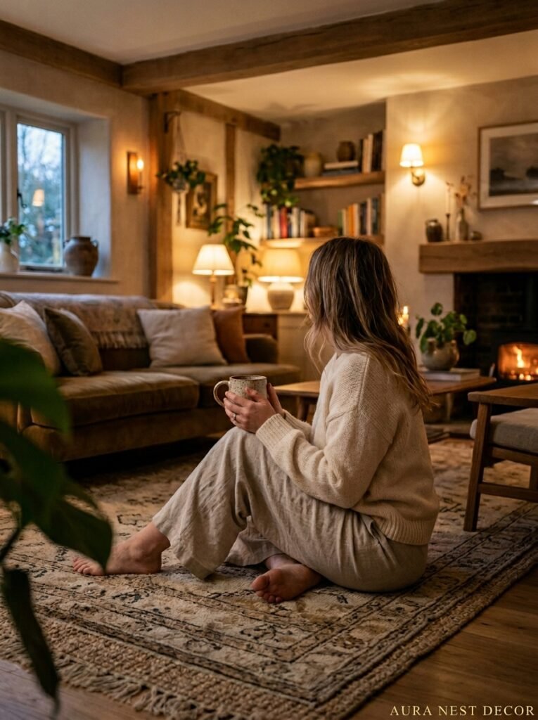
Sit. Actually sit in every seat in your planned arrangement before you commit. Where are your eyes going? Is there something nice to look at? Can you hold a conversation with someone on the other end of the sofa without craning your neck? Does the TV feel too close, or too far?
In the UK, a lot of older homes have bay windows that tempt you into pushing seating toward the back wall to “face the view,” but this leaves an awkward no-man’s-land in the center of the room. Don’t be afraid to position a sofa facing away from the window — or at an angle to it. It breaks the grid in a way that actually feels more interesting.
The layout question isn’t “how does this look?” It’s “where does this room want me to sit?”
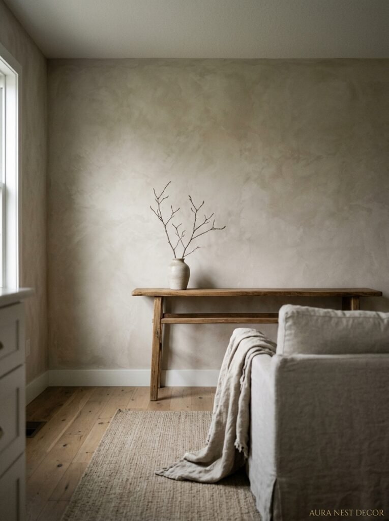
3. The Color That Keeps Showing Up in Every Beautiful Living Room Right Now
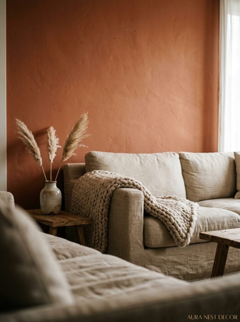
Not Farrow and Ball’s Elephant’s Breath. Not greige. Not even white — though white’s having a moment again too, sort of.
It’s a warm dark green. And I know, I know — dark colors in a living room sounds counterintuitive. But I keep seeing it everywhere, and not because it’s a trend exactly. More because people have collectively gotten tired of safe rooms.
Here’s the thing about a dark green wall: it doesn’t make a room feel smaller. Done right, it makes it feel MORE. More cozy, more intentional, more like someone actually chose it. Benjamin Moore’s Black Forest Green, Farrow and Ball’s Studio Green, Behr’s Woodland Dark — any of them will do it. The key is pairing it with warm, natural materials so it doesn’t tip into feeling cold or cave-like.
Rattan furniture. Warm oak. Linen upholstery in oat or ivory. Plenty of plants (obviously). And lighting that’s amber, not blue-white — this last part is NON-NEGOTIABLE if you’re going dark on the walls.
If you’re in a Victorian terrace with lower ceilings, one dark green wall rather than all four will still give you the effect without making the ceiling feel like it’s pressing down. Honestly, sometimes the one-wall approach looks even more considered.
Side note — cream or warm white ceilings always, always, always. Never bright white if your walls are dark. Never.
4. Flooring First, Everything Else After — Here’s Why
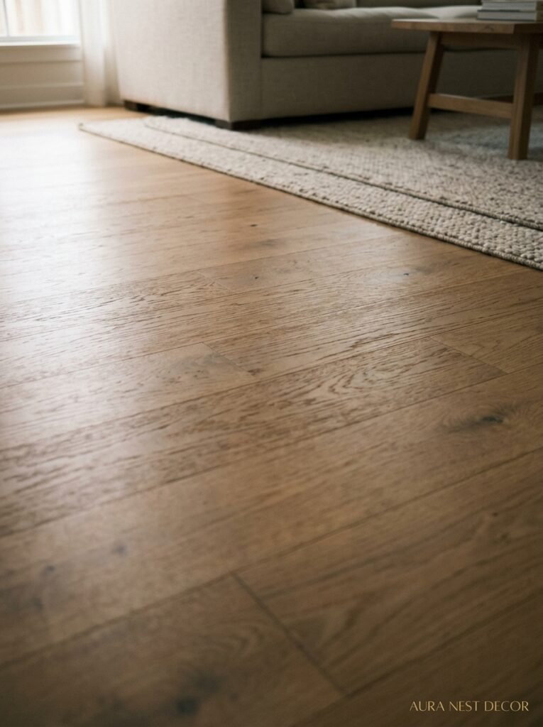
People treat flooring like a background decision. It’s not. It’s the decision that every single other decision in the room has to answer to.
I made the mistake of choosing my sofa before confirming my floor. They’re both beautiful separately. Together, they fight. The cool grey undertone in the sofa fabric and the warm honey tone in the hardwood are just… at odds. Not terribly so. But enough that I’m always vaguely aware of it.
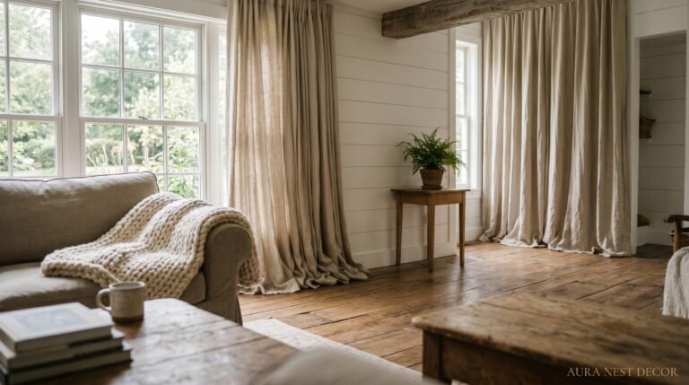
Pick your flooring, commit to it, then build everything else upward from there. Warm wood floors want warm, earthy textiles. Cool slate or stone floors can handle bolder, more graphic patterns because the floor itself is already doing something strong. Light-colored flooring — pale oak, whitewashed pine — is more forgiving, but that flexibility means you have to be MORE decisive elsewhere, not less, or the room goes flat.
In American homes where carpet is still common in living spaces (which is much less of a thing in most UK homes), replacing carpet with hardwood or engineered wood is consistently one of the highest-return renovations you can do, both for resale and for daily livability. The room immediately reads as more intentional.
“Your floor is the one thing everyone stands on, sits next to, and looks down at without realizing it. It’s doing more work than any wall ever will.”
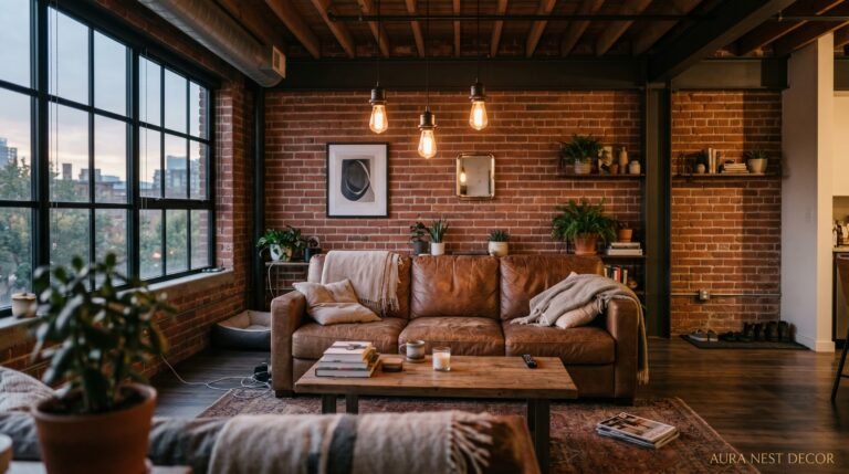
5. The Lighting Plan Nobody Talked to You About Before You Started
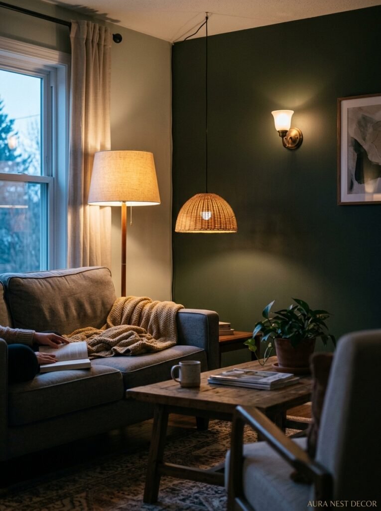
Can we just acknowledge that overhead lighting is usually terrible? Not always. But usually.
A single centered ceiling light — or worse, recessed LED downlights set too bright — flattens a room instantly. Everything looks clinical. You lose all shadow and texture, and shadow and texture are what make a room feel alive.
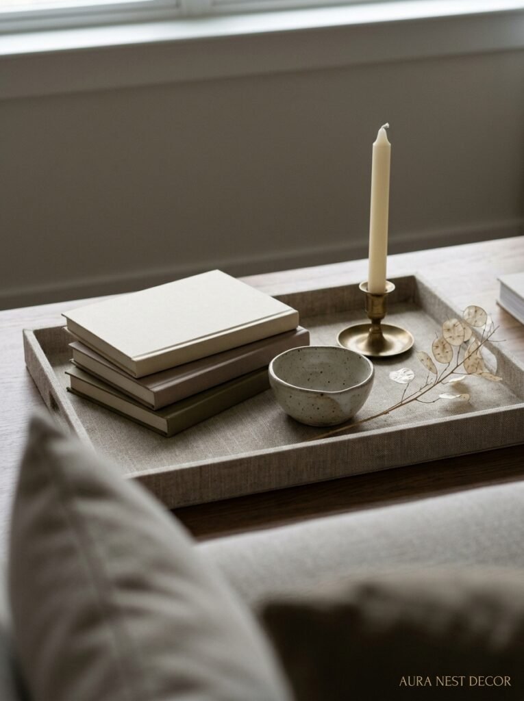
What you actually want is layered light at different heights. A floor lamp in a corner. A table lamp on a side table or console. Candles, if you’re into that (and you should be, at least sometimes). Maybe an interesting ceiling pendant, but dimmed way down and treated as ambient rather than functional.
The height thing is crucial. Lights at eye level and below create intimacy. Lights only from above create a working office. Guess which one feels better to relax in?
Dimmer switches. If you take one practical piece of advice from this entire article, make it this: every living room light source needs to be on a dimmer. Every single one. The difference between your room at full brightness and your room at 40% brightness — same furniture, same colors, same everything — is genuinely startling. It’s like two different rooms.
In the UK, there’s often more reluctance around wall lights because it means chasing cables through walls, which in a period property can be a whole thing. Cordless wall sconces with rechargeable batteries are actually a really solid workaround. They look proper, they work, and you haven’t touched the plaster.
6. What Pinterest Won’t Tell You About That Styled Bookshelf Look
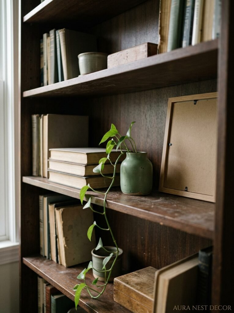
We’ve all saved the pins. The perfectly curated shelves with the alternating books, the sculptural objects, the little trailing plant, the neutral color story running through everything. And then we try to recreate it and it looks… like we tried.
Here’s what’s actually happening in those pins that you can’t see: editing. Brutal, merciless editing. The person who styled that shelf removed about 70% of what was originally on it.
The problem most people have isn’t that they don’t have nice things — it’s that they have too many things displayed at once. Your eye doesn’t know where to go, so it gives up and the whole thing reads as clutter, even if every individual object is lovely.
Start by taking everything off. Everything. Then put back only the things you genuinely love and would miss. Then edit again. A bookshelf looks curated not because of what’s on it, but because of what ISN’T on it.
And please — stop trying to hide all the books. Books are good. A shelf FULL of books, actual books in actual colors, is beautiful and interesting in a way that three artfully stacked books next to a sculptural vase is not. Let the books be books.
7. The One Textile Decision That Pulls Every “Almost There” Room Together

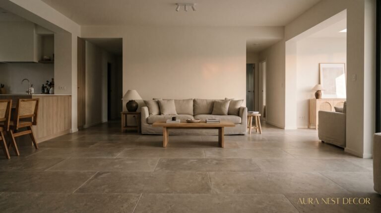
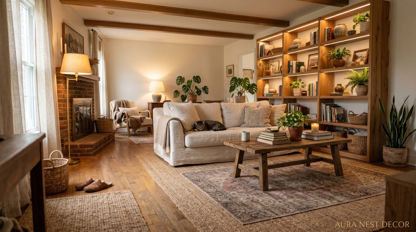
A rug. Not a small rug. A rug that’s almost uncomfortably large.
This is the single most common thing I see holding renovated living rooms back, and I’ve been saying it so long I sound like a broken record but I will keep saying it: the rug is too small. If you think you need an 8×10, get a 9×12. If you’re looking at something called a “statement rug” at 6×9, keep looking.
The front legs of every sofa and armchair should sit on the rug. Not just graze it, sit on it. This is what anchors a seating arrangement and makes it look like a room rather than furniture parked in a room.
In terms of what the rug actually does visually — it defines the zone. A living room that’s open-plan into a kitchen or dining area especially needs this. The rug is what tells your eye where the living room IS. Without it, the space reads as one big undifferentiated room and everything feels uncertain.
Texture matters more than pattern, honestly. A high-pile wool rug in a solid warm neutral does more work than a busy patterned rug that fights with everything else. Not always — a great Persian or Moroccan rug can be the anchor the whole room builds around — but if you’re not sure, go texture.
“A room with a too-small rug looks like someone almost got it right. Go bigger and suddenly the whole thing clicks.”
8. Why “Statement Walls” Got a Bad Reputation and What to Do Instead
Accent walls had a moment. Then they became the thing that renovating shows made fun of. Then everyone overcorrected and decided all four walls had to match, always.
Both extremes are wrong. Or — more accurately — both can be right depending on what the room needs, which is a more useful way to think about it.
The accent wall got a bad reputation because people used it to introduce a color that had no relationship to anything else in the room. A bright teal wall behind the TV in a room full of beige. That’s not an accent — that’s a mistake wearing confidence. The color has to belong to the room even when it’s doing something bolder than the rest of it.
What works better than a traditional accent wall is an architectural treatment. A plaster finish, limewash paint, or Roman clay on one wall that creates texture and depth rather than just a color hit. Or board and batten panelling, which reads as classic in the US and period-appropriate in a lot of British homes. Or — if you’re committed to color — painting the wall AND the trim the same shade, so it reads as a design decision rather than a DIY accent wall.
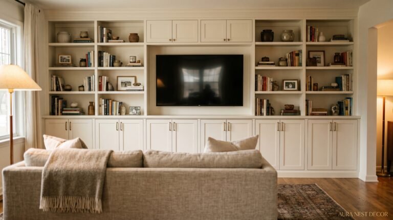
The built-in look is having a HUGE moment right now. Alcove shelving, built-in cabinetry flanking a fireplace — these are the architectural investments that make a living room feel genuinely finished rather than furnished.
9. The Sofa Question You Need to Answer Before You Buy Anything
Not “what color?” Not “what style?” The first question is: how do we actually sit?
This sounds obvious and it isn’t. Some households are snugglers — everyone piles onto one sofa, legs everywhere, someone always horizontal. That household needs deep seats, a soft loose cushion fill, and probably a chaise. Other households are more perched — people sit upright, there are often guests, conversation matters. That household needs firmer seats, tighter back cushions, and a sofa with some structure.
A sofa that’s wrong for how you sit is uncomfortable for years. And an uncomfortable sofa is one you eventually stop using, which makes the room feel wrong for reasons you can’t quite name.
Down-blend cushion fill is the most comfortable but requires constant maintenance — you’re plumping and adjusting constantly. Foam fill stays tidy but goes flat and hard faster than you’d like. The best middle ground most people find is a foam core with a down or fibre wrap. It has shape, it has give, it doesn’t eat you alive when you sit down.
Also: measure your doorways BEFORE ordering. Both in the US and UK, there are classic sofa-stuck-in-the-stairwell stories that aren’t actually funny when it’s happening to you.
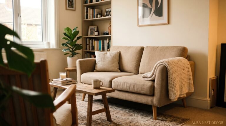
10. Plants in a Living Room — Where People Get It Wrong
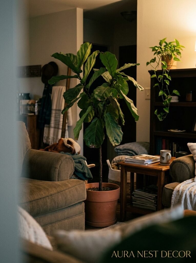
Not every corner needs a plant. Not every shelf needs trailing greenery. The “more plants = more life” logic has a ceiling (no pun intended) and past a certain point it starts to read less like a living room and more like a conservatory you happen to have a sofa in.
The real use of plants in interior design is punctuation. A tall fiddle leaf fig or snake plant in a corner creates a vertical element that draws the eye up and gives the room scale. A small plant on a side table adds something organic to an otherwise flat surface. A trailing pothos on a high shelf brings softness to a hard edge.
The mistake is using plants to fill gaps instead of to solve visual problems. A plant in a corner because the corner feels empty isn’t a design decision — it’s avoidance. Ask why the corner feels empty first. Sometimes the answer is a different piece of furniture. Sometimes it’s better lighting. Sometimes, yes, it’s a plant. But know which it is.
Low light situations — and a lot of UK homes have genuinely low natural light for much of the year — seriously limit what will actually survive. Snake plants, ZZ plants, and pothos are your friends. Anything that’s sun-dependent will just slowly die and make the room sadder.
11. The Thing About “Finishing Touches” That Actually Makes or Breaks the Room
Art. Specifically: the height at which you hang it.
Gallery walls hung at sitting height are one of the most common finishing-touch mistakes I see. Art should be hung with its center at roughly eye level when standing — approximately 57-60 inches from the floor to the center of the piece. This is what museums use and there’s a reason it works: it’s where your eye naturally travels.
When art is hung too high, and it almost always is, the room feels disconnected. Like the art belongs to the ceiling, not to you.
Gallery walls work best when there’s a logic to the arrangement — not necessarily a grid, but an underlying order. An invisible center line, or a consistent bottom edge, or a deliberate anchor piece from which everything else radiates. Arrange it on the floor first, photograph it, THEN hang.
Mirrors are underused. A large mirror on a wall that receives natural light will effectively double the light in the room. Not metaphorically — it genuinely bounces light into corners that wouldn’t otherwise see it. In a smaller UK living room especially, one large well-placed mirror does more work than almost any other single purchase.
12. The Budget Question Nobody Wants to Answer Honestly
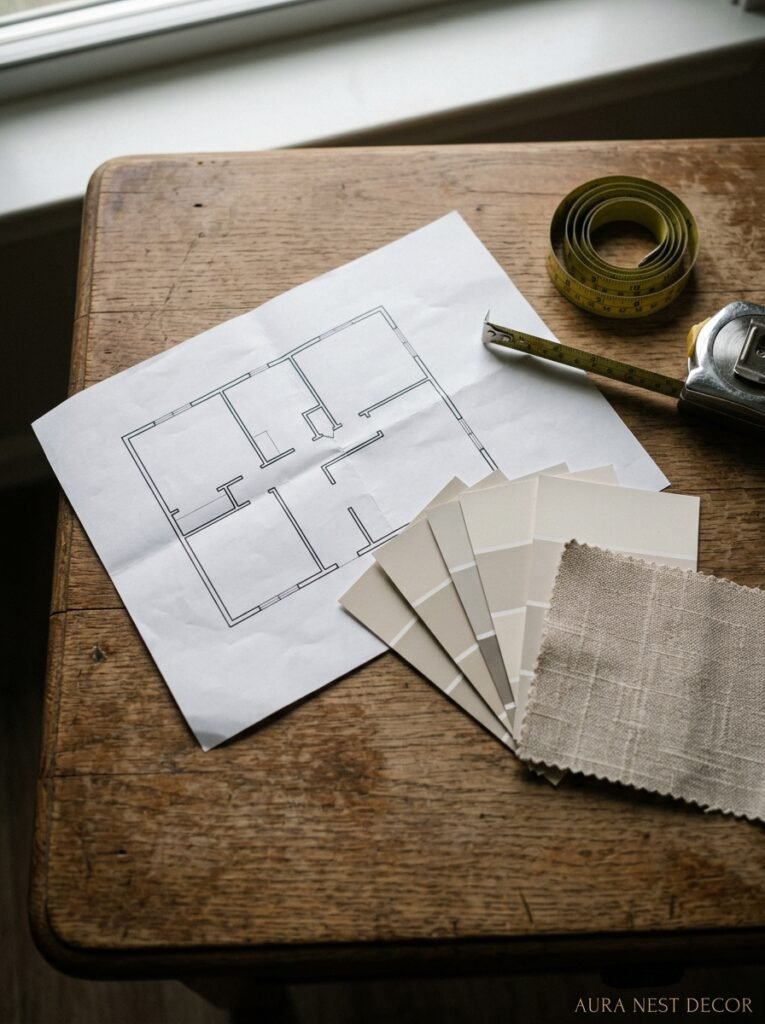
There isn’t a number that’s “right” for a living room renovation. But there IS a useful framework.
Roughly: spend your money where it can’t easily be changed (flooring, built-ins, any structural work) and be more flexible where things can be swapped out over time (cushions, accessories, art). This isn’t groundbreaking advice, but most people do the opposite — they economize on the bones and splurge on the things they’ll be tired of in three years.
A mediocre sofa in a well-proportioned, well-lit room with great flooring still looks fine. A gorgeous sofa in a room with bad bones and builder-grade lighting looks… ordinary.
Paint is the highest-ROI thing you can spend money on. The difference between a £5-a-litre paint and a £20-a-litre paint is real and visible, especially in how it holds up over time and how it looks in different lighting conditions. It’s not snobbishness — it’s physics. Better pigment, better coverage, more depth.
Don’t cheap out on lighting either. A beautiful lamp that actually works — that gives the right quality of light, from the right height, with a bulb in the right color temperature (2700K is your number, not 4000K, please) — is worth every penny. And dimmer switches. Did I mention dimmer switches?
—
❓ FAQ
Q: How long does a living room renovation actually take from start to finish? A: Depends enormously on scope. A cosmetic refresh — paint, new flooring, furniture swap — can be done over a few weeks if you’re organized. A proper renovation involving any structural work, built-ins, rewiring, or replastering? Budget three to four months minimum, and add a buffer because something always takes longer than expected.
Q: What’s the best way to make a small living room feel bigger without knocking any walls down? A: Light, mirrors, and getting furniture off the floor. Low furniture with visible legs creates negative space underneath which makes the room feel airier. One large mirror opposite a window. Keep the palette light and cohesive. And absolutely — go for the larger rug, not a smaller one. Small rugs in small rooms make small rooms feel smaller.
Q: Is it worth hiring an interior designer for a living room renovation or can you do it yourself? A: Genuinely depends on your budget and your confidence level with spatial thinking. An interior designer earns their fee primarily through avoiding expensive mistakes — not the decorating part, but the planning and sequencing part. If you’re spending serious money, a consultation (even just an hourly one) before you commit to anything structural is almost always worth it. For a more cosmetic renovation, doing it yourself with good research is completely doable.
—
💭 Final Thoughts
The living room is the room that has to do the most. It’s where people come together, where you decompress at the end of a long day, where you host and hide and read and argue and laugh. It deserves more than just “nice.” When it finally works — really works — you’ll feel it before you can even say what changed. Is yours there yet?