Why Blue Is the Coziest Color You Can Put in a Living Room (And Most People Are Sleeping On It)
You walked into someone’s living room once and just… exhaled. Maybe you don’t even remember whose house it was. But you remember the feeling — that instant drop in your shoulders, the way the room seemed to hold you. Chances are, there was blue in it somewhere.
—
1. The Shade That’s Quietly Taking Over Every Room I Love Right Now
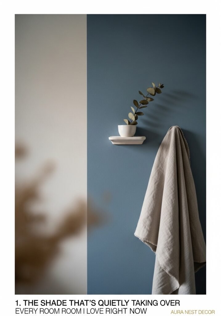
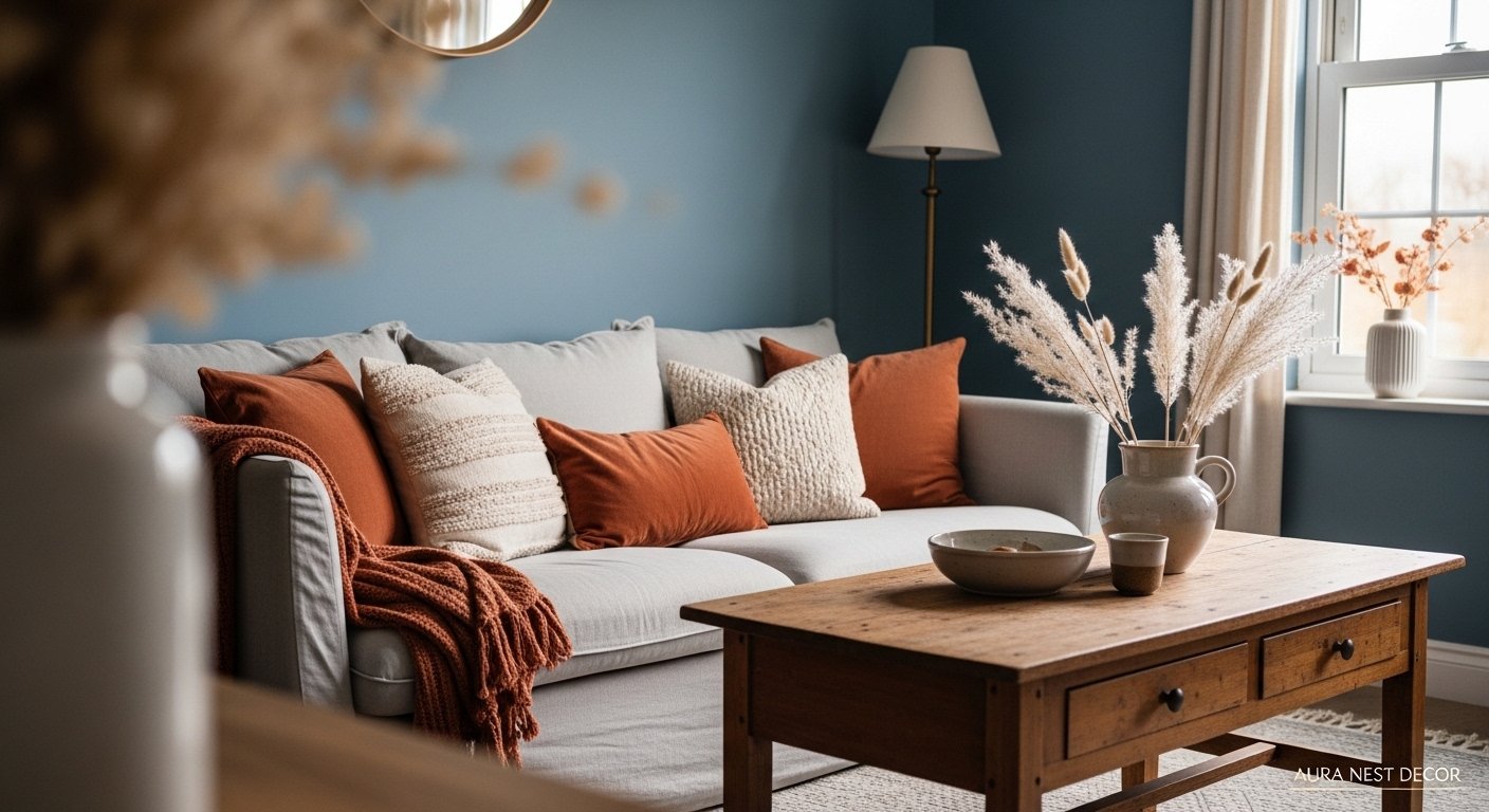
Not navy. Not that generic coastal blue that peaked around 2018 and still hasn’t quite recovered. I’m talking about something murkier, richer — a dusty, slightly grey-toned blue that looks different at 10am than it does at 7pm, and somehow looks good in both.
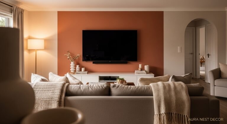
It shows up different depending on who’s using it. In the UK, I keep seeing it on chunky linen sofas, layered with oatmeal throws and the kind of brass candlestick that looks like it came from a market stall. In the US, it’s appearing more on accent walls — usually behind a gallery wall or beside a fireplace that someone has finally had the nerve to paint a dark colour.
The shade I keep pinning? Somewhere between duck egg and slate. Not quite either. It’s got this quality where it reads as a neutral from a distance but pulls out a whole mood up close, and that’s EXACTLY what a cozy room needs. A room that rewards you for being in it.
The reason it works so well for living rooms specifically is that it doesn’t compete. You can throw basically any warm textile at it — terracotta cushions, rust-coloured rugs, warm wood floors — and it just… cooperates. It’s not trying to be the star. It’s trying to be the room itself.
“The best living room blues don’t shout. They hum.”
—
2. Why Painting All Four Walls Blue Feels Scary Until You Do It
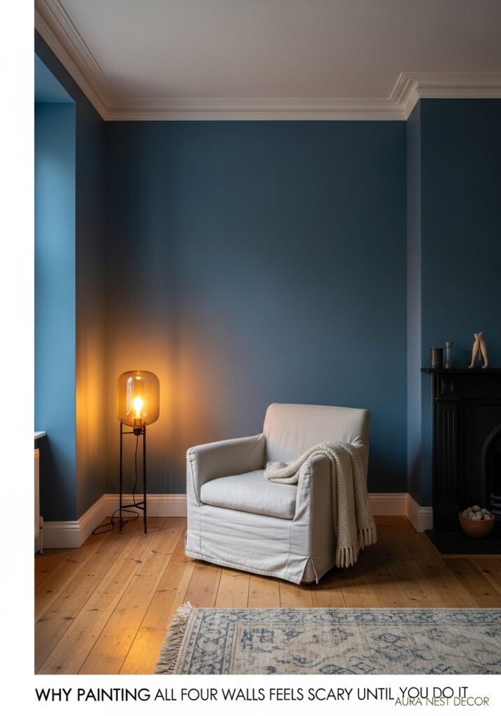
Everyone stops at one wall. I get it, I really do. The sample goes up, it looks beautiful, and then the fear kicks in: what if it’s too much? What if it makes the room feel like a cave?
Here’s what nobody tells you: darker blue walls, when done right, don’t shrink a room. They create depth. They make the room feel INTENTIONAL, like it was designed rather than assembled. A single blue wall says “I tested the water.” Four blue walls say “I live here and I meant it.”
The key — and this is the bit people miss — is keeping the ceiling a warm off-white rather than a clinical bright white. Something like an antique linen, or even a very pale version of the wall colour. It keeps the room from feeling like a box and instead feels like you’re nestled inside something. A nest. A burrow. All the cozy words.
Good lighting matters a lot here, but not in the way design blogs usually frame it. It’s not about “layering your lighting” as a concept. It’s about making sure you have at least one warm, low lamp in a corner — the kind that casts a glow rather than illuminates. That amber light bouncing off a deep blue wall is genuinely one of the most atmospheric things you can do in a home, and it costs about £30/$35 from a charity shop or thrift store.
—
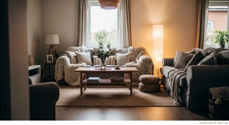
3. The Texture Rule That Actually Makes Blue Feel Warm Instead of Cold

This is the one that saves people from ending up with a living room that looks like a conference room. Blue is a cool colour — that’s just physics — and if you don’t offset it with the right textures, the room will FEEL cool. Not cozy-cool. Literally cold.
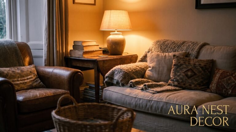
Linen is your best friend here. Not the stiff, formal kind — the rumpled, slightly wrinkled kind that looks like it’s been lived in. A linen sofa in a warm stone or biscuit tone against a dusty blue wall looks like something out of a French farmhouse, in the best possible way.
Chunky knit throws are next. One draped over the arm of the sofa, one folded on a footstool. They don’t have to match. Honestly, they shouldn’t match — that’s what makes it look real rather than staged.
And rugs. A jute rug is the single fastest way to warm up a blue room. That rough, natural, almost-yellow-beige tone pulls all the warmth out of the blue and grounds everything. Layer a smaller wool rug on top if you want it to feel extra lived-in. A pattern in terracotta or rust on top of a flat jute base? That’s the combination I’d bet money on every time.
—
4. Vintage Finds That Look Like They Were Made for a Blue Living Room
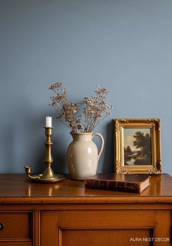
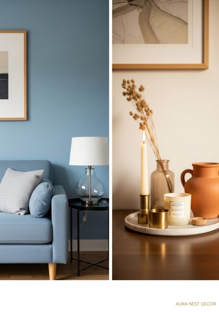
There’s something about aged wood and blue walls that’s almost cosmically meant to be together. Old oak, walnut with a bit of wear on the edges, pine that’s darkened slightly with age — all of it looks stunning against blue. Which is great news, because this is the stuff that’s cheap at car boot sales, thrift stores, and eBay.
Wooden frames around artwork. A battered chest used as a coffee table. An old library ladder propped against a bookshelf. Even just a turned-wood lamp base from a charity shop, painted a matte black or left natural — it all anchors the room in a way that makes it feel collected rather than decorated.
“A room that looks like it came together over years is always more interesting than one that arrived in a delivery van on the same Tuesday.”
Brass and antique gold work incredibly well too, but lean toward the darker, more oxidised end rather than shiny new brass. Shiny brass next to a deep blue can tip into nautical territory fast, and unless you’ve got actual nautical intentions, you probably want to avoid it. Tarnished, slightly matte brass? Different story entirely.
Candles in old terracotta pots, dried flowers in ceramic vases, a worn leather journal on the coffee table — none of this costs much. All of it makes the room feel like a PLACE.
—
5. The Sofa Situation: What Actually Goes With Blue Walls
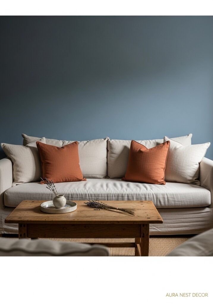
Let me save you from the grey sofa. I know it’s tempting. Grey is safe, grey goes with everything — but grey next to blue walls tends to flatten the whole room. It becomes a room without a temperature, and cozy rooms need to feel warm.
What actually works? A warm white or cream sofa has a lovely, almost French country effect. A camel or cognac leather sofa against a deep dusty blue is genuinely stunning — that rich tan against the cool blue creates this contrast that just works. And if you want to stay in the blue family, a slightly different tone of blue on the sofa — a little warmer, a little lighter — can look really sophisticated without being matchy-matchy.
Green sofas are having a moment and they pair brilliantly with blue walls, especially if the green is in the sage or olive range. Not emerald, not forest — too dramatic. But a muted, earthy green next to a muted, earthy blue? That’s a nature-inspired palette that’s going to feel calming for years rather than weeks.
What about patterned sofas? You can, yes. But keep the pattern subtle — a tone-on-tone stripe or a very quiet geometric — because the walls are already doing heavy lifting.
—
6. Cushion Combinations That Don’t Look Like You Bought Them as a Set
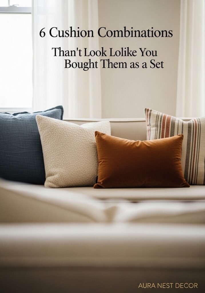
Sets are the enemy of cozy. Hear me out. When everything matches perfectly, a room looks like a showroom — and showrooms aren’t comfortable. They’re impressive, but you don’t want to sit in them.
A cozy blue living room needs cushions that look gathered, not curated. Start with one anchor cushion — maybe a deep blue velvet that picks up the wall colour — and then build outward in different directions. A terracotta linen. A stripe in cream and rust. A small floral in muted pink and sage. Something with a bit of fringing or a textured knit.
The sizes should vary too. You don’t want four identical square cushions in a symmetrical row. Try two large squares, one rectangular lumbar, one round. The messiness is the point.
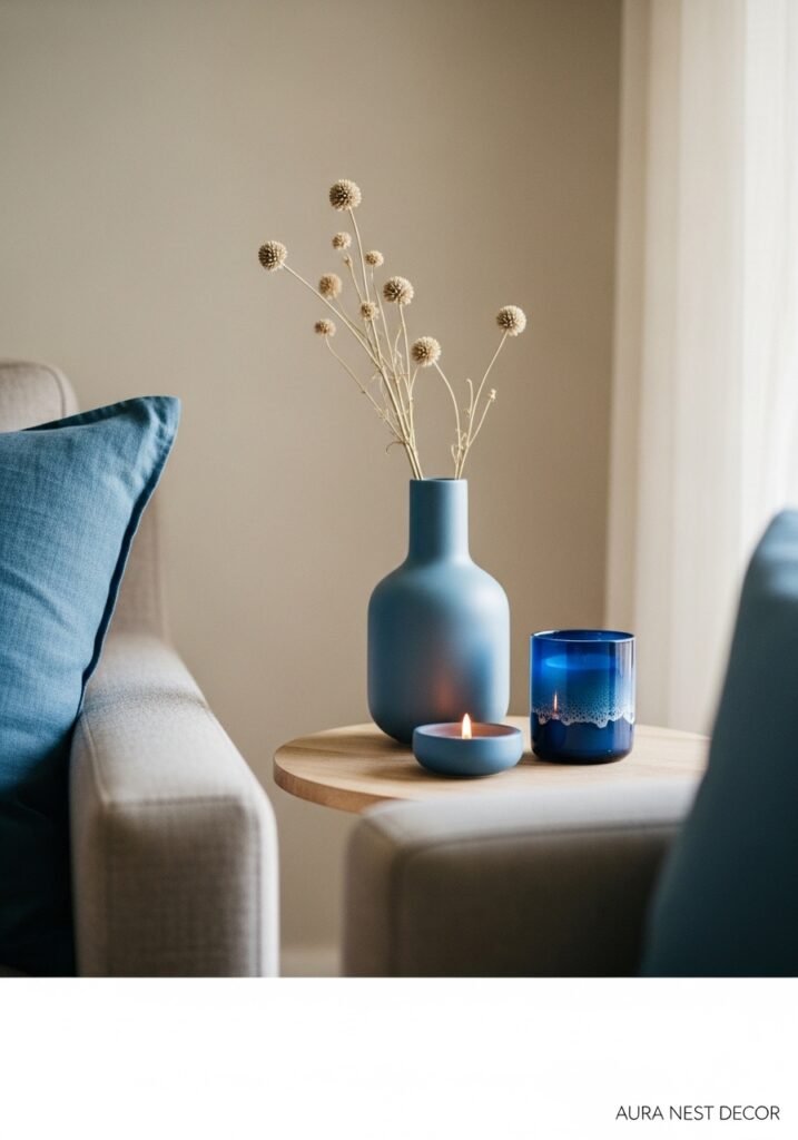
Side note — velvet cushions in a jewel tone against a dusty blue wall are an absolute combination. The light catches the velvet differently depending on where you’re sitting, and that little bit of shimmer against the matte blue wall is so good. Very low effort, very high impact.
—
7. What to Put on Blue Walls That Isn’t Just Art Prints
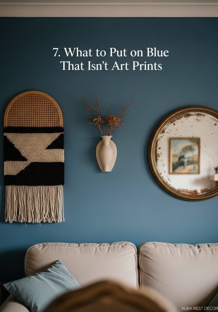
Okay so art prints are fine. Great, even. But there are a few other things that look INCREDIBLE on blue walls and people don’t think about them enough.
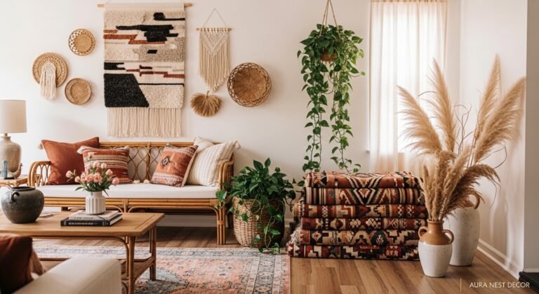
Woven wall hangings. The kind with natural materials — jute, cotton, maybe some dried grasses woven in — look extraordinary against blue. The warmth of the texture against the cool wall tone creates this incredibly inviting contrast. And they’re affordable. You can find beautiful ones on Etsy for £30-£70/$35-$85 depending on size.
Mirrors. But not just any mirror — mirrors with warm, interesting frames. A sunburst mirror in antique gold. A large oval mirror in a thick plaster frame. Even a simple arched mirror in a thin brass frame. The reflection doubles the depth of the blue around it and bounces the light in a way that makes the room feel much larger.
“A good mirror doesn’t just show you the room — it gives you more of it.”
Shelving is another one. Open shelves painted the same blue as the walls, so they almost disappear, and then loaded with books, plants, and a few carefully chosen objects? That’s one of the most effortlessly cool looks in interior design right now, and it’s genuinely not complicated to achieve.
A single large plant in a terracotta or matte black pot. On the floor, not on a shelf — floor plants make rooms feel inhabited in a way that smaller plants can’t quite manage.
—
8. The Lighting Layer That Everyone Gets Wrong in Blue Rooms
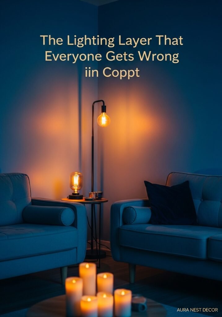
Overhead lights. Look, I understand they exist and sometimes you need them. But in a blue living room, a harsh overhead light will make the walls look flat and slightly cold and the whole room will feel like a waiting room. Not what we’re going for.
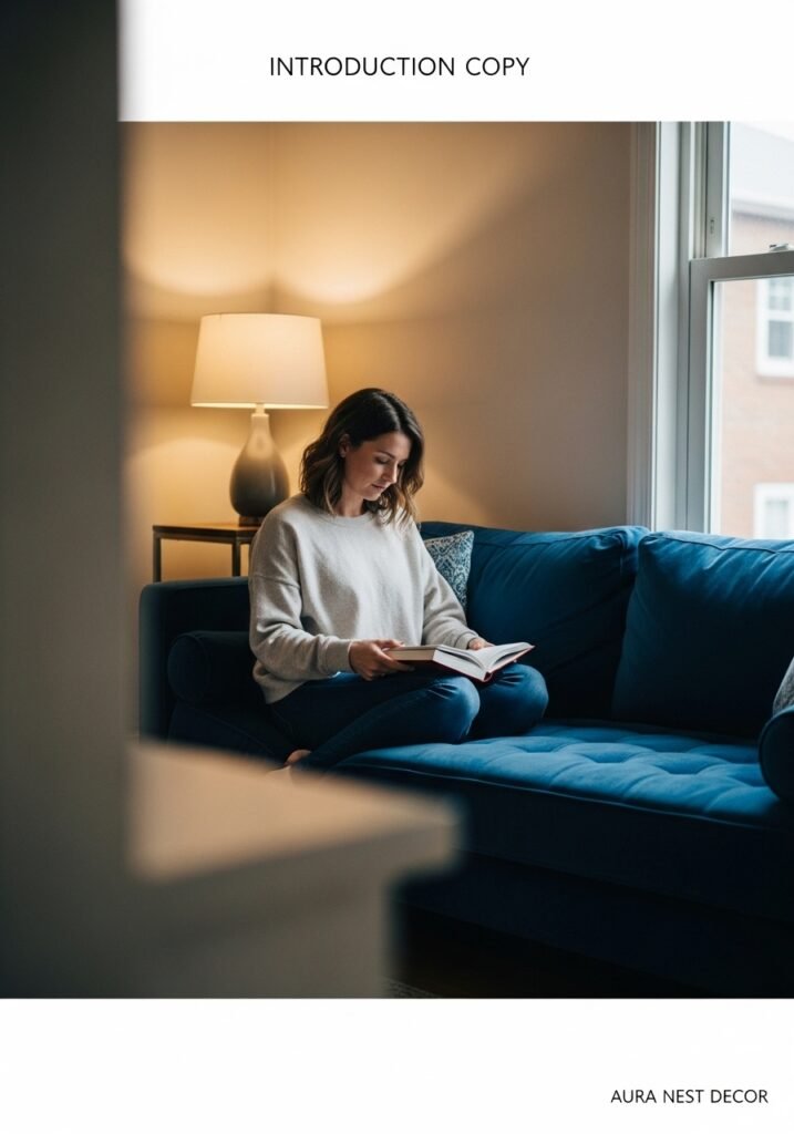
The goal is to light the room from the sides and from below, not from above. Table lamps with warm bulbs — not cool white LED, please — create pools of amber light that make the blue look incredibly rich and almost velvety. A floor lamp in a corner. A small lamp on a bookshelf. Candles, always candles.
If you can’t change your overhead fitting, get a lamp dimmer. Or put a warm amber bulb in the existing fitting and keep it on the lowest possible setting. The goal is for the overhead to supplement the lamp light, not dominate it.
Fairy lights get a bad reputation for being juvenile, but honestly? A string of warm white fairy lights woven through a bookshelf or draped very loosely along a windowsill on a dark autumn evening in a blue room is one of the cosiest things I’ve ever seen in a living space. Do it. Don’t overthink it.
—
9. The Windowsill Moment That Changes the Whole Room
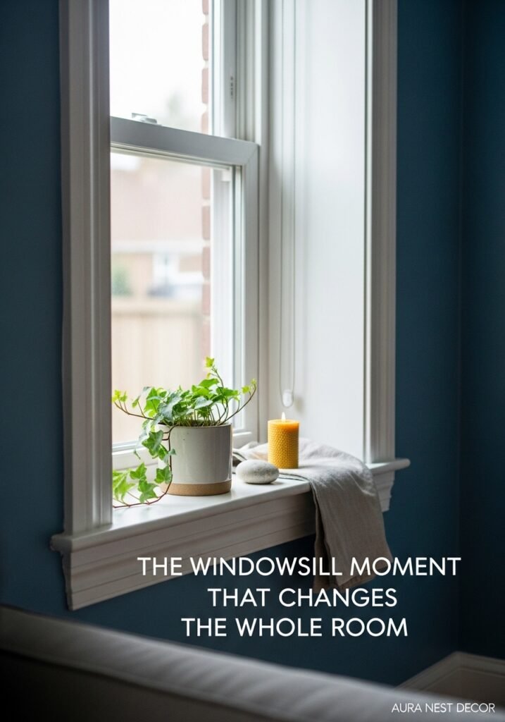
Windows in a blue room are worth paying real attention to. The windowsill especially. Because that’s where outside light meets your interior, and it’s an opportunity that most people just use for storing remote controls.
A wide windowsill in a blue room could have a short ceramic pot with a trailing plant. A single taper candle in a brass holder. A small stack of books with a smooth stone on top — or maybe just a stack of books and nothing on top, because sometimes that’s enough.
If the curtains aren’t blue — and they don’t need to be — this is where warm linen curtains earn their worth. Long, floor-length linen panels that pool slightly at the floor. They filter light in a way that makes the whole room glow, and against a blue wall, that warm filtered light is something else entirely.
Roman blinds in a natural fabric work too, especially in smaller UK living rooms where floor-length curtains feel like a bit much. Bamboo blinds are another option — they cast that striped warm light that makes everything look like a photograph.
—
10. How Blue Translates Differently in US vs UK Homes (And Why Both Work)
This is something I find genuinely fascinating. The same dusty blue reads completely differently depending on the architectural context it’s sitting in.
In a traditional British Victorian or Edwardian terraced house, with the high ceilings and the picture rails and the original sash windows, a deep blue wall looks almost regal. It suits the proportions of the room. It leans into the history of the space rather than fighting it.
In a more open-plan American home with lower ceilings and more casual architecture, the same blue reads differently — cosier, more cabin-like, more intentional. Both interpretations are beautiful, but they’re not the same room.
The other difference is the light. UK homes tend to get softer, more diffuse light — grey skies do have their advantages — which means blue walls don’t get bleached out mid-afternoon the way they might in a sunnier US climate. In a bright southern US home, you might want to go a shade or two darker than you think, because the light will eat some of the depth.
—
11. The One Blue Room Mistake That’s Actually Really Easy to Fix
It’s the accessories. Specifically — going too blue with EVERYTHING once you’ve committed to blue walls.
It’s an understandable instinct. You love the colour, you’re all in, you start buying blue cushions and blue throws and blue vases and a blue rug. And then you stand in the room and it feels like you’re inside a bottle of Vick’s. That’s not the goal.
The walls do the blue job. Everything else should be doing something different — bringing warmth, texture, contrast, a different colour entirely. The blue walls are the backdrop, not the theme. There’s a difference.
One or two accessories that echo the blue tone are fine — a vase, maybe a cushion — but keep them as accents rather than repetitions. The rest of the room should feel like it’s having a conversation with the blue, not agreeing with everything it says.
—
12. Starting Small When You’re Not Quite Ready to Commit
Not everyone is ready to paint four walls. Or even one. That’s completely fine and I’m not here to pressure anyone into a decision they’re not ready for.
You can have a genuinely cozy blue living room without painting a single thing. A large blue velvet sofa is the most obvious way — it brings the colour in at scale without touching the walls. A big blue area rug has a similar effect. A blue upholstered armchair in the corner, next to a lamp, with a throw draped over the arm — that’s a complete moment in itself.
Blue can also come in through art. A large framed print with significant blue tones, hung in a prominent spot, pulls the whole room toward that palette without commitment. Add a few blue accessories around it and the room starts to feel cohesive.
The nice thing about starting small is that you get to feel how blue lives in your specific room — with your specific light, your specific furniture, your specific life. And once you feel it, you’ll usually want more of it.
—
❓ FAQ
Q: Will blue walls make my living room feel cold and unwelcoming? A: Only if you don’t balance it with warm textures and lighting. Blue walls paired with linen, jute, wood, brass, and warm-toned lamps feel incredibly cozy — the blue provides the depth, and everything else brings the warmth. The two work together, not against each other.
Q: What’s the best blue paint shade for a cozy living room? A: Dusty, muted blues with grey or green undertones tend to work best — think Farrow & Ball’s Hague Blue or Denim Drift, or Benjamin Moore’s Van Deusen Blue. Avoid anything too bright or too saturated if you want the room to feel calm rather than bold.
Q: Can blue work in a small living room or does it only suit larger spaces? A: Blue actually works brilliantly in smaller spaces when used with intention. A deep blue on all four walls of a small room creates depth and makes the room feel more like a considered, intimate space — a snug — rather than a cramped one. Keep the ceiling light and the lighting warm.
—
💭 Final Thoughts
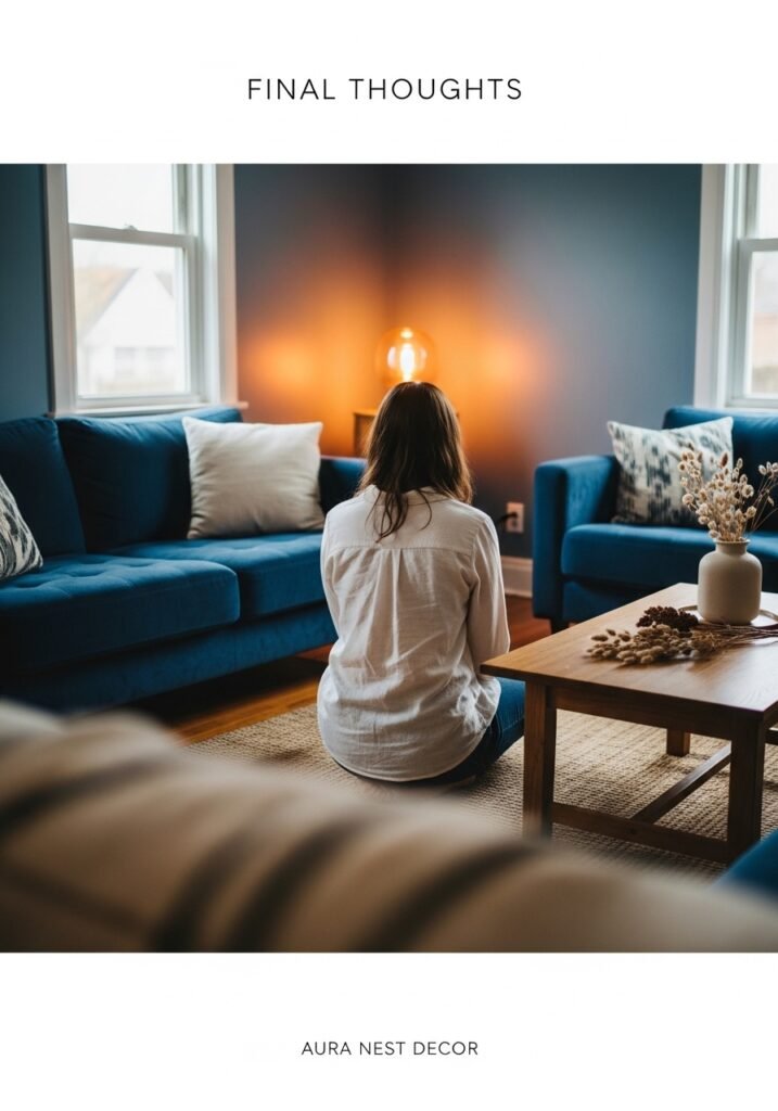
There’s a reason blue keeps showing up in every beautiful, lived-in room I stumble across online. It’s not a trend, not really — it’s more like a truth about what makes a space feel safe and real and a little bit apart from the rest of the day.
You don’t have to do it all at once. One thing, then another, then maybe the wall you’ve been staring at for two years. The room will tell you what it needs.
What would you do with yours?