
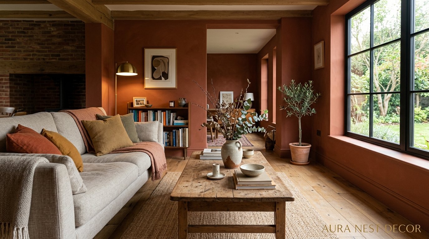
The Living Room Paint Color You Keep Dismissing Is Probably the One You Need
You’ve scrolled past it a hundred times. That warm, slightly muddy, kind of weird shade that doesn’t look like much in a swatch but keeps appearing in the most gorgeous rooms you’ve ever saved. There’s a reason you can’t stop coming back to it.

—
1. Why the “Safe” Beige You Keep Defaulting To Is Making Your Room Feel Homeless
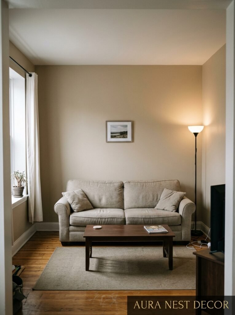
Here’s the thing nobody tells you when you’re standing in the paint aisle holding seventeen chips against your forearm: safe doesn’t mean right. There’s this gravitational pull toward greige and off-white and “agreeable gray” and honestly? I get it. They seem like they can’t go wrong. But that’s also why they feel like nothing.
A room painted in true-safe beige has this quality I can only describe as airport lounge. It’s inoffensive. It’s clean. And it has absolutely no personality. You can put the most beautiful sofa in the world in it and the room still feels like it’s waiting for something to happen.
The problem isn’t neutral colors. Neutrals are incredible. The problem is choosing a color BECAUSE it’s safe, rather than because it’s right. That’s a completely different decision. One comes from fear, one comes from intention — and rooms know the difference, somehow.
What actually reads as timeless on a wall has a little something going on. A smidge of green in the white. A gray that leans almost lavender in evening light. A brown that can’t quite decide if it’s clay or coffee. It’s the slight unexpectedness that makes a color feel curated rather than chosen out of paralysis.
So if you’ve been defaulting to the same shade for three apartments running, it might be time to actually ask yourself what you want the room to FEEL like at 6pm on a Tuesday, not just what looks acceptable at noon on a paint chip.
—
2. The Color That’s All Over Every Beautiful Living Room Right Now (And Has Been for Two Years)
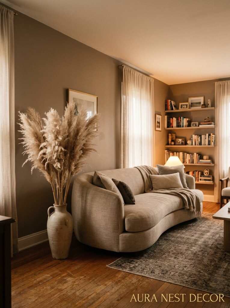
Warm clay. Deep terracotta. That red-brown-rust that sits right at the intersection of old Italian farmhouse and very modern London flat. It’s been creeping into every gorgeous living room I’ve seen lately — American craftsman bungalows, Victorian terraced houses in Bristol, new-build apartments in Chicago — and it works every single time.
What makes it work is that it’s warm without being aggressive. It’s got heat but it doesn’t SHOUT. Paired with linen and aged wood and a lot of low lighting, it turns a regular room into somewhere you actually want to stay. Not stay because there’s nowhere else to go — stay because leaving feels like a shame.
Farrow & Ball’s Dead Salmon gets a lot of credit in this space (and deserves it), but honestly Benjamin Moore’s Tucson Sand and Sherwin-Williams Cavern Clay are doing the same thing. The exact shade doesn’t matter as much as the quality: warm, a little dusty, slightly aged-looking. It needs that softness. High-chroma terracotta reads more like a statement; this is quieter than that.
“The room didn’t look decorated. It looked lived in — and that was entirely the point.”
—
3. The Myth That Dark Paint Makes Small Rooms Smaller (It Doesn’t Do What You Think)
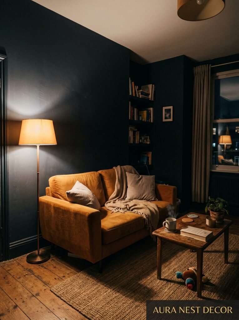
I cannot count how many times I’ve seen someone talk themselves out of a beautiful deep color because their living room is “too small for that.” And I want to gently push back on this because it’s mostly just not true.
What makes a small room feel cramped isn’t darkness — it’s visual interruption. If your room has six different wood tones, busy upholstery, a gallery wall with mismatched frames, and a bright white ceiling with yellowing trim, it will feel small and chaotic at any paint color. A small room painted in a consistent deep color — navy, forest green, charcoal — actually tends to feel more intentional and contained. The edges recede. The whole thing reads as a deliberate decision rather than a room that ran out of space.
In the UK this is especially relevant because so many Victorian and Edwardian living rooms are genuinely small — proper small, with low ceilings and deep skirting boards and a bay window that eats up half the usable wall space. Dark paint on those rooms can feel almost jewel-box-like. Cozy and complete, not cramped.
The rule I actually use: if the room is small, paint everything (walls, ceiling, sometimes even the trim) the SAME color. Or very nearly. That’s the thing that makes it expand visually, not going lighter.
—
4. What No One Mentions About White Paint (It’s Kind of a Lot of Work)
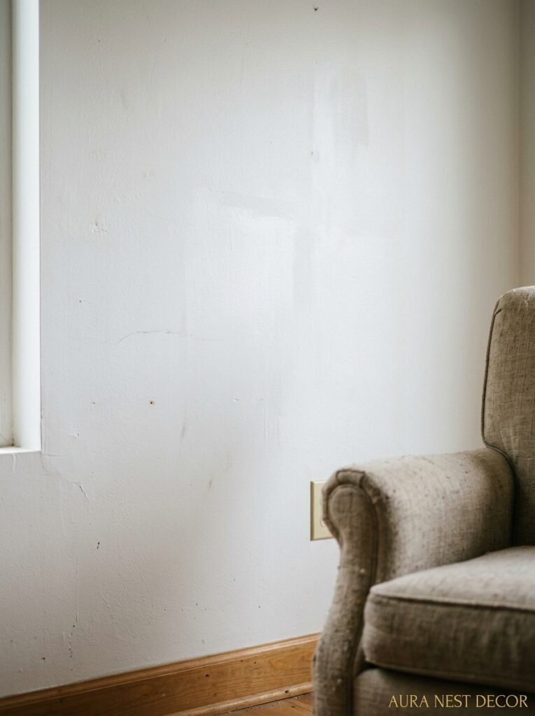
White is supposed to be simple. Clean slate, fresh start, all of that. But can we talk about how white is actually one of the most demanding and opinionated paint choices you can make?
Because here’s what happens. You choose a white. It goes up on the walls. And suddenly every ding, every shadow, every smudge is visible from across the room. The natural light hits it and it goes yellow in the morning and blue in the afternoon. The curtains you thought were white are now clearly cream. Your sofa, which you’ve had for years and never thought about, looks a little grubby under the harsh truth of a bright white wall.
White paint tells on your furniture. It exposes your windows, your floors, your trim. Everything has to be working together because there’s nothing else to look at — the walls are essentially asking everything else in the room to carry the visual weight.
“White walls don’t simplify a room. They audit it.”
That said — when it works, it really works. The secret is never go pure brilliant white on large walls. Almost without exception, you want a white with something in it. Warm whites (think Pointing by F&B, or White Dove by Benjamin Moore) are forgiving in a way that ice whites simply aren’t. The warmth bounces differently. It ages better. It plays nicer with basically everything.
—
5. The Green Living Room Conversation We Need to Have, Immediately
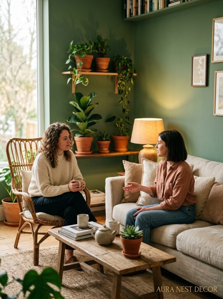
Not sage. Not the pale, wishy-washy sage that’s been on everything since 2019 and is starting to look a little tired, honestly. I mean a real, committed green. Something with depth.
Farrow & Ball Calke Green. Sherwin-Williams Cascades. Benjamin Moore October Mist if you want it a little softer but still there. Railings by F&B if you want to go truly deep and moody. These are greens that do something. They bring the outside in in a way that doesn’t feel literal or cheesy. There’s something about a deep green room that feels both old and very current — like it’s been there forever but it’s also the most alive color you’ve ever seen on a wall.
Side note — the reason green is so hard to get wrong is that it reads as natural. Our eyes just aren’t offended by green the way they can be surprised by, say, a purple-adjacent gray. Green registers as belonging. Even when it’s dark, even when it’s unexpected, green tends to feel earned.
British homes in particular look astonishing in deep green because the light — often softer and more diffuse than American light — makes the color richer rather than heavier. On a gray March afternoon, a forest green room lit by a couple of lamps is honestly one of the most beautiful things a house can contain.
—
6. The Specific Moment You Should Actually Test Your Paint Samples
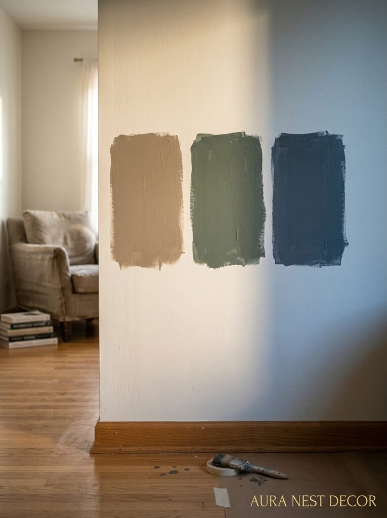
Not at 10am. Not in the paint store. Not on a scrap of white card that you hold against the wall for thirty seconds and call it a job done.
You need to see your sample at 6:30pm, with whatever lights you’ll actually have on, with your furniture in the room, after the natural light has started to shift. That’s when the color becomes real. That’s when you see whether the gray you chose is actually a very definite lavender, or whether the “mushroom” you loved is actually going to read as dirty peach in lamplight.
Paint a large section — I mean LARGE, at least two feet by two feet, ideally bigger — directly on the wall. Not a card, not a sample board. The wall. Let it dry completely (wet paint lies to you; it’s always darker than it dries). Then live with it for two or three days before you decide.
This sounds obvious but the number of people who choose paint in the wrong conditions and then wonder why the room looks different than they expected… it’s most of us. It was definitely me for longer than I want to admit.
—
7. Colors That Look Incredible on Pinterest and Require Specific Light to Work
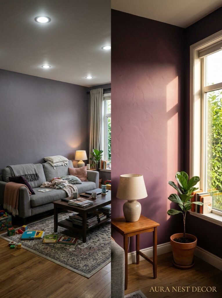
You know which ones. That incredibly moody dark plum you saw in a Notting Hill townhouse. The cobalt blue living room in an Arizona loft. The pale, chalky gray-blue that looked like a Scandinavian dream on your screen and went on your walls looking like a doctor’s waiting room.
These colors aren’t bad. They’re location-dependent. And Pinterest doesn’t tell you that.
“You’re not falling in love with the color. You’re falling in love with the light in that specific room at that specific hour.”
The cobalt that sings in a south-facing Arizona room with ten-foot ceilings and direct afternoon sun is going to feel oppressive in a north-facing British sitting room that gets maybe four hours of indirect light. The pale Nordic gray that looks crisp and minimal in a white-walled Stockholm apartment is going to turn greenish-blue under UK skies. This isn’t the color’s fault. Lighting is everything — it’s basically the other half of the paint color.
So when you fall hard for a room online, try to figure out what direction it faces, what latitude, what kind of artificial light. That’s what you’re actually responding to, not just the pigment.
—
8. The Case for Painting Just One Wall a Completely Different Color (Hear Me Out)
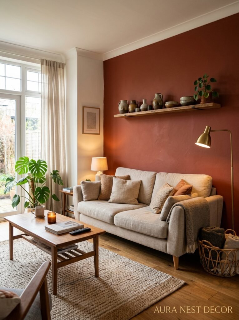
Accent walls got a bad reputation. And okay, some of that reputation was earned — the early 2000s accent wall, usually in a deep burgundy or forest green against three cream walls, did look a bit random and disconnected. But I think the concept was never actually the problem. The execution was.
A deliberate, thoughtful accent wall is kind of spectacular. What makes it work versus look like an afterthought: the wall you choose has to mean something architecturally. The chimney breast. The wall the built-in shelves sit against. The alcove. The wall behind the sofa that frames the room when you walk in. Those read as intentional. The random fourth wall next to the door doesn’t.
And the contrast shouldn’t be chaotic. If your room is a warm off-white, the accent wall doesn’t need to be a completely different color family — it can just be a much deeper version of the warmth. That harmony is what makes a contrast feel pulled together.
—
9. What Happens When You Stop Matching Your Paint to Your Furniture
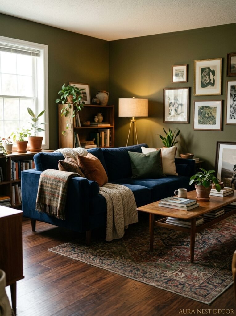
Matching is overrated and kind of exhausting anyway. The idea that your wall color needs to be pulled directly from your sofa or rug is a design rule I’d like to retire entirely because it creates rooms that feel overly coordinated in a way that reads as stiff.
The most interesting rooms I’ve seen work in contrast and in conversation, not in match. A slightly unexpected warm white against a dark navy sofa. A soft terracotta behind a sage green chair. A pale sage wall with a deep walnut sideboard and a warm cream rug. These combinations work because they’re not trying too hard. They exist next to each other without clutching.
What you do want to make sure of is that the undertones agree. Warm wall, warm furniture. Cool wall, cool furniture. That’s the actual rule. The specific colors within those families can do whatever they want.
—
10. The Finish You Choose Matters as Much as the Color (And Most People Get This Wrong)
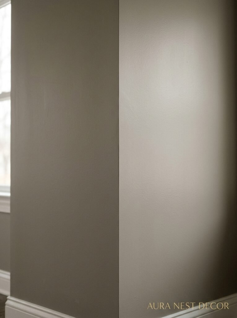
Matte looks incredible in photographs. Eggshell is what most rooms actually need. Gloss is for trim, doors, and confident people who don’t have kids or dogs.
Here’s the practical truth. Matte paint absorbs light beautifully and hides wall imperfections brilliantly — bumps, old patches, the slightly uneven plaster that’s in literally every older British house I’ve ever been in. But it marks easily and it’s a nightmare to clean. Scuff it and you’ll see it. Touch it and it shows.
Eggshell has a very soft, barely-there sheen that’s just enough to wipe down without being shiny enough to reflect everything in the room. For a living room wall — especially in a house with any foot traffic, children, pets, normal human life — eggshell is almost always the right call. Save the matte for a formal space or a bedroom you treat with care.
—
11. The Ceiling Color Nobody Talks About That Changes Everything
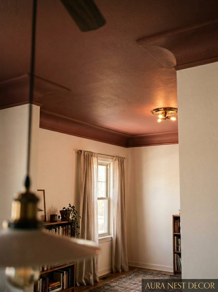
White. Slightly warm white. That’s probably what your ceiling is now, and that’s probably fine. But can I introduce you to the concept of painting your ceiling the same color as your walls?
Or just slightly lighter, but in the same family. Because when you do this, the room changes completely. The ceiling doesn’t feel separate and hovering. The room becomes a whole environment rather than a box with a lid. It’s especially effective in low-ceilinged rooms where the bright white ceiling can feel like it’s pressing down — when you bring it into the room’s color, it stops announcing itself.
Deep green ceiling in a deep green room? Extraordinary. Warm clay all the way up and over? So cozy it’s almost overwhelming. Even in a light room, a very soft tinted ceiling — barely-there pink or the gentlest sage — does something that takes a room from nice to genuinely interesting.
—
12. The Last Coat, the Second Guessing, and Why You Should Ignore Your Doubts
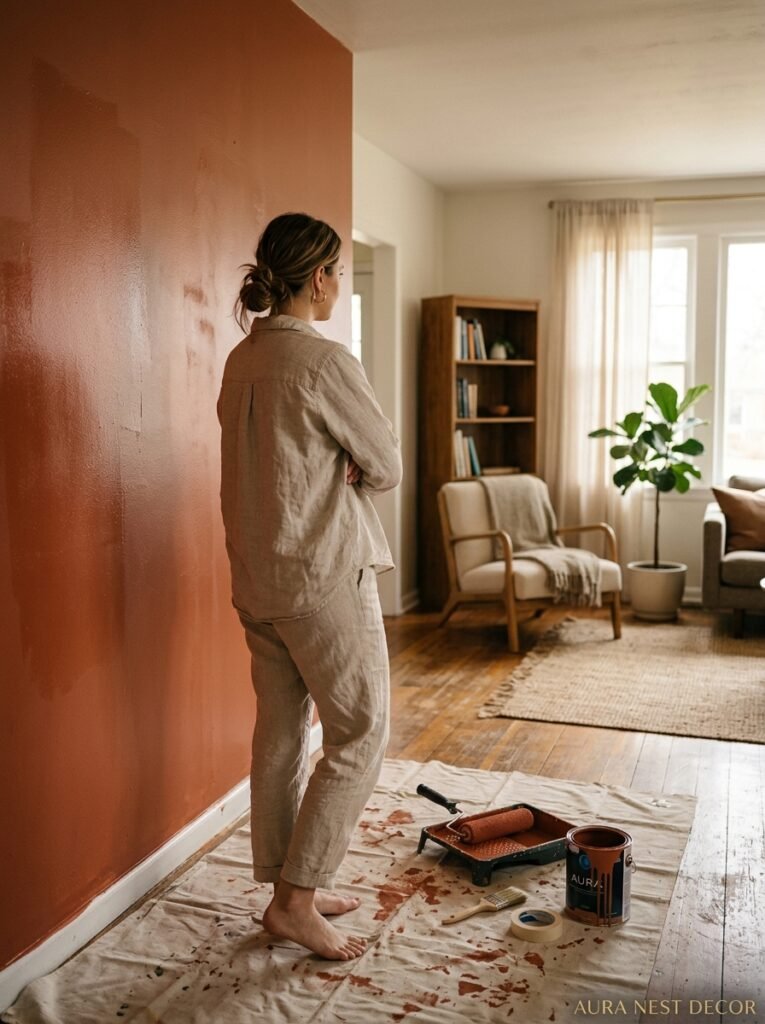
Every single person who’s ever painted a room has experienced this. You’re on the second coat. The color is going up. It looks wrong. It’s too dark, too bright, too something, and you’re quietly panicking. You start googling whether paint dries darker or lighter. You text someone a photo.
This is normal. This is almost universal. And in about 80% of cases, the color that looked wrong wet looks right dry, in light, with your furniture around it.
The moment right after painting is the worst possible moment to evaluate a color. Give it 24 hours. Let the room breathe. Put a lamp on in the corner. Sit with it for a day.
And if after all that it’s genuinely wrong? You paint again. It’s paint. It’s not permanent. This is the most liberating thing about color decisions — they’re reversible. Completely, totally reversible. The cost of a mistake is a few gallons of paint and a weekend, not a structural error or a permanent decision. Be a little bolder than feels comfortable. You can always change it.
—
❓ FAQ
Q: How do I choose between warm and cool paint tones for my living room? A: Look at your fixed elements first — flooring, existing furniture, the natural light your room gets. If you’ve got warm wood floors and south-facing windows, warm tones will feel seamless. If you’ve got cool gray stone or north-facing rooms with indirect light, a warm paint color can balance that out beautifully. Cool paint in cool natural light can sometimes feel a bit flat.
Q: How many paint samples should I test before choosing? A: Honestly, don’t test more than three at once — it gets confusing fast. Pick your top two or three, paint them in large swatches directly on the wall, and eliminate rather than compare endlessly. More samples usually creates more doubt, not more clarity.
Q: Is it worth paying more for premium paint brands like Farrow & Ball? A: Coverage and pigment quality are genuinely better in premium paints, which means you’ll often use fewer coats, and the color depth reads differently on the wall — richer, more complex. That said, plenty of Benjamin Moore and Sherwin-Williams shades are equally beautiful and more wallet-friendly. If the color exists in a mid-range range, don’t feel pressured to go premium. But F&B color mixing is legitimately different, and if a color only exists there, it’s usually worth it.
—
💭 Final Thoughts
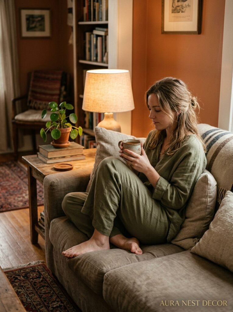
Paint is the cheapest thing you can do to a room and the highest-impact. A thousand dollars of new furniture can disappear into the wrong colored wall, and a perfect color can make a secondhand sofa look intentional. If you’ve been sitting on a paint decision for months, that’s usually because you already know which color you want — you’re just looking for permission to actually do it. So here it is.
What’s the color you keep scrolling back to?




