Pink Living Rooms That Don’t Look Like a Candy Store (and How to Get That Balance Right)
There’s a version of a pink living room that makes you want to curl up with a book and never leave. And there’s another version that looks like someone decorated for a six-year-old’s birthday party and then just… stayed. The difference? It’s not the shade of pink. It’s everything else around it.
—
1. The Shade That’s Quietly Taking Over Every Beautiful Living Room Right Now
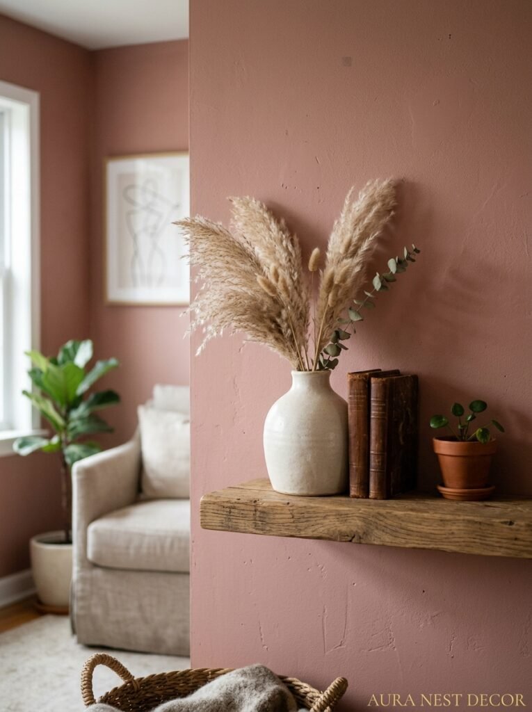
Dusty rose is done. I mean, it had its moment — a long one — but the pink that’s actually showing up in homes I can’t stop thinking about is something murkier. More complicated. Think warm terracotta-pink, or that specific blush that leans almost nude in afternoon light but reads clearly pink at night under a lamp. There’s also a very particular deep pink — closer to antique rose or dried carnation — that’s been appearing in British interiors especially, and it’s stunning in a way that feels almost accidental.
The pink that doesn’t work? Anything too cool, too bright, or too even in tone. Hot pink on walls, unless you’re extremely committed and extremely skilled, reads as a statement that then has nowhere to go. Bubblegum reads young. Neon reads chaotic.
But an earthy pink — one with some brown or red mixed in — that’s the shade that photographs beautifully, ages well, and somehow makes every piece of furniture look more expensive than it is. Not gonna lie, I’ve started noticing it everywhere and I can’t tell if it’s new or if I just finally have eyes for it.
—
2. Why Painting Just One Wall Pink Actually Works Better Than You’d Think
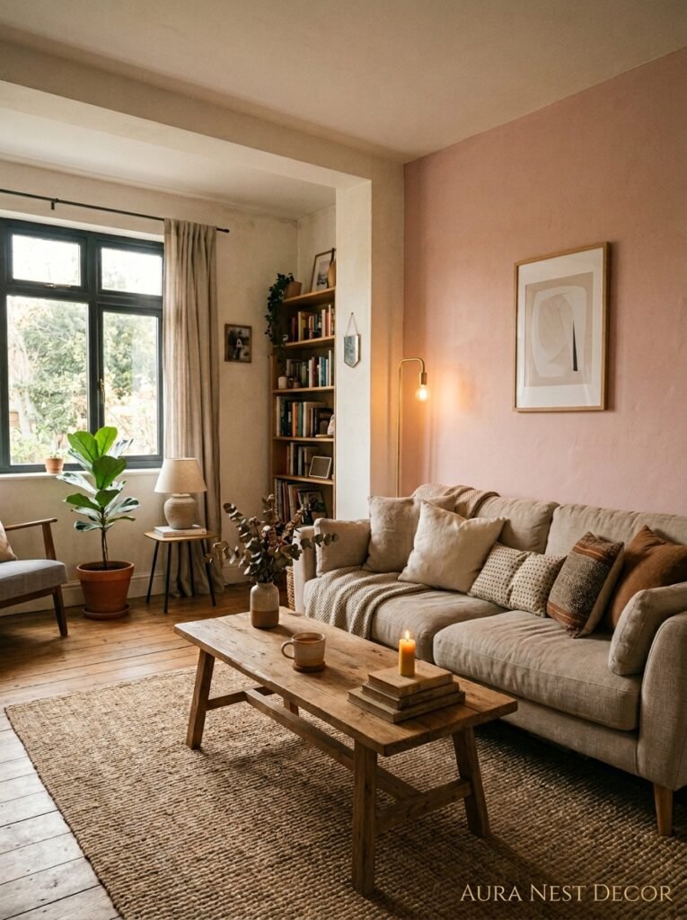
I know. Accent walls had their time and we collectively moved on. But there’s a reason designers keep coming back to the idea of one dominant pink surface — and it’s not laziness. It’s proportion.
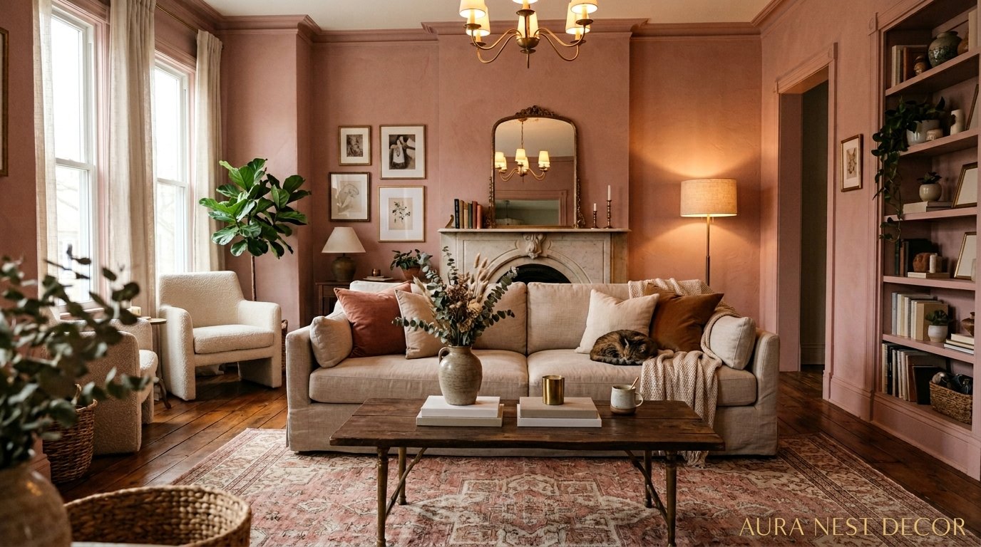
If you paint all four walls a warm dusty pink, you either need a very specific set of other choices to keep the room from feeling like the inside of a seashell, or you need high ceilings and strong natural light. Most of us don’t have both. But one wall — particularly the chimney breast wall or the wall directly opposite your windows — gives you enough pink to feel intentional without swallowing the room.
And here’s the thing nobody mentions: when the light changes throughout the day, that single pink wall behaves like a living thing. In the morning with bright natural light it’s almost neutral. By 5pm in winter when the sun’s low, it’s properly, warmly, undeniably pink. That shift is actually what makes the room feel interesting. It’s working for you in ways you don’t even clock while you’re just sitting there watching TV.
“A room that changes with the light is a room that never gets boring.”
—
3. The Unexpected Color That Makes Pink Look Completely Grown Up
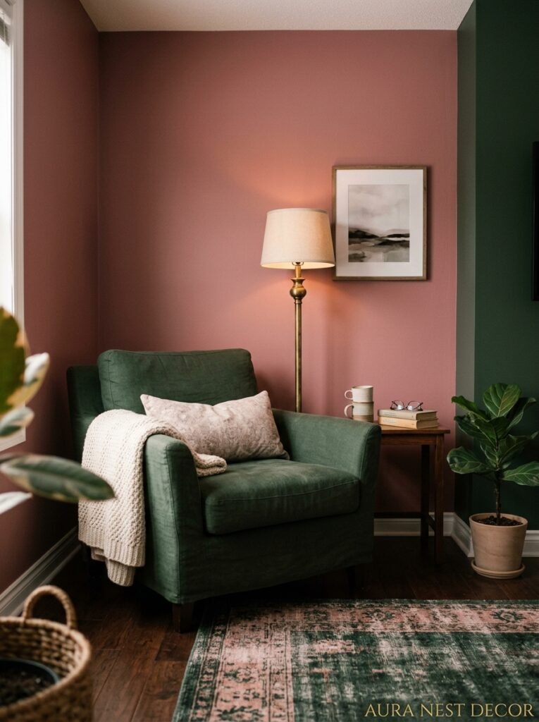
Green. Full stop. Not sage, not forest — both are lovely but they’re the obvious answer. The green that does something shocking and great next to pink is a proper mid-tone warm green. Think dried herbs, or old olive oil bottles, or the green you’d find on an antique map. It shouldn’t be trendy. It should feel almost like it came from a painting.
When you put that green against a warm pink, something happens that you can’t quite explain but you feel immediately. The pink stops looking sweet. The green stops looking outdoorsy. They do something to each other — bring out a certain quality that makes the room feel layered and a little historical. Honestly it’s kind of alchemy.
In practical terms: green velvet cushions on a pink sofa. A painted green console table against a pink wall. Even just a few green-glazed ceramics on a shelf are enough to shift the register of the whole space.
—
4. How to Use a Pink Sofa Without Regretting It in Two Years
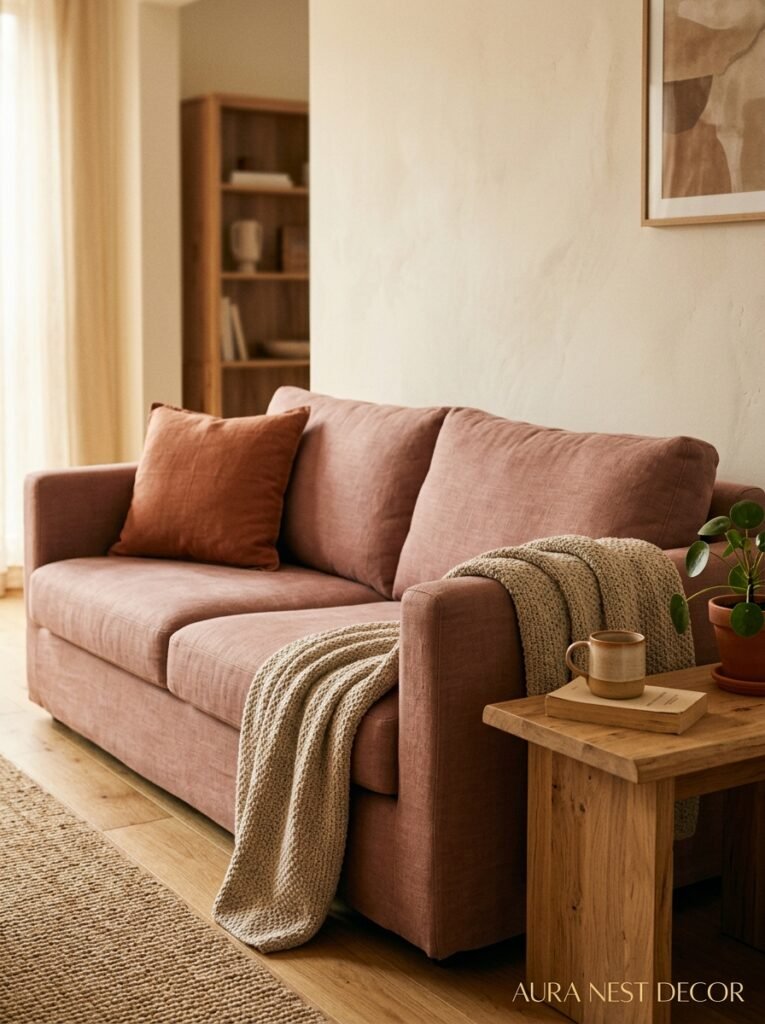
The pink sofa question. It terrifies people and I get it — furniture is expensive, sofas last years, and pink feels like a commitment. But the sofas people regret aren’t the pink ones. They’re the safe greige ones they bought because they were scared.
Here’s what actually matters: fabric and form. A pink sofa in a low, sleek modern silhouette can feel a bit girly in a way that doesn’t age. But a pink sofa with a traditional shape — a high back, rolled arms, a Chesterfield, even a camelback — reads as classic. That shape is doing as much work as the color. Same goes for texture. Velvet pink reads glamorous. Linen pink reads relaxed and neutral almost. Cotton pink is somewhere in the middle.
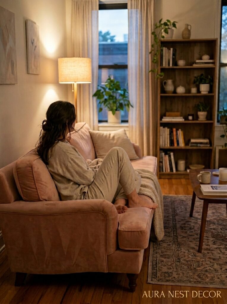
The other thing that saves a pink sofa is the rug underneath it. A warm Persian rug, something with red and navy and cream and yes, a bit of pink woven through — suddenly the sofa doesn’t look like a decision. It looks like it was always going to be there.
“The right rug doesn’t just anchor a sofa. It explains it.”
—
5. The Lighting Trick That Makes Any Pink Room Feel Like 9pm in a Very Good Restaurant
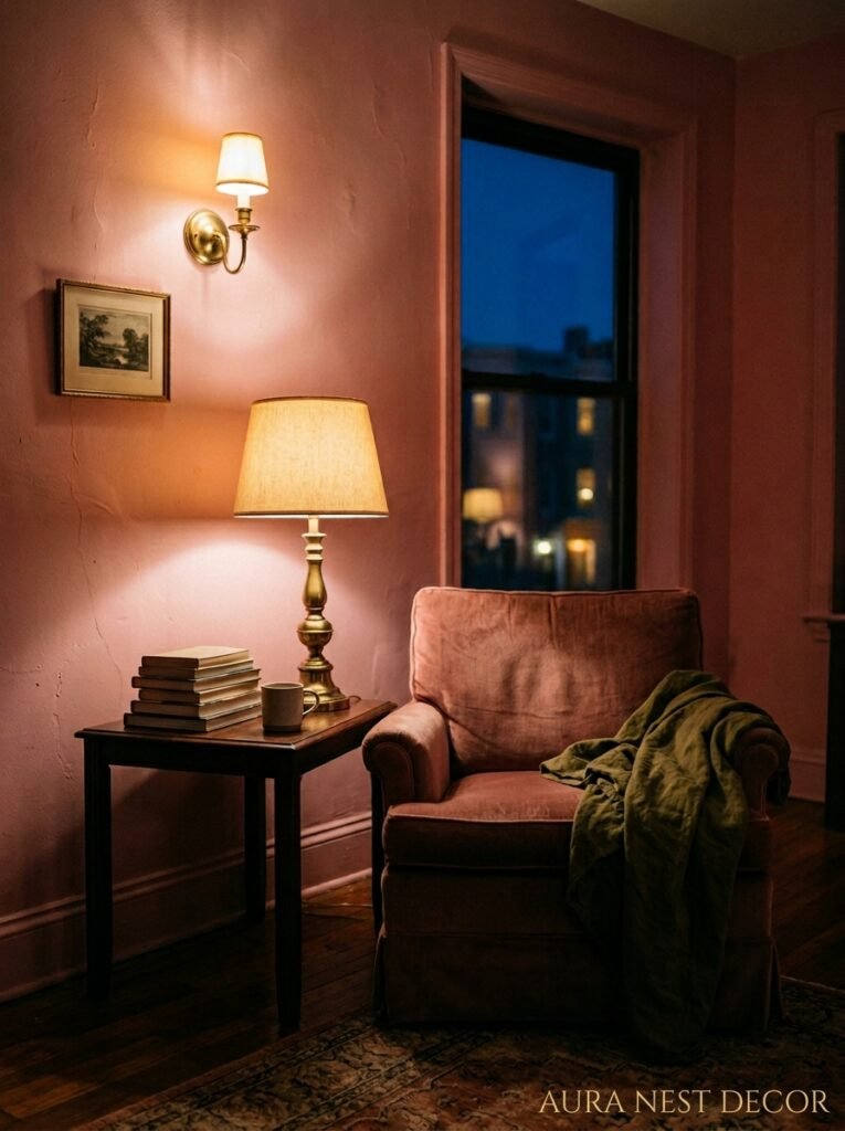
This one is simple and it changes everything. Warm-toned bulbs. Not natural daylight, not cool white — warm. The amber glow of a proper Edison bulb or a lamp with a 2700K bulb will shift a dusty pink wall into something that looks genuinely rich and moody by evening. The same room under cool LED lighting looks flat and a little sad, honestly.
Side note — this rule doesn’t only apply to pink rooms, but it ESPECIALLY applies. Because pink is already a warm tone, and warm lighting deepens and enriches it in a way that cool light just cancels out.
Table lamps are doing more for pink rooms than any other single element, and I don’t think that gets said enough. An overhead light with a shade — even a simple drum shade in a warm white or blush — does less than a pair of well-placed table lamps at eye level. Think about where you’re sitting on the sofa and put a lamp there. And another one there. Overhead light is for cooking and cleaning. Not for living rooms.
—
6. The Art That Doesn’t Fight With a Pink Room (and the Art That Completely Ruins It)
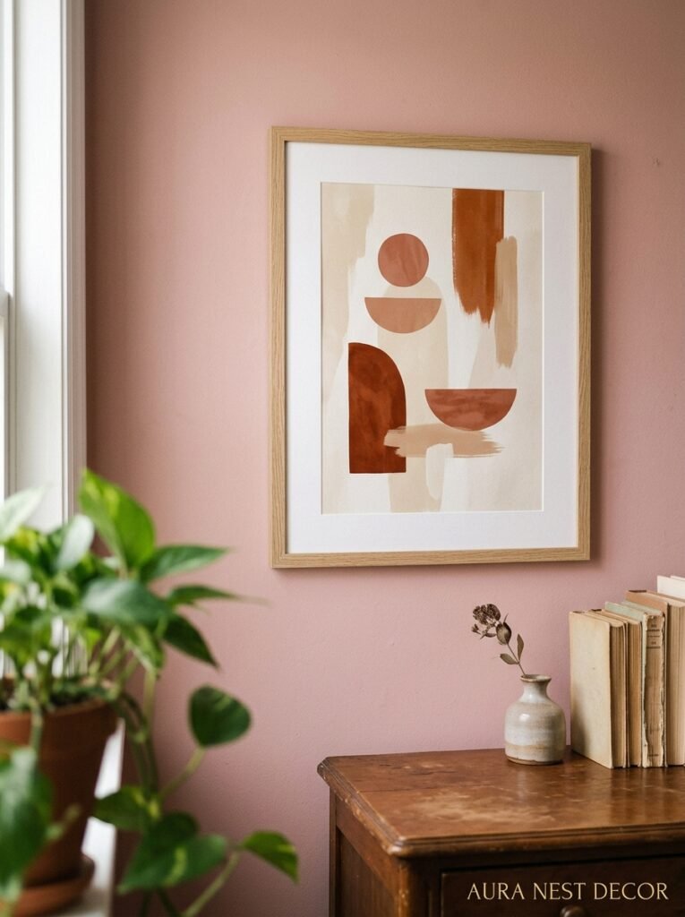
Pink walls and colorful art can coexist — but it takes some care. The art that tends to clash is anything with a cool blue or purple base, or anything super graphic in black and white. Not because those colors are wrong, just because the contrast can feel aggressive against a warm pink. You end up with a room that’s fighting itself.
What works: warm tones in the art, obviously — ochre, rust, warm cream. But also photography with a dusty or muted color palette, botanical prints, anything earthy. Abstract art that has some pink or red in it can work extraordinarily well and create that layered, considered look where nothing seems accidental.
And frames matter a lot here. Black frames against a warm pink wall can feel very stark — sometimes good, but sometimes just cold. Warm wood frames, antique gold, or even unlacquered brass? That’s the combination that feels both curated and organic, like the room grew that way naturally over time.
—
7. The Pink Ceiling Nobody Expects and Why It Makes the Whole Room Better
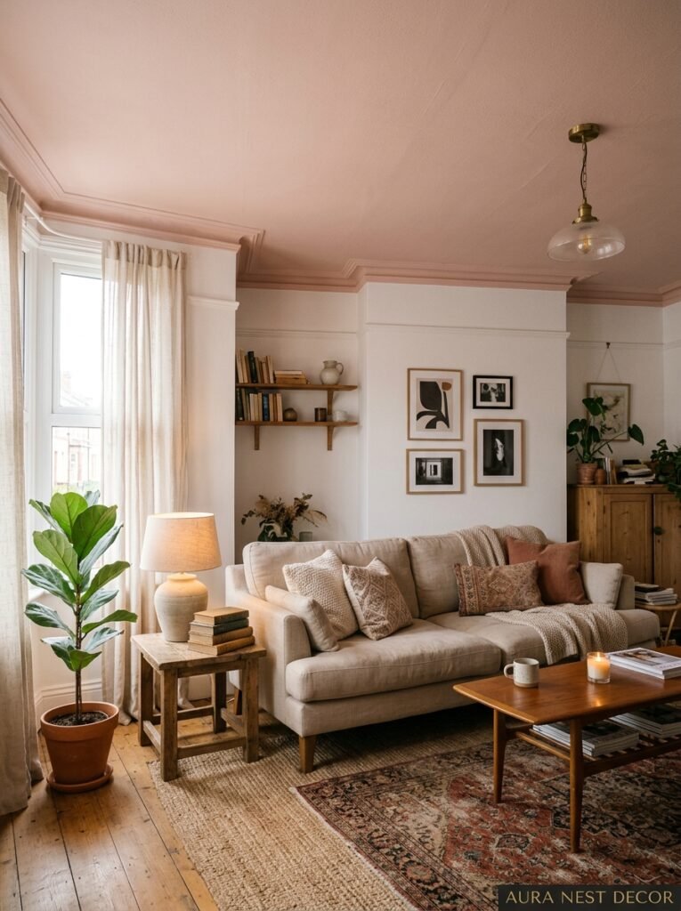
I know, I know. But hear me out. A pink ceiling — particularly a very pale, barely-there pink — is one of those things that you don’t register consciously but you FEEL. It does something to the light in the room. It bounces warmth down onto every surface. Faces look better. Skin looks better. The whole room feels more intimate and flattering and sort of… held.
This works especially well in rooms with lower ceilings, which sounds counterintuitive. Normally you’d paint a low ceiling white to push it up visually. But a warm pale pink or even a warm cream ceiling can make a cozy room feel cocoon-like in the best possible way rather than just small. There’s a difference between a low ceiling that feels oppressive and one that feels like a hug.
The caveat: it needs to be subtle. We’re talking one or two steps lighter than the walls, or a white with a significant pink or warm undertone added. Not a full-on pink ceiling unless your aesthetic is genuinely maximalist and you’ve earned it.
“A pink ceiling doesn’t just change a room. It changes how you feel in it.”
—
8. The Furniture Finish That Looks More Expensive Next to Pink Than Anything Else
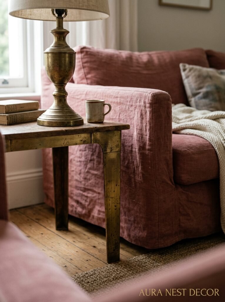
It’s unlacquered brass. And I’m not sorry for being predictable about it because it’s genuinely, genuinely the answer.
There’s something about the slightly uneven, warm gold tone of unlacquered brass against a dusty or earthy pink that looks like it came out of a very expensive hotel in Paris. Lamp bases, cabinet handles, a brass coffee table base, picture frames — it doesn’t matter. You put unlacquered brass next to warm pink and suddenly the whole room has a quality to it that you can’t fake with anything cheaper.
The alternative, if brass feels too much: warm wood. Walnut especially, or an oak that’s been oiled rather than lacquered, so it has depth and warmth. Chrome and pink is a harder combination, though not impossible — it reads more contemporary, a bit clinical. It can work if that’s the direction you’re going. But for most people chasing that warm, layered, intentional living room feeling? Brass. Every time.
—
9. How Texture Does Half the Work That Color Can’t Do Alone

A flat pink room — all smooth surfaces, matte walls, crisp everything — can feel sterile. Even if the pink is beautiful. Because pink, like any single-note color, needs contrast to breathe. And the contrast that works hardest without creating visual chaos is texture.
Think about it: a linen cushion next to a velvet cushion. A jute rug under a leather armchair. Rough plaster walls with a silk lampshade. None of those combinations sound pink-specific but they’re the thing that makes a pink room feel genuinely rich rather than just… decorated.
This also applies to plants. A big fiddle-leaf fig or a chunky monstera in a ceramic pot adds organic texture that softens the pink in a way that feels natural. The green helps too, but mostly it’s the visual texture of the leaves, the height, the slight imperfection of a real living thing in a carefully styled room. That little bit of wildness. It matters.
—
10. Small Doses for People Who Are Genuinely Scared of Committing to Pink
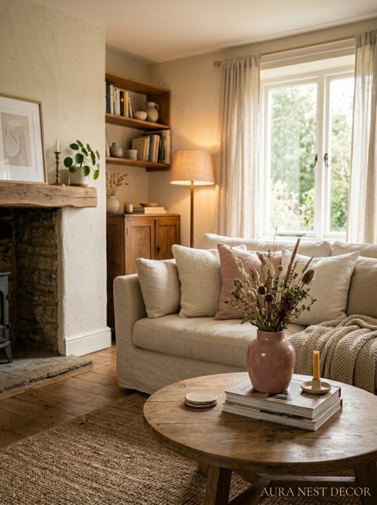
Fair enough. Pink doesn’t have to be a wall or a sofa. There are ways to get the warmth and personality of a pink room without any irreversible decisions.
A pink lampshade throws pink-tinted light around an entire room. A blush-pink throw over the back of a neutral sofa introduces color without commitment. Pink flowers — ranunculus, peonies, dried strawflower — in a simple vase do something to a room that no one talks about enough. Even a pink ceramic bowl on the coffee table or a blush-tinted candle holder does something gentle and warm to the overall feel.
The point is that pink doesn’t have to arrive all at once. You can start with accessories and see if the room is asking for more. Usually it is.
—
11. The Mistake People Make When They Try to “Balance Out” the Pink
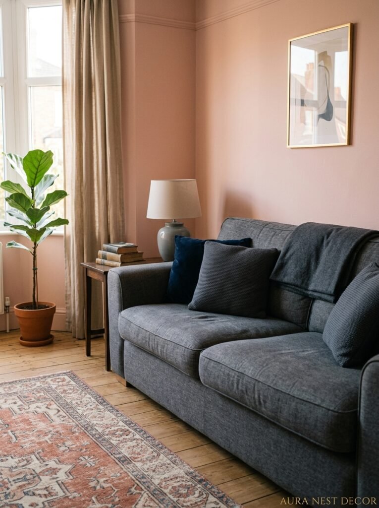
Here’s the thing that trips people up. They add pink to a room — a beautiful dusty rose wall, say — and then they get nervous. So they start adding neutrals to “balance” it. More white. More grey. More beige. More and more beige. And the result is a room that doesn’t look balanced. It looks apologetic.
Pink doesn’t need to be balanced out with neutrals. It needs to be anchored with depth. There’s a difference. A dark navy cushion grounds a pink room — it gives it weight. A chocolate brown leather armchair does the same. Deep walnut flooring. Even a properly dark-stained bookshelf full of books. These things give the room a foundation so the pink reads as confident, not frothy.
The greys and whites just make everything look washed out. Warm depth is what pink is actually asking for.
—
12. The Pink Living Room That Photographs Well AND Feels Good to Actually Live In
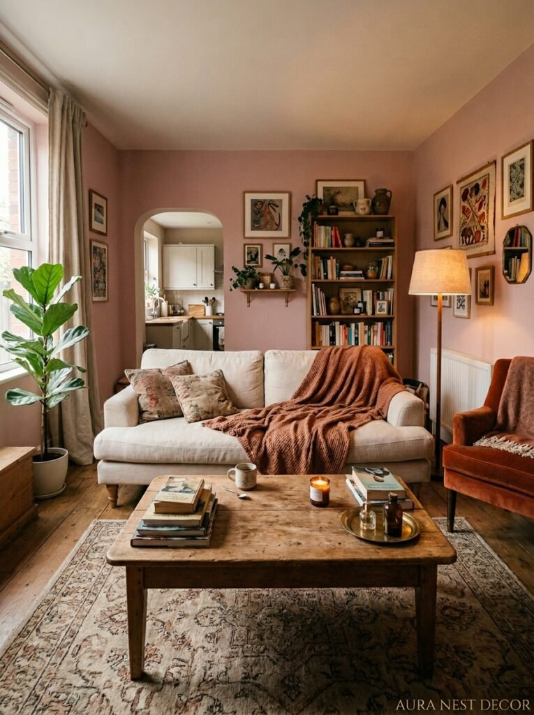
Pinterest and Instagram are full of pink living rooms that are very beautiful in a photograph and almost certainly exhausting to actually inhabit. Too many objects. Too carefully arranged. No room for a coffee mug and a stack of books you’re currently reading and a dog-eared magazine.
The pink rooms that age well — that you’re still happy in three years later — are the ones that were styled for living, not for pictures. That means enough surface space to put things down. Furniture at comfortable heights. Lighting that works for reading, not just ambience. Cushions you can actually lean on.
The pink is just a backdrop. A beautiful, warm, slightly complicated backdrop. But a backdrop nonetheless. The life you live in front of it is the whole point.
—
❓ FAQ
Q: Will a pink living room make my home harder to sell? A: Honestly, it depends on the shade and how it’s executed. A well-done dusty rose or blush room with warm neutrals actually photographs well and appeals to a broad range of buyers. It’s the overly bright or overly themed pinks that might give buyers pause — and those are easy to repaint before you list.
Q: What’s the best pink paint color for a living room with limited natural light? A: Go warm and slightly deeper rather than pale and cool. A pale cool pink in a dark room reads grey and a bit sad. Something like a warm blush with a terracotta undertone — Farrow & Ball’s Peignoir or Dulux’s Blush Pink family — will hold its color better and feel warm even when natural light is low.
Q: Can pink work in a more masculine or gender-neutral living room? A: Yes, and the key is pairing it with things that carry weight — leather, dark wood, brass, natural stone. A deep dusty pink with a tan leather sofa and dark walnut shelving doesn’t read feminine at all. Pink’s reputation as a “girl color” is genuinely recent history, and it’s already shifting back.
—
💭 Final Thoughts
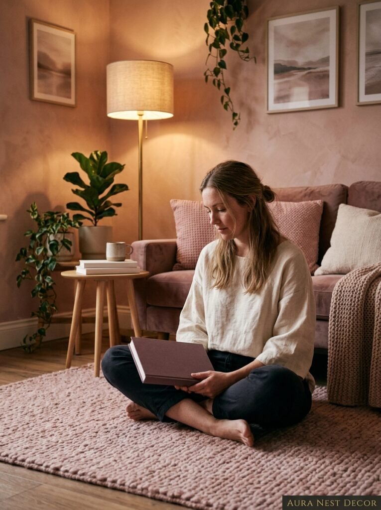
Pink living rooms don’t require bravery — they require commitment. Not to the color, but to the specific room you’re making. The shade, the light, the things you put next to it. Done thoughtfully, pink is one of the most versatile, livable, quietly mood-shifting colors you can put on a wall or a sofa. The question isn’t really whether pink works. It’s which pink is yours.