
The Living Room Color Decision That’s Actually Keeping You Up at Night (And How to Finally Get It Right)
You’ve been staring at that paint swatch taped to the wall for three weeks. Maybe longer. It looked perfect in the store — that gorgeous dusty sage, that moody slate blue — and now it’s mocking you in afternoon light. Here’s what nobody tells you: the color isn’t the problem. You just haven’t been shown how to read it yet.
—
1. Why Your Living Room Color Feels Wrong Before You’ve Even Painted It
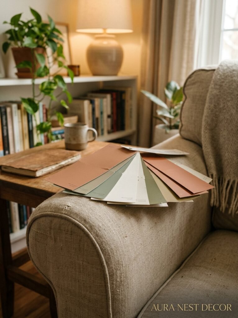
This is the part that trips everyone up. You pick a color you love, you bring it home, you tape it to the wall — and something feels off. Not terrible, just… not what you imagined. And then the doubt spiral starts.
But here’s what’s actually happening. Paint swatches are tiny. Your brain can’t accurately predict how a color will behave at scale, across an entire wall, under YOUR specific light. That warm greige that looked so calm in the store? In a north-facing room with cool gray light all day, it can pull almost lavender. Not wrong, necessarily. But different.
There’s also the undertone problem, and I cannot stress this enough. Almost every paint color has an undertone hiding underneath the main color. Benjamin Moore’s Simply White has a creamy yellow undertone. Farrow & Ball’s Elephant’s Breath (yes, that’s a real paint name and yes, it’s gorgeous) leans warm pink-gray. If your floors are cool-toned — pale oak, gray tile — a warm-undertoned paint is going to fight with everything in the room without you knowing why it bothers you.
The fix is simple but takes patience. Paint a large sample directly on the wall — not a tiny patch, we’re talking at least 12 inches square. Live with it through a morning, an afternoon, and an evening with your lamps on. That last one especially. The amber glow of your lamps at 9pm changes EVERYTHING.
—
2. The Color That Keeps Showing Up in Every Beautiful Living Room Right Now
Not gonna lie, I’ve been tracking this for a while now. And there’s a quiet consensus happening in living rooms across the US and UK that I find genuinely fascinating.
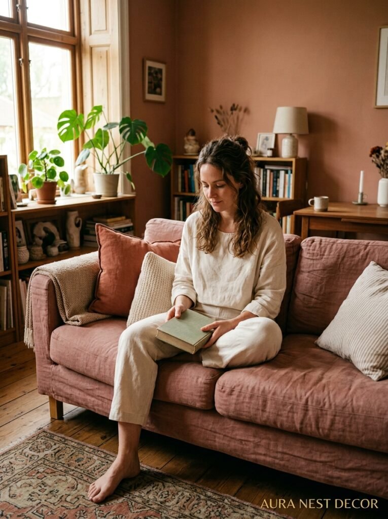
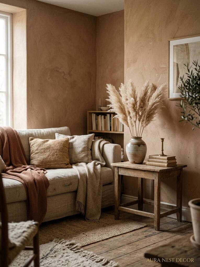
It’s not gray. Gray had its moment — a long one — and it’s not gone, but it’s definitely in its retirement era. What’s replacing it is something warmer, more complicated, harder to name. Think: a color that could be a very pale terracotta, or a dusty warm blush, or a greige that decided to have a personality. In the US design world it’s showing up in names like “Vintage Rose” and “Pale Adobe.” In UK homes — especially the Farrow & Ball crowd — it’s things like “Pink Ground” and “Setting Plaster.”
The reason this works so well is that it doesn’t commit. Walk into a room painted in this kind of color and your brain registers “warm and calm” before it registers any specific hue. It doesn’t scream pink. It doesn’t whisper beige. And it plays beautifully with natural wood, with linen sofas, with the kind of warm brass hardware that’s been everywhere for a few years now.
But here’s the thing about trend colors: they work best when you’re not leaning on them too hard. If your sofa is also blush, your cushions are blush, your candles are blush — you’ve accidentally built a monochrome color board and the whole room will feel flat. Use this kind of color as the backdrop, then layer in contrast: deep olive green, matte black, aged terracotta. That’s when it sings.
“A beautiful living room color isn’t the loudest thing in the room. It’s the reason everything else looks better.”
—
3. North-Facing Room? Stop Reaching for White
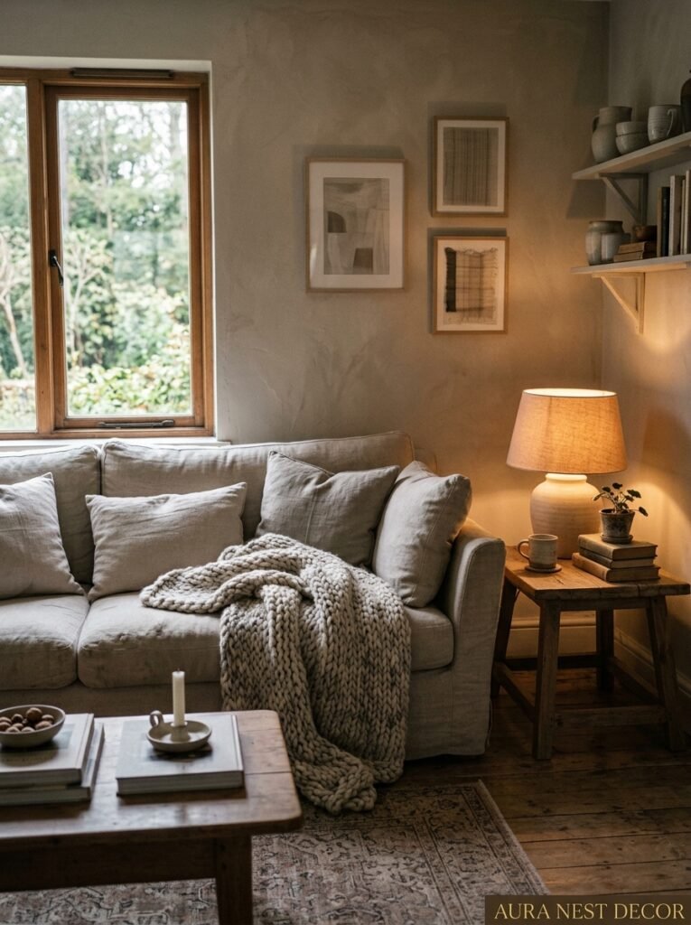
This might be controversial. But I genuinely think that default advice — “light rooms need white paint!” — is responsible for a lot of cold, sad living rooms.
Here’s the situation. North-facing rooms in the UK and north-facing rooms in most parts of the US get limited direct sunlight. The light they do get is cool, bluish, and kind of flat. So what do people do? They reach for bright white, hoping to maximize that light.
And then the room looks clinical. Like a waiting room that can’t decide what it is.
The counterintuitive move — which actually works, and which designers use constantly — is to lean INTO the cool light rather than fighting it. Pick a paint color that embraces the moody quality of that north-facing light. A deep dusty blue. A chalky slate. A rich warm green. Something like Hague Blue by Farrow & Ball or Naval by Sherwin-Williams. Suddenly the room doesn’t feel dark anymore — it feels INTENTIONAL. Cozy, even. Like it was designed to feel exactly this way.
It’s the difference between a room apologizing for its light and a room owning it completely.
—
4. The One Thing No Paint Brand Will Tell You About Finish
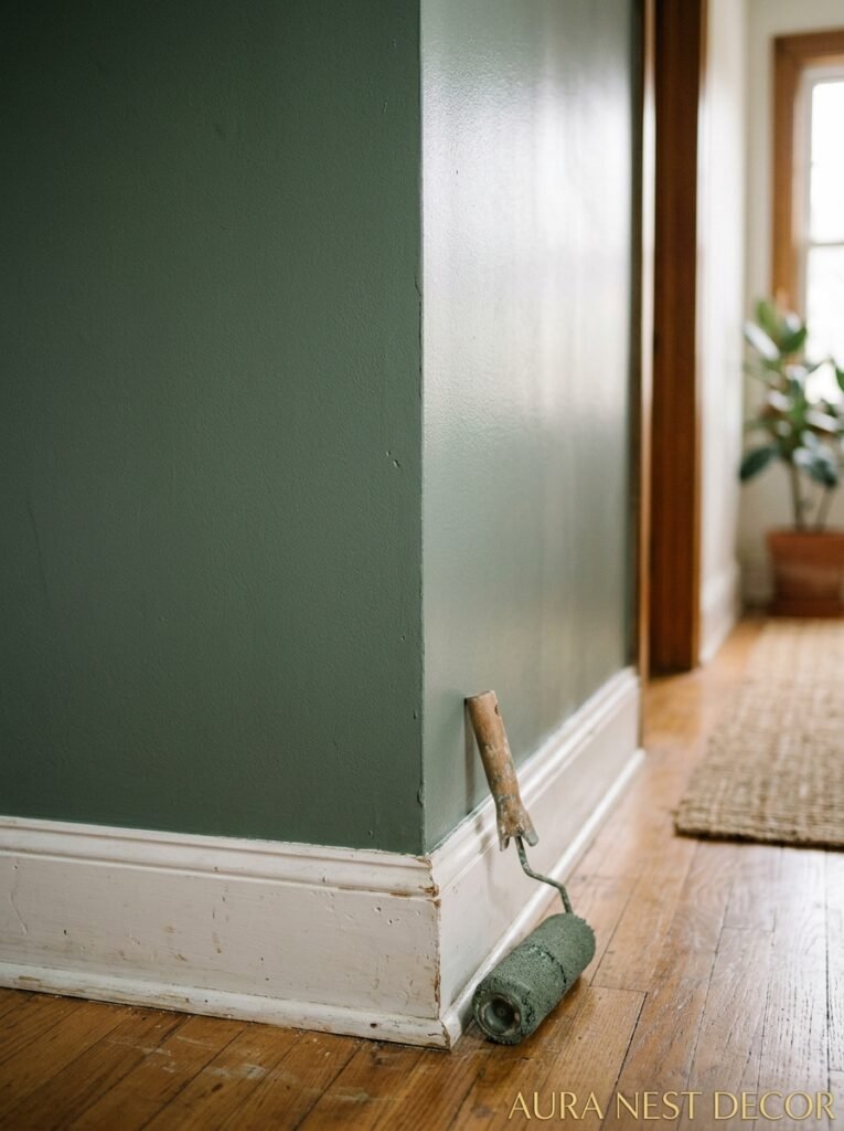
Everyone talks about color. Nobody talks enough about finish. And it’s driving me slightly mad.
Here’s what I mean. You can pick the most gorgeous color in the world — a rich, soulful olive green, something pulled from an Italian villa — and then paint it in flat eggshell on walls that aren’t perfectly smooth, and watch it look cheap. The finish matters. Like, REALLY matters.
For living rooms, I’ve done this enough times to have opinions. Flat or matte finishes are beautiful — they have that chalky, sophisticated quality you see in all those Farrow & Ball lifestyle shots — but they show every scuff and every mark your kids (or your cat, or your clumsy partner who shall remain nameless) leave behind. In a living room that gets real use, that’s worth thinking about.
A dead flat or chalky finish works if you’re willing to spot-clean carefully. A matte finish with a slight sheen — what Farrow & Ball calls “Estate Eggshell,” what American brands sometimes call “Soft Sheen” — gives you most of that beautiful matte quality with a tiny bit more durability. It’s genuinely the sweet spot for most living rooms.
And dark colors? They almost always need at least two coats — sometimes three. That moody forest green you’re dreaming about is going to look patchy and heartbreaking after one coat. Budget for the time and the extra paint. You’ll thank yourself.
“The finish is doing half the work. Pick the wrong one and even a perfect color can let you down.”
—
5. The Color Combination People Are Getting Wrong on Pinterest
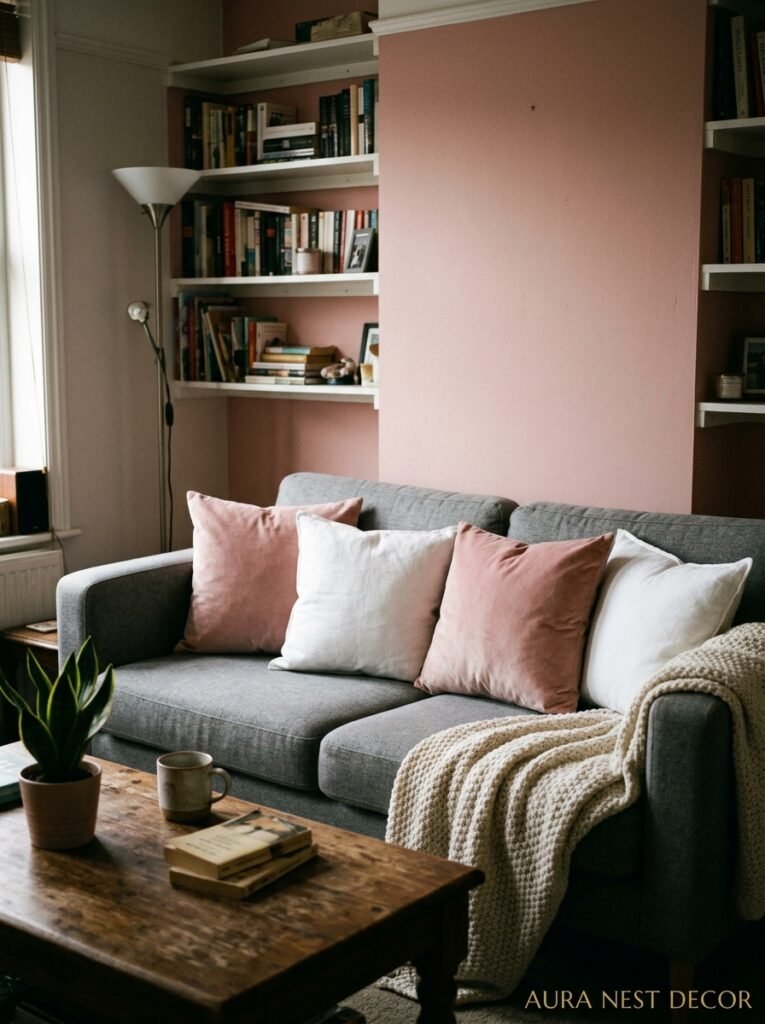
Okay, I love Pinterest deeply. It’s basically a mood board for my entire life. But there’s a color combination floating around right now that looks STUNNING in photos and can go subtly wrong in real rooms, and I feel like someone needs to say it.
Cream walls plus terracotta accents plus a rust-colored rug plus warm wood. It’s everywhere. And on a bright, airy, perfectly lit set? It’s gorgeous. Warm and organic and very right-now.
But in a real living room — especially one that gets afternoon sun coming through west-facing windows — all that warm orange-red energy in one space can start to feel like too much. Heavy. Almost oppressive by evening.
The save is simple: one cool element. Just one. A deep teal cushion, a matte black lamp, some aged silvery-green eucalyptus in a vase. It sounds small but it gives your eye somewhere to rest. The brain craves a little contrast even when it doesn’t know it’s looking for it.
Anyway, don’t give up on the combo. Just balance it.
—
6. What British Homes Get Right That American Ones Often Don’t
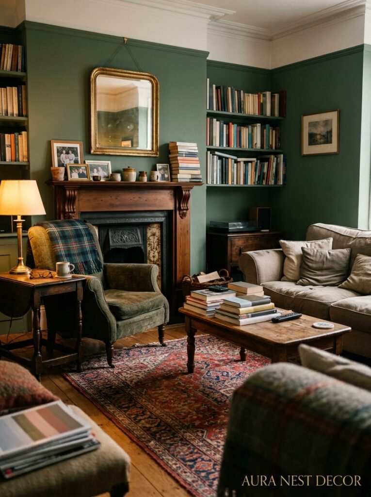
This is a loving observation, not a criticism. I’ve spent time in both countries and looked at genuinely thousands of living rooms and I think there are some real differences in how color gets used.
British homes — and maybe it’s the tradition of Farrow & Ball, or maybe it’s the older architecture with higher ceilings and deeper window recesses — tend to use color more confidently on walls, and pair it with contrast more instinctively. You’ll see a deep dusty green paired with warm white trim and aged brass and it just looks… settled. Like it’s been there a hundred years.
American homes often lean safer. More neutral. And when color does appear it’s sometimes in accent walls, which — I’m just going to say it — almost never look as good as everyone hopes they will. An accent wall usually reads as indecision, not design.
The British approach that I think is worth borrowing: commit to the room. Paint all four walls. Let the color be the room, not a feature of it. This is especially true for deeper, braver colors. A single dark wall in an otherwise pale room looks like a mistake. Four dark walls look like a design choice.
—
7. The Surprising Color That Works in Any Living Room, Any Style

I keep coming back to this one. It’s not as exciting as deep midnight blue or fashionable sage green, but hear me out because it might actually be the most useful color in existence for living rooms.
Off-white with a warm, slightly yellow undertone.
Not bright white — that’s too stark for most living room lighting. And not a full cream — that can age a room if you’re not careful. Something in between. In the US, you’re looking at things like Benjamin Moore’s White Dove or Chantilly Lace or even the much-loved Swiss Coffee. In the UK, Farrow & Ball’s All White or Little Greene’s Aged White sit in a similar territory.
What makes this work everywhere — and I mean genuinely everywhere, from a Victorian terrace in Manchester to a ranch house in Arizona — is that it gives color back to everything else in the room. Your sofa looks like itself. Your plants look GREEN. Your wooden floors glow. The room doesn’t compete with the furniture, it shows it off.
It’s also the easiest color to live with over time. Not boring — just quietly excellent. Like a good cream linen shirt. You’ll never regret it.
“Off-white done right isn’t a lack of commitment. It’s the color that makes every other decision in the room look intentional.”
—
8. How Lighting Actually Changes Your Paint Color (And What To Do About It)
I’ve touched on this but I want to dig in because it genuinely trips people up more than any other part of the color process.
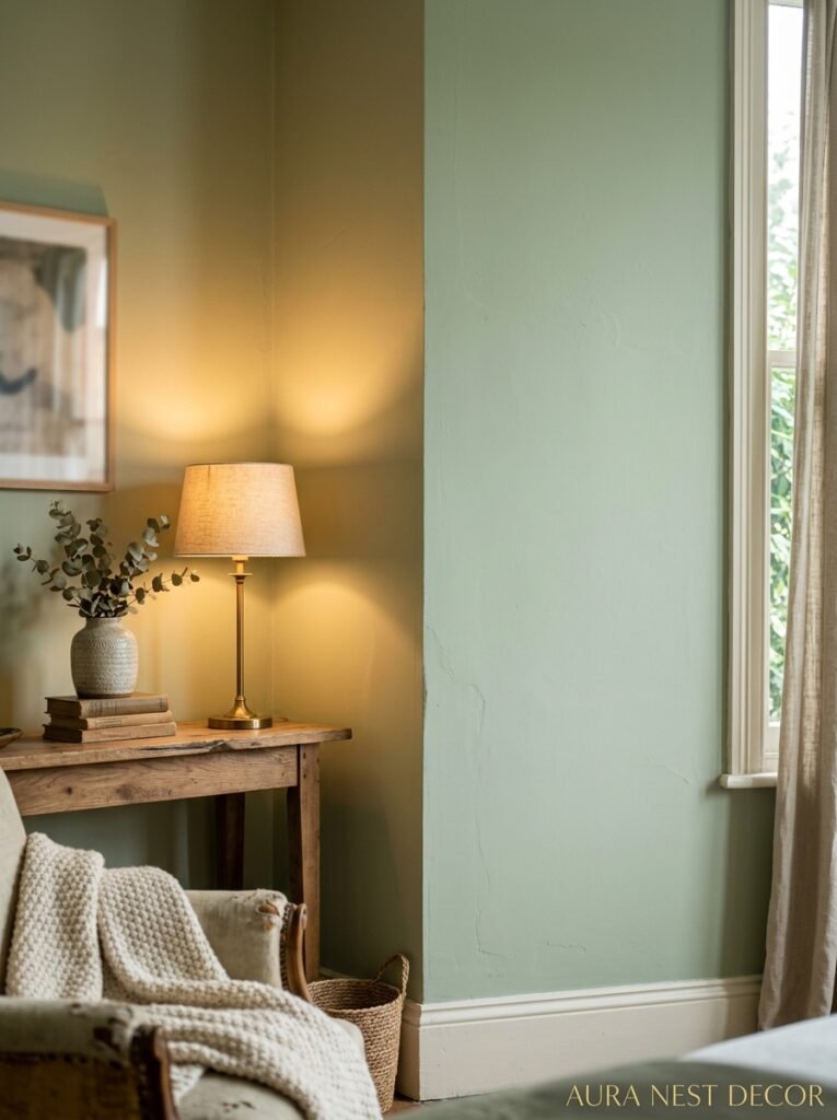
Your paint color has multiple personalities. In morning light — especially if you’re east-facing — it’ll look one way. By midday with overhead light it shifts. In that soft, particular late-afternoon light that lasts maybe 40 minutes and makes everything beautiful, it’ll look entirely different again. And under your lamps in the evening? That’s the fourth version.
This is especially true of warm tones. A peachy-beige can look almost white at noon, then look deeply salmon at 7pm under warm Edison bulbs. A gray can look vaguely purple in morning light and perfectly neutral at midday.
The practical advice: if your living room sees MOSTLY evening use — you’re out all day, you’re in there at night watching TV, having people over — then test your paint samples specifically in evening light under your actual lamps. That’s the version you’re going to live with. I cannot tell you how many people pick colors in bright daylight for rooms they mostly use at night.
Side note — if you’re using LED bulbs, the color temperature matters enormously. 2700K is warm and golden, great for living rooms. Anything above 3000K starts getting cooler and can make warm paint colors look much less warm than you expected.
—
9. The Rule About Dark Colors That Interior Designers Never Break
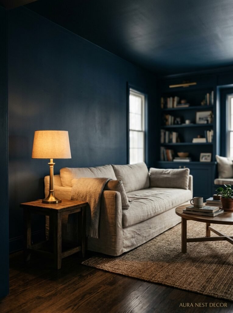
Dark living room colors are having a long, well-deserved moment. Deep navy. Inky green. Almost-black charcoal. They’re on Pinterest, they’re in every interior magazine, and honestly — done right — they’re incredible.
But there’s a rule most designers follow quietly. Dark colors need LIGHT sources they can bounce off of. Not daylight necessarily. Lamp light, candle light, something warm and localized. A dark room with nothing but overhead fluorescent light isn’t moody — it’s just dark. Like a basement that hasn’t been told what it is yet.
The rooms you see photographed beautifully in deep tones almost always have at least three separate light sources. A floor lamp in one corner, a table lamp on a side table, maybe low cabinet lighting or some candles. This creates pools of warm light that the dark walls absorb and reflect back, and the whole room starts to glow in this dramatic, cinematic way.
Get your lighting plan sorted BEFORE you paint dark. Seriously. Commit to where your lamps are going. Because the paint alone won’t do it.
—
10. What “Warm Neutral” Actually Means (Because Everyone Uses It Wrong)
This phrase is all over every paint website, every interior design blog, every magazine feature. And half the time it’s being used to describe colors that are NOT warm neutrals and the other half it’s describing colors that genuinely are but without explaining why.
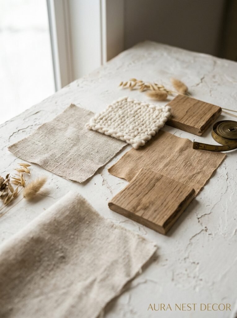
Quick clarification that’ll save you a painful repaint situation. A warm neutral is a color that has yellow, orange, or red undertones — even if those undertones are very subtle. These colors read as cozy, soft, and harmonious against natural wood, warm metals, and earthy fabrics.
A COOL neutral has blue, green, or purple undertones. These can be beautiful — think of a pale gray-blue that looks stunning in a Scandi-style space — but they’re not warm. And if you mix a “cool neutral” with warm wood floors and amber lighting, the paint will look weird and you won’t know why.
So how do you tell? Hold the paint swatch against a piece of pure white paper. Suddenly the undertone pops. You’ll see the yellow, the pink, the gray. It works every time and takes about three seconds. Also: look at the color name. Anything with “sand,” “stone,” “wheat,” “cream,” “linen” in the name is almost always warm. “Slate,” “ash,” “mist,” “silver” — cool. Not universal, but a decent starting point.
—
11. The Colors Pinterest Made Too Famous (And What To Pick Instead)
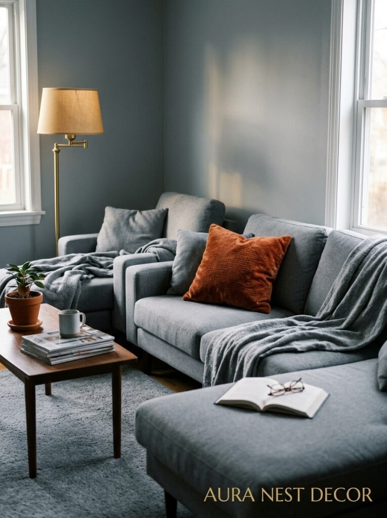
Look, I’m not anti-trend. But there are a few colors that are now SO associated with a specific moment that using them in a new living room already feels like it’s in conversation with that moment — and not always in a good way.
Millennial pink, obviously. It had its time. It was great. But that very particular bubblegum-meets-terracotta pink that was on every blogger’s walls between about 2017 and 2022 now has a timestamp on it.
Greige — that beige-gray blend — is the same. Not offensive, not unworkable, but so ubiquitous in the 2010s that it tends to read as “default” now rather than “chosen.”
And sage green… okay, I love sage green. But the specific yellow-green shade that exploded on Pinterest around 2020 is getting to the point where it needs a rest. If you love it, use it — but look at slightly different versions. Darker. Bluer. More gray in it. Something that feels like yours rather than like a screenshot.
—
12. The Thing That Actually Makes a Living Room Color Look “Right”

We’ve talked about light and finish and undertones and all the technical stuff, and it all matters. But there’s something less tangible that I keep thinking about when I see a living room that just WORKS.
The color looks right because it agrees with the room’s personality.
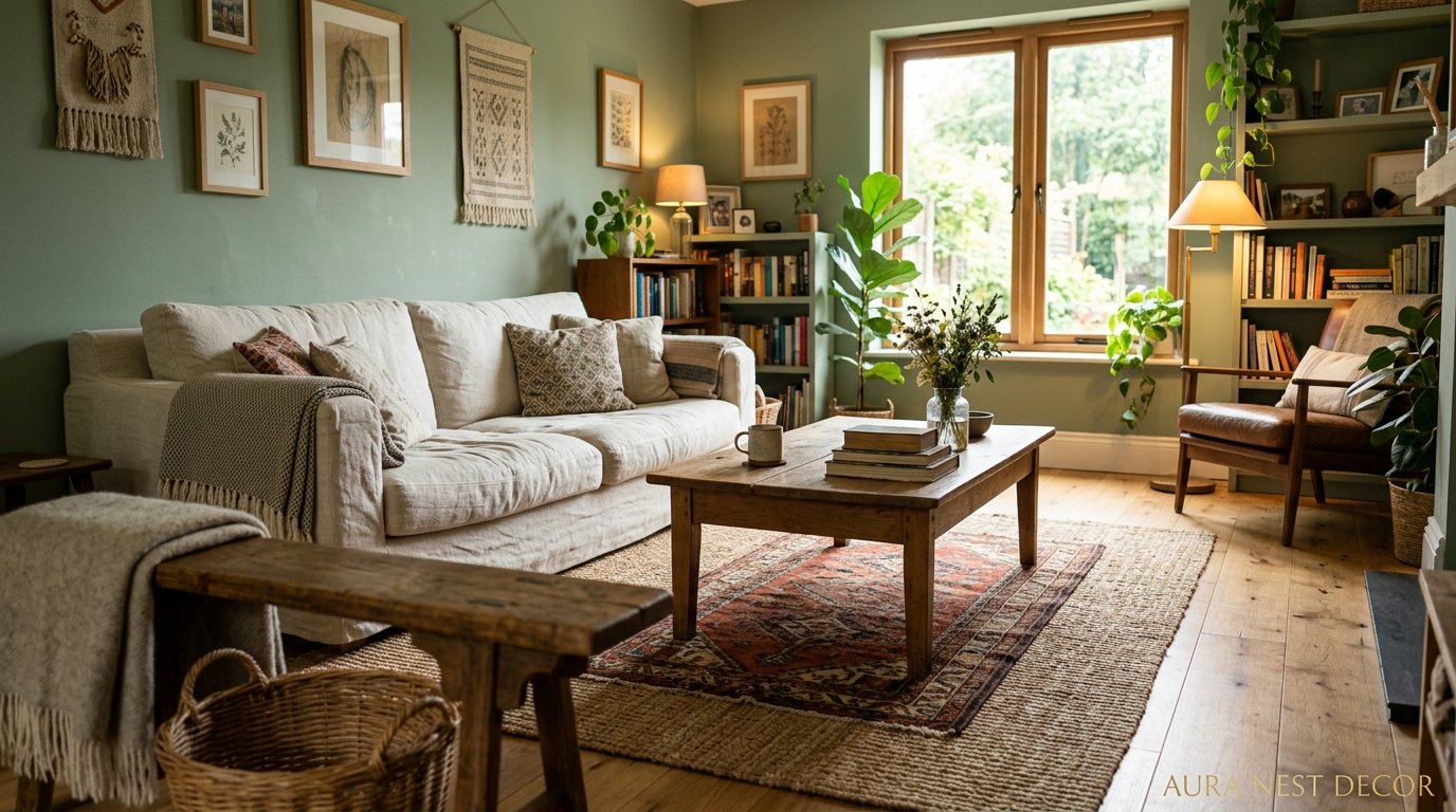
A living room that’s full of soft linen, worn leather, vintage books, and a dog-eared rug has a personality. And some colors will feel like they belong there — warm ochre, chalky green, a deep whisky-brown — and some will feel like they’re visiting. A sharp, cool white would feel alienating in that room. A bright cobalt blue would feel like it wandered in from somewhere else.
The best question to ask yourself when you’re standing in front of the paint chart isn’t “is this color beautiful?” Most of them are beautiful. It’s: does this feel like what this room already is, or what I want it to be? A room painted by someone who understood it — its light, its furniture, its purpose — looks completely, effortlessly right. Not perfect. Just right. There’s a difference, and you feel it the moment you walk in.
—
❓ FAQ
Q: How do I know how many paint colors to use in one living room? A: For most living rooms, one wall color does the job — try to keep it simple. If you want to add a second color, use it only on built-in furniture, alcoves, or woodwork, not on an accent wall. Three or more paint colors in one room almost always creates visual noise.
Q: Should I match my living room and hallway paint colors? A: They don’t have to match exactly, but they should feel related — especially in smaller homes where the hallway is visible from the living room. A good approach is to use one color in the living room and a lighter version of it (or a warm neutral that shares the same undertone) in the hallway.
Q: Is Farrow & Ball actually worth the price? A: Genuinely, the quality is there — the pigmentation is richer and the depth of color is different from most standard paints, and many of their colors are very hard to match accurately with cheaper alternatives. That said, if the price is a barrier, ask your local paint shop to color-match it. You might lose a tiny bit of the depth but it’ll be very close, and it’s a reasonable option.
—
💭 Final Thoughts

Living room color is one of those decisions that feels enormous before you make it and then, once you do, becomes just the room. The walls you stop seeing because the life in front of them is so much more interesting. Don’t overthink the perfection — think about the mood, the light, what the room’s already telling you it wants to be.
Get a large sample, live with it for a few days, and trust your gut at 9pm with the lamps on and a cup of tea in your hand.
And honestly — what’s the color you keep going back to, even though you keep talking yourself out of it?




