
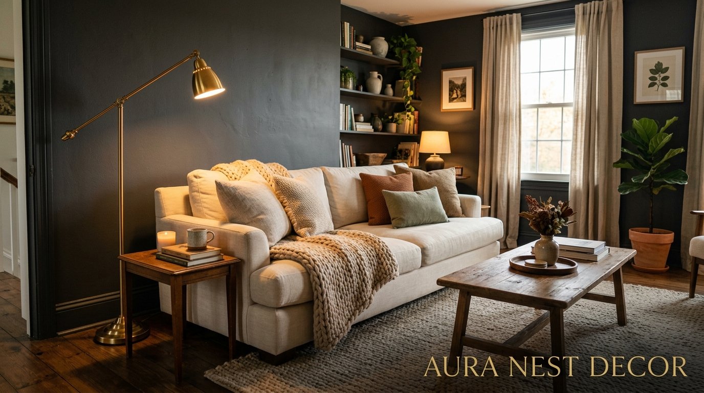
Dark Grey Living Rooms That Feel Cozy, Not Cold — Here’s How They Actually Do It
You’ve stared at that paint swatch seventeen times. Picked it up. Put it back. Told yourself it might be too much. But the rooms you can’t stop pinning? They’re all dark grey. Every single one.
There’s a reason for that.
—
1. Why Dark Grey Hits Different Than Every Other Neutral
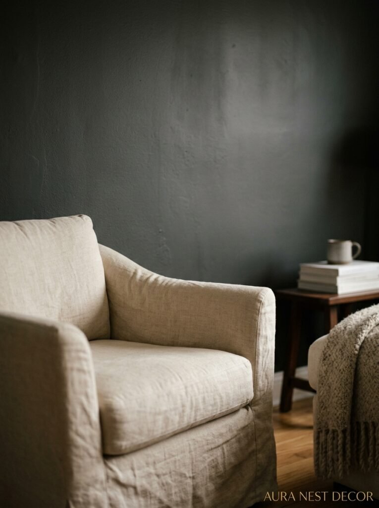
It’s not just a color. It’s a mood. And I think that’s why people are scared of it — because committing to a mood feels bigger than picking a paint shade.
But here’s what dark grey does that no other neutral can pull off: it absorbs light in this incredibly flattering way. Not in a black hole, depressing way. More like how a storm cloud looks dramatic and beautiful at the same time. There’s depth to it. Complexity. A room painted in warm grey feels like it has a pulse.
The problem with beige — and I say this as someone who lived through a full decade of greige — is that it doesn’t commit to anything. It’s the color of indecision. Dark grey commits. It says “I thought about this.” And that confidence is exactly what makes a room feel designed rather than just furnished.
There are also genuinely different undertones to navigate and it matters more than people realize. Some dark greys pull blue. Some pull green. Some pull purple in the wrong light, which sounds alarming. The ones that read as warm tend to have a slight brown or red undertone — think Farrow & Ball’s Down Pipe or Sherwin-Williams Peppercorn — and those are generally the ones that photograph beautifully and feel livable at 7pm when the lamps come on.
“The right dark grey doesn’t swallow a room. It holds it.”
—
2. The Paint Colors Actually Worth Talking About (Not Just the Famous Ones)
Okay, Down Pipe. Yes. Everyone knows. It’s gorgeous and it earns every bit of its hype, not gonna lie. But it’s also everywhere now, which doesn’t mean you shouldn’t use it, just means there are other options worth knowing about.
Farrow & Ball’s Mole’s Breath is doing something slightly warmer and more muted — it’s not as dramatically dark but it photographs in this moody, considered way that feels genuinely different from standard charcoal. For something with a slight green-grey cast (which sounds wrong but looks phenomenal with warm wood tones), Studio Green is worth a test pot.
On the US side, Benjamin Moore’s Wrought Iron is having a major moment, and for good reason. It’s dark without being oppressive and it works in rooms with decent but not exceptional light. Sherwin-Williams Peppercorn is the one I keep recommending to people who are nervous — it’s dark enough to make an impact but has enough warmth that it doesn’t feel like a cave.
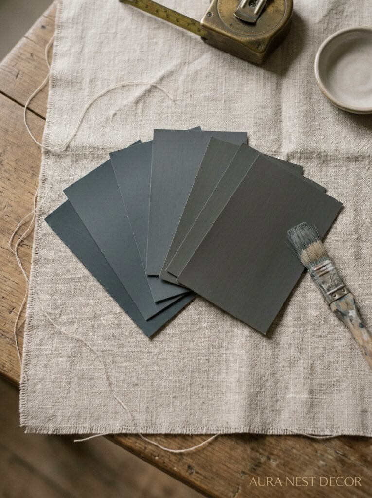
One thing: ALWAYS get the sample. Always. Paint it on a big piece of cardboard and move it around the room at different times of day. Look at it in the morning. Look at it at 10pm with just the side table lamp on. A grey that looked perfect in the shop can go muddy purple on your north-facing wall and it’s genuinely gutting when that happens.
—
3. The Lighting Secret Nobody Talks About Enough
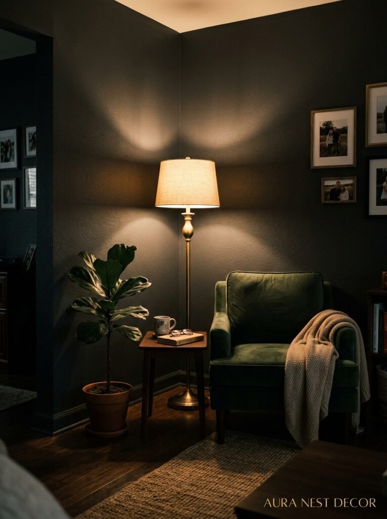
This is where dark grey rooms actually live or die. And most people get it wrong.
Overhead lighting is the enemy. One ceiling light in a dark grey room and you’ve created a bunker, not a sanctuary. The fix is layering — and I mean genuinely layering, not just adding a floor lamp in the corner and calling it done.
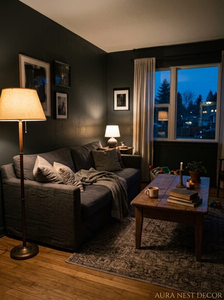
Think about what you want the room to feel like at 7pm on a Tuesday in November. That’s the real test. For that moment, you need: something warm and low (a table lamp, ideally with an amber or ivory shade), something that draws the eye upward (a wall sconce or uplighter), and ideally something unexpected — a candle cluster on the coffee table, a string of LED Edison lights along a shelf.
The amber glow of an Edison bulb at that hour does something almost unfair to dark grey walls. The warmth bounces off the grey in a way that makes the whole room feel like you’re inside something intentional. Like the light was designed for that specific wall.
Also — and this is less romantic but equally important — dimmer switches. Non-negotiable in a dark grey room. You need to be able to dial everything down at night and up in the afternoon when you’re trying to read. Without them you’re just stuck at one setting, and no single setting works for every hour of the day.
—
4. Furniture Colors That Actually Work (And One That Surprises People)
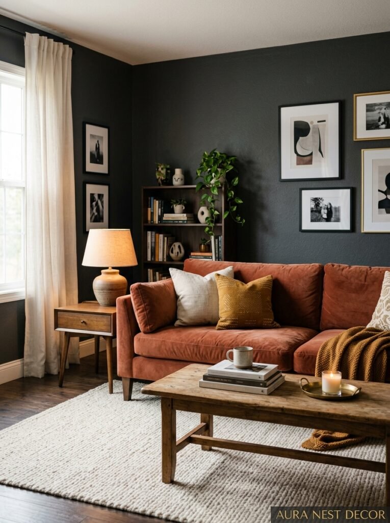
Most people go two directions with dark grey: they either pile everything in cream and white to “lighten” it, or they double down on all dark tones and end up with something that looks like a moody hotel bar. Neither is quite right.
Cream and ivory do work, but they need to be warm-toned ivories, not crisp whites. Bright white against dark grey reads as stark. Warm cream reads as considered. Big difference in person, even if it sounds like a tiny detail.
Warm wood — oak, walnut, even a lighter pine — is genuinely the perfect companion for dark grey. It does the lightening work without making things feel clinical. A chunky oak coffee table against dark grey walls is one of the best combinations in residential interiors right now, and it’s been having this moment for years because it’s just… correct.
“A warm wood coffee table in a dark grey room isn’t a trend. It’s an answer.”
The surprising one? Rust. Burnt orange. Terracotta. People assume dark grey is cool-toned and needs cool companions, but warm earthy colors work incredibly well with it — especially in cushions, throws, or a single accent armchair. There’s this visual tension that somehow resolves itself into something that feels grounded and alive at the same time.
Blush pink also works in small doses. A single blush velvet cushion can soften a dark grey room without making it feel feminine or overdone. Just one, though. Not five.
—
5. Textures That Stop a Dark Grey Room From Feeling Flat
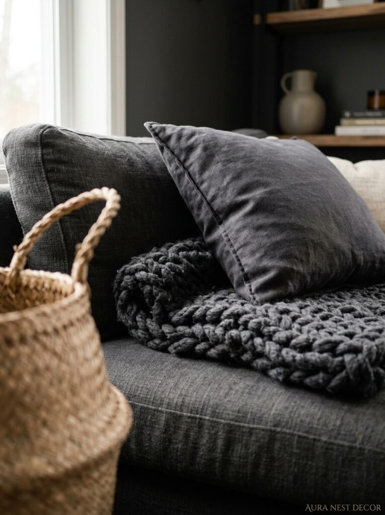
A dark grey room with smooth, flat surfaces everywhere is genuinely depressing. Texture is what saves it. It creates that sense of depth and visual interest that keeps a dark room feeling rich rather than gloomy.
Think chunky knit throws draped over the arm of the sofa. A linen-textured cushion cover next to a velvet one. A jute rug on a hardwood floor. A rough terracotta pot sitting on a smooth marble shelf. Contrast is the whole game here — you want the eye to keep moving, finding different surfaces, different weights.
Curtains matter so much in this equation. Heavy linen curtains in a warm oatmeal tone are transformative in a dark grey room — they’re soft, they move, they catch light in this incredibly subtle way. Velvet curtains in deep emerald or forest green are the other option, which sounds like you’re committing to a lot but is actually just deeply, satisfyingly dramatic.
Don’t forget the walls themselves as texture. Limewash paint over dark grey creates this beautiful layered effect. Exposed brick painted in grey reads as textural without any extra effort. Even matte paint versus eggshell versus satin will read differently in this color — matte tends to look the most sophisticated, but it marks more easily, so that’s a real-life trade-off worth knowing.
—
6. The One Mistake That Makes Dark Grey Rooms Look Depressing
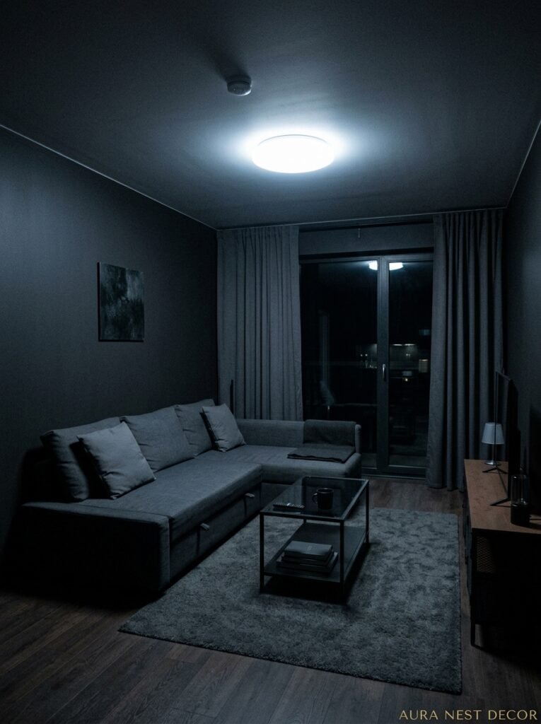
Too much of the same grey. When the walls, sofa, rug, and curtains are all in the same grey family, the room loses all definition and it looks flat. Not moody. Not dramatic. Just flat and a bit sad.
The grey needs contrast to sing. It needs something that isn’t grey. This sounds obvious and yet I see this mistake constantly — people fall so in love with the idea of an all-grey scheme that they forget the room has to actually work visually.
The contrast can come from anywhere: a creamy white bookshelf, a wooden floor (or a rug that shows the floor color), warm metal hardware on the furniture, a gallery wall with warm-toned frames. Any of these. But SOMETHING has to break the grey, or the whole thing collapses.
Also — clutter kills a dark grey room faster than any other color. A light, busy room can absorb clutter and still look cozy. A dark grey room cannot. Everything that sits in a dark grey space needs to feel chosen. That’s not about being minimal exactly, it’s about being intentional. There’s a difference.
—
7. How to Make a Dark Grey Room Feel Bigger (Yes, Really)
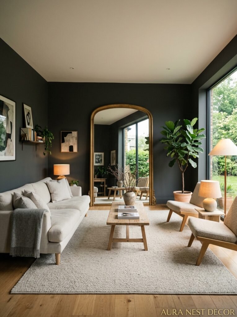
I know. Every instinct says to use light colors to make a room feel bigger. And mostly that’s true. But dark grey can actually make a small room feel more expansive if you play it correctly, and I say this as someone who painted a small Victorian terrace living room in a very deep charcoal and didn’t regret it for a second.
The trick is continuity. Dark grey on all four walls, the ceiling, even the skirting boards — yes, including the ceiling — creates this effect where the eye doesn’t stop at any boundary. The room sort of… expands into itself. It sounds mad. It works.
“Paint the ceiling too. I know that sounds like too much. It isn’t.”
This is called the “colour drenching” technique and it’s been a proper moment in UK interiors for a few years now. When everything is the same deep tone, there are no visual interruptions, no “wall ends here” moments, and the room reads as one cohesive, intentional space rather than a small box with four separate walls.
The light fixtures become the stars. Every object you bring in pops. A white orchid in a dark grey room looks like art. A single brass lamp looks like a sculpture. The contrast is working for you constantly.
—
8. Plants in a Dark Grey Room (And Which Ones Actually Thrive)
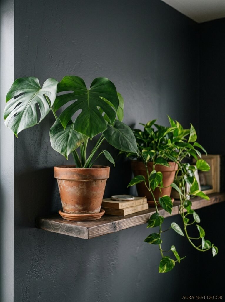
Not all plants are going to be happy in a room that’s absorbing a lot of light. Worth knowing before you fill the shelves with the wrong ones.
Low-light plants are your best friends here. Pothos — almost unkillable, trails beautifully, reads as lush without being high-maintenance. ZZ plants have this beautiful waxy leaf that actually looks incredible against dark walls. Snake plants work too, and there’s something about the graphic quality of their leaves that feels right in a room with strong colors.
Visually, go for plants with interesting leaf shapes rather than just green mass. A monstera in the corner of a dark grey room looks absolutely intentional. So does a fiddle leaf fig, if you can keep one alive, which is a genuine challenge. A trailing plant on a high shelf — pothos again, or a string of pearls — draws the eye up and adds movement.
The pot matters here more than in a lighter room. Terracotta pots against dark grey walls are one of those combinations that photographs better than it has any right to. Warm, earthy, immediate. Or go matte black — disappears into the wall and makes the plant look like a painting.
—
9. Art and Gallery Walls in a Dark Grey Room — Getting the Frames Right
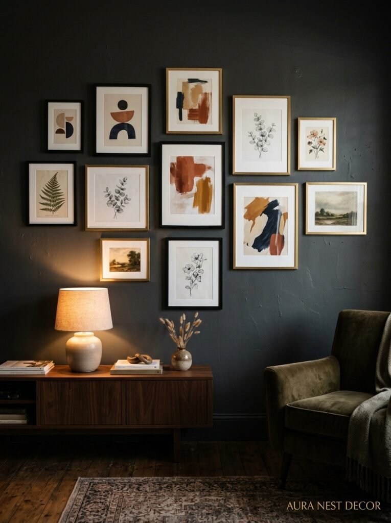
Here’s the thing about art in a dark grey room: it gets to be actually seen. In a white room, the walls compete with the art. In a dark room, the art floats forward. It’s one of the best arguments for going dark that I can make.
For frames, warm metals — brass, bronze, gold — look extraordinary. They catch every bit of light and feel luxurious without trying. Black frames disappear, which can be a lovely choice if you want the artwork itself to dominate. White frames pop dramatically, which works for some styles and looks jarring in others.
Gallery walls work brilliantly in dark grey rooms but they need the same intentionality rule as everything else — they need to feel curated, not accumulated. A mix of black and white photography with one or two warm-toned prints in matching brass frames is genuinely foolproof. So is a single large-scale piece, something with warm tones or botanical imagery, mounted and slightly oversized for the wall.
What doesn’t work: too many different frame finishes, too many different sizes with no visual logic, or all very small pieces scattered across a big wall. The dark background amplifies whatever chaos or order exists in your arrangement.
—
10. The Sofa Question: What Color Goes With Dark Grey Walls
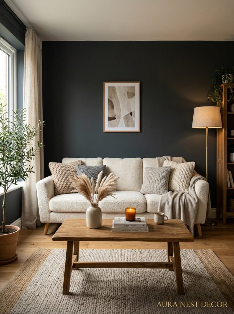
Genuinely the question I get asked more than any other. And the honest answer is that a lot of things work, but a few things work BEST.
Cream or warm linen sofa against dark grey walls is the classic combination for a reason. It’s the contrast ratio that makes the room work — the sofa becomes the focal point, the walls recede, the whole thing balances. The risk with this combination is looking too expected, but you can fix that with unexpected accessories.
A dark sofa — navy, forest green, even charcoal — works if you’re leaning into the dramatic. The trick is making sure the sofa reads as a different color from the wall, not the same. A navy velvet sofa against charcoal walls is stunning. A grey velvet sofa against grey walls is muddy.
Camel or cognac leather is genuinely underrated for dark grey rooms. The warm brown-yellow tone against cool-leaning grey creates this sophisticated tension that feels expensive without being over-designed. Side note — aged leather specifically, the kind with slight wear marks, looks incredible. New and stiff leather less so.
—
11. The Dark Grey Room That Works in Every Season
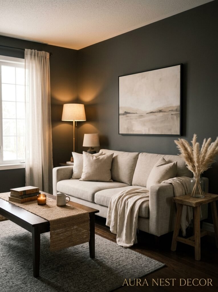
This is actually one of the best things about committing to dark grey — it doesn’t need to be completely re-styled for every season. The bones stay the same.
In winter, you lean into it. More throws, heavier candles, deeper-toned accessories. The room becomes this genuinely cozy, slightly dramatic space that feels made for December evenings. Add clementines in a bowl. Pine cones if you want. The warmth of those small organic elements against dark grey is genuinely beautiful.
Come spring, you don’t need to repaint. Swap the throw for a lighter linen one. Add fresh flowers — white tulips or something with a bit of green. Pull the curtains back further during the day and let the longer daylight do the work. The room lightens because the light lightens, not because you changed anything structural.
Summer in a dark grey room is surprisingly pleasant. Dark walls keep a room feeling cool. Something about being inside a darker space when the sun is blazing outside feels sheltered and intentional. Add something bright — a stack of colorful books, a bowl of yellow lemons — and it sings.
—
12. Starting Small If You’re Not Ready to Commit to All Four Walls
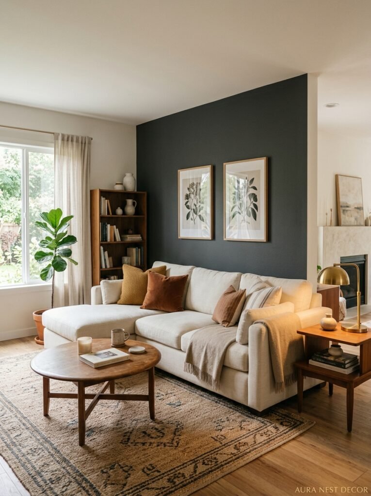
Not everyone is ready to go all in. That’s fine. Honestly. There are lower-stakes ways to test whether dark grey is for you.
One wall — the wall your sofa sits against, ideally — gives you a proper sense of what dark grey does to a room without the full commitment. This is called an accent wall and I know the term is a bit tired but the actual approach still works, especially in this context. Go dark on that one wall and everything else can stay lighter. The room gets drama. You get to see if you love it.
Or go dark on the alcoves if you have them. Victorian terrace houses especially often have those chimney breast alcoves on either side of the fireplace — painting those in a deep grey while keeping the main walls lighter creates this beautiful sense of depth and architectural detail. It looks intentional. It is intentional.
Built-in shelving painted dark grey is another way in. The shelves pop everything displayed on them — books, plants, ceramics — in the most flattering way. It’s the least scary version of this whole idea and it’s absolutely worth doing if you’re hesitating.
And if you love it — and I genuinely think you will — you’ll have your answer about the walls.
—
❓ FAQ
Q: Will dark grey make my small living room look even smaller? A: Not necessarily — and actually, if you paint ceiling and walls the same shade (color drenching), the lack of visible boundaries can make the space read as larger and more intentional. The key is good layered lighting and keeping things uncluttered.
Q: What’s the difference between dark grey and charcoal, and does it matter? A: Charcoal tends to be darker and cooler, sitting right on the edge of very dark grey and soft black. Dark grey usually has more visible undertones — warm, cool, or greenish. It does matter, because those undertones change completely depending on your light and your furniture. Always test with sample pots.
Q: Does dark grey work in a living room that doesn’t get much natural light? A: It can, but the lighting plan has to work even harder. Lean on warm bulbs, multiple light sources at different heights, and reflective surfaces like mirrors and metallic accessories to keep the room feeling alive rather than dim.
—
💭 Final Thoughts
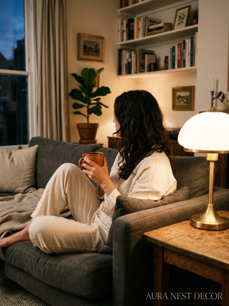
Dark grey isn’t the risky choice people think it is. If anything, it’s one of the most forgiving — it makes ordinary furniture look considered, ordinary objects look curated, ordinary evenings feel a little more like something.
The rooms that don’t work aren’t dark grey’s fault. They’re under-lit, over-matched, or missing that warmth that the color needs to feel alive.
So — are you still staring at that swatch?




