
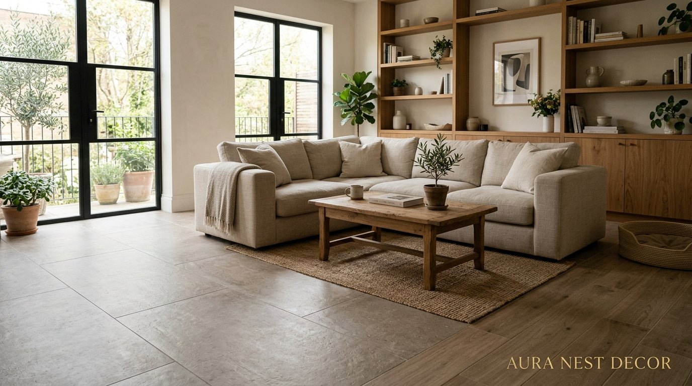
The Floor Tile Choices That Are Secretly Making or Breaking Your Living Room
You walk into someone’s house and something just feels right. The furniture’s fine, the walls are whatever — but there’s this pull, this sense of groundedness. Nine times out of ten? It’s the floor doing that work.
—
1. Why Your Living Room Floor Is the Decision You’re Getting Wrong First
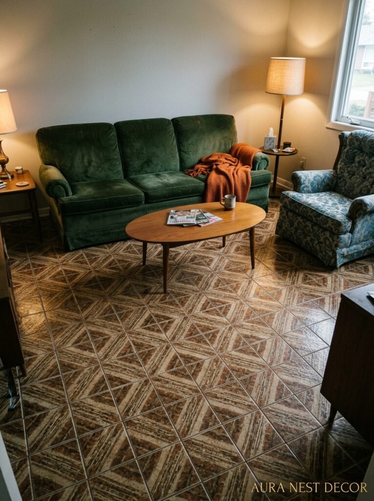
Here’s the thing nobody tells you when you’re planning a living room renovation: most people choose their sofa first. Then the rug. Then the paint. And the floor tiles — if they’re tiling at all — get picked last, almost as an afterthought, when the budget’s tighter and the decision fatigue has fully set in.
That’s backwards.
The floor is the single largest surface in any room. It’s what every other decision has to answer to. And when you tile a living room — which, by the way, is genuinely one of the best things you can do for a space that needs to feel solid and designed — the tile you choose sets the entire conversation. It decides whether the room feels warm or clinical, old or contemporary, relaxed or uptight.
I’ve seen people pair the most gorgeous linen sofas with cold, bright white porcelain tiles and wonder why the room felt like a dentist’s waiting room. And I’ve seen the opposite — a tiny, dark living room transformed completely by a warm-toned terracotta tile that caught afternoon light in a way no paint color ever could.
So before you do anything else — before you pin sofas, before you swear allegiance to a particular shade of greige — figure out the floor.
“The floor doesn’t complete the room. It starts it.”
—
2. The Tile Size Conversation Nobody’s Having Honestly
Everyone says “use large tiles in small rooms to make them feel bigger.” And okay, technically true, but also — kind of annoyingly oversimplified.
A 24×24 porcelain slab in a tiny Victorian terraced front room in Manchester isn’t going to make it feel like a loft. It’s going to feel like someone made a slightly weird decision. Scale matters, but so does character. So does the bones of the space.
In genuinely large rooms — open-plan living areas, American ranch-style layouts where the living room bleeds into the dining room — big format tiles (we’re talking 32×32 or even larger) are incredible. Fewer grout lines mean the floor reads as one continuous surface. Sleek. Calm. Almost architectural.
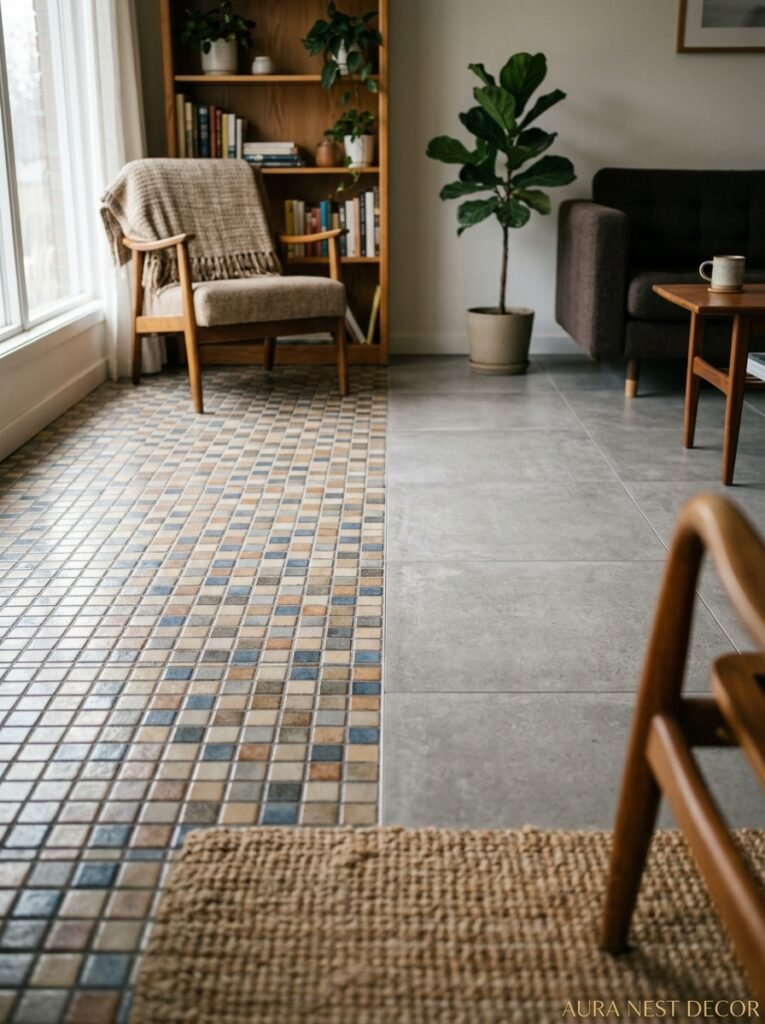
But in a smaller or more traditional space? Medium tiles, maybe 12×12 or 18×18, give the room something to work with. And small format tiles — think 4×4 cement tiles with a pattern, or classic Victorian-style encaustic tiles — can actually make a room feel MORE intentional, not more cramped. It’s about whether the pattern has enough breathing room or whether it’s competing with everything else.
The honest rule: don’t choose tile size based on a formula. Choose it based on what the room is actually shaped like and what feeling you’re going for.
—
3. The Color That Keeps Showing Up in Every Beautiful Living Room Right Now
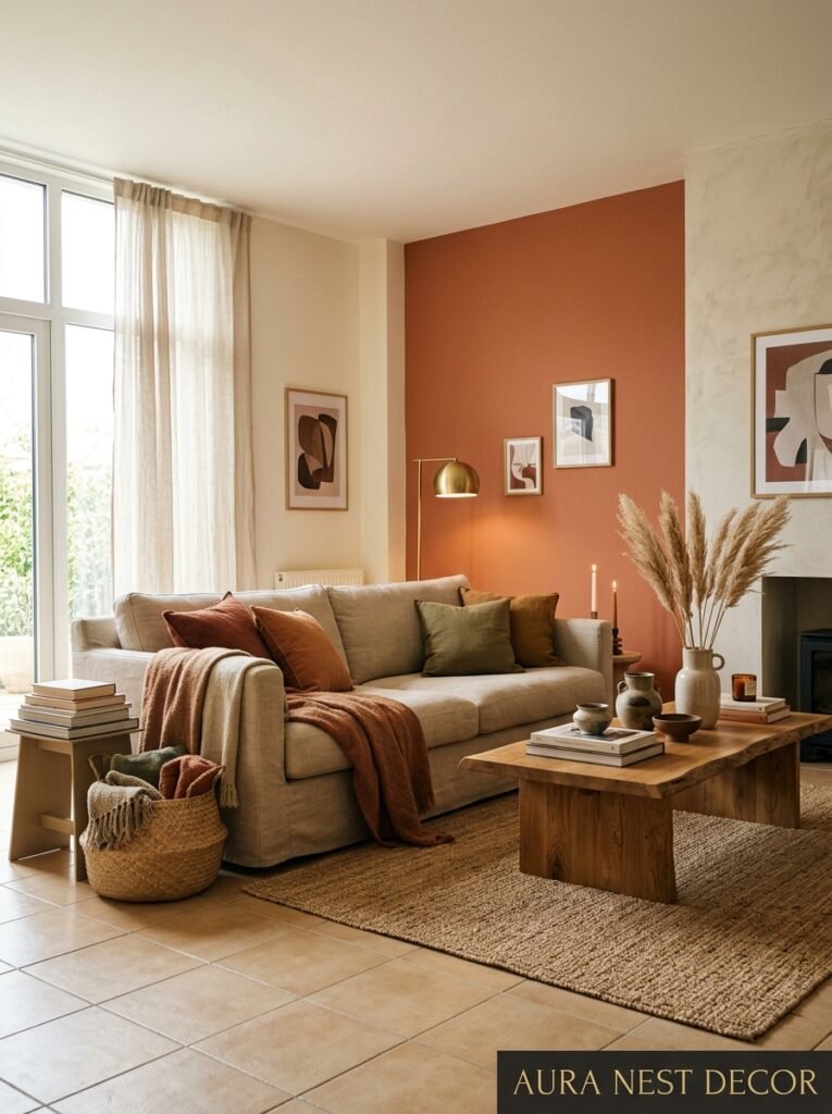
Warm greige. Specifically, that particular shade that sits somewhere between a pale warm tan and a light grey — not beige, not grey, but this in-between thing that somehow works with everything.
But more than that: warm-toned tiles in general are having a moment, and it’s not just a trend. There’s a real logic to it. Cold white or blue-grey tiles look sharp in photos but they’re hard to live with. They make a room feel temperature-wise cold, even when it isn’t. They flatten natural light instead of catching it.
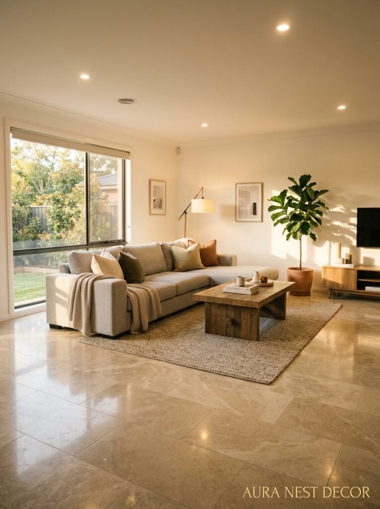
Warm stone tones — cream marble with gold veining, sandy limestone-look porcelain, those slightly peachy terracotta shades — they do something different. In the morning light they glow. At dusk, with a lamp on, they go almost amber. They make a room feel occupied, alive, like someone actually lives there and enjoys it.
I’m not saying cold tones are wrong. A pale slate-grey tile in a very deliberate, moody room with dark walls and brass hardware can be stunning. But if you’re not sure? Warm is almost always the safer call. And weirdly, it’s also the bolder one right now, because everyone’s defaulting to those flat grey tones that don’t do anything interesting under changing light.
—
4. What “Stone Look” Actually Means and When It’s Not the Cop-Out It Sounds Like
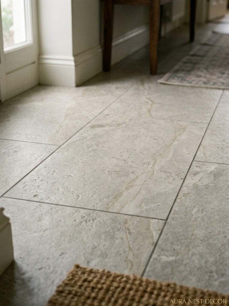
So, real stone versus stone-look porcelain. Let’s just have this conversation.
Real stone — actual marble, travertine, limestone — is genuinely beautiful. The variation is real, the texture is real, the way it changes with age is real. There’s no faking that. In a living room with underfloor heating and a lot of foot traffic, though, natural stone needs sealing, regular maintenance, and the occasional moment of accepting that yes, that red wine is now part of the floor’s story.
Stone-look porcelain has improved MASSIVELY. We’re not talking about the fake-looking stuff from the early 2000s that looked plasticky and wrong. Modern rectified porcelain with high-definition printing can be genuinely difficult to distinguish from the real thing at a glance, especially in larger tiles where the variation gets to play out properly.
The practical advantages are real: more consistent coloring, easier to clean, doesn’t need sealing, more resistant to scratching and staining. For a family living room — kids, dogs, the general chaos of actually living in a space — stone-look porcelain is a completely legitimate choice. Not a compromise. An actual decision.
That said: don’t get the cheap version. The difference between a mid-range stone-look and a budget stone-look is enormous. The cheap ones have visible repeating patterns in the print, and your eye catches it, even if you can’t articulate why the floor feels slightly off.
“Spend more on the floor than anything else in the room. It’ll outlast everything else anyway.”
—
5. The Pattern Tile Question: Brave or Chaotic?
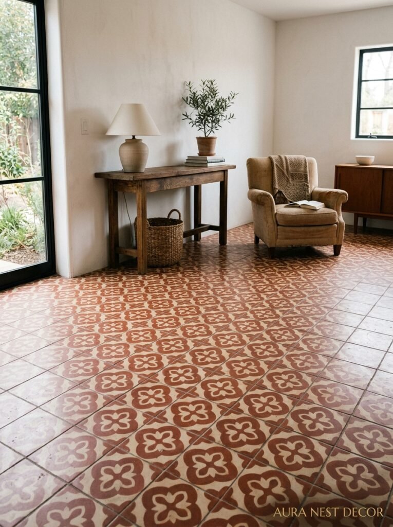
Pattern tiles in a living room scare people. I get it. A patterned floor feels like a commitment, and it IS a commitment — you’re not changing that next season.
But here’s what I’ve noticed: the rooms that photograph best, the ones that feel the most considered and the most personal, almost always have something interesting happening on the floor. Not necessarily a loud, maximalist pattern, but something beyond plain.
Encaustic cement tiles — those graphic, geometric, or floral tiles that were everywhere in Victorian-era British homes and Spanish and Moroccan architecture — are incredible in a living room. They add the kind of soul that no amount of soft furnishings can replicate. A herringbone pattern in a two-tone neutral colorway (cream and charcoal, or warm white and dusty sage) reads as sophisticated, not chaotic.
The trick with pattern tiles is to keep everything else quieter. Walls in a plain, calm tone. Furniture in solid colors or very subtle textures. Let the floor be the thing. It can absolutely carry a room on its own, and it’ll do it more durably and interestingly than any wallpaper.
If full pattern feels like too much, there’s a middle ground: a border tile. Plain field tiles in the main area with a contrasting pattern tile border around the perimeter. Very traditional, very beautiful, very easy to live with long-term.
—
6. Grout: The Detail That Either Makes It or Ruins It
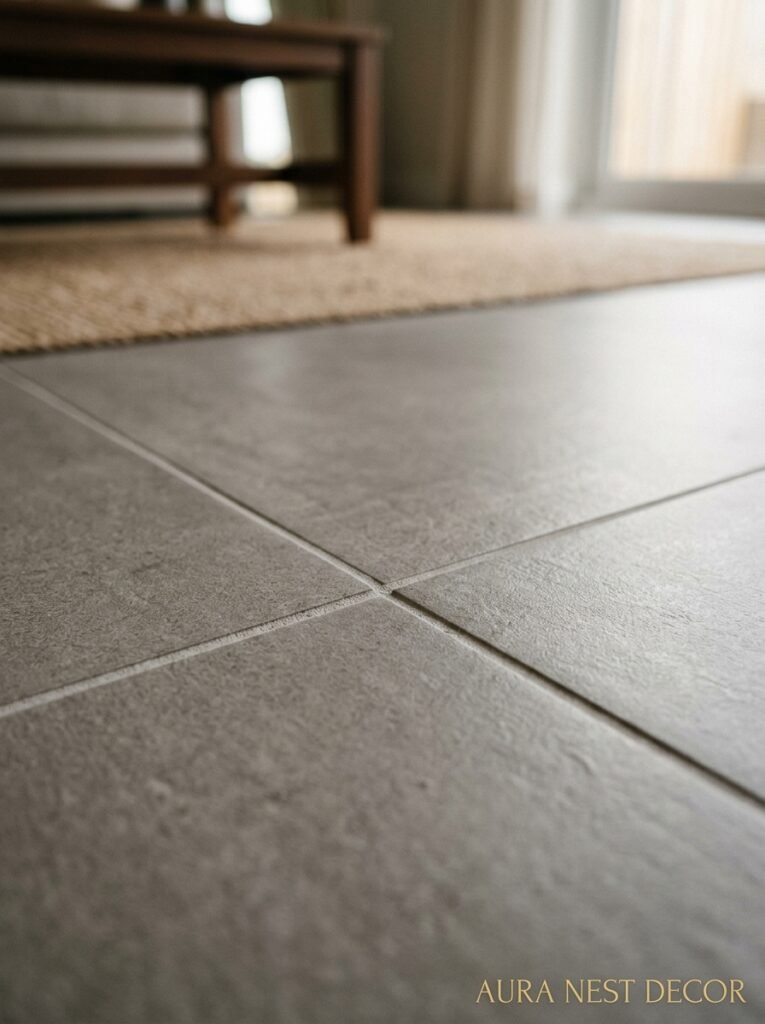
I cannot stress this enough. The grout color is doing so much work and it gets almost no attention in the planning phase.
Matching grout — where you choose a grout color very close to the tile — makes the floor read as one seamless surface. This works brilliantly with large format tiles, stone looks, and anything where you want the material itself to be the focus. It’s clean, it’s calm, it visually expands the space.
Contrasting grout — dark grout with light tiles, or vice versa — draws the grid. It emphasizes the individual tiles, the pattern, the layout. This is gorgeous with geometric shapes or herringbone layouts where the pattern IS the point. But if your tile laying isn’t perfectly straight? Contrasting grout will show every tiny wobble. Not ideal.
One practical note for UK readers especially: those traditional Victorian black-and-white encaustic tiles with dark grey grout have a very specific, period-appropriate look that’s doing a revival in British homes right now, and it’s working beautifully.
And please — PLEASE — use the right grout width. Large format tiles typically need very thin grout lines (1-2mm). Rustic or handmade-look tiles often want a wider joint (sometimes 5-8mm) because it reads as more artisanal and organic. Getting this wrong is subtle but it nags at you every time you look at the floor.
—
7. Underfloor Heating and Tiles: What They Don’t Tell You at the Tile Shop
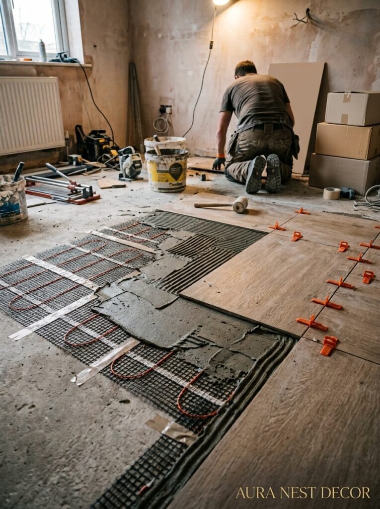
Tiles are the best flooring option for underfloor heating. Full stop. They conduct and hold heat better than almost anything else, and they release it evenly. A tiled floor with underfloor heating on a cold January morning is — honestly — one of the small domestic pleasures that people don’t talk about enough.
But there are things to sort out before you commit. Not all tiles work equally well with underfloor heating systems, and the adhesive matters as much as the tile. You need a flexible tile adhesive, specifically one rated for underfloor heating use. Standard adhesive can crack over time as the floor heats and cools through daily cycles.
Also: tile thickness. Thinner tiles (10mm or under) conduct heat faster and more efficiently than very thick tiles. This isn’t a dealbreaker with thicker tiles — but if you’re installing a new system specifically to heat a tiled floor, it’s worth factoring into your tile choice.
And one thing that catches people out: the system needs time. A newly installed UFH system under tiles should be commissioned slowly — gradually increasing temperature over a couple of weeks rather than blasting it full heat immediately. This lets the adhesive and grout cure properly. Your installer should tell you this, but not all of them do.
“A warm tiled floor in February costs less to run than you think and feels better than you’d imagine.”
—
8. The Layout Direction That Changes How a Room Reads
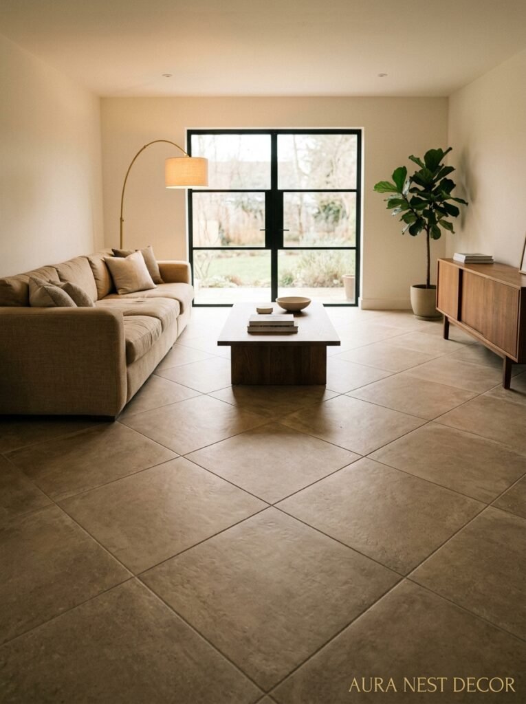
Where to start, which way to run the tiles — this sounds like a builder’s question but it’s actually a design decision.
Running tiles lengthways along the longest wall of a room makes it look longer. Running them on the diagonal (45 degrees to the walls) makes the room feel wider, more dynamic, slightly French-country-ish. It also uses more tile because of the cutting at the edges — budget for about 15% extra waste if you go diagonal.
Herringbone is having a big moment in living rooms right now. It’s traditionally a wood floor pattern but it’s being used in tile now, especially with large rectangular tiles in stone looks or concrete finishes, and it looks genuinely beautiful. More complex to install, so make sure your tiler has actually done it before and not just watched it on YouTube.
One thing that gets overlooked: where you start the layout matters. A good tiler will plan the layout so that cut tiles at the perimeter are equal on both sides, and that the first full tile visible from the main doorway is centered. Get this wrong and the floor looks slightly off even if you can’t immediately say why.
—
9. Concrete-Look Tiles: Still Worth It or Finally Over?
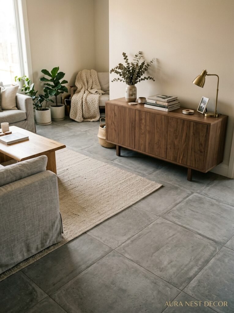
Okay, honestly? Concrete-look tiles aren’t over. I know they’ve been everywhere for years and there’s been this collective sense of “haven’t we all moved on from this” — but a well-chosen concrete-look tile in a living room is still doing something no other finish really does.
It’s got this particular quality: industrial but not cold. Minimal but not sterile. It works with almost any furniture style, from mid-century to contemporary Scandinavian to even more traditional pieces if you’re mixing deliberately. The warm versions — those slightly greige or putty-toned concrete looks — are especially liveable.
The ones to avoid: the very dark, almost charcoal concrete tiles that look amazing on Instagram and then absorb all the light in a real room. They work in spaces with serious natural light. In a UK front room that gets maybe three hours of direct sun a day? They’re going to make everything feel grey and a bit heavy.
If you love the concrete aesthetic, look at the mid-tone versions. And pair them with warm textiles — chunky knit throws, wool rugs in cream or terracotta — to keep the room from feeling sparse.
—
10. The Rug Situation When You’ve Got Tiles Down
You’ve put in beautiful floor tiles. Now people tell you to cover them with a rug. And yes — you should. But not to hide the tiles.
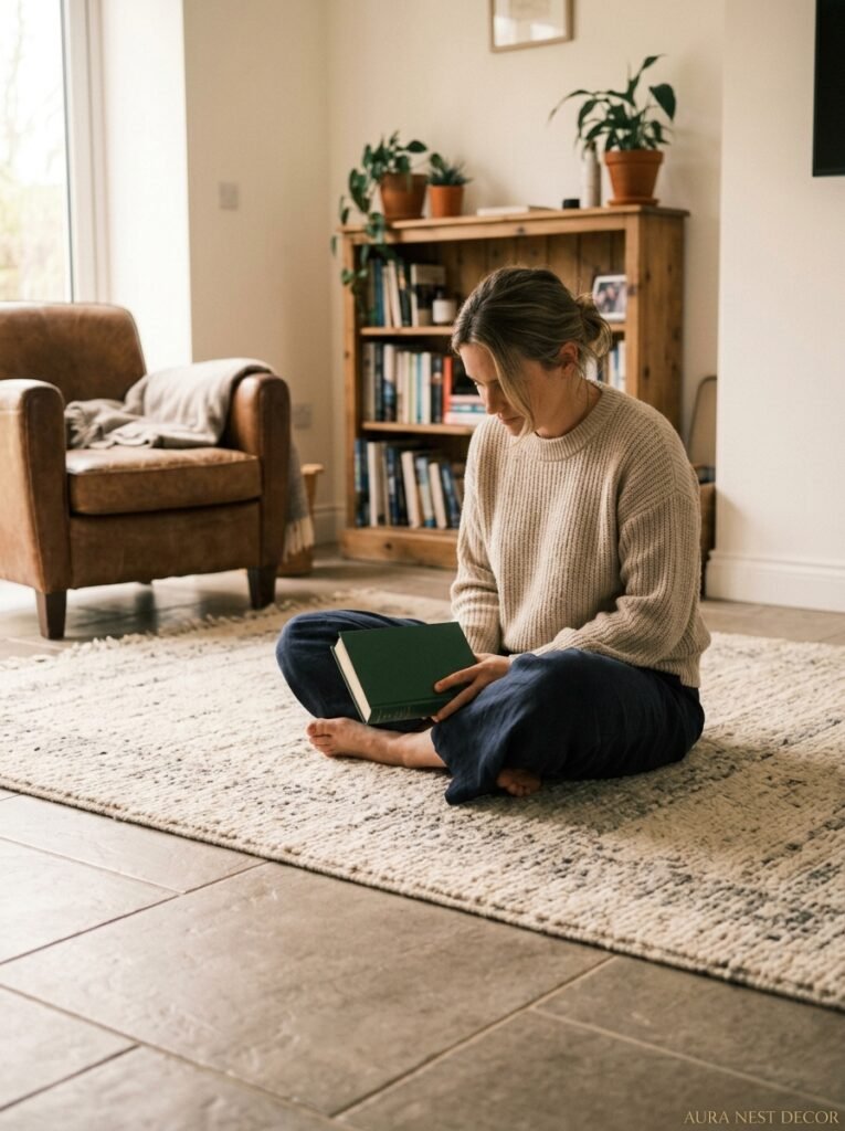
A rug over tile flooring works differently than a rug over carpet or wood. The tile is still visible around the edges, and that framing is actually part of the aesthetic. The tile becomes a kind of “frame” for the rug, and both are visible and contributing to the room.
For this to look intentional, the rug needs to be properly sized. Too small and the tile border looks accidental, like you just plopped a rug down. The rug should extend at least a foot beyond the main seating cluster on all sides. In a bigger living room, even bigger — think 8×10 or 9×12 feet minimum.
Natural fiber rugs — jute, sisal, seagrass — look brilliant on tile because they add warmth and texture without competing. So do flatweave wool rugs in quieter tones. The rug needs a good non-slip underlay because tile is significantly more slippery than carpet, and the rug WILL move without one.
—
11. The Tile Finish That Everyone Overlooks and Then Regrets
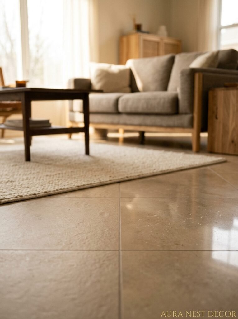
Glossy tiles in a living room. Let’s talk about this.
High-gloss tiles reflect light beautifully in a showroom. They’re dramatic, they photograph brilliantly, they make colors look richer and more intense. And they show every single footprint, every scuff, every piece of dust.
In a living room — which is a LIVED-IN room — high gloss is a maintenance choice as much as a design choice. If you’re the kind of person who wipes their floors every couple of days, go for it. If you’re the kind of person who lives a normal life, a matte or satin finish will look clean and beautiful under daily conditions without requiring constant attention.
Matt finish tiles have this great quality where they hide imperfections in both the surface and the cleaning frequency. They also tend to look more natural — stone looks especially work better in matte because actual stone isn’t shiny.
Semi-polished (sometimes called lappato or satin) is the compromise: a bit of the light reflection, considerably less fingerprint drama. Worth looking at if you genuinely can’t decide.
—
12. The Budget Truth Nobody Wants to Say Out Loud
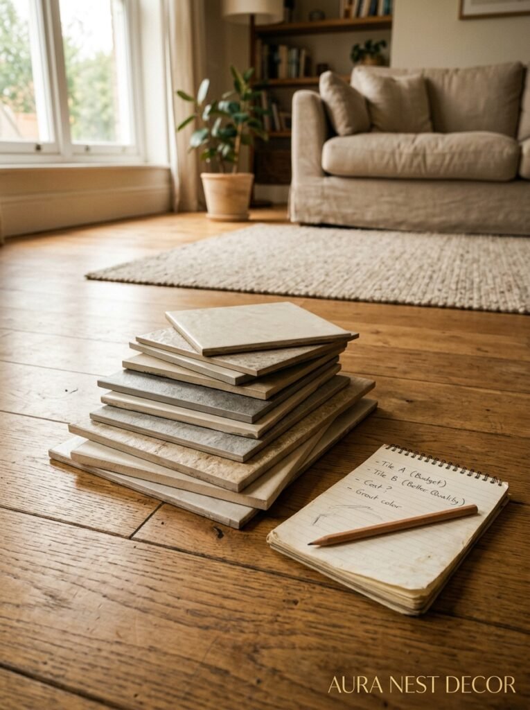
Here’s the bit where I’m just going to be honest with you. Living room floor tiles have an enormous price range — we’re talking anywhere from $2/sq ft for basic ceramic to $30+/sq ft for genuine marble or high-end designer porcelain.
And the installation cost is separate from the tile cost, and it’s significant. A good tiler — someone who’ll plan the layout properly, use the right adhesive, get the grout lines right — costs real money. In the US, you’re typically looking at $5-15/sq ft for installation depending on complexity and location. In the UK, day rates for skilled tilers run £200-400+ depending on the region and job complexity.
The math that most people get wrong: they spend money on nice tiles and then try to save on installation. This is exactly backwards. A mediocre tile installed beautifully will look better than a gorgeous tile installed badly. Every time.
My actual advice: spend mid-range on tile (where the quality-to-price ratio is best), and don’t cut corners on the installer. Get quotes, look at their portfolio, ask specifically if they’ve done the tile format and pattern you want. A great floor installed correctly will last twenty years and still look right. That’s the value equation worth doing.
—
❓ FAQ
Q: Can you put floor tiles in a living room even if you have wood floors in the rest of the house? A: Yes, absolutely — and it can look really intentional if the transition is handled well. A threshold bar or a deliberate design step (like a slight level change or a contrasting border tile) marks the boundary cleanly. The key is making sure the tile height aligns reasonably with the adjacent floor height so there’s no tripping hazard.
Q: How do you keep tile floors warm in a living room during winter? A: Underfloor heating is the best answer, but if that’s not an option, a large area rug over the tile makes an enormous difference. Layer a wool rug over a thick underlay and the floor will feel genuinely cozy even in the coldest months. The tile itself holds any ambient heat well, so a warm room stays warmer longer.
Q: Is it hard to change living room floor tiles once they’re laid? A: Hard, yes — but not impossible. Tiles are bonded with adhesive and often the subfloor comes up with them. It’s a significant job. This is genuinely why it’s worth spending time getting the choice right before committing. Think of it as a 10-15 year decision, minimum, and choose accordingly.
—
💭 Final Thoughts
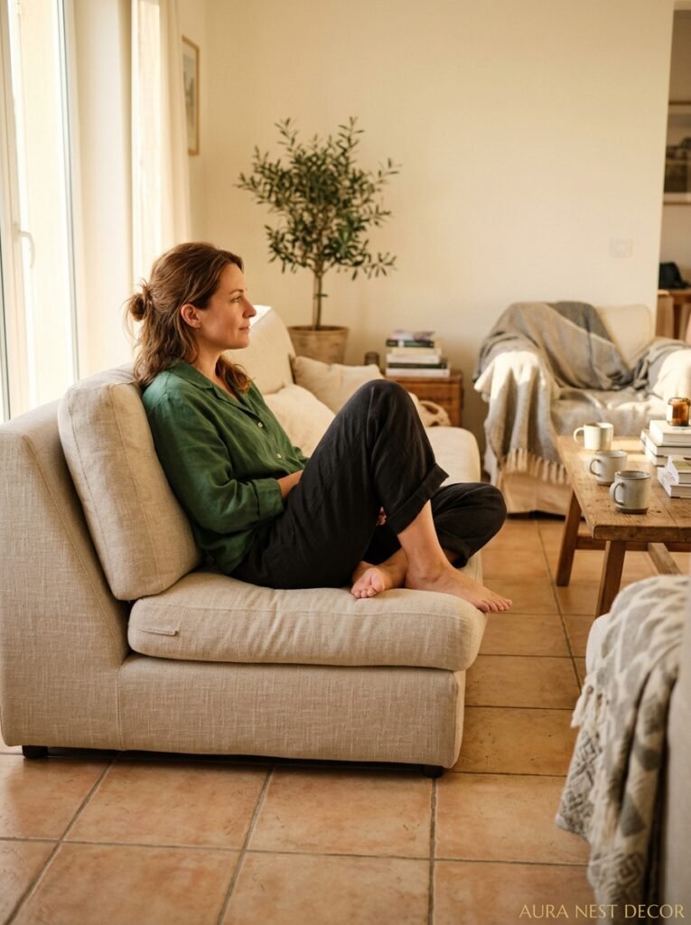
The floor is the room. Not the statement piece, not the accent wall — the floor. Get it right and everything else has something to respond to. Get it wrong and no amount of styling will fully fix it.
I know it feels like a lot of pressure for something that goes underfoot. But that’s kind of the point — it’s always there, always contributing, quietly setting the tone for every single moment that happens in the room.
So what’s the floor feeling you actually want to walk into every morning?




