
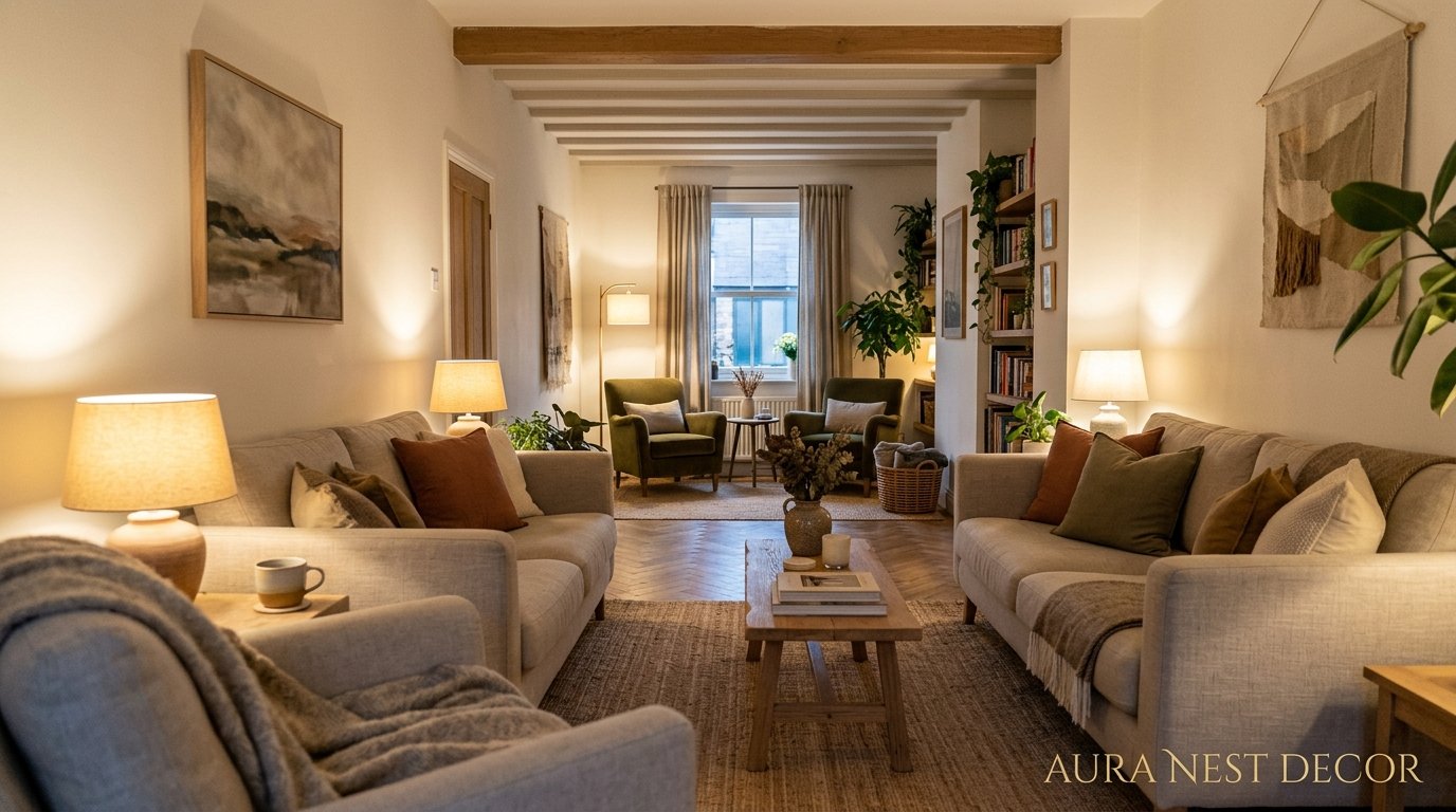
The Long Living Room Problem Nobody Talks About (And What Actually Works)
You’ve got the space. That’s the thing — you have MORE than enough square footage, and somehow the room still feels wrong. Too much of it running in one direction, furniture shoved against walls, a layout that makes the whole thing feel like a hallway with a sofa.
Long living rooms are one of the trickiest spaces to style well. And most advice completely misses the point.
—
1. Why “Just Add a Rug” Advice Makes Things Worse
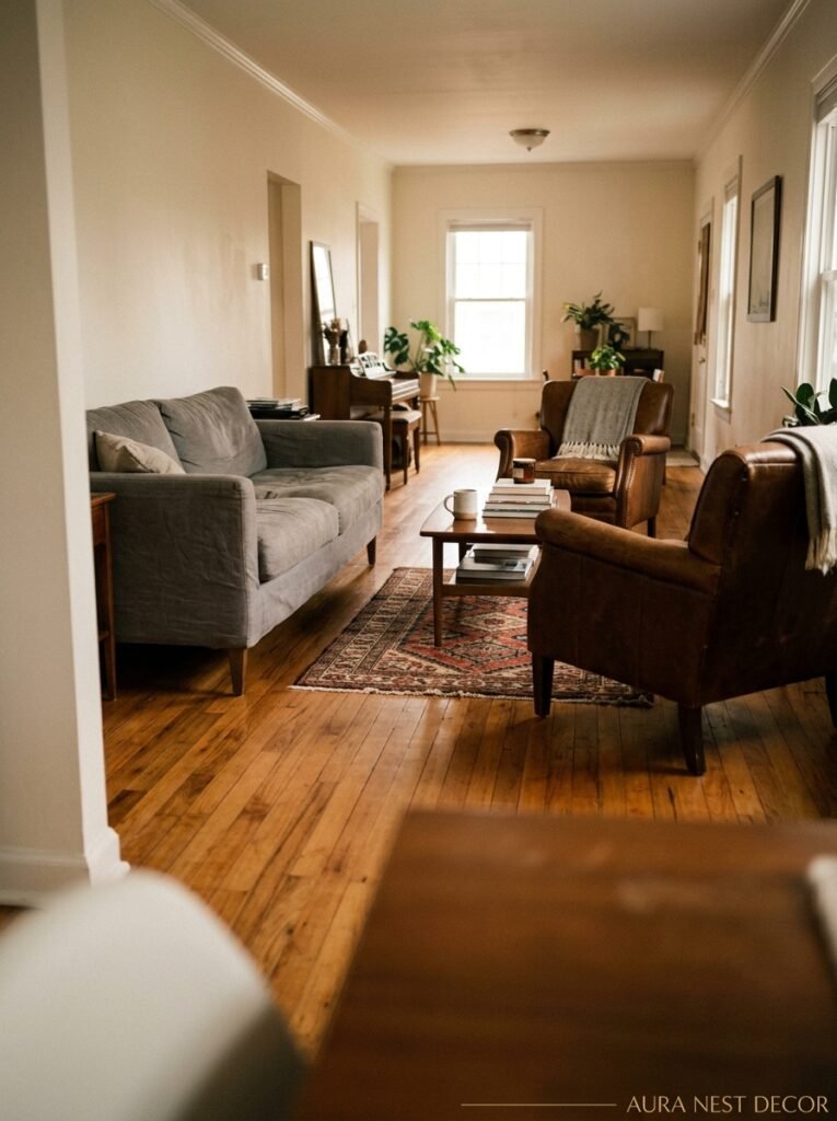
Here’s what happens. You Google “long living room ideas,” you see seventeen photos of beautiful, narrow rooms with giant rugs and floating sofas, and you think — okay, I’ll do that. So you buy the rug. You float the sofa. And somehow the room looks… worse. More obviously stretched. More corridor-like than before.
The problem isn’t the rug. It’s the assumption that a long room needs one seating zone, just styled better. It doesn’t. A long room is essentially asking you to create multiple moments — actual destinations within the space — and most people skip that part entirely because it feels complicated or expensive.
It’s not. But you do have to rethink the room from scratch, which means letting go of the idea that your sofa is the center of everything. In a long room, the sofa is just the beginning. The room keeps going after that, and what you do with those extra feet is what separates a room that feels intentional from one that just feels long.
“A long room isn’t a layout problem. It’s an invitation to do something more interesting than one sofa and a TV.”
—
2. The Ratio That Architects Actually Use (And You’ve Probably Never Heard Of)
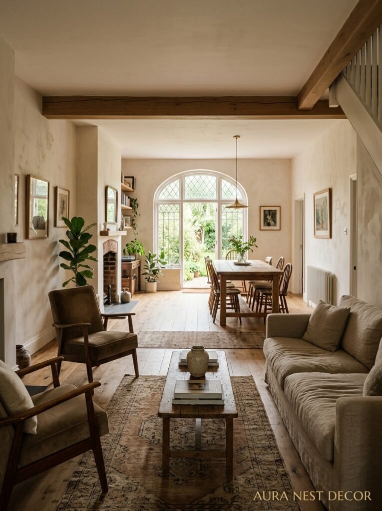
Okay so this isn’t some secret formula — but it kind of is, the way nobody ever talks about it in casual home decor content. When a space is significantly longer than it is wide, designers often aim for a 1:2 ratio of width-to-zone. Meaning if your room is 12 feet wide and 28 feet long, you’re basically looking at two distinct zones, not one. Roughly 14 feet each.
That sounds clinical. But in practice, it just means: stop trying to make one layout work across the whole room. You’re not solving one problem. You’re solving two smaller, more manageable ones.
A conversation seating area at one end. A secondary purpose — reading nook, work corner, game table, extra sofa — at the other. And a thoughtful transition in between, which might be a console table, a tall bookcase placed perpendicular to the wall, a pendant light that signals “the room changes here.” That transition point is everything. It’s the thing that makes a long room feel curated instead of just… long.
—
3. The Perpendicular Bookcase Trick That Interior Designers Are Quietly Obsessed With
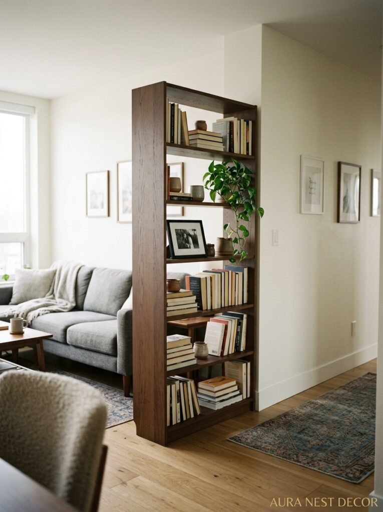
Not gonna lie, the first time I saw this done well I genuinely stopped scrolling. Someone had taken a long, awkward living room in what looked like an older terraced house — classic UK proportions — and placed a low open bookcase perpendicular to the longest wall. Not all the way across. Just about two-thirds of the way, like a half-wall.
It divided the room without closing it off. The sofa sat on one side of the bookcase facing a TV. The other side had a reading chair and a floor lamp. Both areas felt private but connected, and the room suddenly had DEPTH instead of just length.
You can do this with a bookcase, a credenza turned sideways, a slatted room divider, even a large indoor plant arrangement on a bench. The key is that it doesn’t reach the ceiling and it doesn’t reach the other wall. It interrupts the eye without blocking it. Your brain reads “two spaces” instead of “one very long space.”
—
4. What British Terraced Houses Figured Out Long Before Pinterest Did
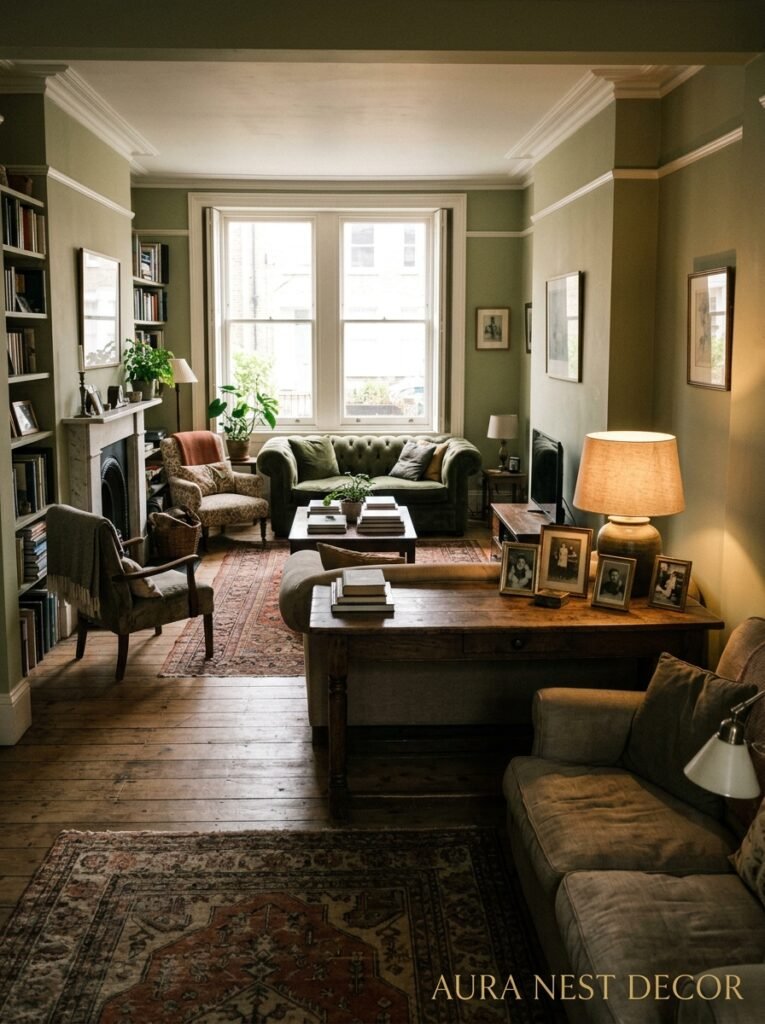
If you’ve spent any time in a Victorian or Edwardian terraced home in the UK — and if you’re a British reader, there’s a good chance you live in one — you already know that “long and narrow” isn’t a flaw, it’s just an architectural reality. These houses were built with front reception rooms and back reception rooms that flow into each other, often through original archways or knocked-through openings.
What the best-decorated versions of these homes do is lean into that linear flow rather than fight it. The rooms run in a sequence, each one slightly different in mood. A slightly more formal front sitting area near the window, a warmer, softer space toward the back near the kitchen. The color might shift slightly. The lighting gets warmer. The furniture gets lower and more relaxed.
American homeowners with long open-plan spaces can steal this logic completely. You don’t need separate rooms. You need separate MOODS across the length of the space. Different lighting zones, different textures, slightly different palettes that relate to each other without being identical. That’s how you make a 30-foot room feel like somewhere you actually want to be in, rather than somewhere you’re passing through.
—
5. The Color Trap That Makes Long Rooms Feel Like Tunnels
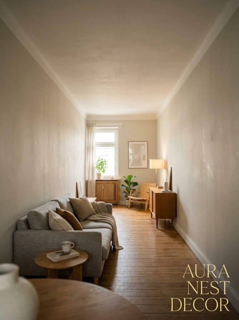
If you paint every wall the same color — even a beautiful color — in a long room, you’ve essentially turned it into a tunnel. The eye shoots straight to the far wall and that’s all it does. There’s nothing to stop it, nothing to pull it sideways.
So you’ve got two options, and both of them work. The first: paint the far short wall a slightly deeper or more saturated version of your main color. This is called color depth and it creates the illusion that the far wall is closer than it actually is, which makes the room feel squarer. Warm terracottas, deep greens, moody blues — all brilliant for this.
The second option, which I personally think is more interesting: use the color change to mark your zone transition. The reading nook end gets a different wall treatment altogether — a contrasting paint color, wallpaper, limewash, board and batten. Suddenly the room isn’t one long stretch, it’s two distinct spaces that happen to be connected. It’s almost cheeky how well this works.
“Paint the far wall and you trick the eye. Wallpaper it and you give people a reason to walk toward it.”
—
6. Lighting at 7pm Is More Important Than Any Furniture Decision You’ll Make
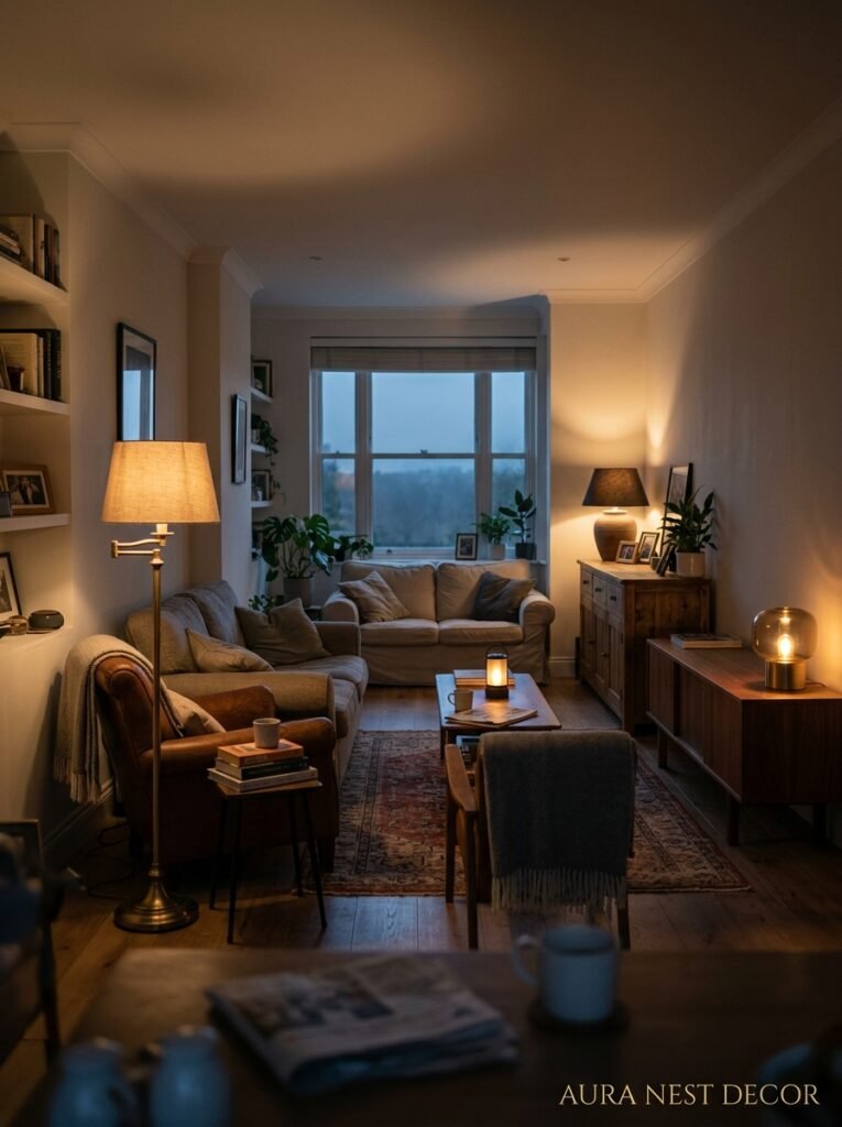
This is the thing that doesn’t photograph well but completely changes how a room FEELS. In a long living room, overhead lighting is basically your enemy. It flattens everything, it emphasizes the length, and it makes the room look like a hotel corridor at 11am.
What you want is layered light. Multiple sources. Low. Warm. At different heights and different ends of the room.
A floor lamp near the sofa — not the ceiling, the floor. A table lamp on the console table that marks the middle of the room. A pendant over a secondary seating area if you have one. Maybe an LED strip behind your TV unit or under a floating shelf. The amber glow of an Edison bulb at 7pm doesn’t just look good — it makes the room read as shorter and warmer because the far end of the room disappears into soft shadow instead of being lit up like an airport.
And honestly? Candles. I know that sounds obvious but a few real candles on a fireplace or a coffee table change the entire atmosphere of a long room in a way that no lamp fully replicates. It’s not decorative. It’s functional mood management.
—
7. The Sofa Direction Mistake Almost Everyone Makes in a Long Room
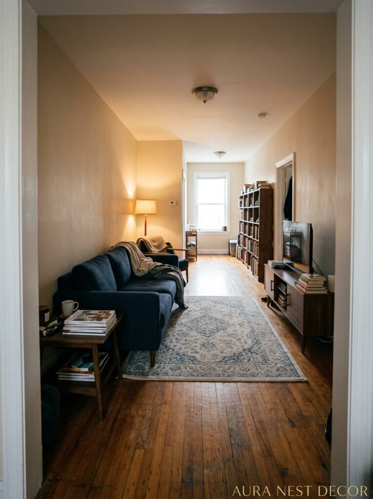
Most people put the sofa on the long wall, parallel to the room’s length. Makes sense on paper. Terrible in practice.
When your sofa runs with the length of the room, you’re reinforcing that tunnel feeling. You’re making the room look longer and narrower. And you’re guaranteeing that anyone sitting at one end of the sofa is basically in a different postcode from the person at the other end.
Try this instead. Pull the sofa away from the wall — even 18 inches is enough — and angle the whole seating group inward. Even better, try placing the sofa perpendicular to the long wall, essentially facing across the width of the room. It sounds counterintuitive. It feels weird when you first do it. But it immediately makes the room feel wider and more intimate because you’re working with the room’s narrow dimension instead of its long one.
The gap behind the sofa becomes an opportunity too. A narrow console table, a row of plants, a lamp on a stack of books. You’re not losing space — you’re gaining a little styled moment that makes the room look like it was designed by someone who knew what they were doing.
“Move your sofa off the long wall and suddenly you’re working with a completely different room.”
—
8. Why Two Rugs Beat One Big Rug Every Single Time
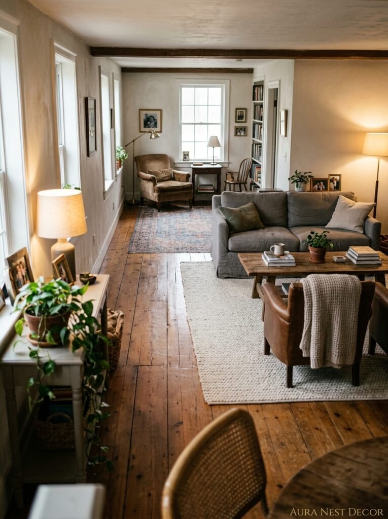
The instinct is to get one massive rug and anchor the whole room with it. And look — one rug CAN work. But in a room over about 22 feet long, a single rug (even a very large one) tends to either end too soon, leaving a sad stretch of bare floor at one end, or it covers everything and the room looks like one continuous blob with no hierarchy.
Two rugs. Full stop.
One under the main seating area, anchoring the sofa and coffee table and any chairs. A second — different size, possibly different texture but in a complementary palette — under whatever you’ve got going on at the other end. A reading chair. A console and two low stools. A small games table.
The two rugs signal that the room has two purposes, which is actually appealing rather than confusing. People understand that this is a room designed for more than just watching telly. And the visual break between the rugs — even if it’s just a foot or two of bare floor — acts as a natural border between zones in the most subtle way possible.
—
9. The Console Table That Does All the Work Nobody Sees
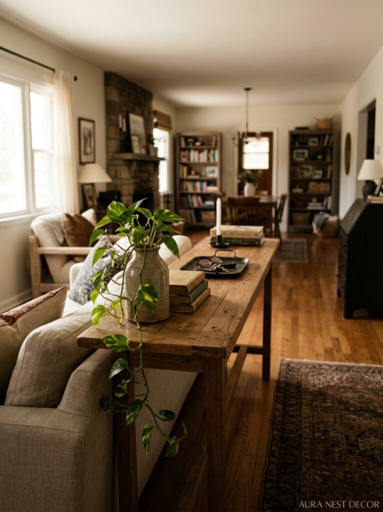
Console tables are the most underrated furniture piece in a long room. Most people think of them as narrow tables you put against a wall with a lamp and a mirror. And they ARE that. But in a long living room, a console placed with intention becomes a zone divider, a styling moment, and a visual anchor all in one.
Placed behind a floating sofa, it fills the gap between the sofa back and the wall — which is always awkward. Placed perpendicular to the wall as a kind of low-profile room divider, it marks the boundary between zones. Placed against the far short wall, it draws the eye to something beautiful at the end of the room instead of just… a wall.
Style it with varying heights. Tall lamp. Low decorative object. A plant that spills downward. Something leaning — a small framed print, a mirror. The mix of heights is what stops it looking like a shelf display and starts making it look like something someone actually lived with and thought about over time.
—
10. The One Piece of Advice for UK Sash Window Rooms Specifically
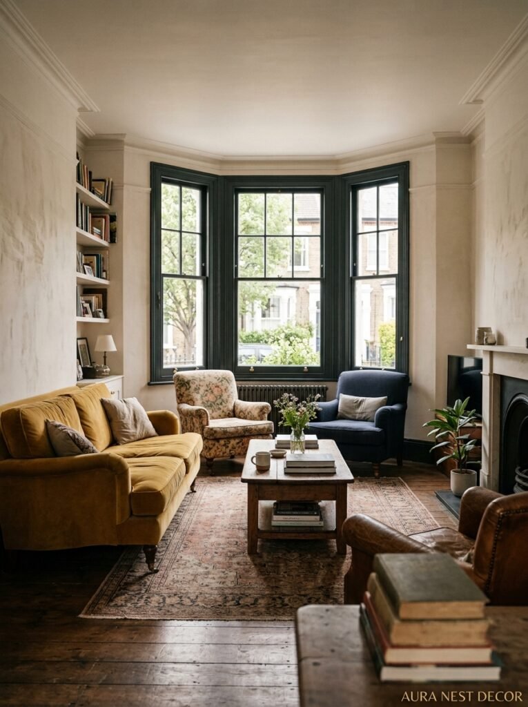
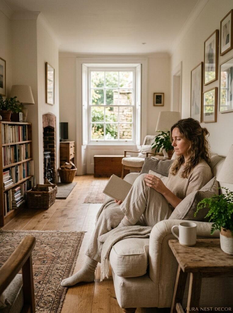
If your long living room has original sash windows on the short end — common in older UK homes — this is actually a gift you might be underusing. A window at the END of a long room does something that no designer trick can fully replicate: it terminates the view on something real and beautiful.
So don’t block it. Don’t put tall furniture in front of it. Don’t hang heavy curtains that eat the light. Instead, work the furniture toward it rather than away from it. A low reading chair positioned to face the window at an angle. A small side table within reach. Maybe a window seat if the sill is deep enough.
You’re creating a destination. A reason to walk the length of the room, which is what long rooms need more than anything — a payoff at the far end.
—
11. The Gallery Wall Placement That Actually Works (Hint: Not on the Long Wall)
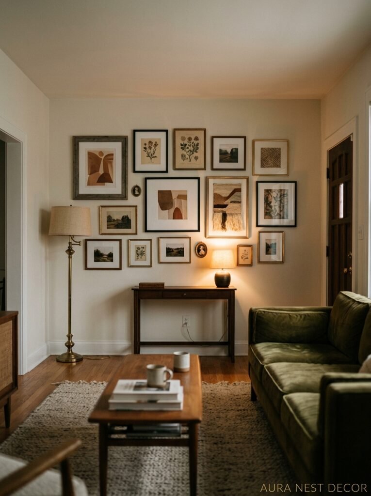
The obvious move in a long room is to cover that long wall with art. And it can look gorgeous — I won’t pretend it can’t. But if you ONLY hang art on the long wall, you’re again reinforcing the tunnel. Everything’s running in one direction.
What works better: hang your statement gallery wall on one of the SHORT walls. The end wall. The “back” of the room. It gives people something to look at across the width of the room. It creates a focal point that pulls the eye horizontally rather than straight through the space.
Or — and this is my actual favorite move — hang a significant single piece of art on the long wall, roughly centered, slightly larger than feels comfortable. Not a gallery. One piece. Large enough that it interrupts the visual run of the wall and gives the eye somewhere specific to land. An 80×60 cm print in a simple frame. A vintage textile. A leaning mirror that’s just too big. That one moment of interruption does more work than a full gallery spread.
—
12. The Small Adjustments That Somehow Make the Biggest Difference
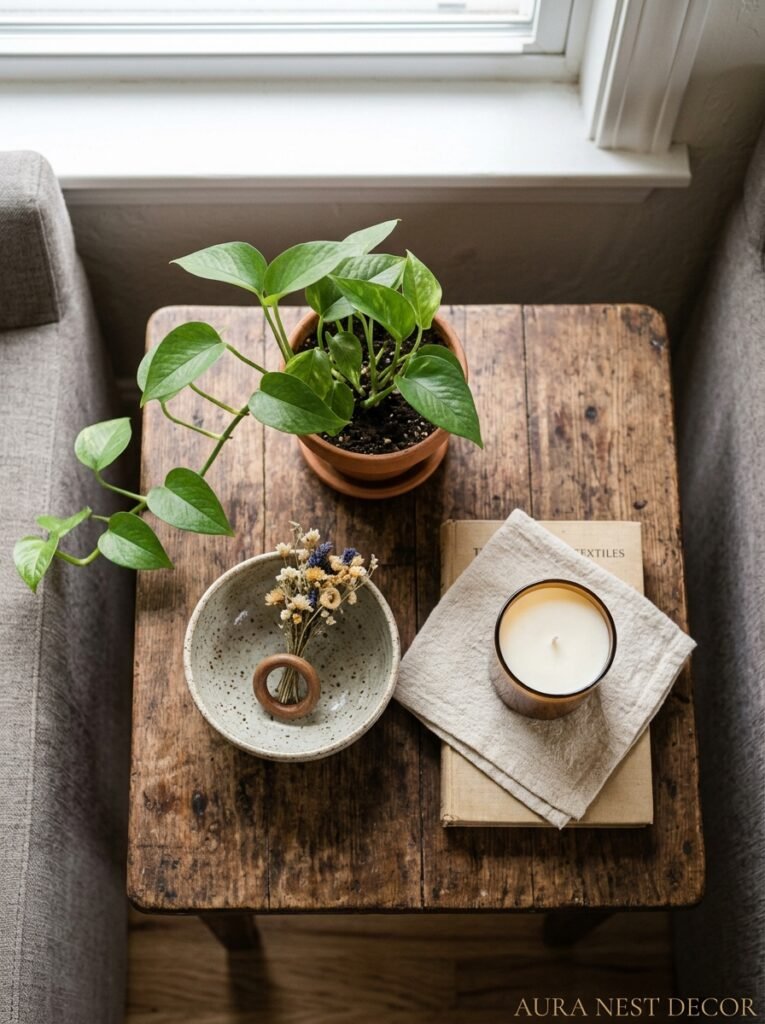
A plant in the corner that’s about five feet tall — not a shelf plant, a FLOOR plant — does something almost architectural to a long room. It breaks the horizontal run of the space with a vertical moment.
Window treatments hung from ceiling to floor, even if the actual window is much smaller. This makes the ceilings feel higher AND the room feel wider — two things a long room desperately needs.
Placing a mirror on the short wall rather than the long one reflects the width back at you. Sounds small. It isn’t.
And this last one: don’t match your lighting temperatures. Warm bulbs at one end, slightly cooler at the other. It creates the sense that you’ve moved into a different space — different time of day, different atmosphere — even though you’ve only walked eight feet. It’s the kind of thing nobody notices consciously but everyone FEELS.
—
❓ FAQ
Q: How do I make a long narrow living room feel wider without major renovation? A: Pull furniture away from the walls, especially the sofa — floating it even 18 inches creates breathing room. Use mirrors on the short walls to reflect width back at you, and hang curtains as wide and as high as possible to make the windows appear larger. These three moves cost almost nothing and shift the entire perception of the room.
Q: What size rug should I use in a long living room? A: In a long room, consider two rugs instead of one — a larger rug (typically 8×10 or 9×12 feet in a US context, or roughly 240x300cm in UK sizing) under the main seating area, and a smaller one anchoring a secondary zone at the other end. This breaks the room into visual chapters and is usually more effective than hunting for one rug big enough to cover everything.
Q: How do I create two zones in a long living room without it looking chaotic? A: Connect them through color. Use the same two or three tones across both zones — just remix how they appear. If your main zone has a cream sofa with terracotta accents, let the secondary zone be more terracotta-heavy with cream cushions. Relate them, don’t repeat them. That relationship is what makes the room feel designed rather than just crammed with furniture.
—
💭 Final Thoughts
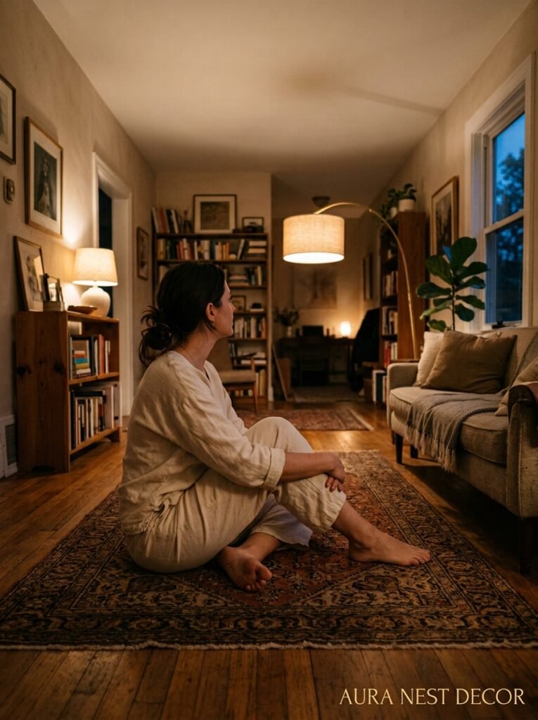
Long living rooms aren’t a problem to solve — they’re a brief to work with. The instinct to fight the length, to somehow make the room look square, is almost always the wrong one. The better instinct is to lean into it, give it purpose all the way down, and create a room that people actually want to move through and linger in.
You’ve got more to work with than you think. And honestly — isn’t a room with a reading nook at one end and a soft conversation area at the other pretty much the dream?




