
Why Gray Living Rooms Are Having a Moment Again (And This Time, They’ve Figured It Out)
You scroll past the beige living rooms, the greige ones, the ones that all kind of blur together. And then a gray one stops you cold. Not because it’s neutral. Because it’s ALIVE.
—
1. The Reason Gray Rooms Failed the First Time (And What’s Different Now)
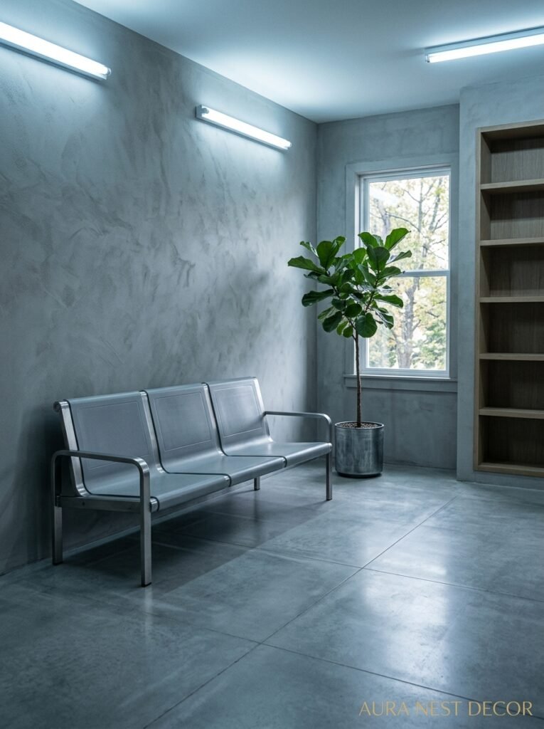
Here’s the thing nobody wants to admit: gray went wrong in the 2010s. Not because gray is a bad color — it’s never been a bad color — but because everyone painted their walls Farrow & Ball Elephant’s Breath and called it a day, then sat in a room that felt like a hospital waiting area with better throw pillows.
The problem wasn’t the gray. It was the nothing else. Cold gray walls, cool gray sofa, silver-toned accessories, and suddenly you’ve got a room that photographs beautifully and feels absolutely horrible to sit in at 6pm in January when you just want it to feel like a home.
What’s different now is texture. And warmth. And honestly, a bit of nerve.
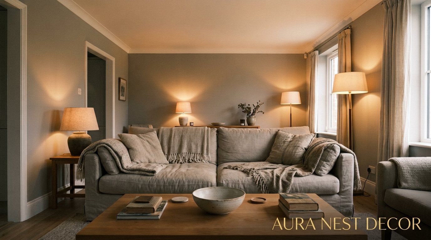
The gray rooms that are stopping people mid-scroll right now? They’re pairing cool walls with warm wood floors that feel almost honey-colored. They’re throwing a terracotta cushion into the mix and somehow it works completely. There’s a sheepskin rug over a linen sofa, a lamp casting that amber glow at 7pm, a stack of books with broken spines on the coffee table. Gray is the background now, not the whole story.
That’s the shift. Gray used to be the story. Now it knows its place.
“Gray isn’t the vibe anymore. It’s the thing that makes everything else the vibe.”
—
2. The Specific Shade That’s Doing All the Heavy Lifting Right Now
Not every gray is created equal, and this is where a lot of people get tripped up. There’s probably a version of this in your head — gray — and it’s almost certainly the wrong one for a living room.
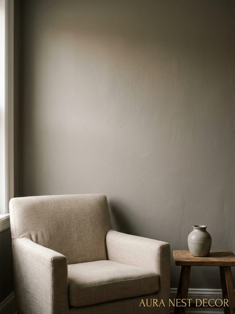
Warm grays are what you want. The ones with a tiny bit of taupe in them, or a whisper of green, or even the lightest suggestion of purple (don’t panic — you can’t really see it, but you FEEL it). Colors like Dulux’s Pebble Shore or Sherwin-Williams Agreeable Gray or Benjamin Moore’s Revere Pewter. These aren’t pure grays. They’re sort of lying about being gray, which is exactly what you need them to do.
Cool grays — the blue-grays, the stark ones — work better in rooms with a lot of natural light, and even then they need serious help from warm accents. A room without south-facing light will eat a cool gray and spit out something miserable. I’ve seen it happen.
Side note: the undertone thing is not overthyped. Hold your paint sample up to actual furniture in actual light in your actual room. Don’t trust the chip alone. Just don’t.
The moodier options — think a deep charcoal, almost slate — are having their own moment, particularly in older British homes with high ceilings where you can actually get away with going dark. In a ground-floor flat with one window, probably not. But in a Victorian terrace with original coving? Absolutely yes, and I will not be told otherwise.
—
3. The Sofa Color Nobody Expects to Work With Gray (But Does)
Okay so everyone’s first instinct is a white sofa or a light gray sofa with gray walls. And that’s fine. Fine. It’s safe and it looks nice and it doesn’t make anyone feel anything in particular.
But can we talk about mustard yellow for a second?
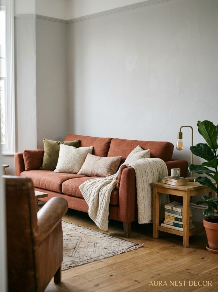
A deep mustard-toned sofa — not neon, not baby, the kind that looks like good Dijon — against a warm gray wall is one of those combinations that shouldn’t logically work but absolutely does. It’s the color equivalent of wearing something slightly wrong on purpose and having it look intentional. There’s a tension there that makes a room feel like someone made decisions, not just purchases.
Rust works too. So does a faded sage green, if your gray has warm undertones to match. Even a really deep navy blue against mid-tone gray reads as sophisticated rather than cold, especially with wood accents nearby to break it up.
The piece of advice I’d actually give someone? Don’t buy the gray sofa for the gray room. It sounds right, but you’ll end up with a room that disappears into itself. Pick ONE statement sofa color and let the gray hold everything else steady.
—
4. Lighting Is the Only Reason Some Gray Rooms Look Amazing and Others Look Sad
This isn’t opinion. It’s basically physics.
Gray reflects and absorbs light differently depending on time of day, cloud cover, and what direction your windows face. A gray room at noon in summer can look airy and serene. The exact same room at 4pm on a November afternoon in Manchester or Chicago? Crushing.
Which means your lighting isn’t a finishing touch in a gray room. It’s structural.
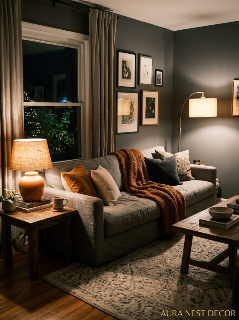
Warm bulbs — 2700K, not the cool white ones that come in cheapo fixtures — make an enormous difference. The color rendering of warm light turns even a cool-toned gray a little softer and more welcoming. Layer your sources: overhead isn’t enough, not even close. You want a floor lamp in the corner, table lamps at different heights, maybe a small wall light or a picture light over something you actually love.
“In a gray room, bad lighting isn’t a mistake. It’s a disaster.”
Dimmer switches. Please. They cost almost nothing extra and they change everything about how a room feels after sundown. I’m slightly evangelical about dimmers at this point, not gonna lie.
Candlelight, even the fake flicker LED kind, adds something that no overhead fixture can. The way gray walls respond to candlelight is actually beautiful — it creates shadow variation that makes the room feel three-dimensional instead of flat.
—
5. The One Mistake That Ages a Gray Room Instantly
Chrome. Or more specifically, all chrome everything.
There was a decade where gray rooms paired with chrome and glass became the default Pinterest aesthetic, and honestly it looked fine at the time. But that combination now reads very 2014 in a way that’s hard to articulate but impossible to unsee once you notice it.
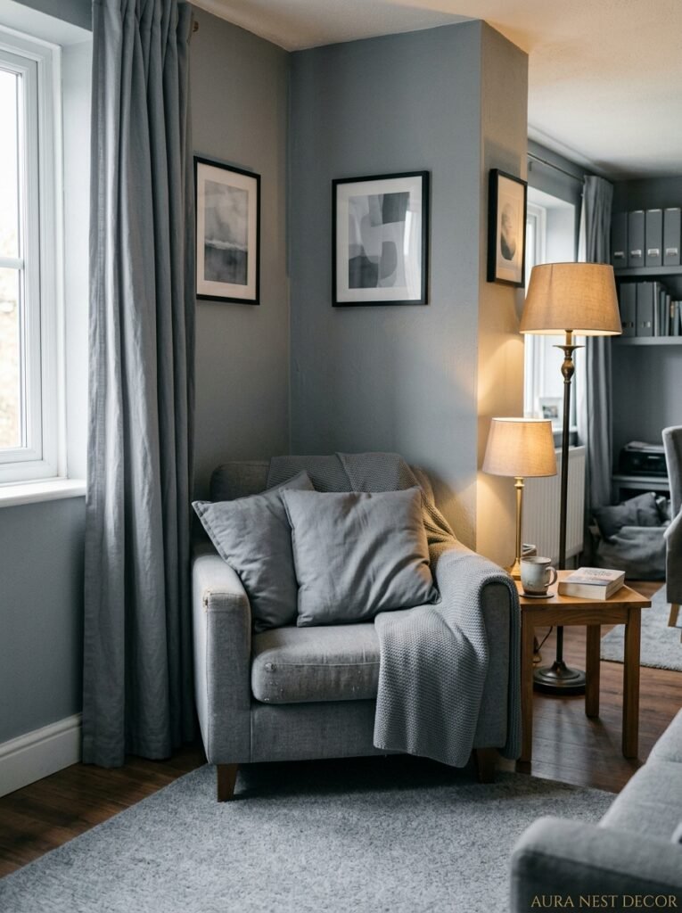
The alternative is mixed metals, but done thoughtfully. Brass or gold-toned hardware against gray walls is genuinely gorgeous — there’s a warmth contrast that feels deliberate and current. Matte black is strong and works in rooms that are leaning more modern or graphic in their style. Brushed nickel is the middle ground, a bit safer, nothing wrong with it.
What ages a space fastest is when everything matches exactly. When every hinge, every knob, every lamp base is the same metal finish — it looks like someone bought a set. And buying the set is exactly the thing that prevents a room from looking like yours.
Mix them, but have one dominant finish and let the others appear as accents. That’s the move.
—
6. Texture Is Doing More Work Than Color in the Gray Rooms Worth Saving
Because when almost everything is some version of gray or neutral, the things that make it feel rich and layered are tactile. Not just visual.
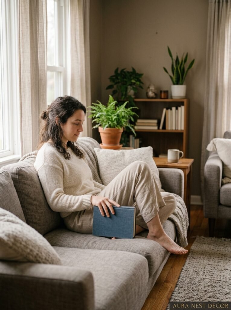
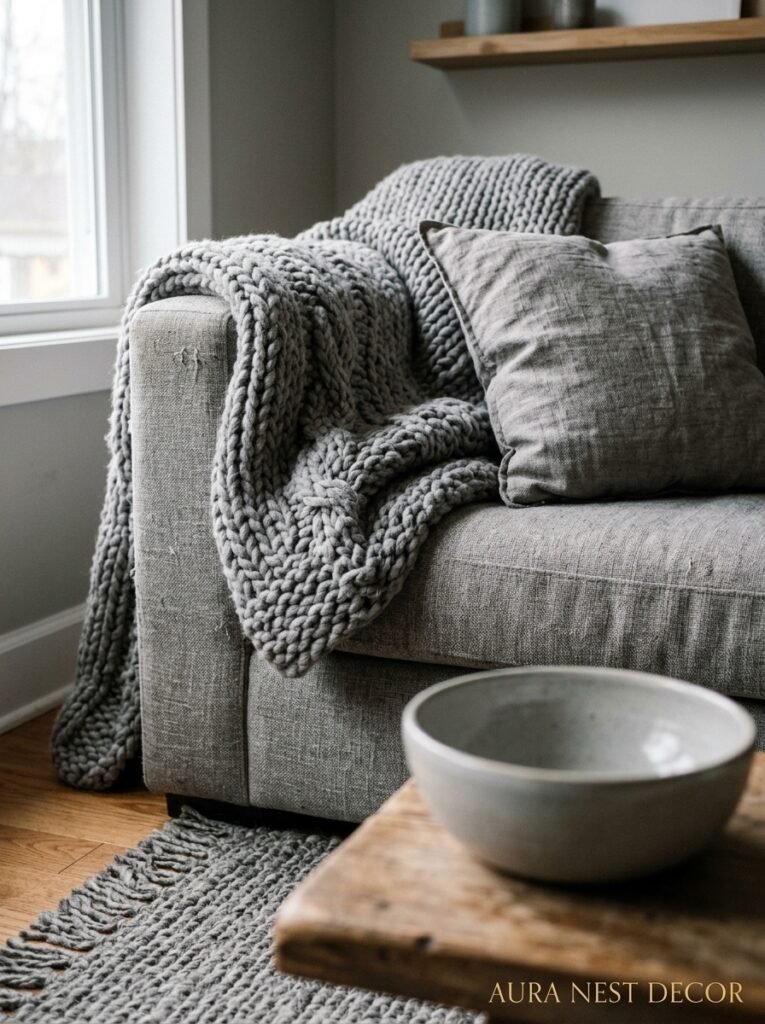
A chunky knit throw over the arm of the sofa. A jute rug under a glass coffee table. Linen curtains that pool very slightly on the floor (a divisive choice, but I’m pro-puddle). A basket in the corner that’s actually used. Velvet cushion covers that look different at different angles because of the nap.
None of these are expensive moves. They’re considered ones.
The rooms that feel like a budget gray room and the ones that feel like an expensive gray room often have identical furniture. The difference is almost always in the layering of texture. More variety of texture = more visual richness = a room that looks and feels luxurious even if it absolutely wasn’t.
Bare walls are also a texture decision, by the way. A painted wall with a slightly eggshell or satin finish reflects differently than matte. Lime wash paint — which has this gorgeous chalky, uneven quality — on a gray-toned wall is one of those things that sounds very fancy but is surprisingly doable as a weekend project if you’re feeling brave.
—
7. Plants in a Gray Room: The Answer Is Always Yes, But Here’s the Rule
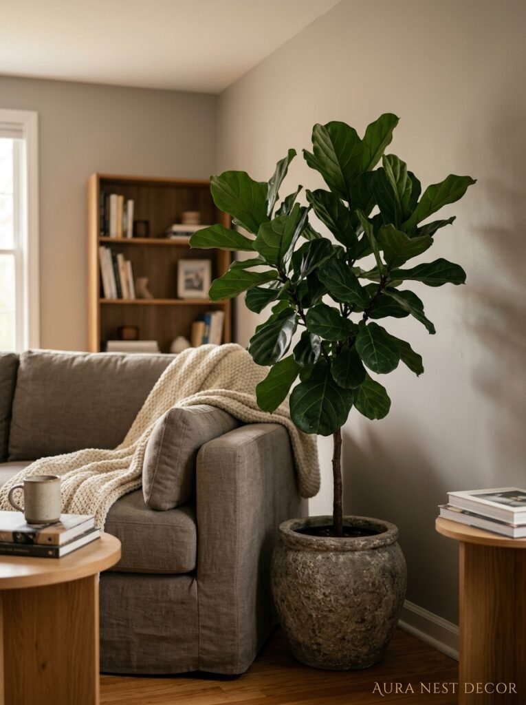
Not because every room needs plants (though let’s be honest, it does), but because green and gray have a specific chemistry that’s almost botanical in how naturally it works. Cool gray walls with deep green foliage? Feels like rain on leaves in the best possible way.
The rule, though, is to think about pot color first. Terracotta pots in a gray room add that warm earthen note that stops the space from reading as clinical. White pots are fine but they disappear. Black pots look deliberate and a bit dramatic, which can be exactly right depending on the vibe you’re going for.
Size matters more than variety. One big plant — a monstera, a fiddle leaf, a large snake plant — does more for a gray room than seven small ones scattered around the windowsill. Statement plants make statement rooms.
“One big plant says ‘I made a choice.’ Seven small plants says ‘I wasn’t sure.'”
And if you’re not someone who keeps plants alive — genuinely, no judgment — high-quality faux is so much better than it used to be. A convincing faux olive tree in a terracotta pot against a gray wall is nobody’s business but yours.
—
8. The Art Rule That Every Beautiful Gray Living Room Follows Without Realizing It
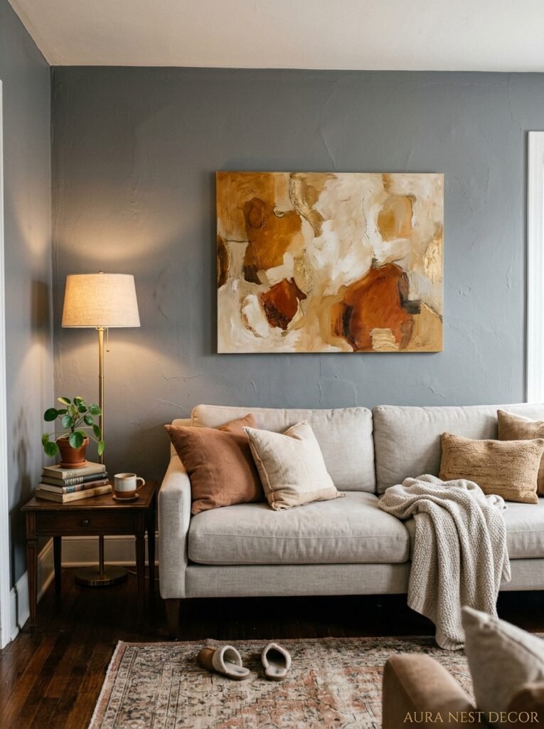
Scale. They all get scale right.
The number of gray rooms I’ve seen ruined by a tiny canvas hung at eye level on a large wall — it’s heartbreaking, honestly. Gray walls read as expansive and a bit austere, which means your art needs to match that energy. Big, or grouped, or floor-leaning. Not small and lone.
A gallery wall works well in gray rooms because it creates a visual mass rather than isolated small moments. But the frames matter. Consistent frames (all black, all natural wood, all white) look intentional. A mix of random frames from different decades looks collected and real. Both can work. It’s the random mix of SIZES with random frames that falls apart.
Abstract work tends to feel right in gray rooms — all that negative space and tonal variation. But honestly, the art you love will work in a gray room. Because gray is generous that way. It doesn’t compete, it just holds.
—
9. Why British and American Gray Rooms Look Subtly Different (And What We Can Steal From Each Other)
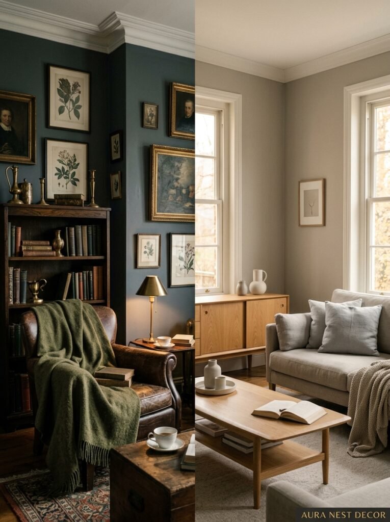
It’s an interesting thing to notice. American gray rooms tend to lean into the farmhouse or transitional direction — lots of shiplap, chunky wooden coffee tables, warm metals, cozy-bordering-on-rustic. British gray rooms are often more restrained. Moodier. Less matchy. More likely to have an inherited piece of furniture that doesn’t technically belong but somehow does.
The Brits are better at confidence — at committing to a very dark shade or leaving things slightly unresolved without panicking. The Americans are better at warmth — at making sure the room actually feels good to be in, not just good to photograph.
The ideal is somewhere in between, and I say this as someone who’s looked at probably too many living rooms on both sides of the Atlantic. Take the British willingness to go dark and moody and commit. Take the American instinct toward layered warmth and genuine coziness. That combination is where the best gray rooms live.
—
10. Small Gray Rooms — The Counterintuitive Advice That Actually Works
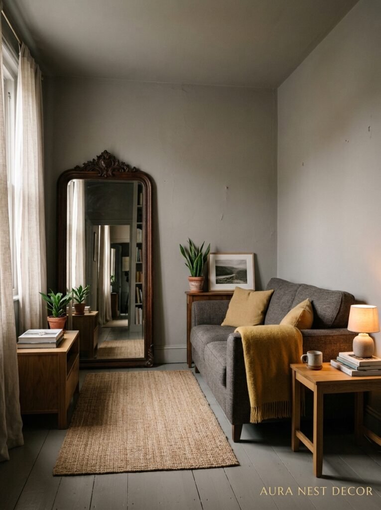
Everyone says go light in a small room. And that’s often right. But a small gray room painted in a deep, enveloping shade of charcoal can actually feel larger than the same room painted pale gray, because going dark makes the walls recede into shadow and removes the sense of boundary.
It’s sort of the same principle as wearing dark colors. They don’t make you smaller — they make the outline less defined.
If you’re going light in a small living room, the trick is to keep the trim and ceiling all the same tone as the walls, or only very slightly lighter. Stopping at the skirting board with the paint and going bright white on the trim just chops the room into horizontal bands. Tone-on-tone all the way up makes the walls feel continuous and the space feel taller.
A large mirror helps, but you already knew that. What’s less obvious is that a mirror with a warm-toned frame — rattan, carved wood, aged gold — will reflect the room back in a warmer cast, essentially turning your gray room into its best version of itself every time you look at it.
—
11. The Floor Situation: What’s Under Your Feet Changes Everything About Gray
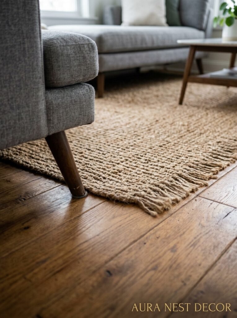
Light oak floors with gray walls is probably the most common combination for a reason — it works. The warm yellow-brown of natural oak against cool gray has a balance that feels easy and complete.
But dark floors with gray walls is dramatically underrated. Walnut, or any floor that’s stained darker, against a mid-to-light gray wall creates a contrast that makes the room feel grounded in a way that light floors don’t. Everything feels weighted and intentional.
The floor you want to avoid in a gray room is anything with strong orange or red undertones. A very orange-toned pine floor with gray walls creates a clash that neither color can resolve. If you’ve got it, layer a large rug over most of it and pick a rug tone that bridges the two — a faded terracotta or a mushroom-toned neutral can do the job.
Painted floors, by the way, are completely back. A pale gray or off-white painted floor in a gray room is a very particular aesthetic — more European, a little editorial — and it absolutely works in the right house.
—
12. The Gray Room Finishing Touches That Separate Styled From Staged
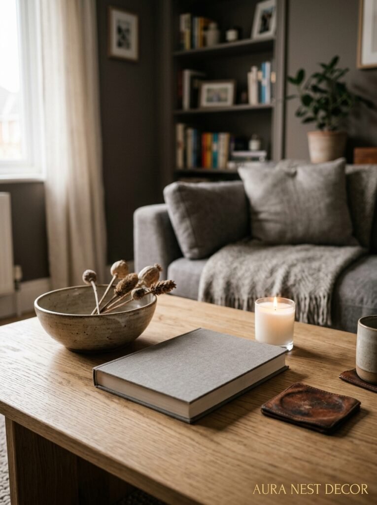
Books. Actual ones, not artfully arranged spines that nobody reads. A stack on the coffee table. A few on the side table. They add color, imperfection, and the feeling that someone real lives there.
A scented candle that’s been used enough to have a tunneled center. The blanket that’s actually thrown, not folded in thirds.
The thing that makes a room feel styled rather than staged is evidence of life. In a gray room, because everything is so intentional in terms of palette, those imperfect lived-in touches matter even more. The fruit bowl on the side table with one apple going soft. The dog bed in the corner that doesn’t match anything. These are the things that make a room feel YOURS.
Gray is a color that can take over a room completely if you let it, turning it into a showroom. The antidote to that is just… living in it. Actually sitting on the sofa with a cup of tea and not worrying that you’re messing it up. The best gray living rooms feel inhabited. That’s not an accident.
—
❓ FAQ
Q: What’s the best gray paint color for a living room with not much natural light? A: Stick to warm-toned grays with taupe or greige undertones — colors like Sherwin-Williams Agreeable Gray, Dulux Warm Pewter, or Benjamin Moore Revere Pewter. Cool or blue-based grays will feel heavy and dim in low-light rooms. Test your sample in the afternoon and evening light before committing.
Q: Can gray and navy work together in a living room? A: Yes, really well actually. A mid-toned warm gray wall with a deep navy sofa or accent chairs reads as sophisticated and not at all cold, especially if you bring in natural wood tones and warm lighting. It’s one of those combinations that sounds like it might be too much but tends to be just right.
Q: Is gray going out of style? A: The cold, minimalist all-gray look from the 2010s has dated. But gray as a considered background color, layered with warmth and texture, isn’t going anywhere. It’s one of the most versatile backdrop colors there is — the rooms that use it well don’t feel trendy, they just feel good.
—
💭 Final Thoughts
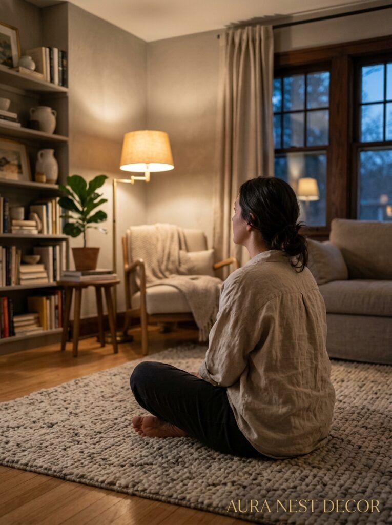
A gray living room, done right, is one of the most livable spaces imaginable — not because it’s neutral, but because it’s generous. It holds whatever you bring to it. The warmth you layer in, the color you introduce, the life you actually live there.
The rooms that stop you mid-scroll aren’t gray rooms, really. They’re rooms with personalities and stories and a very specific light at a very specific hour of the day. Gray is just what made all of that possible.
So what’s the one thing you’d change about yours first?




