
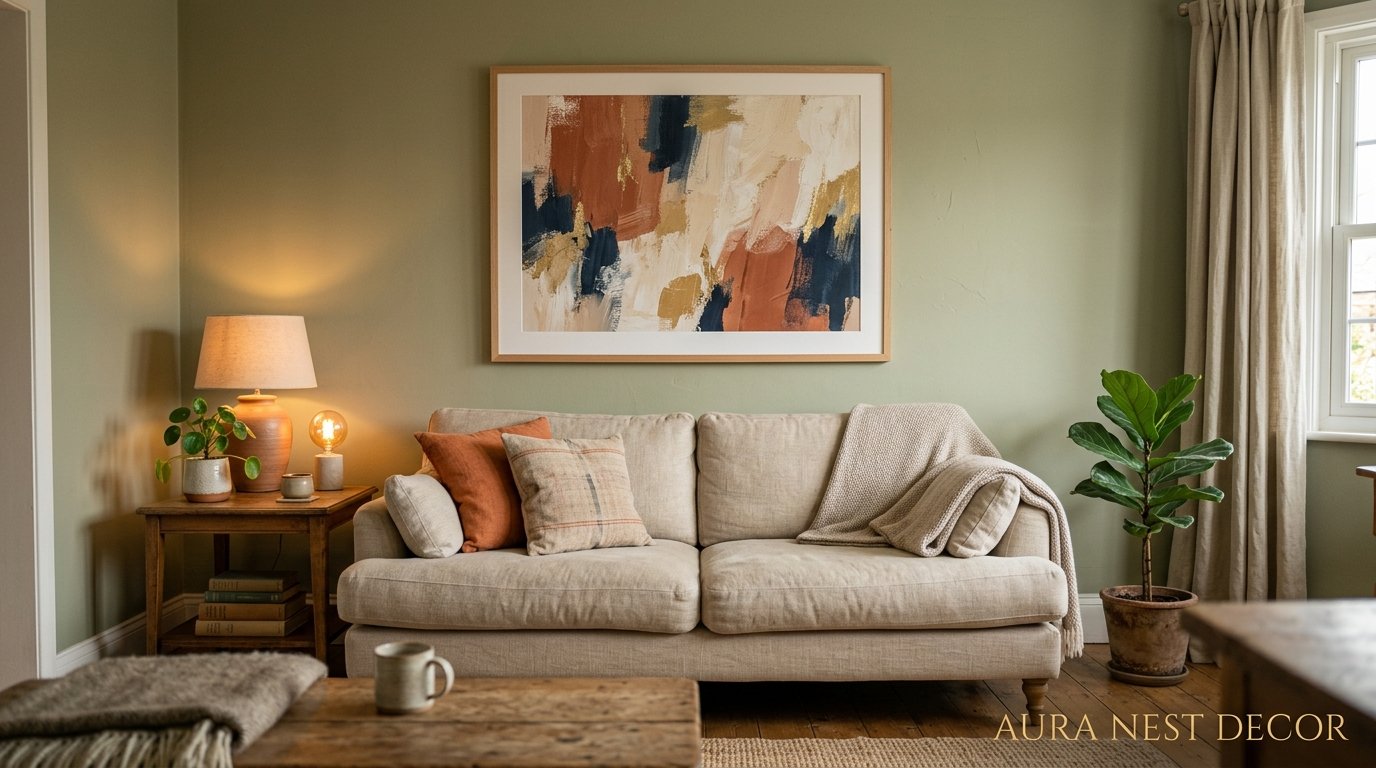
Small Walls, Big Personality: Wall Decor Ideas That Actually Work in Tiny Living Rooms
You know that feeling when you walk into a small living room and it feels intentional — not cramped, not apologetic, just… right? That’s not an accident. It’s usually one or two wall decisions that changed everything.
—
1. Why Most Small Living Room Walls Look Worse With More on Them
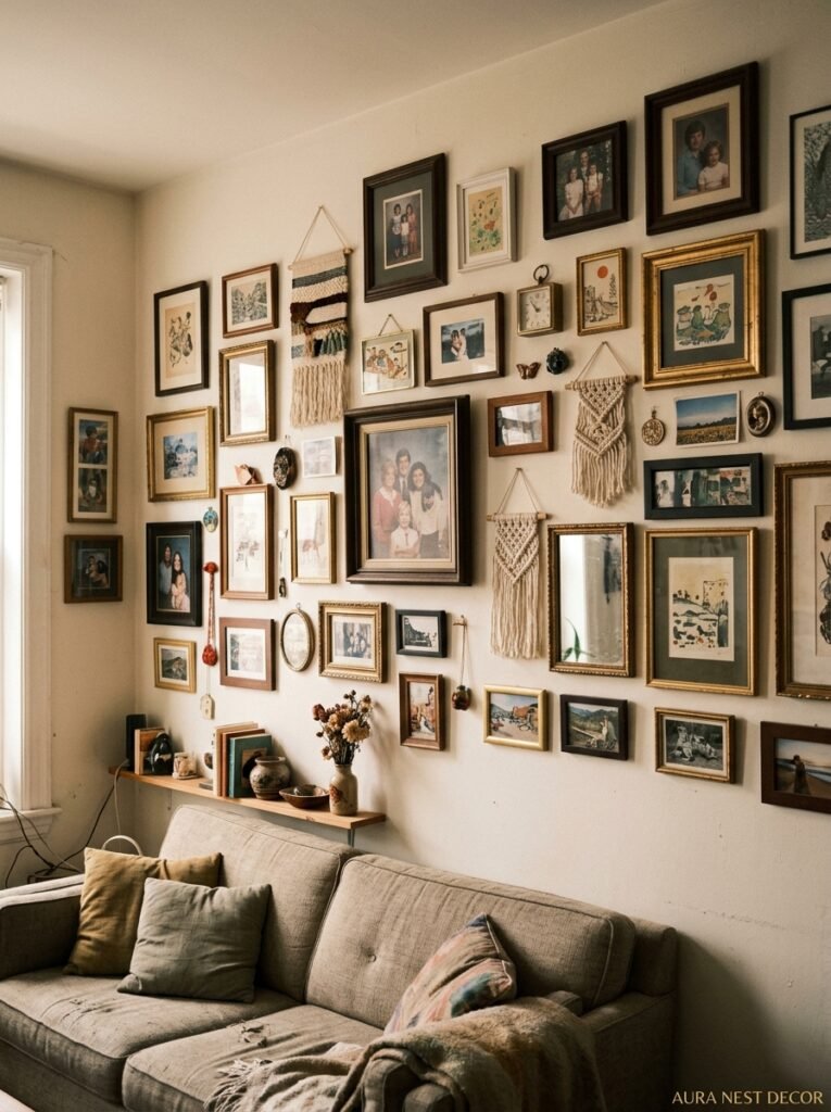
Here’s the thing nobody tells you when you’re standing in IKEA holding a three-pack of matching prints: more isn’t more. Not in a small living room. It’s kind of the opposite, actually.
When walls are cluttered, your eye doesn’t know where to land, so it just… doesn’t. The whole room starts to feel chaotic, and you don’t even know why. You just feel vaguely stressed every time you sit on the sofa. I’ve been there. My first flat had so much stuff on the walls that a friend walked in and said it felt like a car boot sale. Not the vibe.
The rooms that photograph beautifully on Pinterest — the ones that get saved and re-saved — tend to have fewer things on the walls, not more. One dominant piece. Or a small grouping that functions as ONE visual unit. The trick is making whatever you put up feel deliberate rather than like you were just filling space.
And filling space is the trap. Because blank wall space feels uncomfortable when you’re standing in an empty room, so we hang things. Then we hang more things. And suddenly there’s a wicker starburst clock next to a canvas print next to a shelf with seventeen little figurines and it’s just… a lot.
Start with less. You can always add.
—
2. The Single-Statement-Piece Rule That Designers Don’t Talk About Enough
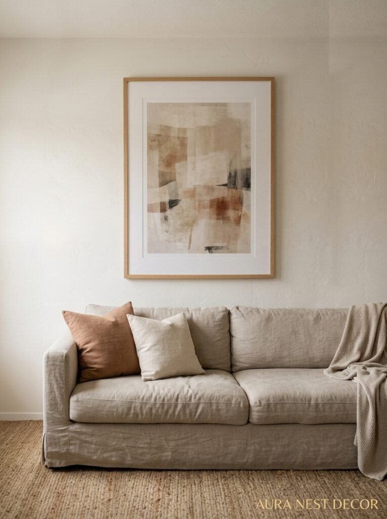
One large piece of art does more work for a small room than a gallery wall ever will. This is my hill. I’ll die on it.
A big print, a large framed photograph, a proper canvas — something that takes up real estate on the wall and commands the space rather than dotting around it timidly. In a small living room, this creates the illusion that the room is bigger than it is, because your eye travels to ONE point and the rest of the room kind of… breathes around it.
The size thing matters more than most people think. People consistently choose art that’s too small for their walls. A 30x30cm print above a sofa looks like a postage stamp. You want something that fills the visual weight of the space. Not every inch of the wall — but enough that it anchors the room.
Don’t be scared of big. Side note — I went oversized with a black and white architectural photograph in my living room and honestly it’s the single best decor decision I’ve made in five years. The room is small. The print is enormous. It works PERFECTLY.
Color also matters here. Cool, muted tones tend to push walls back. Warm, vivid pieces pull them forward. In a small space, that distinction changes the feel of the whole room.
“One oversized piece of art does more for a small room than an entire gallery wall ever could.”
—
3. The Color That Keeps Showing Up in Every Beautiful Small Living Room Right Now
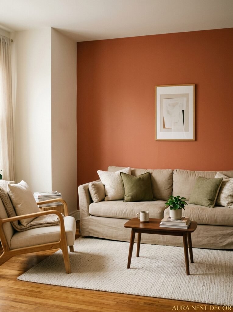
Warm off-white. But not the boring kind.
I’m talking about that particular creamy, barely-there warmth — somewhere between linen and butter — that seems to coat every living room I can’t stop saving. It’s not white-white. It’s not beige. It’s something in between that makes every single thing you put on the wall look better.
There’s a reason this color is everywhere. It doesn’t compete. It softens harsh edges. And in a small living room, it makes the walls recede just enough that the room feels less boxy.
But here’s the more interesting bit: this color does something WILD with lighting. Under a warm bulb in the evening, it glows. It turns a small room into something cozy rather than just small. That distinction matters so much.
Dark walls can work too — I know, I know, everyone says dark makes rooms smaller, but a really deep moody shade like slate blue or forest green can actually make a small room feel like a cozy cave rather than a tiny box, and that’s a whole different emotional experience. Not for everyone. But worth mentioning.
If you’re committed to lighter walls (which, honestly, easier resale) then that warm off-white is your safest bet. Paint it, then sit with it for a week in different lighting before you hang anything. The color changes constantly throughout the day.
—
4. Floating Shelves Done Right (Because Most People Get This Wrong)
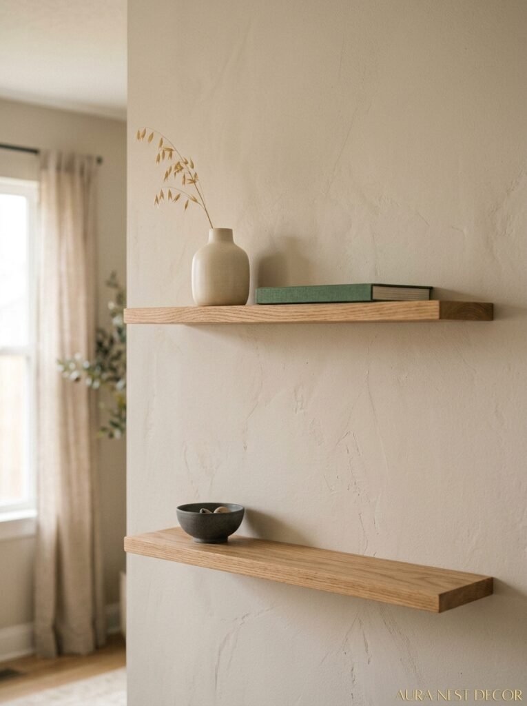
Floating shelves are everywhere. They’re in every home tour, every makeover, every before-and-after. And yet so many of them look cluttered and sad.
The difference between a shelf that looks incredible and one that looks like a charity shop donation pile waiting to happen? Editing. And breathing room.
Put less on your shelves than feels right. Then take one more thing off. The empty space around objects is what gives those objects presence. A single ceramic vase, a stack of two or three books, a trailing plant — that can be everything you need on one shelf. Your instinct will say it needs more. It doesn’t.
Height is the other thing. In a small living room, high shelves — like, genuinely high, near the ceiling — draw the eye upward and make the room feel taller. Lower shelves draw the eye downward and make a small space feel more compressed. So if you can go high, go high.
And please, for the love of all things beautiful, don’t shelf everything. If you’ve got books, vases, plants, photo frames, a candle, two sculptures and a trailing ivy on the same shelf, it’s not styled — it’s stored. Pick one or two types of objects per shelf. Keep it to that.
“The empty space around an object is what gives it presence. Shelves need to breathe.”
—
5. The Mirror Trick That Actually Works (And When It Doesn’t)
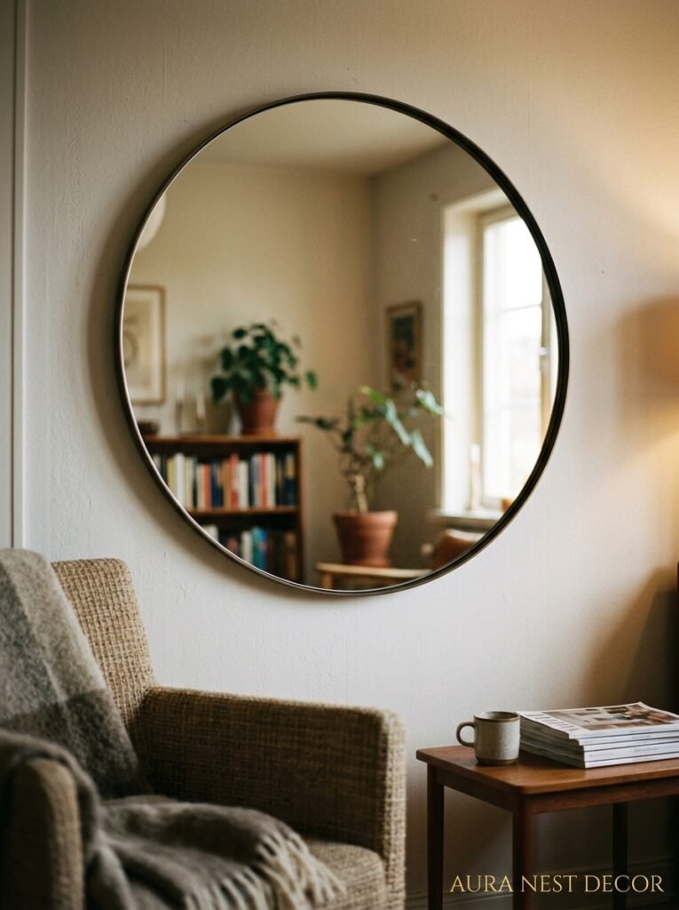
Mirrors make small rooms bigger. We’ve all heard it. But the execution matters enormously because a badly placed mirror just reflects an ugly corner back at you, which makes things worse.
The key is what the mirror faces. Ideally, it reflects light — a window, a lamp, a source of warmth. If you position a large mirror opposite your main window, it essentially doubles the natural light in the room. The difference is HUGE. On a grey autumn morning in Manchester or Seattle, that can genuinely change the mood of the whole space.
But shape matters too. Round mirrors are softer, more sculptural. They feel like decor as well as function. A big round mirror on a plain wall is one of the easiest, most satisfying things you can do to a small living room. Arch mirrors are having their moment too — they elongate, they’re a bit dramatic, and they look expensive even when they weren’t.
What doesn’t work: small mirrors scattered around trying to be a gallery wall. A 20cm ornate mirror surrounded by three other small mirrors just reads as trinkets. Go big or leave it.
—
6. One Rule That Makes Any Tiny Room Feel Intentional Rather Than Accidental
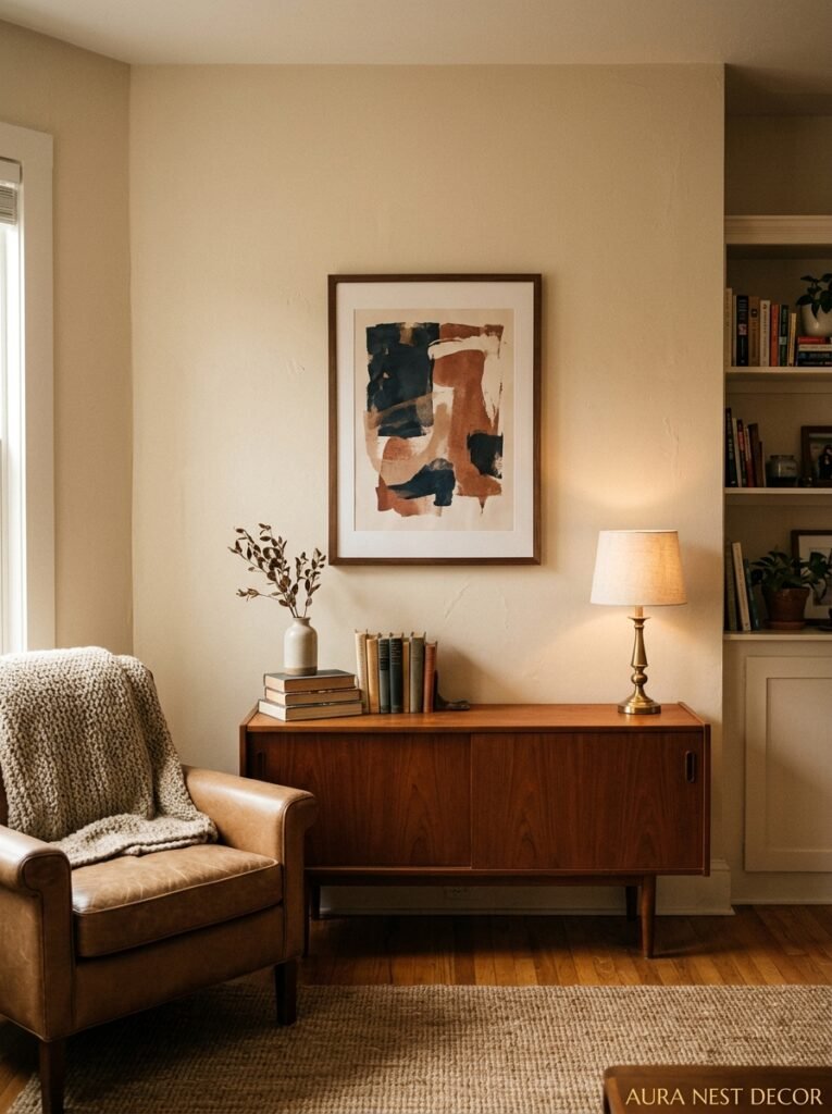
Everything on your wall should belong to the same visual family. Not the same color. Not matching frames. But the same emotional register.
Here’s what I mean. If your living room has warm, earthy, handmade-feeling furniture — rattan, linen, wood — and then you put up a collection of slick monochrome photography prints in sleek black frames, those things are fighting. They’re both fine on their own. But together they create visual tension that reads as “unconsidered.”
Your wall decor should feel like it was chosen by the same person who chose the sofa. Because it was, obviously. But a lot of the time rooms don’t read that way, because people choose each thing individually without stepping back to see if the conversation makes sense.
Natural materials on the walls — woven pieces, wooden frames, ceramic plaques, macramé — work beautifully in rooms with organic furniture. Clean, linear art and mirrors work better in more contemporary spaces. Mix if you want, but know you’re mixing and make it intentional.
This single consideration will do more for the look of a small living room than any specific product recommendation I could give you.
—
7. Gallery Walls in Small Rooms: There’s a Right Way and About Fourteen Wrong Ones
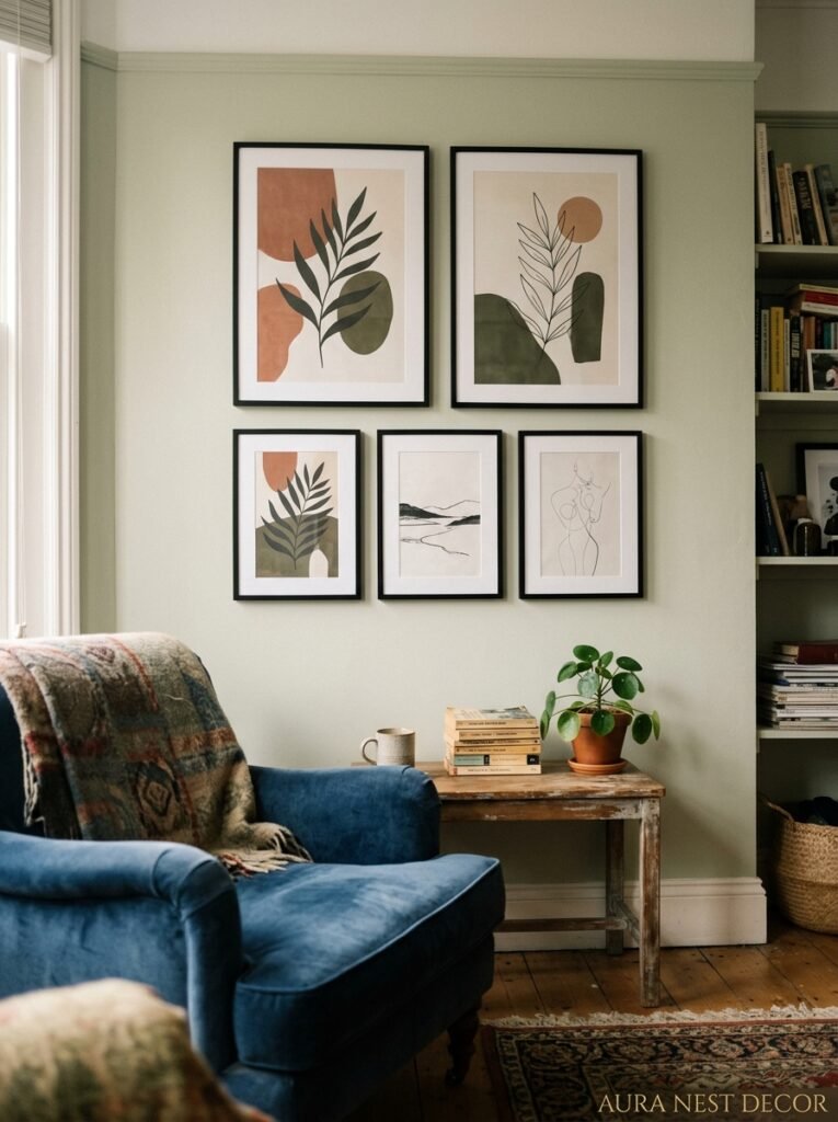
Okay so I said one big piece works better than a gallery wall for small spaces and I stand by that. But gallery walls CAN work. With conditions.
The frames have to be cohesive. Not identical — but cohesive. All black, or all wood tones, or all the same antique-gold. Mix of frame styles AND sizes AND materials and it just looks chaotic. Pick one frame variable to play with and keep everything else consistent.
The grouping has to function as a single visual unit. When you step back and squint, it should look like one rectangle, not a constellation of random things. This usually means close spacing — 2 to 4 inches between frames — and a clear outer boundary. No single piece drifting off into empty wall space like it wandered away from the group.
Size of the grouping relative to the furniture matters enormously. A gallery wall above a sofa should be roughly the width of the sofa. Maybe slightly wider. Much narrower and it looks like someone started something and gave up. Much wider and it overwhelms.
And honestly? Three to five pieces is a gallery wall. You don’t need twelve. A small living room with a modest grouping of four thoughtfully framed pieces looks more intentional than a floor-to-ceiling grid that belongs in a boutique hotel.
“A gallery wall in a small room should feel like a complete thought, not a sentence that never quite ends.”
—
8. Vertical Everything: The Most Underrated Small Space Trick
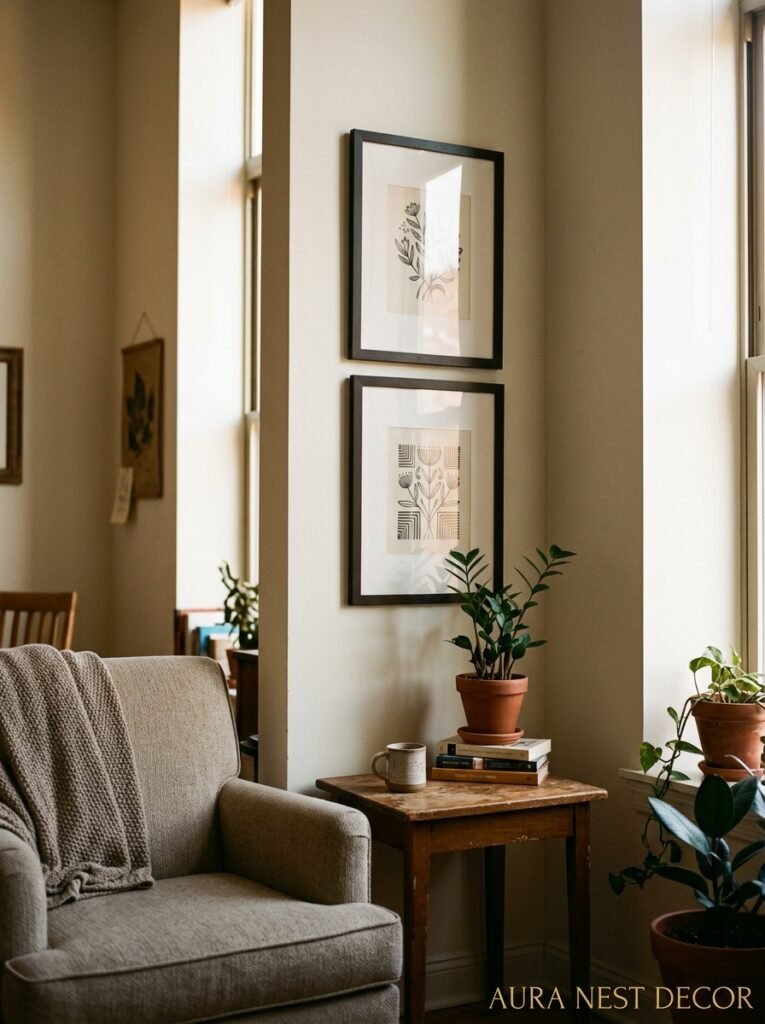
Your eye defaults to horizontal. Most furniture is horizontal. Which means small rooms feel wide and flat and low by default.
Fighting that — aggressively — is one of the most powerful things you can do with wall decor. Vertical prints create vertical lines. A tall, narrow frame hung high on the wall pulls your gaze upward. Stacked shelves rather than horizontal ones. A tall mirror instead of a wide one.
This is one of those things that sounds minor and turns out to be enormous. The room doesn’t get taller. But it feels taller. And in a small living room, feeling spacious is just as good as being spacious.
If you’ve got high ceilings already, use them. Hang things higher than feels intuitive. The conventional wisdom is to hang art at eye level (roughly 57-60 inches to the center) but that’s for average-height rooms. In a room with higher ceilings, pushing things up a bit creates better proportions.
—
9. What No One Tells You About Lighting Your Wall Art
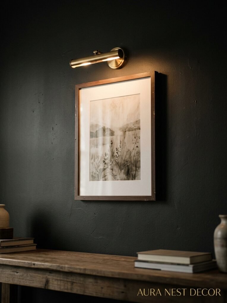
The frame, the art, the placement — all of it matters less than how the thing is LIT.
Badly lit art looks flat and boring. Well-lit art looks gallery-worthy. And the difference between a £20 print that looks incredible and a £200 print that looks forgettable is often just a picture light or a directional lamp angled toward it.
Picture lights are having a revival and they deserve it. They’re functional, they look beautiful, and they add that warm amber glow to a wall that makes the whole room feel considered. Plug-in versions mean you don’t need an electrician. Easy win.
Even just positioning a floor lamp or a table lamp so it washes light up toward your wall decor can change things dramatically. That amber glow at 7pm in the evening — when the overhead lights are off and the lamps are on — that’s when a small living room either looks cozy and beautiful or just looks like a small room. Lighting makes that call.
—
10. Textured Wall Decor That Actually Works in Small Rooms (And Doesn’t Feel Crafty)
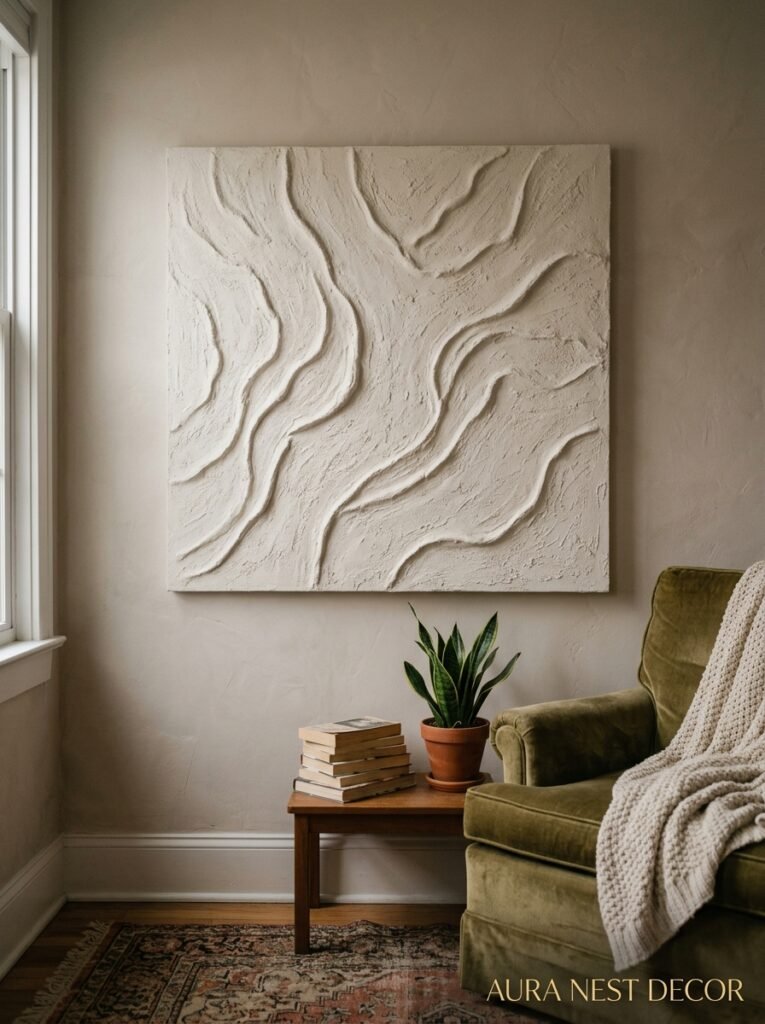
This is tricky because textured wall decor has a bit of a reputation, and honestly, some of it earned. Macramé went through a dark era.
But done right? Texture on the wall is one of the most interesting things you can do. A woven wall hanging in neutral tones adds depth and dimension that you just can’t get from a flat print. A ceramic wall relief. A sculptural wooden piece. Things that cast tiny shadows and look different depending on the time of day.
The key in a small room is scale and restraint. One textured piece, given space to breathe. Not three woven things competing with two wicker mirrors. One.
And material matters. Natural fibers and organic materials — linen, wool, clay, wood — feel warm and quiet in a small space. Shiny or highly polished materials can feel cold. Especially in a compact room where you’re living closely with everything.
—
11. The Trick of Leaving One Wall Almost Empty
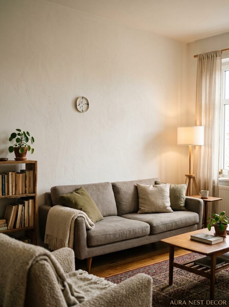
This one takes nerve, but it works. In a small living room, designating one wall as intentionally minimal — maybe just a single small object or nothing at all — gives the whole room a visual exhale.
When every wall is competing for attention, nothing wins. But when three walls have something going on and one wall is quiet, the quiet wall becomes restful. The eye goes there and relaxes. And paradoxically, it makes the decorated walls look more curated because they’re not just filling space — they’re doing something deliberate.
This is easier to commit to than you’d think once you see it working. The anxiety is in the before. The blank wall feels unfinished when you’re standing in the empty room. But in a fully furnished, lit, lived-in room? It feels like a breathing space.
—
12. The Small Details That Make Wall Decor Look Expensive Rather Than Just Present
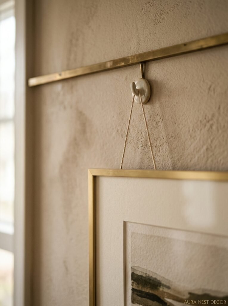
Frame quality matters more than print quality. A beautiful frame with a simple print inside looks expensive. A cheap frame with an expensive print inside looks cheap. That’s just the reality of how the eye processes things.
Consistent hardware — hooks, screws, fixtures — sounds like obsessive detail, but it’s one of those things that registers subconsciously. Random mismatched hardware reads as haphazard even if you can’t articulate why.
And spacing. Even spacing between elements, or intentionally uneven spacing — both can work. What doesn’t work is slightly uneven spacing that looks like you tried to get it right and missed. Get a level. Use it. It’s five minutes that changes everything.
Small things. But small things are what separate rooms that look like a lifestyle from rooms that just look like a house.
—
❓ FAQ
Q: How do I make a small living room wall look bigger without spending much money? A: One large mirror placed opposite a window is honestly the cheapest and most effective thing you can do. It reflects light, creates depth, and costs less than a gallery wall of prints. A single large-ish piece of art in a good frame also does more for the space than several small pieces.
Q: Can dark walls work in a small living room? A: They absolutely can. Dark walls — deep greens, navy, charcoal — can make a small room feel intimate and intentional rather than cramped. The key is keeping the rest of the space lighter (furniture, textiles) and making sure the room has good lighting so it doesn’t end up feeling like a cave.
Q: What’s a good rule for gallery wall spacing? A: Keep about 2-4 inches between frames. Any more and the grouping starts to fragment into individual pieces rather than reading as one unit. Step back and squint — if it looks like one visual block, the spacing is probably right.
—
💭 Final Thoughts
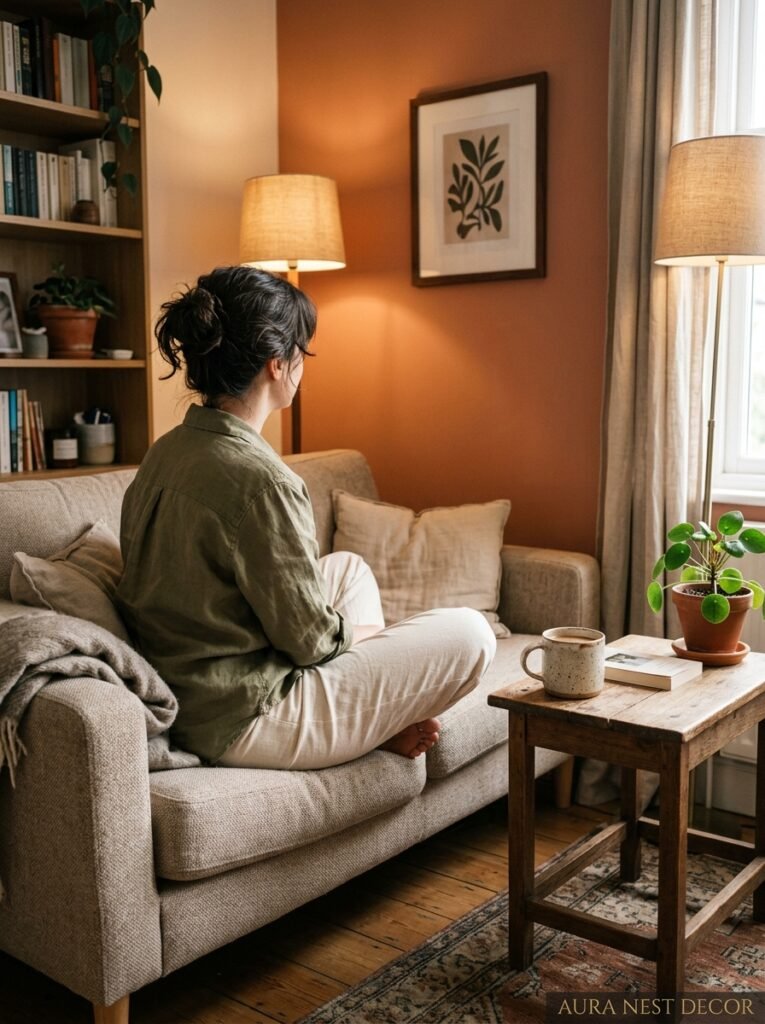
Small living rooms ask something of you that big ones don’t. They ask you to be deliberate, to choose less and choose it better, to trust that one really good thing is worth more than five okay things. And when you get that right — when the wall feels like it’s working WITH the room rather than just filling it — the whole space changes.
It doesn’t take much. Sometimes it takes less than you’ve already got up there.
What’s the one wall in your living room that you still haven’t figured out?




