
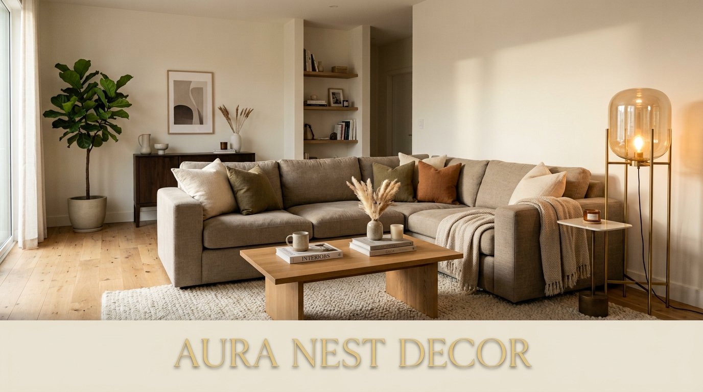
Modern Living Room Ideas That Actually Look Good in Real Homes (Not Just Show Houses)
My friend came over last spring, looked at my living room, and said “this feels like a hotel but in a good way.” I didn’t know how to take that for about three days. Then I realized — that’s exactly what modern done RIGHT feels like. Considered. Calm. Like someone actually thought about it.
—
1. The Sofa Color That’s Quietly Taking Over Every Beautiful Living Room Right Now
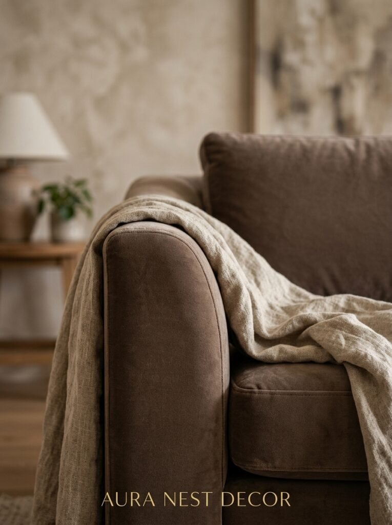
Not grey. Not beige. Not even white.
It’s warm taupe — that particular shade that sits somewhere between a latte and a sand dune, and looks completely different depending on the light. At noon it reads almost neutral. By 7pm with the lamps on it goes full desert-sunset warmth. I’ve seen it in UK homes styled with dark wood and vintage brass, and in American homes layered with cream boucle cushions, and it WORKS in both. Completely different results, same starting point.
The reason it’s everywhere isn’t trend-chasing — it’s that taupe plays well with literally everything. You don’t have to redesign your whole room around it. Swap the sofa, keep the rest, and suddenly it all looks intentional.
“The sofa is the room. Everything else is just conversation.”
If you’re in the UK, look at Loaf, Swyft, or even the Marks & Spencer sofa range — they’ve all leaned hard into this palette lately. US readers: Article and Joybird have solid options that don’t cost a small mortgage.
—
2. Why Your Living Room Feels Off (And It’s Probably Not What You Think)
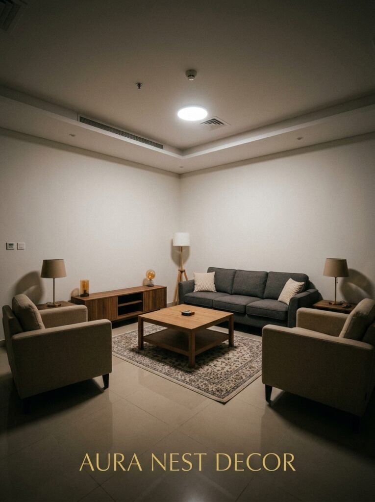
Scale. It’s always scale.
Not the wrong rug color, not the wrong sofa style — the rug is just too small. I know because I did it for two years in my old flat and couldn’t figure out why the room never felt right. Everything was fine individually. Together it looked like a furniture showroom where pieces hadn’t been properly introduced yet.
The rule that actually works: your rug should sit under at least the front two legs of every major piece of furniture in the seating area. Ideally all four legs. Most people buy the one size down from what they need, because the bigger size looks enormous in the shop. It won’t look enormous in your room. It’ll look correct.
In a modern living room especially, a large rug anchors everything. It says “this is intentional.” Without it, even expensive furniture kind of floats.
—
3. The One Type of Lighting That Makes Any Modern Space Feel Instantly Warmer
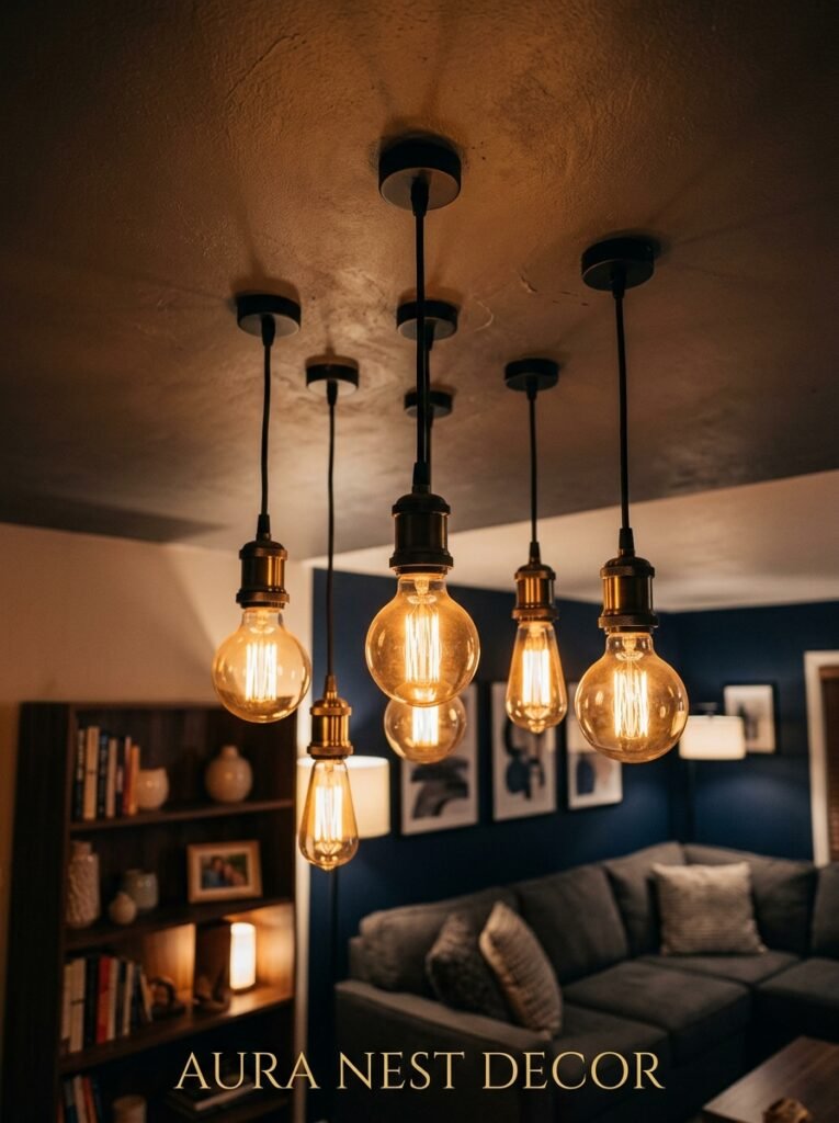
Not a floor lamp. Not recessed lighting (though that helps). Not even a statement pendant, though I love one.
A lamp on a low surface — a sideboard, a console table, a stool — with a warm-toned bulb, set to amber rather than bright white. That’s it. That’s the secret that designers use constantly and that nobody talks about enough.
The amber glow at eye level changes the ENTIRE mood of a room in a way that overhead lighting just can’t. It creates shadow. It creates depth. It makes your room look like a photograph even when it’s just Tuesday night and you’re watching something forgettable on Netflix.
For a modern space specifically, pair this with one statement ceiling light that you dim for evenings and only keep full brightness for actually reading or looking for the remote. Layer the two. Don’t rely on either alone.
—
4. Concrete, Stone, or Plaster? The Texture Debate Modern Rooms Actually Need
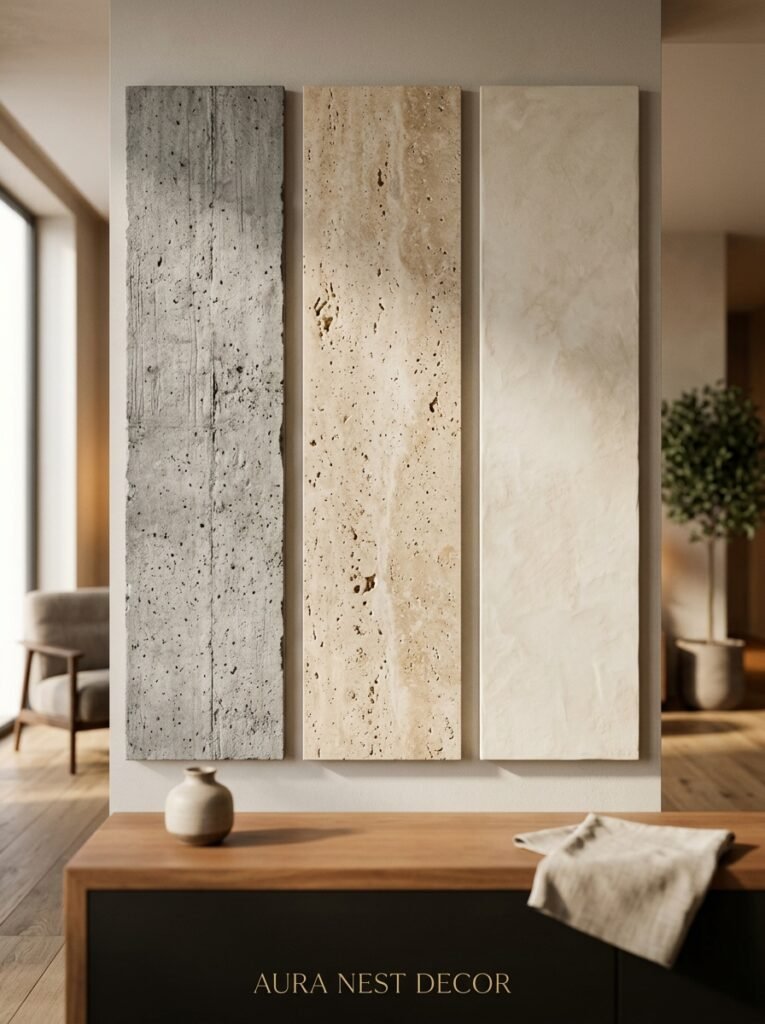
Here’s my take and I’ll stand by it: in a modern living room, you need ONE rough or raw texture to stop the room feeling sterile.
Modern design has this tendency — when it’s done badly — to look like everything was wiped down with a screen cloth. Too smooth. Too even. Nothing for the eye to catch on. You add one thing with actual texture and suddenly the whole room breathes.
Concrete-look accessories (a small vase, a table, a lamp base) are the easiest entry point and they’re everywhere right now for good reason. They’re cheap, they’re versatile, and that slight roughness against a smooth sofa or clean-lined shelving is EXACTLY the contrast a modern room needs.
Plaster walls are having a massive moment — particularly limewash paint in the UK, which gives a similar effect without the full renovation budget. Americans are catching on fast. It’s that slightly uneven, layered finish that looks ancient and modern at the same time. Somehow both.
If you can’t do either? A chunky knit throw or a linen cushion does similar visual work on a smaller scale. The principle’s the same: one thing that isn’t smooth.
—
5. The Gallery Wall Rule That Modern Design People Never Break
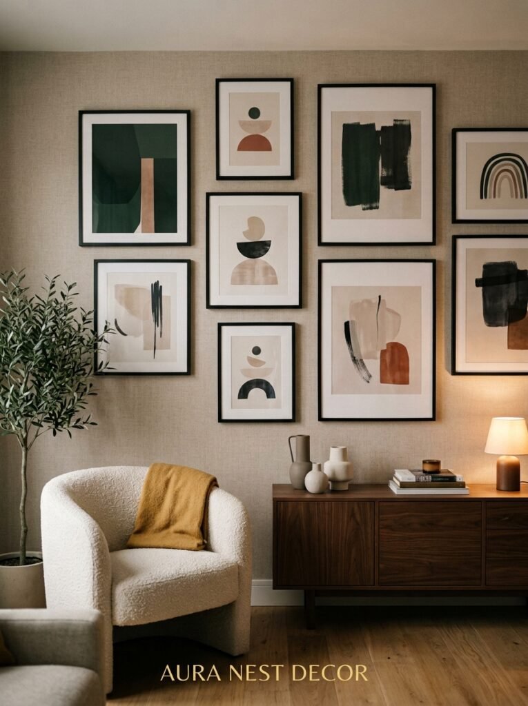
One frame. One size. One color frame. Stacked in a tight, intentional grid.
Not an eclectic mix of sizes and finishes — that’s a different aesthetic entirely and it’s lovely, but it’s NOT modern. Modern gallery walls (and yes, they can coexist) are disciplined. Same thin black frame or same narrow natural wood frame, same white mat, same spacing between prints. The art varies. The container doesn’t.
“A tight grid of matching frames reads as a decision. Everything else reads as accumulation.”
The reason this works in a modern space is that it brings visual interest without visual chaos. Your eye has somewhere to rest between the prints because the framing is consistent. It’s the same reason a row of identical books on a shelf looks better than a random pile.
In the US and UK both, IKEA’s Ribba frames are still the go-to for this because the white mat is already the right size and the frame profile is thin and unobtrusive. You’re not going to find much better for the price, honestly.
—
6. The Specific Type of Coffee Table That Works Harder Than Any Other
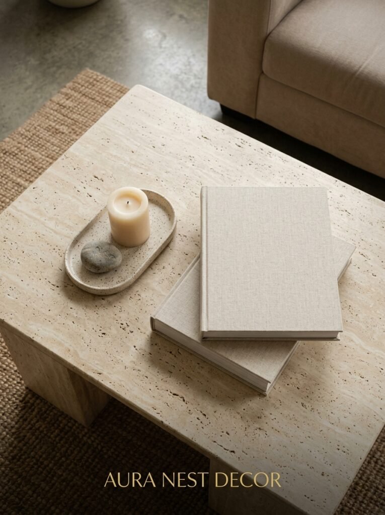
Round. Or oval. Not square, not rectangular.
I know, I know. Most sofas are rectangular and it seems like you’d want something that echoes that shape. But a round or oval coffee table in a modern living room does something different — it interrupts the grid. It softens. And in a room full of clean right angles, that interruption is what makes the space feel like someone lives in it rather than photographed it.
Marble-top round coffee table with a thin black or brass base is probably the most versatile version of this. It exists at every price point (genuine marble, marble-look, sintered stone) and it photographs beautifully which, let’s be real, matters if you’re trying to make your living room Pinterest-worthy.
But here’s the thing about the coffee table most articles skip — it needs to be the right HEIGHT. Standard is 16-18 inches. Not lower. Not higher. Low, designer-looking tables that sit at 12 inches look beautiful and are an actual nightmare to put a drink on. Don’t do it to yourself.
—
7. How British and American “Modern” Are Actually Different (And Which Bits to Steal From Each)
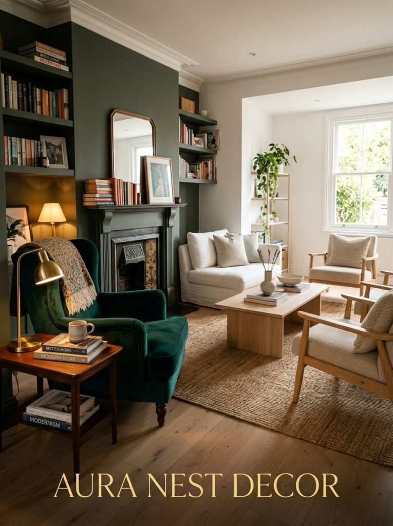
This is something I find genuinely fascinating, side note.
British modern tends toward restraint. Fewer objects. Higher quality. A kind of quiet confidence that says “we didn’t try too hard.” There’s often one piece of old or antique furniture mixed in — a Victorian side table in a room that’s otherwise completely contemporary. That tension is very British and it’s BRILLIANT. It makes the room feel lived-in and layered without being maximalist.
American modern — at its best — goes bolder with scale and contrast. Bigger sofas. More dramatic lighting choices. A willingness to mix materials more aggressively, like pairing a very sleek TV unit with a completely organic live-edge shelf above it. American modern isn’t afraid to make a statement.
My honest suggestion: steal the British restraint for your object count and the American confidence for your scale. Edit like a Londoner. Shop like you’re in LA.
—
8. Plants That Don’t Die in Low-Light Modern Living Rooms
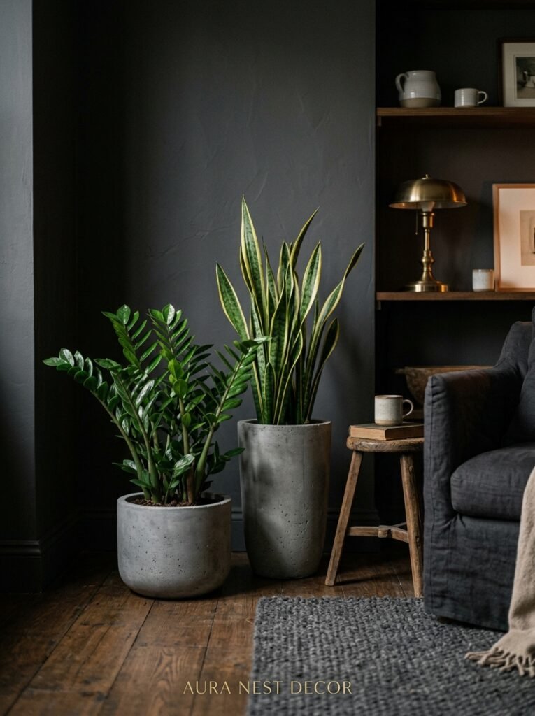
Because every beautiful modern room on Pinterest has plants and nobody tells you which ones actually survive.
The usual suspects — pothos, snake plants, ZZ plants — get mentioned constantly, and they’re on the list for a reason. They’re genuinely nearly impossible to kill. But for a modern living room specifically, I’d push you toward the rubber plant (Ficus elastica) and the monstera deliciosa if you’ve got a slightly lighter spot.
The rubber plant especially has this architectural quality — the leaves are large, dark, almost sculptural — that suits a modern room perfectly. It doesn’t read “cozy cottage,” it reads “editorial.” Which is what we’re going for.
One thing that really matters: the pot. A matte black pot or a simple terracotta (sealed, smooth-finished) makes a huge difference. Don’t put a beautiful plant in a cheap plastic nursery pot and call it a day. That’s where the look falls apart.
—
9. The Color That Looks Surprisingly Good Next to Everything Modern
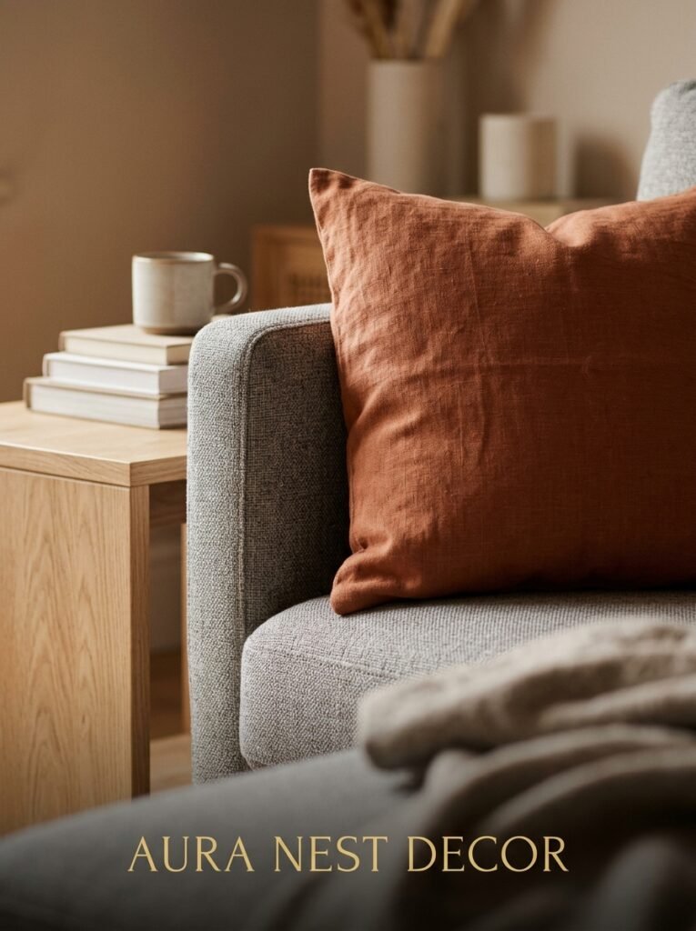
Burnt orange. Or terracotta. Or that particular brick-meets-rust shade that gets called a dozen different names on paint charts.
It sounds bold. It’s actually really easy to live with. And in a modern living room — especially one with a taupe or warm white sofa and some wood tones — a single terracotta accent just LANDS. It’s warm without being cozy-cottage. It’s bold without being aggressive.
One cushion. One piece of art. One ceramic vase on the shelf. You don’t need more than that. In fact, more than two terracotta accents starts to feel like you’re theming the room rather than decorating it.
This works particularly well against grey or charcoal architectural elements — dark window frames, exposed steel, anything with an industrial lean. The warmth of the terracotta against the coolness of those materials is exactly the kind of contrast that makes a room feel considered.
“One warm accent in a cool room is an exclamation point. Two is punctuation. Three is shouting.”
—
10. The Shelf Styling Mistake Almost Everyone Makes (Including Me, for Years)
Filling every inch.
A modern shelf — open shelving, a floating wall shelf, built-in bookcase, whatever — needs breathing room. If every cubic inch of that shelf is occupied, it doesn’t read as “curated.” It reads as “storage.” And storage and display are completely different things.
The ratio that works: roughly 60% filled, 40% empty space. Books clustered in one section, then a gap, then one or two objects, then another gap. The empty space is part of the composition. It’s not waiting for something to fill it.
I also want to gently say: mixing horizontal and vertical books makes a HUGE difference. Lay two or three books flat, stack something on top (a small bowl, a single candle), then return to vertical. It breaks up what would otherwise be a repetitive line and gives the shelf a rhythm.
Color-organize the books. Even loosely. You don’t have to be obsessive, but grouping warm spines together and cool spines together is enough to bring order without looking too try-hard.
—
11. The TV Wall Situation (And How to Not Let It Ruin Everything)
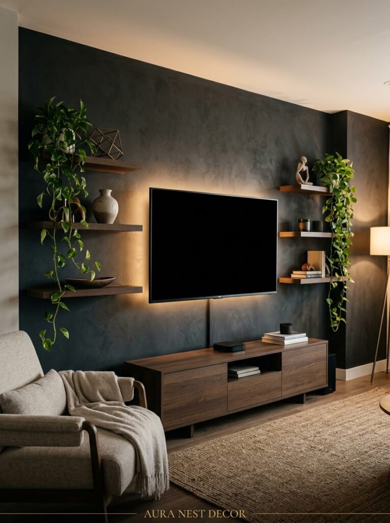
Nobody talks about this enough given that most of us have one.
The TV is the visual anchor of most living rooms whether we like it or not. The mistake is fighting it — trying to disguise it, bury it in a gallery wall, pretend it’s not there. That approach mostly just looks awkward.
The modern solution is to commit to it. Dark paint the wall behind it, floor to ceiling. Or build a simple flat-panel TV unit that spans the full width of the wall so the TV becomes part of a larger horizontal composition rather than a random black rectangle floating on white plaster. Frame it with two tall plants or sconces on either side.
When the TV is off, a dark background makes it almost disappear. When it’s on, the dark wall reduces glare and contrast bleed. It’s actually the practical choice as much as the aesthetic one.
Americans: built-in media walls are a whole genre on US Pinterest and for good reason. UK homes with period walls or picture rails have to adapt more — a floating unit at the right height and some clever cable management goes a long way.
—
12. Small Details That Cost Almost Nothing and Quietly Change Everything
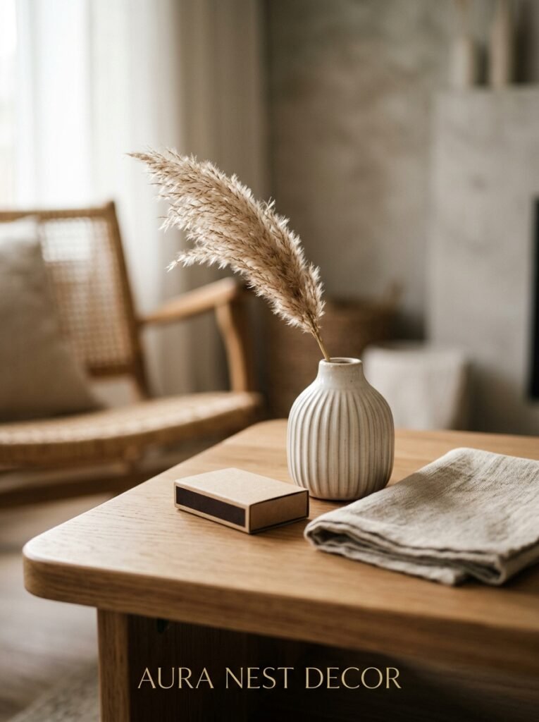
Because not every improvement has to be a project.
Swap your plug sockets for brushed brass or matte black ones. I’m serious. In the UK this costs about £8-15 per socket and takes twenty minutes if you’re vaguely competent with a screwdriver (or ten if you’re not, just call an electrician). In the US, outlet covers are even cheaper and faster. That tiny metallic detail across a room adds up to something that looks like a decision.
Get a book on your coffee table that you actually find interesting. Not a stack of aspirational coffee-table books you bought for the aesthetic — one book, face-up, that means something to you. It’s a detail that says “a real person lives here” in a way that a decorative bowl simply can’t.
Replace any cool-white bulbs with warm white or amber ones. 2700K or warmer. This single thing costs a few dollars or pounds and changes how your entire room feels at night. I cannot stress this enough. Cool white lighting is the enemy of cozy modern. It makes everything look like a dentist’s waiting room.
—
❓ FAQ
Q: What’s the best way to make a small modern living room feel bigger? A: Go light on the walls — warm white or very pale plaster tones — and invest in one large rug rather than a smaller one. It sounds counterintuitive but a bigger rug makes the room feel more spacious, not more cramped. Mirrors placed to reflect a window or lamp also help a lot without requiring any structural changes.
Q: How do I mix modern furniture with pieces I already own? A: Focus on the finish rather than the style. If your existing pieces have warm wood tones, oak or walnut modern pieces will bridge the gap. If they’re mostly upholstered, consistent fabric tones pull things together. You don’t need everything to match — you need everything to be in conversation with each other. One intentional new piece can bring the rest of the room into focus.
Q: Are open shelves still a good idea in a modern living room? A: Yes, but only if you’re genuinely okay with maintaining them. Open shelves look incredible when styled well and chaotic when they’re not — there’s no middle ground. If you know you’ll use them as landing strips for random stuff, go for closed cabinetry and put the effort into a few really beautiful surface displays instead. Honest answer.
—
💭 Final Thoughts
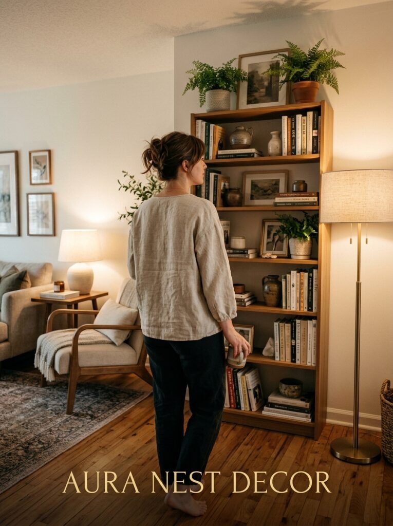
Modern doesn’t mean cold. That’s the thing people get wrong most often and it’s understandable — a lot of modern design photography leans stark and a bit intimidating. But the rooms that feel genuinely good to be in? They’re warm. Considered. They’ve got one weird thing you didn’t expect, one light source that makes you feel slightly better about your life, one texture that makes you want to reach out and touch it.
You don’t have to do all of this at once. One good lamp and a rug that’s actually the right size will do more for your room than a full redesign done half-heartedly.
What’s the one thing about your living room right now that’s been quietly bothering you — and have you been putting it off longer than you probably should?




