
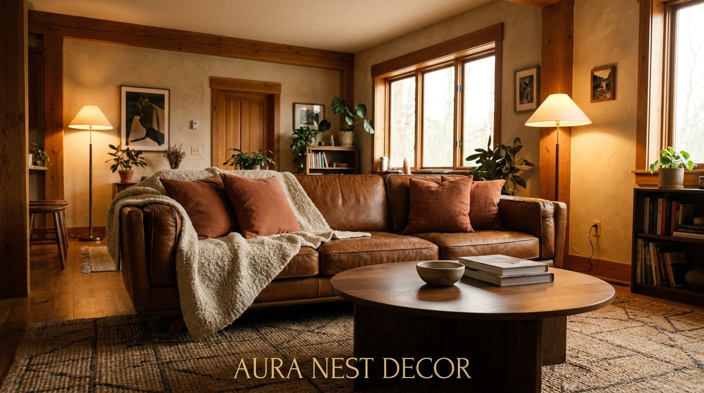
Brown Is Having Its Moment and I’m Absolutely Here For It
My friend Hannah called me last month in full panic mode. She’d just painted her living room a warm chocolate brown and everyone — her mum, her partner, her neighbor — told her it looked “too dark.” She wanted to repaint. I told her to wait two weeks before touching anything.
She texted me a photo last Tuesday. Honestly? It looked incredible.
—
1. Why Brown Stopped Being the Color We Were Running From
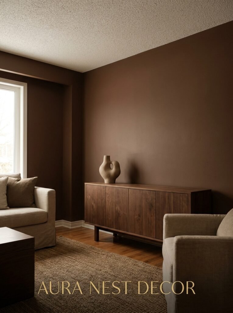
There’s a very specific reason brown got abandoned for about fifteen years. The mid-2000s did something cruel to this color — beige carpet, brown leather sectionals, those dark wood TV stands — and by 2012 everyone fled to gray and white and never looked back.
But here’s the thing. Brown was never the problem. The combinations were.
Right now, the living rooms making the biggest splash on Pinterest aren’t the stark white ones. They’re the rooms with deep clay walls, caramel-toned sofas, and warm cream linen layered in — and they feel ALIVE in a way that white rooms genuinely don’t. There’s depth. There’s a hug in the architecture.
Brown done right doesn’t swallow a room. It grounds it. And once you understand the difference between those two things, everything changes about how you design with this color.
—
2. The Brown That Keeps Showing Up in Every Beautiful Living Room Right Now
Not all browns are created equal and this matters more than most color guides will tell you.
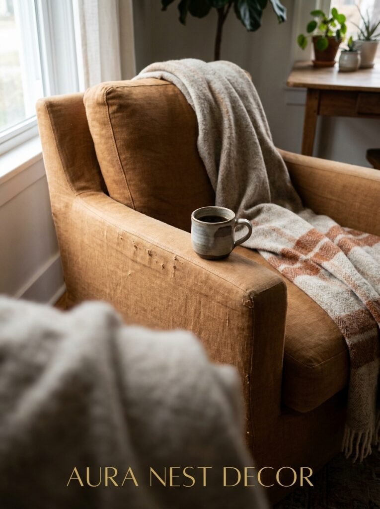
The browns that are everywhere right now — in the design studios, on the mood boards, in the before-and-afters that stop people mid-scroll — tend to pull warm. Not gray-brown. Not greenish taupe (though that has its moment too). Think more terracotta’s quieter cousin. A brown that looks like the inside of a walnut, or the rim of a coffee cup, or leather that’s been broken in over a decade.
“The browns that stop the scroll aren’t ‘safe.’ They’re specific. Warm, committed, and paired with materials that breathe.”
If you’re choosing a paint color, hold your chips up in actual evening light — around 6pm when the sun’s going low — because that’s when brown paint either sings or turns muddy. It’ll look completely different than it did at noon. This isn’t a fun fact, it’s genuinely practical advice that’ll save you from repainting.
Favorite shades that work brilliantly in US and UK homes right now: anything in the Farrow & Ball “Dead Salmon” or “London Clay” family, or Benjamin Moore “Brendan Beige” if you want something a little lighter with legs.
—
3. The Sofa Question (Because That’s What Everyone’s Actually Agonizing Over)
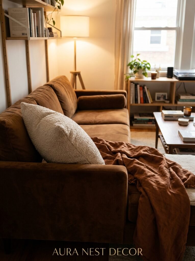
Let’s be real — most people asking about brown living rooms are staring at a brown sofa wondering if they’ve made a terrible mistake. Or they’re about to buy one and need someone to tell them it’s okay.
It’s okay. More than okay.
A caramel leather sofa is one of the most useful pieces of furniture you can own. It ages well. It looks better with a scratch on it, not worse. And it plays nicely with almost every other color in a way that gray velvet simply doesn’t. Olive green throw? Perfect. Cream boucle cushion? Obviously. A dusty blue knit blanket thrown half off? Surprisingly beautiful.
But. If your sofa is a very dark, flat chocolate brown — the kind that doesn’t have much warmth or variation in the tone — you’ll need to work harder with what’s around it. Light wood floors or a pale jute rug beneath it. Warm white walls, not cool white. Brass hardware somewhere nearby because brass and dark brown is a combination that shouldn’t work as well as it does.
The sofa isn’t the problem. It’s usually the ceiling or the flooring that makes a dark sofa feel heavy. Fix those two things before you blame the couch.
—
4. The One Rule That Makes Brown Rooms Feel Cozy Instead of Cave-Like
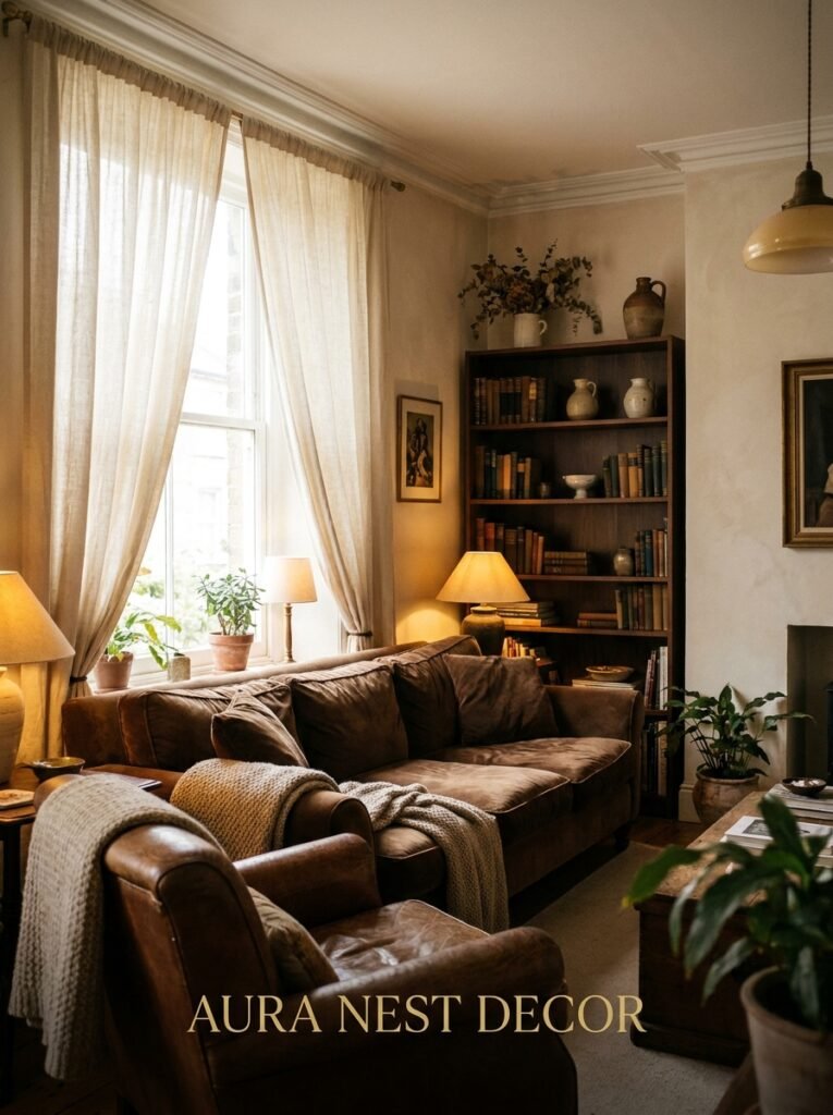
Layer your light sources. That’s it. That’s the rule.
A single overhead bulb in a brown room is a death sentence for the vibe. But four warm light sources at different heights — a floor lamp in the corner, a table lamp on the side table, a couple of candles on the coffee table, and maybe a plug-in wall sconce — and suddenly that brown room feels like the most inviting place in your house.
Not warm lighting generally. Specifically 2700K bulbs or lower. The amber glow of an Edison-style filament at 7pm in October is not something you manufacture easily, but it’s entirely achievable. And in a brown room, that warmth reflects off the walls in a way it never could off white paint.
Side note — I was very late to the plug-in sconce situation and now I have four of them. Absolutely no regrets.
—
5. What to Do with the Floor When Your Walls and Sofa Are Both Brown
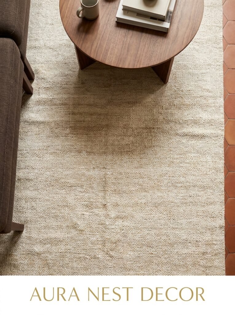
This comes up constantly and honestly it’s a legitimate design puzzle.
If you’re working with warm brown walls AND a brown sofa, your floor has to do something decisive. It can’t just sit there being medium-toned and hoping for the best. The options that actually work:
- Pale stone or light hardwood — the contrast gives the room air. Engineered oak in a light wash is doing a LOT of heavy lifting in UK homes right now.
- A large cream or ivory rug — even if the floor underneath is also mid-brown, the rug creates a visual break that separates the seating area from the walls.
- Deep, dark floor — double down completely. Dark walnut floors with dark brown walls sounds insane and looks like a boutique hotel suite. It requires confidence and good lighting, but if you commit it’s stunning.
What doesn’t work: medium brown floor, medium brown walls, medium brown sofa. Too matchy. Too flat. You’ve got to create some contrast somewhere or the room turns into one big undefined mass.
—
6. The Texture Mix That Stops Brown From Feeling Dated
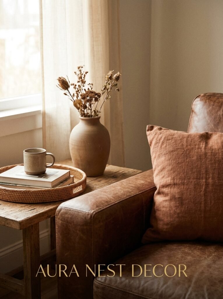
Here’s where a lot of brown living rooms go wrong and it’s subtle. They’re all smooth. Leather sofa, smooth painted wall, glass coffee table — nothing for the eye to catch on.
Brown as a color already reads as natural, earthy, grounded. So you’ve got to amplify that by bringing in materials that ALSO feel natural. Rough-weave linen cushion covers. A chunky knit throw. A sisal or jute rug that you can almost feel just by looking at it. A terracotta pot with actual soil visible at the top.
“If your brown room feels flat, it’s almost never the color. It’s that nothing in the room has texture.”
Wicker and rattan absolutely belong here — I know they got overused in the late cottagecore wave but they’re genuinely useful in a brown room and they haven’t gone anywhere. A rattan side table or a woven pendant light just softens the whole thing.
And if you’ve got wood floors or wood furniture? Don’t match the tones exactly. Mix them. A light ash coffee table with walnut shelves sounds chaotic but it looks considered and real.
—
7. The Color That Wakes Up a Brown Living Room Without Ruining It
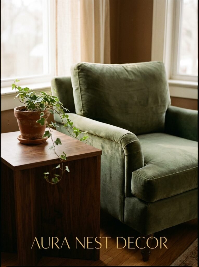
Green. Every single time.
Not lime. Not kelly. Something botanical — sage, forest, a green so dark it’s almost brown itself. The relationship between brown and green is basically just nature’s default setting and it works because we’re biologically wired to find it calming and beautiful or something. I’m not a scientist but I know what looks good.
A few sage green cushions on a caramel sofa. A dark green velvet armchair in the corner. A trailing plant — pothos, philodendron, something with a little drama to the leaf — on a windowsill or hanging shelf.
Or, if you want something that pops a bit more: burnt orange. Mustard. The rust tone you find in old Persian rugs. These sit next to brown the way they were always meant to be there. A single terracotta lamp base on a side table can pull an entire room together and it’ll cost you about fifteen dollars.
—
8. Why Art Matters More in a Brown Room Than in Any Other
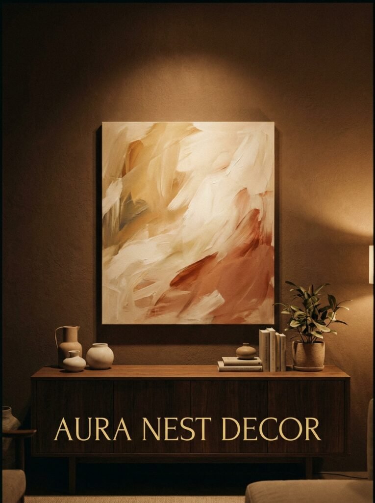
This is something I didn’t expect when I first started styling brown-dominant spaces. Art hits differently against warm brown walls.
White walls make art look clean and gallery-like — which is great, but it’s also a bit sterile. Against a warm brown background, art looks LIVED IN. Like it was chosen. Like it belongs to someone specific. A loose watercolor of olive branches. A framed vintage botanical print. An abstract with warm ochre tones that you found at a car boot sale for three quid and it’s now the thing every visitor mentions.
Big art, too. One large framed print above a sofa in a brown room is fifty times more impactful than a gallery wall of small things. Go bigger than you think. The color of the wall can handle it.
And don’t over-frame in black. Warm wood frames, natural gallery frames, thin brass frames — these are your friends here. Black frames work too but they need to be used deliberately, not defaulted to.
—
9. The Small Brown Living Room Problem (And an Actually Useful Solution)
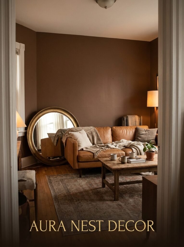
People assume brown will make a small room feel smaller. But often the opposite is true — or at least, it doesn’t make it worse, which is already saying something.
The real issue in a small brown living room is almost always furniture scale. A huge sofa that eats the whole footprint, a giant coffee table that blocks movement — these things make the room feel cramped, not the color.
“A well-scaled small room in deep brown feels like a den. In a good way. In an on-purpose way.”
In a small UK terrace living room or a compact New York apartment sitting room, consider this: one compact sofa, two smaller chairs instead of a second full sofa, and a round coffee table (round tables genuinely make small rooms feel bigger — I don’t know why this works but it absolutely does). Keep curtains floor-length and close to the ceiling rod. Keep the ceiling lighter than the walls.
Done. You’ve got a room that feels intentional.
—
10. Styling the Shelves in a Brown Living Room (This Is Where Most People Give Up)
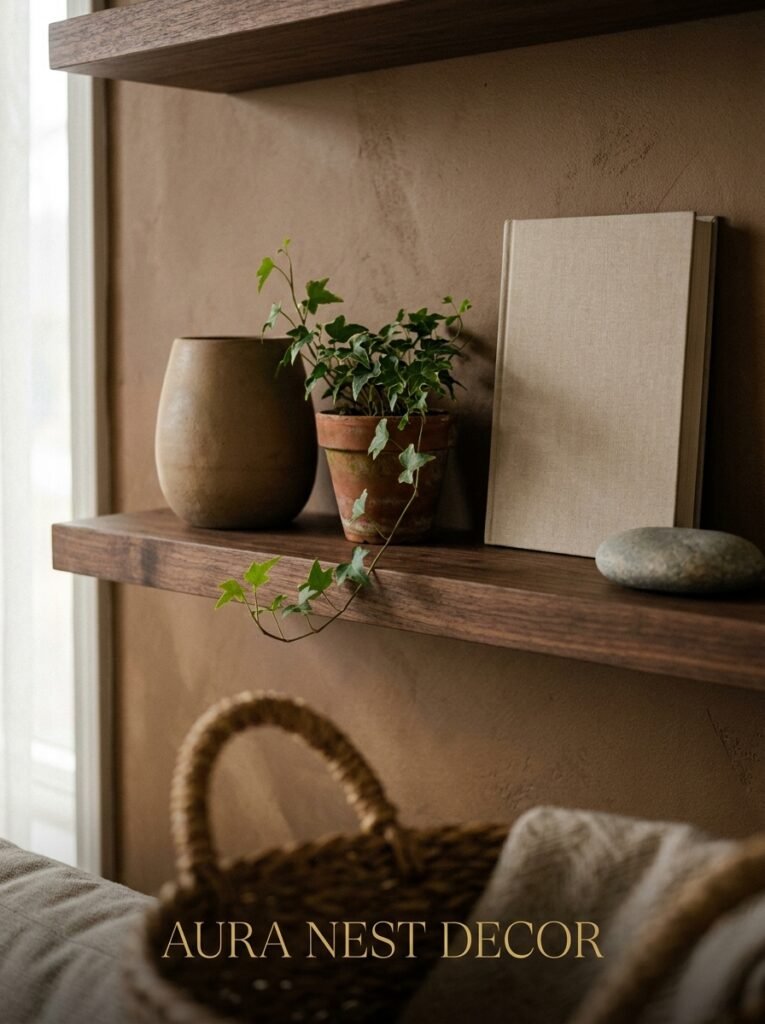
Shelf styling in an already-warm room can go two ways: it either adds depth and character, or it turns into a chaotic mess of stuff that makes the whole room feel cluttered.
Here’s what works. Less than you think. Seriously — when in doubt, take one thing off the shelf. In a brown-toned room where the walls and furniture already have a lot of personality, the shelves need some breathing room.
Neutral objects. Books with their spines turned out or in curated colors — cream, tan, dark green — rather than a full rainbow. A few ceramics in earthy tones. One small plant. A candle. And then a gap. An intentional, deliberate gap where there’s nothing.
That gap makes the things around it look chosen. And in a brown room, “chosen” is the whole point.
—
11. The Lighting Fixture Nobody Talks About (But That Changes Everything)
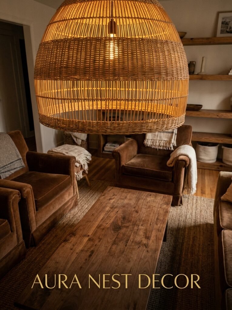
Pendant lights and ceiling fixtures are an afterthought in most decorating conversations and I genuinely don’t understand why.
In a brown living room especially, the overhead fixture is doing visual work even when it’s off. A paper lantern pendant in warm cream. A sculptural rattan globe. A cluster of amber glass pendants hung at different lengths. Any of these, above a seating area with a brown backdrop, creates a moment. A thing to look UP at.
And when they’re on — when you’ve got warm-toned bulbs glowing through rattan or amber glass at night — the brown walls catch that light and the whole room gets about three degrees cozier. Honestly, sometimes the light fixture is the single change that takes a “fine” brown room to a “why does this feel so good” brown room.
Budget options exist. IKEA, Wayfair, and even Amazon have genuinely nice sculptural pendants now for under $80 / £60. You don’t need to spend a lot. You just need to care about this.
—
12. The Brown Living Room Gallery Wall That Actually Works
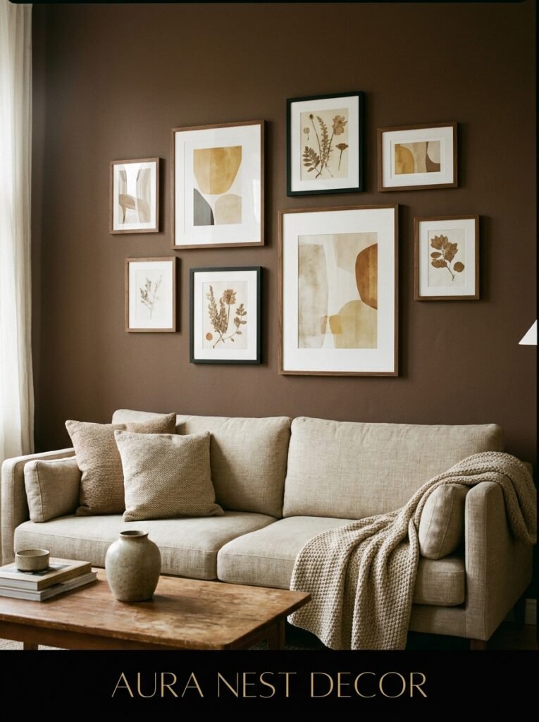
Gallery walls in brown rooms get complicated because the frames, the mat colors, and the art itself all have to play together with the wall tone — and most “how to do a gallery wall” guides were written with white walls in mind.
So a few adjustments. First, choose art that has warmth in it — even if it’s black and white photography, look for images with texture and depth rather than stark contrast. Second, mix your frame finishes: natural wood, a little brass, one or two simple white-mat frames. Third, and this is the part people skip — before you hammer anything, lay it all out on the floor. Exactly as you’d hang it. Photograph it from standing height. You’ll immediately see what’s off.
And give the arrangement some asymmetry. Not a perfect rectangle of frames. Let it drift a little. Slightly irregular. Real homes don’t look like product catalogues — or they shouldn’t, anyway — and a brown living room is fundamentally a space about warmth and humanity, not perfection.
That’s the whole point, isn’t it?
—
❓ FAQ
Q: Does brown work if I have a north-facing living room with not much natural light? A: Honestly, this is where you need to be most careful. A north-facing room in the UK especially gets cool, flat light all day, and very dark brown walls can make it feel gloomy rather than cozy. Try mid-toned browns with strong warm undertones (terracotta leanings, not gray ones) and double down on artificial warm light. Or paint just one wall and keep the rest lighter.
Q: Can I mix brown with gray, or does that look dated? A: It depends completely on the undertones. Warm brown with warm gray (one that pulls beige or greige) can look sophisticated. But warm brown with cool blue-gray often looks confused — like two rooms that got merged by accident. If you want to mix them, get samples on the wall together in actual daylight before committing.
Q: What color curtains go with brown walls? A: Linen in a natural, undyed tone is almost always the answer — it’s warm without competing. Dark green velvet curtains in a brown room are also genuinely beautiful and doing a lot of work in design-forward UK and US homes right now. Avoid curtains in the exact same brown as the walls, because the lack of contrast makes the windows disappear.
—
💭 Final Thoughts
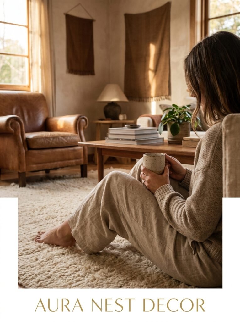
Hannah’s living room looks better than it did before she panicked, better than the off-white she nearly painted it, and she’s already planned three dinner parties there since. The thing about brown is it asks you to commit — and most people aren’t used to committing to a color that feels this significant.
But that’s exactly what makes it work. It’s a room that knows what it is.
Are you the kind of person who plays it safe with a room, or are you finally ready to try the color you’ve been pinning for two years?




