
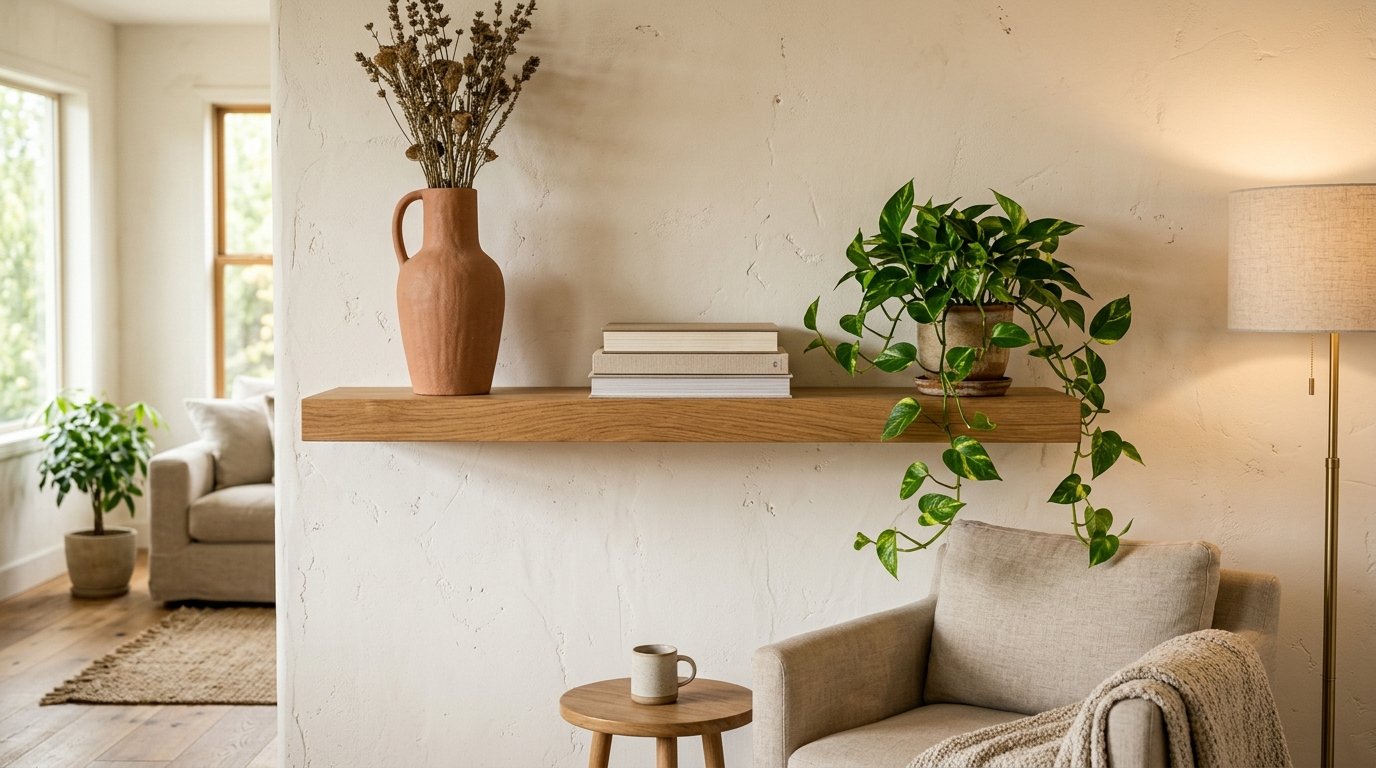
The Shelf Styling Rules I Broke (And Why My Living Room Finally Looks Right)
My shelves looked fine for three years. Fine. Not good, not bad — just there, holding things, doing their job like a waiting room chair. Then a friend came over and said, “why does your bookshelf look like a dentist’s office?” and honestly? She wasn’t wrong.
So I pulled everything off and started from scratch.
—
1. The “Less” Part of Minimalism Doesn’t Mean Boring — Here’s the Difference
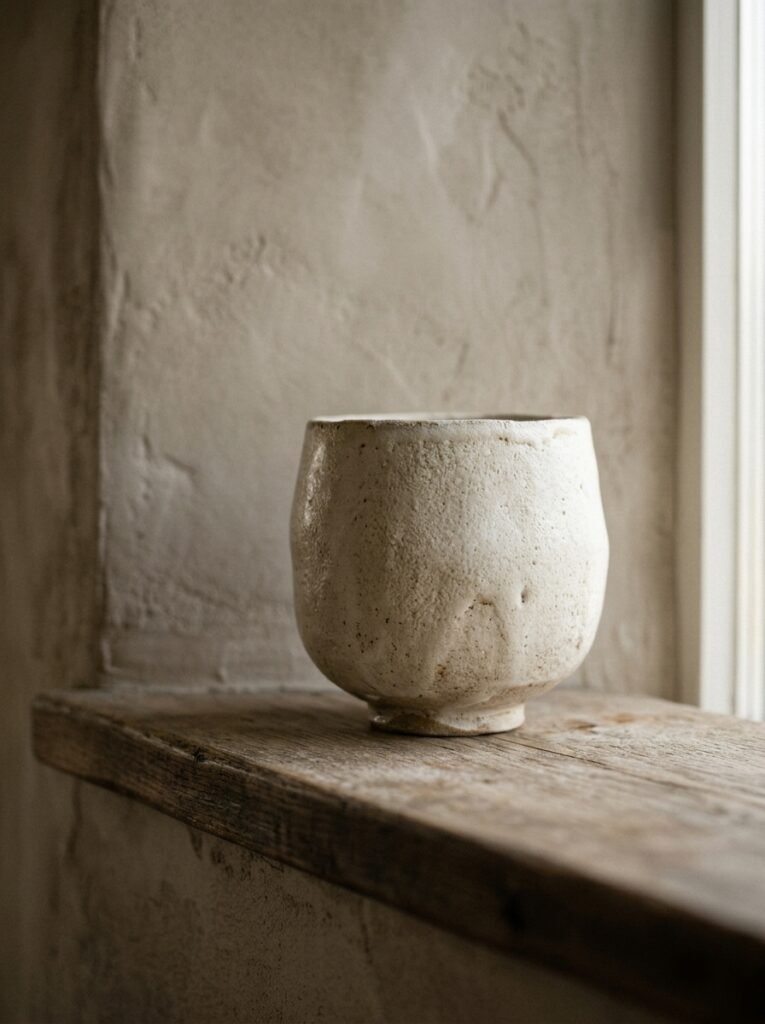
There’s a version of minimalist shelf decor that’s just… empty. A shelf with one white candle on it. And sure, that’s a choice. But the shelves that actually stop you mid-scroll on Pinterest — the ones that feel calm AND interesting — those aren’t empty. They’re edited.
That’s the distinction I didn’t understand for a long time. Minimalism isn’t about removing things until nothing’s left. It’s about keeping only the things that have WEIGHT. Visual weight, emotional weight, some kind of reason to be there.
A shelf with seven thoughtfully chosen objects looks completely different from a shelf with seven random ones, even if the count is the same. The difference is intention, and you can feel it the second you walk into the room.
“Minimalism isn’t about having less. It’s about having less of the wrong things.”
So before you buy anything new, start by asking what’s already on your shelf and whether it would survive a cut. Be ruthless. The stuff that survives is what you actually work with.
—
2. Why Odd Numbers Actually Work (And When to Ignore That Rule)
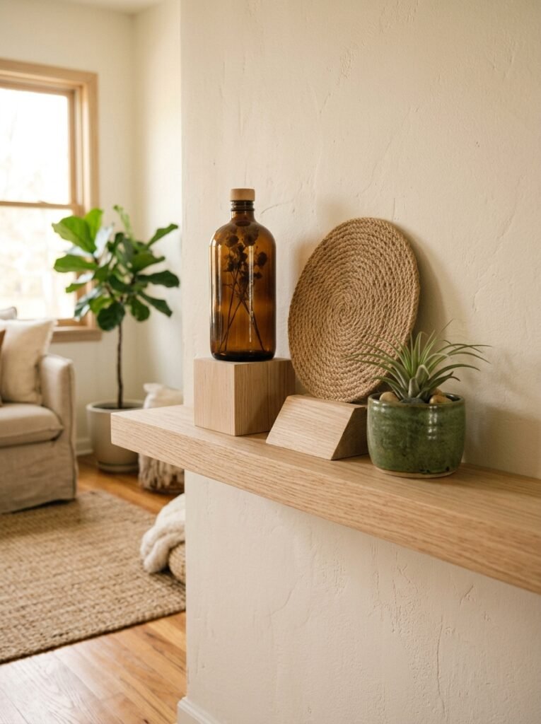
Everyone says “style in odd numbers.” And they’re right, mostly. Three objects grouped together reads as more natural and dynamic than two or four. Something about how the eye moves — it doesn’t get stuck in a loop.
But here’s what nobody tells you: it’s not about counting objects. It’s about creating visual tension. One tall thing next to two small things creates tension. Two tall things of different heights create tension. An even number of mismatched objects can work perfectly if the visual relationship between them is interesting enough.
I have two small ceramic pieces sitting next to a stack of books on one of my shelves. Technically even. Looks great. Because the height difference does the work that the odd number usually does.
So: default to odd numbers, but don’t be precious about it. Trust your eye more than the rule.
—
3. The Height Trick That Makes a Flat Shelf Look Like a Styled One
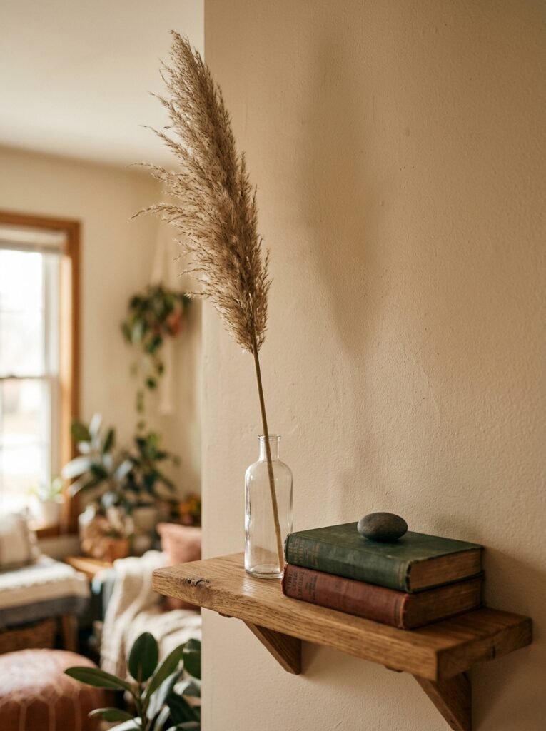
This one’s simple and it changed everything for me.
Vary your heights. Dramatically. Not like, slightly different candle heights — actually different. A tall vase next to a short stack of books next to a medium sculpture creates a kind of skyline effect, and your eye moves across it the same way it moves across an interesting cityscape.
Flat shelf = everything the same height = looks like a shop display, and not in a good way.
The fastest way to add height without buying anything new: stack books horizontally. Two or three books lying flat creates an instant plinth for whatever you put on top. A small plant, a candle, a little object you picked up traveling — suddenly it has presence.
Side note — if you’re stacking books, turn a couple so the spines face inward. Especially if they’ve got loud covers. The neutral page edges look cleaner and, not gonna lie, slightly more editorial.
—
4. The Color Palette That Keeps Showing Up in Every Beautiful Minimalist Shelf Right Now
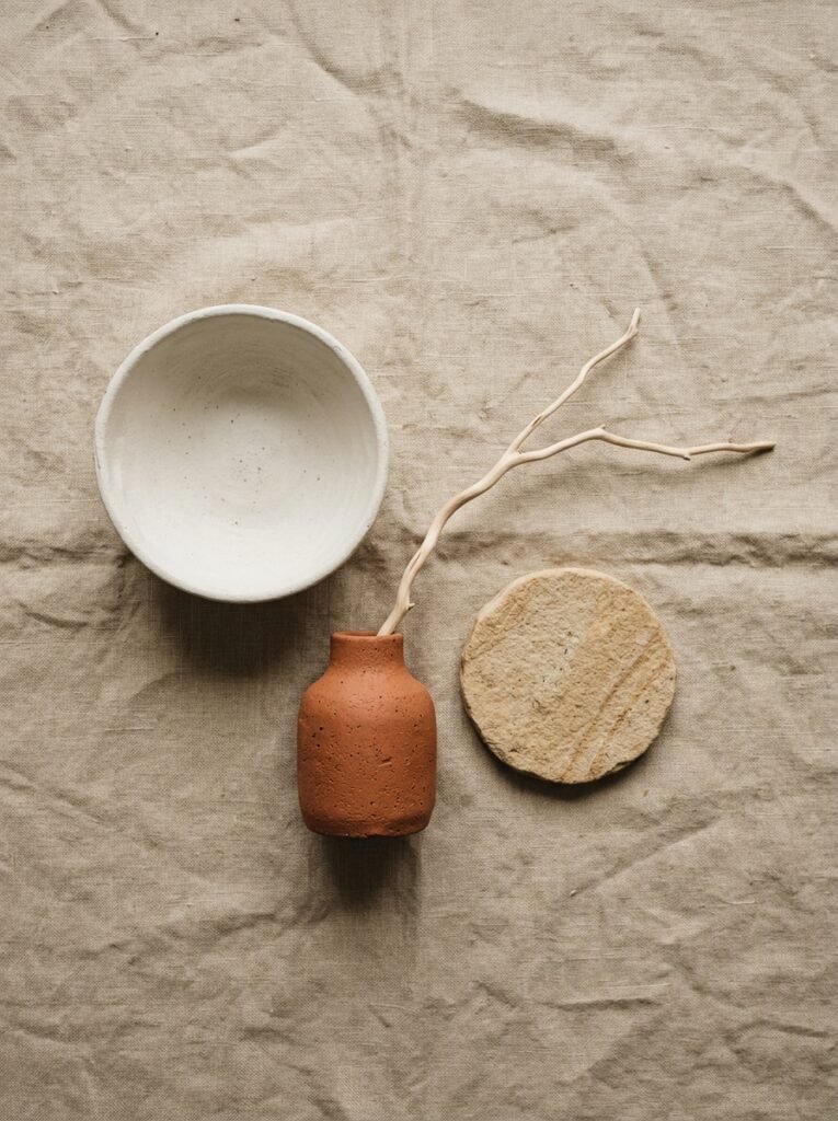
It’s neutrals with ONE moment of warmth. That’s it.
White, off-white, natural linen, raw wood, matte black — and then one thing that’s warm. A terracotta vase. A honey-toned wood piece. A dried grass arrangement that catches the light in October and looks golden.
The warmth is what stops it from going cold. Purely cool neutrals on a shelf can feel clinical. One warm note fixes that immediately, and it doesn’t take much.
What I’d avoid right now: matching sets. A trio of matching vases in the same glaze looks very 2018. Mix your textures — matte next to glossy, rough next to smooth, natural next to geometric. The contrast is where the interest lives.
—
5. Plants That Actually Work on a Shelf (And the One That Always Dies)
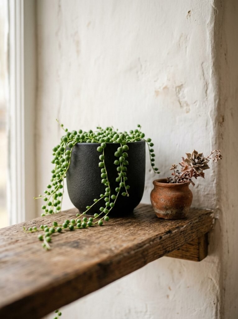
Not every plant is a shelf plant. I’ve killed enough of them to know.
The ones that genuinely thrive on shelves — where light is often indirect and watering is easy to forget — tend to be the ones that tolerate neglect. A small trailing pothos looks incredible draping over the edge of a lower shelf. A propagation glass with a single cutting feels minimal and alive at the same time.
“One real plant does more for a shelf than six artificial ones ever could. You can tell. Everyone can tell.”
Succulents work if you’ve got decent light. Air plants are genuinely forgiving. A small sculptural cactus in a clay pot pulls double duty as decor AND plant, which feels efficient in a satisfying way.
The one that always dies on shelves? Peace lilies. They need more water than you think, and shelf placement usually means they get forgotten. Beautiful in concept, consistently disappointing in practice. Anyway.
—
6. The Object Nobody Thinks to Put on a Shelf That Always Looks Good
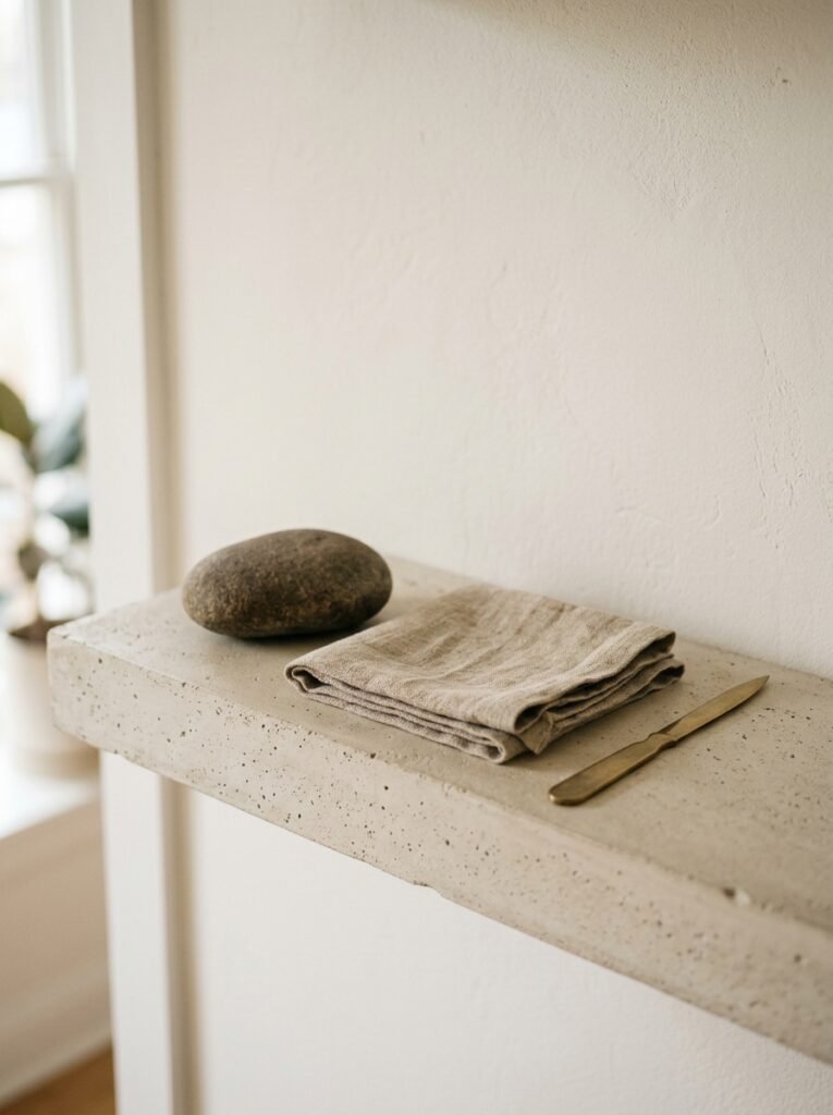
A single piece of fruit.
I know that sounds ridiculous. But a lemon in a shallow ceramic dish, or one perfect quince in October, or a couple of figs — these things look extraordinary on a minimalist shelf. They add color, organic shape, and a realness that no decorative object can fake.
There’s something about knowing it’ll be gone in a week that makes it feel intentional rather than precious. And it forces you to keep interacting with the shelf, switching things out, which keeps it from going stale.
Other unexpected additions that work: a folded textile draped over one shelf edge (adds softness and breaks up the hard lines), a single printed photograph with no frame just leaning, a small architectural model, a vintage glass bottle with nothing in it.
The things that don’t declare themselves as “decor” often look the most interesting on a minimalist shelf.
—
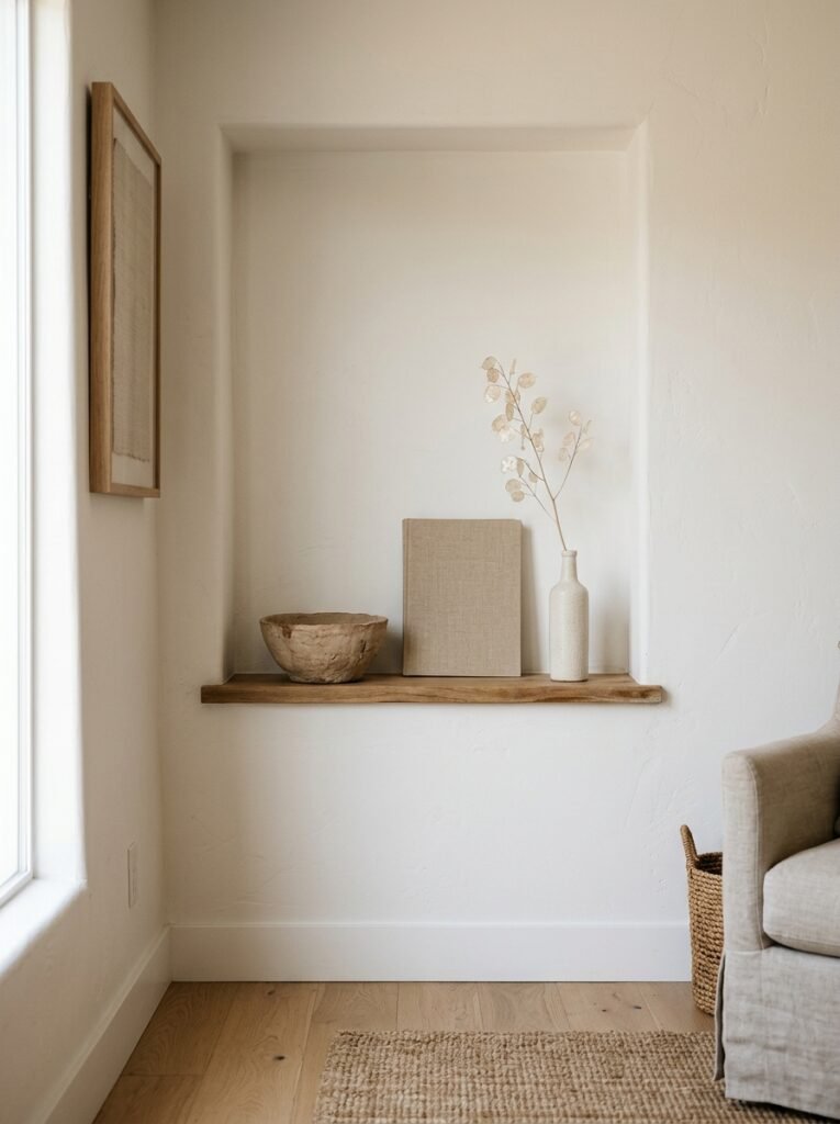
7. The One Rule That Makes Even a Tiny Alcove Shelf Feel Intentional
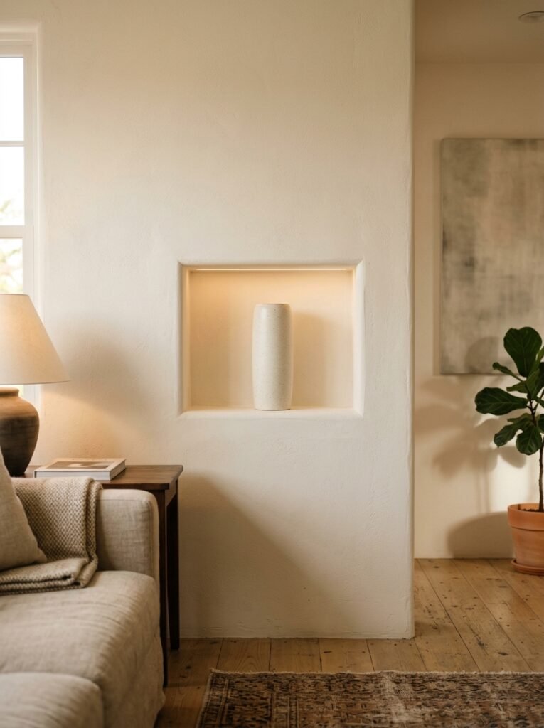
Leave space. Actual space. Not “I ran out of room” space — deliberately chosen empty space.
This is the hardest thing for people to do because it feels like waste. Like you’re leaving a job half done. But that empty area is doing real work. It’s what makes the eye stop at the things you DO have, rather than scanning past everything in a blur.
A third of your shelf should probably be empty. Or close to it. If every inch is covered, nothing reads as a choice.
Think of it like this: a word surrounded by other words is just a word. The same word on a mostly blank page becomes something you actually look at.
—
8. Books as Decor Without Making It Look Precious or Try-Hard
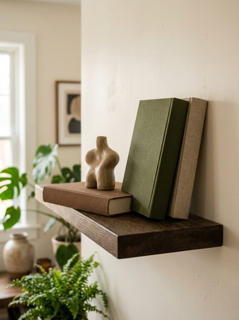
Books are the backbone of most shelf setups, but there’s a range between “chaotic paperback pile” and “aspirational coffee table book tower,” and the sweet spot is somewhere in the middle.
A few practical things that actually work:
- Group books by color loosely, not obsessively. You don’t need a full rainbow — even pulling all your warm-toned spines to one shelf creates cohesion without looking like you spent three hours doing it.
- Mix vertical and horizontal stacking on the same shelf. It breaks the visual monotony and gives you those natural platforms I mentioned before.
- Let a couple of books stick out slightly, not perfectly aligned. Perfect alignment looks sterile. A book or two that’s slightly forward reads as “someone actually reads these.”
And honestly, it’s fine to face some books backward. The minimalist bookshelf internet has been doing this for years and it polarizes people every time, but the neutral page edges genuinely do look cleaner. Your call.
—
9. When Matching Frames Make Everything Feel Too Controlled
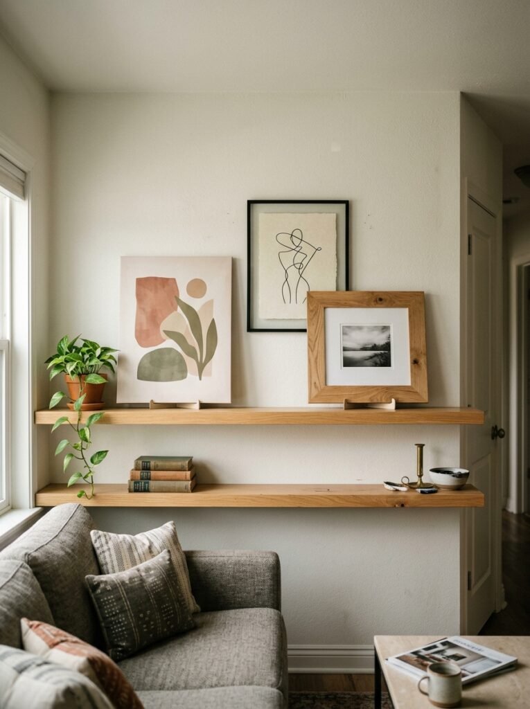
There’s a version of minimalist shelf decor that’s all matching frames — all black, all the same size, same mat, same everything. And it can look good. But it can also look like you bought a starter kit and stopped thinking.
What looks better, in my opinion: one larger frame with real breathing room inside it, leaning rather than hung. Let it tilt slightly. Not aggressively — just enough that it doesn’t look bolted to the shelf.
Or skip frames entirely and try a small piece of woven textile pinned to the back of the shelf, or a printed card leaned against the wall. The informality is the point.
“Lean things. Real homes have things that lean.”
The slightly imperfect placement signals that a person lives there, not a showroom. Minimalism gets cold when it forgets that part.
—
10. The Lighting Detail That Changes Everything After 6pm
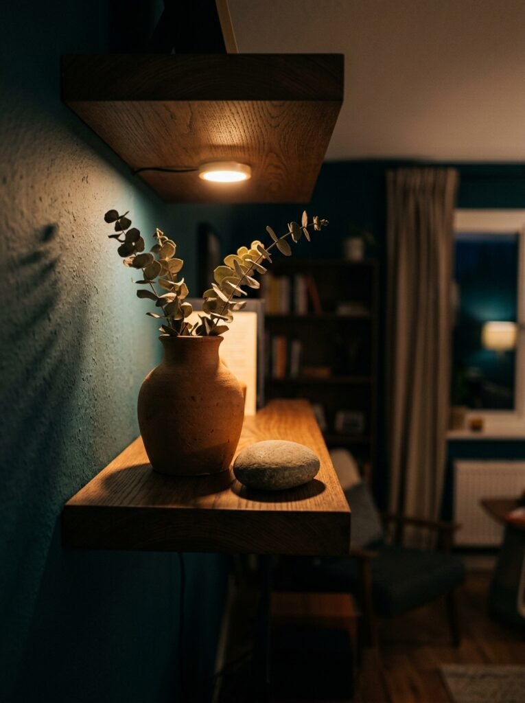
If you’ve got any control over lighting near your shelves, this is worth thinking about.
A small clip light tucked behind a tall object on a shelf — or a battery-operated puck light sitting behind a vase — throws the most beautiful shadows. It backlights your objects, gives everything dimension, and at 7pm when the overhead light’s off? The shelf becomes the coziest thing in the room.
It doesn’t need to be complicated. Even a set of small warm LED string lights draped loosely along the back of a deep shelf looks incredible and costs almost nothing. The key is warm temperature — not cool white, not daylight. Amber. That specific amber that makes everything look like a still from a slow autumn film.
Cold light on a shelf makes it look like a product shot. Warm light makes it look like a home.
—
11. The Common Mistake That Makes Minimalist Shelves Look Cheap
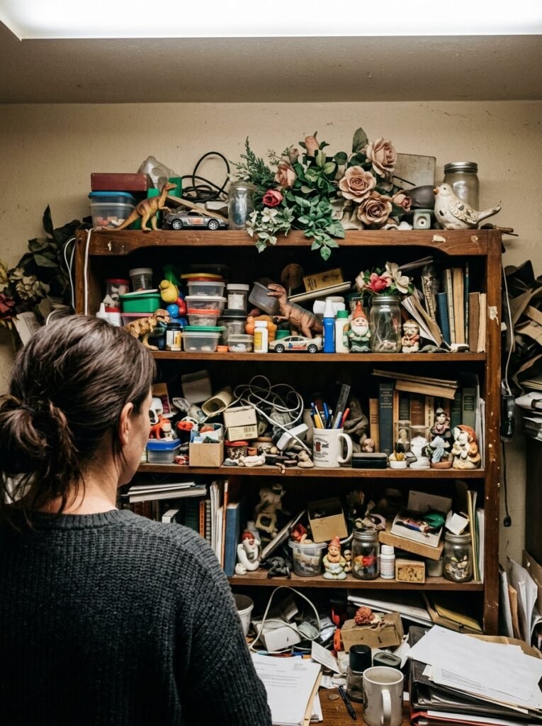
Matching sets from the same collection.
You know the ones — the ceramic set of three with the same glaze, same shape, just three different sizes, sold together as a unit. They photograph well in the shop. On an actual shelf in an actual room, they look like props.
The shelves that look genuinely curated — the ones you pin and come back to — are always a mix of things from different places and different times. A ceramic piece that’s handmade next to something industrial. A found object next to something bought intentionally. Something old next to something brand new.
The variety of origin is what creates authenticity. Or maybe it’s the opposite, honestly — maybe it’s that you can FEEL when things were chosen one at a time. Either way, resist the matching set. Pull things from different corners of your home first, then decide if you need anything new.
—
12. The Last Thing to Do Before You Call It Done
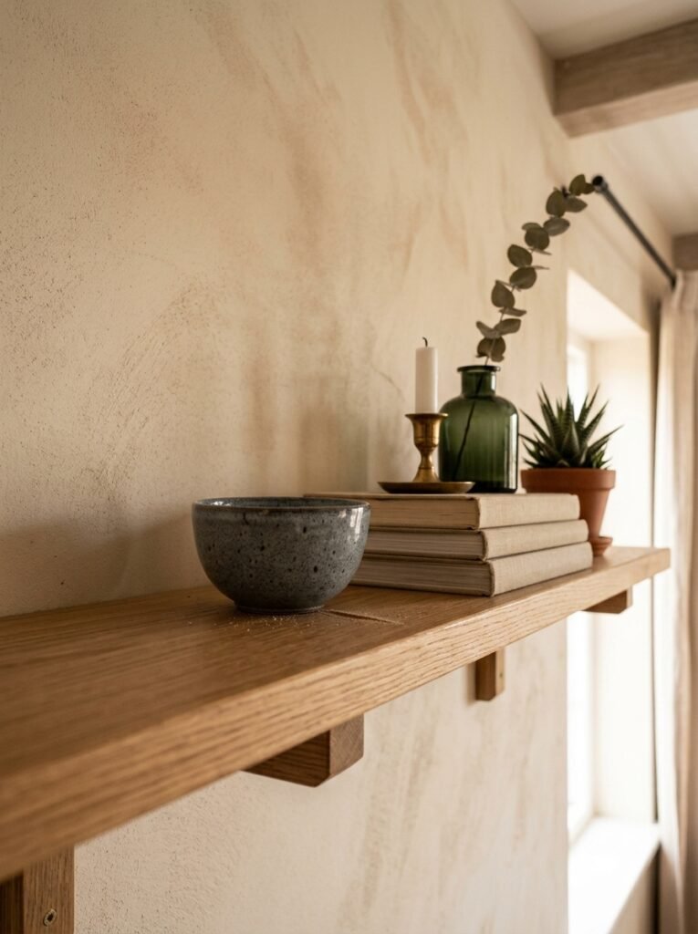
Step back. Literally — walk across the room and look at the shelf from where you actually sit in your living room.
Not where you styled it from. Not where the light’s best for a photo. From your sofa, your usual chair, wherever you actually spend time. Because that’s the view that matters and it’s almost never where you do the work.
Things look different from across the room. Objects that felt balanced up close can look clustered from ten feet away. Gaps that seemed too empty suddenly feel intentional. You’ll see things you want to move and things that are working better than you thought.
Then, if it still feels right after a day or two of living with it — stop. Resist the urge to keep tweaking. Minimalist shelves are most alive when you leave them alone long enough to actually notice them.
—
❓ FAQ
Q: How many things should I put on a minimalist shelf? A: There’s no exact number, but a good starting point is to put everything back you think you want, then remove a third of it. Most people over-fill. The items that remain after that cut usually make a stronger arrangement than anything you add back in.
Q: How do I make my shelf look styled without spending money? A: Work with what you already have first — books, candles, a plant from another room, a single framed photo. Rearranging with intention costs nothing. The biggest shifts usually come from editing down, not adding more.
Q: What’s the easiest way to make a shelf look more cohesive quickly? A: Pull a consistent color through at least two or three of your objects. It doesn’t have to be matchy — just a shared undertone. Warm wood, warm ceramics, a neutral textile. That common thread is what makes a varied collection read as a deliberate arrangement rather than a random pile.
—
💭 Final Thoughts
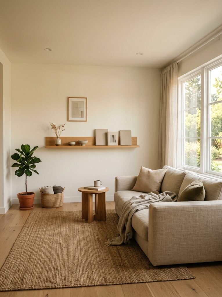
The best shelf I ever styled took about twenty minutes. I stopped trying to make it look like something I’d seen online and just asked what I actually liked looking at. Turns out it was simpler than I thought.
There’s something really settling about a shelf that feels done — not perfect, just done. Like a sentence that ends in the right place.
What’s the one thing you’ve been keeping on your shelf that you already know needs to go?


