
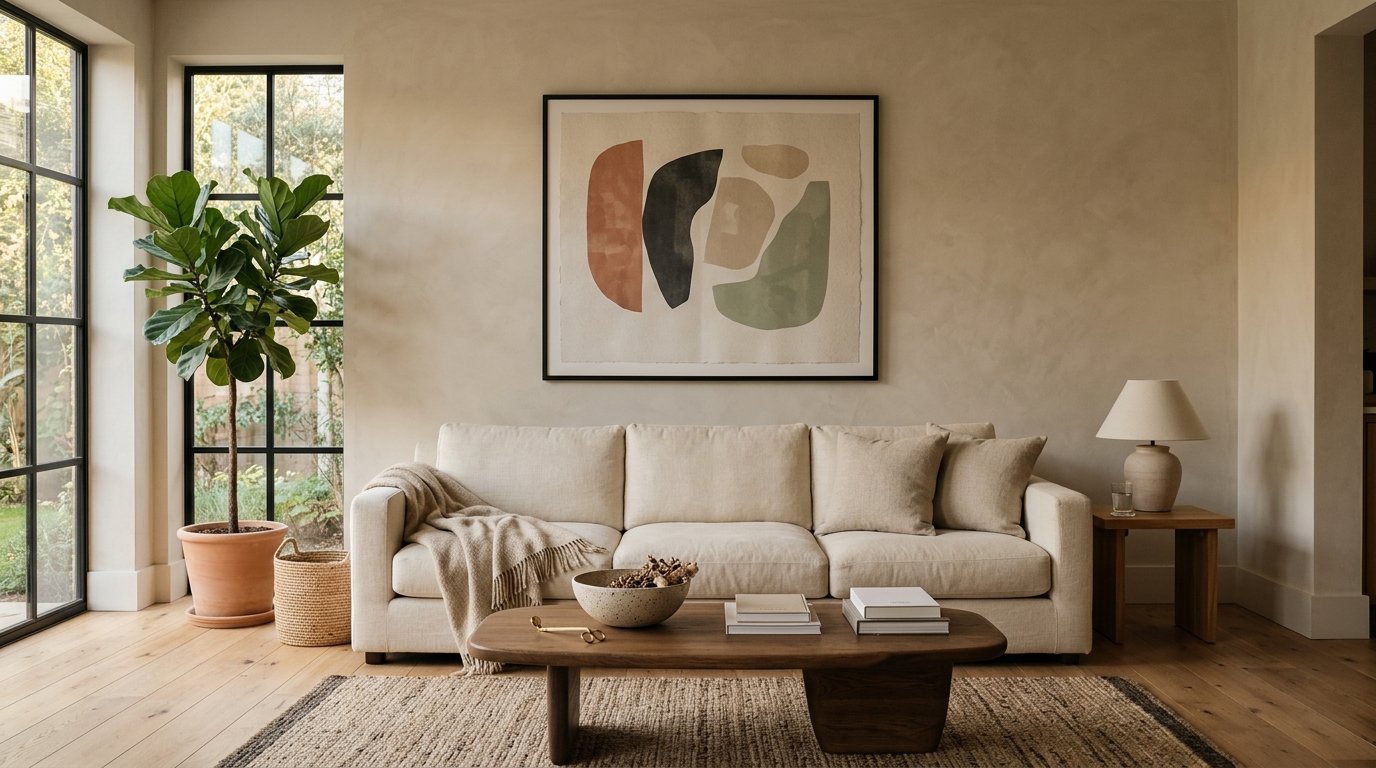
One Big Poster or a Whole Gallery Wall? How Minimalist Art Actually Works in a Living Room
My friend Jess said something to me a few months ago that I couldn’t stop thinking about. She said, “I keep buying art and my walls still look empty.” And I knew EXACTLY what she meant, because I’d done the same thing for years.
—
1. The Reason Your Wall Feels Empty Even After You’ve Decorated It
It’s not that you don’t have enough art. Seriously, it’s not that.
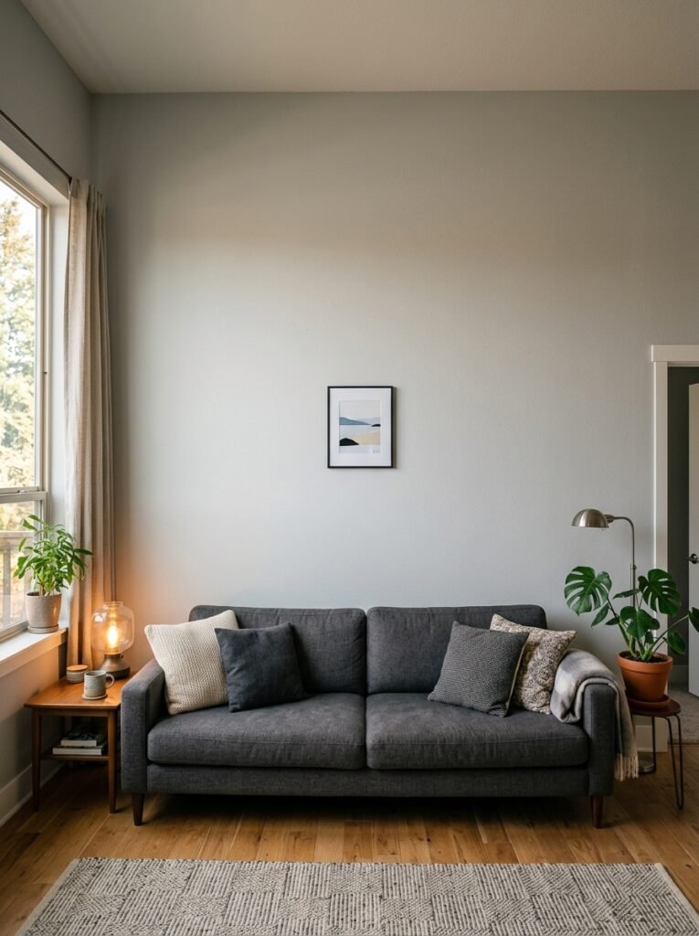
Most people with “empty-feeling” walls have actually hung things — a small print here, a framed quote there — and the room still feels weirdly unfinished. The problem isn’t quantity. The problem is scale. A small poster on a large wall doesn’t fill space, it highlights how much empty space there is around it. It’s almost worse than nothing.
Minimalist wall decor kind of broke my brain when I first got into it, because the whole philosophy is counterintuitive. You’d think fewer things on the wall would make emptiness worse. But a single large, confident piece does something that six small pieces can’t — it anchors the room. It gives your eye somewhere to land and rest.
That’s the foundation everything else builds on.
—
2. What “Minimalist” Actually Means for Posters (Not What You Probably Think)
Can we talk about the word “minimalist” for a second? Because it gets thrown around so loosely that it’s almost become meaningless.
“Minimalist doesn’t mean boring. It means every single thing on the wall has a reason for being there.”
I’ve seen living rooms with one enormous abstract poster that feel rich and layered and warm. I’ve seen rooms with eight small frames that feel cluttered and anxious. The number of pieces isn’t what makes something minimalist — the intention is.
So for the purposes of this article, when I say minimalist poster decor, I mean: deliberate, spacious, not competing. A wall that looks like someone thought about it rather than just filling gaps. That could mean one oversized print. Or three prints in a very strict, simple arrangement. But it’s never just random stuff stuck up wherever there’s room.
—
3. The Poster Size That Changes the Whole Room (and Why Most People Go Too Small)
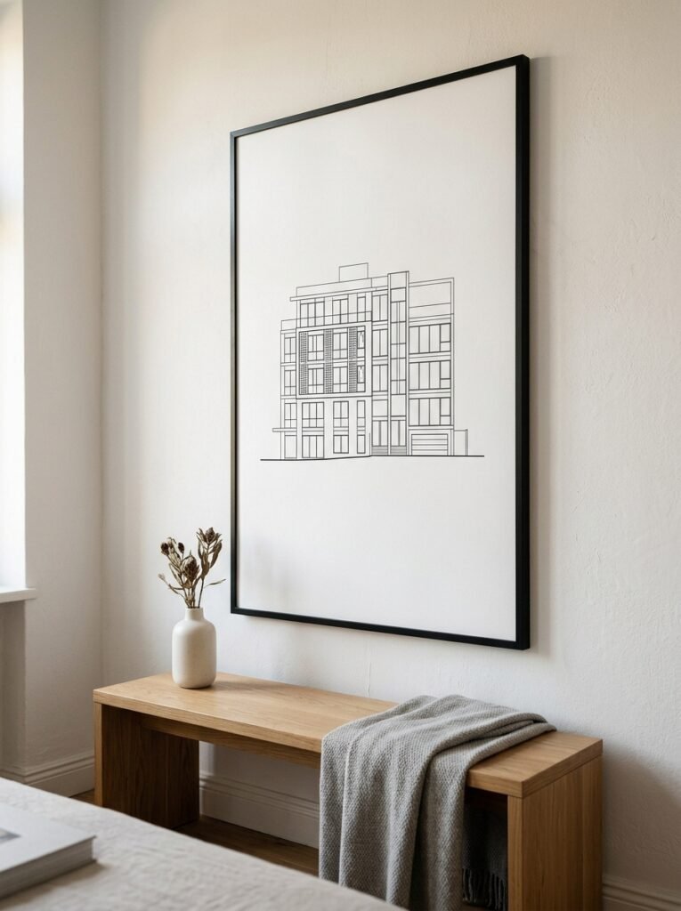
Here’s something I wish someone had told me about five apartments ago.
The most common poster mistake isn’t ugly art. The most common mistake is buying something 16×20 inches and hanging it on a wall that’s eight feet wide. It looks tiny. Sad, even. Not minimalist — just small and a bit lost.
Go bigger than feels comfortable. Genuinely. If you’re nervous about a 24×36, you probably need a 30×40. If 24×36 feels fine, you might need something even larger. The goal is for the artwork to feel like it BELONGS on the wall rather than sitting on it awkwardly.
For most standard living room walls in a UK terrace or an American single-family home, a 24×36 poster is usually the minimum for any kind of visual impact on its own. And honestly? The 40×60 range is where things start looking really intentional and gallery-like.
A tall narrow print can work brilliantly too, especially in rooms with high ceilings. Something about vertical art makes ceilings feel even higher, and that’s never a bad thing.
—
4. The Color That Keeps Showing Up in Every Beautiful Minimalist Living Room Right Now
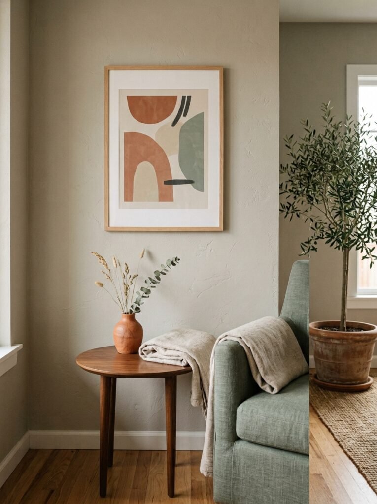
Warm black and white. Not cool, high-contrast, harsh black and white — warm black and white.
There’s a difference and once you see it you can’t unsee it. Warm black and white photography or illustration has slightly golden undertones in the lighter areas, a softness to the shadows. It doesn’t feel clinical. It feels like an old film photograph, or like morning light coming through a linen curtain.
Paired with cream walls, linen sofas, natural wood — it’s almost unfair how good it looks. And it works in both directions: American open-plan living rooms with lots of natural light, and smaller, cosier UK living rooms where you want warmth without visual clutter.
The other color moment happening right now? Dusty terracotta and warm sage on off-white or cream backgrounds. Single-color illustration, almost like a linocut or botanical print. Simple, earthy, and somehow both timeless and incredibly current.
—
5. Three Posters, One Wall: The Arrangement That Actually Works
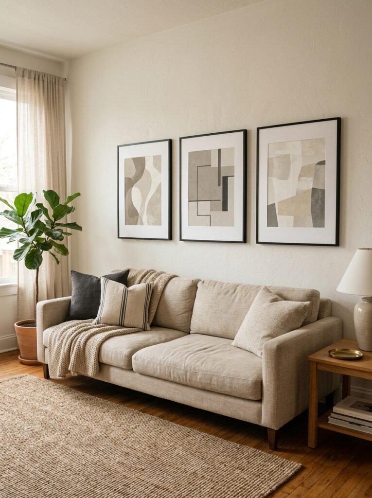
So you want more than one poster. That’s fine — a small grouping can still feel minimalist if you follow a few rules.
First: use the same frame for everything. Or at minimum, frames that share a material or finish. Mixing black metal frames and white wood frames and gold clip frames is the number one way to make a curated collection look like a car boot sale.
Second: treat the group as one big shape. Three prints in a horizontal row should together form roughly a rectangle or square of negative space. You’re not hanging three separate things — you’re creating one composed piece made of three parts. That mental shift changes everything about how you approach the spacing (tight, about an inch or two between frames) and the sizing (matching sizes, or a very deliberate variation like one large flanked by two small).
Third: hang the group lower than you think. Most people hang art too high. Eye level means the CENTER of the piece at eye level, which for most people is around 57 to 60 inches from the floor. Not the top of the frame.
“The group should feel settled into the wall, like it grew there — not like it’s hovering near the ceiling.”
—
6. The One Frame Color That Goes With Everything (and the One That Doesn’t)
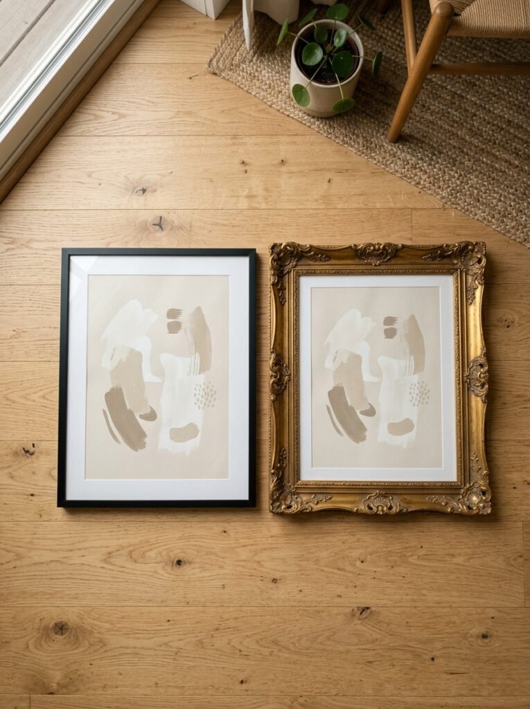
Thin black metal frames. That’s it. That’s the answer.
Not because other frames are wrong, but because thin black frames disappear into almost any wall color and let the poster do all the talking. Cream walls, grey walls, sage green, white — thin black frames just work. They don’t compete.
Wide ornate frames, though? In a minimalist living room they often read as ironic or confused. Unless you’re going for that one specific eclectic-but-spare look (which is a real and gorgeous aesthetic, but a different article). For clean, simple, “I thought about this” minimalist poster styling — thin frames, consistently.
Oak or light wood frames are also genuinely lovely, especially with warm-toned prints, photography of natural landscapes, or that botanical illustration style. They have a softness that black frames don’t.
Just don’t mix the two on the same wall.
—
7. What to Put IN the Posters: Subjects That Work in Minimalist Living Rooms
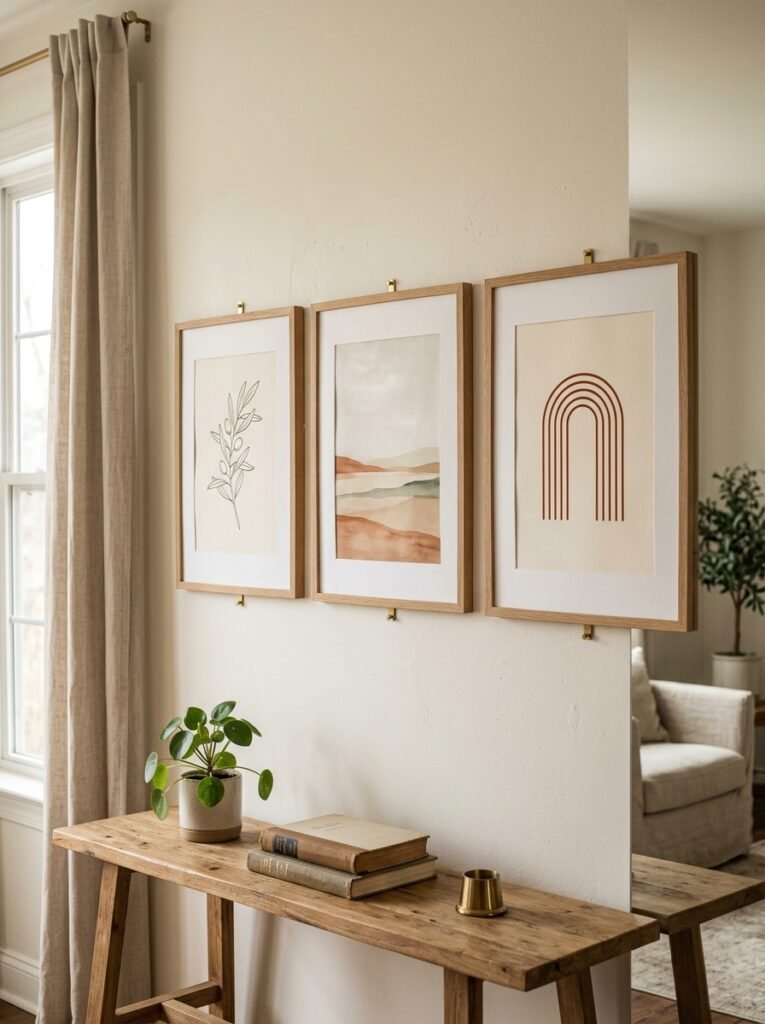
This is where I have some opinions.
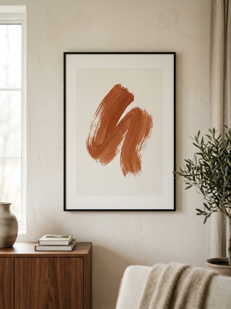
Abstract art in muted tones — honestly, impossible to get wrong if you choose the right palette. A loose brushstroke painting in terracotta and cream. An abstract shape in warm black and ivory. These work because they’re decorative without being literal, and they age really well (you won’t look at it in three years and think “wow that’s dated”).
Architecture photography is having a major moment and rightly so. A black and white photograph of a doorway, a staircase, a single window — there’s something about architectural minimalism inside a room that just… makes sense. Like it’s in conversation with the space.
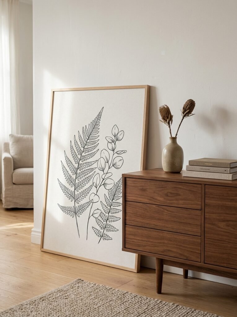
Botanical prints, but the spare ones. A single plant stem on a white background. One leaf. Not a dense Victorian botanical illustration (beautiful, but chaotic) — the kind where there’s as much blank space as there is drawing.
What I’d avoid in a minimalist living room: anything with a lot of text (especially “inspirational quotes” in fancy fonts — I know, I know, but they rarely photograph well and they date badly), anything overly busy or pattern-heavy, and anything with a very literal pop culture reference unless it’s genuinely important to you personally.
—
8. The Overlooked Trick That Makes a Single Poster Look Gallery-Level
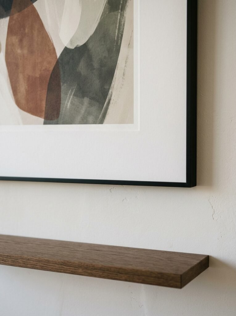
Mat your prints. Even if the poster itself is inexpensive.
A mat — that’s the border between the print and the frame — adds so much perceived value and visual breathing room that it’s kind of embarrassing how much difference it makes. A standard poster in a frame looks like a poster. The same poster with a wide white or cream mat looks like framed art.
Wide mats are having a big moment right now, and deservedly. We’re talking a mat that’s two to four inches on all sides, sometimes wider at the bottom than the top (which is a classic framing trick that makes prints feel more grounded). It makes even a simple photograph look considered and intentional.
And here’s a thing I didn’t know for years: you don’t always have to buy a poster specifically sized to a standard frame. You can buy a large frame and mat it down to a smaller print. So a 12×16 photograph inside a 20×24 frame with a wide mat? Gorgeous.
—
9. Hanging Height, Wall Position, and the Furniture Rule Nobody Talks About
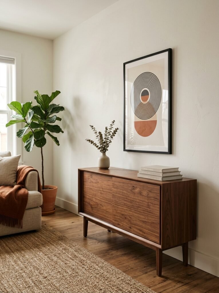
Here’s the furniture rule: float your art above your sofa or console table, not just on the wall.
What I mean is — your poster should relate to the furniture below it, not just the wall behind it. Ideally, the bottom of the frame sits six to eight inches above the top of the sofa. This creates a visual relationship. The art and the sofa become one unit, one zone, rather than two separate things that happen to share a wall.
If your sofa is against the wall and you hang art four feet above it? There’s a dead zone. That blank gap makes both pieces look like they don’t know each other.
This is also why oversized art can be so effective directly on the floor, leaning against the wall. No hanging required. It sidesteps the problem entirely, and it has this casual, “I just got back from a gallery” quality that’s weirdly hard to achieve with nails.
—
10. The Arrangement That Always Looks Intentional Even When You Don’t Plan It
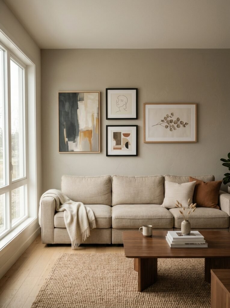
One large poster. Full stop.
Not because I’m being lazy — because it genuinely is the most foolproof minimalist approach and I don’t think it gets enough credit. One big, considered piece of art, well framed, hung at the right height, with nothing competing for attention around it. That’s it.
No arrangement to stress over. No symmetry to worry about. Just one thing that you love, given the space it deserves.
“Sometimes the most confident design choice is deciding not to add more.”
This is the living room equivalent of wearing one really great piece of jewelry rather than layering six things. It reads as intentional, calm, and secure. Which is also, coincidentally, exactly what good minimalist interior design feels like to be in.
—
11. Small Living Room? Here’s the One Rule That Makes It Work
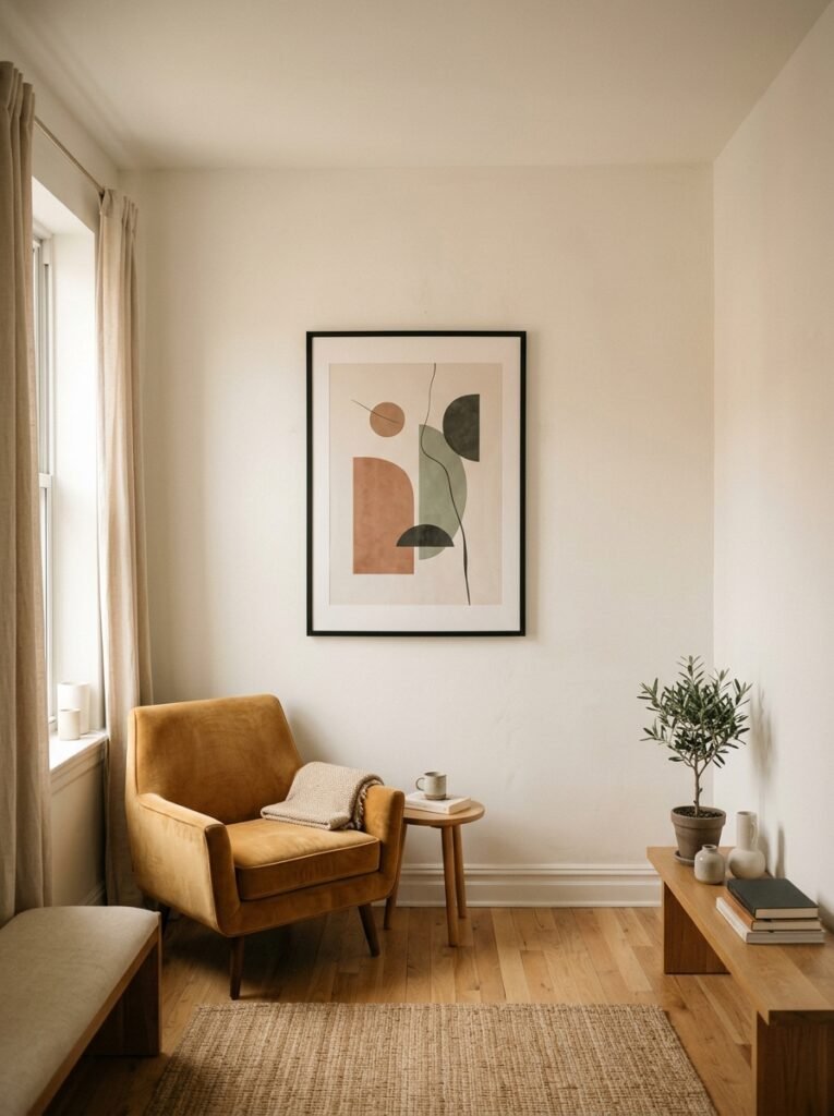
Don’t scale down. Counterintuitively, going too small with art in a small room makes the room feel smaller.
I know that sounds completely backwards. But small prints in small rooms just create more visual fragmentation. Your eye bounces around more, and the room feels busier, not bigger.
One medium-to-large print, or a very tight grouping of two or three, gives the room one clear focal point. Your eye goes there, rests, and the room feels more organized as a result. The walls on either side of the art become intentional breathing space rather than just empty wall you ran out of things to fill.
In small living rooms — which, by the way, describes most UK living rooms and a lot of urban American apartments — the trick is treating negative space as a feature, not a failure. The blank wall around a single large piece isn’t emptiness. It’s part of the composition.
Side note — if you’ve got alcoves (very common in UK Victorian terraces), a single vertical print fitted neatly inside an alcove looks absolutely brilliant. Built-in gallery wall, basically, without any effort.
—
12. How to Test Before You Commit (The Paper Method That Saves Holes in Your Walls)
Last thing, and it’s practical.
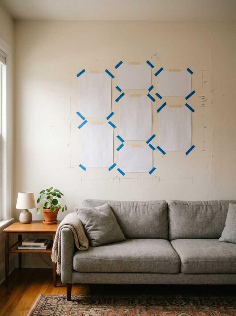
Before you put a single nail in the wall: cut out the frame size in newspaper or brown parcel paper and tape it to the wall. Live with it for a day. Walk past it. Sit on the sofa and glance at it the way you actually look at art in your own home — casually, from across the room, while you’re watching something or talking to someone.
If the paper template looks too small from the sofa, your poster will too. If it looks right? You’re ready to commit.
It also shows you if the placement is off — too high, too far left, not quite above the sofa the way you imagined. Much better to figure this out with tape and newspaper than with holes you have to fill and repaint.
And honestly? Sometimes that paper rectangle on the wall is where you realize you need to go bigger. Not gonna lie, I’ve upsized my poster choice at least twice this way. Glad I did both times.
—
❓ FAQ
Q: How many posters should I have in a minimalist living room? A: There’s no fixed number, but the question to ask is whether each piece has a clear reason for being there. One large, confident poster can carry a whole room. Two or three in a tight, coherent grouping can work beautifully. More than that starts to need careful curation to stay feeling spacious and deliberate rather than busy.
Q: Should living room posters match the sofa or the wall color? A: They don’t need to match, but they should be in conversation with the room. The easiest approach is pulling one color from your existing palette — a throw pillow, the rug, even the wood tone of your furniture — and making sure it appears somewhere in the artwork. This creates cohesion without being matchy-matchy.
Q: What’s the best way to display a poster without framing it? A: Poster clips or wooden dowels at the top and bottom are a really clean, low-commitment option that can still look very intentional. Leaning a large unframed poster against the wall on a shelf or mantelpiece is another good approach. Just avoid standard adhesive strips on their own — they work fine for lightweight prints but can look a bit makeshift without something at the top to finish it off.
—
💭 Final Thoughts
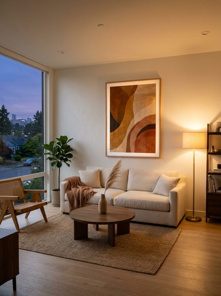
The thing about minimalist poster decor is that it asks you to trust the space a little. To believe that one thing, chosen well, is enough. That’s a surprisingly hard thing to do when you’re standing in a room that feels unfinished.
But the rooms that feel really calm and beautiful — the ones that show up in every Pinterest board you’ve ever saved — they almost always have less on the walls than you’d expect. Just the right thing, in the right place.
What’s the one piece of art you keep putting off buying because you’re not sure it’s quite right for your space?