
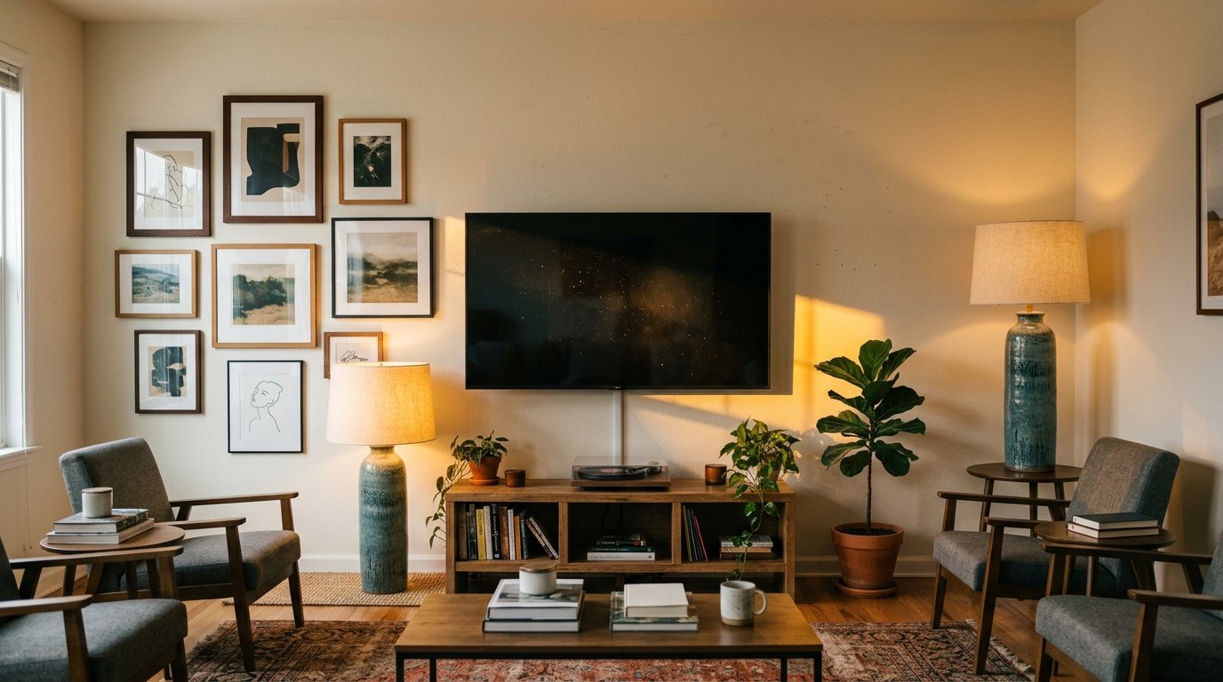
The Wall Around Your TV Doesn’t Have to Look Like an Afterthought
My friend looked at my living room once and said, “oh, so that’s just… the TV wall.” She didn’t say it meanly. But I heard it.
That was the moment I realized I’d done everything right in that room — the sofa, the rug, the lamp in the corner that casts the most perfect amber glow at 7pm — and then just… stuck a TV on a blank wall and called it done. Like the TV didn’t count as part of the room.
It absolutely counts. And there’s so much you can do with it.
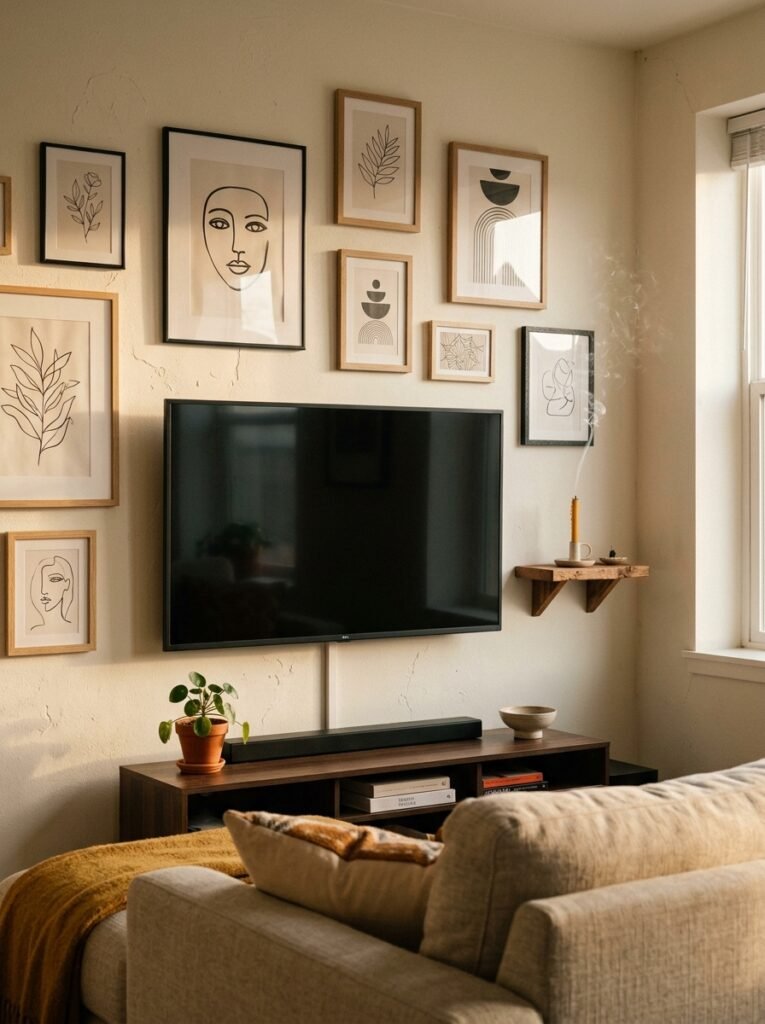
—
1. Why Most TV Walls Feel Unfinished (And It’s Not the TV’s Fault)
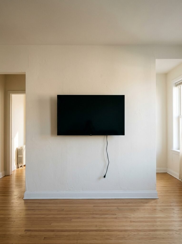
Here’s the thing nobody talks about. A TV on a wall is basically a black rectangle. Dark, shiny, a little imposing. And when the rest of the wall around it is just… nothing? Your eye has nowhere to go. It just sits on that screen like it’s waiting for permission to look somewhere else.
The problem isn’t the television. It’s the negative space around it.
Most people hang the TV and then feel like anything they add might “compete” with it or look weird. So they don’t add anything. And the result is a wall that looks like it gave up halfway through getting dressed.
“A TV on a blank wall isn’t neutral. It’s just unfinished.”
What you actually want is for the TV to feel like it BELONGS — like it was always meant to be there, the same way your favorite painting was always meant to be on that wall. That’s entirely achievable. You just need to stop treating the screen as the enemy and start treating the whole wall as one design decision.
—
2. The Gallery Wall Approach That Actually Works Around a Screen
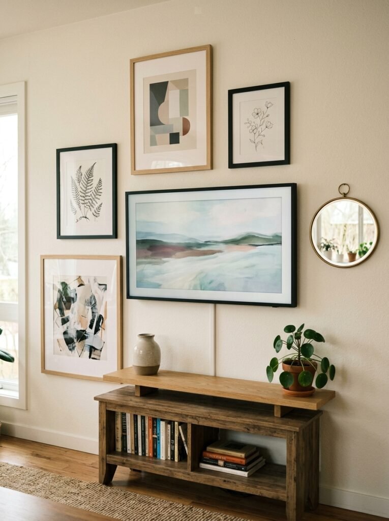
Gallery walls around TVs get a bad rap, and honestly, sometimes fairly. Done wrong, they look chaotic — random frames floating around a screen like they’re orbiting a planet they didn’t ask to be near.
But done right? They’re extraordinary.
The trick is asymmetry with intention. Don’t center everything. Don’t frame the TV perfectly on both sides like you’re building a shrine to it. Instead, let the arrangement breathe — heavier on one side, a couple of smaller pieces trailing off on the other. Your eye reads it as curated rather than controlled.
Keep the frames in a consistent finish. Black, wood, brass — pick one metal or material and stick to it. The art inside can vary wildly. That’s the whole point. A black-and-white photograph next to a simple abstract print next to a small vintage botanical? Completely fine. All in matching black frames? Suddenly it looks like a decision.
And leave some breathing room around the TV itself. You don’t need to crowd it. A few inches of clear wall between the screen and the nearest frame is not wasted space — that’s what makes the whole thing feel intentional rather than desperate.
—
3. The Color That Keeps Showing Up on Every Beautiful TV Wall Right Now
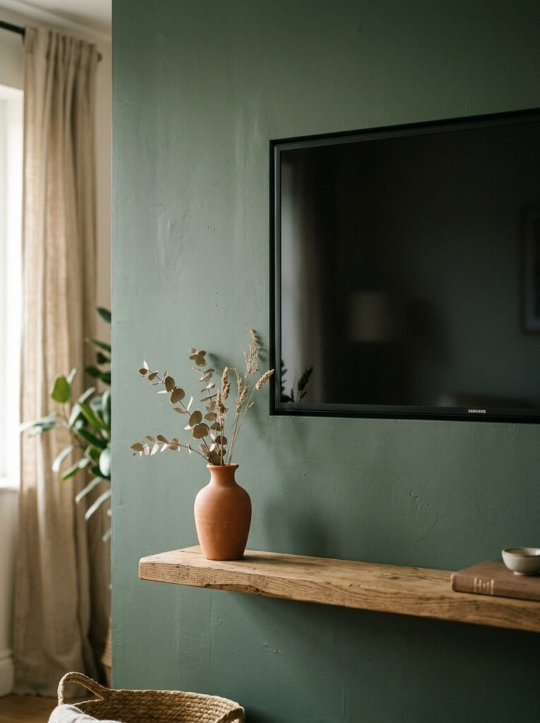
Deep, moody wall paint. And I mean DEEP.
Forest green. Charcoal. Ink blue. A really serious burgundy if you’re brave enough, which I hope you are.
What these colors do for a TV wall is almost unfair. When the wall behind the TV is dark, the screen disappears into it. Not literally — but visually, the contrast is gone. The TV stops being the jarring black rectangle interrupting your lovely room and starts feeling like it’s built in, intentional, part of a considered palette.
This works in both American open-plan rooms and in smaller British sitting rooms, by the way. Maybe especially in smaller rooms, actually. A dark accent wall in a tight space doesn’t make it feel smaller — that’s an old rule that needs to die. It creates depth. It makes the wall feel like it has a purpose.
Side note — if you’re renting and can’t paint, removable wallpaper has gotten genuinely good. I know. I didn’t believe it either.
—
4. Built-In Shelving Is the Cheat Code Nobody Talks About Enough
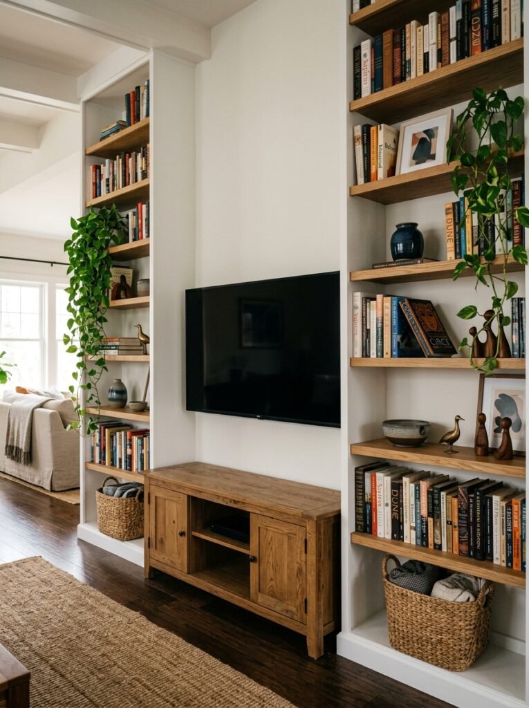
Not everyone can install built-ins. I know. But hear me out, because even a close approximation of this look does something remarkable to a TV wall.
When you flank a TV with shelving — whether that’s actual floor-to-ceiling cabinetry or just two tall open shelves on either side — the TV suddenly has context. It has a HOME. It’s not just a screen on a wall; it’s part of a composition.
“When the TV has context, it stops competing with the room. It joins it.”
The shelves don’t need to be symmetrical in how you style them, either. One side can have books, a trailing plant, a few candles at different heights. The other side can have a couple of larger objects with more negative space. Asymmetric styling on symmetric shelving is one of those combinations that looks effortlessly curated.
What you put ON the shelves matters too, but maybe not the way you think. You don’t need a collection of beautiful objects. You need a variety of heights. Tall things, medium things, something low and horizontal. Mix textures — something matte next to something ceramic next to something that reflects light just a little. That’s it. That’s the whole formula.
—
5. Hanging Art at the Right Height Changes Everything
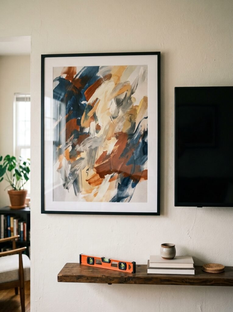
This is probably the most practical section and I almost didn’t include it because it sounds dry. But I can’t tell you how many otherwise-gorgeous TV walls I’ve seen ruined by art hung at the wrong height.
The standard advice is to hang art so the center sits at eye level, roughly 57–60 inches from the floor. That works for standalone pieces. But around a TV? You need to think about it differently.
If your TV is mounted, art hung significantly above the screen tends to look disconnected — like the top half and bottom half of the wall belong to different rooms. Either bring the art down so it sits closer to the TV’s vertical center, or go large enough that the piece spans both zones visually.
If your TV is on a media unit rather than wall-mounted, you’ve got more flexibility. Art above the TV can sit higher, because the unit itself grounds the whole composition from below. The eye reads it as: unit, screen, art. One vertical story.
Small pieces hung in isolation above a TV almost never work. If you’re going small, go in a group.
—
6. The One Rule That Makes Any Awkward TV Wall Feel Intentional
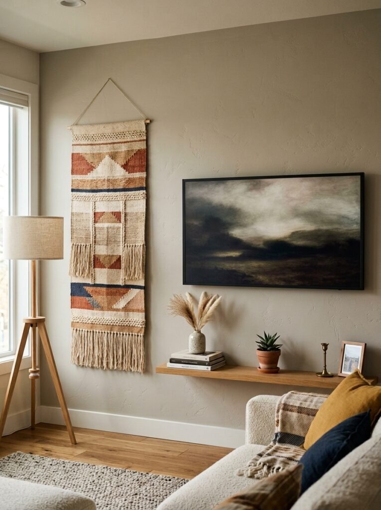
Ground it.
This is the single thing that distinguishes a TV wall that looks finished from one that looks like furniture got arranged and nobody followed up.
Grounding means giving the wall visual weight at the bottom. A media unit with real presence — not a skinny floating shelf that disappears visually, but something substantial. Or if you have a wall-mounted TV, a low console or sideboard beneath it. Or even just a rug that extends out far enough to anchor the whole seating arrangement.
The floor-to-ceiling proportion of a TV wall needs to feel balanced. When everything is happening mid-wall (screen, floating shelves, maybe some art) and there’s nothing connecting it to the floor, the whole thing floats in an uncomfortable way. You feel it even if you can’t name it.
Add weight at the bottom. The rest sorts itself out faster than you’d expect.
—
7. What to Do With the Wires (Because You Noticed Them, Didn’t You)
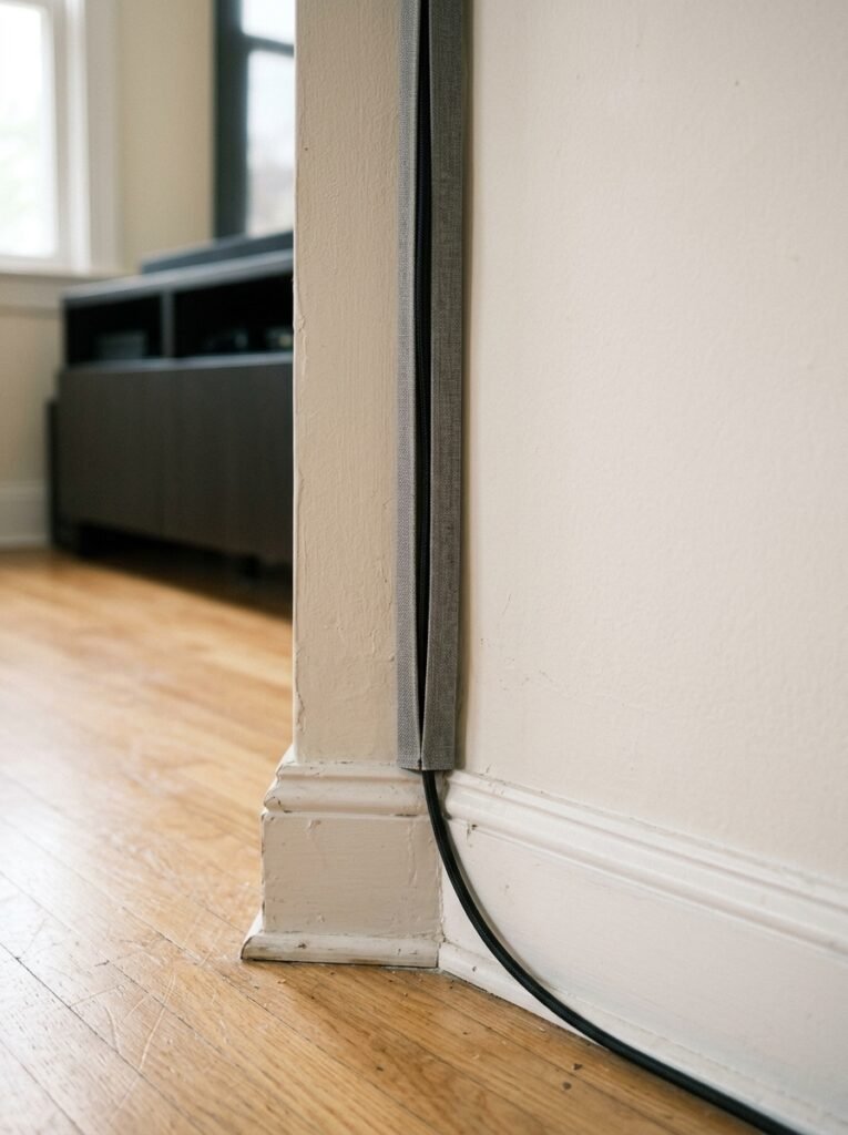
I know we’re here to talk about decor and I’m about to talk about cable management, but this isn’t a detour — this IS the decor conversation. Because nothing undermines a beautifully styled TV wall like a loop of cables dangling down the wall like the whole thing forgot to finish getting dressed.
A few things that actually help:
- In-wall cable covers that paint over. Available in white and paintable — they disappear when done right.
- Cord clips along the back edge of a media unit. Keeps everything tight and invisible from a seated position.
- A deliberate media unit with enclosed storage. Not everything needs to be open shelving. Sometimes a door is just a door and it’s beautiful for it.
The goal isn’t perfection. The goal is that when someone sits down in your living room, their eye travels around the wall and doesn’t snag anywhere. Cables are a snag point. Just deal with them.
—
8. Mirrors Next to TVs — Risky, But Worth Knowing About
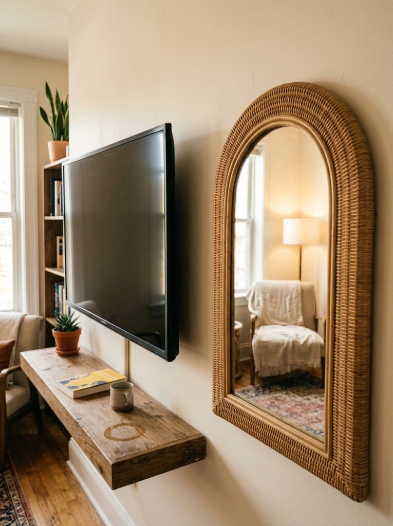
This one’s more of a warning than a recommendation, but it comes up enough that it’s worth saying clearly.
Mirrors can absolutely work near a TV. A large, beautiful vintage-framed mirror on one side of the TV wall can feel rich and layered, especially in a room that’s a bit dark and needs the reflection. British Victorian terraced houses in particular tend to love this combination — something about the ornate mirror frame against a painted chimney breast just works.
But. Mirrors reflect what’s in the room. Including, in daylight, windows. And if the reflection in that mirror during the day is just the back of your sofa and a cord dangling somewhere — you’ve created a feature that highlights the problem rather than solving it.
Place mirrors where you know what they’ll reflect. Stand in the spot where the mirror would hang and look at the wall opposite. That’s what you’re putting in the room twice.
“A mirror is only as beautiful as what it decides to show you.”
—
9. The Case for Doing Almost Nothing (And Doing It Deliberately)
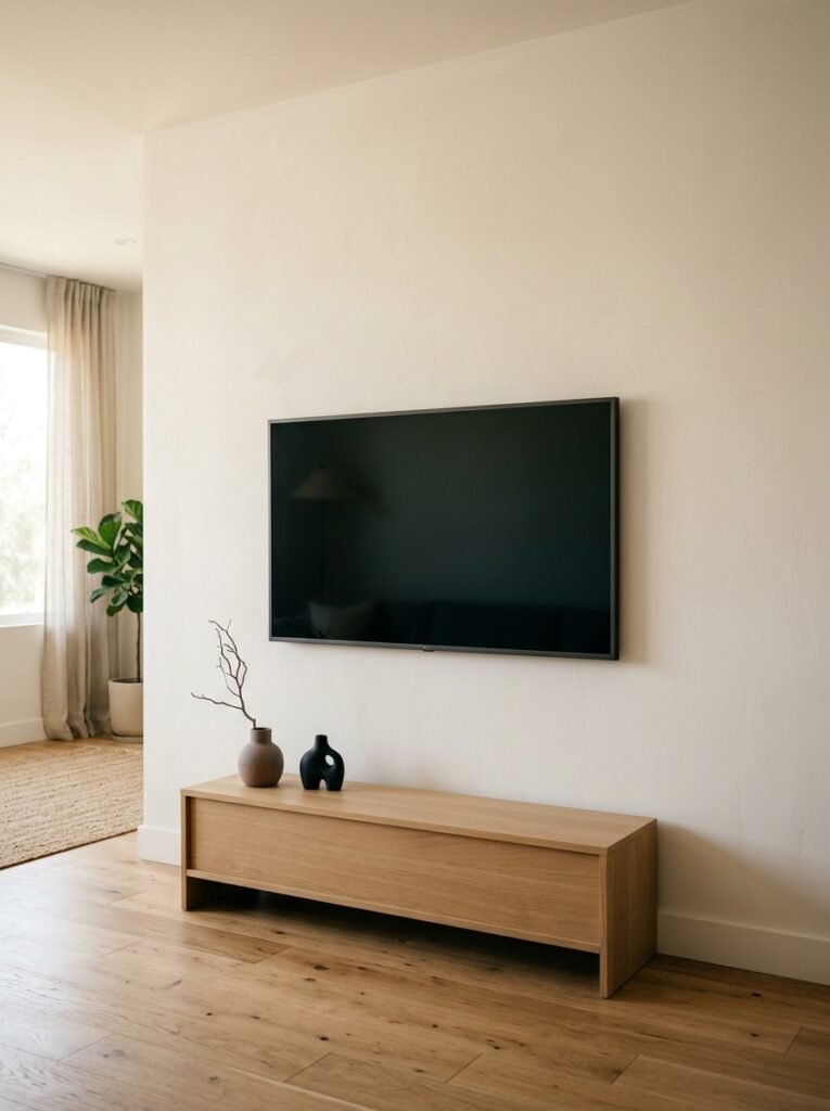
Not every TV wall needs layering and art and shelves and a statement paint color. Some of the most quietly confident rooms I’ve ever seen have almost nothing going on around the TV.
One large, beautifully framed print centered above a low, clean-lined media unit. Nothing else. No gallery wall, no flanking shelves, no dramatic paint. Just the TV, the unit, the one piece of art, and enough space around everything that the whole wall breathes.
This works specifically when the REST of the room is doing something interesting. A bold sofa. An unusual rug. Lighting that has real character. When the room has texture and life, the TV wall doesn’t have to carry it. It just has to not let the room down.
The danger is ending up with a TV wall that’s bare because nobody made a decision, versus one that’s minimal because someone made a very deliberate one. The difference between those two things is enormous, even though they can look almost identical. One feels like a finished thought. The other feels like a sentence that didn’t —
—
10. Texture and Material on the Wall Itself (Not Just What Hangs on It)
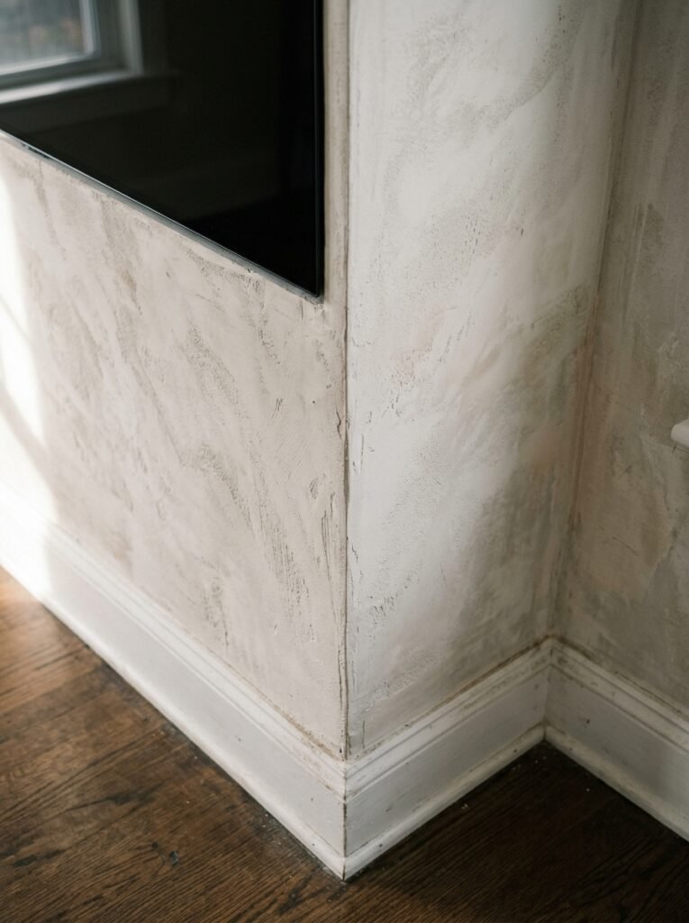
This is the direction more people are moving and I’m completely here for it.
Limewash paint on a TV accent wall. Slat panels — thin vertical wood strips in warm oak or a matte grey — running the full height of the wall. Plaster effect paint in something dusty and imperfect. Wainscoting on the lower half with a different finish above.
These are treatments that make the wall itself interesting, so the art and styling on top of it don’t have to work as hard.
Wood slat panels in particular have become genuinely popular and I understand why. They add warmth without being heavy. They give the TV a rich, textural backdrop that makes the screen look almost like a feature rather than an intrusion. And in photographs they look absolutely brilliant, which — let’s be real — matters to most of us whether we admit it or not.
If you go this route, the slats or texture should run at least as wide as the TV is. Ideally wider. A small textured panel centered tightly around the screen looks like a patch, not a design choice.
—
11. Plants on a TV Wall — How to Make It Work Without Looking Desperate
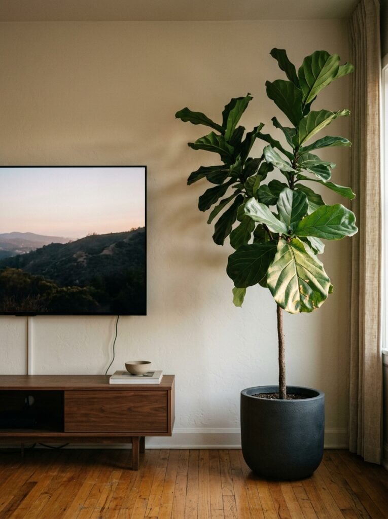
Yes. Plants. Near a TV wall. It’s not weird, it’s just got to be done right.
The failure mode here is a single small plant on a shelf next to the TV looking like it got lost on the way to the windowsill. That’s not a design choice, that’s a plant trying its best.
What actually works: scale and placement. A tall plant in the corner adjacent to the TV wall — not ON the wall, but defining the edge of it — grounds the whole space beautifully. Or a trailing plant on a high shelf that drapes down with genuine commitment, not just a couple of sorry vines. Something with presence.
Plants near a TV do need to actually survive there, though. Most TVs aren’t near windows. Low-light plants — pothos, ZZ plants, snake plants — can manage it. Anything that needs bright indirect light is going to struggle and look it.
A struggling plant is worse than no plant. It just is.
—
12. Starting From Where You Are (The One Thing Most Articles Don’t Say)
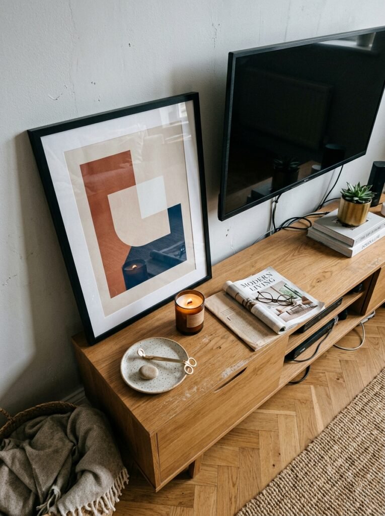
You don’t have to redo everything.
If you’ve got an existing TV wall and it feels a bit blah, the smallest interventions make a meaningful difference. One thing above the TV instead of nothing. Better cable management. A floor lamp angled toward the wall rather than the sofa.
I changed literally one thing on my TV wall — I moved the lamp from the corner of the room to just beside the media unit — and someone walked in and said the room felt different. They couldn’t say what had changed. That’s how decor works at its best. It shifts how a space feels without announcing itself.
You know your room. You know what it needs, probably better than you think. Sometimes the only thing standing between a TV wall that’s fine and one that’s genuinely lovely is just… deciding to care about it a little.
Go care about it.
—
❓ FAQ
Q: Should the TV be mounted on the wall or on a stand for the best look? A: Both can look excellent — it really depends on your room. Wall-mounting creates a cleaner, more built-in feel and gives you more styling flexibility below the TV. A stand or media unit gives you surface space and visual grounding without drilling into the wall, which makes it ideal for renters or anyone who prefers flexibility. The most important thing is that whatever sits below the TV feels proportional to the screen — a too-narrow surface under a large TV looks unstable, even if it technically isn’t.
Q: How do I style a TV wall in a small living room without making it feel cluttered? A: Less is genuinely more in a smaller space. Stick to one or two things — maybe a single piece of art above the TV and one plant nearby, or flanking shelves kept very deliberately minimal. Dark paint on the TV wall can actually help in small rooms by creating a sense of depth. And resist the urge to add things just to fill space. A small room with a few well-chosen pieces always looks better than one where every surface has been addressed.
Q: What size art should go above a TV? A: A rough guideline is to aim for art that’s about two-thirds the width of the TV, though going slightly wider can look even better. The most common mistake is going too small — a piece that’s significantly narrower than the screen looks lost. If you’re hanging a single piece, lean toward larger. If you’re doing a gallery arrangement, the overall grouping should be roughly as wide as the TV or wider.
—
💭 Final Thoughts
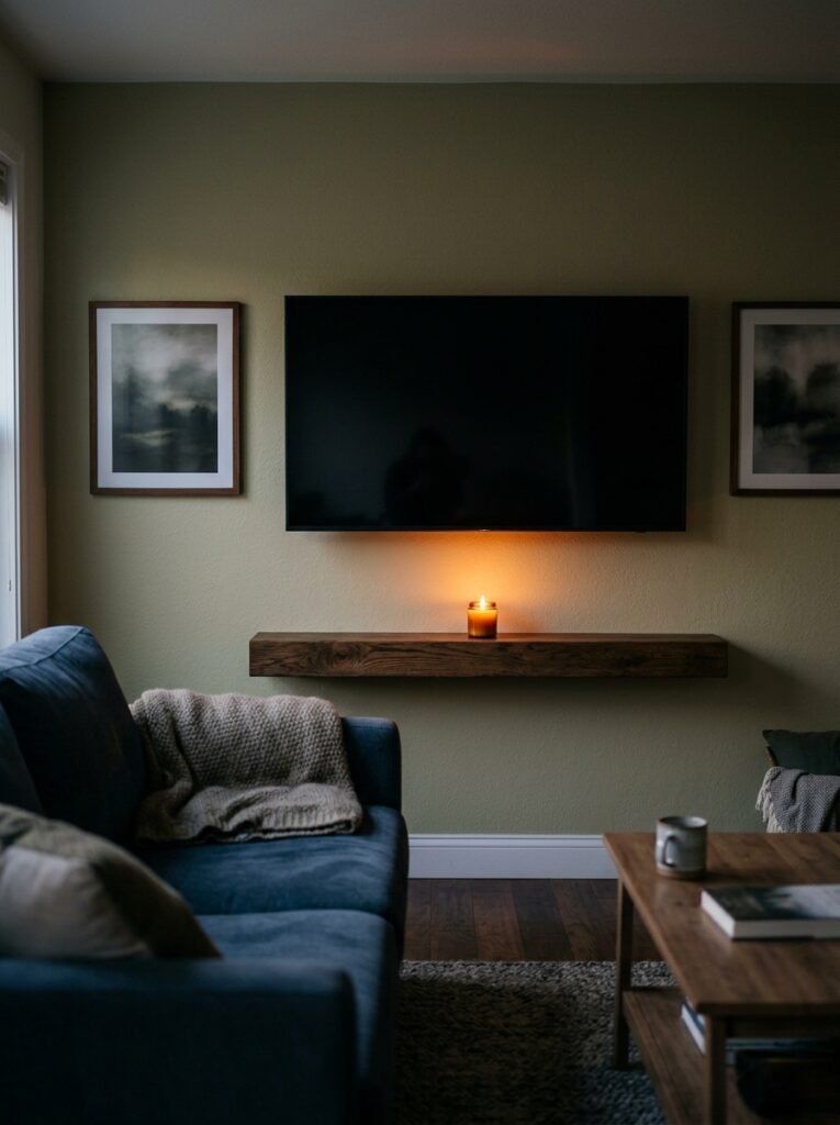
A TV wall is, in the end, just a wall. It doesn’t have different rules to the rest of the room — it just gets less attention, and that neglect shows. Give it some thought, even a fraction of the thought you’d give a gallery wall somewhere else in the house, and it’ll pay you back every time you sit down in the evening and the room just feels right.
The lamp’s on, the screen’s there if you want it, and nothing jars.
What’s the one thing your TV wall has been missing all along?