
The Wall Above Your Couch Is Begging for Something Better — Here’s What Actually Works
My friend walked into her new flat, looked at the big blank wall above her sofa, and just… put nothing there. For eight months. “I don’t want to get it wrong,” she said. I completely get it. But here’s the thing — that empty wall is already wrong. It’s just blank-wrong instead of bold-wrong, and blank-wrong doesn’t even have the decency to be interesting.
—
1. Why That Space Feels So Hard (And Why It’s Not Actually You)
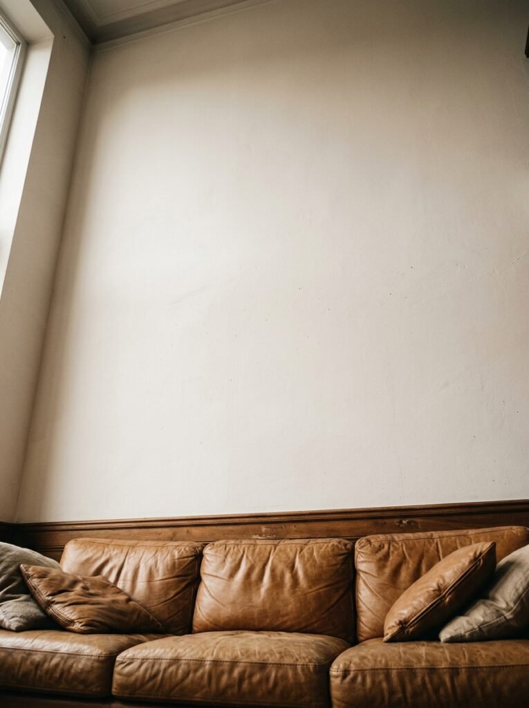
The wall above a couch is one of the most loaded pieces of real estate in any home. It’s the first thing people see when they walk into a living room. It’s the backdrop for every photo taken on that sofa. It’s, for some reason, the thing that makes everyone suddenly forget every piece of decor they’ve ever loved.
Part of the problem is scale. Most people go too small. They hang one medium-sized print, centered, and it floats there like a sad postage stamp above a massive sofa. It doesn’t look minimalist. It just looks like you ran out of wall and gave up three-quarters of the way through.
The other part is that we’ve all seen so many versions of “gallery wall” that the whole concept feels a bit done. And it is — if you do it the predictable way. But done RIGHT, with real intention behind it? Still one of the best solutions for this exact wall.
Don’t let the fear of trends talk you out of what actually works in a space.
—
2. The Gallery Wall Rule Nobody Told You About
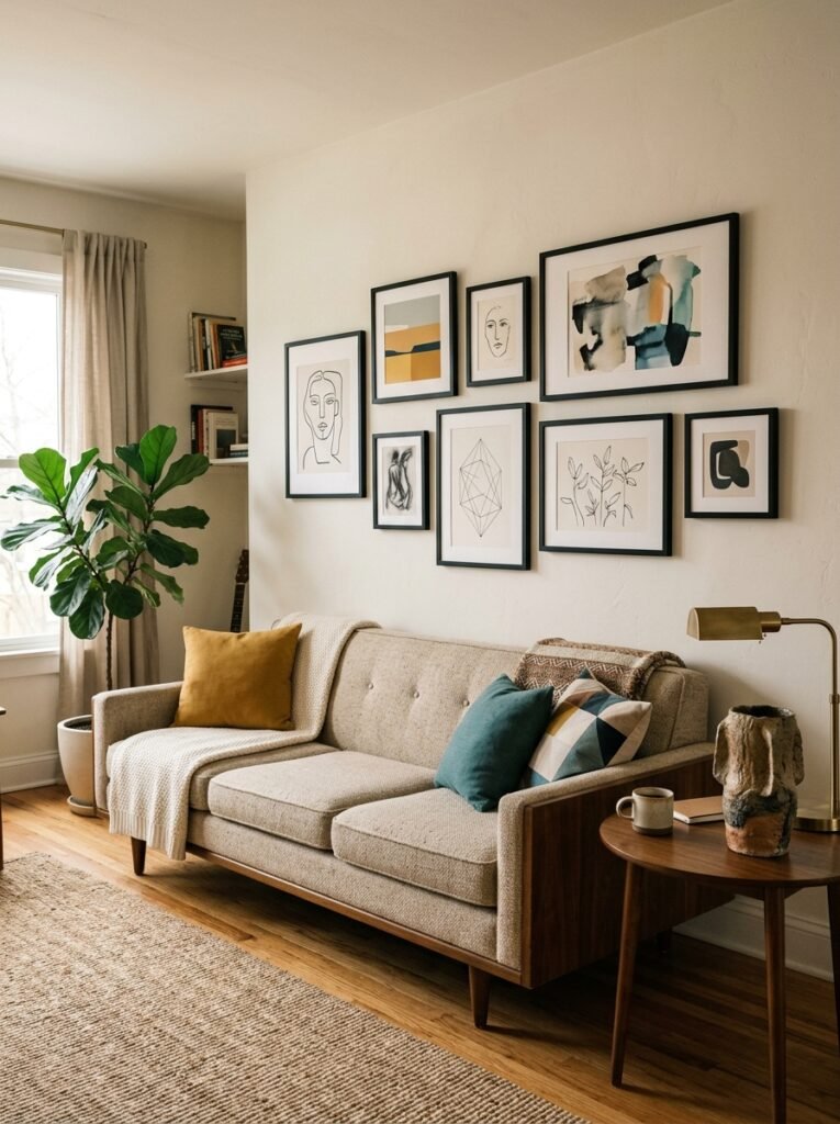
Here’s the thing about gallery walls that I wish someone had told me before I spent an afternoon with a hammer and about fourteen nail holes I had to fill in: the frames don’t need to match, but the TONES do.
What does that mean exactly? You can mix black frames with natural wood frames, thin metal with chunky painted wood, modern with ornate. It can look amazing. But if one frame is warm-toned and every other is cool-toned, your eye won’t know where to land. The wall will feel restless in a way you can’t quite name.
Warm frames, warm art, maybe one or two neutral pieces. Or cool frames with grey-toned photographs and muted watercolors. Pick a lane on tone and then you can go absolutely wild on style.
“The frames don’t need to match. But the tones have to agree with each other.”
Lay everything out on the floor before you touch the wall. Seriously. This changed everything for me. Spend twenty minutes shuffling things around on the floor, step back, squint at it, and THEN start nailing. You’ll save yourself a lot of spackle.
—
3. One Giant Piece of Art and Why Most People Are Afraid to Commit
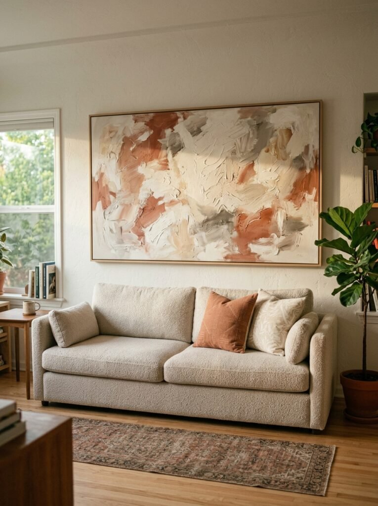
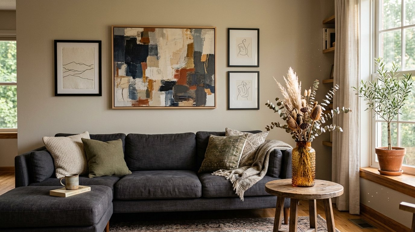
There’s a version of this wall that is just one piece. One huge, beautiful, slightly-terrifying-to-buy piece of art. And when it works, it WORKS.
The reason people don’t do this isn’t money, by the way. It’s commitment. One large piece is a statement. It’s you saying: this is the thing, and I’m not hedging with twelve smaller things around it. That vulnerability is, weirdly, exactly why it looks so good.
What size are we talking? For a standard sofa, you’re looking at something roughly two-thirds the width of the couch. So if your sofa is 84 inches wide, you want art that hits somewhere around 55 to 60 inches across. Anything smaller and you’re back in postage-stamp territory.
Abstract art works especially well here because it doesn’t demand a specific “reading” — it just exists in the room and adds color and texture and a general feeling of someone having a point of view. Landscape photography, oversized botanical prints, large textile art — all gorgeous options. You don’t have to spend a fortune either. Prints from independent artists, canvas photo enlargements of a place you love, even large handmade paper pieces can all do the job.
—
4. The Color That Keeps Showing Up in Every Beautiful Living Room Right Now
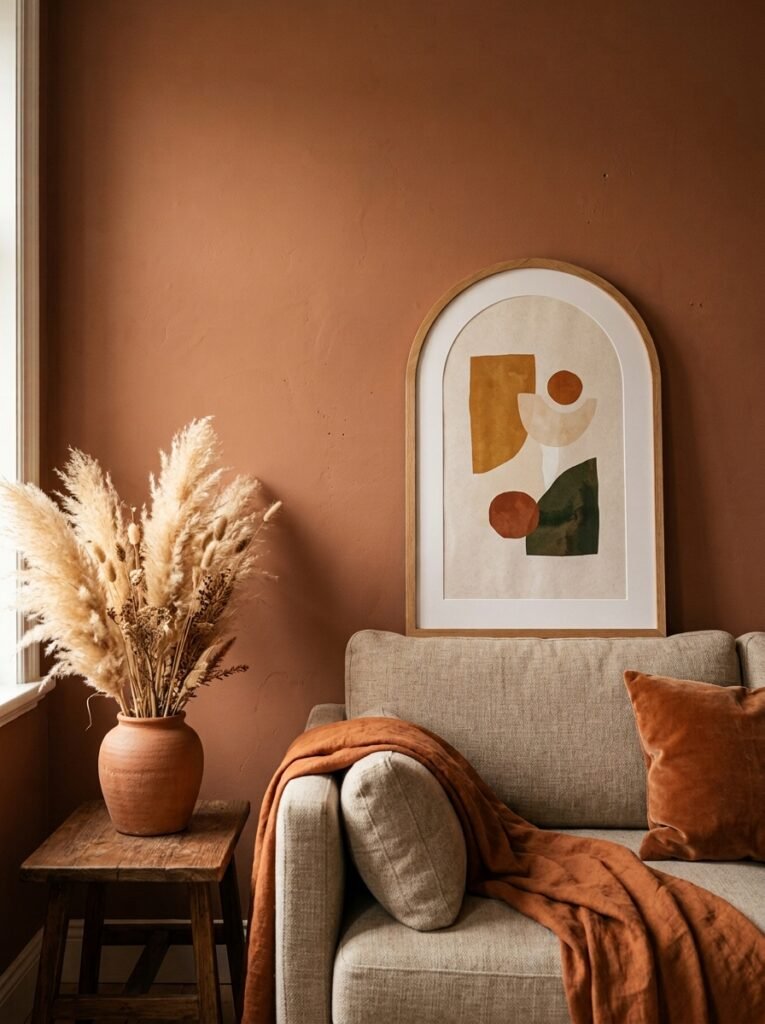
Terracotta. Warm ochre. Deep sage. Burnt sienna.
If you’ve been on Pinterest for more than ten minutes lately, you’ve already noticed the shift. We’re moving away from the crisp white-and-grey palette that dominated for years, and wall decor is leading the charge. Art in warm earthy tones hung above a linen sofa is having an absolute moment right now, and honestly — it deserves it.
The reason it works? Those colors do something warm rooms need. They feel human. Not designed, but lived-in. A terracotta abstract print above a cream sofa with a few dried pampas stems tucked in a vase nearby creates this atmosphere that feels effortless even if you spent two hours getting it right.
Side note — if your sofa is a bold color, this whole calculus changes. A dark forest green velvet sofa changes everything. In that case, you might want something more neutral above it, like a collection of light-toned botanical sketches or a simple large-scale black and white photograph. Let the sofa do the drama, and let the wall breathe.
—
5. Shelves Above a Sofa: the Option Everyone Forgets
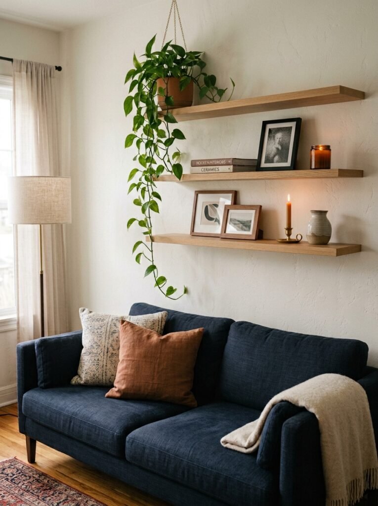
Not a gallery wall. Not art. Floating shelves.
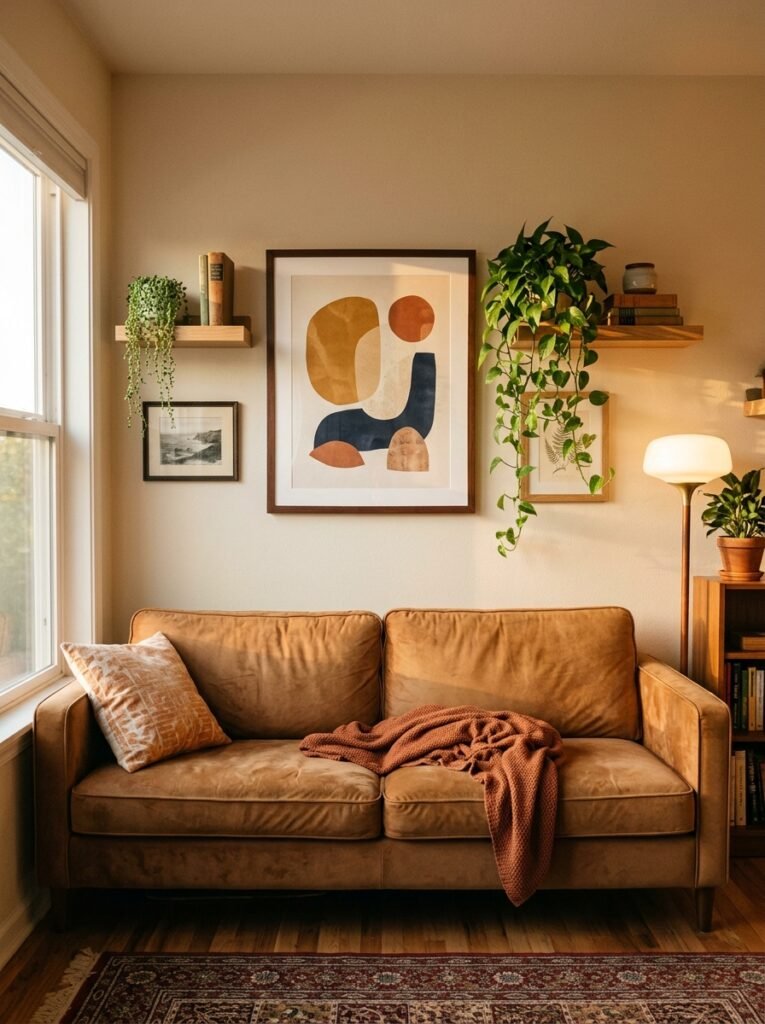
I keep seeing people struggle with the above-couch wall like there are only two options, and then they discover shelves and it changes the whole game. Floating shelves — done in the right finish, at the right height, with the right things on them — can be the most personalised, most layered, most genuinely YOU version of this wall.
The key is height and depth. Shelves above a sofa should sit high enough that nobody’s going to bump their head if they stand up quickly, so aim for at least 8 to 10 inches of clearance above the sofa back. Depth matters too — shallow shelves (around 6 to 8 inches) keep things from looking cluttered and heavy.
“A shelf above a sofa is a gallery wall you can rearrange on a Tuesday evening when you’re bored.”
What goes on them? This is where people overthink it. Small framed art leaning back against the wall, a couple of plants (trailing ones look especially good), a candle or two, an interesting small sculpture, a stack of books turned spine-in for texture. You don’t need all of those things. Two or three done thoughtfully beats eight things crammed in.
—
6. The Height Thing That Almost Everyone Gets Wrong
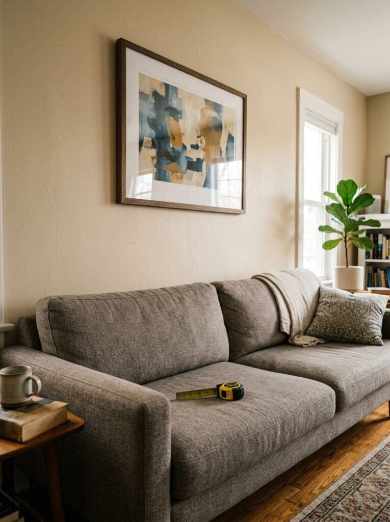
Hang. It. Higher.
I cannot tell you how many beautiful rooms I’ve seen undermined because the art is hung at eye level — which means it’s floating, disconnected from the sofa below it, just sort of existing on the wall in a general way.
Art above a couch should have a gap of roughly 6 to 8 inches between the top of the sofa back and the bottom of the frame. That’s it. Not a foot. Not two feet. Six to eight inches. This visual connection between the furniture and the art is what makes the whole arrangement look intentional rather than accidental.
And if you’re doing a gallery wall, that 6-to-8-inch rule applies to the BOTTOM of the lowest piece. Everything else can go up from there.
—
7. Mirrors: The Answer When You Want Light More Than Art
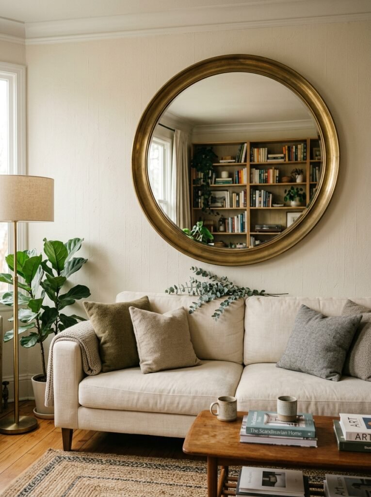
Dark living room? Smaller space? Renting and wary of making a million holes?
One large mirror above the sofa does things that art simply cannot. It bounces light back across the room. It makes the space read bigger. And it doesn’t commit you to a color palette the way art does, which — if you’re someone who redecorates frequently — is genuinely useful.
The look works especially well in British terraced houses and older flats where the light comes from one direction and the living room can feel a bit cave-like by afternoon. A large arched mirror, or a vintage-style ornate frame, above a dark sofa does something gorgeous with whatever natural light is available.
One thing I’d avoid: two smaller mirrors side by side. This often looks like you couldn’t find one big enough. If you’re going mirrors, go one, go large, go statement.
—
8. Macramé, Woven Textiles, and Why Texture Beats Flat Every Time
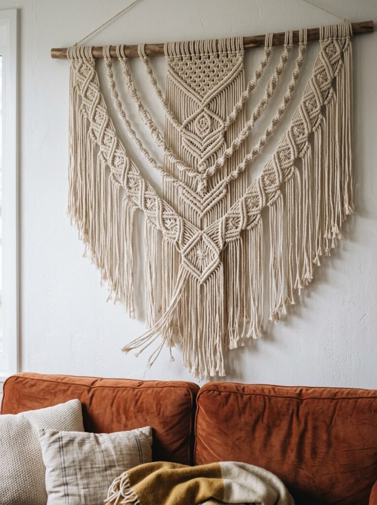
There’s a moment every evening, when the lamps come on and the overhead lights go off, when texture on a wall becomes the most beautiful thing in the room. Flat art kind of disappears. But a woven wall hanging? It catches the light. It creates shadow. It looks completely different at 2pm than it does at 8pm.
This is genuinely underrated as a reason to choose textile wall art. Macramé, woven tapestries, large knotted fiber pieces — they all do this. And they’re particularly good for renters because many can be hung from a single nail or a wooden dowel rod, no serious hardware required.
Scale still matters here. A small macramé piece above a large sofa looks like an afterthought. You want something that spans at least half the sofa width, ideally more. And natural tones — cream, oatmeal, warm white, sandy beige — tend to work in almost any living room without competing with anything else.
—
9. The Grid Layout That Makes Gallery Walls Feel Modern Instead of Busy
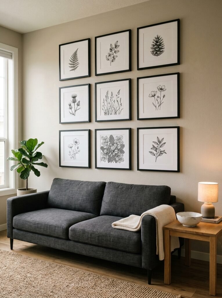
Not into the salon-style, clustered gallery wall? Fair enough. The grid layout is the calmer, more contemporary alternative and it deserves more attention.
A grid gallery wall is exactly what it sounds like — same-sized frames, same spacing, hung in clean rows and columns. Usually works best with 4, 6, or 9 frames. The art inside can vary wildly (photographs, illustrations, prints, even pressed botanicals) but the rigid structure of the grid creates order that lets your eye relax.
The spacing is everything. Leave exactly the same gap between every frame — three to four inches is the sweet spot. If one row is four inches apart and the next is six, the whole thing starts to look like a mistake rather than a choice. A level and a measuring tape aren’t optional here.
“The grid works because it tells your brain: someone was deliberate about this. And that alone makes it feel finished.”
Black frames on a white wall, black and white photographs inside. Simple. Doesn’t need anything else.
—
10. What to Do When Your Sofa Sits Against a Wallpapered Wall
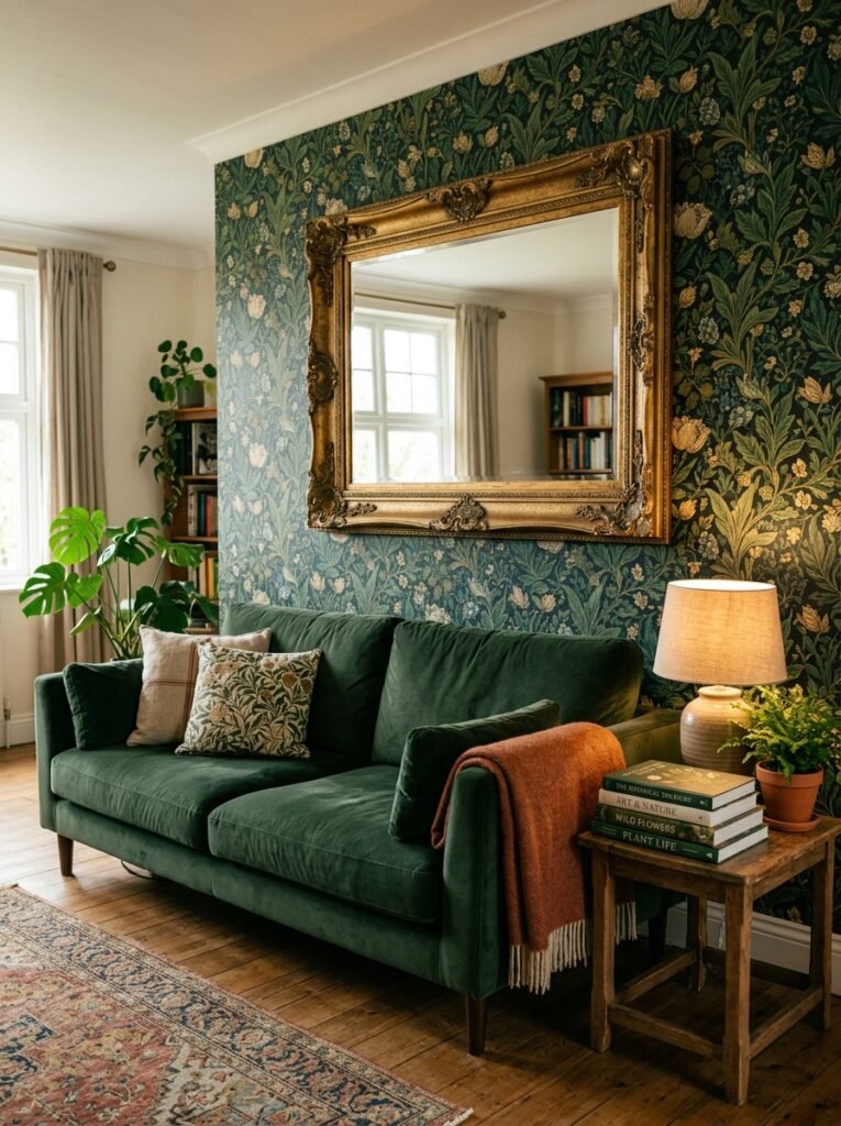
This is a genuine style challenge that doesn’t get talked about enough.
If your sofa sits against wallpaper — especially a patterned or bold wallpaper — hanging art above it gets complicated fast. You’re suddenly layering patterns, and it can either look incredibly intentional and designer-y, or it can look like a jumble sale.
The safest move is to go tonal. If your wallpaper is warm-toned, choose art in similar warm tones. If it’s a botanical print wallpaper, choose botanical art that echoes rather than fights it. Or go completely neutral — simple framed mirrors, or natural material wall hangings that let the wallpaper be the main event.
What almost never works: busy art against busy wallpaper. One of them has to be quiet. The wall or the art — choose one to be the statement.
—
11. The “Leaning” Look and When It Actually Reads Sophisticated
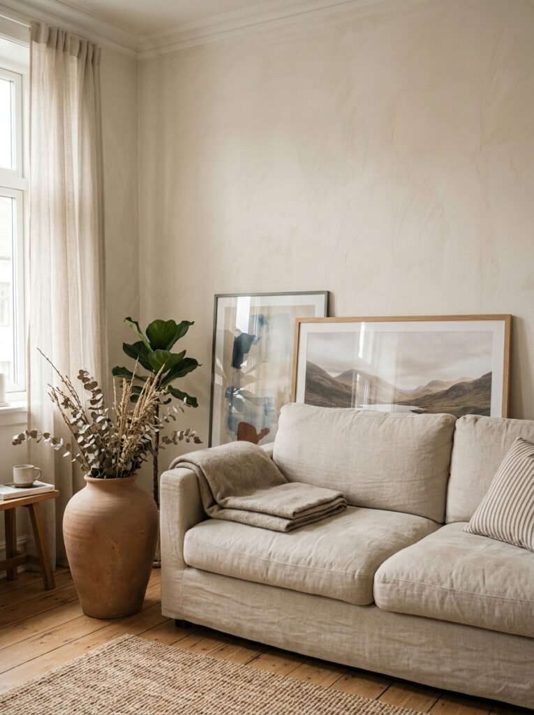
Leaning large art against the wall rather than hanging it is one of those things that looks effortlessly stylish in photos and sometimes just looks like you haven’t finished unpacking yet.
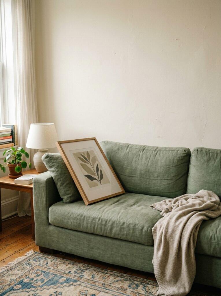
The difference is proportion and company. A large canvas or framed print — we’re talking at least 36 inches tall — leaning against the wall behind a sofa can look genuinely great. Especially when it’s not alone. Add a smaller piece leaning in front of it, slightly overlapping. Or a tall dried branch arrangement to one side. The layering is what takes it from “forgot to hang it” to “I meant to do that.”
Flat against the wall is fine. Angled slightly is better — it reads more casual and deliberate at the same time, if that makes sense. And low-profile sofas pull this look off better than high-backed ones; the height contrast between the big leaning art and a low sofa is very pleasing.
—
12. The One Thing That Makes Any Above-Couch Arrangement Feel Complete
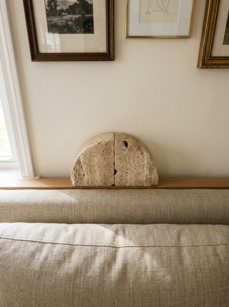
It’s not the art. It’s the lighting.
A picture light mounted above a key piece of art, or a floor lamp with a directional head positioned to wash light upward across the wall, completely transforms how the whole arrangement reads. Without it, even a beautiful gallery wall looks flat after dark. With it, you suddenly have a room that has atmosphere, not just decoration.
Wall sconces on either side of art above a couch is another option that’s having a big moment — and it works particularly well in older homes and converted flats with high ceilings. The light sources become part of the composition, not just functional additions.
Think of it this way: museums don’t light their art randomly. There’s a reason everything in a well-curated space looks better than it would in your hallway. Light is the invisible curator, and it’s almost always the finishing touch that home decor content conveniently leaves out.
—
❓ FAQ
Q: How high should art be hung above a sofa? A: The bottom of the frame (or the lowest piece in a gallery arrangement) should sit about 6 to 8 inches above the top of the sofa back. This keeps the art visually anchored to the furniture rather than floating disconnected on the wall.
Q: What size art is right for a standard sofa? A: A general rule is that your art or arrangement should span roughly two-thirds of the sofa’s width. For a typical 84-inch sofa that’s somewhere around 54 to 60 inches wide — which is larger than most people instinctively go, but it’s what actually looks proportional in the room.
Q: Can I mix different frame styles in a gallery wall? A: Absolutely — but keep the tones consistent. Warm wood frames and black frames, for example, can both work in the same arrangement, but mix warm and cool metal tones and it tends to feel chaotic. A shared color temperature is the invisible thread that holds mixed frames together.
—
💭 Final Thoughts
The wall above a couch is genuinely one of the most rewarding spaces in a home to get right — and one of the most forgiving ones to get wrong, because almost everything can be rehung or rearranged. Don’t wait until you’ve found the “perfect” thing. Put something up, live with it for a few weeks, and let the wall tell you what it actually needs. The best-looking rooms I’ve ever been in weren’t finished all at once — they evolved.
What’s sitting above your sofa right now — and what’s been stopping you from changing it?