
Small Wall, Big Feeling: How to Decorate Apartment Walls That Actually Look Intentional
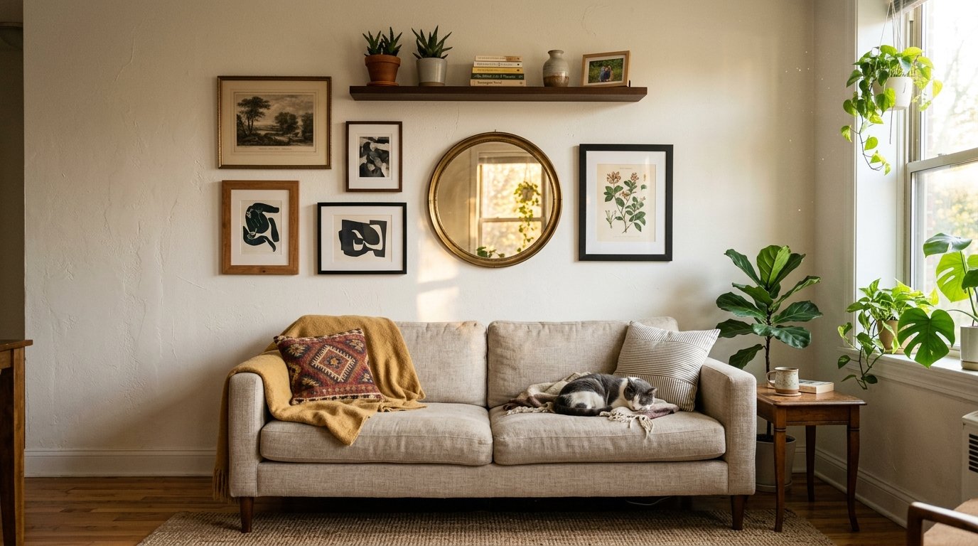
My friend texted me a photo of her living room last spring with the message “why does it still look like I just moved in.” She’d been there three years.
I knew immediately. It was the walls. Bare, flat, and completely disconnected from everything she’d put effort into below them — the nice sofa, the plants, the carefully chosen throw. Everything from the waist down was her. Everything above it was a rental.
That conversation is basically why I’m writing this.
—
1. The Reason Your Apartment Walls Feel Empty Even When They’re Not
Here’s the thing nobody says out loud: hanging stuff on a wall and decorating a wall are two completely different activities. You can nail up four frames and still feel like something’s missing. The issue usually isn’t quantity. It’s relationship — how the pieces on your wall relate to each other, and to the room below them.
Small apartment walls have this specific problem where they become an afterthought. You finish the floor, you finish the furniture, and then you look up and panic and hang whatever you’ve got. A print here. A mirror there. Something your mum gave you over on the left.
It doesn’t work because nothing is talking to anything else.
What actually works — and this sounds obvious when you say it, but it genuinely changed how I think about this — is treating the wall as part of the room’s conversation, not a separate project. The colors, the height, the scale. All of it has to respond to what’s already on the floor.
So before you hang a single thing, stand in your living room and ask: what’s the visual weight down here, and what does the wall need to do in response to that?
—
2. The Height Mistake Almost Everyone Makes in Small Spaces
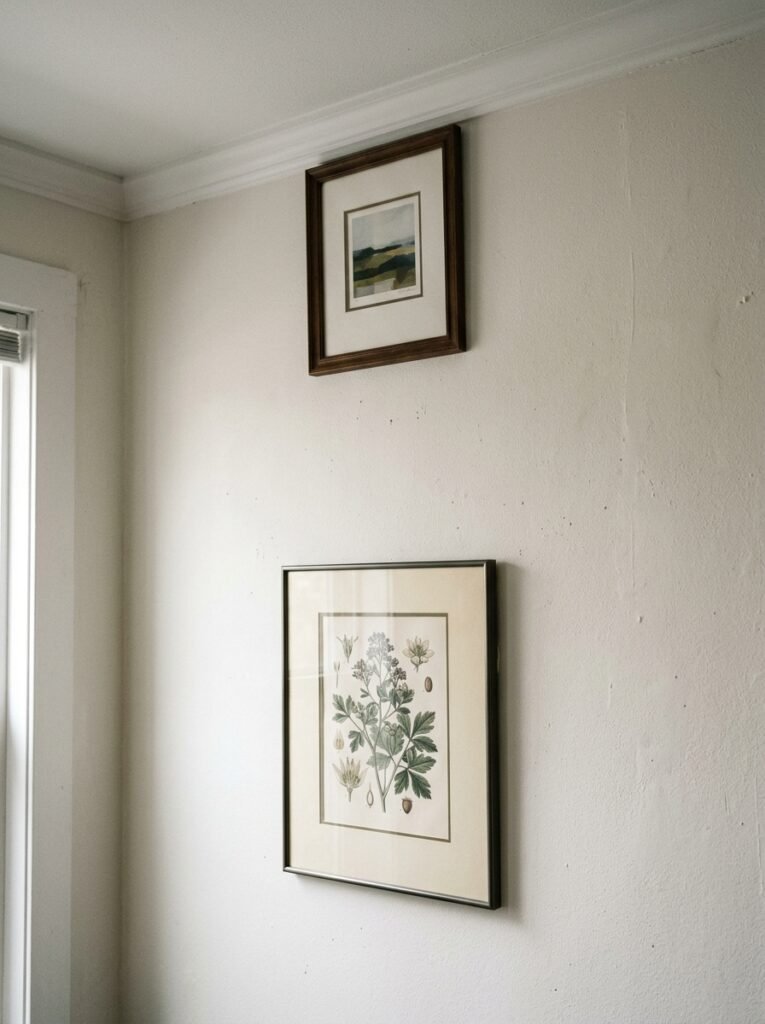
Hang things too low, and the room shrinks. That’s the whole rule. That’s it.
But HOW people mess this up is interesting, because it’s almost always done with good intentions. You put art at eye level because that’s what feels natural, what feels like you’re supposed to. And eye level in a small room with low ceilings is a trap.
“In a small room, art hung high doesn’t just decorate the wall — it builds the room.”
When you push artwork slightly higher than feels comfortable, something strange and wonderful happens. The eye follows it up. The ceiling feels further away. The room breathes.
I’m not talking about hanging things at absurd heights, like you’re decorating a hotel corridor. Just a couple of inches above where your instinct says to stop. Maybe a third of the way up the wall rather than centred. Try it once and you won’t go back.
In a UK Victorian terrace with original high ceilings, this already works in your favor — lean into it completely. In a modern flat or American apartment with standard 8-foot ceilings, it becomes almost essential. You’re borrowing visual height you don’t technically have. And that’s completely allowed.
—
3. The Color That Keeps Showing Up in Every Beautiful Small Living Room Right Now
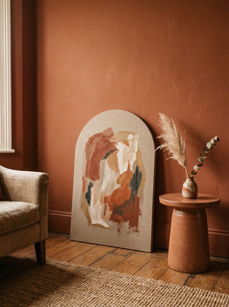
Terracotta. I know, I know — it’s been everywhere. But not in the way people are using it now.
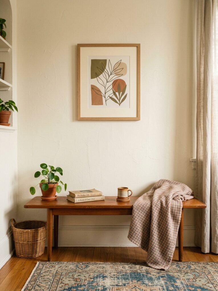
It’s not the bright, almost-orange terracotta of a few years ago. It’s deeper. More clay. Sometimes it edges toward a dusty rose-brown, the color of old brickwork in the late afternoon. And on a small wall, paired with natural textures — linen, raw wood, a little wicker — it does something that cooler colors just don’t.
It makes the room feel warm without feeling smaller. That combination is harder to find than it sounds.
The other color showing up constantly (and this one surprised me) is a really dirty, muted sage. Not the fresh minty green that had its moment. The tired, almost-grey version that looks like it’s been in sunlight for years. In small spaces, this color on a wall — or even just in a large-scale print — does the work of an entire design scheme.
Both colors, by the way, look extraordinary under warm-toned bulbs. Which you should already have. But that’s a whole other article.
—
4. Gallery Walls Don’t Have to Be Chaotic — Here’s the One Rule That Fixes Them
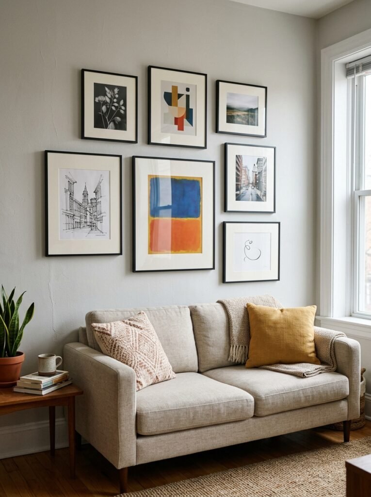
I used to think gallery walls looked messy by default in small spaces. Too much going on, competing for attention, making the room feel cluttered instead of collected.
Then someone explained the constraint rule to me and it completely changed my opinion.
Pick ONE thing to keep consistent across every single item on the wall. Just one. Everything else can vary wildly. It could be the frame color. It could be the mat width. It could be that every piece has the same general orientation (all landscape, or all portrait). It could even just be that every image has a warm, earthy background tone.
That single thread of consistency is what stops a gallery wall from reading as chaotic. Your brain finds the pattern, relaxes, and then gets to enjoy all the variation.
For small spaces specifically, I’d say: keep the frames the same finish (all black, all natural wood, all white) and let literally everything else be different. Sizes, subject matter, art style — all of it. The uniform frames will hold it together. I promise.
—
5. The One Rule That Makes Any Tiny Room Feel Intentional
Odd numbers.
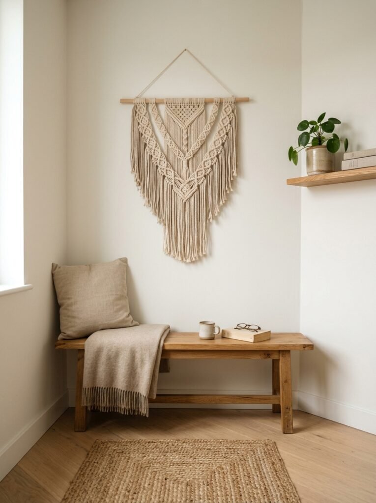
Seriously. Three frames instead of four. Five objects on a shelf instead of six. One big piece flanked by two smaller ones. The human eye reads even numbers as static and symmetrical, which in a small room tends to feel a bit… rigid. A bit hotel-lobby.
Odd groupings read as curated. Collected. Like things that happened to find each other rather than things that came in a set.
This applies to how you group frames on a wall, how you arrange objects on a floating shelf, even how many different materials you’re working with across the whole wall arrangement. Three textures — say, metal, wood, fabric — will almost always feel better than two or four.
“Three is the magic number in small space decorating, and the fact that it sounds cliché doesn’t make it any less true.”
It’s one of those rules I fought against for years because it felt too simple. Turns out simple rules exist because they actually work.
—
6. What to Do With an Awkward Corner Wall (That Isn’t Just a Plant)
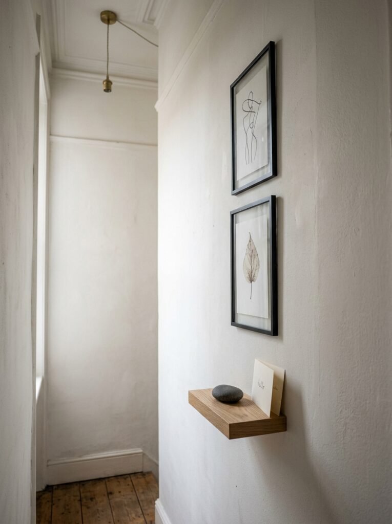
Okay, the specific problem: you have a wall — maybe beside a window, maybe in a corner, maybe behind a door — that’s an awkward shape. Too narrow for a proper gallery, too wide for one statement piece, too something. Every apartment has at least one.
Plants are a great answer and I will not criticize a plant. But if you want something different:
A single tall, vertical print or artwork can be transformative in a narrow space. Not a small piece on a big wall — a piece that actually fills most of the width, oriented vertically, that leans into the narrowness rather than fighting it. Think: a botanical illustration, a long abstract, a photographic print in portrait format. Let it be almost uncomfortably tall. That’s the point.
Alternatively — and this works particularly well in British homes where you sometimes have odd chimney breast walls — a single large round mirror. Not to make the space look bigger (though it will). But because the circle interrupts all the rectangles in the room. It’s a visual rest. And on an awkward wall, that interruption is exactly what you want.
Side note — a mirror hung slightly at an angle (just a degree or two off true vertical) actually reads as intentional in a way a perfectly straight mirror sometimes doesn’t. I don’t fully understand the psychology of why, but I’ve tested it enough times to trust it.
—
7. Shelves Are Doing Double Duty and Not Everyone Realizes It
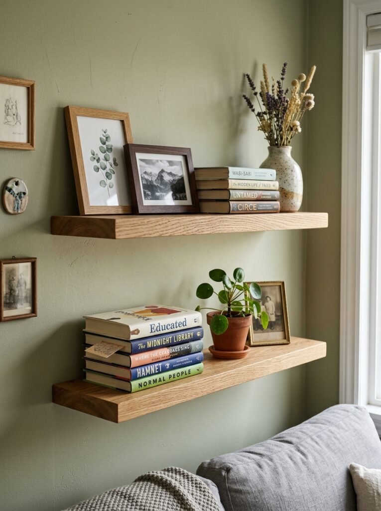
Floating shelves are wall decor. Not just storage that happens to be on the wall — actual, visual elements of the wall’s design. If you’re treating them as purely functional, you’re leaving a lot on the table.
A well-styled shelf in a small living room can carry the whole visual scheme of a wall without you needing to hang a single frame. Books spined out in a tonal arrangement, a small piece of art leaned against the back, a trailing plant, one sculptural object. That’s a complete wall story.
The lean is key, by the way. Art that’s leaned against a wall or shelf back looks so different from art that’s hung. It looks chosen. Casual in a way that reads as confident rather than unfinished. In a small space, that casualness is genuinely valuable — it keeps the room from feeling too tight or over-decorated.
And because the shelf adds a horizontal line to the wall, it also works with that height trick from earlier. A shelf placed slightly higher than expected raises your eye. Pile things on top of it that draw the gaze upward. Suddenly your ceiling has gone somewhere.
—
8. Texture on Walls Without Painting or Renovating
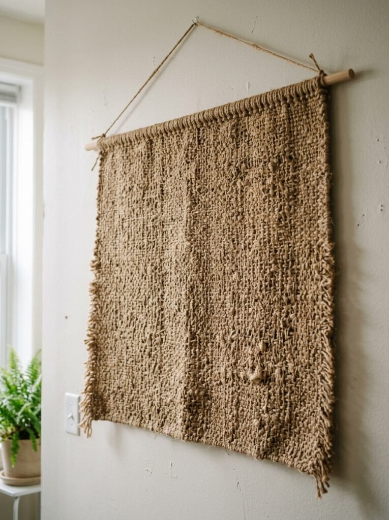
Renters, this one’s for you. Or honestly, anyone who doesn’t want to commit to a painted feature wall.
Woven wall hangings — not the bohemian macramé from 2016, but the tighter, flatter, more architectural versions you’re seeing everywhere now — add actual physical texture to a flat wall in a way that no print or frame can. They absorb sound a little too, which in a hard-floored apartment is worth more than you’d think.
Rattan panels hung as decoration. Framed fabric. A single large piece of linen, stretched or pinned, with an abstract painted detail. These are all things that bring warmth and material interest to a wall without touching the paint.
There’s also a technique I’m slightly obsessed with right now: taking a large piece of architectural paper — something with a waffle or grid texture — and framing it simply. From three feet away it looks like expensive abstract art. Up close it’s interesting in a different way. The texture reads differently at different distances and times of day, especially under directional light.
—
9. The Lamp You’re Not Using as Wall Decor (But Should Be)
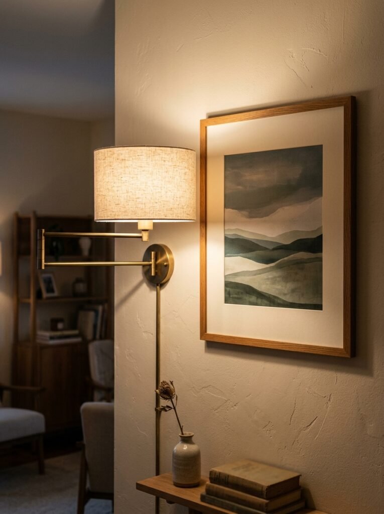
Sconces. Wall-mounted lights. Whatever you want to call them.
I know, I know — in a rented apartment the idea of installing wall lighting feels like a whole project. But there are plug-in sconces that require zero hardwiring, just a small hook and a cable you can run discreetly down the wall or tuck behind a piece of furniture. They exist, they’re beautiful, and they change everything.
Because here’s what a sconce does that a floor lamp or table lamp can’t: it anchors a point on the wall. It creates a destination. In a small living room, having one light source on the wall — even just one, flanking a sofa or a piece of art — gives the room a sense of layers that makes it feel designed rather than assembled.
“A sconce at 7pm does more for a small living room than almost anything else you could spend the same money on.”
The warm pool of light it throws onto the wall creates shadow and dimension. Suddenly your flat, featureless wall has depth. That’s not nothing. That’s actually a lot.
—
10. When One Big Thing Beats a Whole Arrangement
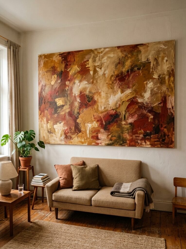
There’s pressure — I feel it too — to do something interesting with every wall. To layer and style and arrange. And most of the time, that approach works.
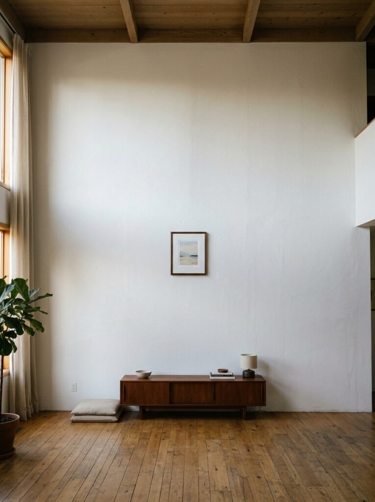
But sometimes the answer is one very large piece of art. Full stop. No shelf, no companion frames, no little sculptural hook nearby. Just one thing, scaled up to a size that feels slightly too big the first time you look at it.
In a small room, this is counterintuitive. Shouldn’t you use smaller things to avoid overwhelming the space? Generally — no. A small piece of art on a big wall just makes both look smaller. A large piece fills the wall with intention. It stops the eye. It creates a focal point without asking for much around it.
The trick is that the art needs to work harder when it’s alone. It needs to have enough going on — color, texture, detail — that you can look at it for more than a second. A single large abstract with rich, varied mark-making will do this. A single large minimalist print might not, depending on the room.
—
11. The Trick With Mirrors That Nobody Talks About
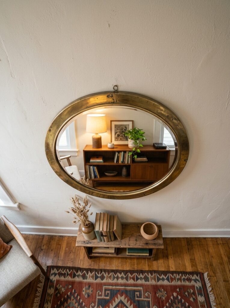
Everyone knows mirrors make small rooms look bigger. That information is about forty years old at this point. What’s less discussed is angle and relationship — where the mirror is aimed, and what it reflects.
A mirror that reflects a blank opposing wall just shows you more blank wall. Cool. Very helpful.
But a mirror positioned to reflect your best light source — a window, a lamp, the open doorway into a brighter room — does something genuinely useful. It doubles the light in the room. Not just the perceived space, but the actual ambient quality of the light.
And a mirror that reflects a piece of art on the opposing wall? Now you’re playing. The reflected art becomes a kind of ghostly second version of itself across the room. It creates depth and mystery in a space that doesn’t have much physical room to play with.
Position your mirrors the way a photographer would position a reflector on a shoot. Think about what they’re catching, not just where they look good hung.
—
12. The Detail That Ties the Whole Room Together and Costs Almost Nothing
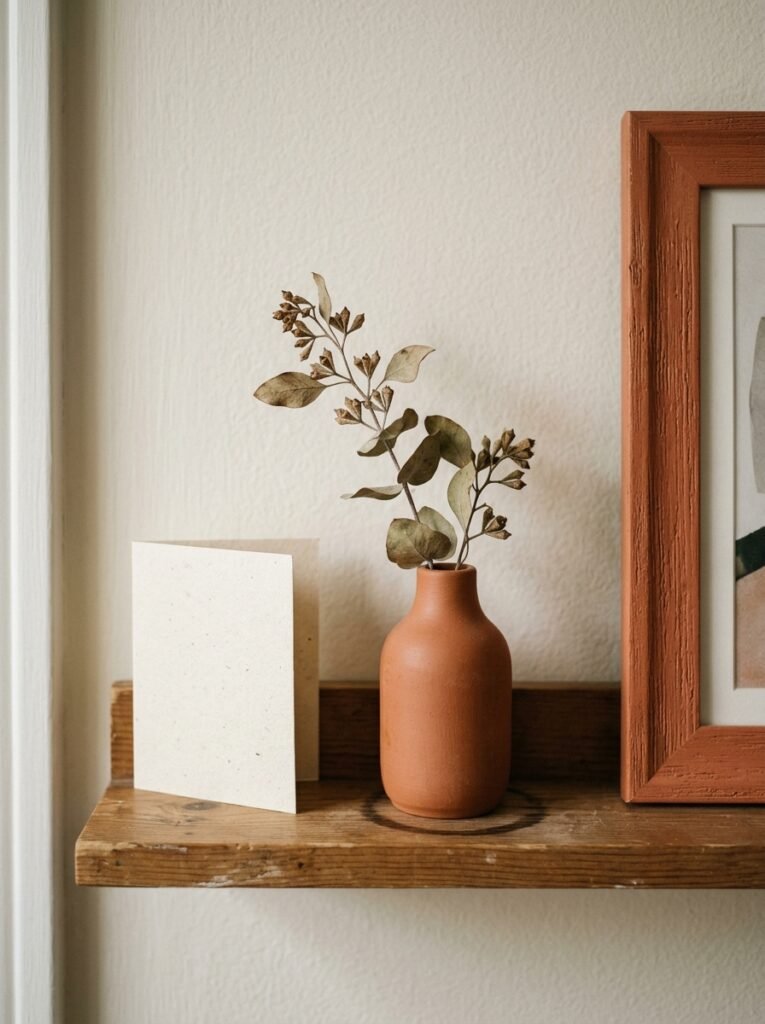
Cord management. Wall-adjacent clutter. The small stuff you stopped seeing.
I’m ending here because it matters more than it sounds. A gorgeous gallery wall with a trailing power cable cutting across it at an awkward angle is still a gallery wall with a trailing power cable cutting across it. A beautiful sconce with a cord that snakes messily to the plug is still a messy cord.
White cable clips on white walls. Cord channels painted to match. Furniture positioned to absorb the cable path. A small framed print placed strategically below a plug socket to draw the eye away from it. These tiny things — five minutes, almost no money — change how the whole wall reads.
Because our brains don’t edit for us when we look at a real room the way they do when we look at a styled photo. We see EVERYTHING. The beautiful print AND the cord AND the slightly crooked frame AND the smudge near the light switch. Clean up the periphery of your wall, and the main event suddenly looks like it was planned.
Which, now that you’ve read all of this, it absolutely will be.
—
❓ FAQ
Q: How do I hang things on apartment walls without losing my deposit? A: Adhesive strips and hooks have come a long way — there are options now that genuinely hold several pounds of weight without damaging most painted walls. The key is to check the weight limit carefully, apply them to completely clean walls (wipe with rubbing alcohol first), and never try to remove them too soon or too late. For heavier pieces, a single small nail hole is usually far cheaper to repair than you’d think — just keep a little tub of wall filler and matching paint handy.
Q: What size art should I get for a small living room wall? A: Almost always bigger than your instinct says. As a general guide, your art should fill roughly two-thirds to three-quarters of the wall space above your sofa, or about 60% of a feature wall. If you’re unsure, cut paper to the size you’re considering and tape it to the wall. Live with it for a day. You’ll almost certainly go larger.
Q: Is it okay to mix different frame styles in a small space? A: Yes, but use the constraint rule mentioned in section 4 — pick one element to unify and let everything else vary. The easiest unifier is frame color or finish. Mixed metals, mixed wood tones, and mixed sizes all work as long as there’s one consistent thread pulling it together.
—
💭 Final Thoughts
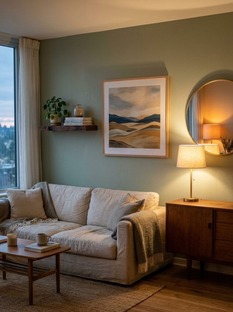
Small walls aren’t a limitation, even though they feel like one. They’re just a different kind of brief. You’re working with less, which means every choice has to mean something — and honestly, that constraint tends to produce better results than having endless room to spread out.
My friend, by the way, rearranged her entire wall situation after that text. Moved everything higher, took half of it down, added one large print and a plug-in sconce she found in a charity shop. She sent me a photo a week later with just “okay I get it now.”
What’s the one wall in your home you’ve been avoiding thinking about?