
Beige Walls Living Room: Why This Quiet Color Is the Most Transformative Choice You’ll Ever Make
There’s something quietly revolutionary about choosing beige for your living room walls — not the flat, lifeless beige of a forgotten office building, but the warm, breathing, layered kind that makes every person who walks through your door exhale just a little. If you’ve been scrolling past the bold jewel-toned rooms and wondering why none of them feel quite like home to you, this might be your answer.
—
1. The Quiet Power of Beige That Nobody Talks About
Beige doesn’t shout. That’s exactly the point.
In a world where everything competes for our attention — our phones, our schedules, the endless noise of modern life — a beige living room offers something genuinely rare: visual rest. The color itself is a neutral in the truest sense of the word, meaning it doesn’t push an agenda. It doesn’t demand that your sofa match or your throw pillows coordinate perfectly. It simply holds space, the way a good friend does, and lets everything else breathe around it.
Color psychologists consistently describe warm neutrals like beige and greige as emotionally regulating tones. They lower perceived visual stimulation, which in turn helps the nervous system settle. This isn’t just interior design theory — it’s the reason you feel calmer in certain rooms and inexplicably tense in others. Your walls are doing more emotional work than you realize.
“Beige isn’t the absence of color. It’s the presence of calm.”
And here’s what makes beige genuinely extraordinary: it’s not a compromise. Choosing beige isn’t giving up on having a beautiful room. It’s choosing a foundation that makes everything else — every lamp, every plant, every memory you hang on those walls — look more intentional, more curated, more you.
—
2. Not All Beiges Are Created Equal — Here’s What to Know Before You Paint
This is where most people stumble, and it’s completely understandable. You pull a beige paint chip off the rack, bring it home, slap it on the wall, and suddenly your living room looks like the inside of a manila envelope. What went wrong?
Undertones. That’s what went wrong.
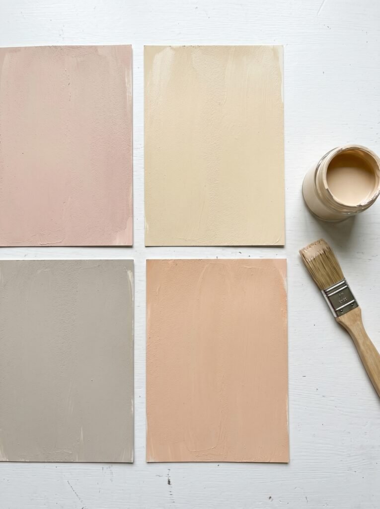
Beige is never just beige. Every shade carries an undertone — pink, yellow, green, gray, or peach — and that undertone will either harmonize with your existing light and furnishings or fight against them completely. A beige with strong pink undertones can read as blush in afternoon light. A green-leaning beige can feel earthy and organic in a north-facing room, or slightly clinical in a south-facing one.
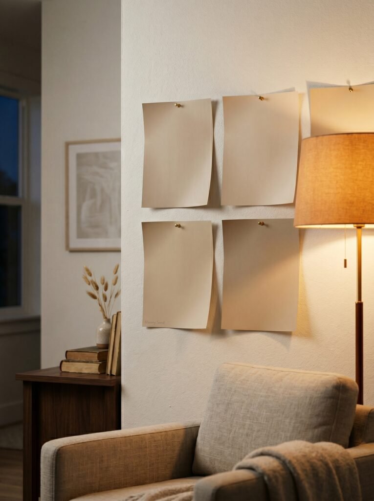
The smartest thing you can do before committing to a color is buy sample pots and paint large swatches — at least 12 inches by 12 inches — directly on your wall. Then observe them at different times of day. Morning light, afternoon sun, lamplight in the evening. The color you see at 10 a.m. will look completely different by 7 p.m., and the version you fall in love with in the hardware store under fluorescent lighting might surprise you at home.
Some consistently beloved beige shades that interior designers reach for again and again include Accessible Beige by Sherwin-Williams, White Dove by Benjamin Moore (which reads as a creamy, warm beige in many rooms), Pale Oak by Benjamin Moore, and Navajo White — a classic that feels both modern and timeless depending entirely on the room around it.
—
3. Why Beige Works So Well With Natural Light (And What to Do Without It)
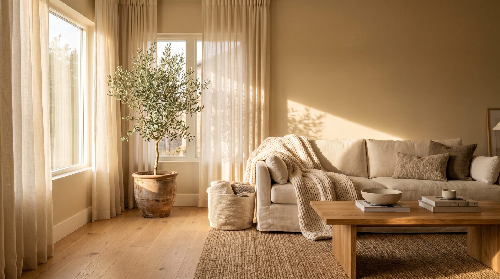
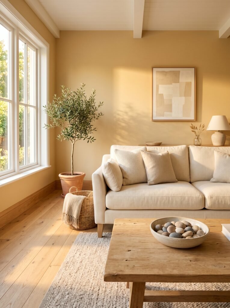
Imagine walking into your living room on a slow Sunday morning. The curtains are open, light is pooling across the floor in soft rectangles, and your walls seem to glow rather than simply reflect. That’s beige in natural light — and it’s genuinely one of the most beautiful things a room can do.
Warm neutrals absorb and reflect light in a way that cooler colors simply don’t. Rather than bouncing light harshly the way bright white sometimes does, beige diffuses it — softening it, warming it, spreading it gently across the room. The result feels less like living inside a box and more like living inside a lantern.
If your living room doesn’t get much natural light, don’t despair and don’t rule out beige. In fact, choosing a beige with a slightly warmer, deeper tone — something with golden or amber undertones rather than cool gray ones — can actually make a darker room feel cozier and more intentional rather than dim and heavy. Pair it with warm-toned artificial light sources: Edison bulbs, linen lampshades, floor lamps tucked into corners. The room will feel like it was designed by someone who truly understands light.
—
4. The Art of Layering: How to Make a Beige Room Look Effortlessly Designed
Here’s the truth that separates a magazine-worthy beige living room from a forgettable one: layering.
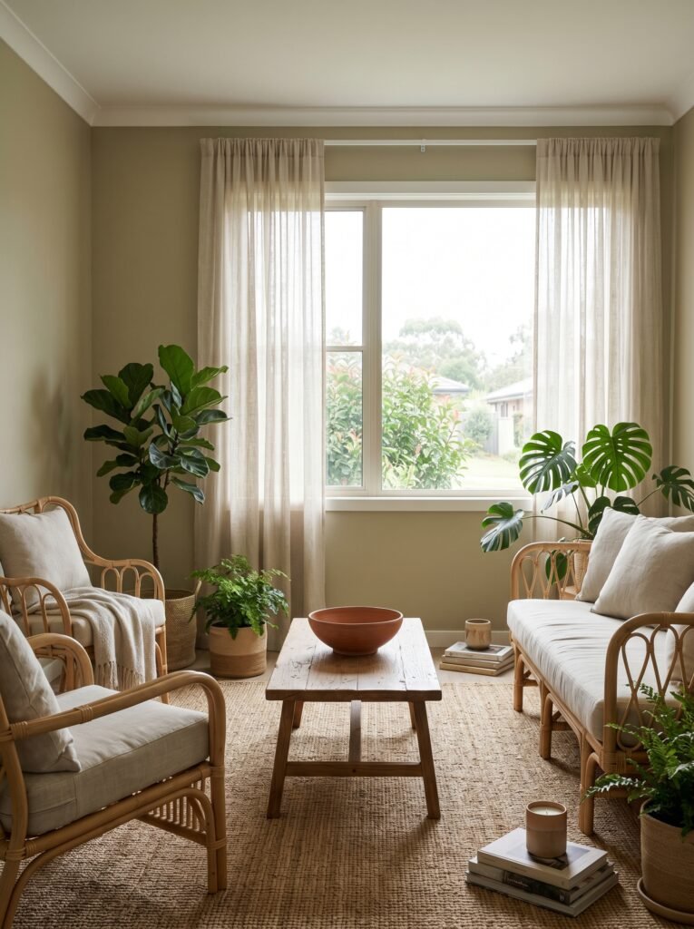
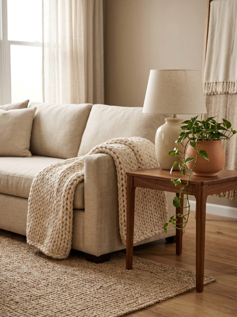
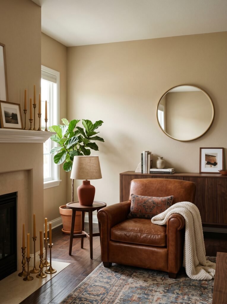
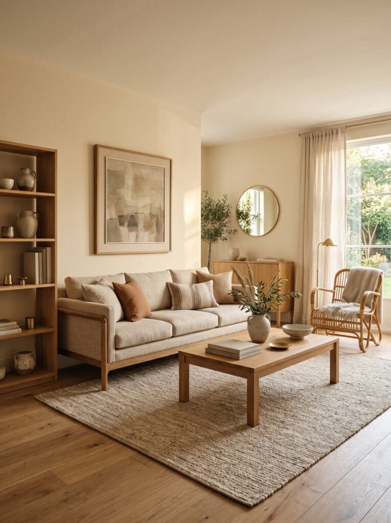
Beige walls on their own are a blank canvas, and a blank canvas without texture, depth, and considered contrast can feel unfinished. But add a chunky knit throw over a linen sofa, a woven jute rug underfoot, a terracotta planter holding a sprawling fiddle leaf fig, and suddenly that same beige background becomes the most sophisticated room in the house.
The key is to think in layers, literally from floor to ceiling. Start with your largest pieces — sofa, rug, curtains — in tones that either echo the beige (for a tonal, spa-like atmosphere) or provide intentional contrast (deep walnut wood, charcoal velvet, forest green linen). Then build with medium-scale items: side tables, artwork, bookshelves. Finally, finish with small-scale details: candles, books stacked with their spines facing out, a ceramic bowl with a few seasonal objects inside.
Each layer adds visual interest without adding visual noise. The beige walls hold it all together like the binding of a well-loved book.
—
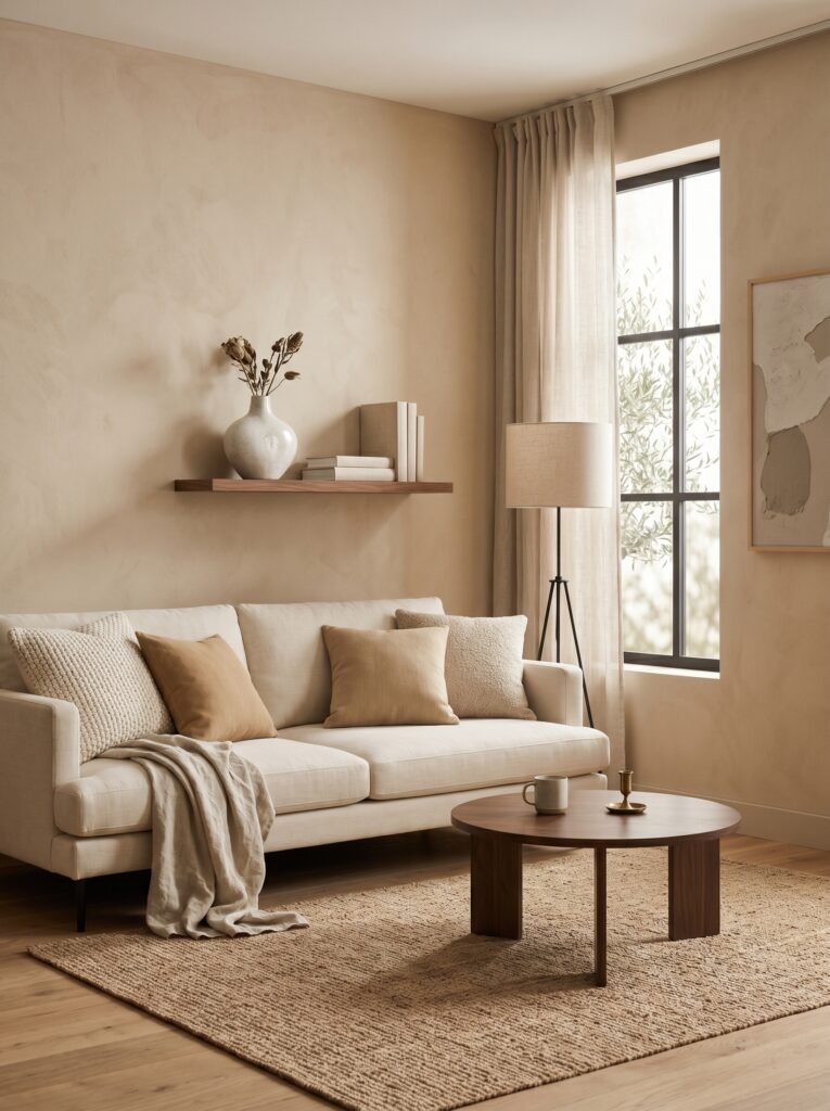
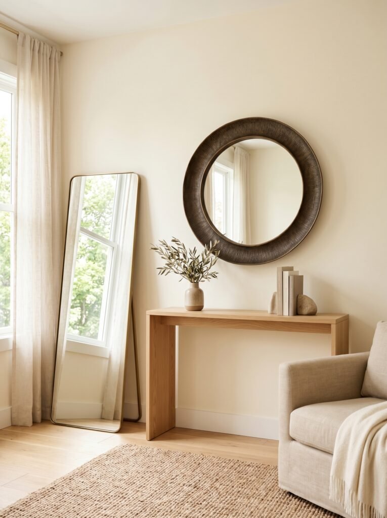
5. Beige and Wood: The Pairing That Never, Ever Fails
If there’s one combination that feels as natural as morning coffee and a good book, it’s beige walls with warm wood tones. Oak floors, walnut furniture, pine shelving, rattan accent pieces — all of them come alive against a beige backdrop in a way they simply don’t against stark white or trendy gray.
This isn’t accidental. Both beige and warm wood draw from the same palette that exists in the natural world: sand, bark, stone, dry grass, pale earth. When you bring them together inside a room, something in our brain registers it as right — as safe and grounded and real. There’s a reason Scandinavian and Japanese interior design principles both lean heavily on this pairing. It’s biophilic design in its most accessible, affordable form.
“Wood and beige together don’t just look beautiful — they feel like the earth brought indoors.”
The best part? This combination works regardless of your style. A mid-century modern living room with a teak credenza and beige walls looks clean and architectural. A farmhouse living room with shiplap accents and blonde wood furniture against the same beige reads as warm and welcoming. Beige is genuinely style-agnostic. It performs beautifully in every room it enters.
—
6. Accent Colors That Transform a Beige Living Room Without Overwhelming It
One of the most common fears people bring to beige is that it will feel too plain, too safe, too much like they didn’t quite commit to a design direction. The answer to that fear isn’t to abandon the beige — it’s to choose accent colors thoughtfully.
Terracotta is perhaps the most talked-about companion to beige right now, and for good reason. The warm rust-orange tones create a rich, sun-baked Mediterranean quality that feels both current and timeless. A single terracotta vase on a coffee table, a few throw pillows, or a large piece of abstract art incorporating those tones is all it takes.
Sage green is another breathtaking pairing — quieter, more botanical, with a quality that makes a room feel alive without being busy. Forest green and olive work similarly, though they bring more drama and depth.
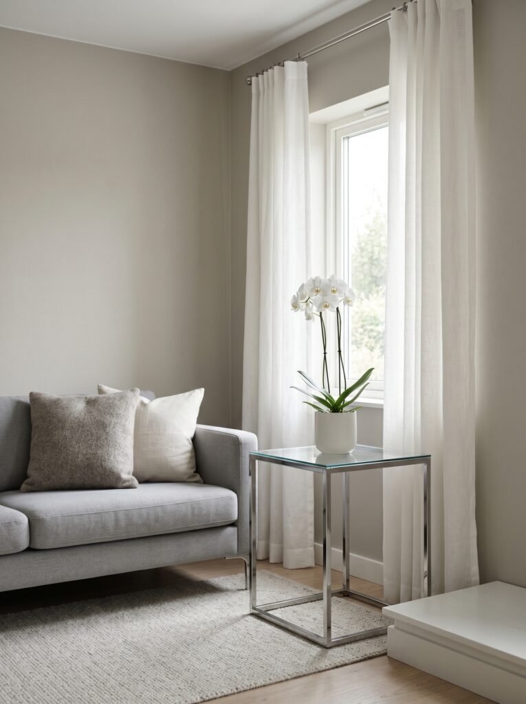
For those who want their beige room to feel more modern and editorial, charcoal and deep navy provide striking contrast without the coldness of black. Dusty rose or warm mauve add an unexpected softness. And if you want to lean fully into the warm neutral palette without introducing a true color, consider layering creams, taupes, and warm whites for a tone-on-tone effect that looks incredibly intentional and quietly luxurious.
—
7. Furniture Styles That Were Made for Beige Walls
The beautiful irony of beige is that it’s both a background color and an active design element. It plays differently depending on the furniture you place in front of it, which means you have extraordinary flexibility in styling your space.
Linen sofas in cream or ivory against beige walls create that tonal, layered-neutral look that’s been dominating Pinterest boards for the last few years. Add a performance fabric sectional in warm gray, and the room feels grounded and comfortable. Introduce a velvet sofa in deep forest green or dusty blue, and suddenly the same beige walls become the perfect foil — quiet, elegant, making the sofa the star of the show.
Curved furniture — rounded armchairs, oval coffee tables, arched mirrors — looks particularly wonderful against beige walls. The softness of the forms and the softness of the color reinforce each other, creating a room that feels genuinely welcoming rather than stiff.
—
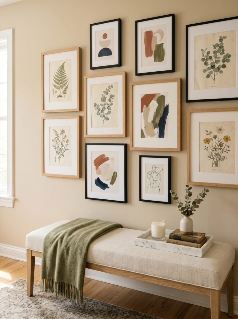
8. The Role of Artwork in a Beige Living Room
Beige walls are, without question, the best backdrop for displaying art. Unlike bold colored walls that compete with artwork or dramatically alter how colors read, beige allows paintings, prints, and photographs to look exactly as their creators intended.
Think of every major art museum you’ve visited. The walls are almost always some variation of warm white, cream, or soft beige. That’s not a coincidence — it’s deliberate. The neutral backdrop allows the artwork to become the focal point without visual interference.
In your own living room, this means you can hang virtually any style of art — abstract, botanical, photography, portraiture, graphic prints — and it will look considered and intentional. A gallery wall of black-and-white photography looks striking and modern. A single oversized oil painting in warm, earthy tones looks like something from a European villa. A cluster of botanical prints in thin brass frames looks fresh and collected.
—
9. How Textiles Bring a Beige Living Room to Life
If beige walls are the song, textiles are the melody line that makes it memorable.
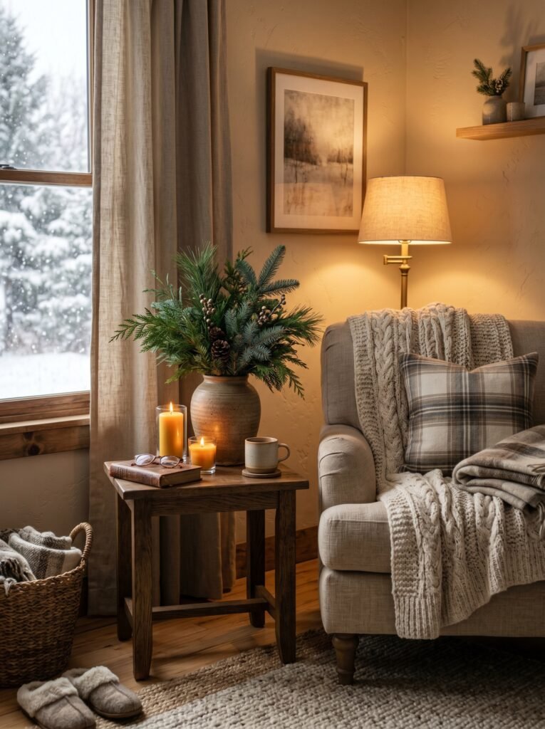
This is where your room gains its personality — through the weight of your curtains, the weave of your rug, the nap of your throw pillows. In a beige living room, textiles matter more than in almost any other color scheme, because they’re doing the work of adding depth and dimension that the wall color, by design, is not doing.
Linen curtains — slightly wrinkled, falling to the floor in soft pools — add an effortless, European quality. Velvet cushions bring luxury and a slight sense of drama. A Persian or Moroccan rug introduces pattern and history and warmth underfoot. Chunky knit blankets draped over the arm of a sofa add texture so tactile you almost want to reach through the screen and touch it.
“In a beige room, what you feel when you walk in is determined almost entirely by the textiles you choose.”
Don’t overlook the curtain weight, either. Heavy, lined curtains in natural linen or cotton canvas will make a room feel grounded and substantial. Lightweight sheers will keep it feeling airy and sunlit. Both are beautiful choices — just different ones, for different kinds of rooms and different kinds of people.
—
10. Lighting Choices That Make Beige Walls Glow
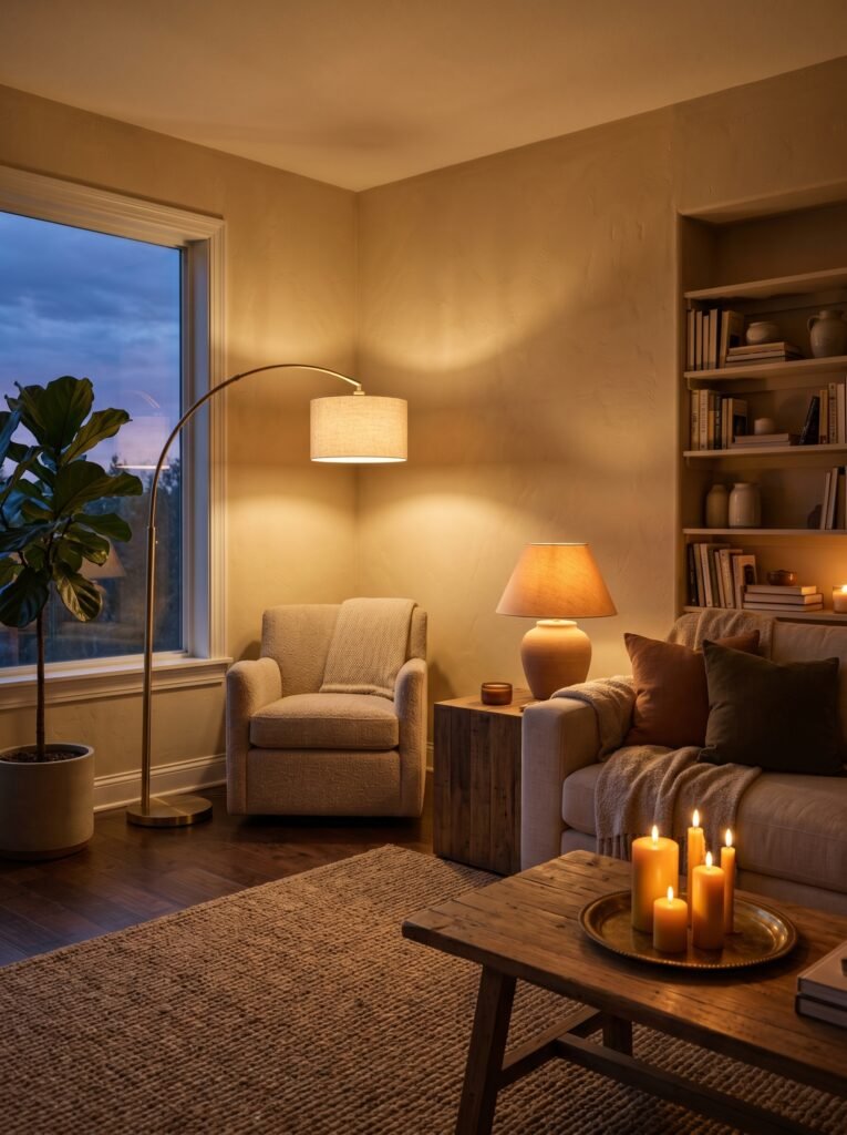
Lighting is the invisible ingredient that can make or break a beige living room, and it’s almost always the last thing people think about.
Beige walls respond dramatically to the temperature of your light sources. Warm-toned bulbs — those in the 2700K to 3000K color temperature range — bring out the golden, honeyed undertones in most beige shades, making the room feel inviting and rich. Cool daylight bulbs, by contrast, can flatten beige and push it toward gray in ways that feel unintentional and a little cold.
Layer your lighting the same way you layer your décor. Overhead lighting provides general illumination, but it should rarely be your only source. Add table lamps on side tables for pools of warm, intimate light. Position a floor lamp in a dark corner to lift the room visually. Consider wall sconces if your layout allows — they create beautiful shadows and highlight wall color in a way overhead lighting never can.
Candles, too, deserve a mention. There’s no lighting source more flattering to beige walls than candlelight. If you have guests coming for dinner and want your living room to feel like a sanctuary, light a few candles before they arrive. The room will look entirely transformed.
—
11. Small Living Rooms in Beige: Making the Space Feel Larger Than It Is
One of the most practical gifts beige gives to small spaces is the illusion of expansion. Light, warm neutrals visually push walls outward — they reduce the sense of enclosure that darker colors can create, and they keep the eye moving gently around the room rather than stopping abruptly at a boundary.
In a small living room, take this a step further by choosing beige for your walls and your ceiling. Painting the ceiling the same color as the walls — or a slightly lighter version of it — removes the visual interruption where walls meet ceiling and makes the room feel taller and more cohesive. It’s a technique beloved by interior designers and surprisingly underused by homeowners.
Keep furniture scaled appropriately to the room. Oversized pieces will make even the most beautifully colored room feel cramped. Choose legs over solid bases where possible — a sofa with visible legs, a glass or open-frame coffee table — to maintain sight lines and keep the floor visually open.
—
12. Why Beige Is the Most Future-Proof Color You Can Choose
Trends move fast. The gray-and-white farmhouse aesthetic that dominated interior design for over a decade has given way to warmer tones, warmer woods, and warmer walls — and at the center of that shift sits beige. But here’s what makes beige different from every other trend: it isn’t one.
Beige has been considered beautiful across centuries, cultures, and design movements. It appears in ancient Roman architecture, Japanese wabi-sabi interiors, mid-century Scandinavian design, and the latest issues of every major interior design publication. It transcends style periods because it works with human instincts that don’t change — our desire for warmth, for calm, for spaces that feel like they belong to us.
Choosing beige for your living room walls is an investment in longevity. You won’t wake up in three years and want to paint over it because the trend has passed. You won’t need to replace your furniture to keep up with a demanding wall color. You’ll simply live in a room that feels genuinely good — every season, every year, every decade.
—
🌿 How to Make the Most of Your Beige Living Room
Getting beige right takes a little care, but it’s less complicated than most people think. A few practical things that make an enormous difference: always test multiple paint samples on your actual wall before committing, because store lighting is nothing like home lighting. Give yourself at least 48 hours of observation time, watching the samples in morning, afternoon, and evening light. Once you’ve chosen your shade, invest in quality paint — the finish matters as much as the color. An eggshell or satin finish will be more forgiving and easier to clean than flat, and it will give your walls a gentle luminosity that flat paint simply can’t achieve. Don’t rush the layering process. Build your room slowly, adding textiles and accents over time rather than all at once. A beige room that feels “done” the day it’s painted often looks generic; a beige room built over months of thoughtful curation looks like a home that truly belongs to someone.
—
❓ FAQ
Q: Will beige walls make my living room look boring or outdated? A: Not at all — the right beige, paired with thoughtful textiles, warm wood tones, and considered accent colors, creates a space that feels layered, intentional, and quietly luxurious. The key is choosing a shade with flattering undertones for your specific light conditions and building the room with genuine depth.
Q: What is the difference between beige and greige, and which is better for a living room? A: Beige leans warm — toward yellow, cream, or peachy undertones — while greige is a blend of gray and beige, sitting in cooler, more neutral territory. Neither is objectively better; the right choice depends on your existing floors, furniture, and the quality of light in your room. Warm rooms and south-facing spaces often suit true beige beautifully, while north-facing or cooler rooms sometimes respond better to greige.
Q: Can beige walls work with a modern or contemporary interior design style? A: Absolutely. Beige is remarkably style-agnostic. In a modern or contemporary space, pair it with clean-lined furniture, minimal accessories, geometric textiles, and strong architectural details. The beige recedes and lets the design speak, creating a sophisticated backdrop that feels intentional rather than plain.
—
💭 Final Thought
There’s something deeply satisfying about a room that makes you want to stay — that pulls you in on a difficult day and offers something soft to land on. Beige walls, done thoughtfully, create exactly that kind of space. Not because beige is flashy or dramatic or bold, but because it understands what a home is actually for.
So before you reach for the most dramatic paint chip on the rack, take a moment and ask yourself: what do I actually want to feel every time I walk into my living room?