
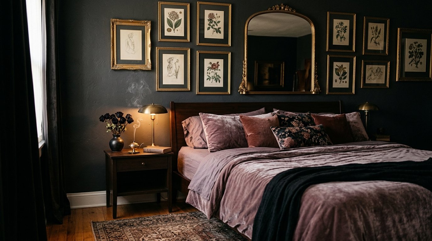
Dark Feminine Bedroom Wall Decor That Actually Feels Like You (Not a Mood Board Copy)
My friend looked at my bedroom and said, “it’s giving vampire girlfriend who reads.” I took that as the highest possible compliment.
—
1. Why “Dark Feminine” Hits Different Than Just Painting Your Walls Black
There’s a version of this aesthetic that ends up feeling like a Halloween store. You know the one — black everything, a skull or two, some red velvet that’s just slightly too shiny. That’s not what we’re talking about here.
Dark feminine is something else entirely. It’s the feeling of walking into a room and exhaling. Like the space was made specifically for you to be unbothered in. The wall decor is a HUGE part of why some rooms nail it and others just look gloomy.
The difference? Intention. Every piece on the wall in a properly done dark feminine room looks like it was chosen over time, not ordered in a bundle. There’s depth — botanical prints next to something abstract, a small dark mirror catching candlelight, a single piece of art that makes you feel things you can’t quite name. It’s layered without being chaotic.
And here’s what I’ve noticed: the women whose bedrooms actually look like this? They didn’t decorate for an aesthetic. They decorated for a feeling.
—
2. The One Wall Treatment That Changes Everything (And It’s Not Paint)
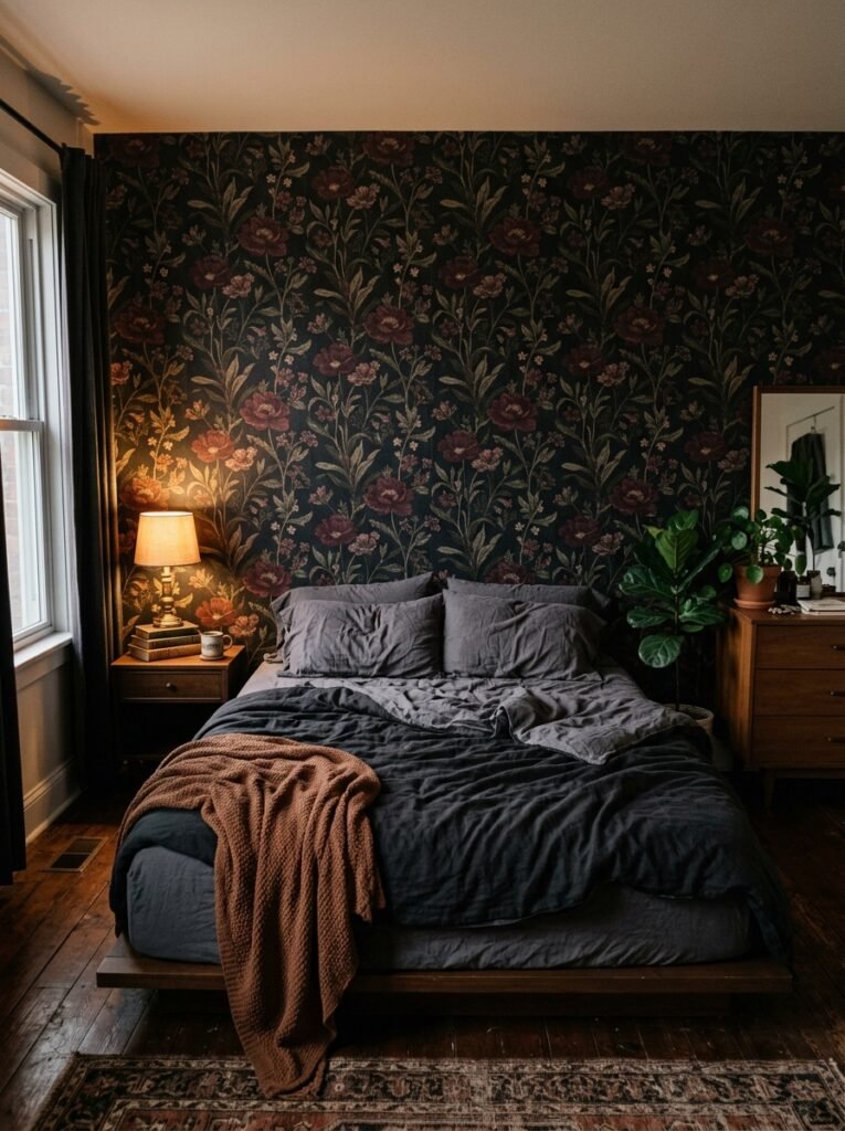
Okay, so paint matters — obviously. But the wall treatment that I keep seeing completely transform a bedroom in this style is textured wallpaper in deep, moody tones.
Not busy wallpaper. Textured. Think: a dark sage botanical print on near-black background, or a charcoal damask that reads almost like shadow in certain light. When you have art or mirrors layered on TOP of that — that’s when the magic happens.
The texture catches light differently throughout the day. At noon it’s one thing. At 9pm with a lamp on, it’s a completely different room. That layering effect is something flat paint just can’t replicate, which is honestly a little annoying because textured wallpaper is more of a commitment.
“The wall treatment that changes everything isn’t always the most obvious one — sometimes it’s the layer you put ON the wall, not the wall itself.”
But if you’re renting or you’re just not ready for wallpaper, here’s the trick: dark paint plus one oversized art piece with heavy visual texture (think loose, gestural brushstrokes in oils, or a large-format photograph with a ton of contrast) achieves almost the same layered feeling. Not quite, but almost.
—
3. Art That Actually Belongs in a Dark Feminine Room (Not Just “Dark Art”)
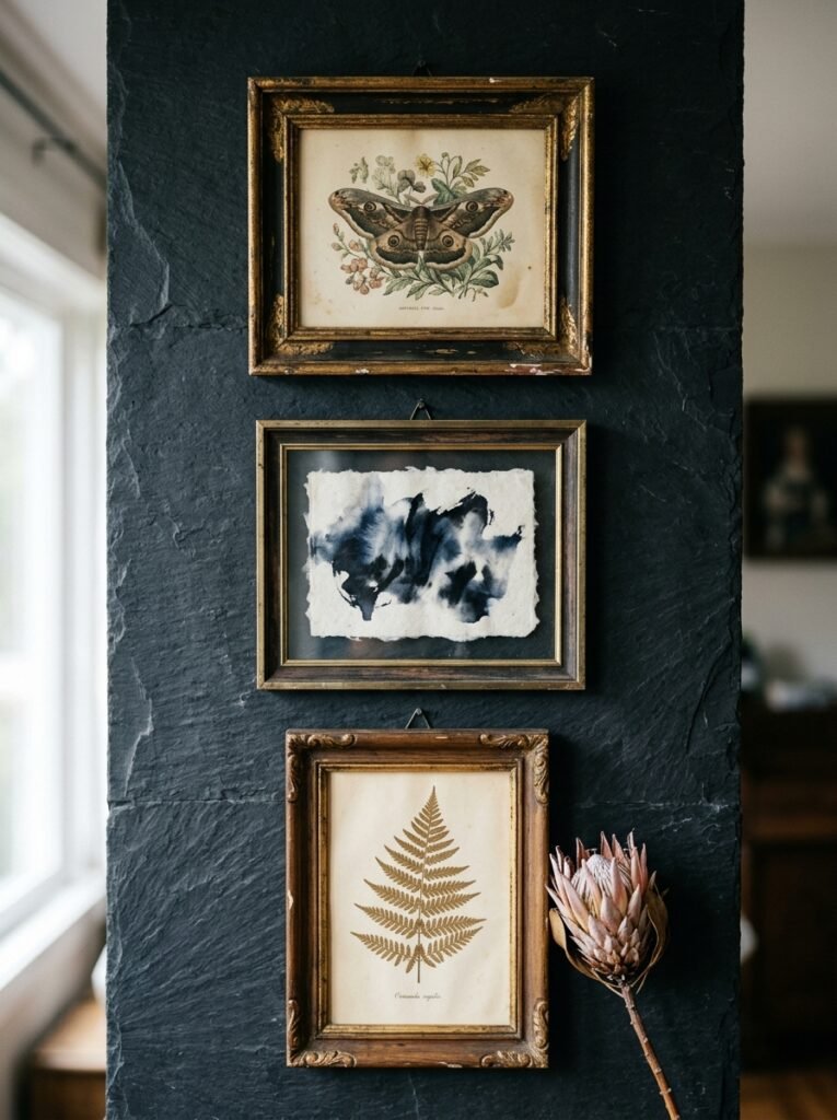
This is where people go wrong. They search “dark feminine art” and end up with something that’s either too literal — women draped in black, roses, thorns, you know the drill — or too gallery-sterile, which kills the whole mood.
What works? A few things, genuinely:
Figurative art that focuses on mood rather than narrative. A woman’s back. A face partially obscured. Something that leaves space for YOU to bring the story.
Abstract work in deep jewel tones — oxblood, forest green, inky navy, dusty plum. Big brushstrokes. Art that looks like it was made with some feeling behind it, not designed by algorithm.
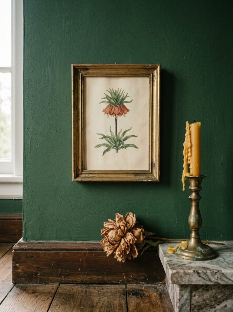
Botanical illustrations, specifically the old-fashioned kind. The ones that look like they came out of an 1800s naturalist journal. Dark backgrounds, delicate rendering. These are SO good in this aesthetic and I feel like people underuse them.
And then — the unexpected thing. One piece that doesn’t “fit” the color palette. Something golden, or dusty terracotta, or even a tiny bright red accent piece. That tension is what makes a room feel like a real person lives there, not a content creator staging a shoot.
—
4. Mirror Placement That Makes Your Room Feel Like a Secret Garden
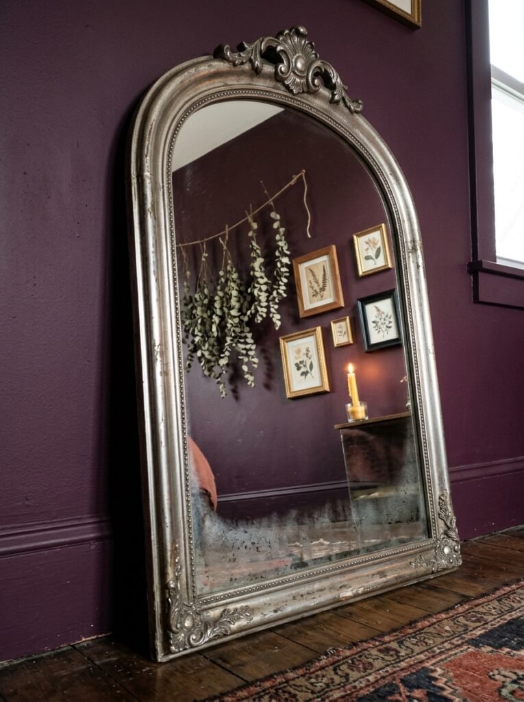
I have strong opinions about mirrors. Not gonna lie.
Most people hang ONE mirror and call it a day. But in a dark feminine bedroom, mirrors are basically doing structural work — they’re bouncing the limited light around, creating depth, and adding a kind of mysterious quality to the space that you can’t get with art alone.
A leaning floor mirror in a dark ornate frame, positioned at an angle, creates a completely different feeling than a mirror hung flat and centered on the wall. It’s the angle that does something interesting. Light hits it differently, your reflection catches your eye at unexpected moments, the room feels bigger but also more layered.
Antique or antiqued mirrors are particularly incredible for this style. The slightly foxed glass — where the mirror has small dark spots and imperfections in the silver — looks so intentional in a moody room. Even if you can’t find a genuine antique, there are reproduction versions that capture that same softness.
One idea I love: a small cluster of three mismatched mirrors on one wall, all different shapes (arch, oval, rectangle), all dark or oxidized metal frames. None of them centered. It sounds chaotic on paper. In practice it looks like a room in a French novel.
—
5. The Color Combination Nobody Talks About Enough
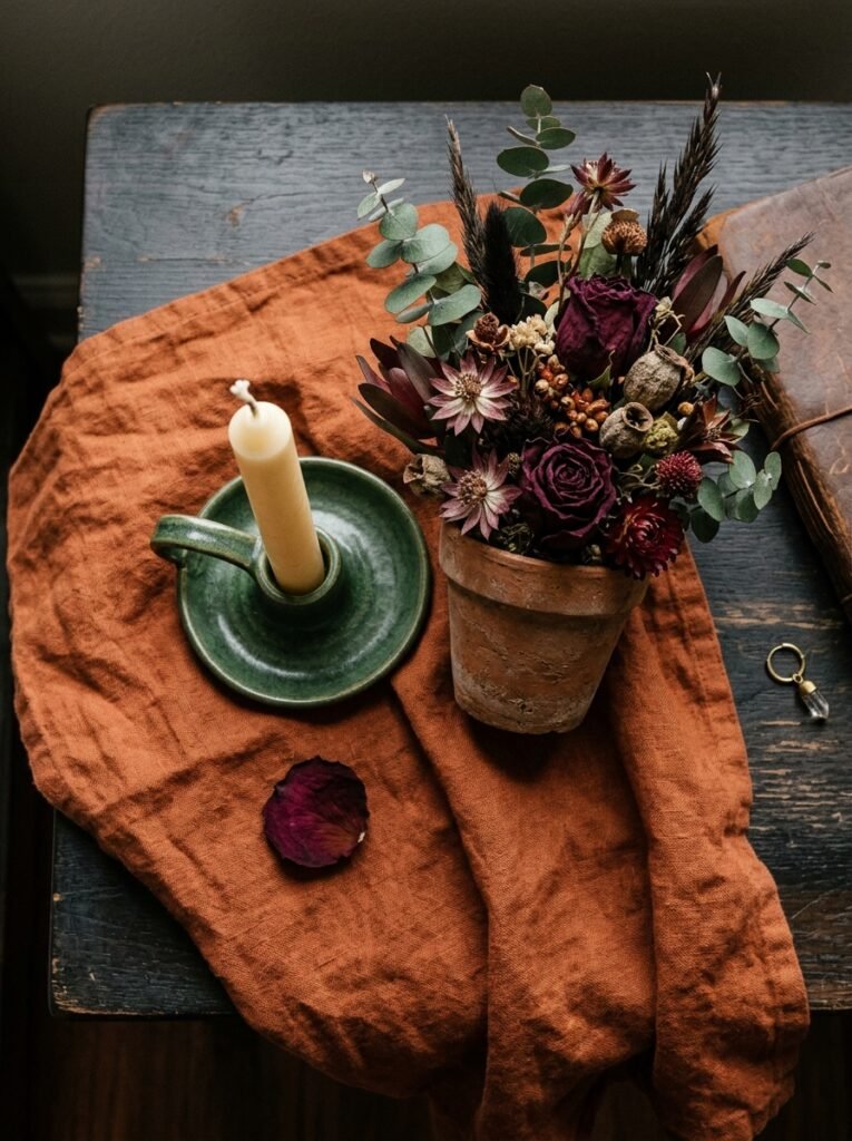
Black and gold gets all the attention. And yes, it works. But there’s another combination that I think is more interesting and honestly more liveable over time.
Deep plum or burgundy walls (or a rich wallpaper in those tones) with warm brass hardware on frames, and then one or two pieces in dusty, almost-grey sage green. Done right, this combination feels like autumn. Like velvet. Like the best kind of Saturday afternoon.
The sage green is the secret weapon. It keeps the room from feeling heavy, but it’s muted enough that it doesn’t fight the dark tones. It just… breathes.
“Deep plum with warm brass and a single note of dusty sage — it’s an autumn afternoon you can sleep inside.”
If you’re building a gallery wall in this palette, think: burgundy velvet-covered frames, brass oval frames, and one simple wooden frame in a weathered, pale tone. The variety in frame material matters as much as the art inside the frames, honestly.
—
6. What to Do With the Wall Behind Your Bed If You’re Not Doing a Headboard
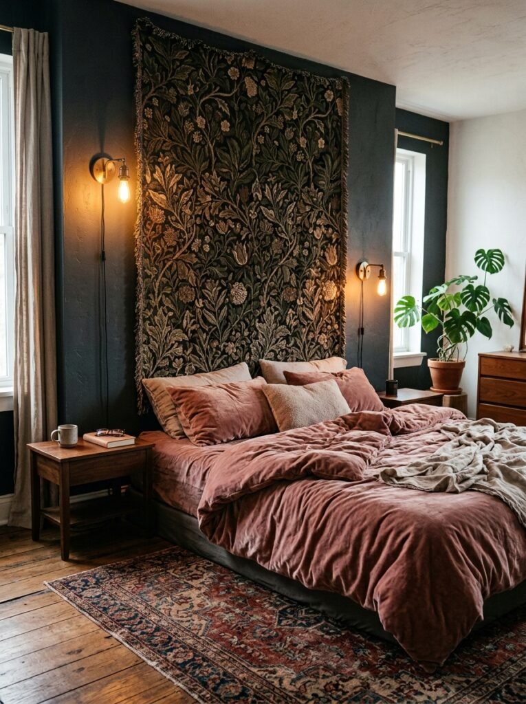
Not everyone wants a traditional headboard. And in a dark feminine room, this can actually be an opportunity.
The wall behind your bed is the most-viewed wall in the room — you see it every morning, guests notice it first. So treat it like a canvas with intention.
A large-scale tapestry hung low, so it grazes the pillows, creates an incredibly cozy, almost tent-like feeling. Something in deep jewel tones, maybe with some subtle metallic threading that catches light. Not a beach mandala tapestry — that’s a different vibe entirely. Think more like woven textile art, abstract, soft-edged.
Alternatively: a vertical arrangement of small framed pieces, stacked close together so they form one tall shape. It reads like a single art piece from a distance but rewards close inspection.
Or — and this is my personal favorite — a single giant canvas print that extends almost the full width of the wall. One image, huge, dark, moody. No competition, no complexity. Just weight. It anchors the whole room.
—
7. The Small Stuff That Actually Makes the Big Stuff Work
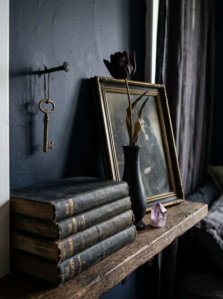
Here’s something I’ve noticed that takes forever to figure out on your own: you can have the most stunning, carefully chosen large art pieces in the world, and the room still won’t feel right if the small details are wrong.
The small stuff, specifically:
Wall sconces. Not overhead lighting — actual sconces positioned near the bed or flanking a mirror. Something in dark bronze or aged iron. The quality of light they produce is completely different from any overhead fixture, and in a dark feminine room, that amber glow bouncing off the wall at eye level is basically the whole vibe.
Small framed quotes or poems, tucked in unexpected places — not centered, not eye level, maybe lower or off to the side. The kind of thing someone discovers when they’re sitting on your bed. A line of poetry in a thin dark frame.
Dried botanicals. Small bundles of preserved eucalyptus, dried roses in deep red or blush, pampas grass in muted tones. These don’t go ON the wall technically, but they sit AGAINST it on shelves or ledges and they’re doing a lot of visual work.
None of these things cost much. But they’re the reason some bedrooms feel curated and others feel unfinished, even when the bones are identical.
—
8. Gallery Walls Done Right in This Aesthetic (With One Rule That Saves Everything)
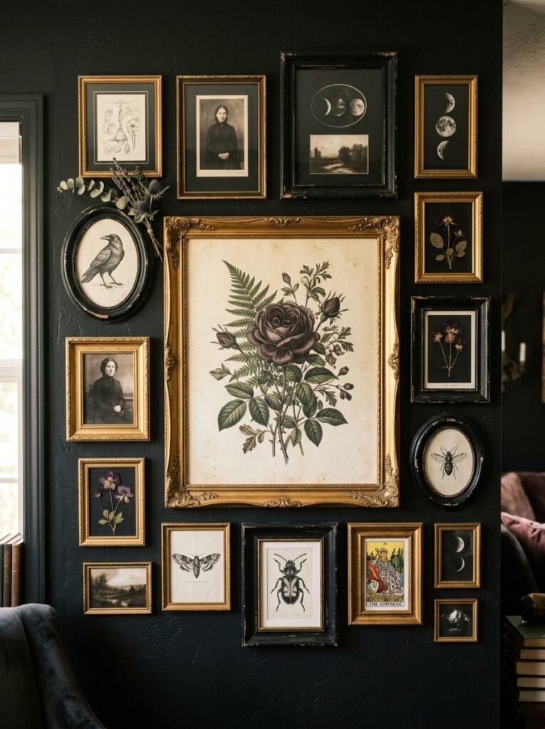
Gallery walls can go so wrong. I’ve made this mistake myself — you put up 12 pieces thinking more is more, and then you step back and it looks like a slightly aggressive office bulletin board.
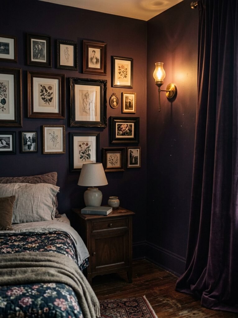
The one rule that saves a dark feminine gallery wall: make sure at least one piece is significantly larger than all the others.
That one large piece becomes the anchor. Everything else can be mismatched, different sizes, different frames, different subjects — and it’ll still read as cohesive because there’s a clear visual center of gravity. Without that anchor, the eye doesn’t know where to land, and the whole thing reads as chaos.
Frame color consistency helps too, but it’s actually less important than the anchor piece rule. You can mix frames as long as they’re within a similar metal family (all warm metals, or all dark/matte finishes) and the gallery still holds together.
Another thing: leave more space between pieces than feels natural. Our instinct is to crowd them together. But dark feminine rooms breathe better with slightly more negative space between pieces — it makes each piece feel intentional rather than stuffed in to fill wall.
—
9. Bringing in Texture Without Adding More Art
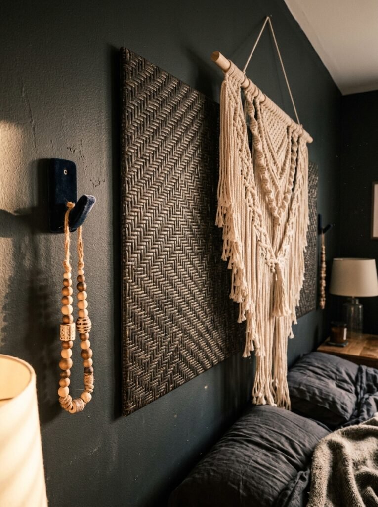
Sometimes the wall IS the decor, and you don’t need to hang a single thing.
Textured plaster, applied in loose, imperfect patterns. Dark boucle wall panels (yes, boucle on walls — it’s happening and it looks extraordinary). Exposed brick painted in a deep, dark tone. Tongue-and-groove panelling painted in rich emerald or near-black navy.
These are bigger commitments, sure. But they fundamentally change how a room FEELS. A boucle wall panel behind the bed, in a dark charcoal or burgundy tone, paired with a simple floor mirror and two sconces — that’s it, that’s the whole bedroom. Nothing else needed.
“Sometimes the best wall decor is the wall itself, treated with enough intention that art would only be noise.”
For renters, there are peel-and-stick options that have gotten genuinely good. The key is going for something that mimics texture rather than pattern — texture reads as intentional, busy patterns can look like a compromise.
—
10. The Lighting Layer People Keep Forgetting About
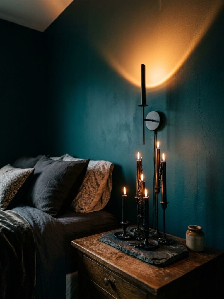
Wall decor doesn’t exist in isolation. The way it’s LIT matters enormously — maybe more than the pieces themselves.
A beautiful botanical print in flat overhead lighting looks fine. That same print lit from below by a small floor lamp, or from the side by a warm sconce, looks like something from a design magazine. The shadows it creates on the surrounding wall become part of the composition.
String lights are usually a bit dorm-room for this aesthetic — but there’s one exception. Very warm, very small fairy lights in dark wire, draped loosely behind a sheer fabric panel hung from a ceiling hook, creates this incredibly diffused, warm glow that feels completely different from the typical string light situation. It’s ambient, not decorative. There’s a difference.
Candlelight, obviously. Not just candles on a surface — consider a candle wall sconce, an actual wall-mounted candle holder in dark iron or aged brass. The light it casts is unlike any electric alternative.
—
11. The Room-Within-A-Room Trick That Makes Wall Decor Feel More Dramatic
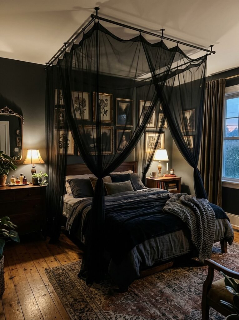
This takes a bit of vision, but it works every time. Create a distinct “zone” within your bedroom — usually around the bed, or around a reading nook if you have one — where the wall decor is noticeably denser and more intentional than the rest of the room.
Think of it like a room within a room. That zone has the layered art, the sconces, the mirrors, the textured wall. The rest of the room can be simpler, quieter. The contrast makes the main zone feel MORE intense, not less. It also makes the whole room feel bigger because there’s variation in visual weight.
This is actually how a lot of hotel rooms in boutique properties do it — you walk in, the room feels spacious and simple, and then there’s one wall that’s just — a LOT. In the best way.
—
12. The “Does It Actually Feel Like Me” Final Edit
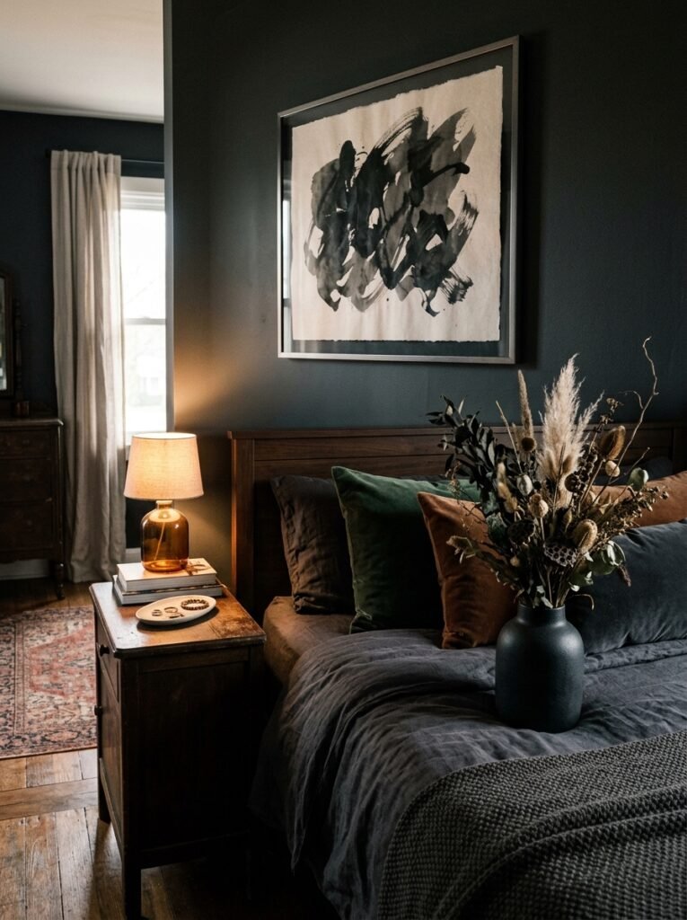
Before you commit to anything, there’s a question worth sitting with: does this room look like a Pinterest board, or does it look like you?
This aesthetic can be copied too faithfully. And there’s something slightly sad about a dark feminine bedroom that looks exactly like 40,000 other dark feminine bedrooms on the internet.
The things that make it YOURS are usually the personal pieces — the small framed photo from a trip, the print you bought from an independent artist because something about it made you stop scrolling, the inherited mirror with the chipped gold frame that you’ve had for years. Those things don’t need to “match.” They need to mean something.
Dark feminine decor, done right, isn’t an aesthetic performance. It’s a room that holds your energy. You walk in and it says: yes, this is yours, rest here.
That’s the edit. Keep what makes you exhale. Lose what you only bought because someone else’s room looked good.
—
❓ FAQ
Q: What wall colors work best for a dark feminine bedroom without making it feel depressing? A: The key is warmth within the darkness — think deep plum, forest green, or a rich navy rather than flat cold black. These tones hold light differently and feel enveloping rather than oppressive. Pair with warm-toned lighting (2700K bulbs, warm Edison styles) and the room will feel cozy, not gloomy.
Q: I’m renting and can’t paint — how do I create this look? A: Honestly, this aesthetic might actually be easier for renters than people think. Large-scale tapestries, peel-and-stick textured wallpaper panels on a single feature wall, and heavily framed art in dark or ornate frames do a lot of heavy lifting without touching a single wall permanently. A leaning floor mirror and some well-placed wall sconces (with adhesive hooks) round it out.
Q: How do I stop a dark feminine bedroom from looking messy or chaotic? A: One anchor piece per wall is the simplest rule. Give every gallery wall a clear center of gravity — usually the largest piece — and let everything else orbit that. Also, don’t hang things too close together; dark rooms actually need slightly more breathing room between pieces than light rooms do, or the whole thing reads as cluttered.
—
💭 Final Thoughts
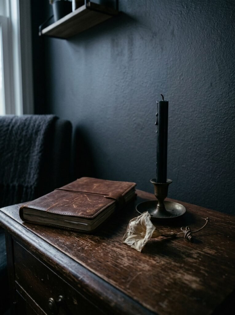
The best dark feminine bedrooms I’ve ever seen — in real life, not just on a screen — all had one thing in common: they felt finished but not perfect. Like someone genuinely lived there and genuinely loved it, and hadn’t anxiously swapped everything out the minute a new trend appeared.
That’s the goal, I think. Not a flawless room. A room that feels like yours, even in the dark.
What’s the one piece on your walls right now that you’d keep no matter what style direction you went in next?