
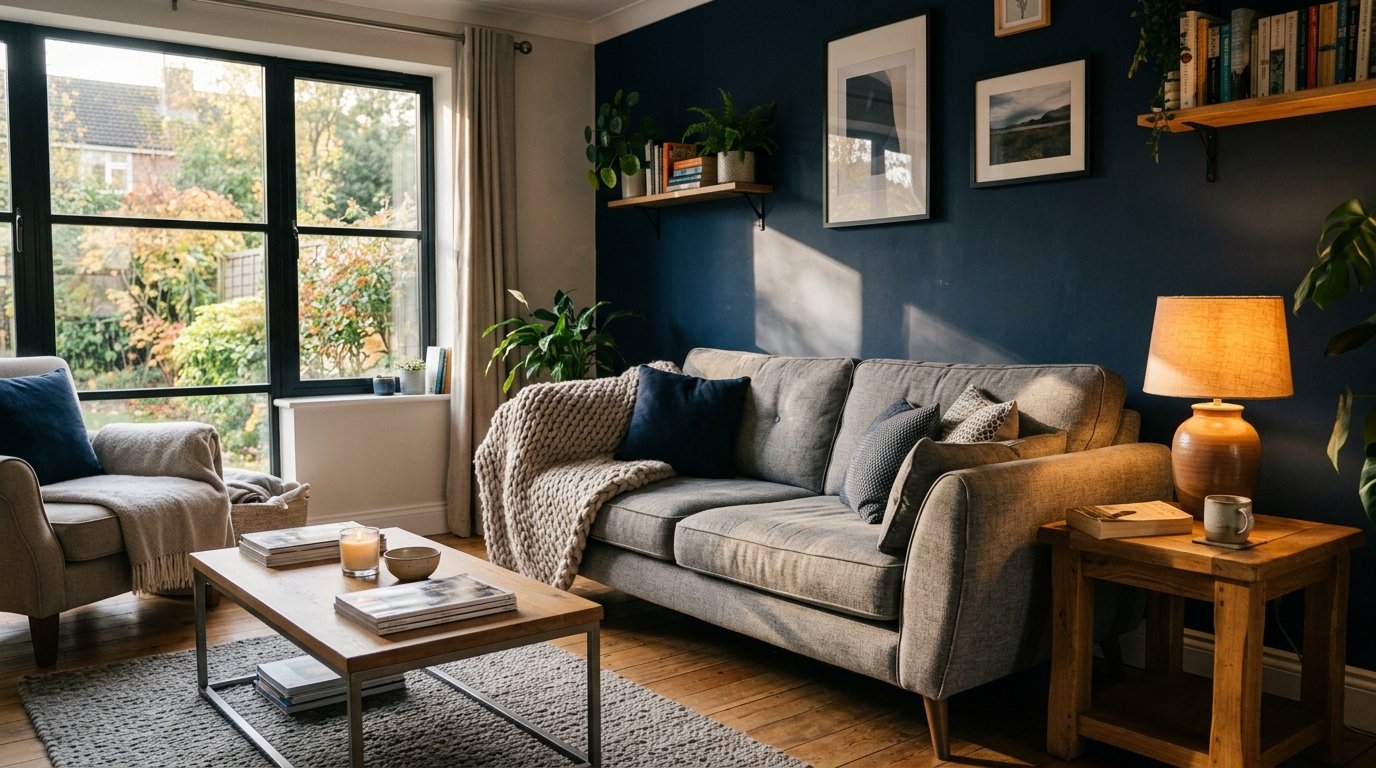
Navy and Grey Living Room Ideas That Actually Look Expensive (Not Cold)
My friend walked into my living room last spring and said, “How did you make navy feel cozy?” And honestly, I didn’t have a quick answer for her.
Because getting navy and grey right isn’t obvious. Done badly, it’s a dentist’s waiting room. Done well — and there’s something about it that’s just rich, quietly confident, the kind of room that feels like it exhales.
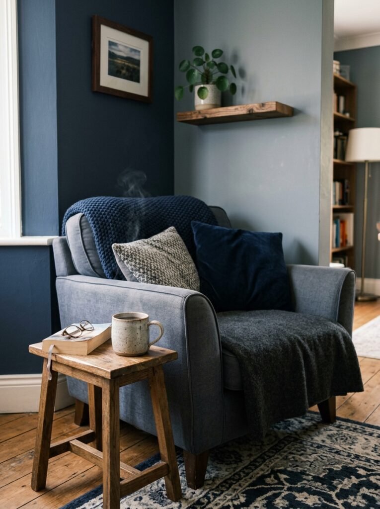
—
1. The Reason This Colour Combo Keeps Showing Up in Every Beautiful Living Room Right Now
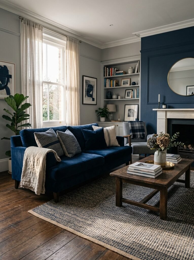
It shouldn’t work as well as it does. Navy is bold. Grey is neutral. Put them together and you’d think they’d either fight or flatten each other. But they don’t.
What happens is navy brings the drama, grey absorbs it. The grey acts like a volume knob — it lets the navy be intense without being overwhelming. That’s the whole secret, actually. Grey doesn’t just sit there looking boring, it’s doing real work. It’s what stops your living room from looking like a nautical-themed pub.
And there’s something about the depth of navy specifically — not royal blue, not cobalt, not something artificially bright — that reads as sophisticated in a way that warmer colours can’t quite pull off in the same way. It’s got weight. It makes a room feel curated.
The other thing? Navy and grey photograph beautifully, which is why you keep seeing it on Pinterest. Natural light hits dark navy walls and they glow a little, like deep water. Grey furniture catches that same light differently. The whole thing is just visually interesting.
“Grey doesn’t just sit there looking boring — it’s doing real work, absorbing the drama so navy doesn’t have to.”
—
2. Which Grey to Actually Pick (Because They’re Not All the Same)
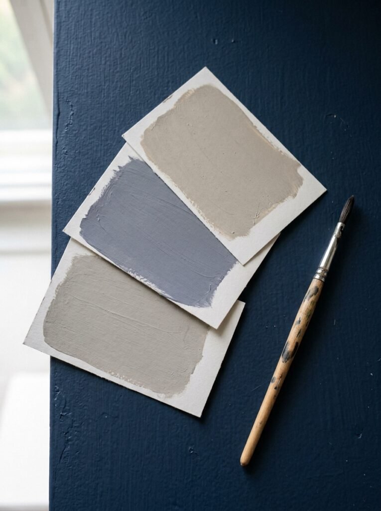
Here’s where people get into trouble. “Grey” is doing a LOT of heavy lifting as a word. There are warm greys that lean into beige territory. Cool greys that go almost blue. Mid-toned greys that are genuinely just… grey. And each one does something completely different next to navy.
Warm greys — think greige-adjacent, anything with a hint of brown or yellow undertone — soften navy dramatically. This is the combination if you want cozy. A warm greige sofa next to a deep navy wall and suddenly the room feels like a Scottish country house, in the best way.
Cool greys are trickier. They can be stunning with navy — very clean, very modern — but they risk tipping into cold if you’re not careful. You need something warming in the room: wood, rattan, a lot of textile layering.
Mid-grey is probably the safest. It doesn’t fight. It doesn’t compete. It’s the grey equivalent of someone who’s easy to talk to at a party.
My take? If you’re in a low-light room (and a lot of UK homes are, I know, I know), lean warm. If you’ve got big windows and decent natural light, cool grey can look exceptional.
—
3. The Sofa Situation — Grey, Navy, or Something Else Entirely
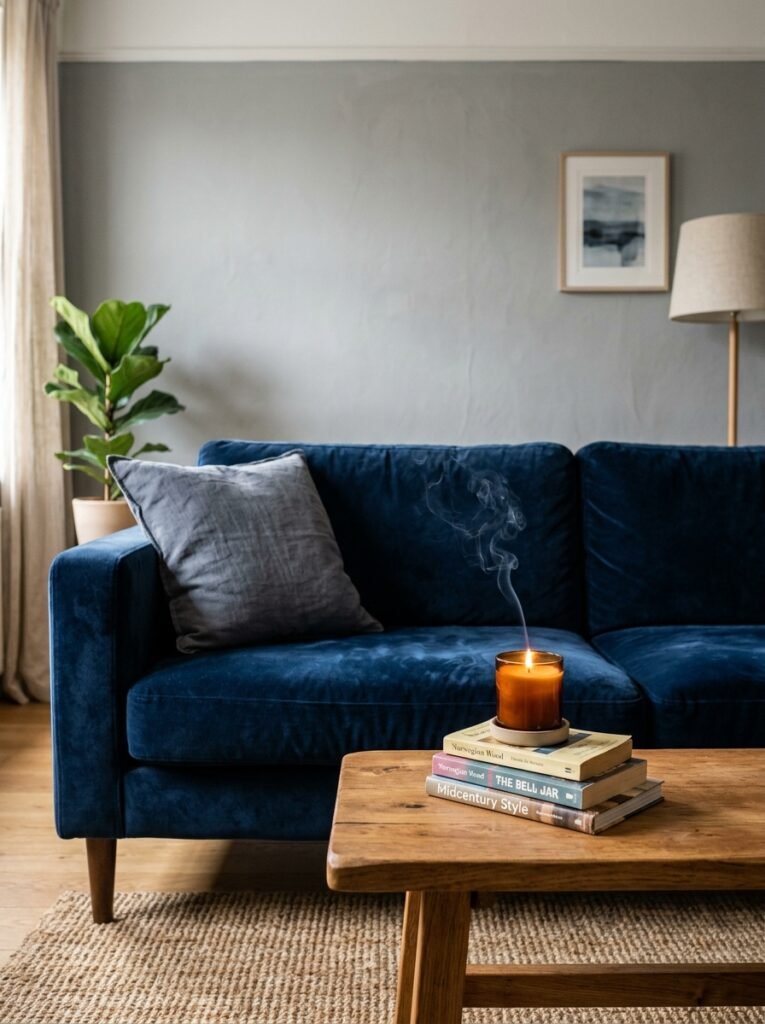
People always assume you need one or the other as your sofa. You don’t.
A grey sofa in a navy room is beautiful. A navy sofa with grey walls is beautiful. But some of the best navy-and-grey living rooms I’ve seen have a third element as the anchor — a warm camel leather, a deep forest green, even a terracotta velvet — with navy and grey working around it rather than fighting for the spotlight.
That said, if you ARE going grey sofa, go textured. A flat, mid-grey fabric sofa can look like a hotel lobby placeholder. But a grey sofa in bouclé, or chunky weave, or velvet? Completely different object. It has presence.
And if you’re going navy sofa — do it. Commit. A navy velvet sofa is one of the most satisfying things in home decor, I’ll die on this hill. Put it against pale grey walls, throw on some warm white linen cushions, add a natural wood coffee table, and you’ve essentially solved the room.
—
4. The Texture Rule That Stops a Navy-Grey Room Feeling Like a Show Home

Navy and grey can skew cold and flat in a way that other colour palettes don’t. It’s not a flaw, it’s just the nature of these colours — they don’t have the automatic warmth of blush or rust or ochre, so YOU have to bring it through texture.
This is the rule: every surface needs something tactile.
Not in an overwhelming way. Just — the sofa cushions shouldn’t all be the same fabric. There should be at least one woven throw. A rug with some kind of pile or pattern. Linen curtains instead of polyester ones. A wooden tray on the coffee table. A ceramic lamp base instead of a metal one.
None of this is expensive. It’s just intentional. And it’s the difference between a navy-grey room that feels collected and one that feels like it was done all at once from one catalogue.
“A navy velvet sofa is one of the most satisfying things in home decor. I’ll die on this hill.”
—
5. Metals That Work and Metals That Don’t
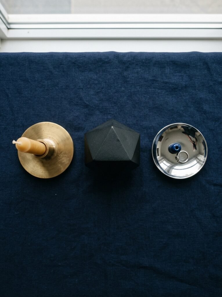
Brass. That’s the short answer.
Warm brass or antique brass finishes against navy and grey is just — look, if you’re not using it somewhere, you’re leaving magic on the table. A brass floor lamp in the corner of a navy-walled room, an oversized brass mirror above a grey sofa — it’s the thing that takes the combination from “tasteful” to “intentional.”
Gold works too, but it’s easier to overdo. One large gold element is interesting. Three are a bit much.
Silver and chrome? I’d be careful. They can work in a very modern, very intentional scheme, but against soft grey and navy they can read as cold or cheap depending on the quality. Not impossible, just harder.
Black hardware — door handles, light switches, curtain rails — is genuinely brilliant in a navy-grey room. It grounds everything. It adds crispness without warmth, which weirdly balances the softness of the textiles.
Brushed nickel is fine. It’s not exciting, but it’s fine.
—
6. Navy Walls vs Navy Accents — How to Know Which One You Actually Want
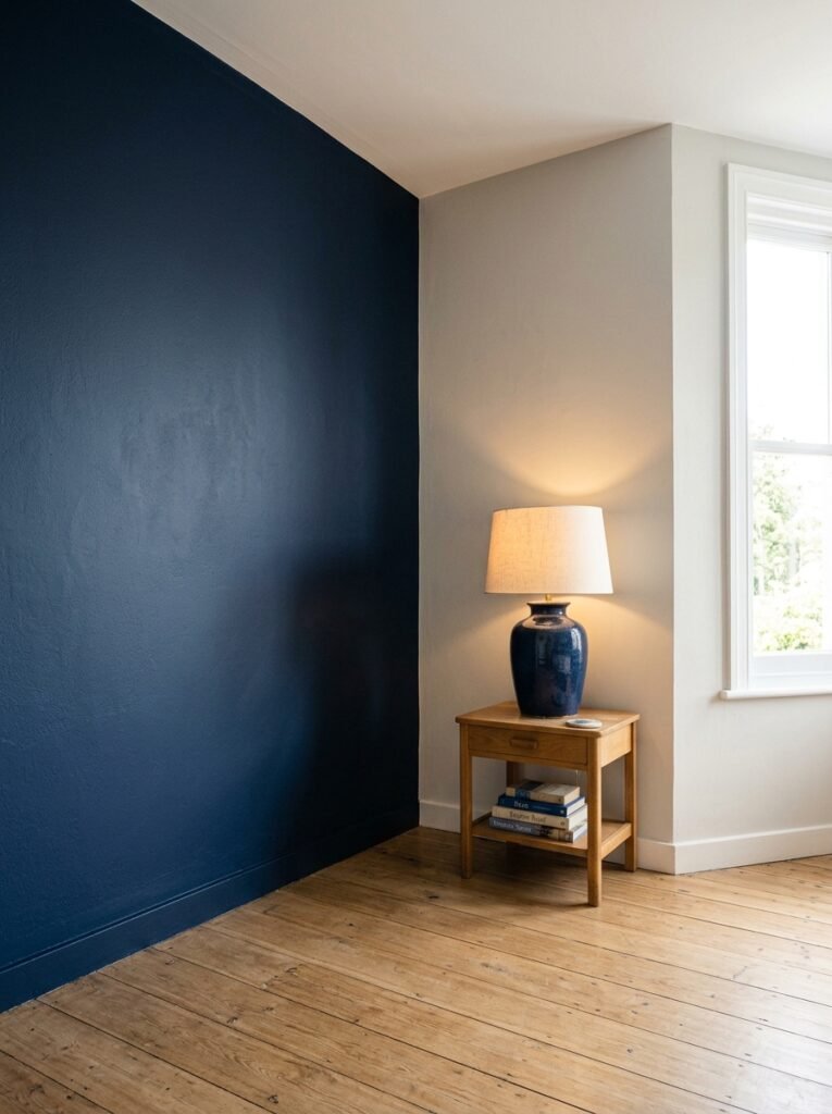
This is the biggest decision and the most personal one, so I’m just going to be honest rather than give you a diplomatic “it depends.”
If you have a room with decent natural light, good ceiling height, and you’re someone who’s committed to the colour (meaning you won’t repaint in six months because you panicked), go navy walls. It is absolutely worth it. Dark walls in a living room aren’t scary once they’re up — they’re cocooning, dramatic in a quiet way, and they make every piece of furniture look better.
If you’re renting, or nervous, or working with a small space that doesn’t get much light — navy accents all the way. A navy gallery wall behind a grey sofa. Navy curtains against grey walls. Navy cushions and throws against a pale grey backdrop.
The accent approach isn’t a lesser version. Some of the most sophisticated living rooms are mostly grey with navy doing just one strong thing.
Side note — navy on a chimney breast only, painted as a feature wall, with grey on the remaining three walls? One of the easiest wins in interior design. It works almost universally.
—
7. The Rug Question (And Why Getting It Wrong Ruins Everything)
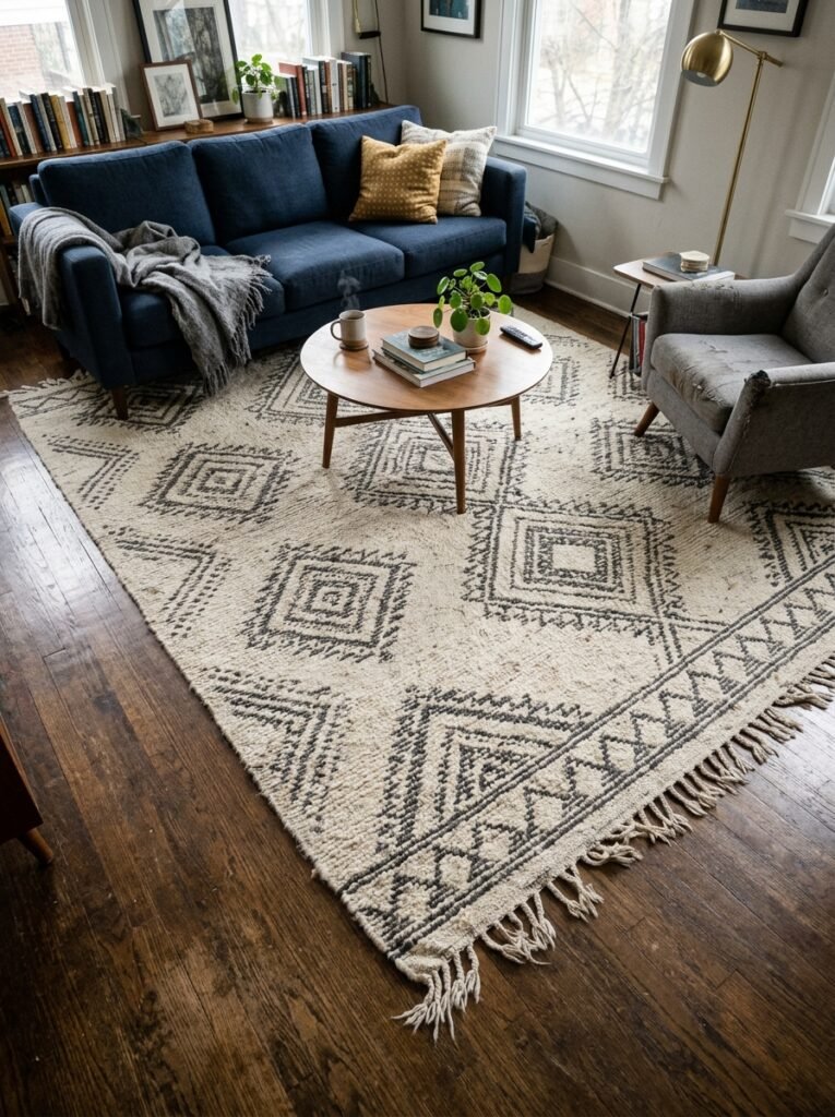
I’m not being dramatic. A wrong rug in a navy-grey room can genuinely kill the whole thing.
The safest option is a rug that introduces a warm neutral — cream, oatmeal, warm white — possibly with a subtle pattern or texture. It lifts the floor, stops the room from feeling heavy, and gives your eye somewhere to land that isn’t just more grey or navy.
A deep charcoal or dark grey rug in a grey-heavy room? Too much. It disappears visually and makes the floor feel like a void.
A brightly coloured rug? Risky, but not impossible — a muted terracotta or rust rug can look absolutely brilliant and add that warmth the palette needs. But it has to be the RIGHT terracotta. Burnt, dusty, aged-looking. Not orange. There’s a difference.
Texture in the rug matters as much as colour. A flat-weave cotton rug in oatmeal is pretty. A chunky, high-pile rug in the same colour is cozy. A vintage-style Persian rug with navy and cream threads is kind of perfect and I’d argue it’s a cheat code for this whole colour scheme.
—
8. How Lighting Changes Everything (Especially After 5pm)
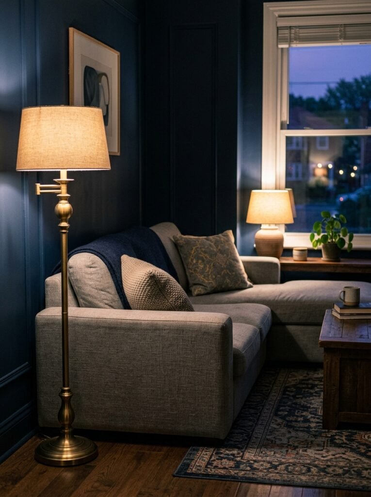
Here’s the thing about navy: it changes completely depending on the light. During the day with sunlight streaming in, a navy wall looks alive and rich. At night, under bad overhead lighting, it can look almost black and a bit oppressive.
This is why layered lighting isn’t optional in a navy-grey room. It’s mandatory.
You want warm-toned bulbs — not daylight, not cool white. Warm white or amber. The amber glow of a floor lamp in the corner at 7pm transforms a navy wall into something that feels almost candlelit. It’s actually quite dramatic in a wonderful way.
Table lamps are non-negotiable. At least two, ideally three. A single overhead fixture in a dark-palette room is the fastest route to “cave.”
If you can add any kind of uplighting — a lamp that throws light up toward the ceiling — do it. It adds height, bounces light into the room, and suddenly the dark walls feel intentional and enveloping rather than heavy.
“The amber glow of a floor lamp at 7pm transforms a navy wall into something that feels almost candlelit.”
—
9. Pattern Without Panic — Making Prints Work in This Palette
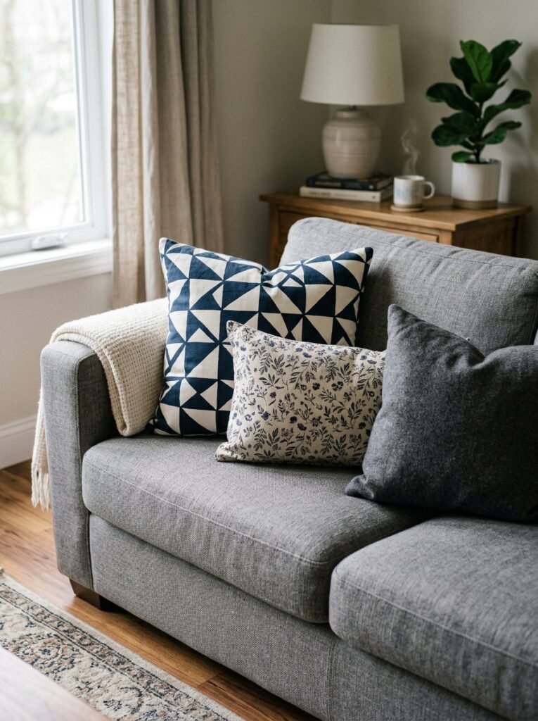
Navy and grey are such a strong colour story that patterns can feel risky. They’re not. But they do need a light touch.
Geometric prints work brilliantly — a navy and cream geometric cushion, a grey and white abstract print on the wall. Clean lines, strong shapes, no fuss.
Stripes are classic for obvious reasons. Navy and white vertical stripes on a cushion or throw bring in a crispness that’s really nice against softer grey textures.
Floral? Trickier, but beautiful when it works. A large-scale, slightly faded floral — the kind that looks like it was always there — can soften the whole scheme and stop it feeling too modern. Think less garden-centre-bright, more antique textile.
What you don’t want is too many competing patterns in different scales. Pick one strong pattern and let everything else be texture.
—
10. Artwork That Earns Its Place on a Dark Wall

Hanging artwork on navy walls requires different thinking. Pale frames — white, cream, natural wood — stand out beautifully and give the art breathing room. Dark frames against dark walls can look intentional and moody if done carefully, but they’re higher risk.
For subject matter: anything with warm tones (botanical prints, portraits, landscapes with golden light) sings against navy. Cool-toned abstract art can work but might read as a bit austere depending on the piece.
Gallery walls on dark backgrounds have a really specific energy — lush and collected and slightly Victorian in the best sense. If you go this route, mix frame finishes and let the layout be a little organic. Too symmetrical and it looks corporate.
One large statement piece over a sofa is always the safe, elegant choice. Big, simple, room-defining. Don’t undersize it.
—
11. Plants and Organic Elements That Stop It Feeling Designed-Within-An-Inch-Of-Its-Life
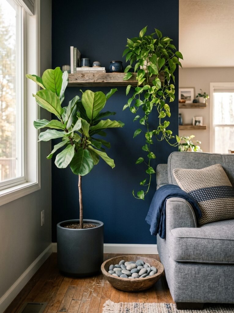
Any very deliberate colour scheme — and navy-grey IS deliberate — risks looking like a showroom. Plants solve this. Not because they’re trendy but because they add something no cushion or lamp can: irregularity. Life.
Dark-leaved plants look incredible against grey walls — a large fiddle-leaf fig, a deep-green monstera, a rubber plant. The contrast between deep navy and rich green is genuinely lush.
Trailing plants work well too, something cascading off a shelf or a high ledge. Adds movement.
And beyond plants — dried grasses in a simple vase, a piece of driftwood, a bowl of smooth stones — these organic textures ground the room in a way that stops it feeling too designed. Or too Pinterest, honestly. Which is ironic given where you probably found this article, but anyway.
—
12. The Small Details That Make the Whole Thing Feel Finished
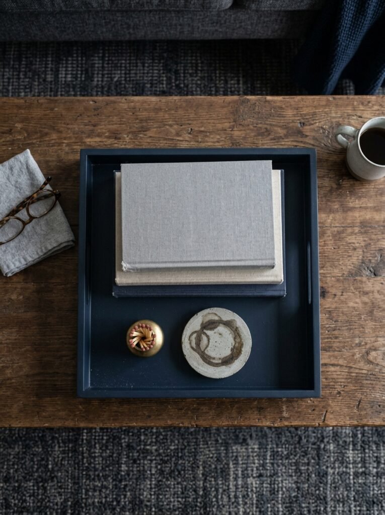
Books. Books on a coffee table, books on a shelf, books literally anywhere. A stack of hardcovers in neutral tones on a grey shelf against a navy wall looks like it was styled by someone who knows what they’re doing. Because it does.
Candles. Obviously. But specifically: grouped in odd numbers, varied heights, warm-coloured wax. Not scattered randomly across every surface.
A blanket folded casually — not neatly — over one arm of the sofa. The “casually” part is important. If it looks folded, it looks staged.
A tray on the ottoman or coffee table that corrals things. Coasters, a candle, a small plant or vase. It makes even a bit of clutter look curated.
And finally — and this is the thing people underestimate — leave some negative space. Not every shelf needs filling. Not every surface needs objects. The restraint is what makes the things you do choose to display actually matter.
—
❓ FAQ
Q: Will navy walls make my living room feel smaller? A: It can, but not always. Dark walls actually blur the edges of a room in low light, which can feel more expansive, not less. The key is lighting — layer it well and the room won’t feel cramped. High ceilings help enormously, but plenty of normal-ceilinged rooms carry dark walls beautifully.
Q: What accent colours actually work with navy and grey? A: Warm brass and gold for metals, cream and warm white for textiles, and if you want a colour — dusty terracotta, muted rust, and soft sage green all work without fighting the palette. Avoid anything too bright or saturated; the combination is strong enough without it.
Q: Can I mix different shades of navy in the same room? A: Yes, but go carefully. Mixing a navy wall with slightly different navy cushions can look intentional and rich if the shades are close. If they clash — one’s warm-navy, one’s cool-navy — it just looks like a mistake. Stick to similar undertones or vary the shade more dramatically (deep navy alongside a very light blue, for example).
—
💭 Final Thoughts
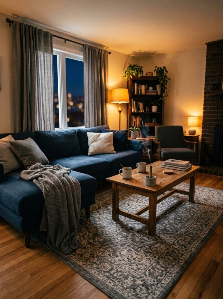
Navy and grey isn’t really a trend. It’s more like a classic that keeps getting rediscovered because it actually works. There’s something genuinely timeless about the combination — cool and confident on the surface, but surprisingly warm when you do it with texture and layered light.
The rooms I keep saving on Pinterest in this palette aren’t the perfectly staged ones. They’re the ones that look like someone actually lives there — a book left open, a throw pulled sideways, a plant that’s grown a bit too big for its shelf.
What’s one thing in your living room right now that you’d swap out first if you were committing to this palette?