
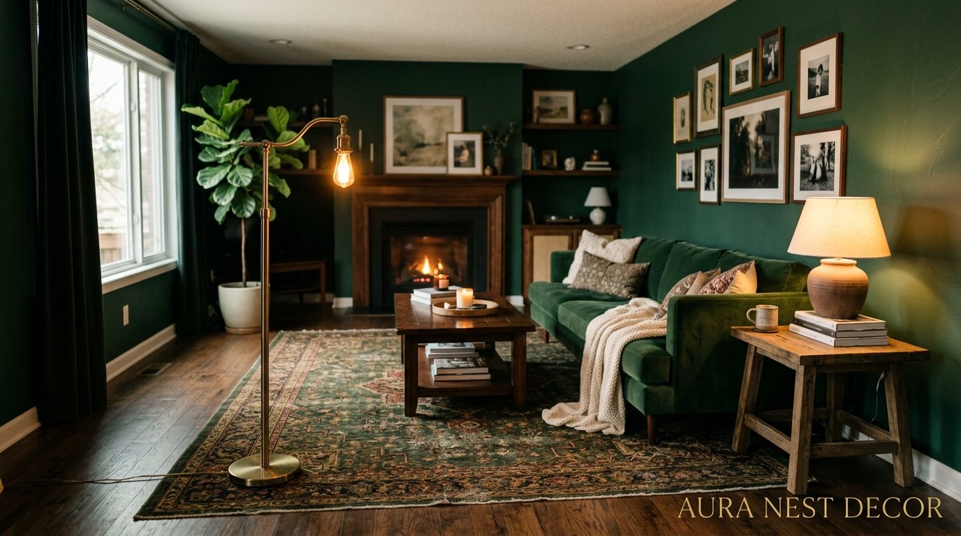
Dark Green Living Room Ideas That Actually Feel Livable (Not Like a Forest You Got Lost In)
You’ve been staring at that blank, beige wall for two years. Maybe longer. And every time you scroll Pinterest, you keep pausing on the same thing — those deep, moody, dark green living rooms that look like someone poured a bottle of Bordeaux wine into a forest and called it interior design. You want it. But something’s stopping you.
Here’s the thing: dark green is not as scary as it looks on a paint chip.
—
1. The Specific Shade of Green That’s Doing All the Heavy Lifting Right Now
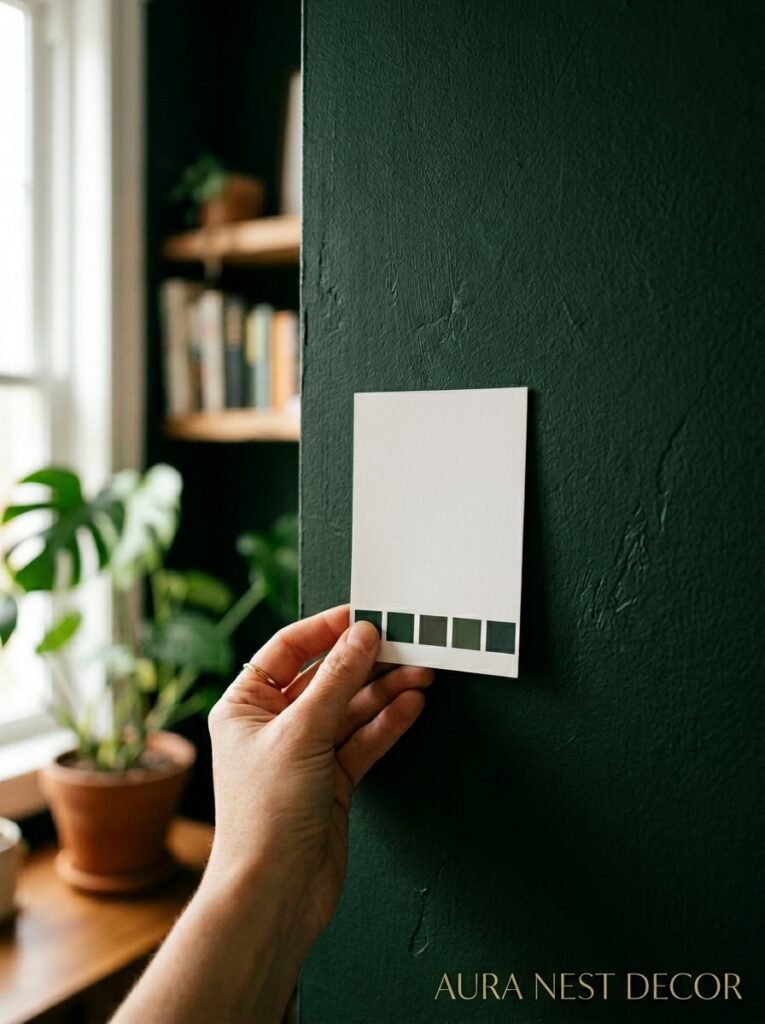
Not all dark greens are equal. And honestly, this is where most people go wrong before they even pick up a paintbrush.
There’s a massive difference between forest green (which reads cool and almost blue-grey in certain lights), hunter green (richer, more yellow-toned, feels very English countryside), and deep olive (which is dark green with warmth baked right into it — almost brown in low light). The shade you choose changes EVERYTHING about how the room feels.
Right now, the greens I keep seeing everywhere — and I mean everywhere, from Brooklyn apartments to Cotswold cottages — lean toward the richer, earthier side. Think Farrow & Ball’s Studio Green or Calke Green. Or Benjamin Moore’s Essex Green if you’re in the States. These aren’t the cold, flat greens of the 1990s. They breathe. They shift. At noon they look one color, at 7pm under lamplight they look almost like velvet.
That’s the thing about dark, saturated greens — they’re chameleons. And that’s actually a feature, not a bug. So before you commit, grab a large sample pot and live with it for a week. Not a little swatch. A big patch, at least 12 inches square, somewhere your light actually hits.
—
2. Why Dark Green Walls Make Cheap Furniture Look Expensive
I’m not gonna lie, this was the thing that converted me. Not the aesthetics — the budget hack.
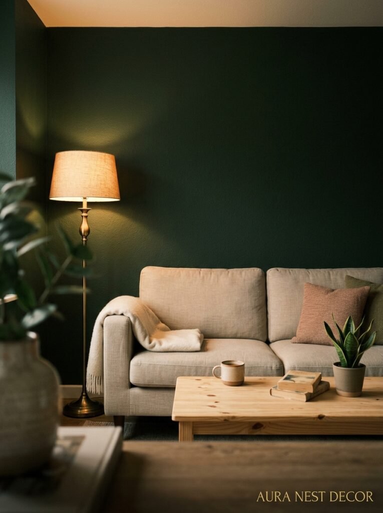
Dark walls create contrast. And contrast is what tricks the eye into seeing quality. A basic cream linen sofa sitting against a dark green wall? Looks like it’s from a boutique hotel. That same sofa against a white wall? It just looks like a sofa. The wall is doing the visual heavy lifting your furniture budget can’t always do.
This works because dark backgrounds force your eye to the foreground. Every piece of furniture, every throw pillow, every lamp becomes a subject against a moody backdrop. It’s the same reason photographers use dark backgrounds for portraits — it makes the subject pop.
Side note — this also means clutter shows up less. Because the eye is drawn to the contrast between light furniture and dark walls, the random pile of books or that charging cable you keep forgetting to deal with reads as part of the richness rather than mess. Not a magic solution for a truly chaotic room, but still. Worth knowing.
The trick is to keep your soft furnishings in warm neutrals — cream, camel, terracotta, warm white. Cold whites against dark green can feel clinical. Warm whites feel cozy.
—
3. The “One Wall vs. All Four” Debate, Settled Once and for All
Okay so I have opinions on this.
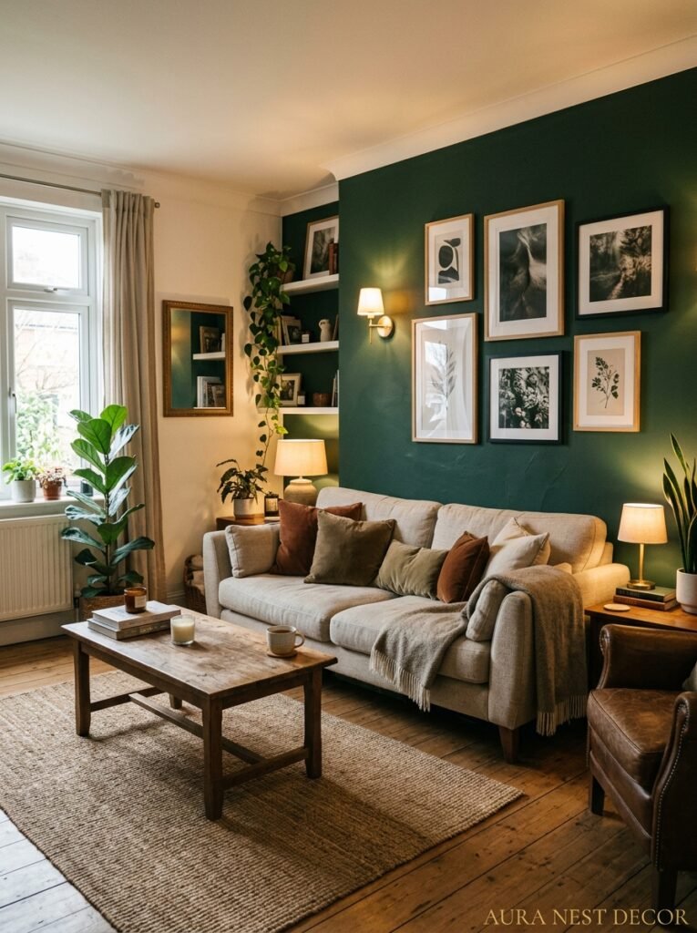
People are often told to start with just one accent wall when they’re nervous about dark paint. And I get it, I really do. But here’s my honest take: one dark green accent wall in an otherwise white room usually looks like a mistake. Like you ran out of paint. Or like you couldn’t commit.
The magic of dark green — what makes those Pinterest rooms look SO good — is immersion. When you’re surrounded by it, the room becomes a different kind of space. Calmer. Richer. More enveloping in a way that feels like a choice rather than an experiment.
That said. If your room is very small, or gets very little natural light, four dark walls CAN feel oppressive. So here’s what actually works as a middle ground: do three walls in the dark green and keep the wall with your main window in a lighter complementary tone. You get the enveloping feel without losing the light source. Or — and this is underrated — paint all four walls AND the ceiling. A dark ceiling drops the room in a way that feels incredibly intentional and sophisticated. Not a cave. A jewel box.
“A dark ceiling doesn’t make a room feel smaller. It makes it feel deliberate.”
—
4. Every Object You Already Own That Suddenly Looks Amazing Against Green
Brass. Oh my word, brass.
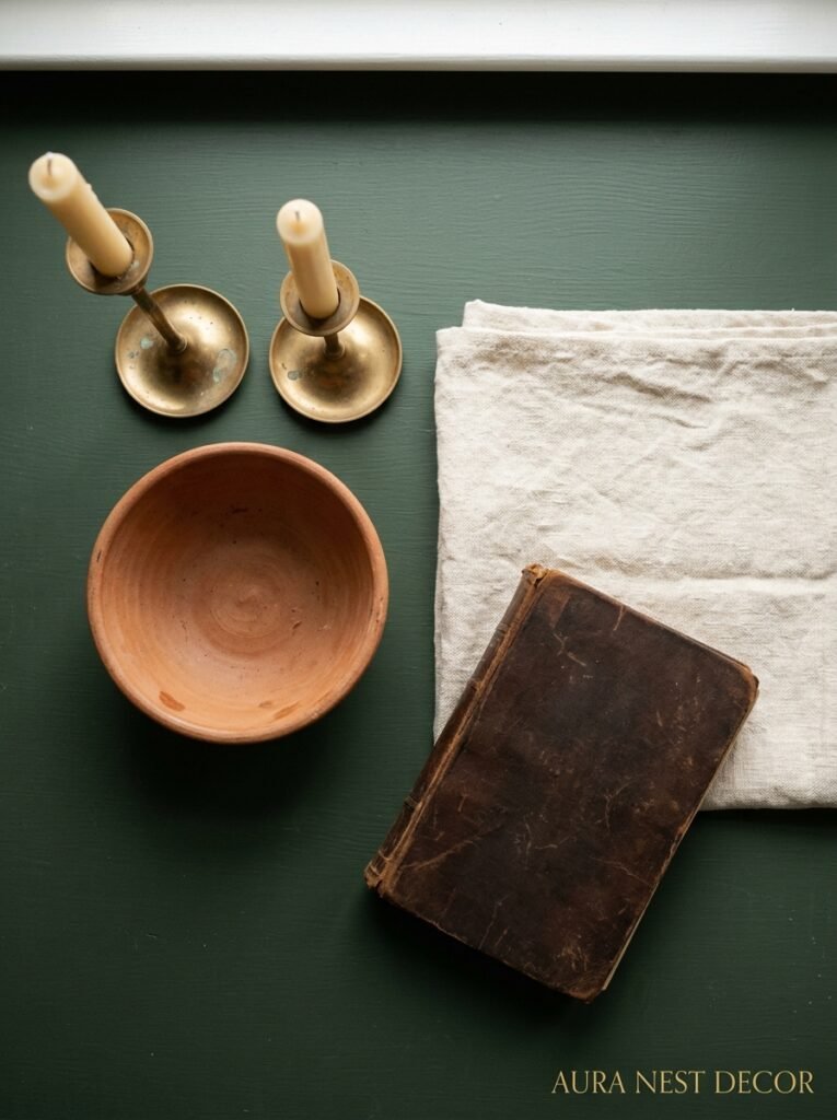
If you have any brass candlesticks, lamp bases, frames, or hardware, dark green is their best friend. The warm gold of aged brass against deep green is one of those combinations that looks like it was invented by someone very expensive. It genuinely doesn’t matter if your brass pieces cost $12 from a thrift store or $300 from a proper antique market — they look the same level of good against this backdrop.
But it’s not just brass. Warm wood tones come alive. Dark walnut, warm oak, even painted wood in creams and off-whites. Terracotta pots, warm leather (in caramel or cognac, not black), amber glass, anything in rust or ochre — all of it suddenly has a reason to exist in a room. The green creates a context that makes warm tones vibrate.
What doesn’t work as well: cool greys, cold metallics like chrome or very bright silver, and very stark modern black-and-white pieces. They can feel disconnected, like they wandered into the wrong room. Dark green doesn’t live in the same world as minimalist cool-toned spaces. It’s warmer and weirder than that.
—
5. Plants: The One “Obvious” Addition That’s Actually Wrong
You’d think dark green walls + green plants = obvious. Yes. Too obvious.
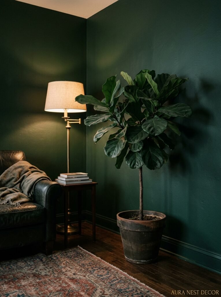
Here’s the thing — green plants against dark green walls kind of disappear. They blend. You lose the sculptural quality of a great fiddle leaf fig or monstera because there’s no contrast to make it stand out. Your gorgeous trailing pothos? Absorbed. Gone. The wall swallows it.
What actually works is plants with statement shapes AND leaves that have some color variation. Think plants with burgundy or deep red undersides (like a calathea or certain strains of begonia). Pale sage or silvery-green plants like eucalyptus create just enough contrast. Or — and this is the move — go with architectural dry plants. Bleached pampas grass, dried neutral botanicals in tall ceramic vases, sculptural dried branches. These pop against dark green in a way that lush tropical plants just don’t.
If you can’t resist the leafy plants (I can’t, it’s a problem), put them in front of a window so the light hits them and creates that contrast naturally. That’s the workaround.
—
6. Lighting a Dark Green Room Without Making It Look Like a Dungeon
This section might be the most practically useful one in this whole article, honestly.
Dark walls absorb light. That’s a fact. And if you don’t plan your lighting deliberately, a dark green room can look amazing at noon and genuinely depressing at 6pm in November. So let’s talk about it.
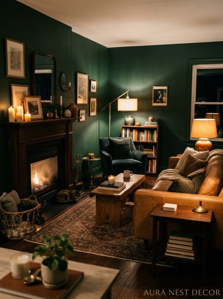
First: ceiling lights alone won’t save you. A single overhead fixture in a dark green room creates shadows and makes the space feel flat. You need layers. Table lamps at different heights, floor lamps, possibly wall sconces. The light needs to come from multiple directions.
Second: bulb temperature matters SO much here. Anything cool-white or “daylight” (over 4000K) is going to fight with the green and make it look murky and strange. You want warm bulbs — 2700K to 3000K. The amber tone enhances the richness of the green rather than washing it out. Edison-style filament bulbs are genuinely magic in a dark green room. That warm glow at dusk makes the walls look alive.
Third, and this is something I don’t see people talk about enough: use mirrors strategically. Not just for bouncing light (though that helps), but positioned so they reflect a lamp or a window rather than a dark corner. A mirror that reflects another mirror reflects nothing interesting. A mirror that reflects a lit lamp doubles your light sources visually.
“The goal isn’t more light. It’s the right kind of light, placed somewhere it can actually do something.”
—
7. How to Make Dark Green Work in a Rented Home (No Painting Required)
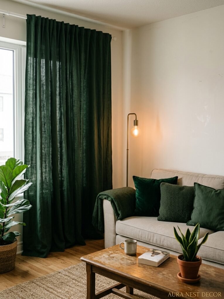
Okay so not everyone can paint their walls. And honestly, this is where I see people give up, which is such a shame because there are workarounds.
The most impactful no-paint option? Dark green curtains from floor to ceiling. I mean floor to ceiling, hung high and wide. When your curtains are that dark and that large, they read like an intentional design statement rather than just window dressing. Velvet works incredibly well — that slightly shaggy texture catches light differently at different angles and creates the same richness as a painted wall. You can cover most of a wall with curtain panels and the effect is genuinely close.
Second option: a large dark green sofa. That’s your anchor piece and your color story all in one. Build the rest of the room around it. Warm neutrals, wood, brass. You’d be amazed how a single large piece of furniture in this color changes the personality of a room even against a white or cream wall.
Third: wallpaper. Some gorgeous dark green botanical wallpapers exist that you can hang with removable adhesive now (the quality is so much better than it was five years ago — they don’t bubble and peel the way they used to). Even one wall of dark green botanical wallpaper makes a room feel like a completely different place.
—
8. The Exact Furniture Colors That Don’t Compete
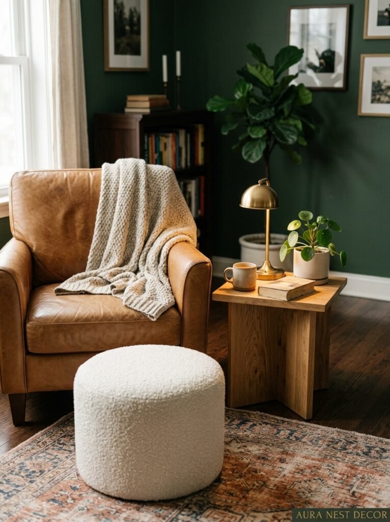
Let’s be specific because “neutral” means about fifty different things.
Cream is your best friend. Warm, buttery cream — not stark white, not grey-cream, but that color that looks like the inside of a good pound cake. Cream sofas, cream armchairs, cream Roman shades. They pop against the green in a way that feels effortless.
Camel and tan leather. A camel leather armchair in a dark green room looks like it should be in a very good novel. The combination is warm and rich without feeling heavy, and the leather’s texture adds something the green walls can’t.
Warm terracotta and rust in accessories — not necessarily in big upholstered pieces unless you’re confident, but in cushions, throws, ceramics, lampshades. These bring warmth and stop the room from feeling too muted or serious.
And one more: blush pink. I know. It sounds weird. But a dusty, muted blush — not hot pink, not baby pink — against dark green is one of those combinations that makes people stop and ask what you did. It’s unexpected. It works.
—
9. The Fireplace Moment: Why Dark Green Was Made for This
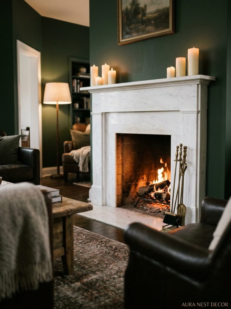
If you have a fireplace, a dark green living room is basically your destiny and you should just accept it.
The combination of dark green walls and an active or even decorative fireplace is one of those interior design pairings that looks like it was lifted directly from a very expensive English country house. And the reason isn’t complicated — it’s warmth against richness. The amber flicker of a real fire (or even a good electric one, I’m not judging) against green walls does something that no other combination really replicates.
Keep the mantle itself simple. White-painted wood or natural stone mantle against dark green walls is a classic for a reason. You can dress the mantle with brass candlesticks, a large mirror, some interesting ceramics. Don’t overdo the mantle decor — the contrast between the pale mantle and the dark walls is doing its own thing and you don’t want to interrupt it.
If you don’t have a fireplace, a tall cluster of church candles in varying heights does a surprisingly good job of approximating that warmth. Not the same, obviously. But better than you’d think.
—
10. The Ceiling Color Question Nobody Tells You to Think About

Most people paint the ceiling white and don’t think about it again. And that’s fine. White ceilings work.
But in a dark green room, you have two more interesting options that people seriously sleep on.
Option one: paint the ceiling the same color as the walls. I know it sounds intense. It is, sort of. But a fully enveloped dark green room — walls and ceiling matching — feels like being inside a gorgeous lacquered box. It’s dramatic, it’s committed, and it reads as very intentional. Especially good in rooms with interesting ceiling features like cornicing, which the dark color will actually highlight rather than hide.
Option two: a warm off-white ceiling. Not bright white — something with a yellow or pink undertone. This is warmer and softer than bright white and stops the ceiling from feeling like it’s floating disconnected above the room. Benjamin Moore’s White Dove or Farrow & Ball’s Pointing work beautifully here.
What I’d avoid: grey ceiling with dark green walls. The whole thing goes cold fast.
“Most people forget about the ceiling entirely. In a dark green room, that’s the one surface you really can’t afford to ignore.”
—
11. Small Dark Green Living Rooms: The Counterintuitive Truth
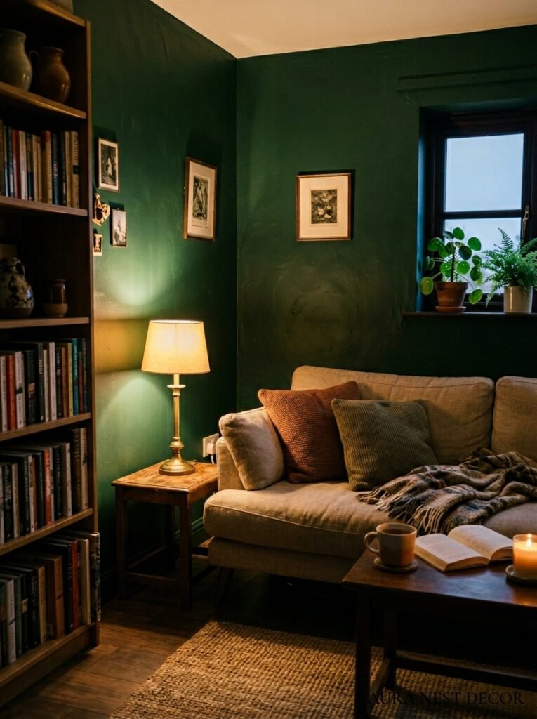
Conventional wisdom says don’t paint small rooms dark. And I spent years believing this. Then I painted a small room dark green and genuinely couldn’t believe I’d waited so long.
Here’s why it works: a small room painted in a pale, “safe” color draws attention to its smallness. Every edge and corner is visible, the proportions are obvious, there’s nothing to distract from the fact that it’s, well, small. A dark room obscures its own edges. The corners disappear. You stop being able to tell where exactly the wall ends and something else begins, and the room feels less bounded rather than more so.
The trick in small dark green rooms is the same trick as in larger ones but maybe even more important: lighting. You need more sources than you think. And keep large furniture pieces relatively light in color so they float against the walls rather than merging with them. A dark green room with a dark green sofa in a small space is too much — the furniture disappears and the room feels like one solid block.
—
12. The Finishing Touches That Separate a Good Dark Green Room From a Great One
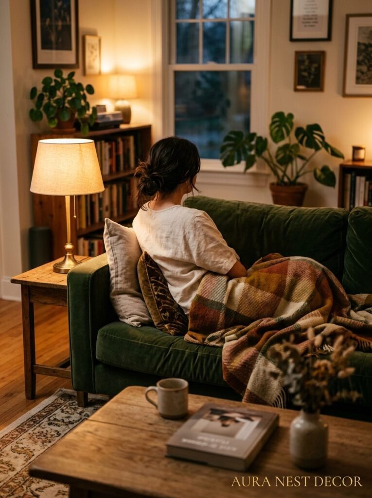
Art. Let’s talk about it. Dark green walls create the most extraordinary gallery wall backdrop. Gilt-framed botanical prints, antique maps, oil paintings (even cheap reproductions) — they all look incredible against dark green. The wall acts like a permanent museum-quality backdrop.
Don’t line them up too neatly. A slightly irregular gallery arrangement looks more lived-in and personal. Mix frame sizes and finishes. You can absolutely use mismatched frames — warm gold, dark wood, natural rattan — and it works because the green unifies everything behind them.
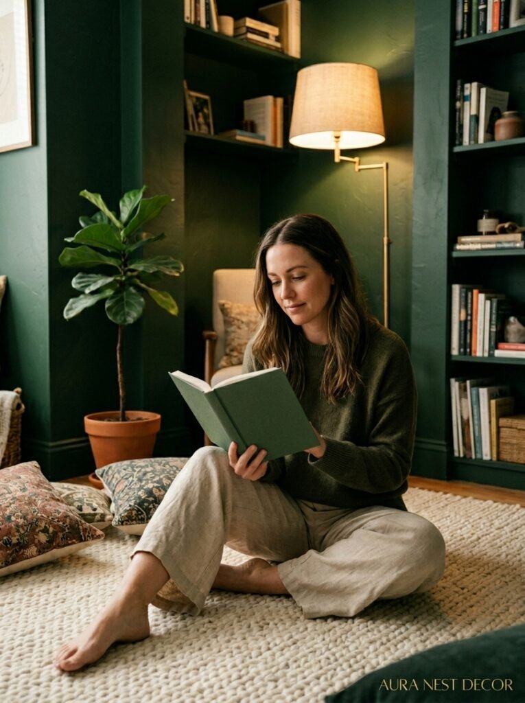
One more thing: smell and texture matter. This sounds weird for a visual medium like Pinterest but bear with me. Dark green rooms tend to attract a certain kind of sensory investment. Candles with woodsy or green scents — cedar, black tea, pine, fig. Textured throws in boucle or heavy linen. A chunky wool rug in cream or warm oatmeal underfoot. When a dark green room is done well, it’s not just something you look at. It’s somewhere you physically feel different. Slower. Quieter. More present. And that feeling is what makes people want to live in these spaces rather than just photograph them.
—
❓ FAQ
Q: Will dark green make my living room feel smaller? A: Not necessarily — and honestly, probably not in the way you’re imagining. Dark paint obscures corners and edges, which can actually make a room feel less defined and more expansive in certain ways. The key is layering lighting so the room doesn’t feel dim, and keeping large furniture pieces in lighter tones so they don’t disappear into the walls.
Q: What’s the best dark green paint color for a room with very little natural light? A: Lean toward warmer, olive-toned greens rather than cool blue-greens. Farrow & Ball’s Calke Green, Olive, or Mizzle, or Benjamin Moore’s Tarrytown Green work well in low-light rooms because they hold warmth even when daylight is minimal. Cooler greens can look flat and a bit grey in dim conditions.
Q: Can I use dark green in a rented apartment where I can’t paint? A: Yes — floor-to-ceiling velvet curtains in dark green, a large green sofa, or removable botanical wallpaper on one wall can all create a similar effect without touching the landlord’s magnolia walls. It takes more layering but it absolutely gets you there.
—
💭 Final Thoughts
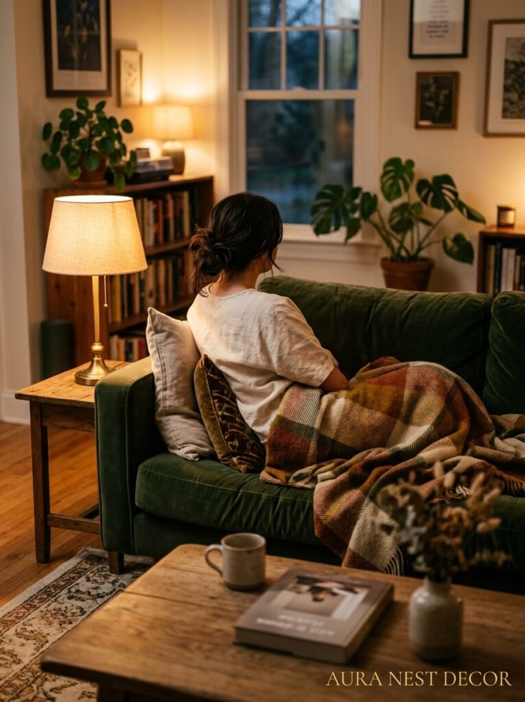
Dark green is one of those rare design choices that feels bold when you’re planning it and completely inevitable once it’s done. You stop being able to imagine the room any other way. It’s not for everyone — but if you’ve been pausing on those images for months, that’s probably your answer right there.
The only question left is: which shade are you going to start with?




