
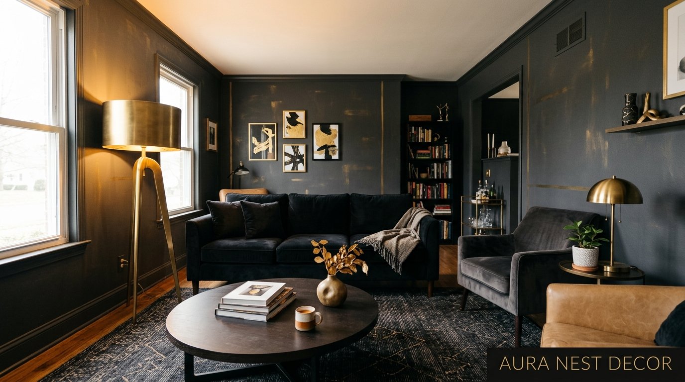
Why Black and Gold Living Rooms Look Expensive Without Actually Costing a Fortune
You walk into a room and something just stops you. It’s the contrast. That deep, almost dramatic darkness meeting the warmth of gold — not yellow, not brass, not “champagne” (which is just gold trying to sound humble). Gold.
—
1. The Reason This Color Combination Hits Different Than Any Other
Here’s the thing nobody really says out loud: black and gold don’t work because they’re trendy. They work because they’re basically opposites doing exactly what opposites do best — making each other impossible to ignore. Black absorbs. Gold reflects. Put them in the same room and the whole space becomes alive in this particular way that feels intentional without being uptight about it.
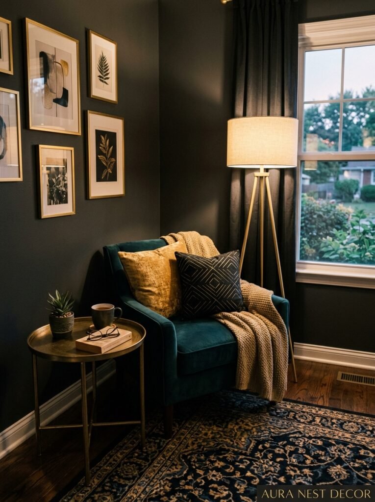
I’ve been obsessed with this pairing for years, and not gonna lie, I resisted it at first. Thought it’d feel too formal, too “cocktail bar,” maybe a little trying-too-hard. But then I saw it done right in someone’s living room — a dark charcoal velvet sofa, a thin-framed gold mirror leaning against the wall, a single black lampshade with a gold interior — and I got it immediately. The trick isn’t maximalism. The trick is restraint with confidence.
Black grounds a room in a way no other color does. It’s not cold like gray and it doesn’t have the weight problem of navy (navy can make a room feel smaller without giving you the drama payoff). Black is just… definitive. And when gold enters that space, it doesn’t compete. It completes. Every gold accent becomes a focal point, a little hit of light in a dark landscape, and your eye moves around the room from one to the next like it’s following a trail.
That’s the magic of this combination done well.
—
2. The Mistake Almost Everyone Makes in the First Week
So you’re sold on the idea. You start buying things. And this is where it goes sideways for most people.
The mistake is buying too much black, too fast. I’ve seen it happen. Suddenly there’s a black sofa, black curtains, black rug, black throw pillows — and the room doesn’t feel dramatic and gorgeous, it just feels heavy. Like a waiting room for something you don’t want to attend. Black needs breathing room or it swallows everything whole.
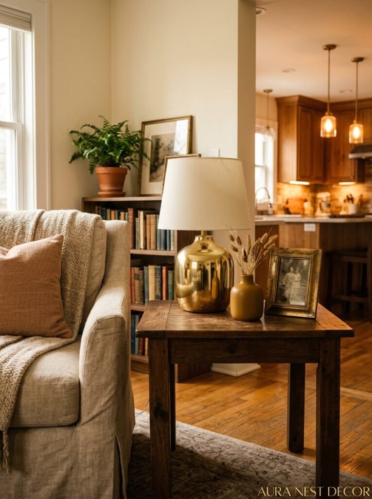
The rule I actually follow: black should be your largest surfaces, but never ALL your largest surfaces. One big black element anchors the room — a sofa, an accent wall, a substantial area rug. Then let the walls stay lighter. White, warm cream, even a very pale greige. Those neutral walls aren’t boring choices, they’re the breathing space that lets your black and gold pieces do their actual job without fighting each other.
And the gold? Keep it in the smaller touches first. A side table. A lamp base. Picture frames. You can always add more, but you can’t un-buy a gold velvet sofa. Well, you can, but it’s annoying and expensive and you’ll spend six months explaining it to people who visit.
—
3. The Texture Thing Nobody Talks About Enough
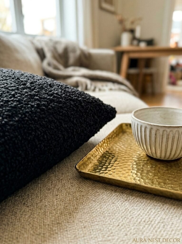
Black and gold can fall completely flat. Not because the colors are wrong, but because everything in the room has the same surface.
Texture is what makes a black and gold room feel genuinely luxurious versus feeling like a hotel lobby that’s trying too hard. This is the difference between a room that photographs well and a room that actually FEELS good to live in. And if you’re going for that Pinterest dream, you want both.
Think about layering surfaces that catch light differently. Matte black — like a flat-finish wall or a matte ceramic vase — absorbs everything. Lacquered black bounces it back. Brushed gold has that soft, warm quality, almost velvety in its finish. Polished gold is sharp and modern. Velvet fabric in black looks like something you want to press your face against. Woven black wool is grounded and earthy. All of these are “black and gold” but they feel entirely different from each other.
My personal favorite combination — and I’ll stand by this — is matte black with brushed antique gold. It’s warmer than you’d expect. Less cocktail bar, more layered and lived-in. The kind of room that has books in it, a candle burning somewhere, a plant that’s doing okay.
—
4. Where to Put Black If You’re Not Ready to Commit to a Wall
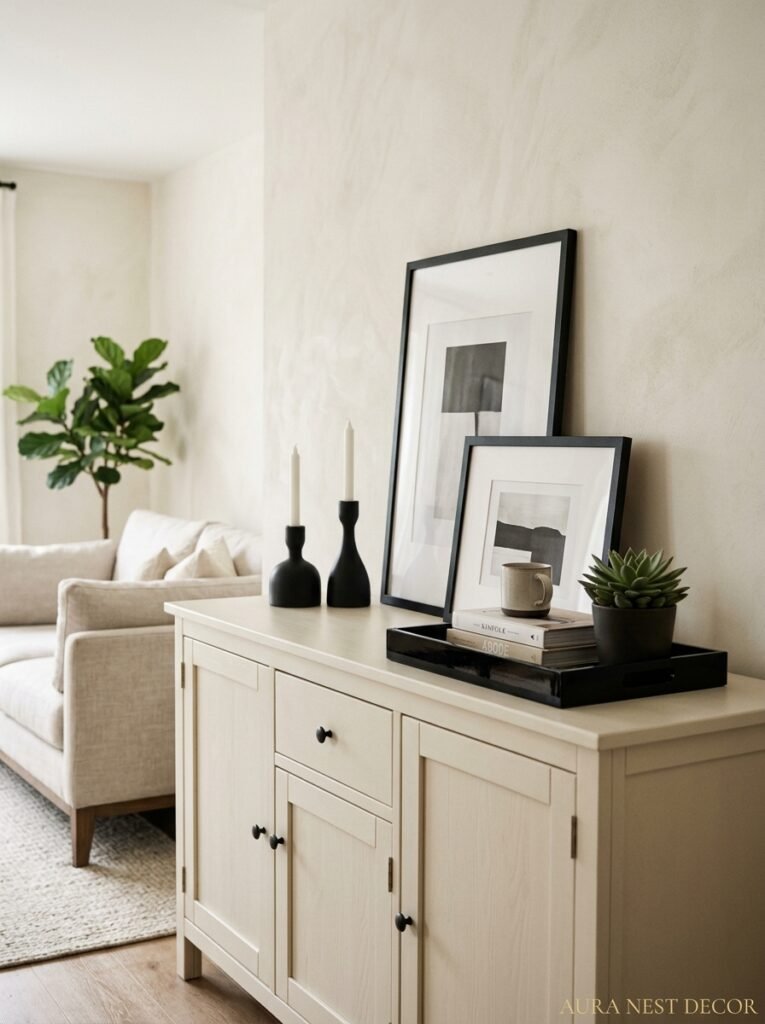
Commitment-phobes, this section is for you.
Not everyone is ready to paint a wall black. That’s fine. Completely fine, actually, because some of the most impactful black and gold rooms I’ve ever seen didn’t have a single black wall in them. The black lived in the objects instead, and it worked beautifully.
A black fireplace surround is one of the most instant, dramatic changes you can make to a living room without touching the walls. It frames the hearth like a piece of art and it doesn’t go anywhere, so it forces you to style around it — which is actually a helpful constraint. Black picture frames in a gallery wall, especially with gold matting inside, create that high-contrast sophistication even against white walls. A black sofa — especially in velvet — is a serious long-term commitment that pays off for years, and it photographs better than any other sofa color for what that’s worth.
“A black fireplace surround does more for a living room than almost any other single change you can make.”
But honestly? Start with a black lampshade. It sounds tiny. It’s not. Put a black drum lampshade on a gold base and sit it in the corner of a room that’s otherwise neutral — the room changes immediately. I’m not exaggerating. Black lampshades are underrated to a genuinely criminal degree, and I don’t know why more people aren’t talking about this.
—
5. Finding Gold That Doesn’t Look Cheap at First Glance
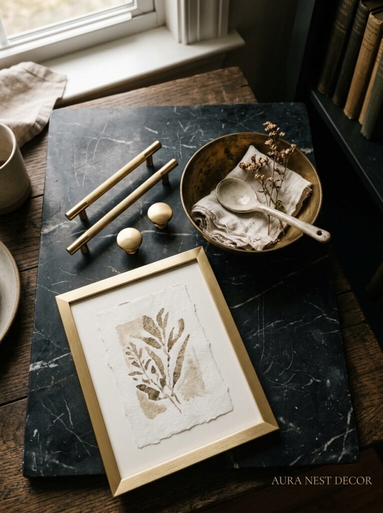
Gold is a minefield. Because there’s “gold” and then there’s GOLD and then there’s that plasticky brass-adjacent stuff that turns greenish after six months and makes the whole room look like it’s cosplaying a fancier room.
Real brushed brass and actual gold-finished metal have a depth to them. They don’t look like they’ve been spray painted. When light hits them, it moves differently across the surface — there are warm spots and slightly deeper spots, variation. Flat gold with no variation is the giveaway. That’s the version that photographs poorly and looks dated within eighteen months.
For the UK folks especially — a lot of the really good brushed gold hardware comes from smaller European brands now. Finish-wise, you want “antique gold” or “brushed gold” over “polished gold” in most living rooms, because polished is gorgeous but unforgiving — every fingerprint shows, and it can tip into flashy when you’re not careful.
Affordable routes that actually work: H&M Home has decent gold frames and smaller accessories. IKEA’s black and gold pieces are genuinely underrated right now. For Americans, Target’s Studio McGee line and HomeGoods are genuinely good hunting grounds for brushed gold accents at prices that don’t make you emotional.
—
6. The One Wall Color That Makes Black and Gold Sing

Everyone defaults to white. And white works, I’m not going to tell you it doesn’t. But there’s a better answer.
Warm white. Specifically that warm, almost cream-toned white — think Farrow & Ball’s “All White” or Sherwin-Williams “Alabaster” — does something for black and gold that pure, cool white just doesn’t. Cool white makes the black feel harsh. Warm white softens the whole room, makes the gold feel richer, and turns the black from “dramatic choice” to “obviously this was always the plan.”
The other wall color that works incredibly well and almost nobody uses: deep forest green. I know, I know — we said black and gold. But a deep muted green on two walls with black and gold accents is… kind of extraordinary. The black stops being so starky against it, the gold pops like fireworks, and the whole room suddenly has personality you didn’t know it needed. Farrow & Ball “Studio Green,” Benjamin Moore “Forest Green,” or even a dark sage — any of these. Try it in a mood board before you dismiss me.
—
7. How Lighting Changes Everything (And I Mean Everything)
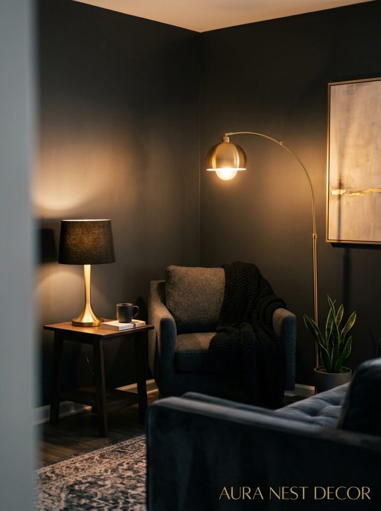
A black and gold room in harsh overhead lighting looks wrong. Just wrong. It flattens out, makes the gold look cheap, and the black just… sits there looking gloomy.
The lighting in this color scheme isn’t optional. It’s load-bearing.
You want warmth. Lower. Multiple sources. The amber glow of a dimmed Edison bulb at 7pm on a winter evening — that’s the exact mood you’re building toward. Multiple light sources at different heights create the kind of layered illumination that makes people walk into your living room and actually say something. Wall sconces with a gold finish catch the light from both directions. A statement floor lamp in black with a warm-toned shade creates that moody glow in the corner. Table lamps on side tables with gold bases.
“Multiple light sources at different heights is the interior design hack that makes everything else look better — but it matters MOST in a black and gold room.”
Candles aren’t just decorative here, they’re functional. Real flames in glass candleholders on a dark tray on your coffee table? The gold flickers and the black deepens and the room looks like something out of a magazine. Not staged. Alive. There’s a difference and you’ll feel it.
Dimmer switches. If you take nothing else from this entire piece, take this: put your living room lights on dimmers. It costs almost nothing to switch them over and it changes the entire character of the room morning to night.
—
8. The Art and Mirror Conversation (Because Both Matter Here)
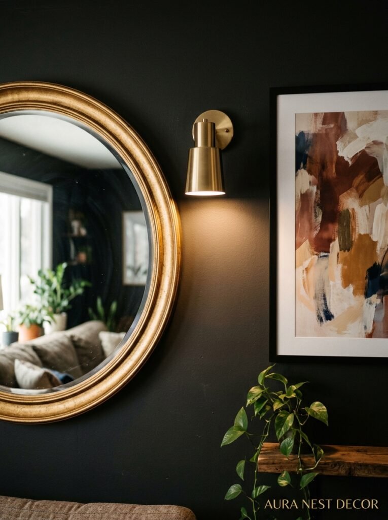
Black and gold rooms need art. But not just any art — the scale and framing matter almost as much as the actual image.
Oversized art in thin black or gold frames hits differently than smaller gallery arrangements. One big piece, a meter wide or larger, against a warm white wall in a black frame with gold matting: that’s confidence. That’s a decision. Meanwhile, a gallery wall of eight medium pieces, mixed frame sizes in both black and gold, creates organized chaos in the best possible way — it adds visual warmth and personality.
Mirrors are doing double duty in a black and gold room. They reflect light (which you need, given all that dark furniture absorbing it) AND they count as a gold or black accent piece at the same time. A large arched gold mirror leaning against the wall is everywhere right now, and for good reason — it’s tall enough to matter, the lean feels relaxed and not like a hotel, and gold arches just photograph beautifully. I keep recommending these to everyone I know who’s redoing a living room. Haven’t had a single complaint.
Abstract art in black and white with gold accents is almost tailor-made for this scheme. But honestly, so is rich dark botanical art, or photography with high contrast. Trust your gut more than you think you should.
—
9. The Sofa Decision: Black, White, Cream, or Something Else Entirely?
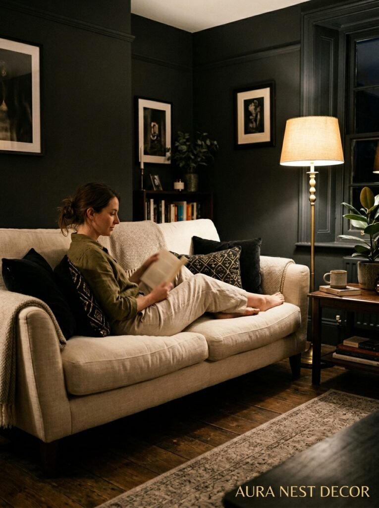
Here’s where I’ll probably be controversial.
A lot of black and gold living room advice pushes you toward a black sofa. And yes, a black velvet sofa is stunning. But it’s also the MOST commitment, it shows pet hair if you have pets, and it can make the room feel heavy if you don’t get the rest of the balance right.
My actual recommendation for most people? A warm cream or ivory sofa. Hear me out. A cream sofa against a dark wall, surrounded by gold accessories and black accents in every other element — it looks incredible and it’s SO much more liveable day-to-day. It lightens the room without losing the drama because all the drama is living in the other elements. And cream with gold is a genuinely gorgeous pairing on its own.
If you want the black sofa, go velvet. Don’t go leather for this scheme — leather reads more masculine and corporate, whereas velvet reads luxurious and intentional. Deep charcoal instead of flat matte black is worth considering too; it reads softer and layers better with warm gold tones than a harsh pure black does.
—
10. Small Touches That Pull the Whole Room Together
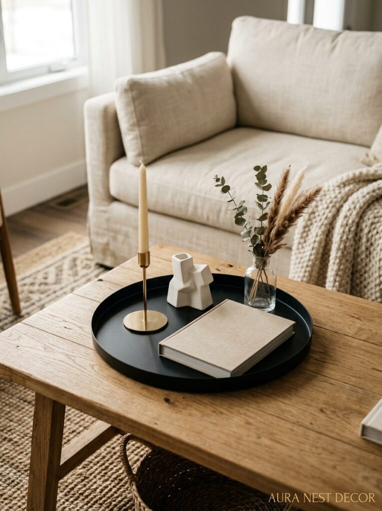
This is genuinely my favorite part of any room styling conversation because small touches are where personality lives.
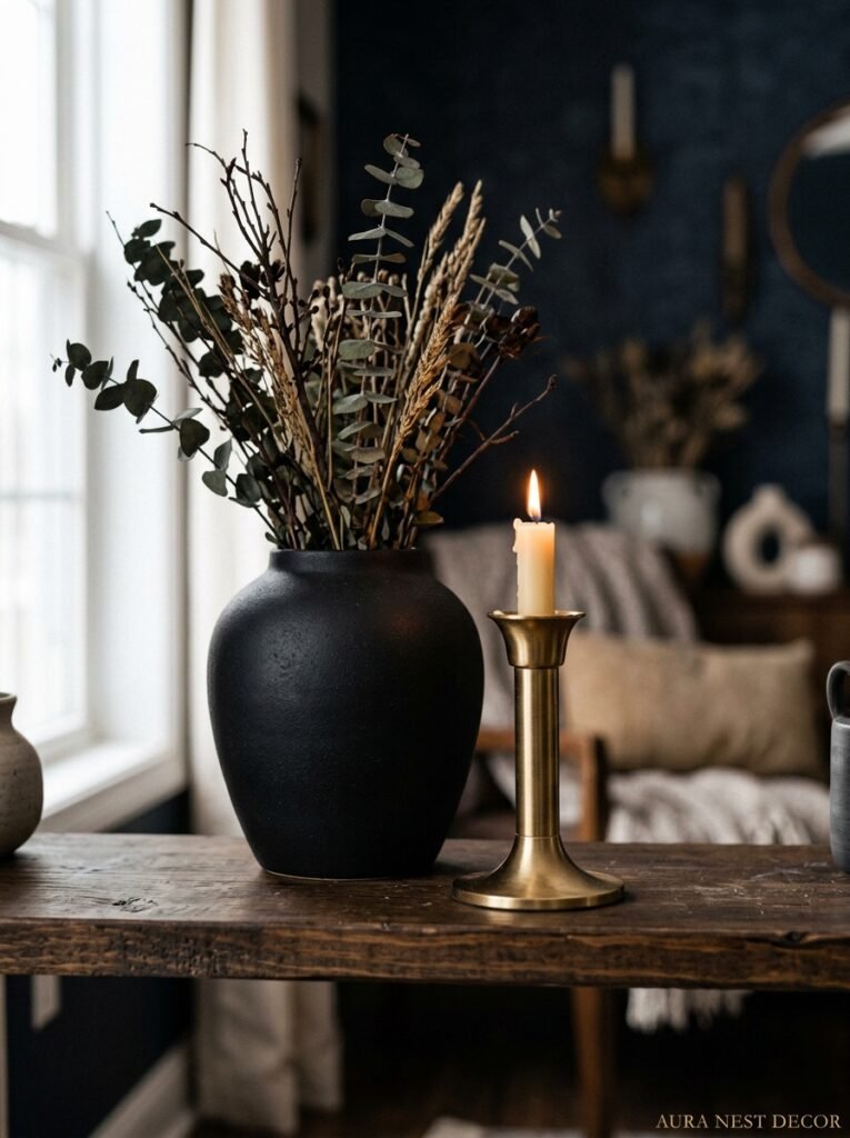
A gold-rimmed candle on a matte black tray. A stack of books with dark spines. A glass vase with architectural black stems or dried pampas in a gold vessel. A black and white geometric cushion with a gold-thread trim. A side table with a marble top and gold legs. These things aren’t expensive and they’re not dramatic on their own — but combined, they’re the difference between a room that feels finished and one that feels like it’s still becoming something.
Don’t style everything at once, by the way. Buy things slowly and only keep them if they earn their place. I have a “one week on the floor” test — if I put something in the room and don’t miss it when it’s gone, it goes. If I notice its absence immediately, it stays. Works every time.
—
11. The Room You Don’t Think Will Work With This Palette (But Definitely Will)
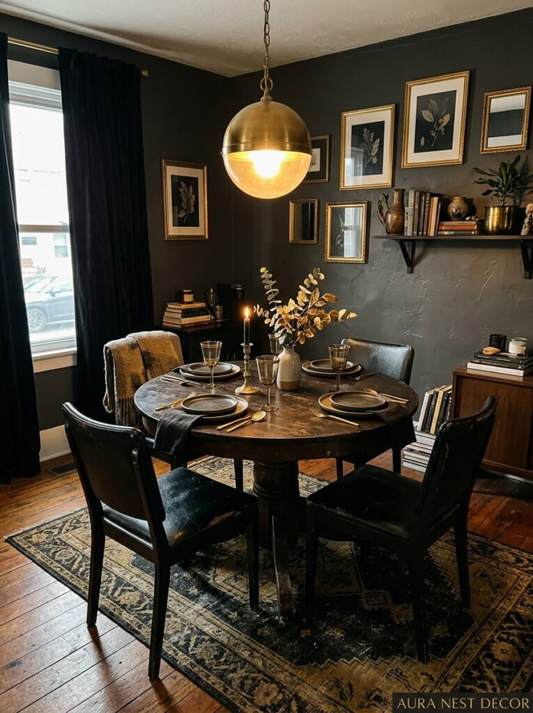
Small living rooms. Everyone assumes black and gold is for big, grand spaces — like you need the square footage to absorb that much drama. But small living rooms can be the most striking in this palette when done right.
The trick in a small space is keeping ONE wall dark (or one large piece of furniture dark) and keeping everything else light. The dark anchor creates the drama. The light surrounding elements stop it from feeling suffocating. Add gold in the smaller accents — hardware, frames, lamp bases, a tray — and the room punches way above its weight.
In a small room, that gold especially matters because gold reflects light and light makes spaces feel bigger. You’re using the color to do functional work, not just aesthetic work. And that’s deeply satisfying in a way I can’t entirely explain, but probably you’ll feel it when you’re standing in your little living room going, oh — OH. That’s what this needed.
—
12. The Pinterest Trap to Avoid When You’re Planning This Room
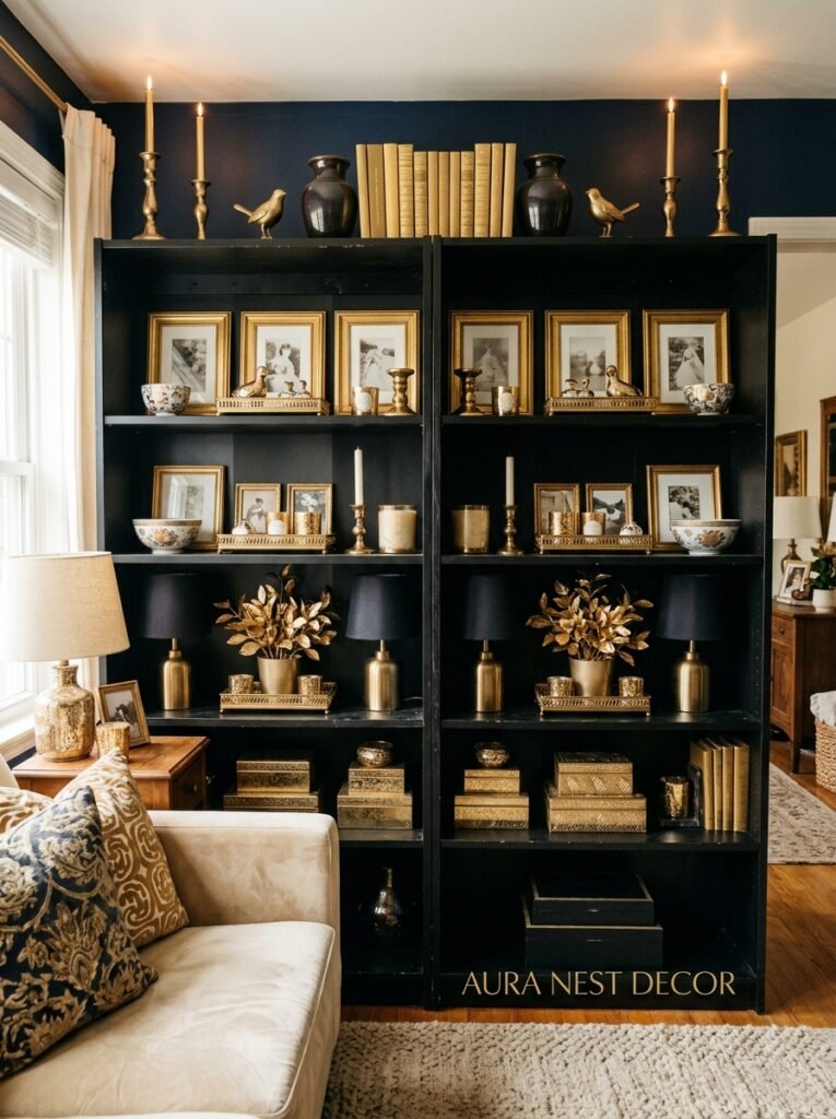
Pinterest is beautiful and dangerous in equal measure and I say that as someone who’s been on it for years.
The trap is pinning exclusively the maximalist, fully-realized, heavily styled versions of black and gold rooms — the ones that look like a fashion editorial, every surface perfectly dressed, thirty throw pillows, expensive art, perfectly arranged flowers. And then trying to recreate that in your actual lived-in home.
Your room will look different. That’s not failure. That’s the point. Real rooms have the remote control on the coffee table and slightly askew cushions and the book you’re currently reading left open on the side table. Real rooms have the lamp that was a gift from your aunt that doesn’t quite fit the scheme but you love it anyway. That stuff — that’s what makes a room feel like yours and not like a set.
Use those highly styled Pinterest images for color ratios and furniture placement ideas. But don’t chase the styling itself. Chase the feeling of the room instead.
“Chase the feeling, not the styling. Your home isn’t a set.”
—
❓ FAQ
Q: Will a black and gold living room make a small space feel even smaller? A: Not if you balance it right. Keep only one large element in black — a sofa, an accent wall, or a rug — and surround it with lighter walls and gold accessories that reflect light. Gold especially helps because it bounces light back into the room, which counteracts the weight of the black.
Q: Is black and gold a trend that’s going to date quickly? A: This is a fair question and honestly, no — not the way it’s done now. Maximalist gold was a trend in the 2010s, but the current pairing of matte and textural black with warm brushed gold is rooted in classic design principles that have held up for decades. The specific styling will evolve, but the bones of this color combination are solid.
Q: What’s the easiest way to start if I’m nervous about committing to this palette? A: Start with the lighting and the accessories before you buy a single piece of furniture. Swap your lampshades to black, add two or three brushed gold accent pieces, put your lights on a dimmer — and see how the room feels. You might find you’ve already gone 70% of the way there without touching a single large item.
—
💭 Final Thoughts
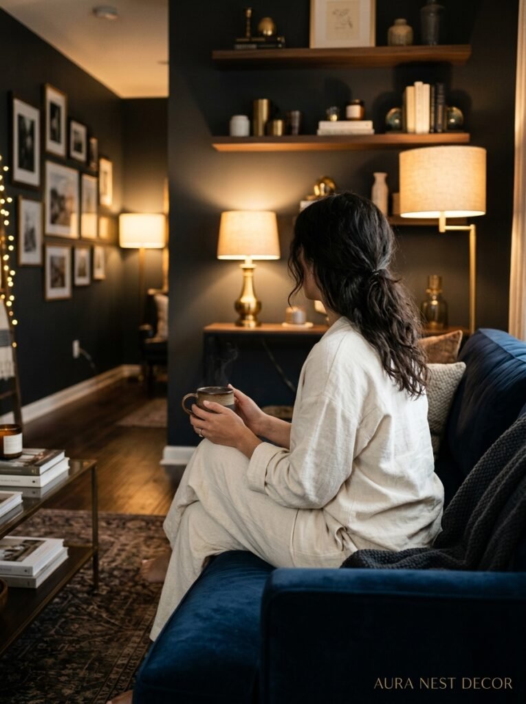
Black and gold living rooms aren’t about looking expensive or impressive or on-trend. They’re about that very specific feeling when you walk into your own living room on a winter evening and every choice in the room just feels right — the light is low, the textures are layered, the contrast is there but it’s not shouting at you.
Build toward that feeling slowly, trust your instincts more than you trust the perfectly staged photos, and give each piece time to settle before you decide it’s wrong.
What’s the one piece in your living room you already own that could anchor a black and gold scheme — do you know what it is yet?




