
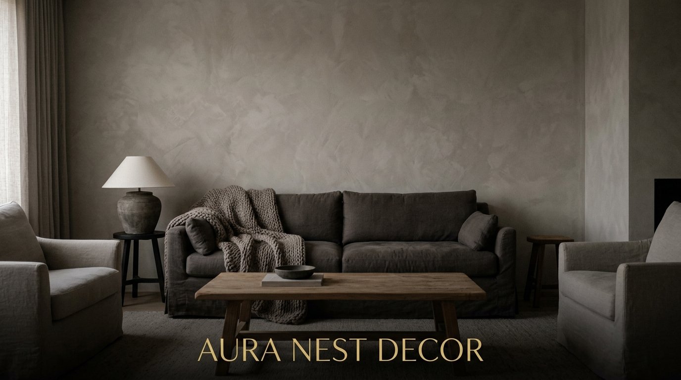
Gray Living Rooms That Actually Feel Warm (And Why Most of Them Don’t)
My friend called her new living room “depressing hospital waiting area” three weeks after painting it gray. The color she’d pinned obsessively for months. The exact shade she’d tested twice on the wall. And honestly? I’d seen it coming, because I’ve made the same mistake myself.
Gray is one of the trickiest colors in home decor — not because it’s boring, but because it’s ruthlessly unforgiving when you get the undertones wrong, the lighting wrong, or the layering wrong. But when you get it right? It’s the most sophisticated, livable color a room can be.
Here’s everything I’ve learned, pinned, and honestly suffered for.
—
1. The Reason Your Gray Looks Purple (Or Green) in Certain Light
This is where most people go wrong, and it’s not their fault. Paint companies don’t exactly shout about undertones on the tin.
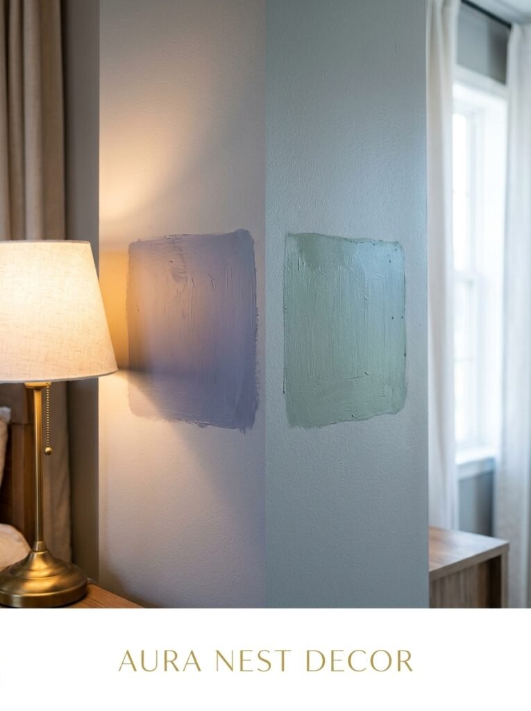
Gray isn’t actually neutral. Every gray has a dominant undertone — blue, green, violet, or warm beige/taupe — and that undertone gets LOUD depending on the light in your room. A north-facing room in a UK terrace will pull every bit of cool blue out of a color like Farrow & Ball’s Mole’s Breath. A west-facing room catching golden late-afternoon sun might make that same color look almost lavender.
The fix isn’t complicated but it requires patience. Get sample pots. Paint them in large swatches — not little 4-inch squares — and look at them at three different times of day. Morning, midday, and around 6pm. Check them against your sofa, your floor, your curtains. The undertone that clashes with your beige hardwood floors at 7pm on a Tuesday is the one that’ll live rent-free in your brain forever.
My shortcut: if you want a gray that genuinely reads as gray in almost any light, lean toward mid-tone greiges. They’re warm enough to avoid the purple trap but gray enough to feel cool and considered.
2. The Color That Keeps Showing Up in Every Beautiful Gray Living Room Right Now
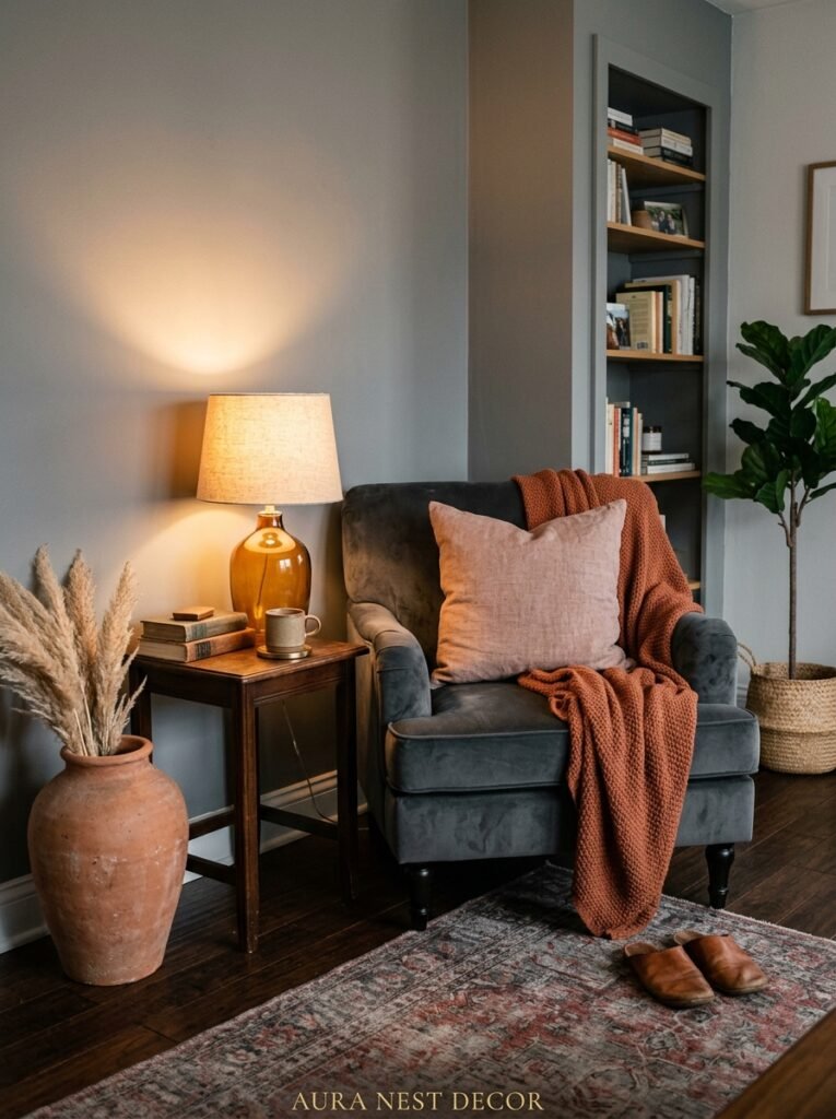
Rust. Not orange, not burnt sienna — rust. That deep, dusty, almost reddish-brown that shows up in a velvet cushion or a ceramic table lamp or an abstract print.
It sounds like it shouldn’t work against gray. And the first time I tried it I actually didn’t believe it until I stood in the room.
The reason it works is contrast without aggression. Rust doesn’t compete with gray — it grounds it. Cool gray walls, rust velvet sofa, some raw wood thrown in for texture. It’s warm without being maximalist, interesting without trying too hard. You can do a lot or a little of it, which is why it keeps appearing on every Pinterest board worth following.
“Gray without warmth is just cold. Rust is what makes a gray room feel like somewhere people actually want to stay.”
If rust feels too bold, try it small first — a throw, a couple of cushions, one piece of pottery on the coffee table. You’ll know immediately whether you want more.
3. Why Some Gray Sofas Disappear Into the Room (And How to Stop That)
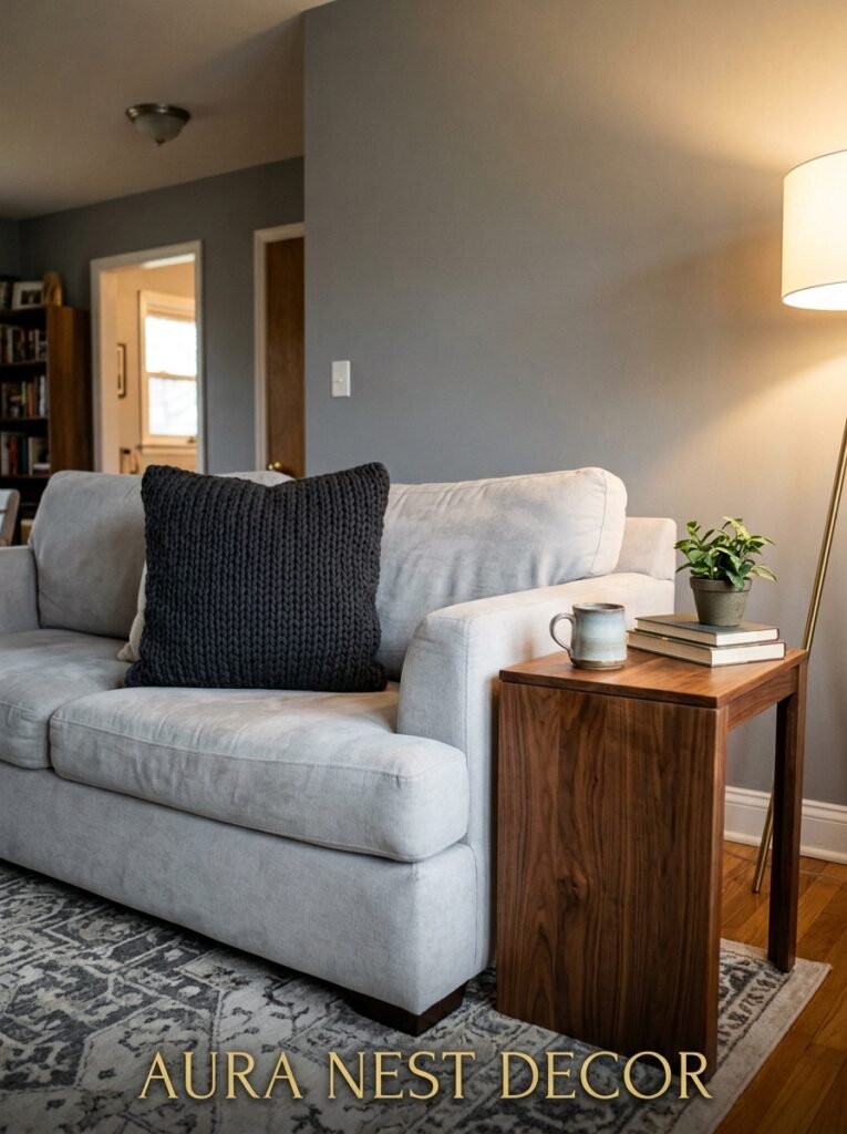
Matching gray furniture to gray walls is a real risk. Not because it’s wrong exactly, but because you need to be intentional about it or everything collapses into a flat, textureless blur.
The secret is contrast in finish, not necessarily in color. A matte gray wall behind a velvet gray sofa reads as intentional and layered. A matte gray wall behind a flat microfiber gray sofa in a similar shade just looks like you ran out of ideas.
So if you’re committed to the tonal approach — and honestly it can be stunning — vary the textures aggressively. Linen cushions. A chunky knitted throw. A glossy ceramic lamp base. Rough jute rug. You’re basically painting in texture instead of color, and it works, but you have to be deliberate about every single surface.
Or go the other direction entirely and use your sofa as the contrast piece. A deep charcoal sofa against a light warm gray wall (something like Dulux’s Polished Pebble, maybe) creates a natural focal point without any extra work.
4. What ACTUALLY Happens When You Pair Gray With White in a Living Room
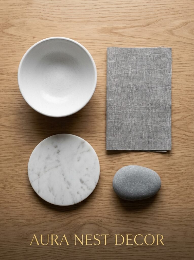
Okay, here’s my strong take: gray-and-white living rooms are incredibly hard to make feel cozy, and Pinterest has oversold them.
They look incredible in photos taken at noon on a sunny day with a professional photographer adjusting the white balance. In real life, in a real home, with real evening lighting and a TV that’s always on and a pile of your kids’ shoes by the door — they can feel cold and almost clinical.
That doesn’t mean don’t do it. It means do it with intention.
If white is your secondary color, it needs to be WARM white. Not brilliant white. Not pure white. Think linen white, aged white, Farrow & Ball’s All White (which is warmer than it sounds) or something off-white with a slight cream lean. That one degree of warmth makes the whole room feel softer.
Add layers of warmth through materials: a sheepskin draped over a chair, candles on every surface you can justify, heavy linen curtains rather than thin cotton, actual art on the walls rather than just mirrors. Mirrors in a gray-and-white room can make it feel like a spa bathroom. Not always the vibe.
5. The Rug That Can Save a Gray Living Room From Itself
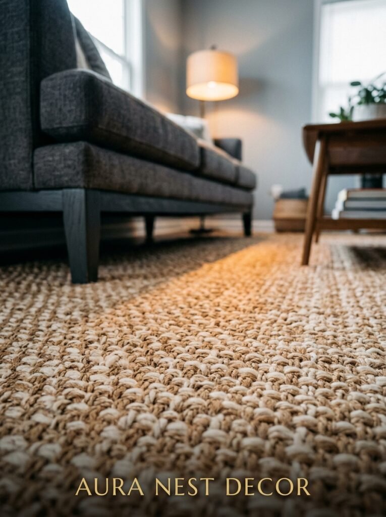
If there’s one single purchase that makes more difference in a gray living room than anything else, it’s the rug. Nothing else comes close.
And the rug most people buy for gray rooms — gray, navy, or white geometric — is usually the wrong choice. It coordinates. Coordinating isn’t the same as working.
What works: something with warmth woven through it. A vintage-style Persian rug in dusty pinks and warm reds. A flatweave with ochre and rust tones. A jute rug with a colored border. Something that introduces color to the floor so the whole room doesn’t float in neutral space.
“The rug is where the room’s warmth lives. If your rug is as cool-toned as your walls, the whole room is sleeping.”
Size matters just as much as color. Go bigger than you think you need. The rug should sit under the front legs of every sofa and chair, minimum. If you’re choosing between two sizes, get the bigger one. Almost every room I’ve ever seen had a rug that was too small, never one that was too large.
6. The One Rule That Makes a Gray Accent Wall Feel Intentional Instead of Random
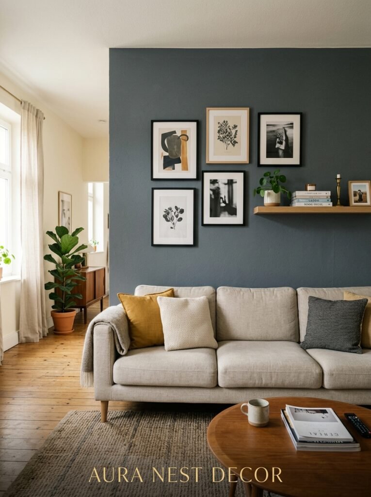
Accent walls have had a complicated decade. They were everywhere, then they became embarrassing, then they quietly came back — but better.
The rule I’ve always stuck to: the accent wall has to be the wall your eye goes to FIRST when you walk into the room. Not a random side wall. Not the wall behind the sofa where no one can really see it. The wall opposite the door, or the chimney breast wall, or the wall the TV lives on if it’s naturally the focal point of the space.
Doing a gray accent wall the wrong way is painting one out of four plain walls a slightly different shade of gray. Doing it right is making the darkest version of your color story live exactly where the room’s architecture already directs your eye.
Dark charcoal on a chimney breast with lighter gray on the surrounding walls? Genuinely gorgeous. That same dark charcoal on a random side wall next to a window? Confusing and heavy.
7. Lighting That Makes Gray Feel Like a Hug Instead of a Hospital
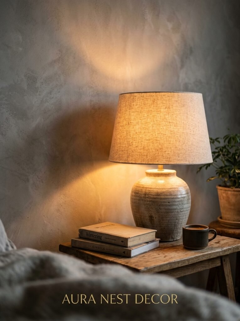
Here’s the thing nobody puts in their Pinterest caption: lighting is doing about 60% of the work in a gray room. Maybe more.
Gray is responsive. It picks up the color temperature of its light more than almost any other color. Warm bulbs (2700K, look for it on the box — do this, it genuinely matters) make gray look cozy and inviting. Cool daylight bulbs make that same paint color look like the inside of a filing cabinet.
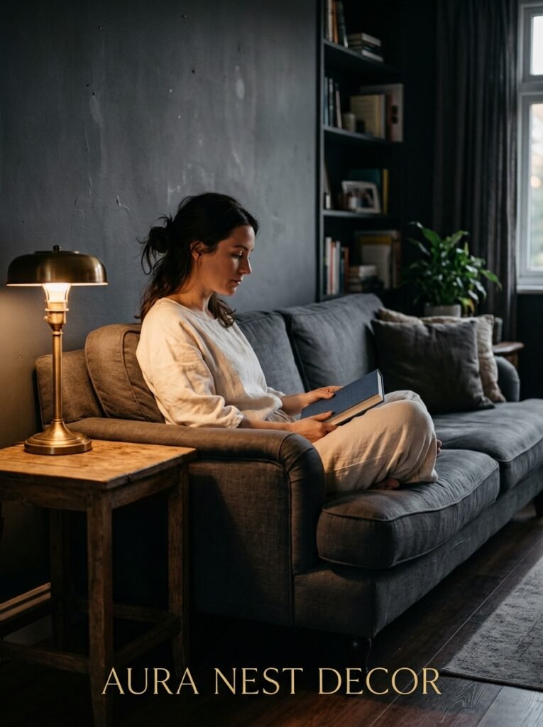
Side note — the worst thing you can do in a gray room is rely on one overhead light. A single ceiling fixture washes everything out evenly, which kills the depth and shadow that makes gray rooms look beautiful. You want pools of warm light. Table lamps, floor lamps, the amber glow of an Edison bulb at 7pm specifically, candles wherever you can put them without setting anything on fire.
Dimmers. If you do one thing to any room, put dimmers on the main light. Non-negotiable. They cost almost nothing and they change everything.
8. How Much Wood Is Too Much Wood in a Gray Living Room
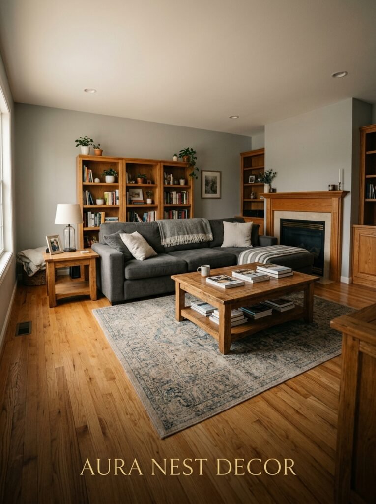
Not enough people ask this question and then they end up with something that looks like a Scandinavian furniture showroom having an identity crisis.
Wood in a gray room is good. Wood grounds the cool tones, adds warmth and visual weight, makes the space feel lived-in rather than staged. But there’s a point of too much where every single surface becomes a wooden something — coffee table, shelving, TV unit, picture frames — and the room tips from “natural warmth” into “are we in a cabin.”
The balance I’ve landed on: wood should be present but not dominant. One or two substantial wood pieces — a coffee table, a console, a low sideboard — and then let other materials carry the rest. Stone, linen, ceramic, metal. Gray rooms that feel BEST usually have some metal in them too, by the way. Brushed brass or aged bronze catches light in a way that chrome never does, and it plays beautifully against gray walls.
9. The Gray Paint Shades Interior Designers Actually Use (And a Few They Don’t)
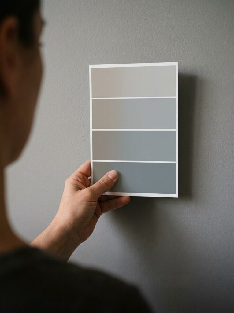
Let me give you real names rather than vague categories, because that’s actually useful.
Farrow & Ball’s Purbeck Stone is one of the most versatile light warm grays out there. It reads as gray in good light but never gets cold. Strong White from the same range is technically an off-white but it hovers so close to gray that it functions as one in shadow.
For something mid-tone and genuinely useful, Dulux’s Chic Shadow has been a workhorse for years and it earns its reputation. Benjamin Moore’s Revere Pewter is probably the most-pinned gray in America for good reason — it sits in that warm-gray-greige space that works with almost anything.
What I’d avoid: pure cool grays with no warmth. Shades with obvious blue or violet undertones in rooms with little natural light. And anything described as “light cool gray” if your room faces north. Just don’t.
“The best gray paint shade for your room isn’t the one on the most Pinterest boards. It’s the one that looks right in your specific light, on your walls, next to your floor.”
10. Gray in a Small Living Room: The Arguments For and Against
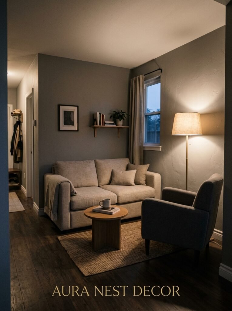
Here’s my honest take: small rooms and gray paint are not automatically enemies, but they do require a different approach.
Conventional wisdom says light paint makes rooms feel bigger. That’s true, sort of. But a very pale cool gray in a small north-facing UK sitting room will just feel cold and cramped. In that situation you’re often better off going DARKER — a deep, confident charcoal or slate that makes the walls recede and turns the room into something intentional and cocooning rather than apologetically small.
The “make it feel bigger” trick for gray rooms isn’t paint shade — it’s what you put in it. Low furniture, legs visible on sofas and chairs, fewer objects, a single large mirror on the right wall (opposite a window, not opposite another wall), curtains hung above the window frame rather than on the frame. These things create the illusion of space in ways that paint color alone can’t.
11. The Plants That Work Surprisingly Well in Gray Rooms (Hear Me Out)
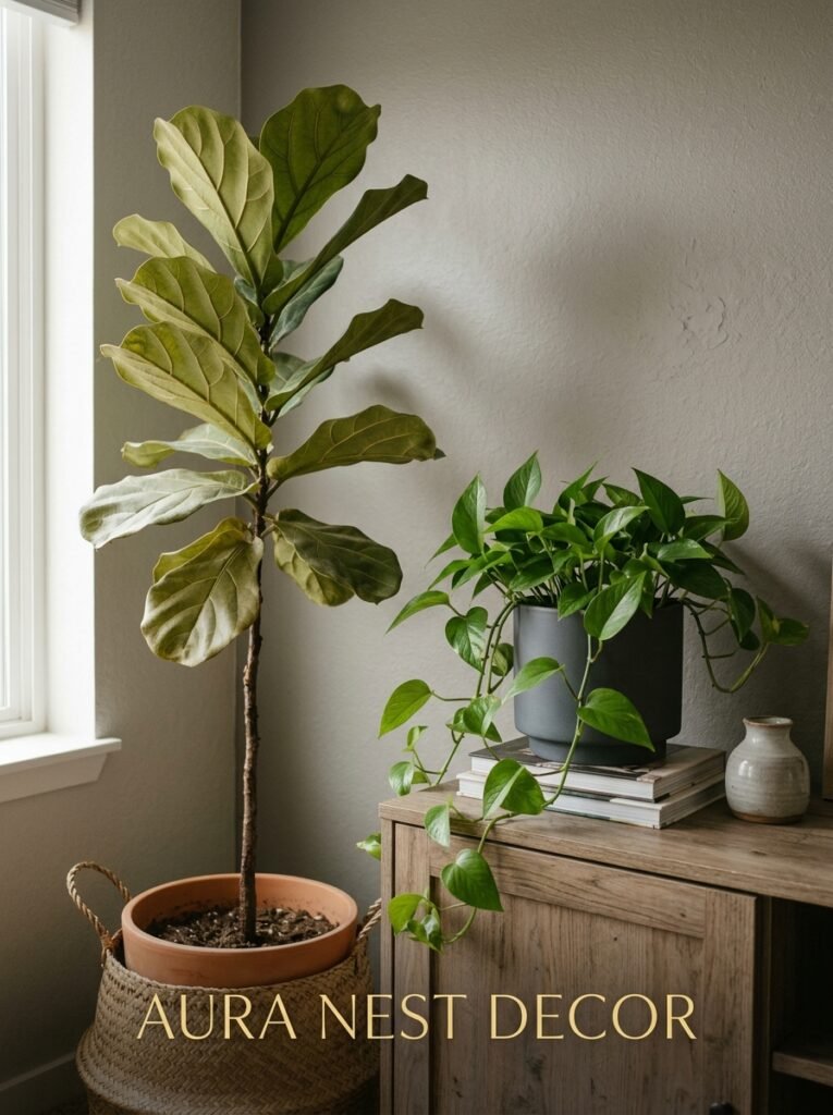
I know this seems like a weird section but stick with me, because I’ve seen gray rooms destroyed by the wrong plant and I’ve seen them rescued by the right one.
Cool gray tones tend to wash out green plants that are already on the cool side — certain ferns, for instance, or pale succulents. They just disappear. What works brilliantly in gray rooms are plants with WARM greens or dark glossy leaves: Monstera, rubber plants, birds of paradise, pothos with those saturated yellow-green leaves. The contrast against gray is striking in the best way.
Also? Dried pampas grass or dried wheat — those warm straw tones against a gray wall look genuinely beautiful and they never die, which I appreciate.
12. The Gray Living Room Elements That Age Badly (And What to Do Instead)
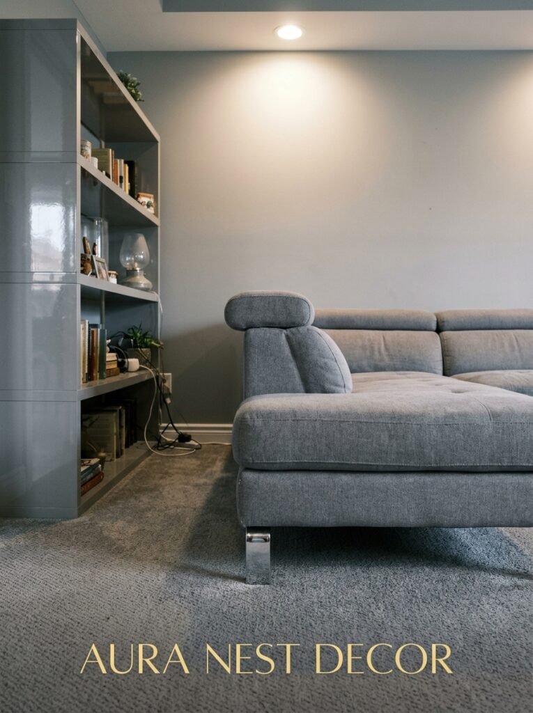
Trend cycles are real and gray isn’t immune.
The version of gray decor that’ll date the fastest: everything gray, cool tones, silver accessories, no warmth, chrome hardware, abstract geometric prints in black and white. It’s very 2016 and it already looks a bit tired.
The version that’ll last: gray as a base, layered with natural materials, warm metallics, lived-in textures, personal objects, plants, and a couple of genuinely bold color pops. This isn’t a trend, it’s just a room that looks good and feels right.
The move isn’t to avoid gray. The move is to stop treating it like a destination and start treating it like a foundation. Build on it. Warm it up. Make it yours. A gray room that has your books and your art and your weird collection of vintage pottery is going to look good in ten years because it looks like you, not like a catalog.
—
❓ FAQ
Q: What’s the best shade of gray paint for a living room with no natural light? A: Go warmer than you think you need to. Greige shades — those that sit between gray and beige — tend to hold up best in low-light rooms because they don’t pull cool or blue. Farrow & Ball’s Elephant’s Breath and Dulux’s Overtly Olive (it’s warmer than it sounds) are good starting points. Always test with large sample swatches and check them in the evening, not just in daylight.
Q: Does gray furniture work with gray walls, or is it too much? A: It can work beautifully, but you need serious variation in texture and depth. The key is making sure your sofa and your wall aren’t the same tone AND the same finish. A deep charcoal velvet sofa against a mid-tone matte gray wall reads as intentional. Two similar shades of flat gray will just look like a mistake.
Q: How do I make a gray living room feel warmer without repainting? A: Swap your light bulbs first — 2700K warm white makes an immediate difference. Then layer in textiles (a warm throw, chunky cushions in rust or ochre), add a rug with warm tones, and put a couple of table or floor lamps in corners where you currently have nothing. You’d be surprised how much the room changes before you’ve touched the walls.
—
💭 Final Thoughts
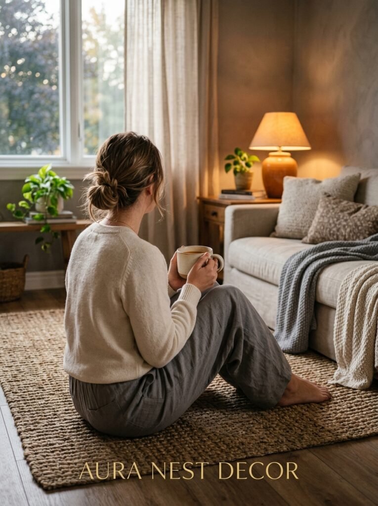
Gray gets blamed a lot for rooms that are actually just badly lit, under-furnished, or decorated without any warmth. The color isn’t the problem — it rarely is. Get the undertones right for your specific room, layer in warmth like you mean it, and give the space enough texture to feel alive.
The gray living rooms I keep coming back to on Pinterest are never the ones that look perfect. They’re the ones that look like someone actually lives there.
Does your room feel cold right now, or just not quite right — and do you know which problem it actually is?




