
Gray Walls Living Room: The Quiet Magic of a Color That Makes Every Home Feel More Like Itself
There’s a moment — maybe you’ve had it — when you walk into someone’s living room and feel an almost inexplicable sense of calm. The furniture is nothing extraordinary, the light is just ordinary afternoon light, and yet something about the space makes you want to sit down and stay. More often than not, the walls are gray.
—
1. Why Gray Has Quietly Become the Most Beloved Wall Color of Our Generation
Gray didn’t arrive with a fanfare. It didn’t demand attention the way a cobalt blue accent wall might, or stir controversy the way anyone who’s tried painting a room bright orange can tell you firsthand. Gray simply showed up, made the room feel better, and stayed. And somehow, in the past two decades, it has become the quiet backbone of modern interior design — not because it’s trendy, but because it actually works.
The reason gray resonates so deeply with so many people is rooted in color psychology. Gray is inherently neutral, which means it doesn’t compete with the other elements in your room — your sofa, your art, your inherited wooden coffee table with the ring stain you can’t quite bring yourself to cover. Instead, it holds space. It lets everything else breathe. Interior designers often describe gray as the color that “listens” — and there’s real truth in that metaphor.
“Gray doesn’t steal the show. It creates the show.”
What’s remarkable is how gray manages to feel simultaneously modern and timeless. A warm gray with yellow undertones can make a living room feel like a cozy English countryside cottage. A cool blue-gray can turn the same square footage into something sleek and almost architectural. The range within a single “color” is staggering — and that versatility is precisely why gray walls in a living room are not a compromise. They’re a strategy.
2. The Warm vs. Cool Gray Debate — and Why It Matters More Than You Think
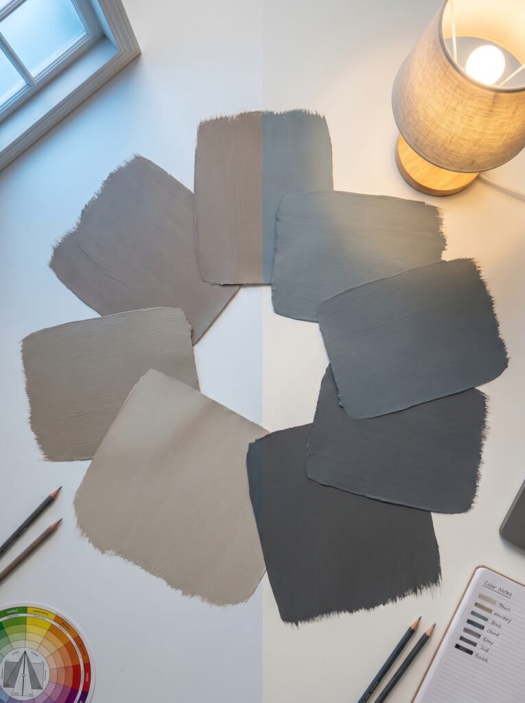
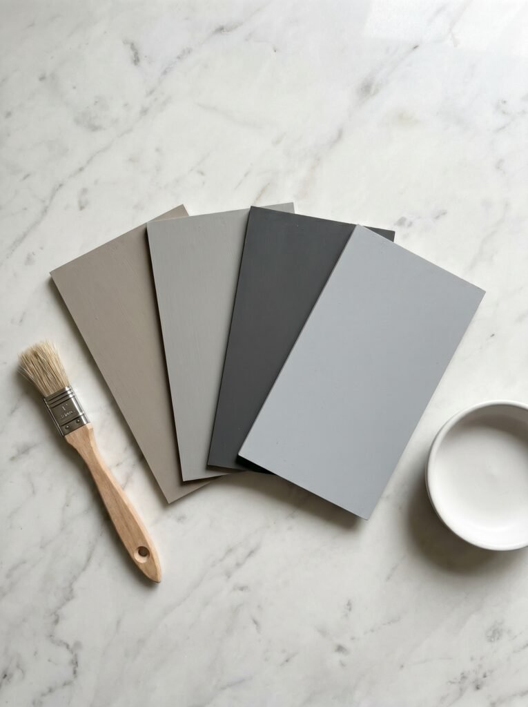
Here’s where a lot of people go wrong: they choose a gray paint chip at the hardware store, it looks beautiful in the fluorescent overhead lighting of the store, and then they get it home and wonder why their living room suddenly feels like the inside of a rain cloud. The culprit, almost every time, is undertones.
Gray is never truly gray. Every shade has an undertone — blue, green, purple, or warm beige and taupe — and those undertones interact with your specific light sources in ways that can completely transform a space. A gray with strong blue undertones will look crisp and serene in a north-facing room with cool natural light, but in a south-facing room drenched in warm afternoon sun, it might start reading as a pale violet. Neither outcome is objectively wrong, but only one might be right for your room.
Warm grays — think Benjamin Moore’s Revere Pewter or Sherwin-Williams’ Agreeable Gray — are universally beloved for a reason. They have just enough beige and taupe in their DNA to feel welcoming without veering into the territory of a fully beige room. They’re the gray equivalent of a cashmere sweater: refined, comforting, and somehow appropriate in every context.
Cool grays, on the other hand, carry a kind of quiet sophistication. Shades like Sherwin-Williams’ Mindful Gray or Farrow & Ball’s Purbeck Stone have a subtly blue or green quality that makes them feel almost spa-like — clean, restrained, intentional. If your living room has modern or Scandinavian-influenced furniture, a cool gray can feel like it was always meant to be there.
3. The Secret Language of Light — How Your Room’s Orientation Changes Everything
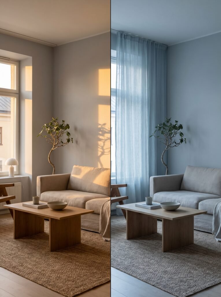
Before you even pick up a paint fan deck, spend a day watching how light moves through your living room. This is not wasted time — it might be the most important design decision you make. The way natural light enters your space will determine whether a gray feels alive and inviting or flat and draining.
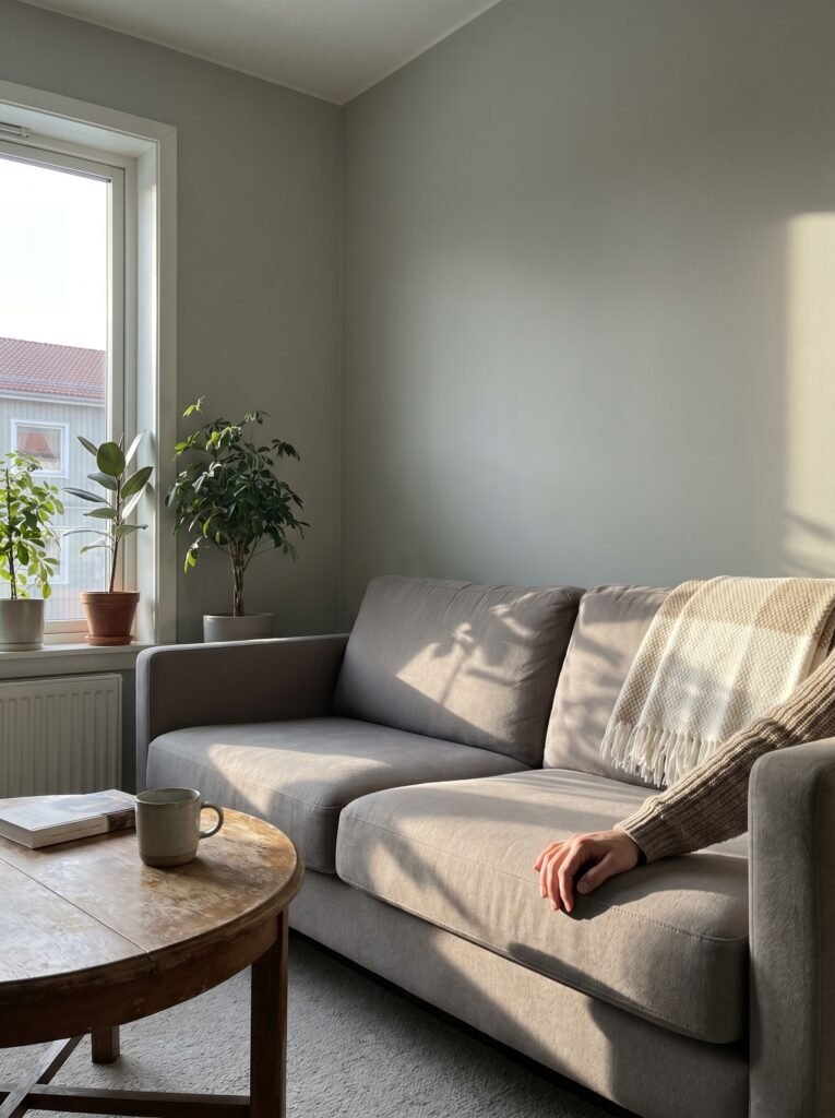
North-facing rooms receive indirect, cool light that tends to amplify the blue and green undertones in any paint color. If your living room faces north, warm grays are almost always your safest bet — they’ll counterbalance the cool light and keep the room feeling hospitable rather than clinical. South-facing rooms are the generous ones: they get long hours of warm, golden light that can handle both warm and cool grays with ease and even make mid-toned grays look luminous.
East-facing rooms are flooded with bright morning light that shifts to a warmer tone in the afternoon. They tend to be forgiving with most grays. West-facing rooms, meanwhile, get that long, low, amber afternoon sun that can make even a mid-cool gray feel almost honey-warm by 4 p.m. — which, depending on your taste, can be utterly beautiful.
The practical takeaway: always test a paint swatch directly on your wall, in the largest size possible — at least 12 by 12 inches — and observe it at different times of day before committing. What looks like a soft dove gray at 10 a.m. might reveal a distinctly green-tinged personality by lamplight.
4. Shades That Interior Designers Actually Reach For — A Curated List Worth Bookmarking
While there are thousands of gray paint options on the market, certain shades have proven themselves worthy of the walls of well-designed homes again and again. These aren’t just popular choices — they’re well-loved for specific, defensible reasons.
Agreeable Gray by Sherwin-Williams consistently tops best-of lists because it reads as warm without being beige, and it works in nearly every lighting condition. It’s the “everyone gets along with it” shade of the color family. If you’re paralyzed by choice, start here.
Repose Gray, also by Sherwin-Williams, is slightly cooler and more balanced — almost perfectly neutral, with just enough warmth to stay friendly. It’s a designer favorite for living rooms because it allows bold furniture and art to take center stage without the walls competing.
Pebble Shore by Benjamin Moore has a beautiful depth — it’s dark enough to feel rich and intentional, but not so dark that a living room feels closed in. It’s ideal for larger rooms or spaces with multiple light sources.
Mole’s Breath by Farrow & Ball is for the person who wants a gray with genuine character — moody, sophisticated, and undeniably British in the best possible way. It rewards bravery.
5. What Colors Actually Work With Gray Walls — The Combinations That Never Fail

One of the greatest gifts of gray walls is how generously they play with other colors. This is not a color that jealously guards the room’s palette — it invites collaboration.
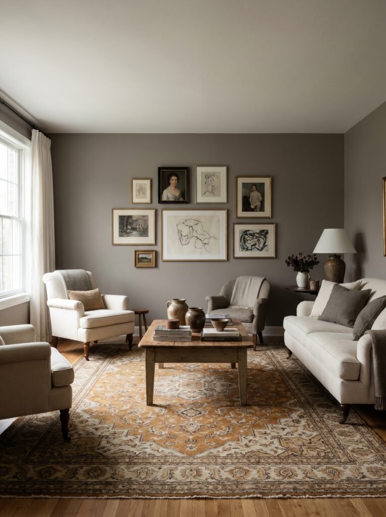
The most timeless pairing is gray with white trim. Clean white baseboards, door frames, and crown molding against a gray wall create a contrast that feels both classic and fresh — the kind of combination you’d find in a magazine spread and in a home that’s been lived in comfortably for thirty years. It works because the contrast is crisp without being harsh.
“Gray walls don’t just support a color palette — they quietly elevate everything they share the room with.”
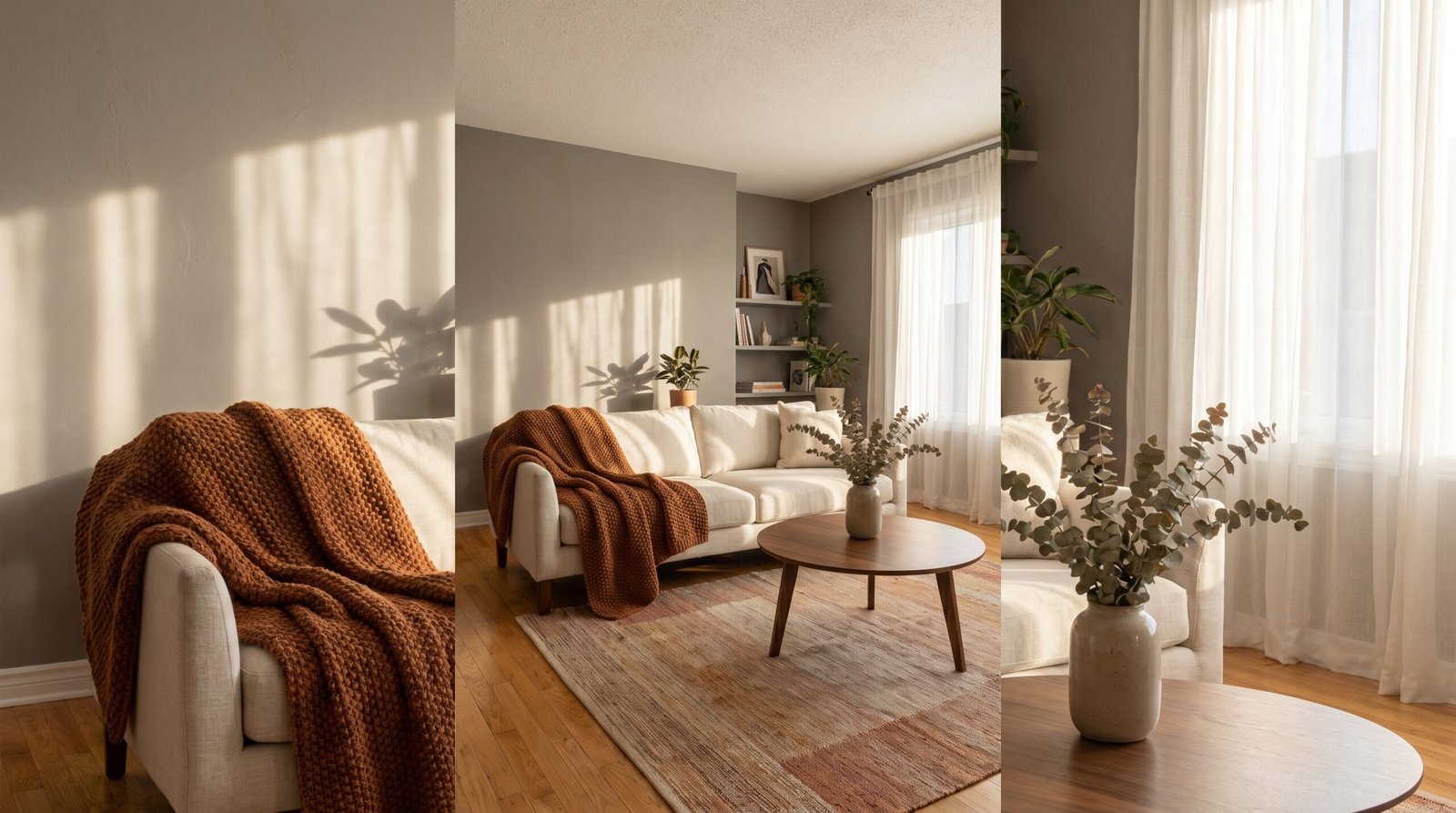
Warm wood tones are perhaps gray’s most natural companion. Honey-colored oak floors, a walnut coffee table, or a reclaimed wood accent piece against gray walls creates a balance of the cool and the organic that feels genuinely beautiful. The gray makes the wood glow warmer; the wood makes the gray feel grounded rather than cold.
Blush and dusty rose bring out a gentle, romantic quality in gray that surprises a lot of people. A blush velvet sofa against a cool gray wall has a quiet luxury to it — layered, considered, and quietly confident. Navy blue is another powerhouse pairing: throw pillows, a navy rug, or a single navy accent chair against gray walls creates a space that feels both sophisticated and restful.
6. The Role of Texture — Why Gray Walls Need It More Than Any Other Color
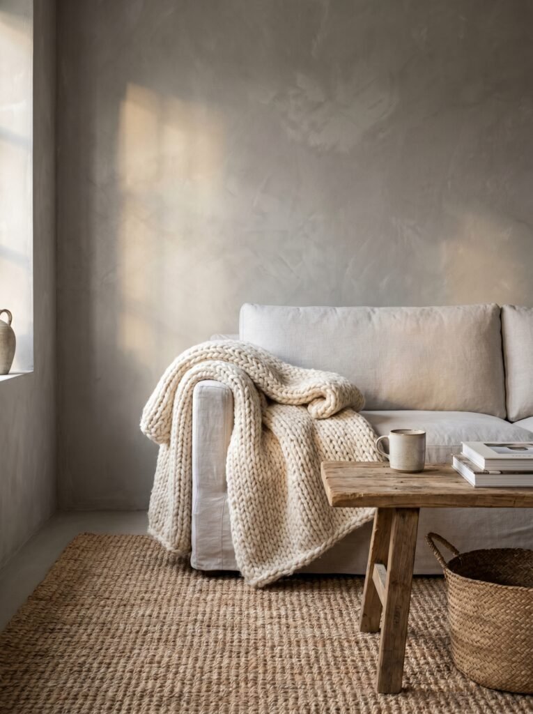
Here’s something designers know that the rest of us often learn the hard way: a flat gray wall in a room without texture can feel sterile. Gray has an unusual relationship with texture — more than most colors, it depends on the surfaces around it to come alive.
This is where textiles do their most important work. A chunky knit throw, a jute rug, a linen sofa in a barely-there natural tone — these things add what flat gray cannot provide on its own: tactile warmth. They’re not accessories so much as necessities in a gray living room.
Wall texture itself can transform the experience of gray. A gray that’s been applied over a lightly textured plaster finish behaves completely differently from the same gray on a flat, smooth wall. The light catches the surface unevenly, creating subtle variation that makes the color feel more complex, more artisan, more alive. Even a simple matte finish rather than flat — which catches slightly more light — can make a meaningful difference.
7. Small Living Rooms and Gray — Busting the Myth That You Need Light Walls
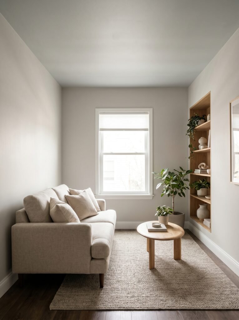
There is a pervasive piece of decorating advice that goes something like this: small rooms need light colors to feel larger. And while there’s a kernel of truth in it, it isn’t the whole story — particularly when it comes to gray.
The reality is that a small living room painted in a soft, warm gray often feels more cohesive and intentional than the same room painted a stark white. White can emphasize the seams of a small room — the corners, the low ceiling, the awkward window placement. Gray, by contrast, can blur those edges slightly, creating a sense of envelopment that reads as cozy rather than cramped.
The key is choosing a gray that is warm enough and light enough to reflect rather than absorb light. Think of shades in the LRV (Light Reflectance Value) range of 50 to 65 — light enough to keep the room bright, with enough color presence to feel considered. Painting the ceiling the same gray, or just a shade lighter, can further soften the room and make it feel taller through visual continuity rather than stark contrast.
8. Furniture That Belongs in a Gray Living Room — And What to Avoid
Gray walls give you enormous freedom with furniture, but they reward thoughtful choices. The most successful gray living rooms tend to mix materials and tones deliberately rather than matching everything within the same color family, which can result in a room that feels washed out.
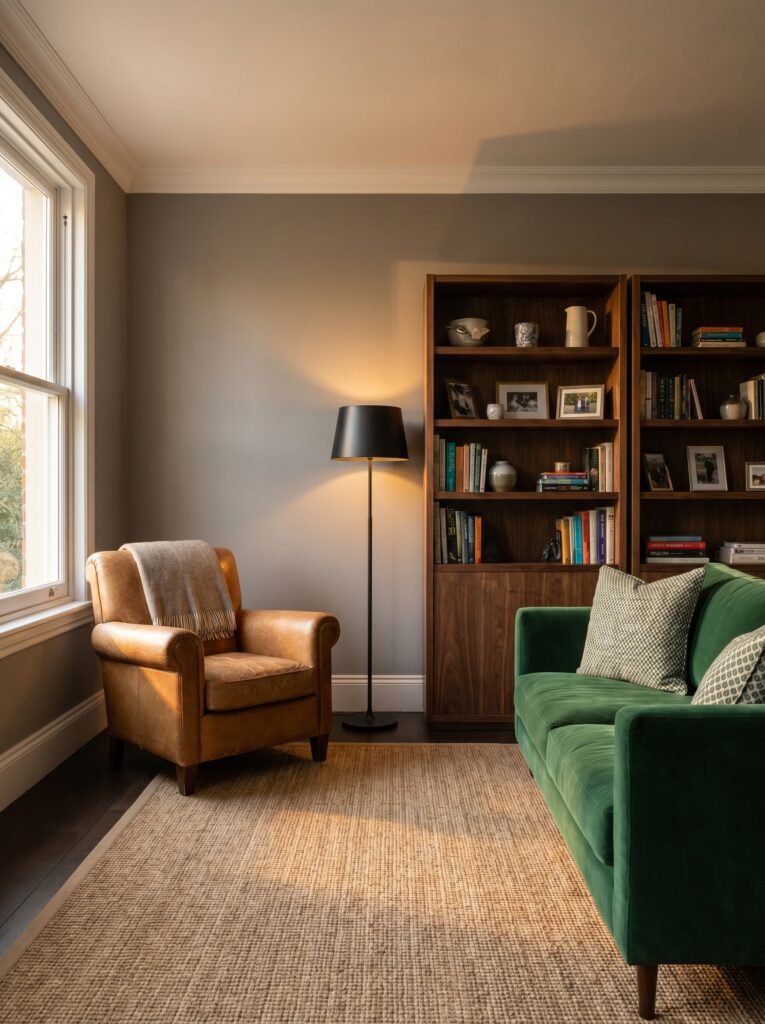
Avoid filling a gray living room with only gray, silver, or white furniture — this is the path to a room that feels more like a waiting area than a home. Instead, introduce warmth through at least one or two pieces: a tan leather armchair, a natural fiber rug, a wooden bookshelf. These elements create the contrast that makes a gray room feel lived in and genuinely welcoming.
Upholstered sofas in warm neutrals — cream, oatmeal, or a barely-there taupe — look extraordinarily elegant against gray walls. So does jewel-toned velvet: emerald green, sapphire blue, or deep plum. If you want the room to feel more contemporary, black metal accents — lamp bases, side table frames, curtain rods — add definition without color competition.
9. Styling Gray Walls With Art — the Layered Look That Makes Rooms Feel Complete
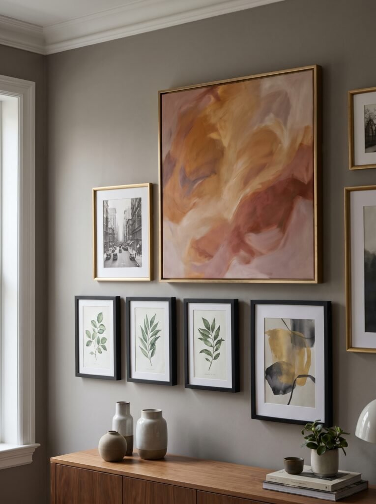
Gray walls are perhaps the most forgiving gallery wall backdrop available to homeowners, and this is one of their most undersung virtues. Because gray doesn’t pull toward a specific hue, it can frame artwork of nearly any color family without clashing — which means your collected pieces can truly shine against it rather than fighting the wall for attention.
“A gallery wall on gray is less about the individual pieces and more about the story they tell together.”
For a cohesive gallery wall effect on gray, consider using frames in two consistent finishes — warm brass and matte black work beautifully together — and allow the artwork itself to vary in subject and color. The visual unity comes from the frame consistency and the neutral gray backdrop, not from matching the art to the wall. This approach creates rooms that feel curated rather than decorated — rooms that evolve over time as you add pieces that matter to you.
Oversized single-piece art also commands tremendous presence on a gray wall. A large abstract in warm ochres and dusty pinks, for example, can completely transform the energy of a gray living room — adding color without committing to colored walls, and creating a focal point that anchors the entire space.
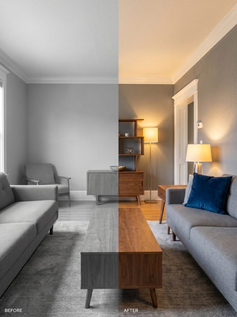
10. Lighting Strategies That Make Gray Walls Absolutely Sing
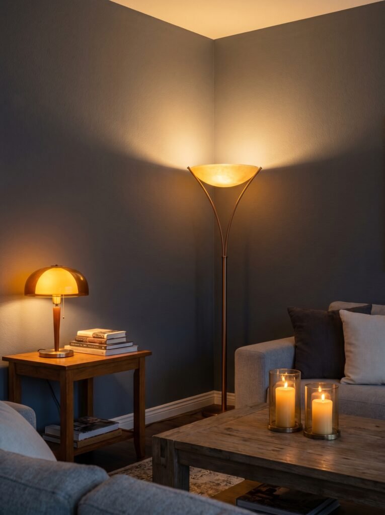
If there’s one element that will determine whether your gray living room feels magical or merely serviceable, it’s layered lighting. Gray is a color that transforms under different light sources more dramatically than almost any other, and this sensitivity is something to harness rather than fear.
Warm-toned bulbs — 2700K to 3000K on the Kelvin scale — are almost always the right choice for gray living rooms. They shift even cool grays toward warmth as the evening deepens, creating that beautiful transition from a bright, crisp daytime room to something softer, moodier, and more intimate after dark.
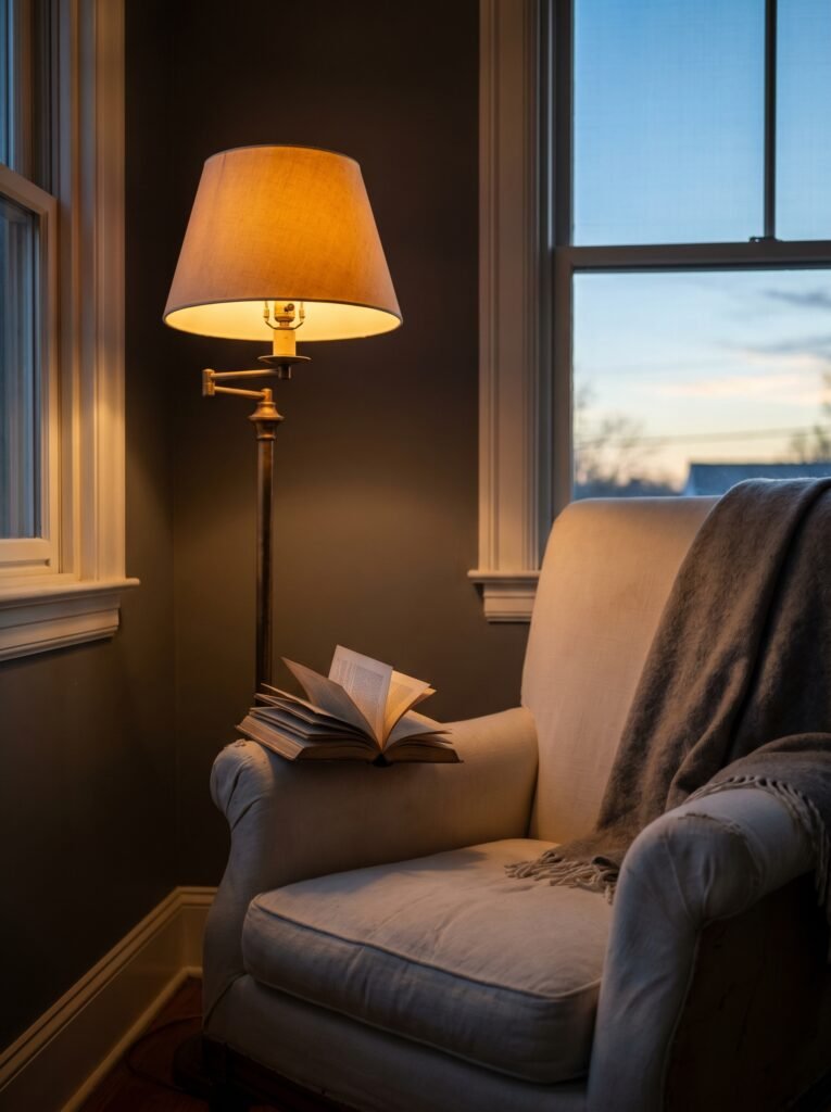
Floor lamps in the corners of a gray living room do something that overhead lighting cannot: they push light upward and outward along the wall, creating a soft gradient that gives the gray color a dimensional quality. Paired with a few table lamps and perhaps a candle or two, layered lighting turns a gray room from a backdrop into an atmosphere.
11. Seasonal Living With Gray Walls — How One Neutral Shifts Through the Year
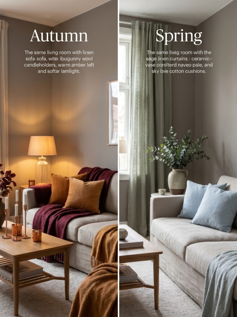
One of the most practical gifts of gray walls is their chameleon-like ability to shift character through the seasons simply by changing the textiles and accessories you layer into the space. The walls themselves remain constant — and this constancy is, paradoxically, what makes the seasonal shifts feel so fresh and noticeable.
In autumn and winter, lean into the warmth: thick wool throws in rust and burgundy, candles in amber and sandalwood, copper and bronze accents on the coffee table. The gray will respond to these warm companions by seeming to deepen and envelop — the living room becomes a retreat. In spring and summer, pull in the opposite direction: linen curtains in soft sage or cream, fresh eucalyptus in a ceramic vase, cotton cushions in terracotta or pale sky blue. Suddenly the same gray reads as airy and light-filled rather than cocoon-like.
This seasonal flexibility is, ultimately, what makes gray such a sound long-term investment for any living room. You’re not repainting — you’re simply redecorating, and the gray accommodates every version of the room you want to create.
12. The Mistakes People Make With Gray Living Rooms — and How to Sidestep Them Gracefully
Even the most thoughtful decorating intentions can go sideways with gray if a few key pitfalls aren’t avoided. The most common mistake is choosing a gray based on a paint chip alone without accounting for undertones in context. The second most common is underestimating the sheer number of gray options and defaulting to the first one that looks vaguely right — only to discover it reads purple in lamplight.
Another frequent misstep is creating a gray-on-gray-on-gray scheme without enough tonal contrast. A gray sofa on gray walls with a light gray rug and gray curtains results in a room that, no matter how beautiful each individual element might be, feels monochromatic in a draining rather than a sophisticated way. Contrast — through warm wood, rich jewel tones, or crisp white — is not optional; it’s structural.
Finally, there’s the issue of commitment. Some people choose a very safe, very light gray that’s so close to white it reads as neither — a sort of non-color that satisfies no aesthetic goal. If you’re going gray, commit. Choose a shade with enough presence to actually read as gray on the wall, and trust that with the right lighting and styling, it will reward your courage.
—
🌿 How to Take Care of Your Gray Living Room
Maintaining the beauty of a gray living room is less about vigilance and more about intentionality — returning to the space with fresh eyes every few months and asking whether it still feels like you.
Every season, rotate at least one textile — a throw blanket, a set of cushion covers, or a new rug — to keep the room feeling current without requiring any real investment. Gray walls accept new companions easily.
Keep your walls clean by using a matte or eggshell finish rather than flat paint, which scuffs and marks more visibly. A soft, damp cloth handles most marks on eggshell without removing the paint itself. Touch up as needed — most gray paints touch up cleanly if you’ve kept some paint in a sealed container.
When your gray living room starts to feel flat or tired, resist the urge to repaint immediately. More often than not, what the room needs is better lighting — a new floor lamp, warmer bulbs, or the addition of a few candles — rather than an entirely new color on the walls.
Let the room evolve. The best gray living rooms aren’t finished — they grow with the people who live in them, absorbing new art, new furniture, new moments. Gray has the patience for all of it.
—
❓ FAQ
Q: Will gray walls make my living room feel cold and unwelcoming? A: Only if you choose a cool gray without balancing it with warm elements — and even then, the right lighting can save it. The key is pairing any gray with warm wood tones, soft textiles, and warm-toned lightbulbs (2700K–3000K). A well-styled gray living room feels genuinely cozy, not clinical.
Q: What is the most popular gray paint color for living rooms right now? A: Agreeable Gray by Sherwin-Williams and Repose Gray by Sherwin-Williams consistently rank among the most-used choices by interior designers and homeowners. Both are warm-leaning grays that work across a wide variety of lighting conditions and furniture styles — which explains their enduring popularity.
Q: Can I use gray walls in a small living room without making it feel smaller? A: Absolutely — the key is choosing a gray with a higher light reflectance value (LRV of 50 or above), which means the paint reflects enough light to keep the room feeling bright. Soft warm grays in lighter shades can actually make small rooms feel more cohesive and intentional than bright white, which sometimes emphasizes the room’s limitations rather than its character.
—
💭 Final Thought
Gray walls don’t ask for attention. They simply make the space feel better — more considered, more settled, more home. In a world that often rewards the loud and the obvious, there’s something quietly radical about choosing a color that exists to support everything around it rather than dominate it. Your living room is the room where your life happens — the long evenings, the Sunday mornings, the ordinary days that somehow become the ones you remember.
So here’s the question worth sitting with: what would it feel like to come home to a room that simply lets you be?