
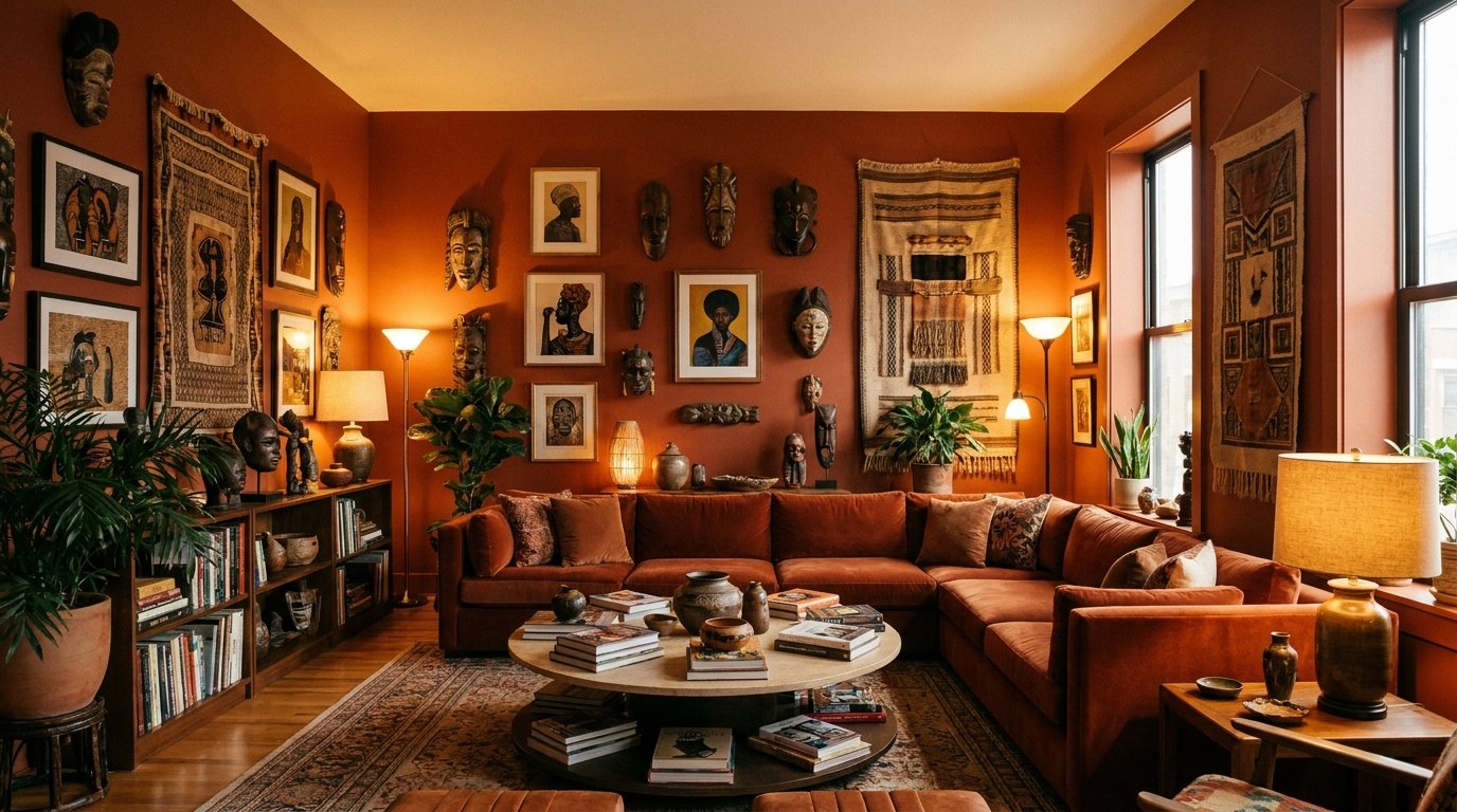
Living Room Wall Decor That Reflects You: Bold, Beautiful Ideas for Melanin-Rich Homes
My friend Jasmine called me last year, kind of frustrated. She’d spent hours on Pinterest searching for living room wall inspo and kept seeing the same beige-on-beige rooms with abstract prints that felt like… nobody’s home. “Where are the spaces that actually look like ME?” she said. And honestly? I got it immediately.
This one’s for every homeowner who wants walls that feel personal, proud, and genuinely stunning.
—
1. The Art of Centering Blackness Without It Feeling Like a Museum
There’s a difference between a home that celebrates Black identity and one that feels like a curated exhibit. You don’t want your guests to feel like they’re walking through a gallery with velvet ropes. You want them to sit down, exhale, and feel the warmth of who lives there.
The trick — and I mean this — is layering personal with intentional. A framed photo of your grandmother next to a bold abstract print in deep ochre. A hand-thrown ceramic piece from a Black artisan on the shelf below a gallery wall. Nothing has to scream. It can whisper and still be LOUD.
Think of your wall as a conversation starter, not a statement piece. The best rooms I’ve seen don’t hit you over the head with a theme. They reveal themselves slowly. You sit down, you look around, and piece by piece you understand who lives here. That’s the goal.
—
2. Gallery Walls That Don’t Look Like Everyone Else’s
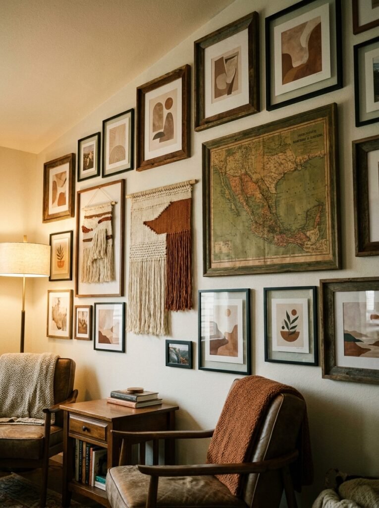
Most gallery walls follow the same formula. Matching frames, white mats, even spacing. And look, there’s nothing wrong with that. But if you want yours to actually stop people mid-sentence? Break the grid.
Mix frame finishes — dark walnut next to brushed gold next to unfinished wood. Go big on one piece and let everything else breathe around it. A oversized portrait in the center, maybe 24×36, with smaller prints fanning out at different heights. Not perfectly symmetrical. Not even trying to be.
“The frames don’t have to match. They just have to mean something.”
Photography is doing a LOT of heavy lifting in Black homes right now, and for good reason. Prints of natural hair portraits, Black family life, urban landscapes shot in rich jewel tones — this is a whole world of art that mainstream decor blogs barely touch. Seek out Black photographers on Etsy-style platforms. Buy prints, not just posters. The quality difference shows up on your wall in about thirty seconds.
Mix in some vintage finds too. A 1970s magazine cover in a slim brass frame. An old family photo blown up to 11×14. These details are what make a gallery wall yours and nobody else’s.
—
3. The Colors That Hit Different Against Deep-Toned Walls
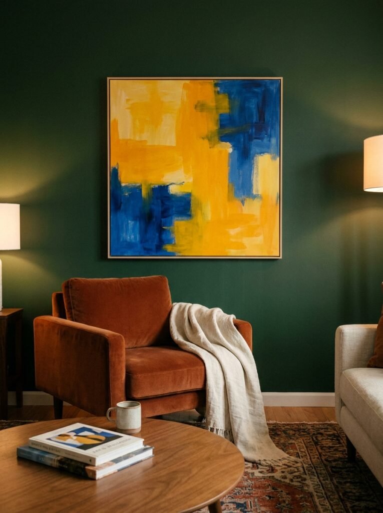
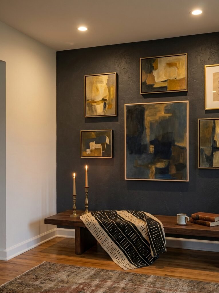
If you’ve got dark walls — and I hope you’ll consider them, because they’re incredible — then the art you hang has to work with that backdrop, not fight it.
Warm metallics are undefeated here. Gold, bronze, antique brass. Against a deep forest green or a moody terracotta wall, a gold-framed print literally glows. The amber from a lamp at 7pm catches the frame edge and the whole wall just… hums.
But don’t sleep on contrast either. Bright white ceramic wall sculptures against a charcoal wall. Cream linen-framed textiles against dark walnut paneling. The contrast creates drama without being aggressive.
And if you’re working with lighter walls — white, cream, warm greige — that’s where really rich art shines. Deep burgundy paintings, indigo-toned photography, prints with that burnt sienna warmth. Let the art bring the color.
—
4. Kente, Ankara, and Textile Art That Isn’t a Cliché
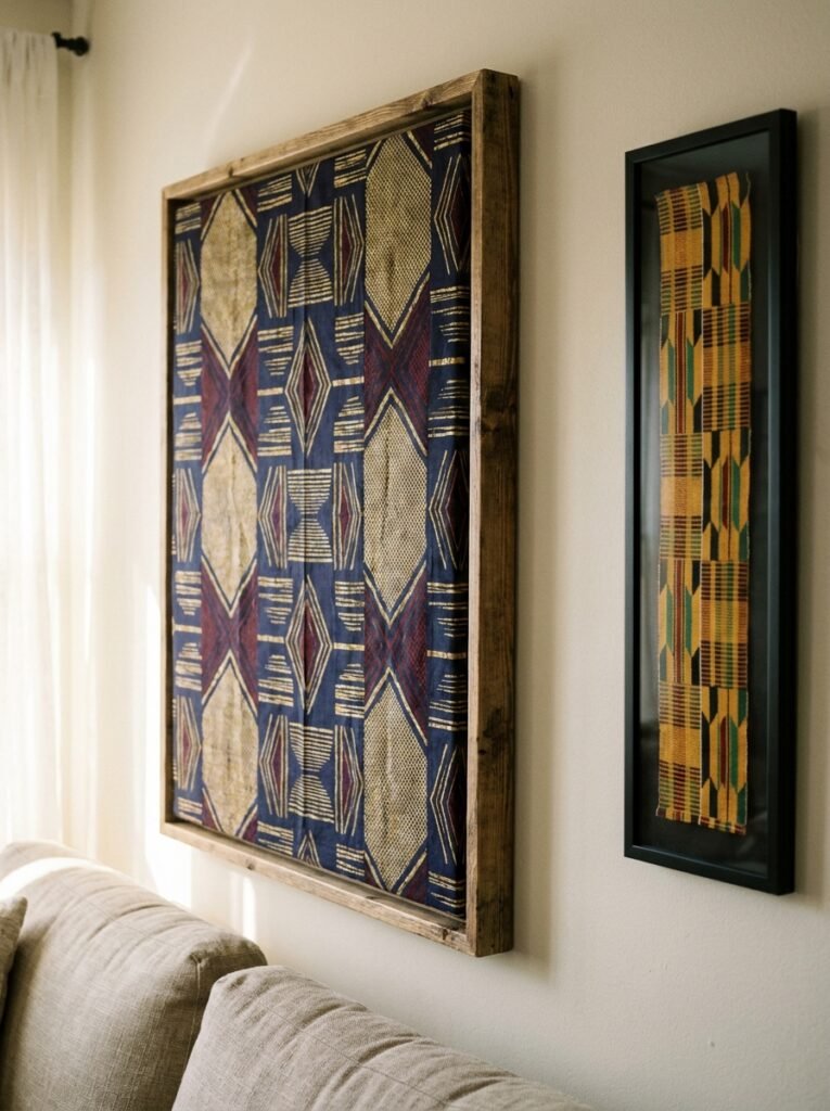
So here’s my potentially spicy take: fabric art belongs on the wall. Full stop.
Not in a “let me nail a kente cloth to the drywall” way. Framed properly, stretched over a canvas, or hung intentionally from a wooden dowel — traditional African textiles become some of the most visually striking wall art you’ll find anywhere.
Ankara prints with their bold geometric patterns are UNREAL when framed in a large format. We’re talking 20×24, maybe bigger. One piece, centered above a sofa. Done. You don’t need ten things on that wall. Just that.
Kente has this incredible optical quality where it catches light differently depending on where you’re standing. Mount a piece near a window and watch what happens in the afternoon. It’s worth every penny.
And look, you don’t have to have roots in West Africa for this to feel right in your home. If it resonates with you, it belongs there. Full stop. The point is choosing things with intention, not just buying whatever the big home stores are pushing this season.
—
5. What a Black Artisan Print Actually Looks Like Up Close

There’s a tactile quality to art made by hand that you genuinely cannot replicate with a mass-produced poster. I want to be specific about this because I think people underestimate it.
When a Black painter or illustrator produces a limited-run print of their work, the color saturation is different. The ink sits differently. The paper has weight. When it’s framed, it looks complete in a way a £3 poster from a big-box shop simply doesn’t.
It’s also just more meaningful to know who made the thing on your wall. You can read their story, their inspiration. Some artists include a small card explaining the work. That card ends up tucked into the frame and becomes part of the piece.
“When you know the story behind the art, you see it differently every time you walk past it.”
Search for Black illustrators, painters, and photographers who sell prints directly. The price point is often surprisingly accessible and you get something genuinely one-of-a-kind. Some of the most jaw-dropping living rooms I’ve seen get their soul from exactly this.
—
6. Mirrors That Do More Than Reflect
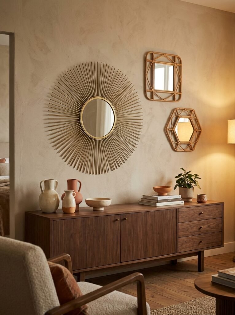
A well-placed mirror is basically architecture you can hang on a wall. It reshapes the room, bounces light, and adds visual depth in a way nothing else does.
In Black living spaces specifically, I’ve seen mirrors used brilliantly in two ways. First, as a statement piece — think a large oval in a hammered gold or aged brass frame, hung where it catches natural light and becomes almost sculptural. Second, as part of a gallery wall where it catches and reflects the other art around it, making everything feel layered and alive.
Arch-top mirrors are having a serious moment and honestly they deserve it. There’s something about that curved top that feels both traditional and completely fresh. Leaned against the wall instead of hung, they take up floor-to-wall space in a way that feels intentional rather than accidental.
Side note — mirrors in darker metal finishes, like black or oil-rubbed bronze, do something really specific in a room with warm lighting. They absorb and reflect simultaneously. Very cool effect, hard to explain until you see it.
—
7. The One-Wall Approach That Always, Always Works
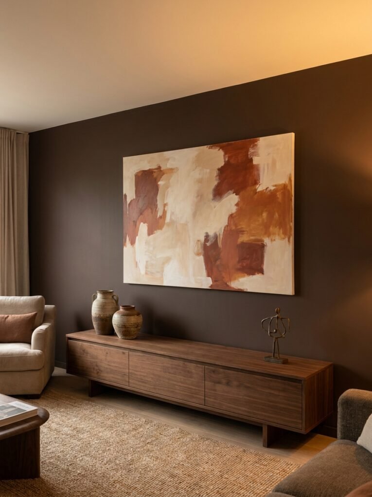
Can I tell you the decorating mistake I see most often? Trying to do too much on every wall.
Pick one wall. Make it extraordinary. Let the others breathe.
In a living room, the anchor wall — usually behind the sofa or facing the main seating area — is where you put everything you’ve got. Large-scale art, a gallery cluster, textile hangings, a mix of mirrors and prints. Whatever your vision is, that’s where it lives.
Every other wall? Minimal. Maybe one small piece. Maybe nothing.
The result is a room that feels intentional instead of chaotic. Focused instead of desperate. And the anchor wall gets the attention it deserves rather than competing with three other walls trying to do the same thing.
—
8. Neon Signs, Murals, and the Case for Going Maximalist
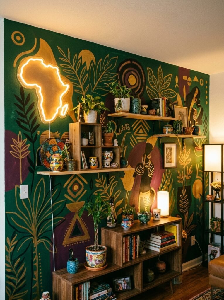
Okay, but — what if you don’t want minimal? What if you want ALL of it?
Valid. Completely valid. Maximalism in Black home decor has a long and gorgeous tradition. Layered, textured, abundant spaces that say “we have so much to celebrate that one wall wasn’t enough.”
Custom neon signs are one of the most personal things you can add to a living room wall. A family surname. A phrase from a song that means something to you. A single word. Against a dark wall, especially a deep navy or forest green, a warm white or golden neon sign creates that hazy, atmospheric glow that photographs absolutely beautifully and looks even better in real life.
Murals are another option that’s become far more accessible. Street artists and muralists do residential work. If one full wall is too much, a corner mural — wrapping from one wall onto an adjacent one — creates a kind of vignette effect that’s genuinely stunning.
Go big if big is in you. Just go with intention.
—
9. How to Hang Things at the Right Height (Without the Measuring Tape Drama)
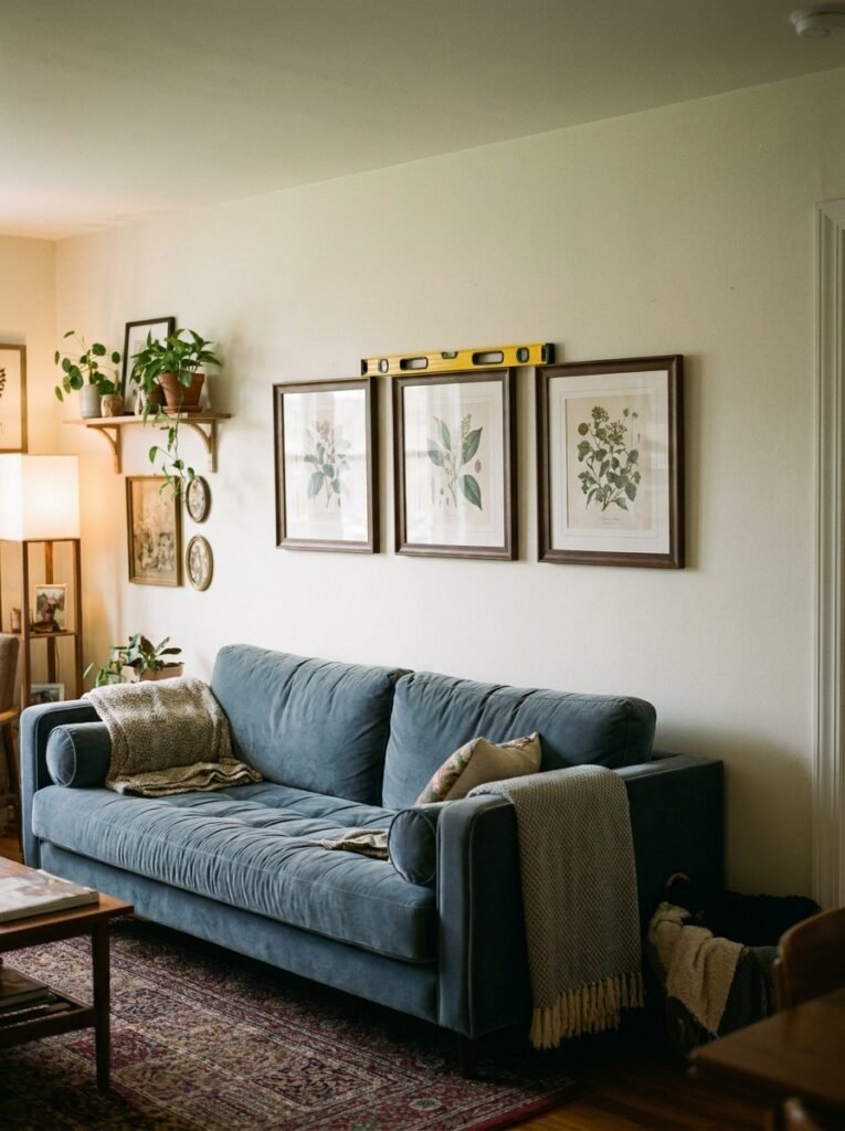
The most common wall decor mistake isn’t about style. It’s about height.
Art hung too high is the #1 thing that makes a room feel “off” without people being able to put their finger on why. The general rule is eye level — roughly 57 to 60 inches from the floor to the center of the piece. That’s not just a design guideline, it’s based on average museum hanging height.
For art above a sofa, you want about 6 to 8 inches of space between the top of the sofa and the bottom of the frame. Any higher and it looks like the art is floating off into the ceiling, disconnected from everything below.
Gallery walls get a bit more flexibility. But your visual center — the imaginary midpoint of the whole arrangement — should still land around that 57-60 inch mark.
One practical thing that actually helps: cut your frames out of kraft paper or newspaper, tape them to the wall, and live with the arrangement for a day before committing. Sounds fussy. Saves a lot of unnecessary holes.
—
10. Plants, Shelves, and the Art of the 3D Wall
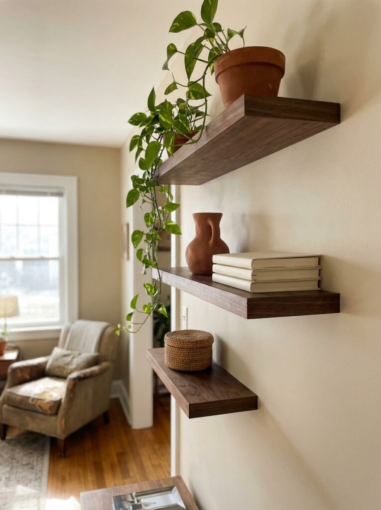
Flat art is incredible. But a wall that has dimension — actual physical depth — does something else entirely.
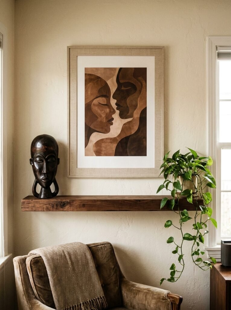
Floating shelves styled with a mix of objects and small art pieces create a kind of vignette that draws people in. On a living room wall, two or three shelves staggered at different heights and lengths become almost a mood board for your life. A small plant trailing over the edge. A framed photo. A ceramic bowl. A book spine-out. None of it matchy-matchy.
Plants specifically — trailing pothos, small ferns in wall-mounted pots, even a dried pampas arrangement — add texture that you can’t get from a print. There’s something about organic material on a wall that makes the whole room feel lived in rather than decorated.
“A wall with a plant on it is a wall that’s breathing.”
If you’re in the UK, the light situation is real — stick to hardy trailing varieties that don’t need direct sun. In the US, most living rooms get enough natural light for low-to-medium light plants to thrive. Either way, a trailing plant on a shelf or in a wall-mounted planter is almost always the right call.
—
11. The Vibe of Black-Owned Ceramics and Sculptural Wall Art
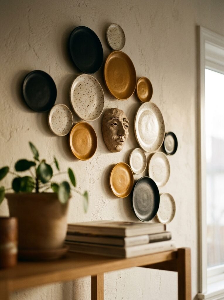
This section is short because the point is simple: sculptural wall art from Black ceramicists and makers is some of the most beautiful stuff you’ll find anywhere.
We’re talking hand-formed ceramic wall discs in matte terracotta and deep espresso glazes. Woven fiber art in natural fibers with rich earthy tones. Cast resin pieces in abstract shapes. These aren’t mass produced. They don’t exist in ten million other homes.
A cluster of three ceramic wall pieces — different sizes, same finish — above a console table is the kind of thing that makes people stop mid-conversation and say “wait, where did you get that?” And the answer can be “directly from the artist.” Which is, honestly, a good feeling.
—
12. Bringing It All Together Without Overthinking It
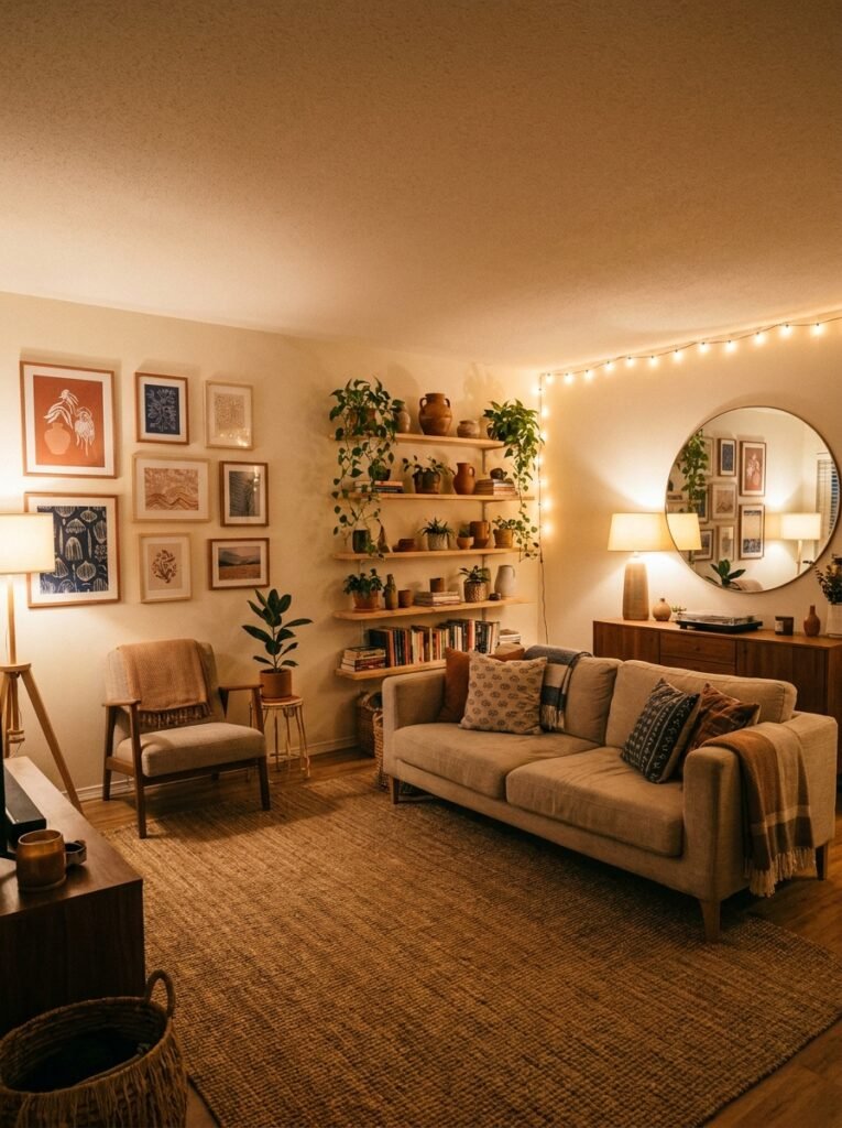
Here’s what I want you to take away from all of this: your living room wall should feel like you. Not like a Pinterest board. Not like the display in a furniture showroom. You.
That means some things will come from artists. Some from markets. Some from your own family photos. Some from a trip you took. The best rooms don’t look like they were styled in a single afternoon. They look like they’ve been collected, slowly, with love and intention, over time.
Don’t wait until you have “the perfect piece” to start. Put something up. Move it around. Add to it. Your wall is allowed to be a work in progress and it’ll probably be more interesting for it.
And if someone tells you your home is “a lot” — that’s almost certainly a compliment.
—
❓ FAQ
Q: How do I make my living room wall look expensive without spending a lot? A: Large-scale art has the biggest impact per dollar. One big piece in a quality frame reads more expensive than five smaller pieces in cheaper frames. Also, consistency in frame finish — even if the frames themselves are budget finds — ties everything together instantly.
Q: What’s the best background wall color for showing off Black art and cultural pieces? A: Deep, warm tones do extraordinary things for this kind of art. Think terracotta, forest green, deep teal, or a warm charcoal. They make colors in the artwork pop and create a sense of richness. If you’re not ready to commit to a full dark wall, even a single accent wall in one of these tones can transform a space.
Q: How do I mix different types of wall decor without it looking cluttered? A: Keep your color palette tight. If your art spans multiple styles and formats, a consistent two or three-color thread running through everything — say, terracotta, gold, and cream — creates cohesion without uniformity. And remember the anchor wall approach: concentrate your most layered styling in one spot, and let other walls be simpler.
—
💭 Final Thoughts
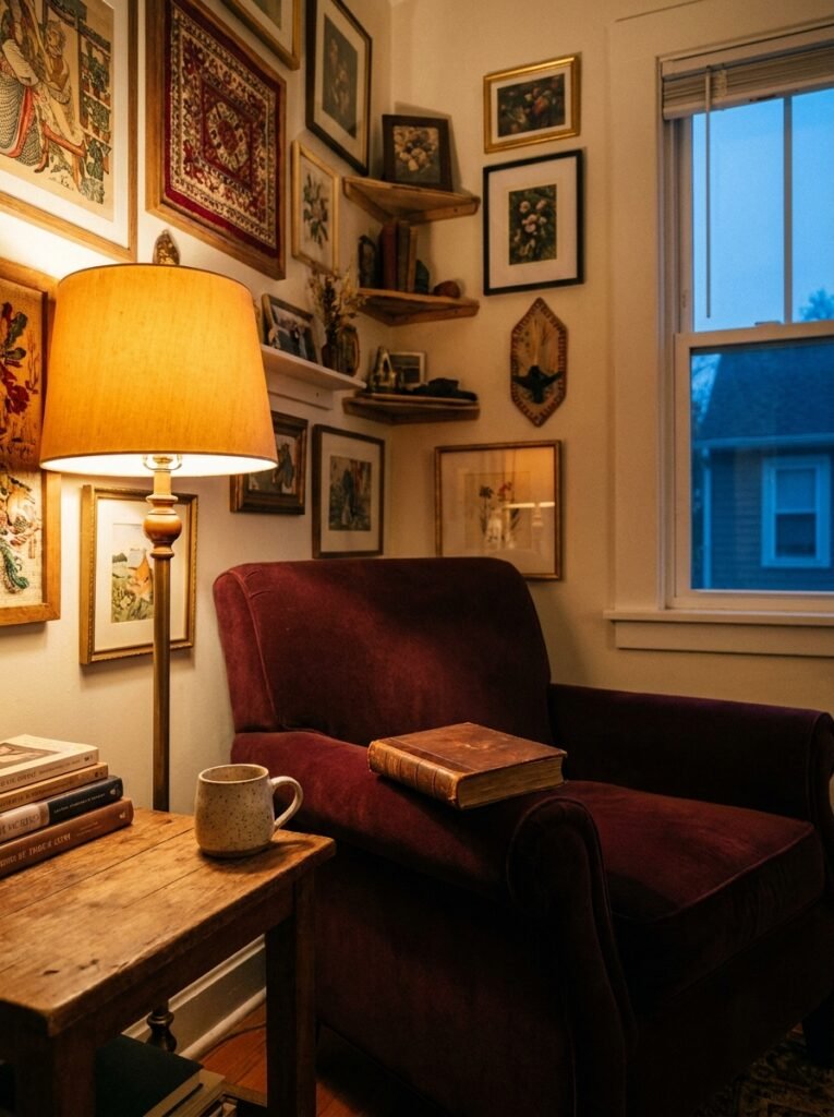
Your walls are one of the most personal things about your home. They hold your history, your aesthetic, your identity. That’s worth spending time on — and worth spending money on, selectively and thoughtfully.
The homes that stop you in your tracks aren’t perfect. They’re personal. There’s a difference and it matters more than any design rule I’ve mentioned here.
So what does YOUR wall need next?




