
Small Living Room Walls That Actually Look Intentional (Not Desperate)
My friend stood in her flat last spring, arms crossed, staring at a blank wall above her sofa like it had personally offended her. “I don’t know,” she said, “everything I put up just looks… random.” And honestly? I knew exactly what she meant.
Small room walls are HARD. They want to feel full but not suffocating. Personal but not chaotic. And the advice out there is almost always written for people with 12-foot ceilings and a spare afternoon to haul furniture around.
This is for everyone else.
—
1. The Reason Your Wall Looks “Off” Has Nothing To Do With What You Hung
It’s the placement. Almost always.
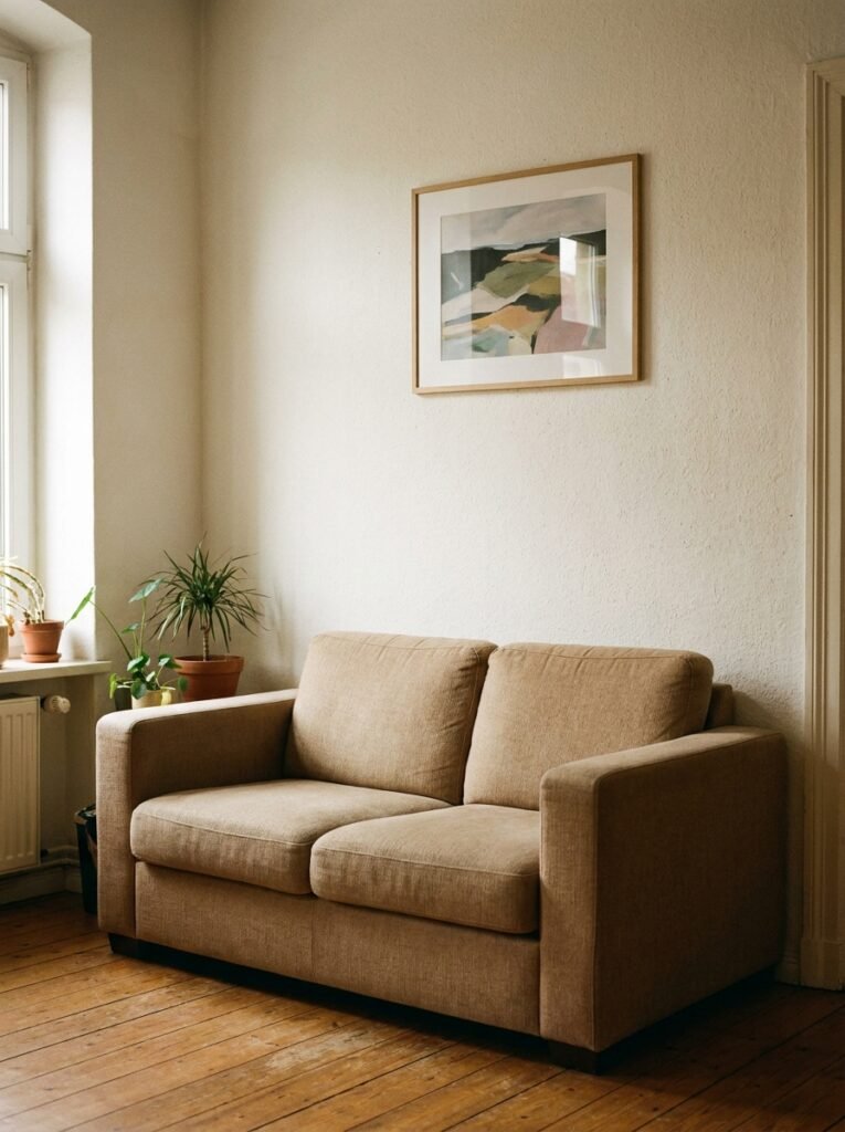
Most people hang things at eye level, which sounds right, until you realize that eye level standing up is completely different from eye level when you’re sunk into a sofa. Pieces end up floating six inches above the back cushions, disconnected from everything below them, and the wall just looks… disjointed.
The rule I swear by: hang art so the center of the piece sits roughly 57–60 inches from the floor. But in a small living room, you can actually go a few inches lower because you’re almost always seated. Try 54 inches. The artwork pulls into the room instead of hovering above it, and suddenly it feels like a decision someone made on PURPOSE.
“The difference between a wall that looks styled and one that looks random is almost never about what you bought — it’s about where you put it.”
Side note — this is also why you should mock things up with paper on the wall before committing. Tape a newspaper cutout to the wall. Live with it for a day. I know it sounds fussy but it genuinely changes everything.
—
2. One Big Piece Will Always Beat Six Small Ones (Unpopular Opinion, But I Stand By It)
Everyone tries to fill a small wall with a collection of little frames. And I get it — it feels safer, more flexible, more “gallery wall Pinterest aesthetic.” But those collections almost always make a small room feel MORE cluttered, not less.
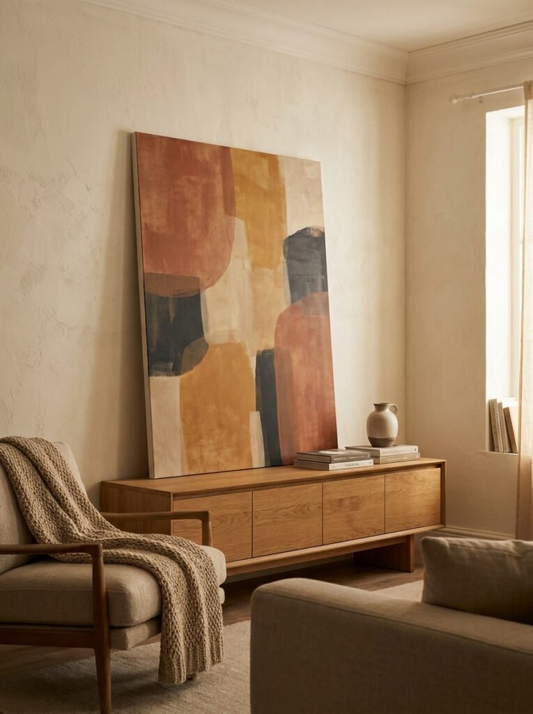
One oversized piece of art on a small wall does something almost magical. It gives the eye a place to land and REST. The room feels curated. Intentional. Weirdly bigger, even.
This doesn’t mean expensive. A single large print, a vintage textile, a bold abstract canvas — any of these, hung alone, makes more of a statement than fifteen little frames fighting for attention. The mistake is thinking that covering more wall space with more objects makes the wall feel “done.” It usually just makes it feel crowded.
Go big. One thing. Trust it.
—
3. The Color That Keeps Showing Up on Every Cozy Small Living Room Wall Right Now
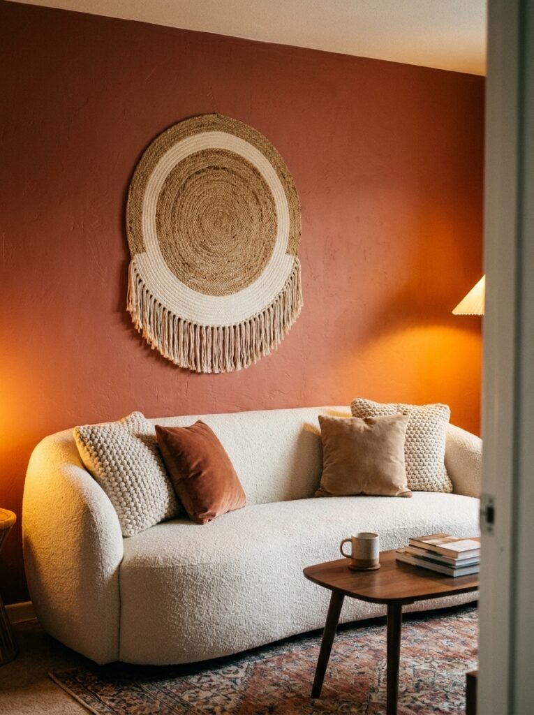
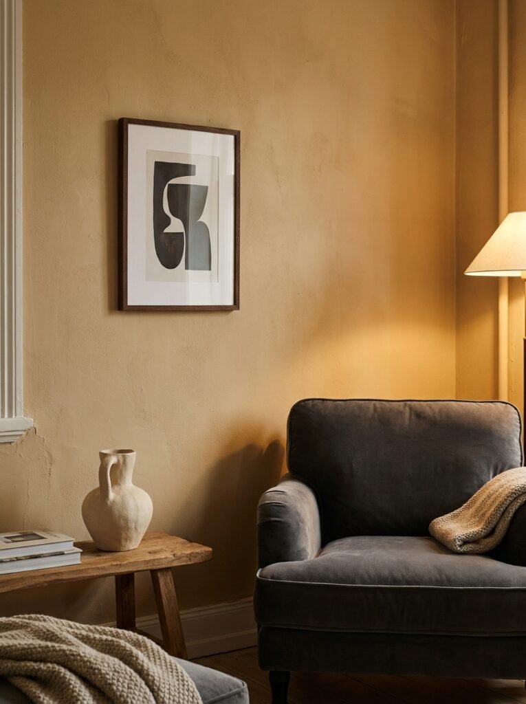
Warm white isn’t it anymore. Not cold grey either, obviously — we’ve all moved on from that. What’s actually working in smaller living rooms in 2024 and into 2025 is something called an “off-off-white” — creamy, slightly clay-toned, with just enough warmth to glow in lamplight without reading as yellow in photographs.
It sounds boring. It isn’t.
That barely-there warm tone does something to a small room that brighter whites completely fail at — it blurs the edges. The corners feel less sharp. The room feels like it exhales.
Pair it with dark wood frames, a little brass, some deep green botanicals, and you’ve got a wall situation that looks like someone spent a lot of money and effort, when really the paint did most of the heavy lifting. I’ve recommended this to probably six different people now and every single one of them texted me afterwards with some version of “okay you were right.”
—
4. Why a Single Shelf Beats a Gallery Wall When You’re Working With Limited Space
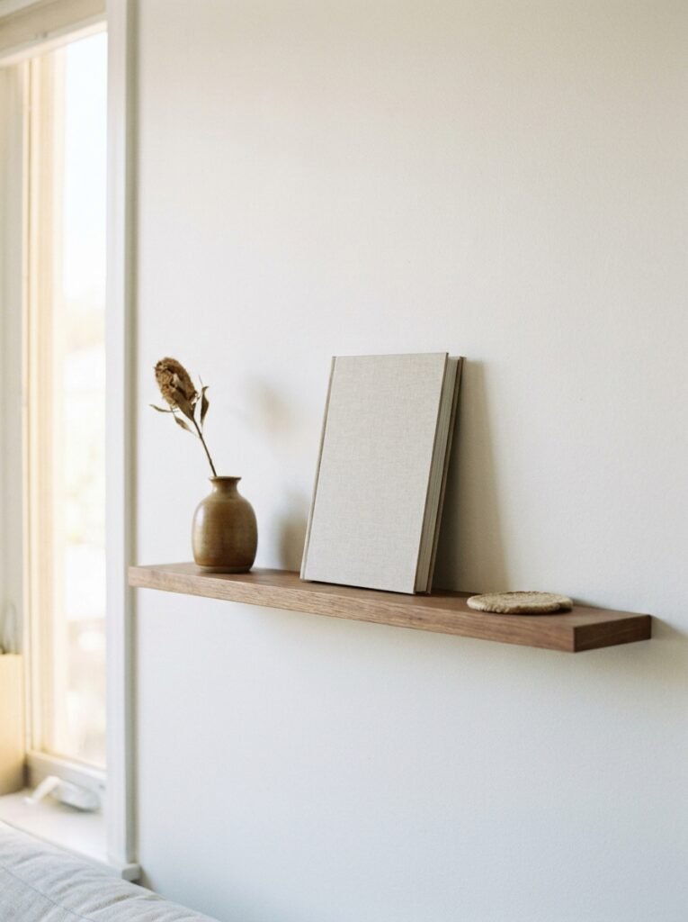
Gallery walls are gorgeous. I’m not anti-gallery-wall. But in a truly small living room, they often read as visual noise, especially if the room already has a lot going on with furniture, rugs, and accessories.
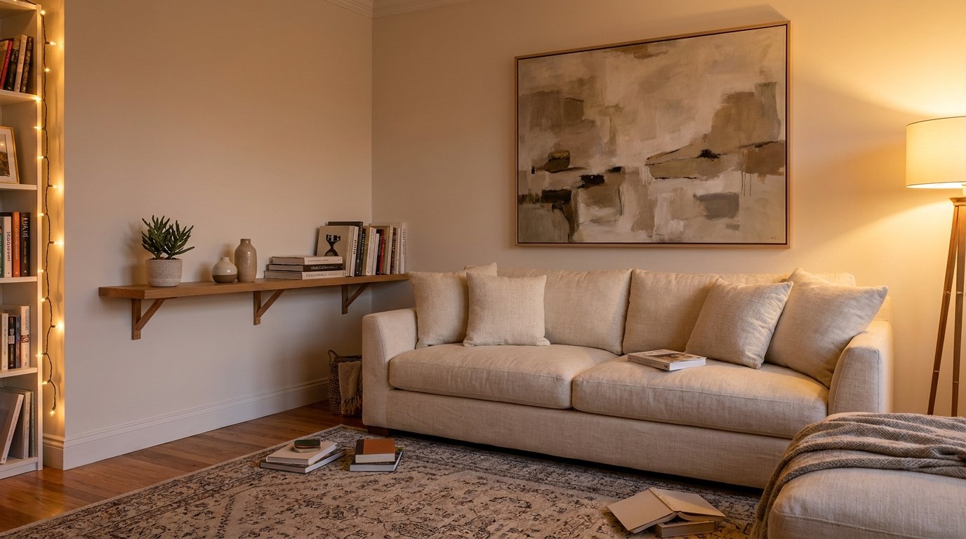
A single floating shelf — low-profile, maybe 24 to 36 inches wide — changes the whole dynamic. You can style it, restyle it, swap things out seasonally without touching a single nail hole. Stack a small framed print against the wall behind it. Add a trailing plant, a couple of small objects, maybe a short stack of books. Done.
It’s sculptural without being overwhelming. And in a small space, anything that lets you LAYER without adding visual weight to the flat wall surface is a win.
“A shelf isn’t just storage — in a small room, it’s the difference between a wall that breathes and one that screams.”
The other thing nobody talks about: shelves draw the eye HORIZONTALLY, which makes narrow rooms feel wider. Not a lot, but enough to notice.
—
5. The One Rule That Makes Any Tiny Room Feel Intentional
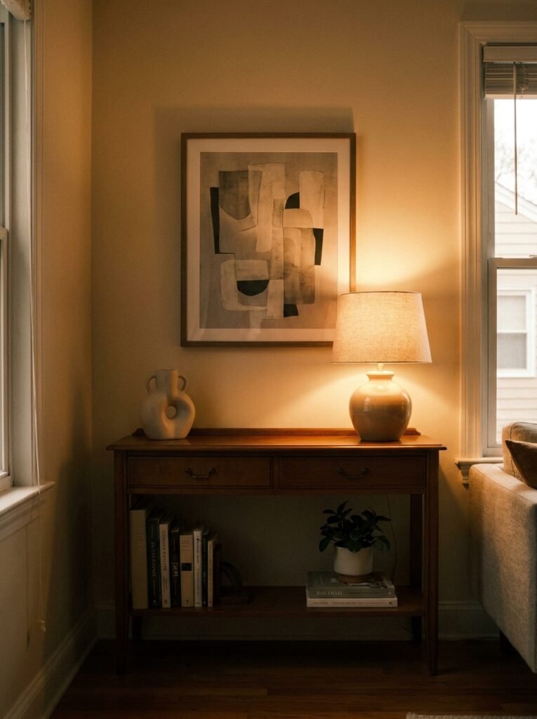
Repeat something. Anything. A color, a shape, a material. Just pick one thing and make sure it shows up at least twice on your wall or in your wall arrangement.
If your main art piece has a terracotta tone in it, add a small terracotta pot to the shelf below. If you’ve got a round mirror, hang a round wreath nearby or place a circular tray on the console beneath it. The repetition creates a visual conversation, and that sense of conversation is exactly what makes a space feel designed rather than accumulated.
It doesn’t take much. Honestly, sometimes it takes nothing more than moving something from one side of the room to the wall area and suddenly everything clicks.
Small rooms don’t need more. They need coherence.
—
6. Mirrors That Actually Earn Their Place (Not Just the Cliché “They Make Rooms Bigger” Version)
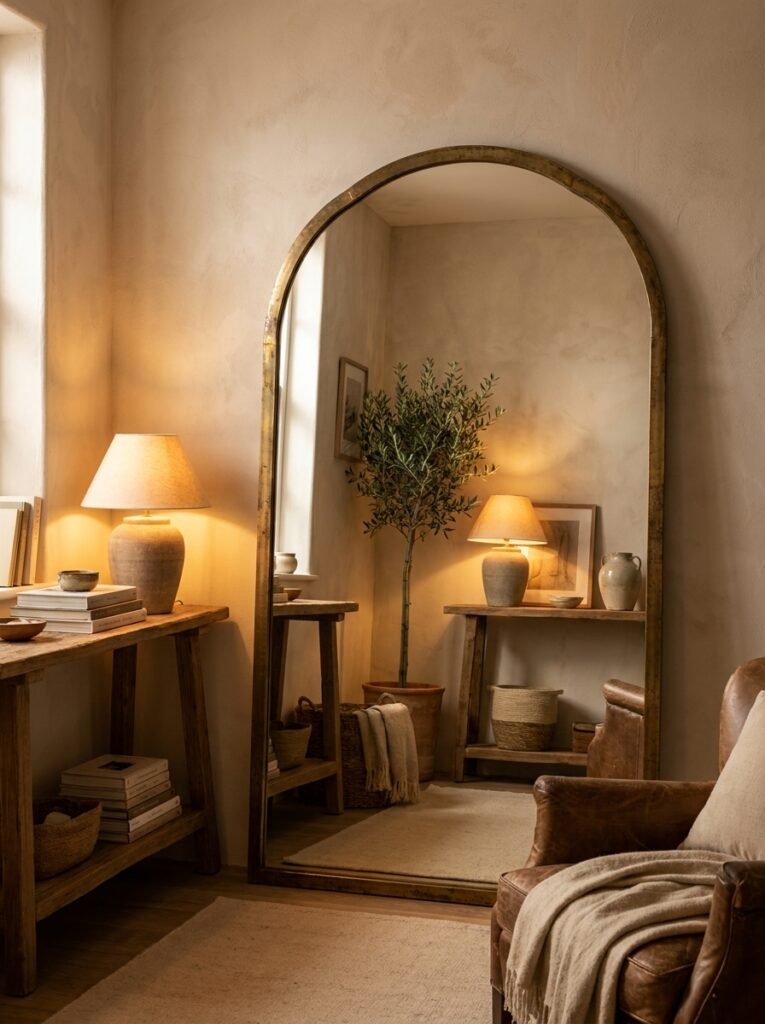
Yes, mirrors make a room feel bigger. We all know. But the WAY you use them matters enormously in a small living room.
A mirror hung directly opposite a dark corner just reflects the dark corner back at you. Not helpful. But a mirror hung where it catches the light from a window — or even just from a floor lamp — reflects warmth back into the room and genuinely feels like an extra light source.
Shape matters here too. Arched mirrors are everywhere right now and I understand why — the soft curve does something a square mirror simply doesn’t. It adds architecture. In a boxy, small living room, that arch creates a kind of visual breathing room that feels almost illogical but works every time.
One leaned casually against the wall rather than hung is also worth considering. It feels intentional without looking fussy, and it’s easy to move if you want to experiment.
—
7. Vertical Lines Are Quietly the Smartest Trick in a Low-Ceilinged Small Room
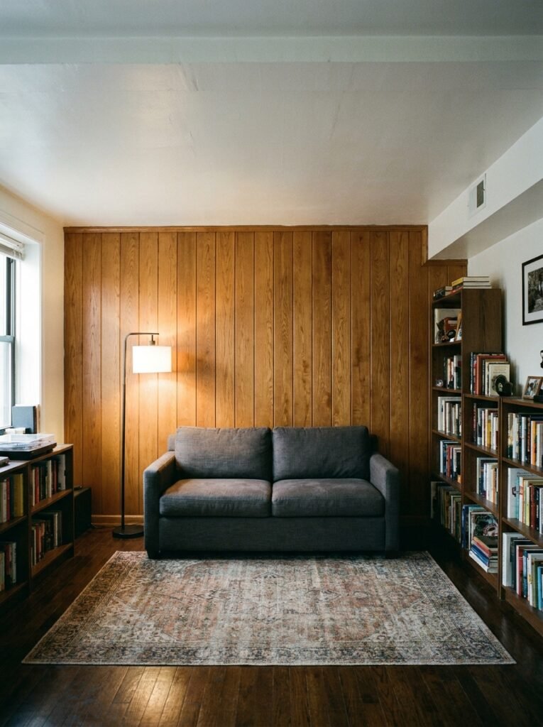
Low ceilings make small rooms feel compressed. The fix isn’t always about the ceiling itself — it’s about training the eye to travel UPWARD before it gets to the ceiling.
Tall, narrow frames do this. A pair of long vertical prints hung side by side. Even a tall, slender plant in the corner near the wall — something like a snake plant or a single-stem dried palm frond in a floor vase. The eye follows the vertical line up and perceives more height than is actually there.
Wallpaper with a vertical stripe (even very subtle) on a feature wall does the same thing. And in a rental where you can’t paint or wallpaper, removable wallpaper has genuinely gotten good enough to be worth considering — not just as a “fake it” solution but as an actual design choice.
—
8. The Texture Trick That Makes a Blank Wall Feel Expensive Without Filling It With Stuff
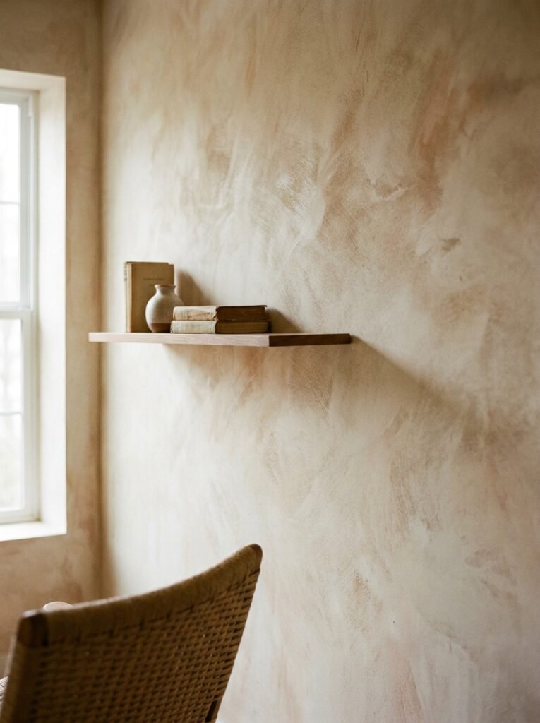
This one took me ages to figure out. A bare wall in a small room doesn’t always need art. Sometimes what it needs is TEXTURE.
A large woven wall hanging — something with actual physical depth, not just a flat print — adds dimension to a wall without crowding it visually. The shadows it creates as the light shifts through the day make the wall feel alive in a way flat art can’t replicate.
Same goes for a single piece of macramé, a wooden wall sculpture, or even a large piece of driftwood mounted simply on two small hooks. These things read as art but behave differently — they’re three-dimensional, they interact with light, and they make a small room feel considered in a way that a second-hand poster framed in black just… doesn’t.
Not more expensive necessarily. Just different in how they land.
—
9. How to Do a Gallery Wall in a Small Room Without It Looking Like a Yard Sale
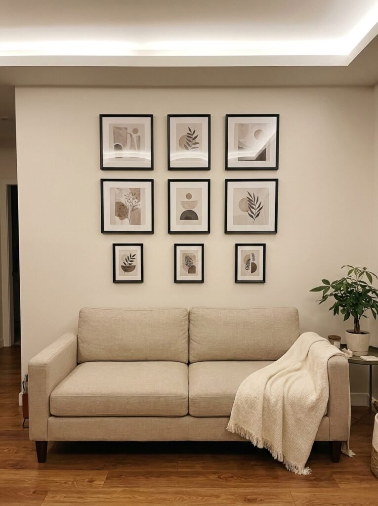
Okay, so I said one big piece beats a gallery wall. That’s still true. But sometimes you HAVE a collection of smaller pieces and you want to use them. Here’s how to make it work.
Keep it tight. Literally — the spacing between frames in a small room should be 2 inches, maybe 2.5. Not 4, not 6. Small gaps create a cohesive UNIT that reads as one large piece rather than a scattered collection.
Stick to one frame color. Or at most two that are in the same family (think all warm metals, or all dark wood, not a mix of black, white, gold, and natural pine). The frame consistency gives the eye a way to read the arrangement as a whole.
And make the arrangement wider than it is tall. A landscape-oriented gallery wall in a small room stays in proportion with the furniture below it and doesn’t compete with the ceiling height.
“Two-inch gaps, one frame color, and a landscape layout. That’s the whole cheat sheet for gallery walls in small rooms.”
—
10. The Console Table + Wall Art Pairing That Makes a Small Entryway Living Room Feel Like a Whole Moment
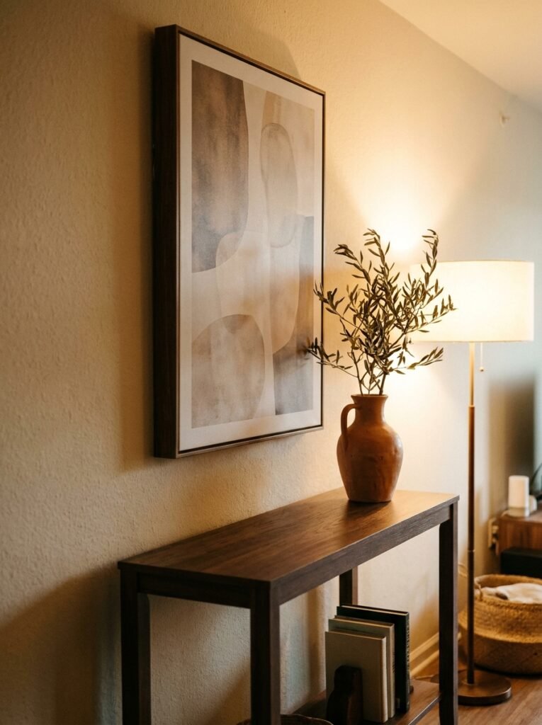
If your living room doubles as your entry — which in a small flat or house it very often does — the wall by the door is doing A LOT of work.
One tall piece of art above a slim console table, with a small lamp on one end and one simple object on the other (a bowl, a small plant, a stack of three books), makes that wall feel like an actual vignette instead of a dumping ground.
The lamp is the secret ingredient. Lit in the evening, it turns an ordinary wall arrangement into something atmospheric. The amber glow from even a small table lamp changes the entire mood of the art above it — shadows, warmth, depth. Suddenly a £20 print looks like something you found at an auction.
Good lighting makes average art look great. That’s not an exaggeration.
—
11. Why Dark Walls Actually Work Better in Small Living Rooms Than You’ve Been Told
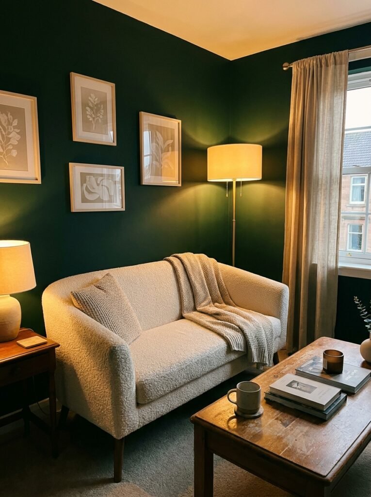
Here’s the counterintuitive one. Everyone says keep small rooms light. And for most surfaces, sure. But a dark feature wall — a deep charcoal, a moody forest green, a rich navy — can make a small living room feel more intimate and MORE spacious simultaneously.
The logic: when a wall recedes visually, the boundary of the room becomes harder to perceive clearly. Dark walls blur the edges of a small space in a way that light walls can’t. You’re not seeing the wall so much as you’re seeing into a depth that isn’t there.
Art pops against it. Warm lighting glows. And the room suddenly feels like somewhere you’d actually want to spend an evening instead of a box you’re just tolerating.
I’d never put this color on all four walls. But one? Especially the wall with the sofa in front of it? Life-changing, not gonna lie.
—
12. The Final Layer — Why Small Living Room Walls Need Something Alive on Them
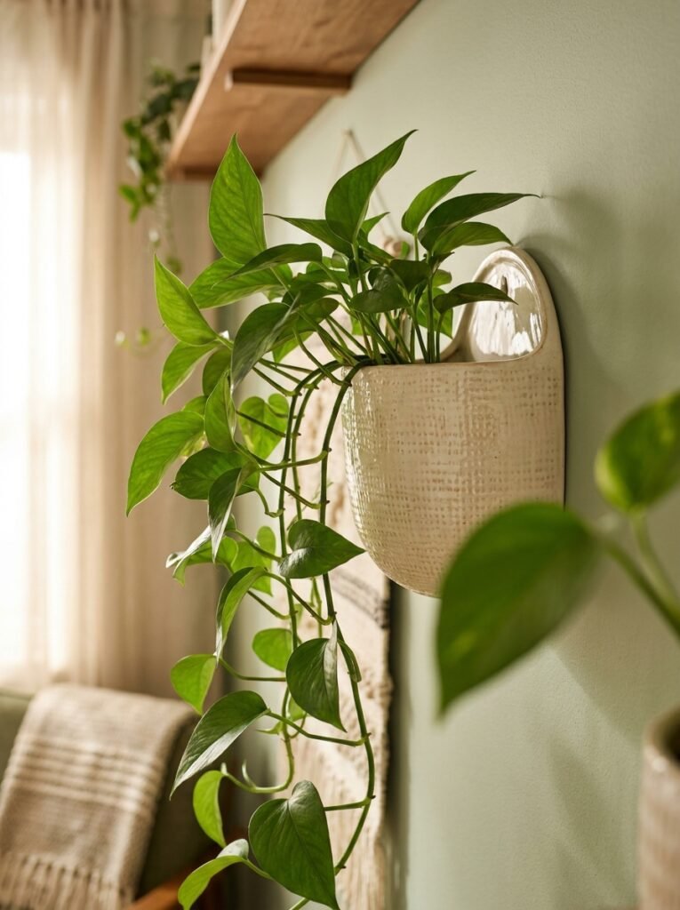
This is the thing that ties it all together and also the thing people skip most often because it sounds fussy.
Something alive. Or near-alive.
A trailing plant on a high shelf that drapes down the wall. A small framed botanical print with a real dried stem propped in front of it. A single sprig of eucalyptus tucked behind a hanging frame. Whatever it is, the organic element softens a wall in a way that no amount of art or mirrors can replicate.
Small living rooms can feel hard-edged and boxy. A little bit of green, a little bit of something that grew somewhere, and suddenly the room has texture and life and warmth that a styled-to-death wall just doesn’t have.
It doesn’t have to be much. It just has to be something.
—
❓ FAQ
Q: How many pieces of art should I hang in a small living room? A: Fewer than you think. One large piece almost always works better than several smaller ones in a tight space. If you do want a gallery wall, keep it contained to one wall and treat it as a single unit — tight spacing, consistent frames — rather than spreading art across the whole room.
Q: What size art should I use above a sofa in a small room? A: The art or arrangement should span roughly two-thirds the length of your sofa. So if your sofa is 84 inches wide, you’re looking for a piece (or grouping) that’s roughly 55–60 inches across. Going narrower makes it look like an afterthought; going wider can overwhelm. Two-thirds is the sweet spot almost every time.
Q: Can I use wallpaper in a rented flat or home? A: Removable peel-and-stick wallpaper has genuinely improved — it’s not the sad, bubbly stuff it used to be. For a small feature wall in a rented space, it’s absolutely worth considering. Just test a small patch first and follow the removal instructions carefully when you leave.
—
💭 Final Thoughts
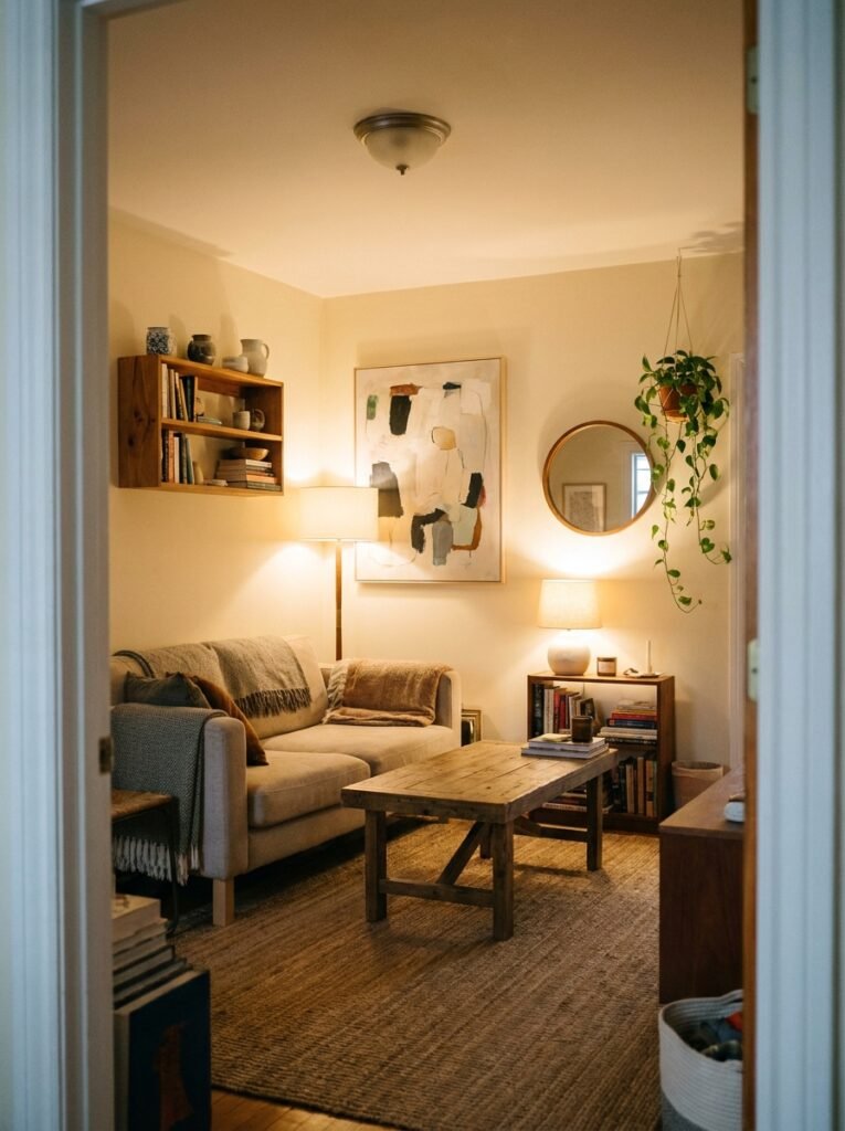
Small living room walls don’t need more on them. They need the RIGHT things, in the right places, doing the right jobs. One strong piece of art hung three inches lower than feels natural. A shelf with a trailing plant. A lamp that makes everything glow at 7pm. That’s usually enough.
The rooms that feel the most beautiful in person — not just in photos — are almost always the ones where something got taken away, not added.
What’s the one thing on your living room wall you’ve been meaning to deal with for months?




