
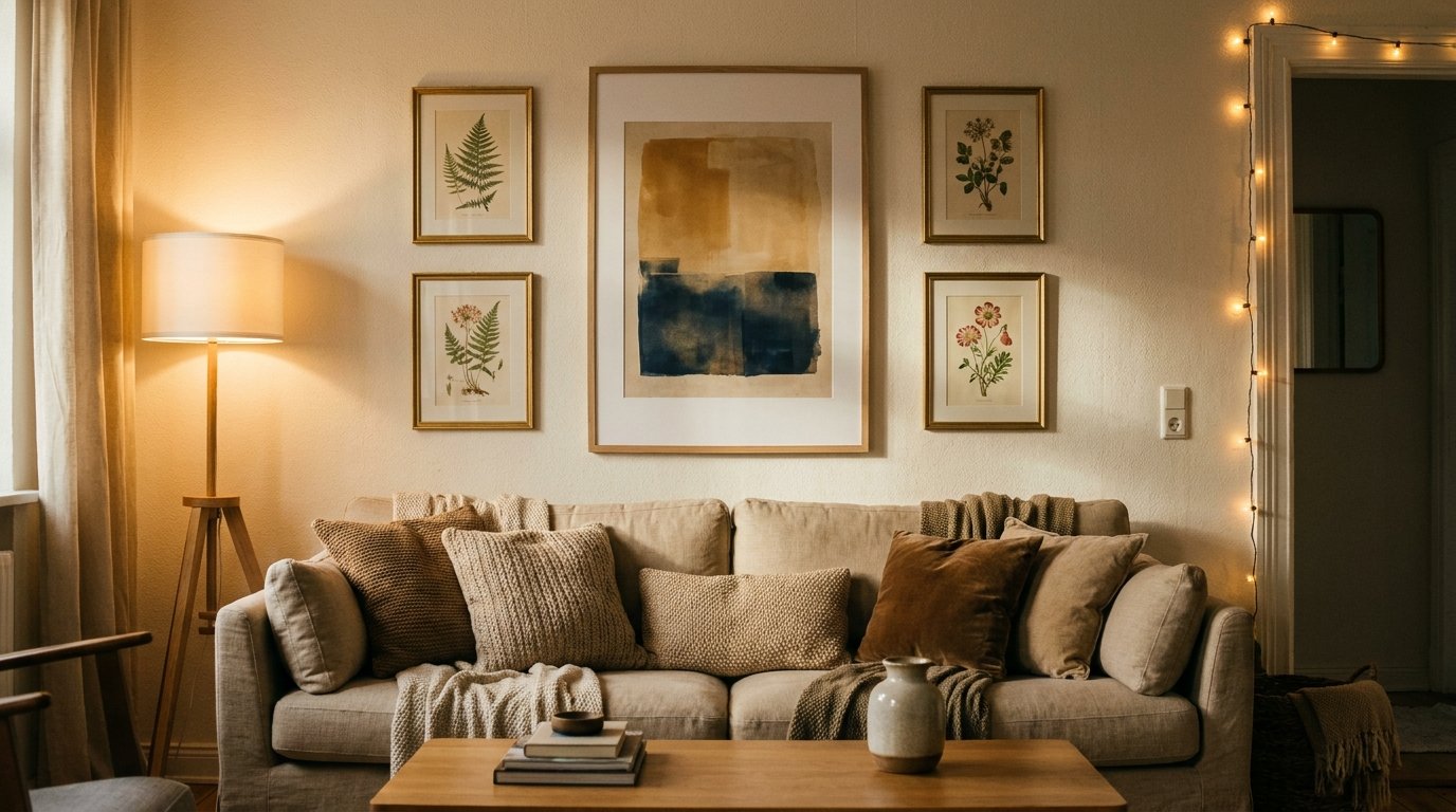
Living Room Walls That Actually Look Like You Live There (Not a Showroom)
My friend walked into her freshly painted living room, looked at the blank wall above her sofa, and said, “So… now what?” She’d spent three weekends choosing the perfect greige. Nailed it. And then just. Stood there.
That wall had become the problem.
—
1. Why the “Big Sofa Wall” Is the One Everyone Gets Wrong
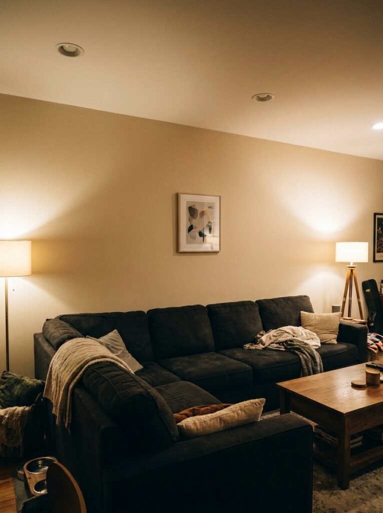
It’s the most important wall in the room and somehow the one that defeats the most people. I’ve seen it a hundred times — gorgeous furniture, lovely rug, and then one sad canvas print from a discount homeware shop centered over the sofa like a postage stamp on an envelope.
The issue isn’t style. It’s scale. Most people go too small and then hang it too high, which makes the whole wall look like it’s floating away from the furniture. The furniture and the wall need to feel like they’re in a conversation with each other. That means art that fills at least two-thirds the width of your sofa, or a gallery arrangement that does the same job collectively.
Here’s what actually works: before you put a single nail in, cut out kraft paper or newspaper to the exact size of what you’re planning to hang. Tape it up. Live with it for a day. You’ll immediately see whether you’re thinking too small.
And yes, you’ll probably go bigger than you thought.
“The furniture and the wall need to feel like they’re in a conversation with each other.”
—
2. The Gallery Wall Formula That Doesn’t Look Like Every Other Gallery Wall
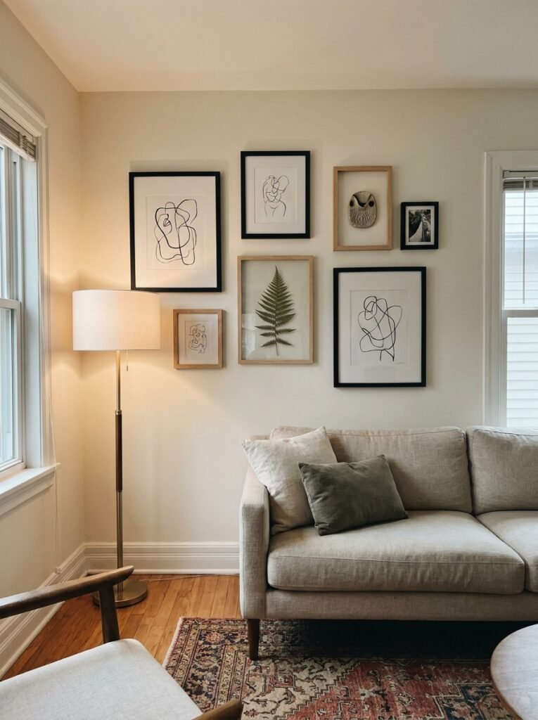
Gallery walls have a bit of a reputation right now, don’t they. Some people love them, some people are deeply tired of them, and honestly? The ones that look bad are all following the same formula — identical thin black frames, evenly spaced, one from every fast-fashion homeware chain in existence.
But a gallery wall done with actual intention is still one of the most beautiful things you can do to a living room. The trick is mixing frame depths and materials. A chunky wooden frame next to a thin brass one next to something unframed with a mat — that variation is what makes it look collected rather than assembled.
Don’t plan it too rigidly on paper. Lay everything on the floor first, photograph it from a few feet away, then start hanging loosely. Leave room to shift things. Some of the best gallery walls I’ve ever seen were slightly asymmetrical in a way that felt totally deliberate even though the owner swore it was just where the nail was.
Mix in objects, not just art. A small shelf with a single object. A dried botanical. A ceramic plate. These break the flatness and give the eye somewhere interesting to land.
—
3. The Color That Keeps Showing Up in Every Beautiful Living Room Right Now
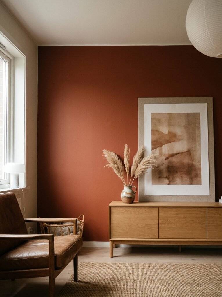
Deep, warm terracotta. Dusty sage. And — this one surprised me — a sort of muted, almost-brown burgundy that looks incredible in low evening light.
I’m not talking about painting a whole room these colors necessarily, though if you want to, go for it. I mean as the dominant tones in the art and objects you hang. Because here’s the thing about art color and room color: they don’t have to match, but they do have to talk to each other.
If your living room is a neutral — the creamy whites, the warm greiges, the soft greys — you actually have so much freedom. Almost any warm-toned art will feel at home. But if your room already has strong color, that’s when you need to slow down and think about what the wall art is adding versus competing with.
One approach I really love: pick up a color from somewhere unexpected in the room — the binding of a book on the shelf, the terracotta pot in the corner — and echo it in a print or textile on the wall. It’s subtle. But it’s the difference between a room that feels designed and one that just feels decorated.
—
4. Hanging Textiles Like You Mean It (Not Like a Dorm Room)
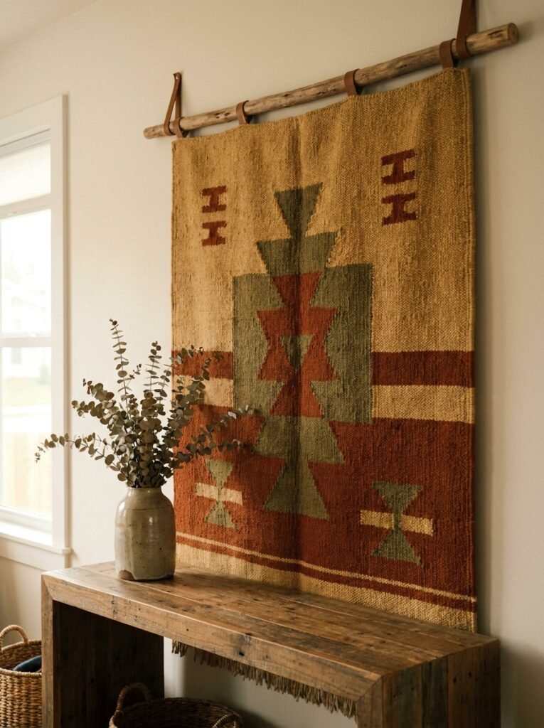
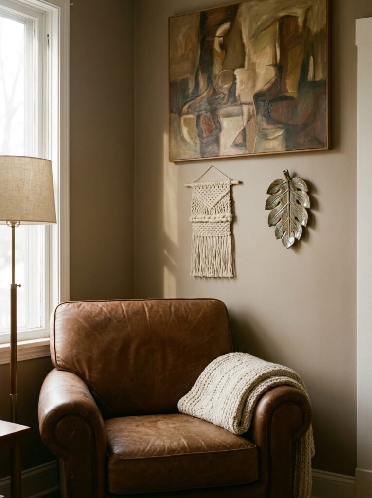
A woven wall hanging or a piece of fabric art can be genuinely stunning in a living room — or it can look like it’s drying out after a wash. The difference is almost entirely in how it’s hung and where it sits in the room.
Macramé and woven textiles work best as a solo statement rather than mixed into a gallery. Give them breathing room. They’re already busy — interesting texture, natural color, organic shape — they don’t need competition, they need space to be the thing you look at.
For fabric art and tapestries, the framing matters enormously. A quality wooden dowel, some simple leather ties — that’s it. Clean, intentional, done. Avoid the over-engineered hanging kits that come with cheap clips all along the bottom. They pull the eye wrong.
Height tip: these almost always look best when the bottom edge hits roughly at eye level or just below. People hang textiles too high all the time. Something about the woven texture reads better when it’s closer to you.
—
5. The One Rule That Makes Any Tiny Living Room Wall Feel Intentional
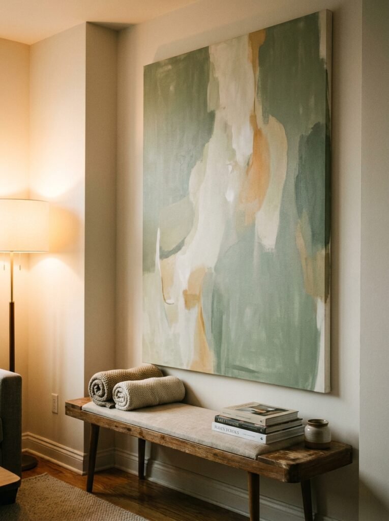
One big thing beats five small things. Every single time.
I know it feels counterintuitive in a small space — you think one large piece will overwhelm the room. But actually, it anchors it. Several small pieces scattered across a small wall make the whole room feel choppy and a bit anxious. One confident piece — properly scaled, properly hung — makes the room feel like it knows what it’s doing.
This is especially true in UK terraced houses and American apartments where the living room wall space is limited. Go big on the one thing that matters most. Leave the other walls simpler.
“One confident piece — properly scaled, properly hung — makes the room feel like it knows what it’s doing.”
—
6. Shelves That Are Actually Worth Looking At
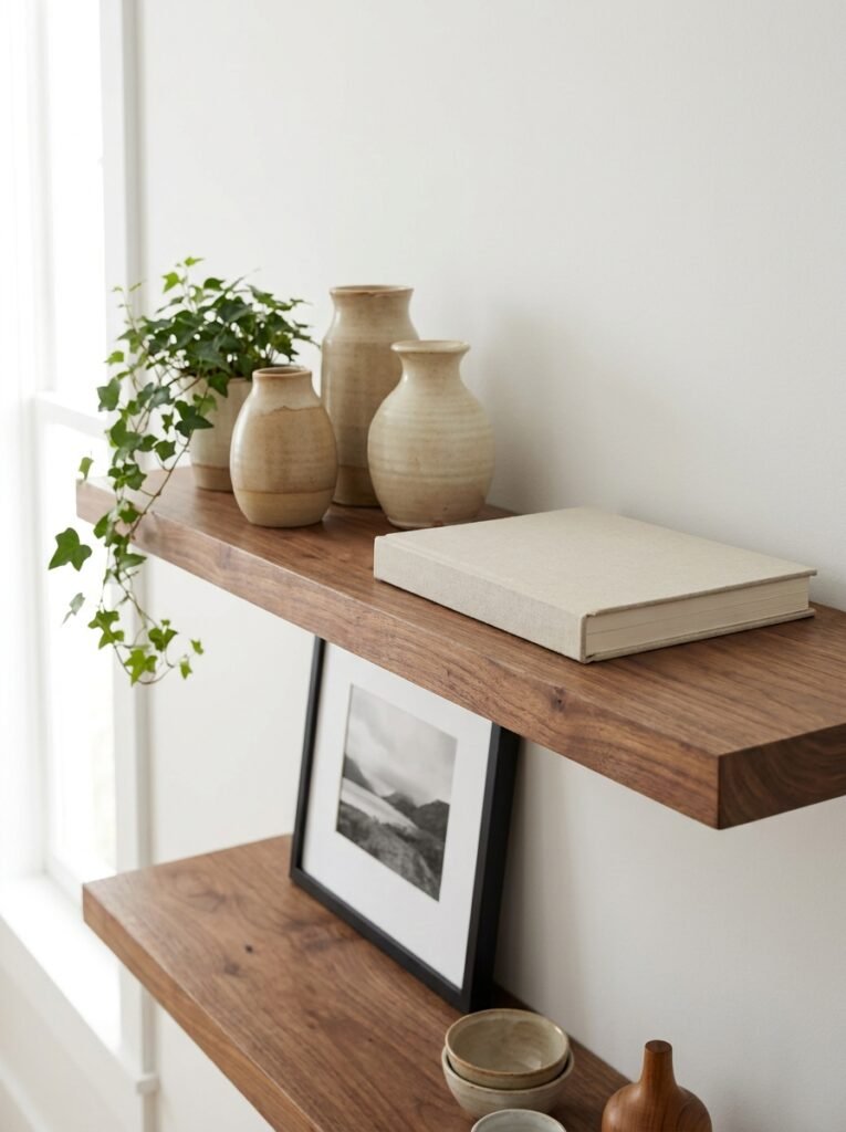
Floating shelves on a living room wall are either a triumph or a catastrophe and there’s rarely an in-between. The catastrophe version: a row of evenly spaced shelves, each one crammed with things that don’t relate to each other, no breathing room, no variation in height.
The triumph version? It’s all about restraint and layering.
A good shelf arrangement follows a rough rule of thirds — about a third “stuff,” a third negative space, and a third layered with things slightly in front of other things. A framed print leaning against the wall behind a small plant in front of a stack of books — that’s layering. That depth is what makes a shelf look styled rather than just full.
Object height variation matters too. Don’t line everything up at the same height. Something tall, something short, a horizontal element like a book lying flat. Your eye needs somewhere to travel.
And honestly, the bravest thing you can do is edit it down more than feels comfortable. Whatever you have on your shelf right now, try removing 30% of it. Leave some gaps. See how it feels. You might not add everything back.
—
7. Mirrors: Hung Wrong More Often Than Almost Anything Else
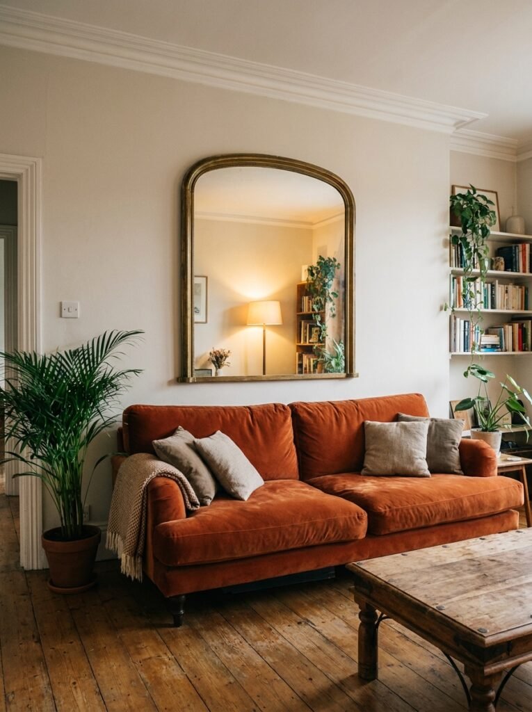
Okay, mirrors. I have strong feelings about mirrors.
They’re one of the most useful things you can put on a living room wall — they bounce light, add depth, can make a small room feel less like a shoebox — but they’re hung wrong more often than almost anything else in home decor.
The most common mistake: hanging a mirror so it reflects the ceiling. Which happens when it’s hung too high. You get up there and all you see is light fixture and plaster. The mirror should reflect something beautiful — another part of the room, a window, the light from a lamp, a plant. Think about what the mirror will actually show you before you commit to where it goes.
In terms of style: an ornate gilded frame in a minimal room looks intentionally unexpected and I love it. A plain mirror in an already-busy room disappears appropriately. What doesn’t work is an ornate mirror in an already-ornate room — at some point it’s just noise.
One underrated move is a cluster of three small mirrors at different heights and angles instead of one large one. Not symmetrically arranged. Slightly scattered, like they landed there. It’s quirkier and it catches light from multiple angles, which is quietly magical at evening time.
—
8. What Actually Happens When You Lean Art Instead of Hanging It
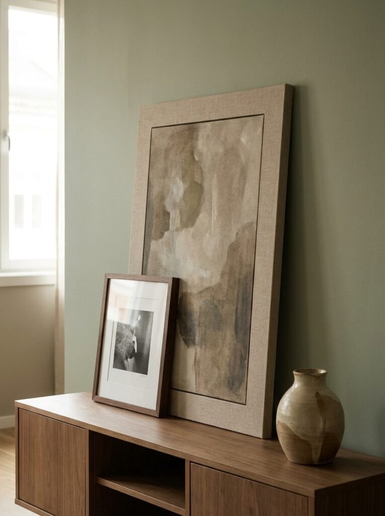
You’ve seen this — art leaned against a wall, sometimes stacked two or three deep, maybe a mix of framed prints and unframed canvases, possibly a mirror in there too. It looks incredibly nonchalant and effortless.
It kind of is, actually. That’s the appeal.
Leaning works especially well in rooms that already have strong architectural character — exposed brick, paneling, a grand Victorian fireplace. The casual lean pushes back against the formality of the space in a way that feels lived-in. On a totally plain white wall, it can look slightly unfinished rather than intentional. Context matters.
The practical thing to know: lean things on a proper surface, not just drywall at skirting board level. A deep shelf, a picture rail, a chunky mantelpiece. You want the art slightly raised so it doesn’t look like it was just abandoned there. Two or three pieces overlapping slightly at the base looks best. One lonely canvas at a slight tilt just looks like it fell.
—
9. The Fireplace Wall — Why Most People Underuse What They Already Have
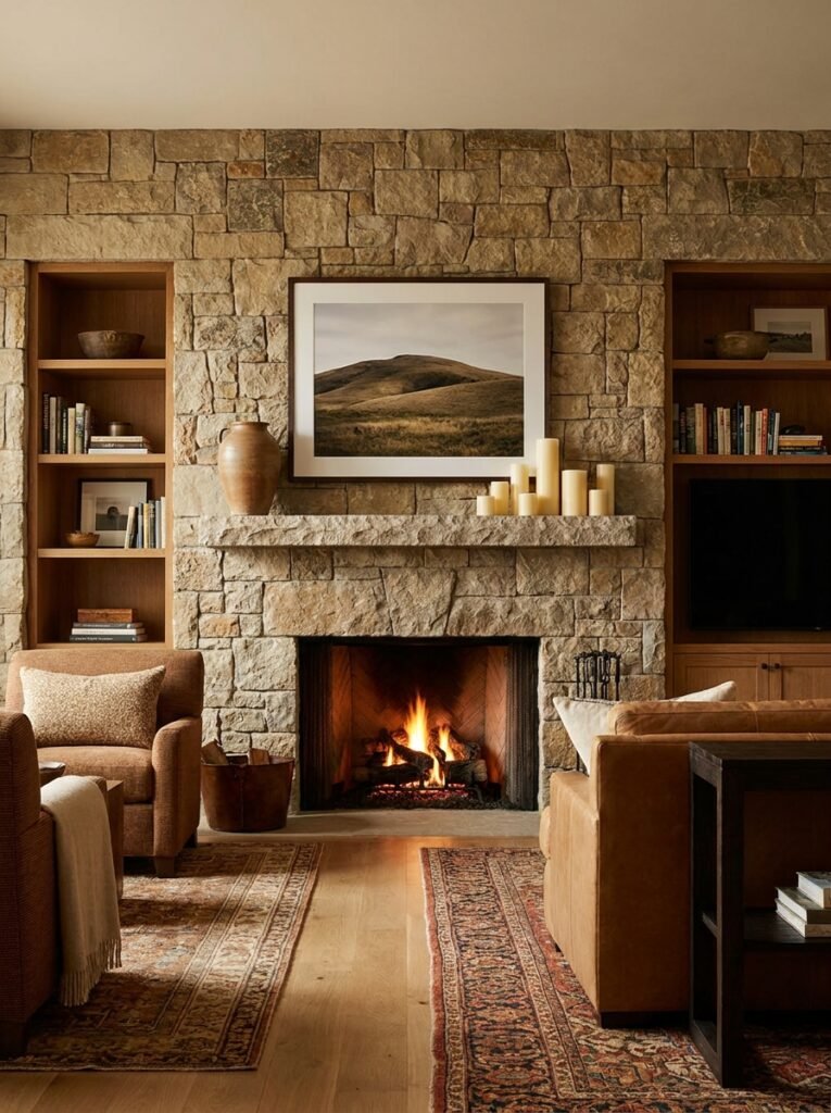
If you have a fireplace, your living room already has its anchor point, its natural focal wall. And most people hang one piece of art above it and call it done.
Which is fine! But there’s so much more you can do.
The space above the mantle is where you can go a bit gallery-style without it feeling random — because the mantle acts as a natural base that grounds the whole arrangement. Art above, objects on the surface below, everything in conversation. A tall mirror leaning from the mantle, slightly oversized, is one of those moves that photographs beautifully and works even better in real life.
What a lot of people miss: the sides of the chimney breast. Those flanking walls are begging for something. A pair of sconces, a pair of small prints hung at the same height, a shelf on each side with matching but not identical styling — this frames the whole fireplace and makes it feel like an intentional feature rather than just a box in the wall.
British Victorian and Edwardian homes especially have beautiful chimney breasts that are worth properly celebrating rather than treating as background.
—
10. The “Nothing On the Walls” Look That’s Harder Than It Seems
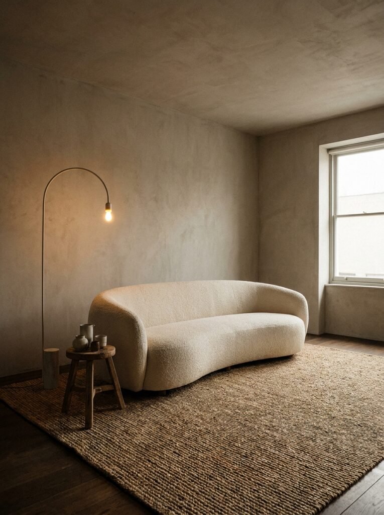
Some rooms look intentionally minimal — just walls with texture, no art, no mirrors, just the architecture doing the work. It can be genuinely stunning. It’s also MUCH harder to pull off than piling a wall full of things.
For this to work, the other elements in the room have to be more interesting than they’d need to be in a typically decorated space. The sofa texture, the rug, the objects on the coffee table — all of it has to carry more weight. Because your eye will go somewhere, and if the walls are bare, it goes everywhere else with more scrutiny.
The middle-ground version that I think is more achievable: one significant texture element on the wall — a large woven piece, a sculptural panel, a section of board and batten if you’re willing to do a bit more work — that adds visual interest without “art” in the traditional sense. It satisfies the eye without being decorative in a conventional way.
—
11. The Lighting Trick That Changes How Wall Decor Looks After Dark
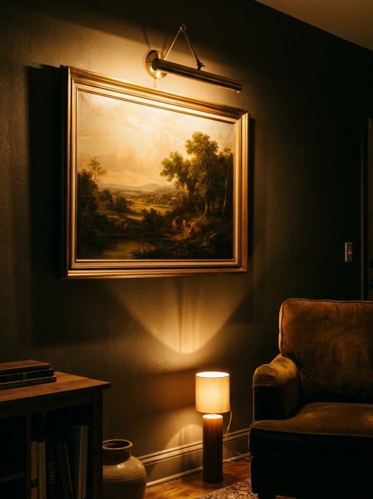
This one’s a bit separate from the decor itself, but it changes everything so I can’t not mention it.
The amber glow of a wall-mounted picture light at 8pm does more for a piece of art than any frame or placement decision you could make. It creates drama, shadow, warmth. It makes art look like it belongs in a gallery — but your gallery.
Even a clip-on picture light — properly placed, warm-white bulb — transforms a print that looks flat in daylight. If you have art you love and it’s only lit by your overhead light, that’s the thing to fix first.
And for gallery walls or shelf arrangements: add a small lamp nearby on a side table. Something low and warm. The light from below or beside an arrangement picks up texture in ways that ceiling lighting completely flattens.
“The amber glow of a wall-mounted picture light at 8pm does more for a piece of art than any frame or placement decision you could make.”
—
12. The Last Thing To Add (And Why Most Rooms Need It)
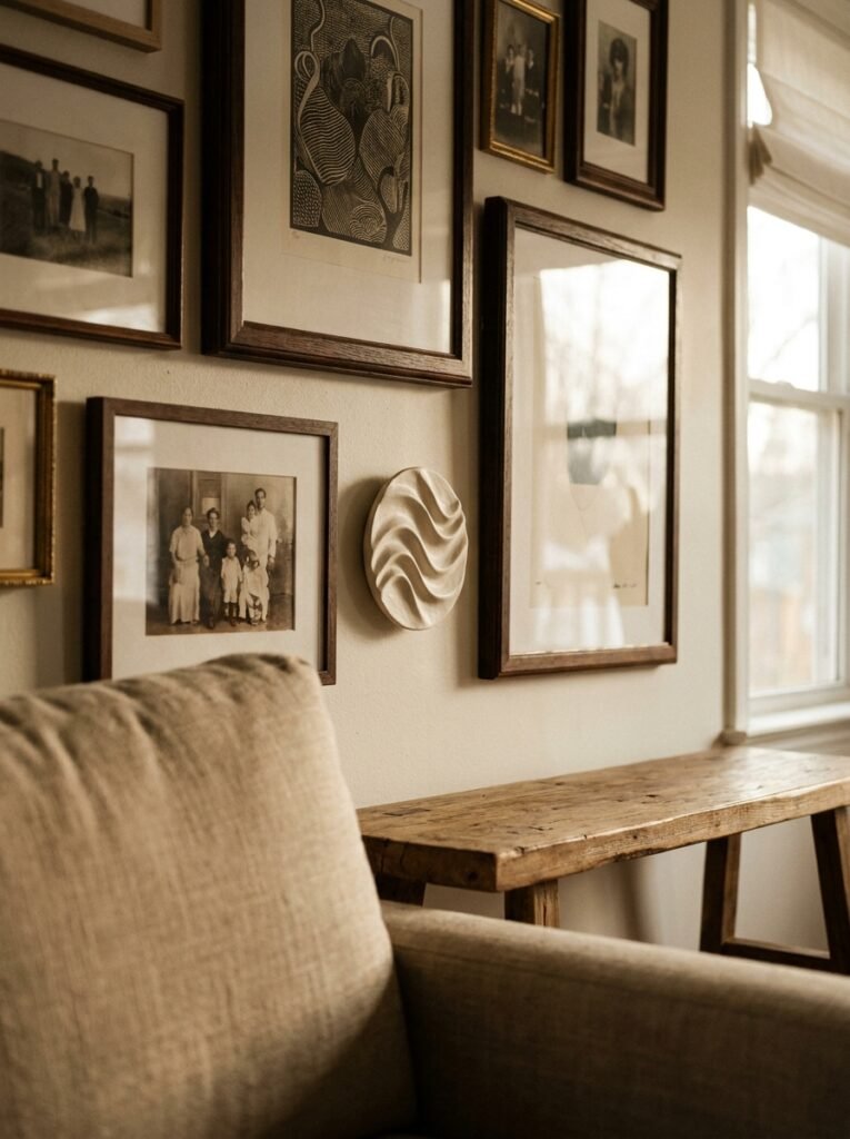
Plants. Or something living, anyway. A dried botanical if you can’t keep anything alive, though fresh or living is better.
I know plants aren’t wall decor exactly, but hang a trailing plant high enough on a shelf or a wall-mounted planter and it absolutely becomes part of what you see when you look at the wall. That softness, that organic edge cutting across the rigid lines of frames and shelves — it’s what makes a room feel alive rather than styled.
A single large-leafed plant in a corner next to a gallery wall does something that no additional print could replicate. It brings the room down to earth. Literally, sort of.
The rooms that feel the most beautiful — the ones you photograph and pin and think about weeks later — almost always have something living in them. Not as an afterthought. As part of the intention.
—
❓ FAQ
Q: How high should I hang art on a living room wall? A: The standard rule is to center art at roughly 57–60 inches from the floor, which is average eye level. But when art is hung above furniture, the bottom edge should sit about 6–8 inches above the furniture’s top rather than following the standard height rule — otherwise it floats away from the piece below it.
Q: What’s the best way to style a long, empty wall in a living room? A: Break it into intentional zones rather than trying to fill it all at once. An oversized art piece or gallery arrangement anchors one section, a console table with objects grounds another, and some breathing room in between actually looks better than wall-to-wall coverage. Negative space is part of the design.
Q: Can I mix different frame finishes in the same gallery wall? A: Absolutely, and it usually looks better than matching everything perfectly. The key is limiting yourself to two or three finishes — say, natural wood, matte black, and brass — rather than five. Too many different metals or wood tones starts to feel random rather than curated.
—
💭 Final Thoughts
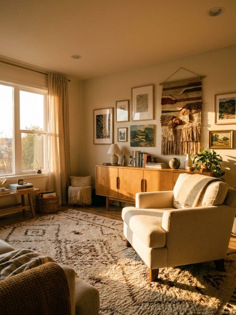
A living room wall isn’t a project to finish. It changes over time — a new print here, something moved there, a piece you fall out of love with taken down to make room for something better. The rooms that feel most alive are the ones that show that kind of history.
So if your wall’s still blank right now, honestly? That’s a fine place to start.
What’s the one wall in your living room that’s been giving you trouble?




