
Brown, Black, and Red in the Living Room: The Color Combo That Shouldn’t Work But Absolutely Does
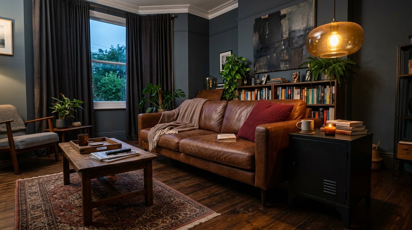
My friend Sara told me my living room looked like “a steakhouse and a library had a baby.” She meant it as a joke. I took it as a compliment.
—
1. Why This Color Combo Gets Dismissed — And Why That’s a Mistake
People hear brown, black, and red together and they picture a TGI Fridays from 2003. I get it. The association is real. But here’s the thing — those spaces got it wrong because of proportion and finish, not because the colors themselves are bad together.
Red is warm. Brown grounds it. Black sharpens everything so it doesn’t tip into cozy chaos. When you get the balance right, it’s one of those rooms that feels like it’s always been there, like it settled in decades ago and decided to stay. Grown-up without being cold. Dramatic without being exhausting.
The mistake most people make is going TOO red. Like, accent wall plus cushions plus curtains red. That’s not the palette talking — that’s just a lot of red. Pull it back to small doses of deep, muted crimson and let the brown and black do the heavy lifting.
“The brown isn’t just a base color here — it’s the whole mood. Red is the spark, black is the edge, but brown is the reason you want to sit down and stay.”
—
2. The Specific Shade of Brown That Actually Works Here (It’s Not Beige)
Not all browns are equal and this is where a LOT of people go wrong.
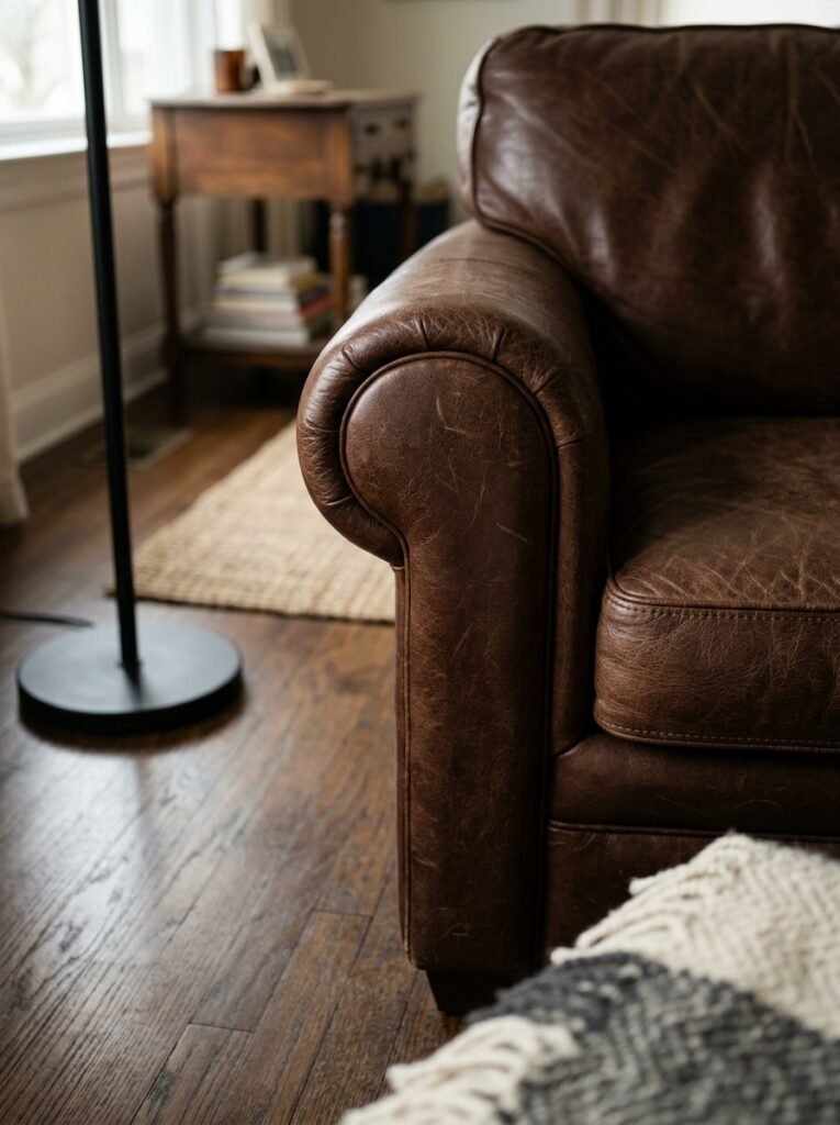
You don’t want sandy beige. You don’t want greige. You want DARK, rich brown — think walnut, espresso, aged leather. The kind of brown that looks like it has history. Something that photographs dark but glows warm in lamplight.
Lighter taupes tend to wash out against black and make the red feel aggressive. But a deep, saturated brown — on a leather sofa, a wood coffee table, a chunky woven rug — acts like a velvet backdrop. Everything looks more intentional against it. More considered.
If you’re working with lighter wood floors or pale walls, don’t worry. You can bring in dark brown through furniture and textiles without painting the whole room a cave. One substantial piece — a big leather armchair, a dark wood sideboard — is enough to anchor the whole thing.
—
3. Red as an Accent, Not a Statement (This Is the Secret)
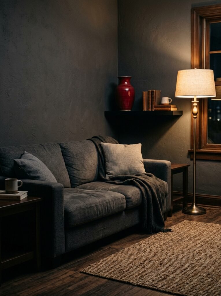
Okay so this is the thing nobody tells you clearly enough. In this palette, red is NOT the main event. It’s the thing you notice second. Maybe even third.
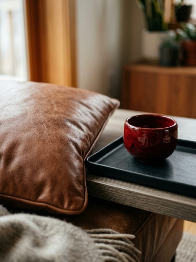
Think of it like salt — it makes everything else taste better without tasting like salt itself. A red throw pillow. A small vintage rug with red running through it. A single ceramic vase. Maybe a few book spines on a shelf (yes, styling your bookshelf by color works here). That’s enough.
Deep crimson or burgundy lands better than bright tomato red, especially in natural light. The brighter the red, the more carefully you have to place it or it starts vibrating against everything else. Muted, slightly dusty reds — wine, claret, brick — play beautifully with dark brown and black without screaming.
Side note: I once tried a red lampshade in a brown and black room and the light it cast turned the whole space this incredible warm amber at night. Don’t sleep on that.
—
4. The Color That Makes Brown, Black, and Red Look Intentional Instead of Dated
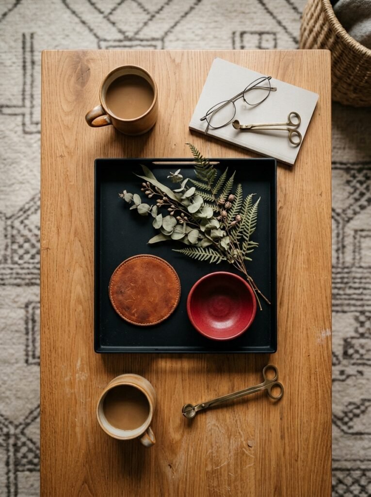
Natural textures. Specifically: aged brass or bronze metal, linen, raw linen, dark wood grain, matte ceramic.
This is not technically a “color” tip but it’s the thing that separates a moody sophisticated living room from a room that feels like it’s stuck in 2009. When everything is shiny and smooth, this palette tips toward “sports bar.” When you layer in texture — rough woven throws, matte black frames, a brass floor lamp with visible patina — suddenly it reads as editorial. As intentional.
The contrast between textures does the work that too many colors might overwhelm. A black matte side table sitting next to a deeply grained walnut shelf? Incredible. Swap the matte table for a glossy black one and the whole thing shifts, not for the better.
—
5. The One-Wall-in-Black Trick That Changes the Whole Room’s Personality
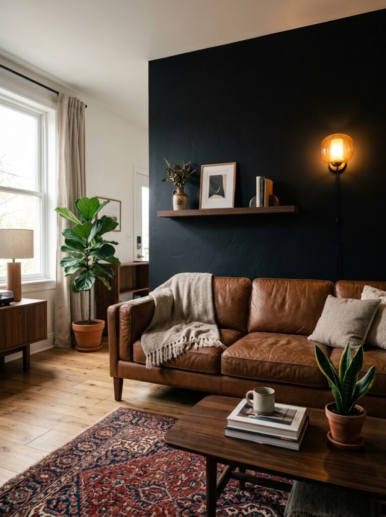
Here’s where I might lose the cautious ones and I’m okay with that.
Paint one wall black. Just one. Not all four, not an accent wall with a cutesy gallery — a full, floor-to-ceiling flat black wall, ideally the one behind your main sofa or TV unit.
It sounds aggressive. It’s not. A black wall in a room with warm brown furniture and a few hits of red doesn’t feel dark — it feels like depth. Like the room goes further back than it physically does. Books on shelves look incredible against it. Plants glow. And somehow the warmth from the brown and red reads even WARMER against the contrast.
If you rent and can’t paint, removable dark wallpaper works. There are some gorgeous matte options with subtle texture that come down cleanly when you leave. Not quite the same but honestly close.
“A black wall doesn’t make a room feel smaller. It makes it feel like it has a secret.”
—
6. Lighting Is Doing at Least 40% of the Work Here, No Kidding
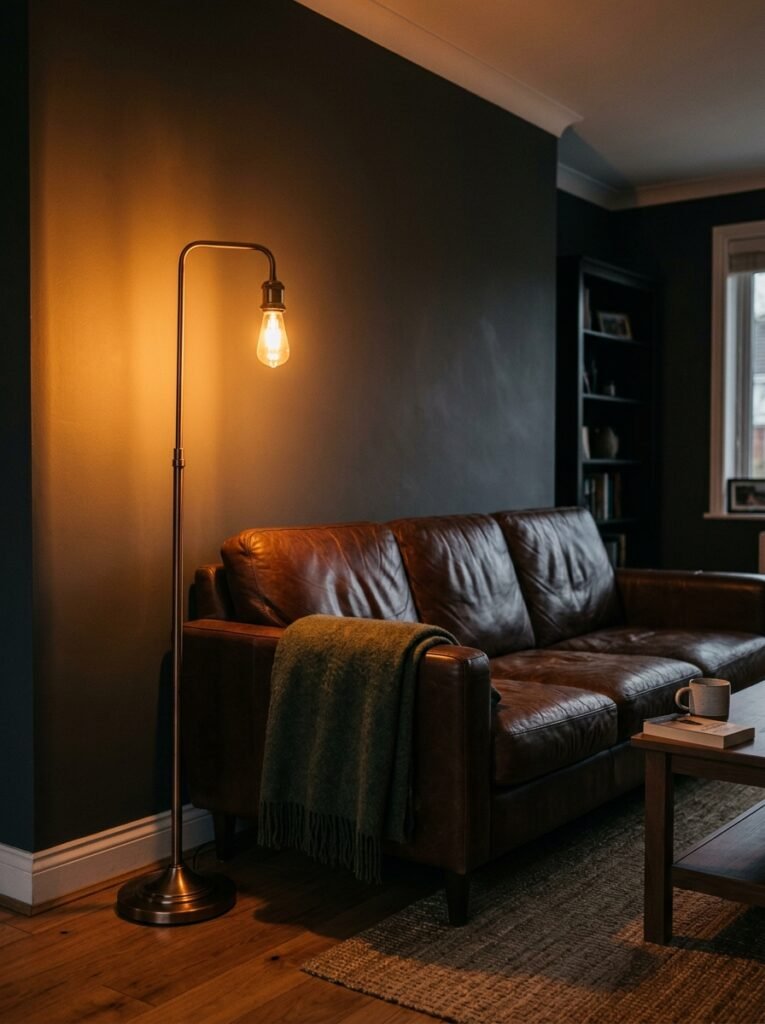
I can’t stress this enough. The wrong lighting and this palette looks dingy. The right lighting and it looks like a page out of an interiors magazine that makes people stop scrolling.
Warm-toned bulbs only. Anything over 3000K starts pulling toward cool white, and cool white light makes brown look muddy and red look weird. You want bulbs around 2700K — that soft golden glow that makes everyone look good and everything feel right.
Layer your sources too. Overhead light alone will flatten this palette completely. You want a floor lamp, a table lamp, maybe some small accent lights near the darker corners. The amber glow of an Edison-style bulb at 7pm in a room full of brown leather and dark wood? Honestly one of the better things in life. Not gonna lie.
—
7. Rugs: The Thing That Ties This All Together Without Becoming the Whole Show
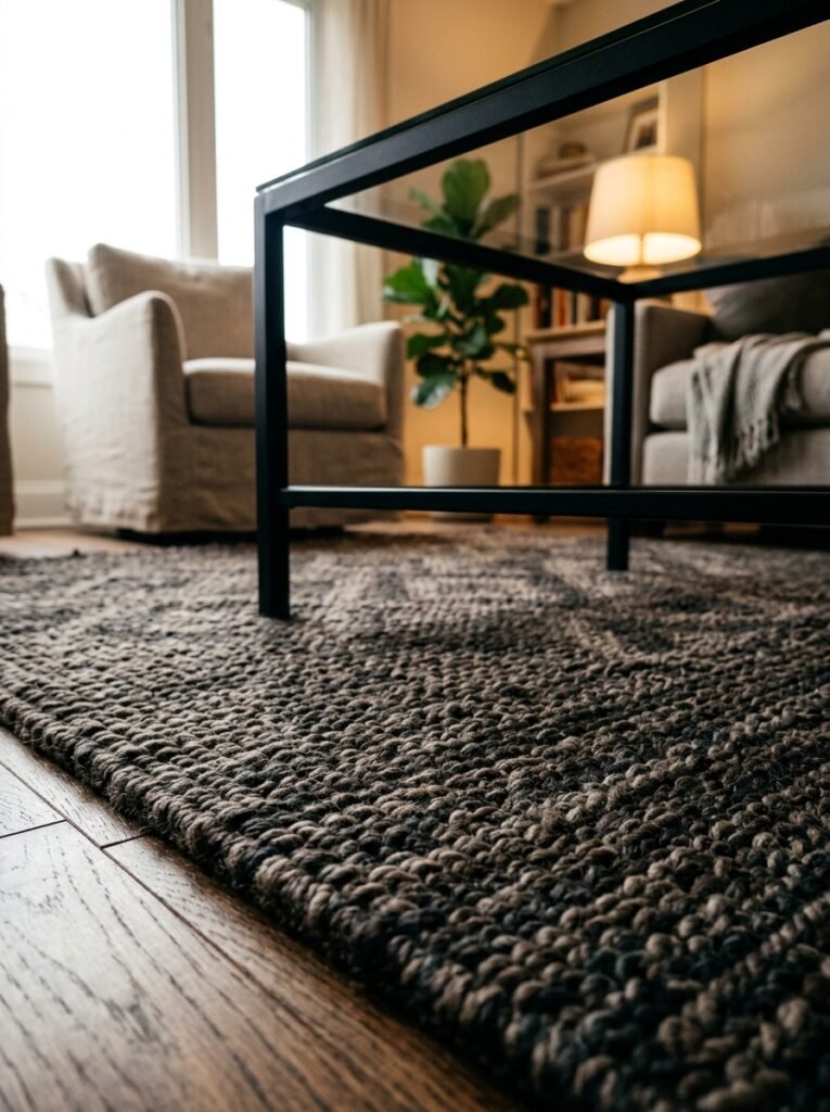
The rug situation in this palette is so important and kind of tricky.
You’ve got three strong colors already competing for attention, which means a busy rug adds chaos, not character. But a plain rug can feel too minimal for how much personality this palette has.
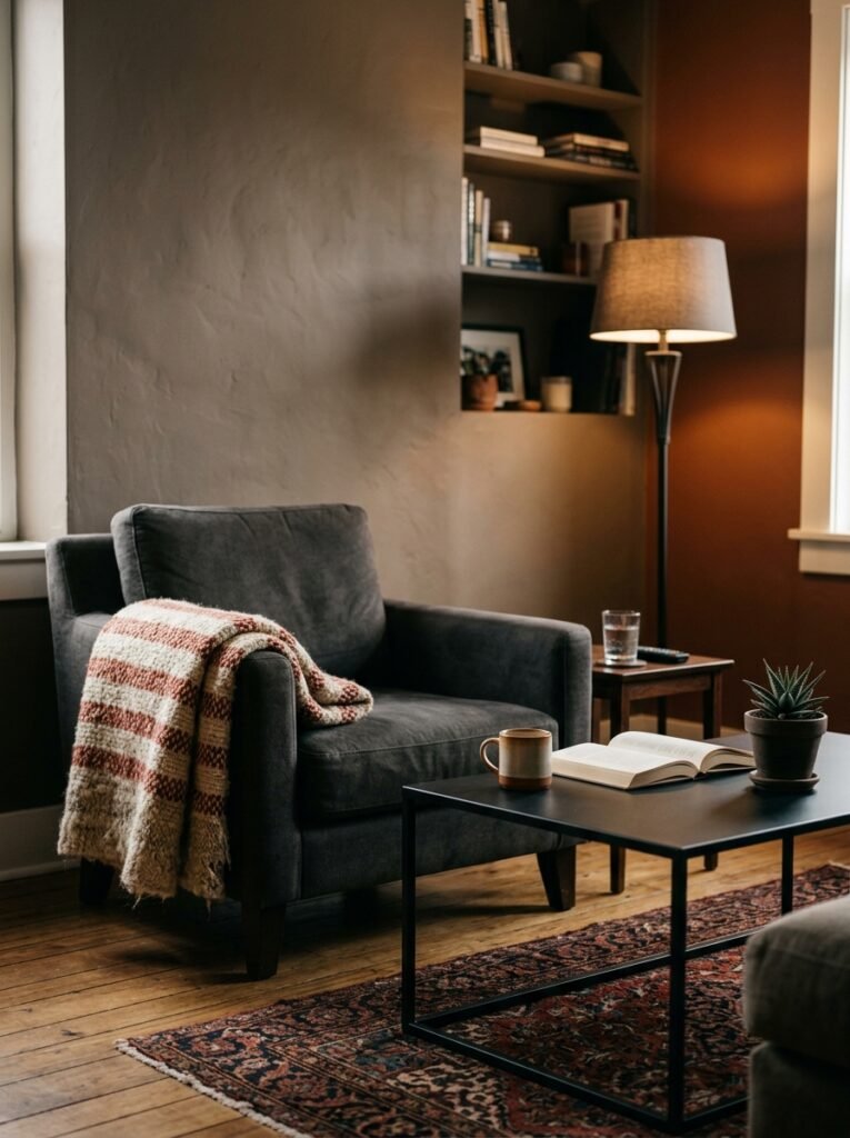
The sweet spot? A rug that has all three colors in it — brown, black, red — but in a pattern that’s geometric or tribal enough to feel intentional without being loud. Persian-style rugs in deep jewel tones work beautifully here, especially anything with a burgundy or rust base and dark borders. Overdyed vintage rugs in black and red can be stunning if you find the right one.
What to avoid: anything with too much cream or white in the pattern. It’ll look like the rug doesn’t belong to the same room.
—
8. Sofas: The Brown Leather Option vs. The Dark Fabric Option
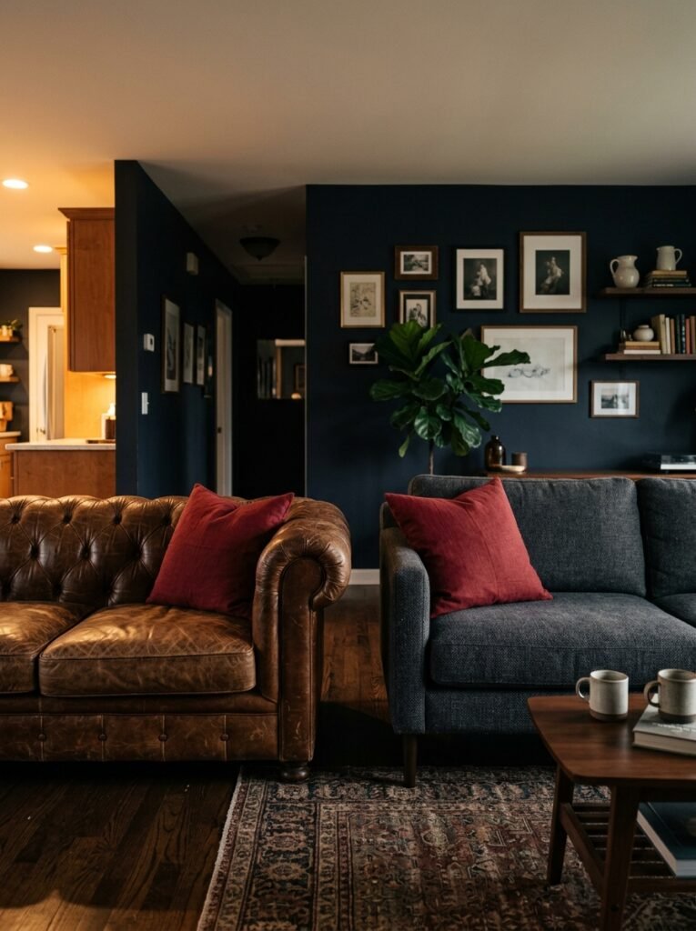
Two paths. Both work. They just create different rooms.
Brown leather sofa — possibly the original anchor for this entire palette. It’s rich, it’s classic, and it handles the brown element so effortlessly that the rest of the room can be lighter on texture. A cognac or saddle leather sofa with black throw pillows and a few red cushions is a complete room, honestly. You barely need anything else.
Dark charcoal or black fabric sofa — this version of the room feels more modern, a bit edgier. Here, you’d lean into warm brown through wood furniture, a woven rug, maybe a leather armchair rather than the main sofa. The red pops harder against this combination, so keep it even more restrained. One or two cushions. A small piece of red art. Done.
Both versions work. Deciding between them is really about what kind of room you want — the one that feels like a gentleman’s library or the one that feels like a moody city apartment. Either way, I’m in.
—
9. Walls: What Color to Paint Them When You’re Not Going Full Black
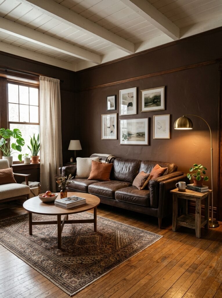
Not everyone’s going to commit to the black wall. That’s fine. So what do the other walls do?
Deep warm white is the easiest answer — something creamy like a true warm white, maybe with a very slight yellow or pink undertone. Not blue-white, not stark white. The warm undertone connects the wall color to the rest of the palette without competing with it.
Warm gray can work too but you have to be careful. Cool grays go against everything this palette is trying to do. If you’re going gray, it needs to lean very much toward taupe or greige. The walls are supposed to feel like a backdrop, not a fourth color.
Some people go for a deep terracotta or dusty rust on one wall instead of black and honestly? It can be beautiful in a more eclectic, warmer room. It softens the drama a bit if full black feels like too much for your space.
—
10. Art and Accessories That Belong in This Room (and the Ones That Don’t)
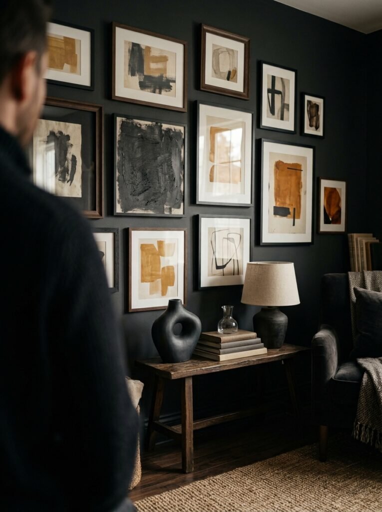
This palette has strong energy. Not everything belongs in it.
Art that works: dark landscapes, moody abstract pieces, anything with deep jewel tones, black and white photography matted in deep brown frames, vintage botanical prints in earthy colors.
Things that tend to clash: anything pastel, anything overly rustic or farmhouse-y, very light driftwood tones, chrome or super-shiny silver metal, anything too “beachy” in palette. The vibe here is more winter evening than summer morning.
For accessories — stick to aged brass, dark bronze, matte black metal, and dark ceramic. A sculptural black vase. A brass candleholder with the kind of patina that looks like it’s been somewhere. A stack of coffee table books with dark spines.
“The accessories in this room should feel like they have a past. Like they were collected, not purchased as a set.”
—
11. Small Living Rooms: Making This Work Without Feeling Like You’re Living Inside a Cave
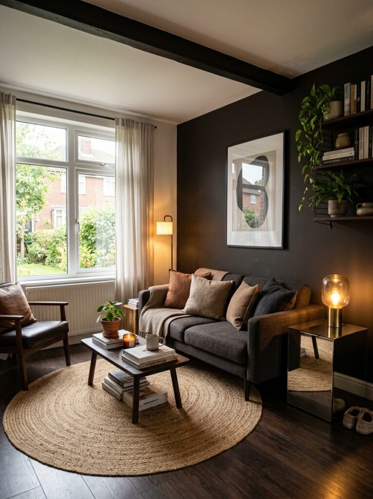
Look, I get it. Deep, dark colors in a small room sounds like a bad idea. But I’d push back on that instinct just a little.
Small rooms can actually carry this palette really well IF you make smart choices about where the darkness lives. Keep your walls lighter — that warm white we talked about. Let the dark come in through furniture, textiles, and one or two accessories. Don’t fill every surface with dark objects.
Mirror placement helps enormously. A large mirror with a black or aged wood frame bounces light around in a way that makes the whole room feel like it breathes. Put it somewhere it’ll reflect a light source or a window, not a wall.
Also: keep the floor plan simple. This palette has a lot going on already. You don’t need eight pieces of furniture. Two or three substantial pieces — a sofa, a low coffee table, an armchair — and then breathing room. Empty space is part of the design.
—
12. The Room Doesn’t Have to Be “Done” — That’s Actually Kind of the Point
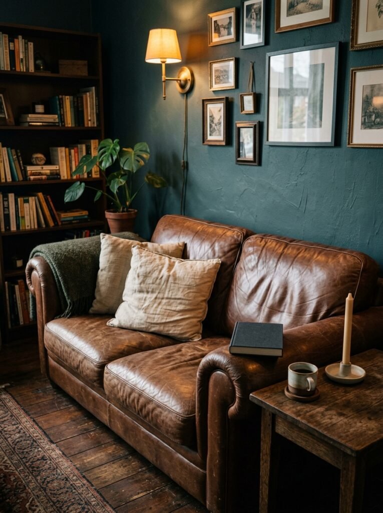
Here’s what I love most about this palette. It’s one of the only color combinations that GAINS from looking a little lived-in. A worn leather cushion. A stack of actual books you’ve actually read. A throw that’s slightly rumpled because someone actually uses it.
This isn’t the palette for a showroom. It’s for a room that has a life. And that’s why it photographs so well on Pinterest — people see it and think “oh, someone actually lives here.” Not “someone staged this for a shoot.”
You can add to this room slowly. Start with a rug and one piece of furniture. Get the lighting right. Let the rest come in over time. A print here, a lamp there. That gradual layering is exactly why these rooms always look so intentional — because they kind of are, just not all at once.
Give yourself permission to build it piece by piece. The room will tell you when it’s done.
—
❓ FAQ
Q: Does brown, black, and red work in a small living room? A: Yes, with some adjustments. Keep walls light and let the dark tones come through furniture and textiles rather than paint. Use a mirror to bounce light, and don’t overcrowd the space. A smaller version of this palette can actually feel really cozy and intentional without closing in on you.
Q: What wood tones work best with this color scheme? A: Dark wood is your friend here — walnut, dark oak, mahogany, ebony-stained pieces. Light or blonde wood tends to feel disconnected from the rest of the palette. If you’ve got lighter wood floors, anchor the space with a deep-toned rug so the furniture has something to sit into.
Q: Can this palette work in a modern or contemporary home, or does it only suit traditional styles? A: It works in both but it shows up differently. In a traditional room you’d lean into rich leather, Persian-style rugs, and ornate frames. In a modern space, keep the lines clean and lean into matte finishes, geometric shapes, and minimal accessories. The palette stays the same — the shapes around it change.
—
💭 Final Thoughts
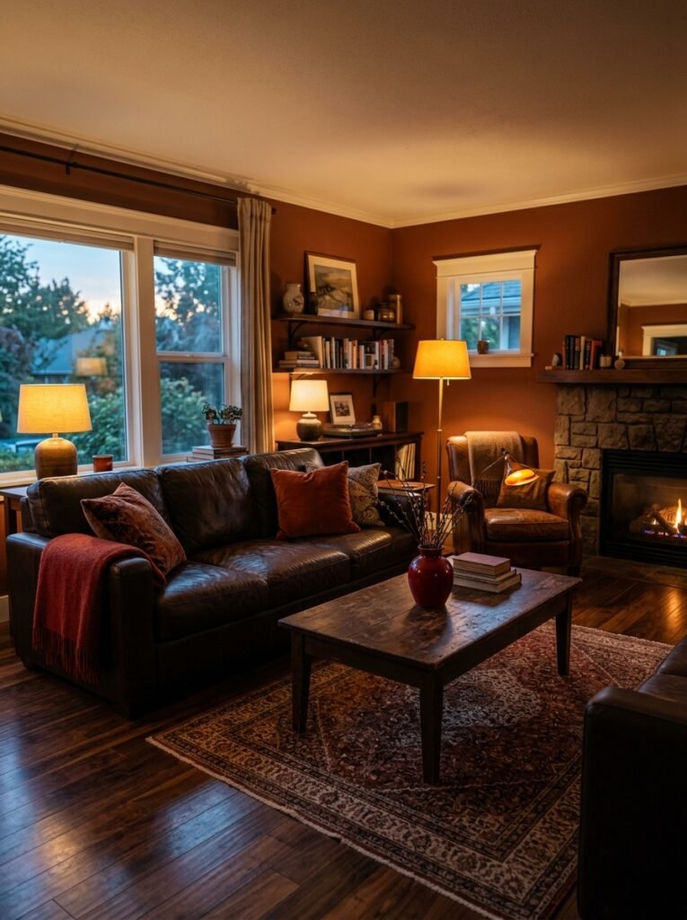
This combination of brown, black, and red is one of those things that people dismiss until they see it done properly, and then they can’t unsee how good it is. It’s warm but it has edges. It’s dramatic without trying too hard. It’s the kind of room you don’t want to leave on a cold evening.
Build it slowly, trust the palette, and don’t let anyone tell you it looks like a steakhouse.
Have you tried any of these colors in your own living room — and which one felt the most daring to commit to?




