
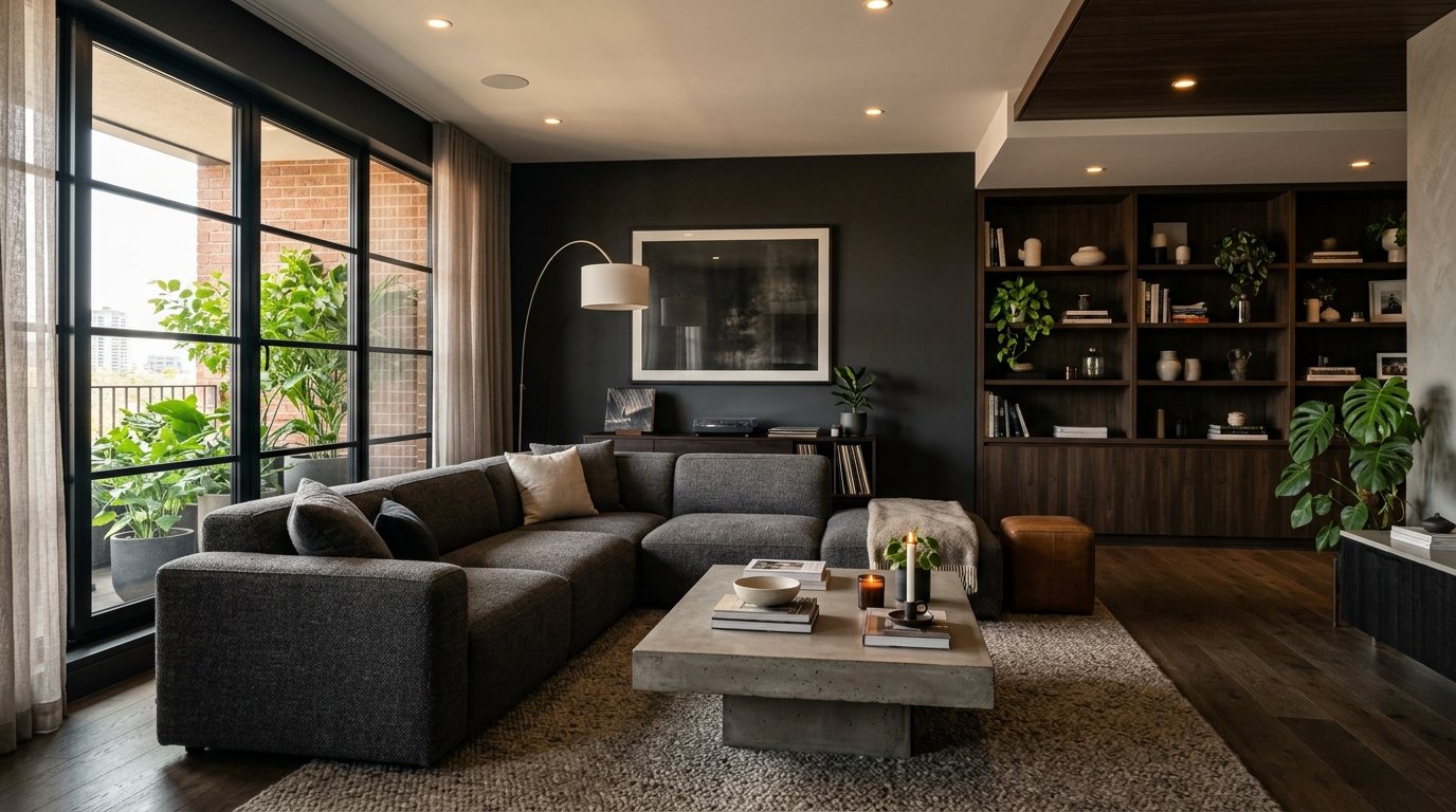
The Modern Man’s Living Room: Design Moves That Actually Work (No Showroom Vibes Required)
My friend Jake moved into his flat last year and called me in a panic. “It looks like a hotel room,” he said. “A bad hotel room.” He had good furniture, decent lighting, nothing offensive — and absolutely zero personality.
—
1. Why “Minimal” Became an Excuse for Boring
Here’s the thing about minimalism. It got hijacked somewhere along the way. What started as a genuinely considered design philosophy — less clutter, more intention — got turned into “buy nothing and call it a vibe.” And men’s living rooms have suffered the most from this particular misreading.
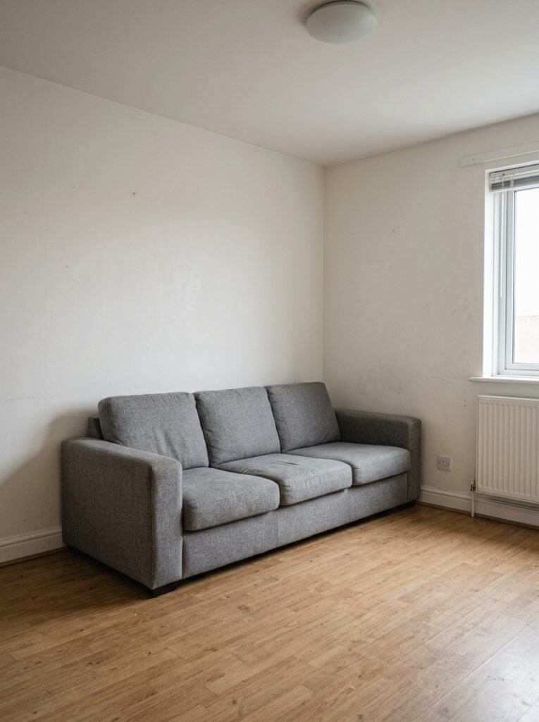
I see it constantly. A grey sofa. A black coffee table. Bare walls. Maybe one plant that’s barely alive. And the owner genuinely believes that’s modern design.
It’s not. It’s absence pretending to be style.
Modern doesn’t mean empty. It means purposeful. Every object you choose has a reason to be there — and that reason should be something other than “it came with the flat.” The rooms that actually make you stop scrolling are the ones where someone clearly made decisions. Specific decisions. About texture and scale and what to leave out.
So let’s talk about what that actually looks like.
“Modern doesn’t mean empty. It means purposeful — and there’s a real difference.”
—
2. The Sofa Choice That Defines Everything Else in the Room
Pick your sofa wrong and you’re rearranging deck chairs, basically. Everything else — rug, lighting, art — gets harder when the sofa is fighting you.
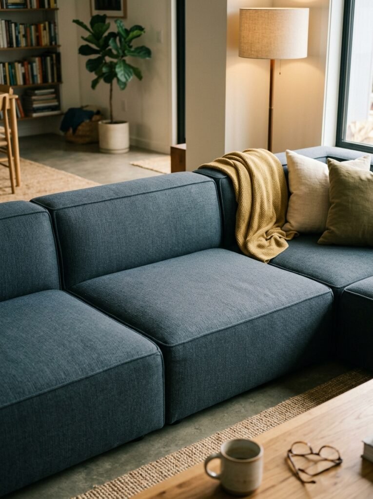
For a modern masculine living room, go low-profile. Sofas that sit closer to the floor have an immediate visual effect — the room feels more intentional, more grounded. Less “furniture showroom,” more “person lives here and thought about it.”
Colour-wise? Don’t default to charcoal grey just because it feels safe. I know it FEELS safe. But slate blue, deep olive, warm camel — these all photograph better, hold a room better, and honestly just look less like every other flat in a four-mile radius. A leather sofa in a cognac or tobacco tone does something almost unfair to a room’s atmosphere. Especially at night.
And please, size it properly. Undersized sofas in large rooms are a crime I feel personally. If your ceiling is above 9 feet, go big.
—
3. The Rug Rule Nobody Talks About Enough
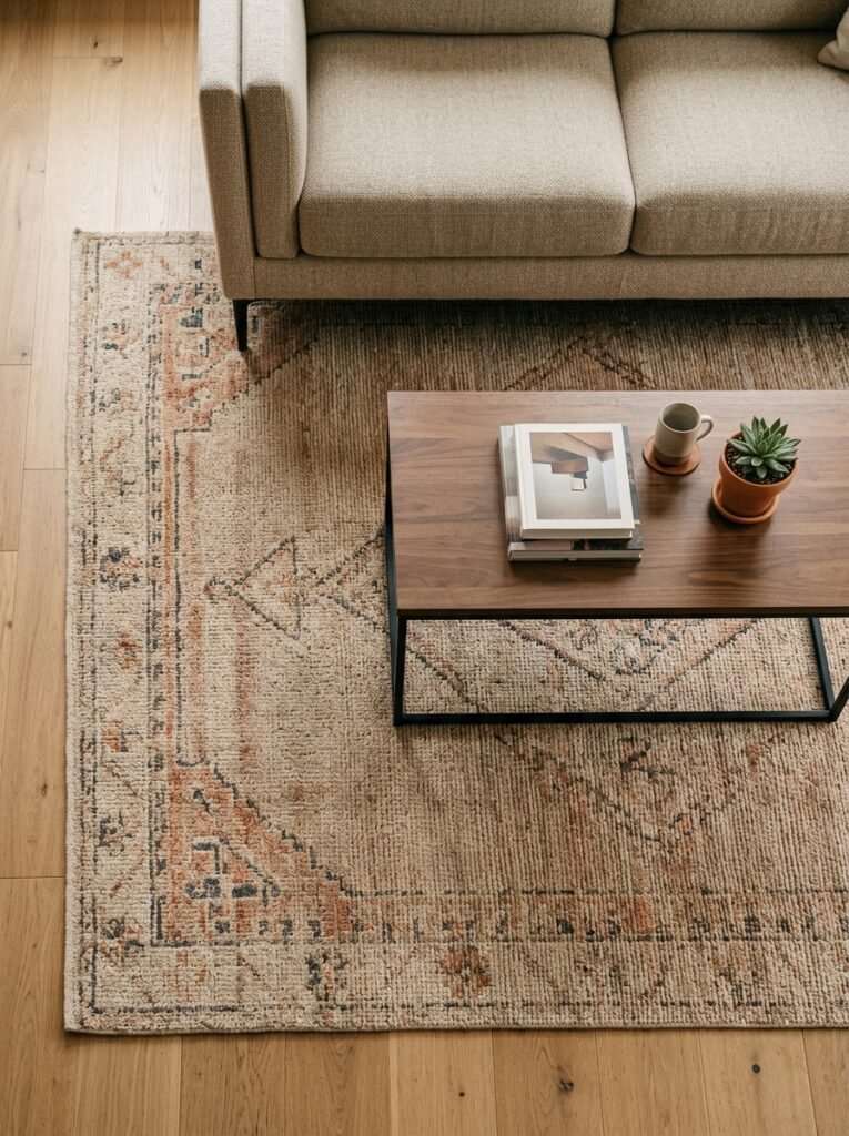
All legs on. Or all legs off. That’s the rule.
Not “front legs only,” which is somehow the default choice, creating this visual awkward situation where the sofa is tethered to the rug by its toes and the whole thing looks unmoored. It drives me quietly mad, not gonna lie.
For a modern look in a man’s living room specifically, a low-pile rug in a graphic or geometric pattern does a lot of heavy lifting. Something with a bit of structure — a clean grid, a subtle diamond, even a worn-in kilim pattern with good bones. A woven jute rug works brilliantly in rooms that lean warmer, and it adds that slight roughness that stops things feeling too polished.
Go big. Seriously. A rug that’s too small is one of the single easiest mistakes to make and one of the most visually costly.
—
4. Lighting Is Doing More Work Than Your Sofa Ever Will
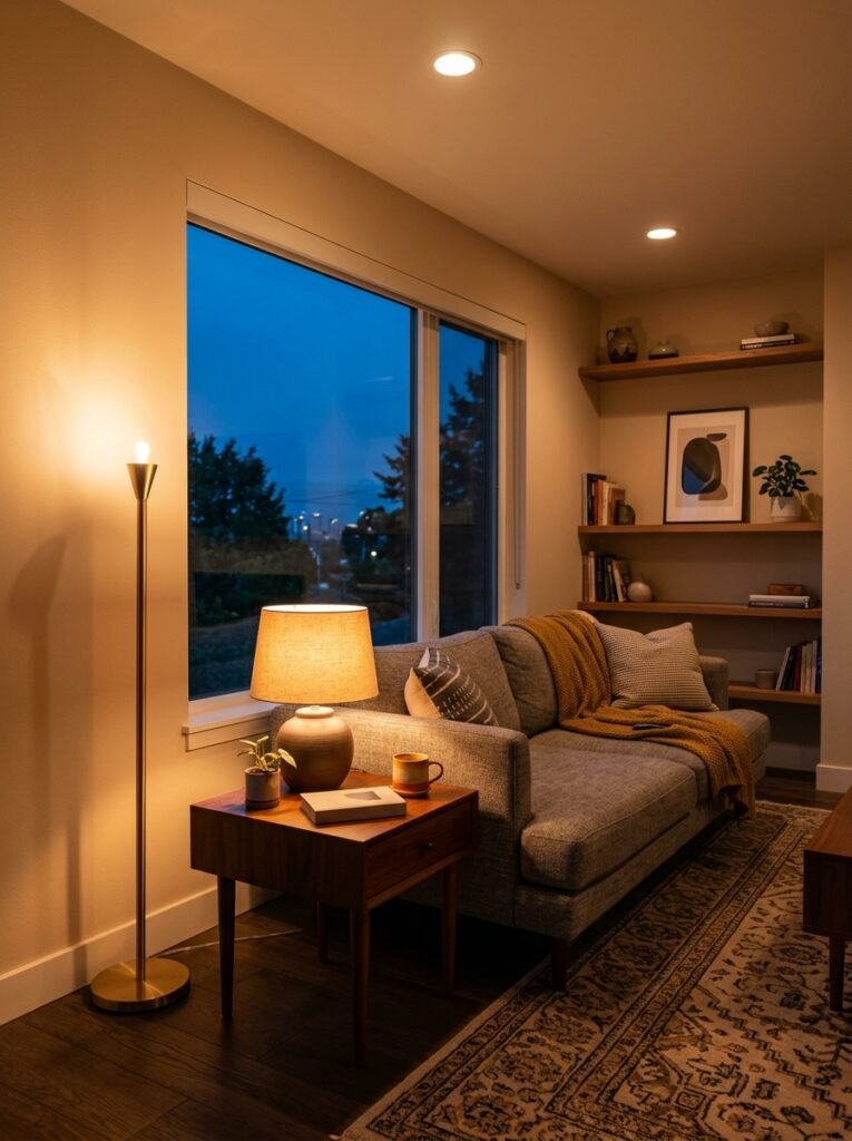
Nobody talks about this enough and I genuinely don’t understand why.
The overhead light in most living rooms is — let’s be honest — pretty terrible. That cold, flat, ceiling-mounted situation that makes everything look like a waiting room. Men’s living rooms especially tend to have this problem because overhead lights are the ones that came with the place and nobody questioned them.
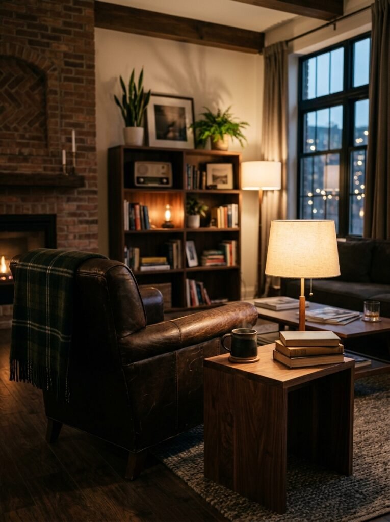
Here’s what actually works: layers. A floor lamp in the corner with a warm bulb. A table lamp on a side table or console. If you have shelving, a little run of warm LED strip hidden on the underside. Not blue-white. Warm. 2700K is the magic number, if you’re looking it up.
The amber glow of a good Edison-style bulb at 7pm on a winter evening does more for a room than any piece of furniture. I’ll stand by that.
“Switch on one warm lamp and suddenly the room does something it couldn’t do in overhead light. That’s not decoration — that’s atmosphere.”
Dimmers are worth every penny. Every single penny.
—
5. The Wall Above Your Sofa Isn’t Wasted Space — It’s the Whole Conversation
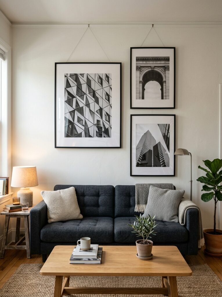
Blank wall above the sofa is such a missed opportunity. And I’ve heard every excuse: “I don’t know what to hang,” “I don’t want it to look fussy,” “I’m renting.”
Fine. Let’s deal with each of those.
If you don’t know what to hang — start with one large piece. Not a grid of ten small prints (that takes real confidence to pull off and most people don’t quite get the spacing right). One large piece, hung at eye level, slightly oversized for the wall. A bold black-and-white photograph. An abstract canvas with earthy tones. Even a framed architectural blueprint or vintage map if that’s your thing.
Fussiness isn’t the risk with a single good piece. It’s actually the cleanest, most modern option.
Renting? Command strips have gotten remarkably good. That argument hasn’t held up for years.
—
6. Dark Walls and Why Men Keep Sleeping on This
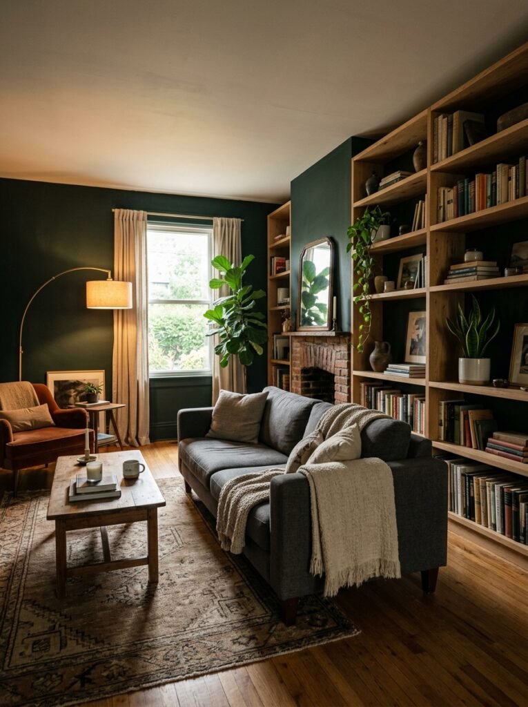
I’ll just say it: a dark painted wall in a living room is one of the best things you can do for the space, and it’s deeply underused in rooms styled for men.
I think there’s a fear that it’ll make things feel small or cave-like. And yes, done badly, it can. But done right? A deep charcoal, a warm near-black with a hint of green or brown, a dusty slate — it makes every single piece of furniture and every object pop against it. It creates a MOOD. It makes the room feel like somewhere, not just a room.
The key is contrast. Dark walls need lighter textures to offset them — a cream throw, natural wood tones, brass or warm metal hardware, some low lighting. Get those things right and the dark wall becomes the best decision in the room.
Side note — this works even in smaller rooms, contrary to what everyone believes. Light doesn’t necessarily make a small room feel bigger. Good proportion and intention do.
—
7. Coffee Table Decisions Are More Personal Than People Admit
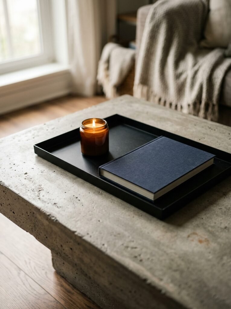
Your coffee table says something about you. Or at least it should.
The most interesting coffee tables in well-designed living rooms aren’t always the most expensive. A raw wood slab on a metal base. A stack of thick architecture books acting as a de facto surface. An oversized ottoman in a tactile fabric that doubles as a footrest, a tray surface, and the most comfortable thing in the room.
What doesn’t work — and I say this with full affection — is the clear acrylic or glass-top table as a “safe” choice. It disappears, which sounds like a feature, but it actually just makes the lower half of your room feel unfinished. You need some visual weight down there.
Concrete, reclaimed wood, a combination of dark metal and stone — all good. The goal is something that looks like it was chosen, not defaulted to.
—
8. Bringing Texture In Without Making It Look Like a Showroom
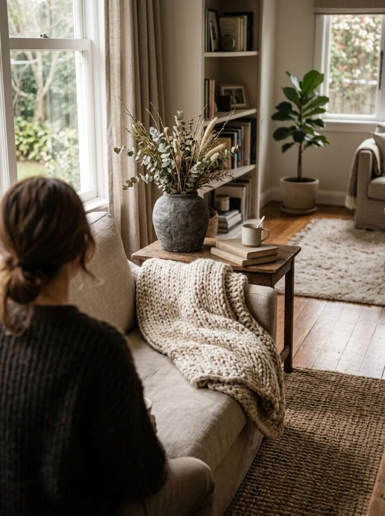
This is where a lot of rooms, honestly, go sideways. Someone reads “add texture” and suddenly there’s a wicker lamp, a chunky knit throw, a macramé wall hanging, and a basket of pinecones. And it’s a lot.
Texture in a modern masculine space should be subtle and earned. A single chunky knit throw draped over one arm of the sofa. A rough stone or ceramic vase on the shelf. The natural grain of a wooden side table. Linen cushion covers in a solid, quiet colour.
Less, but more considered. That’s the version that photographs well AND actually feels good to live in. Which is the goal, by the way. Not just photographs — actually lives in.
—
9. The Bookshelf Isn’t Just Storage — It’s Character
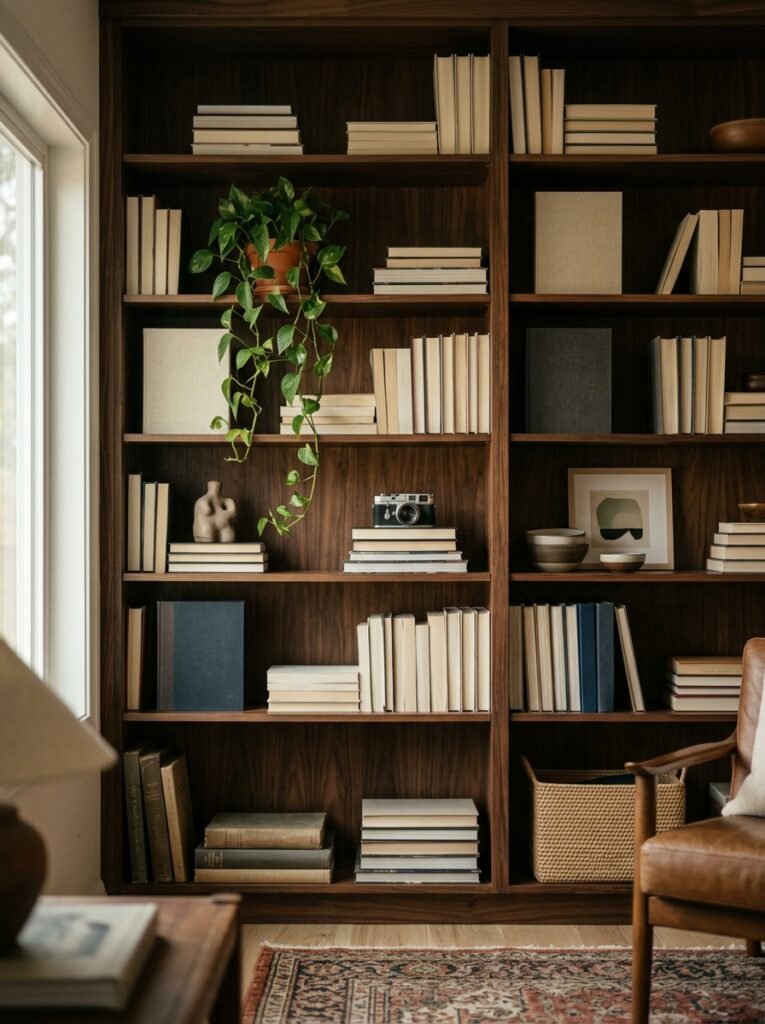
If you have a bookshelf or built-in shelving and you haven’t thought about how it’s arranged, you’re leaving a huge amount of visual real estate untouched.
Books are great. Books actually make a space feel lived-in and interesting, which is something you can’t fake with decor objects. But a shelf that’s ONLY books can look a bit flat. Mix in a few objects — something with height, something low, something with texture — and suddenly the whole thing has rhythm.
Don’t over-curate either, or the opposite problem. Row after row of perfectly colour-sorted books with three precisely placed objects reads as “I watched a YouTube video about this.” Let it be slightly imperfect. A sideways stack here, a plant trailing over there, one object that has actual meaning to you even if it’s not photogenic.
That authenticity is the thing that no algorithm can replicate.
“A shelf that’s too perfect reads as performance. A shelf with one weird, personal thing reads as real.”
—
10. Plant Placement: One Strong Choice Over Four Sad Ones
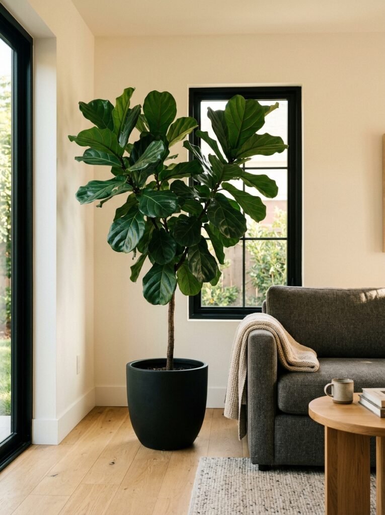
I’m going to be direct about this. One large, healthy plant in a good pot in the right spot will do more for your living room than four small plants scattered around doing nothing.
A fig or a large palm in a corner near natural light — that’s a presence. That’s a design decision. It adds height, life, colour, and that slightly organic quality that modern rooms need so they don’t feel sterile.
What doesn’t work: a dead succulent on the coffee table, a drooping pothos on the windowsill, a struggling snake plant behind the sofa, and a random cactus nobody asked for. I’m describing approximately 70% of living rooms I’ve walked into, by the way, or maybe that’s generous.
One good plant, properly placed, properly lit. Commit.
—
11. The TV Wall Problem and How to Actually Solve It
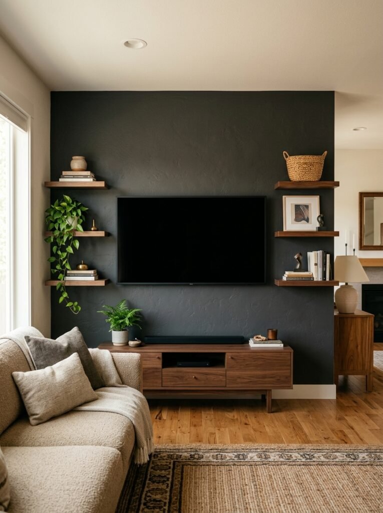
The TV is a black rectangle. A sizeable, inescapable, sort of unavoidable black rectangle. And most living rooms just… let it hang there, naked and slightly confrontational, dominating everything.
There are a few ways to deal with this. A gallery wall around it is one — it incorporates the TV into a larger composition so it’s not just floating. Dark paint on the TV wall helps too because the screen almost disappears against a deep background when it’s off.
Built-in shelving or cabinetry flanking the TV turns the whole wall into something intentional. You don’t need a carpenter — floating shelves on either side, symmetrically placed, does the same job at a fraction of the cost.
What I’d skip: TV stands that are too small for the screen, anything on castors, and the classic “entertainment unit” with doors that close over the TV. Just mount it.
—
12. The Last Five Percent Is Actually the Whole Point
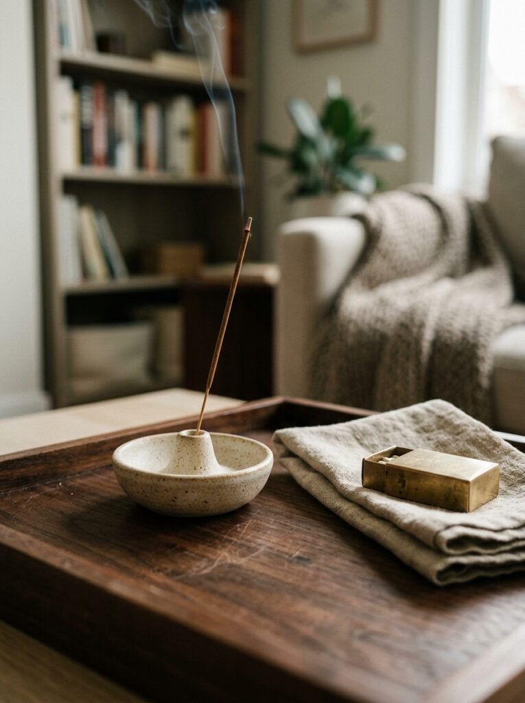
Here’s what separates a room that looks “nice” from one that actually feels like somewhere.
The book that’s actually yours, spine cracked from being read. The ceramic you picked up at a market. The lamp your mate gave you when she moved. The record sleeve framed on the wall because it means something.
None of those are on any mood board. None of them are “cohesive” in the interior design sense. But they’re the things people notice. They’re the things that make someone sit down and say “this feels like a room, not a set.”
Modern design gives you a frame. Personal objects fill it in. You genuinely don’t need more than three or four — but they have to be real. Something chosen, not just placed. That’s the five percent that does all the emotional work.
And honestly, Jake’s flat? Once he stopped trying to make it look like something and started putting in a few real things — a vintage poster he’d always loved, his grandfather’s old camera on the shelf — it finally felt like his. The grey sofa didn’t change. The layout didn’t change.
He just let himself be in it.
—
❓ FAQ
Q: How do I make a small living room feel modern and intentional without it feeling cramped? A: Keep the furniture lower to the ground — it opens up visual space above, making ceilings feel higher. Stick to two or three solid anchor pieces rather than filling every corner, and avoid anything that blocks sightlines across the room. A large mirror opposite a window also genuinely works and it’s not a cliché.
Q: What’s the best colour palette for a modern masculine living room without it feeling cold? A: Warm neutrals with one deeper tone is the sweet spot — think warm whites, natural wood tones, and then one strong colour like deep olive, navy, or charcoal that grounds everything. The mistake is going all-cool: all grey, all white, all metal. That’s when it starts to feel like a waiting room rather than a living room.
Q: Can you do modern design in a rental without damaging walls or losing your deposit? A: Yes, and it’s more doable than it used to be. Removable hooks rated for heavier weights, furniture-based styling (a leaning mirror, a freestanding lamp, styled shelves), and a good rug over existing flooring take care of probably 80% of what you need. The walls matter less than lighting and furniture choices in terms of overall impact.
—
💭 Final Thoughts
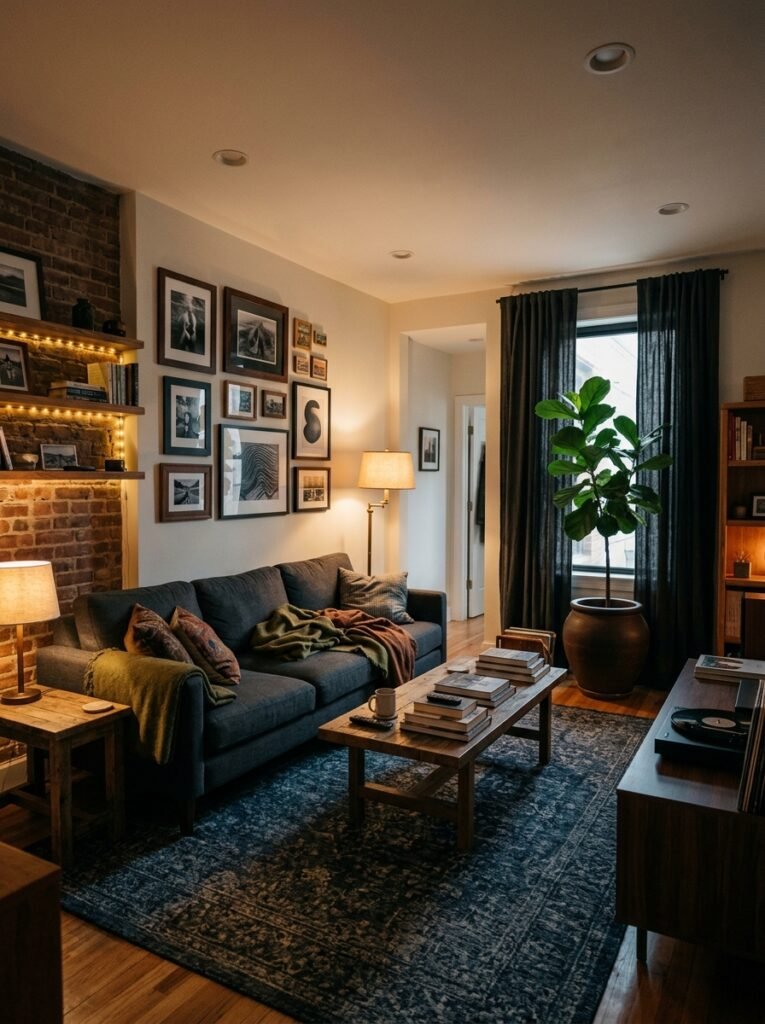
The thing is, modern design for a living room isn’t really about a style. It’s about removing the accidental decisions — the things that just ended up there — and replacing them with deliberate ones. You don’t need much. You just need to mean it.
A room that reflects the person living in it, even slightly, will always feel better than one that follows a trend. And the gap between those two things is usually just a handful of choices.
What’s the one thing in your living room that you’d change first?




