
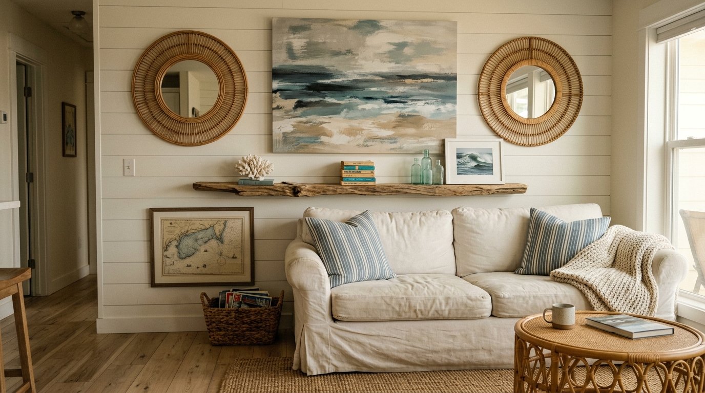
Beach House Living Room Walls That Actually Feel Like the Ocean — Not a Gift Shop
My friend looked at her newly decorated living room and said, “I wanted coastal, but it just looks like I raided a seashell kiosk at a seaside market.” I’ve heard some version of that sentence more times than I can count.
Getting beach house wall decor right is genuinely tricky. Because the line between “collected over a lifetime” and “bought all at once in a panic” is razor thin, and walls are where that line shows up most.
—
1. Why Most Coastal Living Rooms Feel Like a Cliché (And What’s Actually Happening)
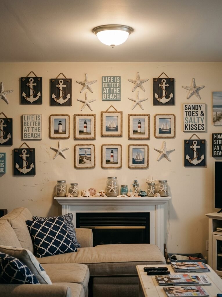
Here’s the thing nobody says out loud: the problem isn’t the theme. It’s the density.
When every single wall surface screams “OCEAN,” your brain reads it as a pattern, not a place. Real beach houses — the ones that actually feel good to sit in — have walls that breathe. They’ve got a big thing, some empty space, maybe one smaller thing, and then nothing for a while.
The rooms that feel authentically coastal usually aren’t trying that hard. There’s a framed piece of sea glass mounted simply. A single large canvas in washed blues that doesn’t obviously depict anything. And then a wall that’s just… wall. Bare plaster. A little rough maybe.
So before you buy a single thing, the most useful exercise is to stand in your living room and ask yourself what you’d leave out. Not what you’d add.
“The rooms that feel authentically coastal usually aren’t trying that hard.”
—
2. The Specific Shade of Blue That’s Everywhere Right Now (And Why It Works)
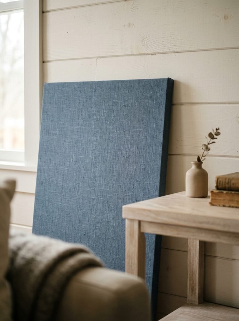
Not navy. Not turquoise. Something in between that I’d describe as “deep sea on a cloudy day” — a slightly greyed, slightly green-tinted blue that sits quietly on a wall without demanding anything from you.
Designers are reaching for it constantly right now, and I think I understand why. It doesn’t read as obviously coastal from far away, but up close there’s something oceanic about it. The grey pulls it back from being too sweet.
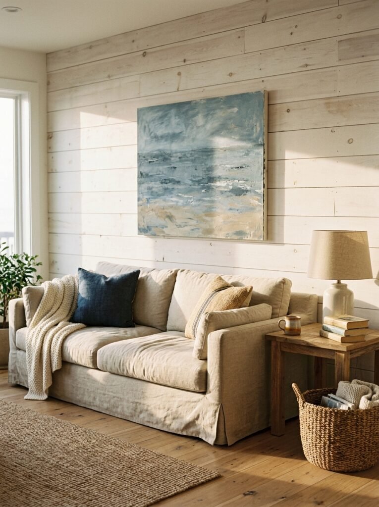
If you’ve got white walls and you’re not ready to paint, this colour works brilliantly as an accent through art. A large-format abstract canvas in this shade — minimal, almost nothing going on in it — will anchor a living room wall in a way that a whole gallery wall of shells just won’t. One thing. Big. Quiet.
Side note — this shade looks incredible in evening light. The amber warmth of a lamp at 9pm turns it almost teal, which is a completely different kind of beautiful.
—
3. The Driftwood Moment: How to Do It Without Looking Like a Craft Fair Stand
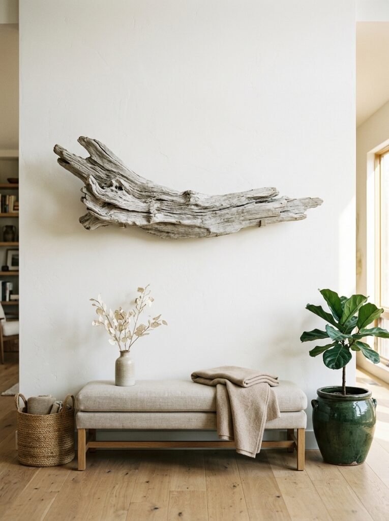
Driftwood is having a slow comeback and honestly I’m here for it, but with conditions.
One piece. That’s my rule. One sculptural piece of driftwood, either hung horizontally like a line drawing across your wall, or mounted vertically with a kind of accidental elegance. The moment you add two, it starts looking deliberate in the wrong way. Three pieces and you’re definitely at a craft fair.
The placement matters more than the piece itself. High on the wall, close to the ceiling — that’s where it feels architectural. Eye-level starts to feel decorative, and decorative is exactly what we’re trying to avoid.
British coastal homes do this particularly well, maybe because the driftwood there tends to be weathered to an almost silver-grey that pairs quietly with stone walls and linen sofas. If you’re sourcing your own and you live near a beach, brilliant. If not, look for pieces that have genuine texture and irregularity — smooth and uniform completely misses the point.
—
4. Framing Things That Aren’t Art (This Is Where It Gets Interesting)
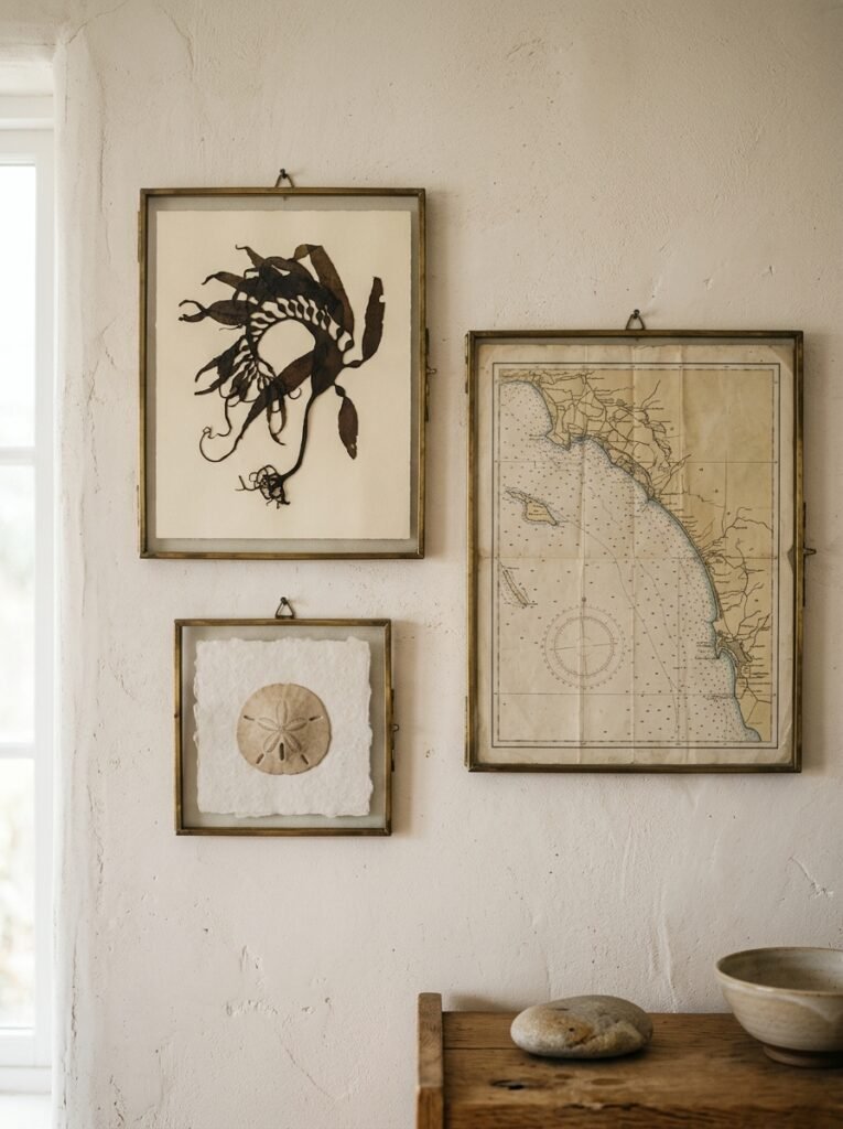
A nautical chart of a coastline you’ve actually been to. A vintage tide table. A hand-drawn map of an estuary. A page from an old maritime almanac.
These things cost almost nothing and they’re endlessly interesting to look at. Frame them in something simple — a thin natural wood frame, or even clip frames if you like the utilitarian look — and they become wall art that has a story attached to it.
“Art that has a story attached is always more interesting than art that was chosen to match the sofa.”
I’ve got a framed nautical chart of the coast near where my family used to holiday when I was a kid. Nobody who visits knows what they’re looking at immediately. They walk over, squint a little, and then go “oh, is that —?” And that’s the whole point. It starts a conversation. It means something.
Art that has a story attached is always more interesting than art that was chosen to match the sofa. Always.
—
5. The Wall That’s Just Texture (No Art Required)
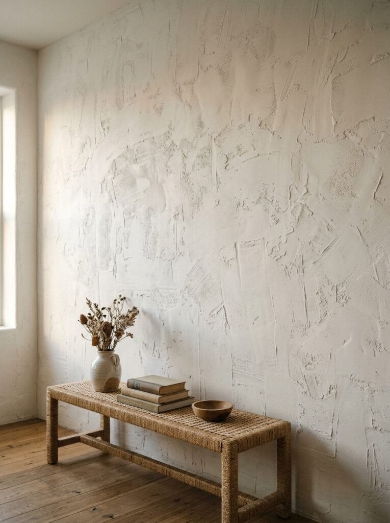
This doesn’t get talked about enough. A wall doesn’t need a frame on it to be beautiful.
Limewash paint on one wall — the kind that varies slightly in tone as the light shifts — can do more for a coastal living room than a whole gallery wall of prints. It has that quality of old Mediterranean houses and sun-bleached stone that sits somewhere between inside and outside.
Alternatively, a large-scale grasscloth wallpaper on a single wall brings organic texture without pattern. It doesn’t read as beachy in an obvious way. But there’s something about the natural weave that connects to water and sand and warmth in a subconscious way that’s hard to explain.
These texture-only walls work best directly behind a sofa or media unit — somewhere the furniture grounds them. A texture wall floating on its own with nothing near it can feel unfinished. Give it something to lean against, metaphorically.
—
6. Mirrors That Actually Earn Their Place
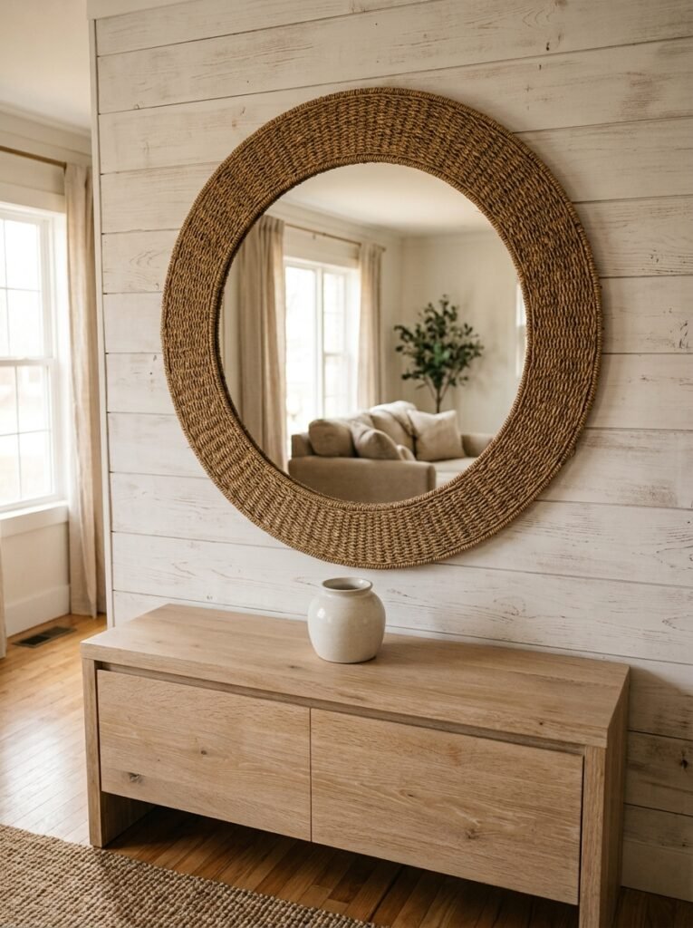
I’m slightly suspicious of the overly styled mirror-on-a-coastal-wall look. The driftwood-framed circular mirror that shows up on every mood board. It’s not that it doesn’t work — it does — it’s just that everyone’s doing it.
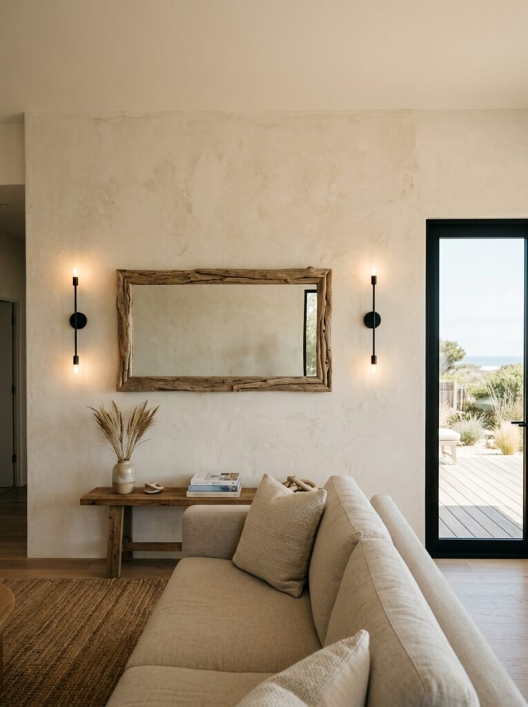
What works better, and feels more genuinely interesting: an oversized antique-style mirror with a slightly foxed surface. That slight cloudiness, the tiny age spots in the glass — it’s got a quality that reads as salvaged and old and interesting, which is more compelling than new-but-styled.
In a beach house living room specifically, mirrors earn their place by amplifying light. If you’ve got ocean-adjacent light (that particular bright white flatness of light near water), a large mirror bounces it in a way that changes the whole room. If you don’t have that light, a mirror just shows you the wall behind you, which is a lot less magical.
So: think about WHERE the light comes in before you decide where the mirror goes. Not after.
—
7. The Color That Keeps Showing Up in Every Beautiful Coastal Living Room Right Now
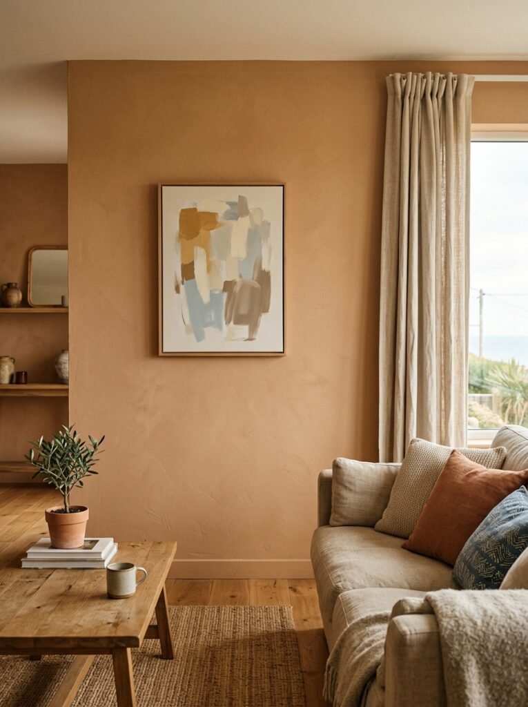
Sand. Not beige, not cream — properly warm, slightly gritty-looking sand tones are everywhere in well-done coastal spaces right now, and they’re doing really interesting work on walls as a secondary color alongside those deep blue-greens we talked about earlier.
A sandy warm white on walls paired with one deep accent wall behind the fireplace or sofa. Or a sandy gallery wall where all the frames are in warm natural wood, no black, no silver. The whole thing reads as warm and sun-bleached without obviously being themed.
I think what people are reacting against — rightly — is the cold grey coastal scheme that dominated for about five years. Grey walls, slate accents, navy cushions. Very Pinterest 2018. It was always trying a little too hard to be “sophisticated coastal” and ended up feeling like a hotel lobby.
Sand is warmer. More relaxed. Doesn’t take itself as seriously.
—
8. Shell Art Done Right (Yes, It Can Be Done Right)
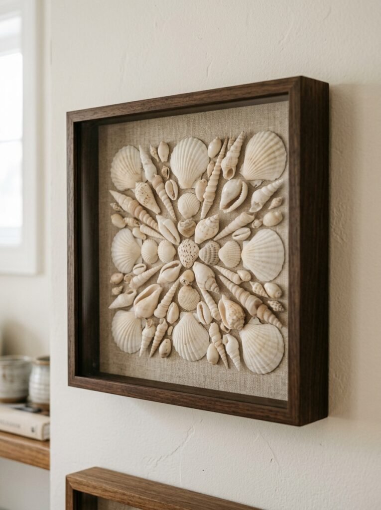
Deep breath. We’re going to talk about shells.
The reason shell decor looks bad is almost always the same: too many pieces, too small scale, too evenly spaced. A collection of twelve small framed shell prints arranged in a grid is going to look like the wallpaper of a seaside B&B, and there’s no getting around that.
But one large-scale photographic print of a single shell — properly close up, lit dramatically, almost abstract — on a wall by itself? That’s a completely different object. The scale makes it art. The singularity gives it weight.
Or, alternatively: real shells, but treated as sculpture rather than decoration. A few large specimens arranged on a shallow shelf as though they’re objects in a museum display, with nothing else on the shelf and some space around each one. That restraint is what separates “coastal decor” from “coastal collection.”
“That restraint is what separates coastal decor from a coastal collection.”
—
9. The Gallery Wall Rules I’ve Actually Found Useful
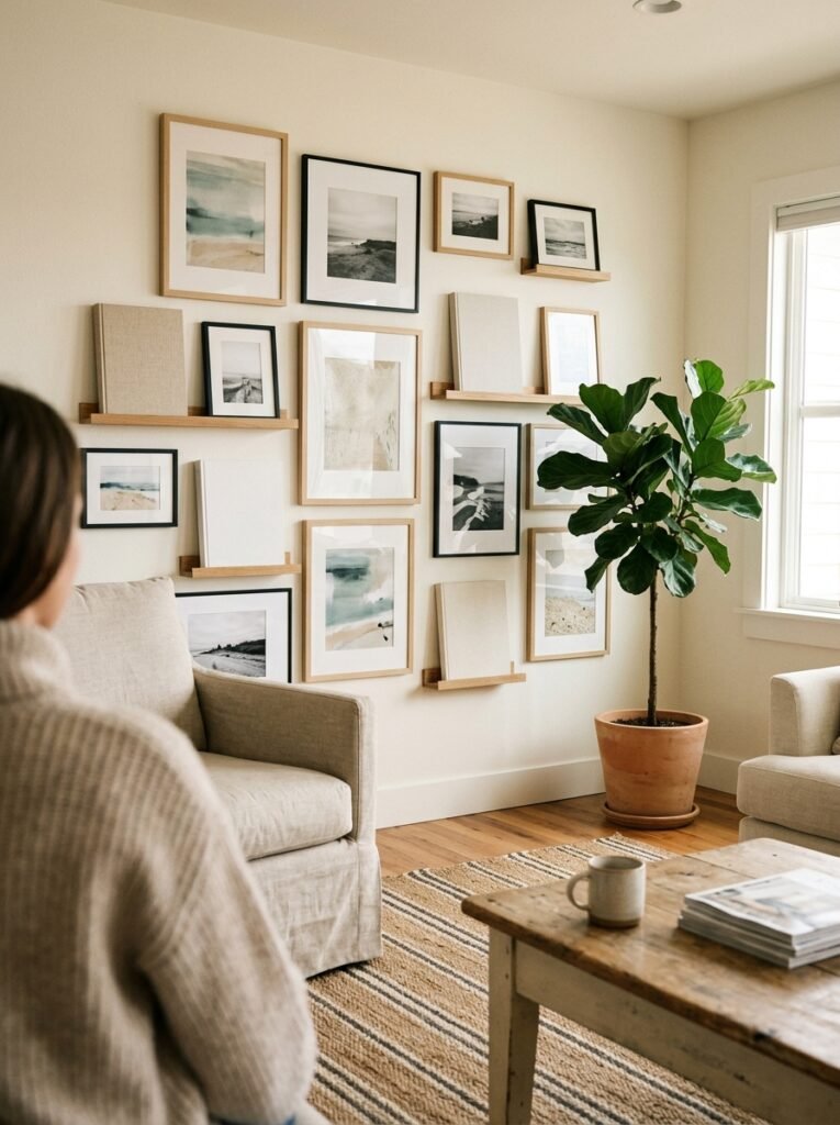
Gallery walls get done badly constantly. On coastal walls specifically, here’s what I’ve learned from doing them wrong first:
- Every frame should be a slightly different size. Not wildly different, just slightly. Identical frames in a row look like a hotel hallway.
- Leave more space between frames than feels comfortable. Seriously. Double what you think.
- Mix at least one non-photographic element in — a small sculptural piece, a framed piece of rope knot work, a ceramic plaque. One thing that isn’t a flat print.
- Keep all the frame tones in the same family. Natural wood in different tones is fine. Natural wood plus black metal plus silver plus white — that’s visual chaos.
The best gallery wall I’ve ever seen in a coastal living room had five pieces, three of which were paintings, one was a piece of driftwood on a small mount, and one was just a framed square of raw linen. That last one sounds strange but it was the most interesting piece there.
—
10. Why Your Ceiling Might Be the Most Underrated Wall You Have
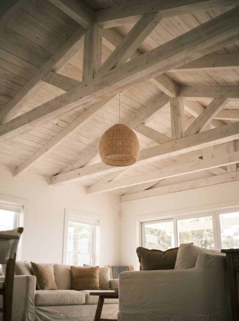
Okay, this is slightly left field, but stay with me.
In a beach house, or a room styled as one, the ceiling is an opportunity that almost nobody takes. Shiplap on the ceiling is the obvious route (and it does work, genuinely). But what I find more interesting is painted ceiling beams in a whitewashed or limewashed finish — even where there are no structural beams, adding simple painted wood strips across a ceiling suddenly gives a room the feeling of an old coastal cottage without touching a single wall.
The eye goes up. The room feels lower in a cosy way. And your walls can be quieter because the ceiling is doing some visual work.
It’s one of those ideas that sounds more dramatic than it is to actually do. And the effect on the room is ENORMOUS.
—
11. The One Type of Art That Always Works in This Kind of Room
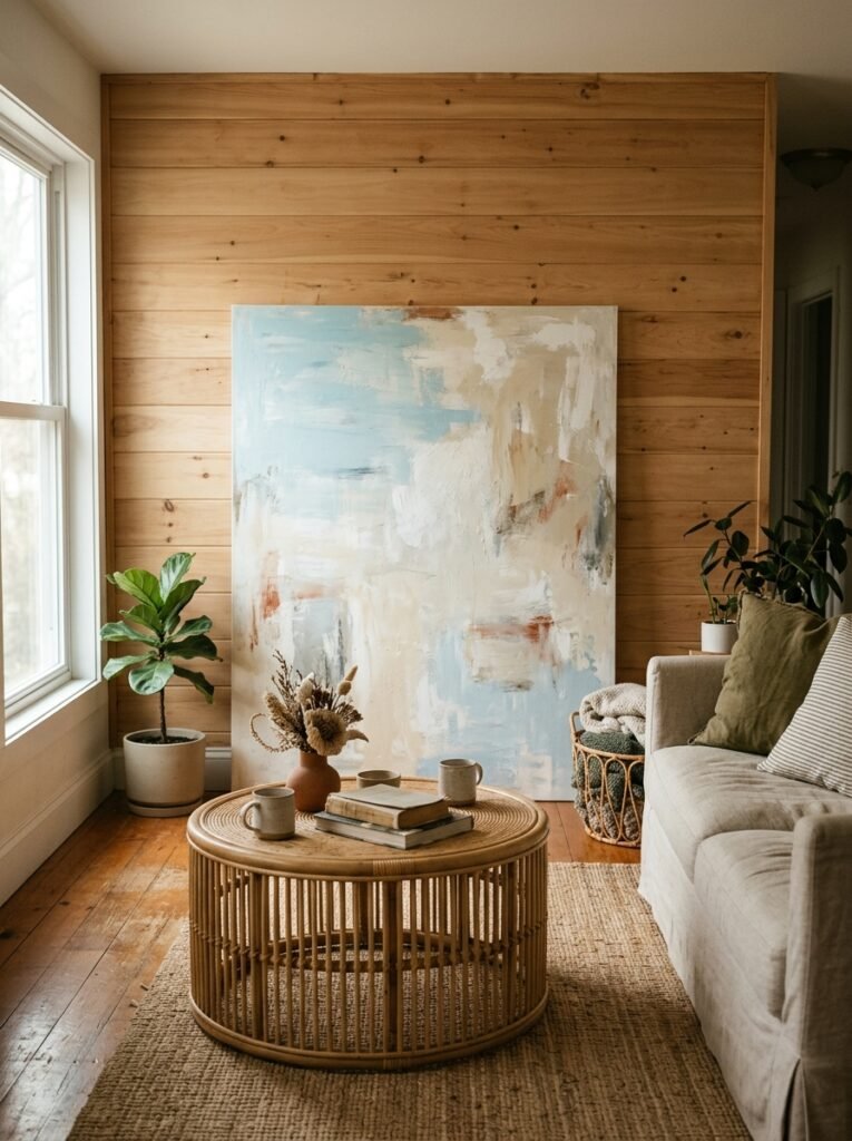
Abstract seascape. Always.
Not a photograph of waves. Not an illustrated fish. An abstract where you can feel the water without seeing it — where the colour and movement suggests something oceanic without depicting it literally.
These pieces are flexible in a way that literal coastal art isn’t. They don’t date as quickly. They work with a wider range of furniture. And they’re easier to live with long-term because they don’t demand the room around them be entirely themed to match.
The best ones tend to have some impasto texture — built-up paint that catches light differently throughout the day. In the morning it reads cool and blue. In lamplight it warms up completely. That quality of changing with the light is what makes a piece genuinely good to live with rather than just good to photograph.
—
12. The Last Wall You’ll Ever Want to Change
Here’s how I’d pull it all together if I were starting from scratch.
One large abstract seascape on the main wall — the one that faces you when you walk in. Sand-toned walls with a slightly rougher texture than flat paint, maybe limewash, maybe just a satin finish in a warm off-white. A horizontal piece of driftwood mounted high on the wall to the left of a window, with nothing else near it. And then, somewhere unexpected — maybe on a narrow wall by the entrance to the room, maybe flanking the fireplace — a framed nautical chart of somewhere that actually means something to you.
That’s it. Not much. That’s the whole wall plan.
Because the rooms that feel most like the sea — properly, quietly, deeply like it — are the rooms that remember what the sea actually looks like. Wide open. Mostly empty. With just enough in the frame to understand where you are.
—
❓ FAQ
Q: How do I make a landlocked living room feel like a beach house without it looking fake? A: Focus on texture over theme — limewash paint, natural fibers, unvarnished wood. These things feel coastal without screaming “nautical.” And keep the decor sparse. A few carefully chosen pieces in organic materials will do far more than a roomful of obvious beach references.
Q: What’s the best wall color for a coastal living room in the UK where light is limited? A: Go warmer than you think you need to. That greyed-blue reads beautifully in strong light but can feel cold and flat in low UK light. A sandy warm white as your base, with blue-green brought in through art and textiles, will hold up much better through the grey months. Save the bold blue walls for rooms that get decent south-facing sun.
Q: Can I do a coastal living room without any blue at all? A: Absolutely, and honestly some of the most interesting coastal rooms lean into sand, driftwood grey, sea-glass green, and bleached white instead. Blue is just the shorthand — the actual coast has a much wider palette than that. Consider the colours of sea mist, wet pebbles, dried sea grass, and foam. None of those are blue.
—
💭 Final Thoughts
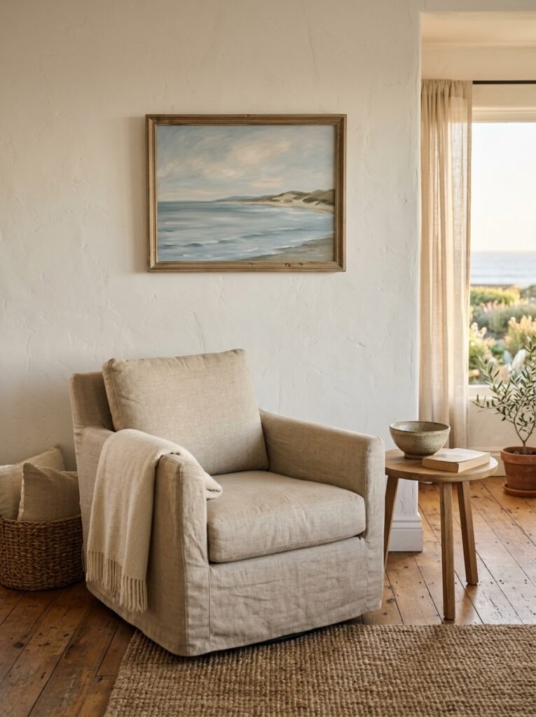
The rooms I keep coming back to on my saved boards aren’t the ones that committed hardest to the theme. They’re the ones that felt genuinely inhabited — like someone actually lives there, walks barefoot on the floor, drapes a towel over the sofa on a Sunday.
Walls in those rooms are doing something quiet. Holding space rather than filling it.
What’s one thing you could take OFF your walls this week that would make the whole room breathe better?




