
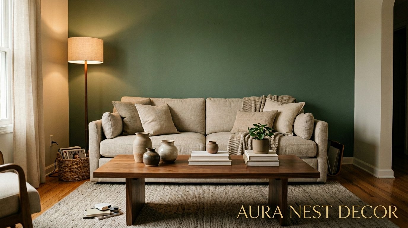
The Accent Wall Trend That’s Finally Worth Doing Right (And Why Most People Get It Wrong)
You painted one wall dark. You stepped back. And now you’re not sure if it looks intentional or like you ran out of paint. We’ve all been there. Here’s what actually makes an accent wall feel like a decision instead of an accident.
—
1. Why the “Just Pick the Wall Behind the Sofa” Advice Keeps Failing People
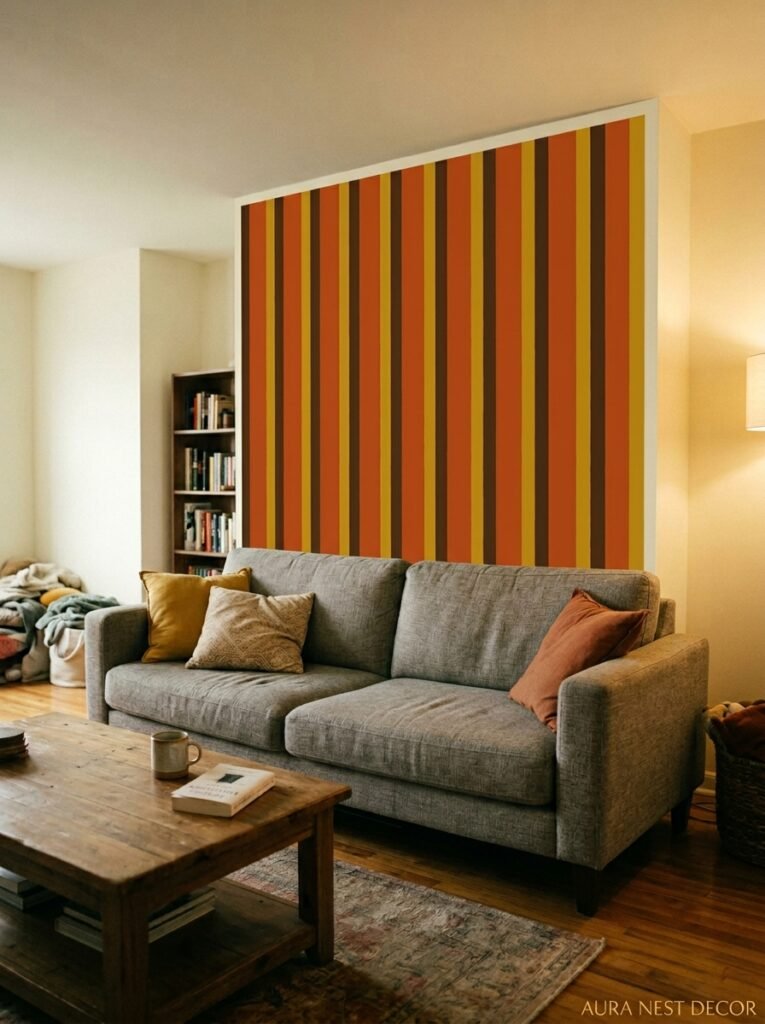
It sounds so simple, right? Accent the wall your sofa faces. Done. But this rule — and I mean the way it gets passed around like it’s gospel — is actually the reason so many living rooms end up feeling slightly off and nobody can explain why.
Here’s the thing. An accent wall works when it anchors something that already wants to be noticed. Not when it just fills the space behind the biggest piece of furniture you own. If your sofa floats in the middle of the room, or if the wall behind it has no architectural interest whatsoever, painting it a different color doesn’t create a focal point. It just creates a big dark rectangle.
The wall you choose should have a reason to exist. A fireplace breast. A chimney stack. A recessed alcove. Even a wall that framing a built-in bookcase or a run of windows can work. If the wall has NO bones — no interruptions, no features, nothing — color alone has to carry a LOT of weight and it usually can’t do it alone. This is where people go wrong. They treat color as the whole plan instead of as the finish on a plan.
So before you pick up a paint chip, ask yourself: what does this wall DO? Because the best accent walls don’t just look good. They make sense.
“Color isn’t the idea. Color is the finishing touch on an idea.”
—
2. The Color That Keeps Showing Up in Every Beautiful Living Room Right Now
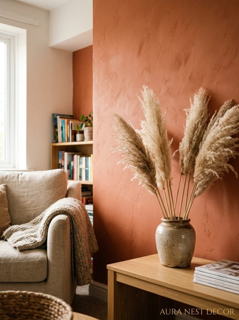
Not gonna lie, I resisted it for a long time. Dark green. Like, properly dark green — forest green, fern, that deep sage-that-isn’t-really-sage shade. I thought it was a trend I could skip. And then I painted my chimney breast in Farrow & Ball’s Calke Green and I basically cried.
It does something warm to a room that navy doesn’t and that charcoal can’t. It bounces candlelight in this amber-green way that feels genuinely ancient, like you’ve moved into a Georgian townhouse even if you live in a 1990s new-build. And it works in SO many different room styles, which is rare. Maximalist rooms with pattern and antiques? Yes. Minimal rooms with linen sofas and bare wood? Also yes.
In the US I keep seeing similar deep greens paired with terracotta accessories and raw wood furniture. In the UK it’s more often paired with cream, warm white, and vintage brass. Both combinations work. Both make green feel grounded and not garden-centre-y.
If you’re not ready for green, dark mushroom and warm charcoal are having their moment too. Dusty rose keeps coming back on Pinterest but I’d be careful — it reads differently in low light and can tip into “90s bathroom” if you’re not intentional about the rest of the room’s palette.
Anyway. Green. Consider it.
—
3. Why Paint Isn’t Always the Answer (And What to Do Instead)
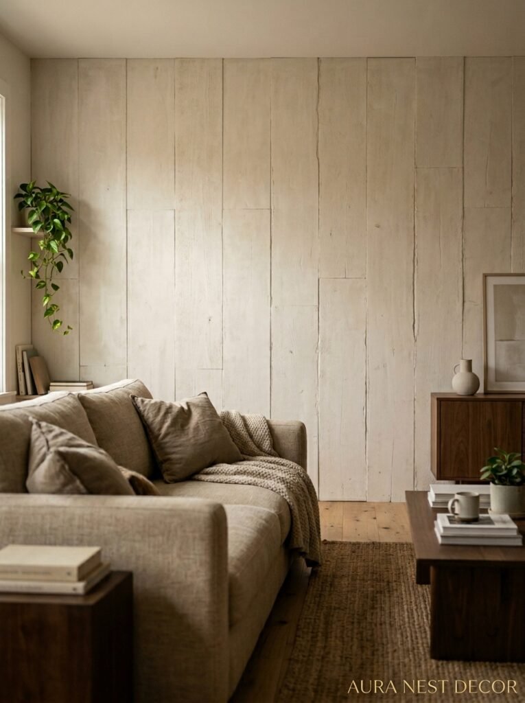
Okay so I know “accent wall” and “paint” feel synonymous. But some of the most interesting living rooms I’ve come across lately aren’t using paint at all on their feature wall. And I think people underestimate how much texture changes the experience of a room compared to a flat coat of color.
Limewash plaster is one. It’s having a huge moment right now and honestly? Deserved. Unlike regular paint, it creates natural variation — lighter patches, darker patches — so the wall literally looks different from different angles and in different lighting. It has this antique Italian farmhouse quality that flat paint just can’t replicate no matter how beautiful the color is.
Wooden slat panels are another option. You see them everywhere right now and yes, it’s reached the point where it could tip into cliché — but when they’re done well and in the right wood tone, they add genuine warmth and acoustic softness that paint never will. They’re great in rooms that are a bit echoey or feel too hard and flat.
Wallpaper on one wall is also back, if it ever really left. Not the aggressively illustrated feature wallpapers of 2012. More like subtle linens, printed botanicals at a small scale, or abstract painterly designs that look almost like plaster from a distance. One wall. Keep it restrained.
The point is — the IDEA of an accent wall is to create focus and depth. Texture creates depth just as well as color does. Sometimes better.
—
4. The Lighting Mistake That Kills Even the Most Beautiful Accent Wall
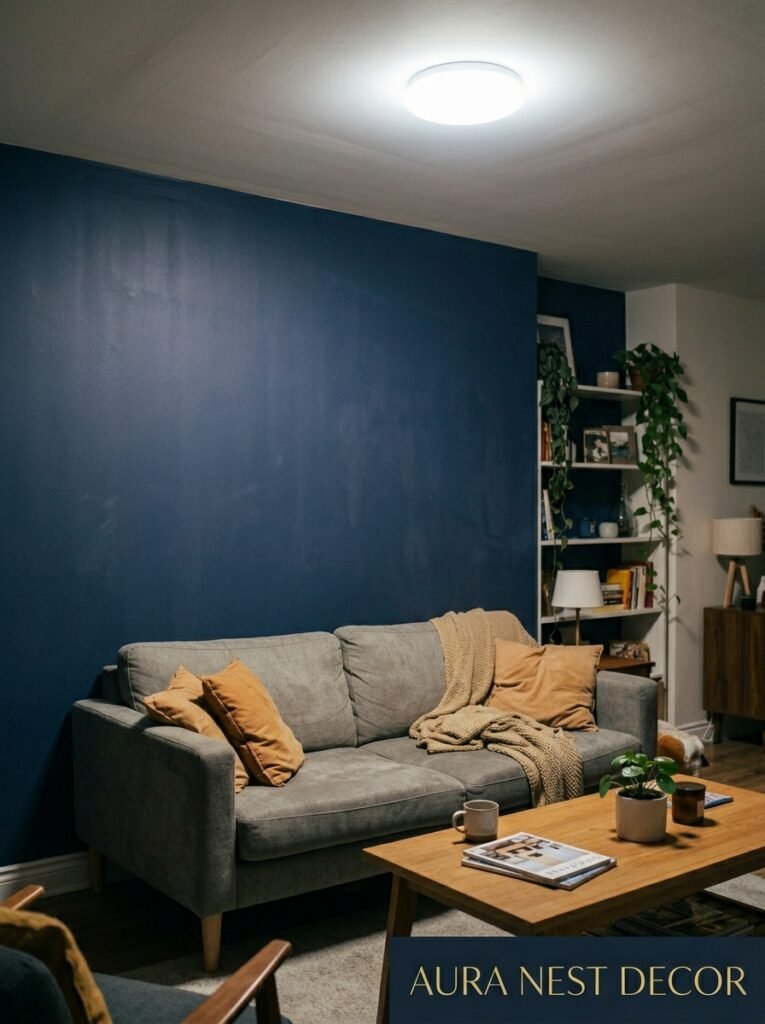
Here’s something almost nobody tells you. Your accent wall can be the perfect color, on the perfect architectural feature, and it can still look FLAT and a bit sad if the lighting is wrong. And most living rooms get this part completely wrong.
Overhead lighting points down. Down is not the direction you want light going when you’re trying to show off a wall. You want light hitting the wall from an angle — either washing down from above (wall-mounted uplights or sconces) or washing upward from below (a lamp placed close to the wall, ideally with a shade that throws light sideways or upward). That angled light creates shadow, and shadow is what makes color look rich instead of just… present.
The amber glow of an Edison bulb at 7pm next to a deep green wall is genuinely something. But the same wall under a 4000K overhead LED looks like a dentist’s waiting room. So get your lighting sorted before you commit to a color. Or at least think about it simultaneously, not as an afterthought.
Side note — if your living room has a fireplace or candles nearby, test your paint color at night with those light sources first. Totally different experience than daylight. Colors behave differently and sometimes the “safe” choice in the paint shop becomes the most beautiful thing in the room once the sun goes down, or vice versa.
“The color doesn’t matter if the light isn’t doing its job.”
—
5. The One Rule That Makes Any Accent Wall Feel Intentional and Not Random
Okay I’m going to try to say this clearly because I’ve explained it so many times and it’s still one of the most misunderstood things in interior design.
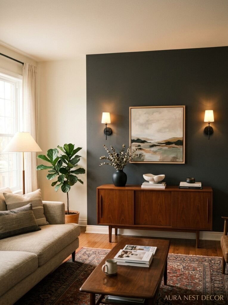
Your accent wall should connect to the rest of the room through the accessories. That’s it. That’s the rule. If you paint a wall in a deep terracotta and then there’s literally nothing else in the room that references that terracotta — no cushion, no candle, no book spine, no small ceramic, nothing — the wall looks like it belongs to a different room. It just sits there. Loud and alone.
But when you repeat the color — even once, even slightly differently — in a throw, in a vase, in the edge of a lampshade, suddenly the wall looks CHOSEN. Like everything was planned. Like you’re the kind of person who has a whole vision for their space.
The repetition doesn’t have to be obvious. It doesn’t even have to be the same color exactly. With a dark green wall, a small olive cushion does it. A dried eucalyptus stem in a clear vase does it. It’s about echo, not copy. The eye connects the dots and the room feels coherent.
This is genuinely the only hack you need. Everything else is just styling and preference.
—
6. The Rooms Where Accent Walls Don’t Work (Honestly, Just Skip It)
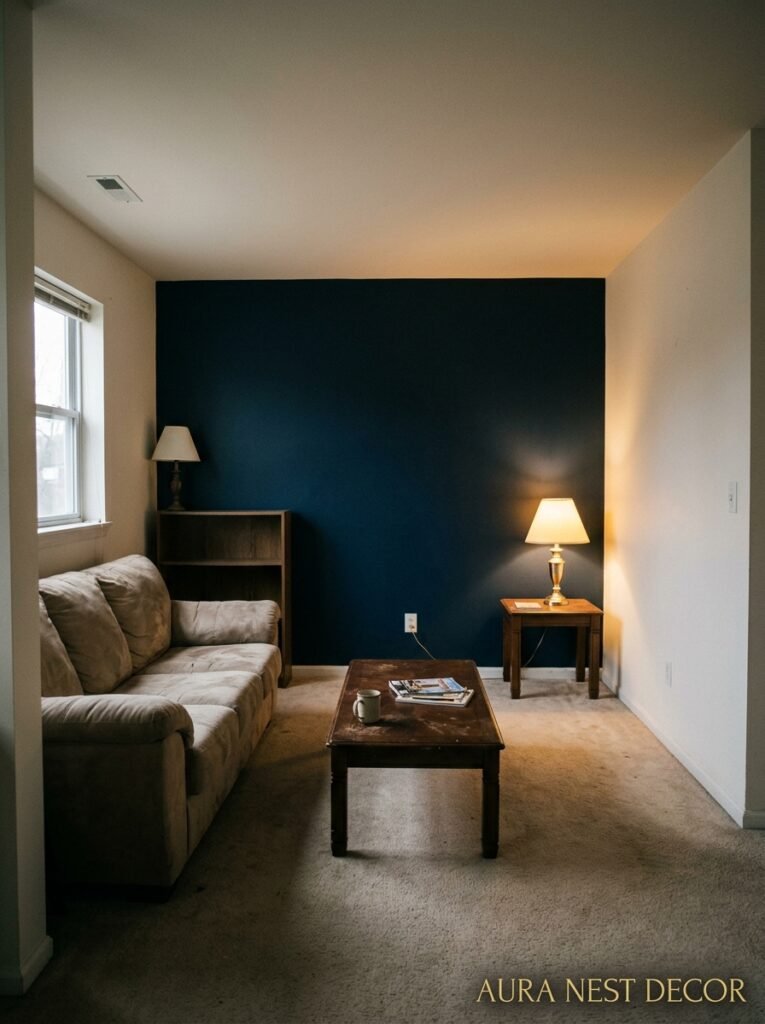
Not every room is a candidate. And I wish more design advice was honest about this instead of acting like one accent wall is always the answer to every awkward space.
Very small rooms — like genuinely small, not “it feels small” — often don’t benefit from an accent wall because there isn’t enough visual distance to read the feature wall as a background. You’re basically just IN the color. Sometimes that can be great (fully committing to a dark moody room can be stunning), but a partial treatment in a tight space often just looks unfinished.
Long, narrow rooms can be tricky too. If you paint one of the SHORT walls at the end of a narrow room a dark color, it can make the room feel like it’s closing in on you even faster. Painting a LONG wall in a narrow room can help it feel wider — but it has to be done carefully and with the right tone.
And rooms with lots of natural light bouncing all over the place — big south-facing windows, glass doors, skylights — sometimes neutralize the impact of an accent wall because the light is so dominant that it washes out the contrast you’re trying to create. Not always. But sometimes. Test before you commit.
—
7. British Living Rooms vs American Living Rooms — The Same Rules DON’T Quite Apply
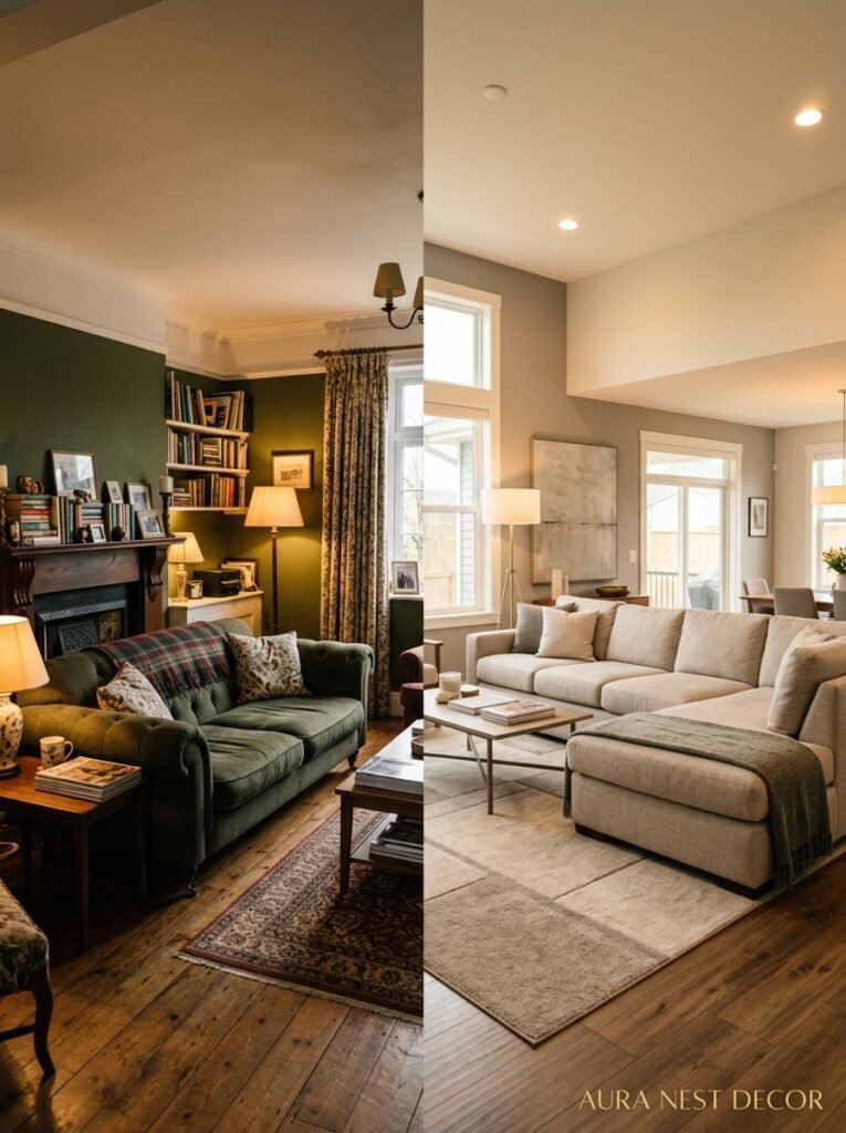
This might be a bit controversial but I genuinely believe British and American living rooms need slightly different approaches to accent walls, and it’s because of the light.
British homes, especially older ones, are darker by default. Smaller windows, deeper rooms, less direct sunlight for large parts of the year. This means dark accent walls can feel VERY dark — heavier than intended. What looks like a moody, dramatic forest green in a bright Californian room can look like a cave in a Victorian terrace in Manchester. If you’re in the UK, especially if your living room doesn’t face south, you often need to go a shade or two lighter than you think to get the effect you saw in the Pinterest photo (which was almost certainly taken in a brighter room).
In the US, particularly in states with strong sunlight, you can usually afford to go darker because the light will knock the intensity back. And because many American living rooms have higher ceilings and more square footage, accent walls have more room to breathe. A dark wall in an open-plan American living space often reads as cozy and dramatic in a good way. The same paint in a UK semi-detached can occasionally just feel oppressive.
Also — British homes tend to have more textural variety already (cornicing, dado rails, period features) so sometimes a quieter accent color works better than something bold. American rooms often benefit from more drama on the wall because the architecture is starting from a more neutral place.
“The photo that inspired you was probably taken in better light than your living room has.”
—
8. How to Actually Sample a Paint Color Before Buying Three Test Pots You’ll Never Use

Okay real talk. The traditional “buy multiple test pots and paint squares on the wall” approach is FINE but most people do it wrong and end up confusing themselves more.
A few things that actually help. First, don’t paint a tiny square in the corner. Paint a LARGE section — at least 2 feet by 2 feet if you can manage it — in a few different spots on the wall, including near natural light and far from it. Small samples in dark corners tell you almost nothing useful.
Second, look at the sample across different times of day and different artificial lights. Morning light, afternoon light, evening with lamps on. The color WILL look different. That’s not a problem, that’s just how color works. You’re looking for the version that looks best at the times you actually USE the room the most.
Third — and this is the thing that’s changed my life — try Samplize (available in the US) or similar peel-and-stick paint samples. You get a large swatch you can move around the room, put next to your sofa, hold up to your curtains. It’s SO much more useful than painted squares because you can actually test it against your existing furniture and textiles, which is the whole point.
—
9. The Pattern Accent Wall That Still Looks Sophisticated (Not Like a Feature Wall From 2008)
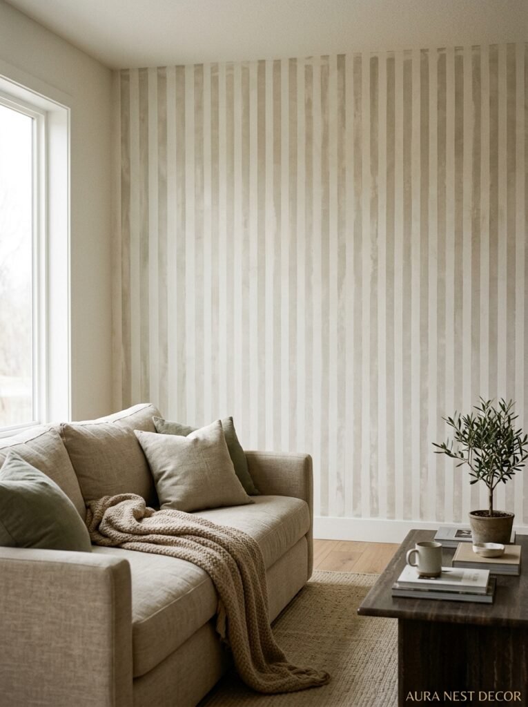
I want to talk about patterned accent walls for a second because they’re back and they look nothing like the medallion wallpapers of the mid-2000s. Done right, a pattern on one wall can add so much more depth and personality than a solid color — and in some rooms it’s actually more subtle, which sounds counterintuitive but makes sense when you see it.
The key is scale and print type. Large graphic prints with high contrast tend to feel bold and contemporary — great for rooms that can handle some visual noise. Smaller, quieter prints — a delicate sprig, a tone-on-tone geometric, a soft abstract — can actually recede slightly on the wall while still adding richness and texture. They whisper rather than shout.
Right now I’m seeing a lot of painterly prints that look like art — like someone made a large scale oil painting and repeated it. These are stunning behind a simple linen sofa and do all the work that twelve decorative cushions would otherwise have to do.
The golden rule with pattern: keep everything else in the room quieter. One patterned wall with simple, solid-colored furniture and minimal accessories almost always works. One patterned wall with ALSO a very busy rug and patterned cushions usually doesn’t.
—
10. Paint Finishes That Nobody Talks About Enough
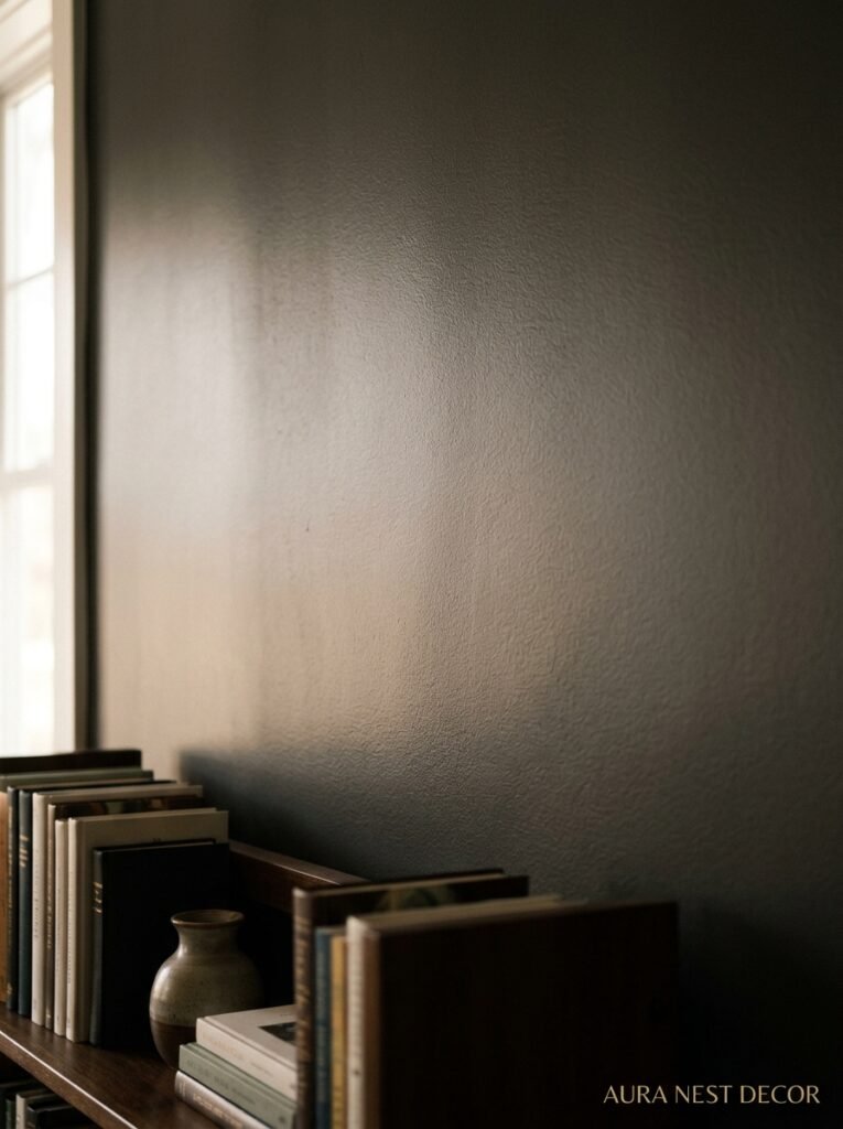
You’ve picked the perfect color. But wait — what FINISH? This is the detail most people skip and then wonder why the wall looks a bit flat or weirdly shiny.
Matte finishes are the standard choice and there’s a reason — they look beautiful on smooth walls, absorb light elegantly, and make rich colors look their deepest. But they mark. Literally any scuff, greasy fingerprint, or splash shows up on matte paint, and you can’t really wipe it. In a high-traffic living room with kids or pets, this can get old fast.
Eggshell is underrated. It has just a tiny amount of sheen — not enough to be glossy, but enough to make the wall slightly washable and give the color a subtle luminosity. Most professional decorators in the UK use eggshell for almost everything and it shows. It tends to make colors look a little more alive without looking shiny.
Flat satin finishes are similar but lean a touch more modern. Great for feature walls in rooms with more contemporary furniture.
Dead flat is gorgeous but genuinely only worth it if the wall is perfectly smooth. Any imperfection in the plaster — and British walls especially are FULL of them — gets highlighted under dead flat because the lack of any reflectivity removes the camouflage effect that even slight sheen provides.
—
11. What to Do With the Other Three Walls (Because This Part Really Matters)
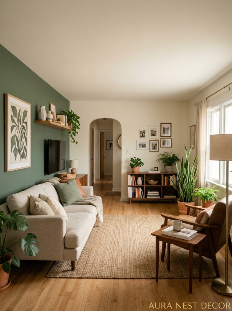
This is the question people forget to think about before they’ve already committed to the accent wall. And it matters almost as much as the accent wall itself.
If your accent wall is dark, the other walls have a choice to make. They can go white or very light (creates contrast and makes the dark wall look dramatic), they can go a lighter version of the same color (creates a cocoon effect — moody, enveloping, sophisticated), or they can go a completely neutral mid-tone that connects the room without fighting.
What doesn’t work: other walls in a completely unrelated bold color. Unless you’re doing a specific maximalist thing deliberately, two competing colors on different walls creates visual chaos and makes it hard for the eye to settle. The accent wall loses its punch.
In British Victorian and Edwardian homes, going two shades lighter on the other walls — so the room has a palette but the accent wall is the darkest expression of it — is such a good move. It keeps the period character of the room while adding some drama. And it looks genuinely considered rather than like someone couldn’t decide between two colors.
—
12. The Mistake That Makes Even Expensive Paint Look Cheap
One final thought. And it’s the most important.
Prep. The wall prep before you paint.
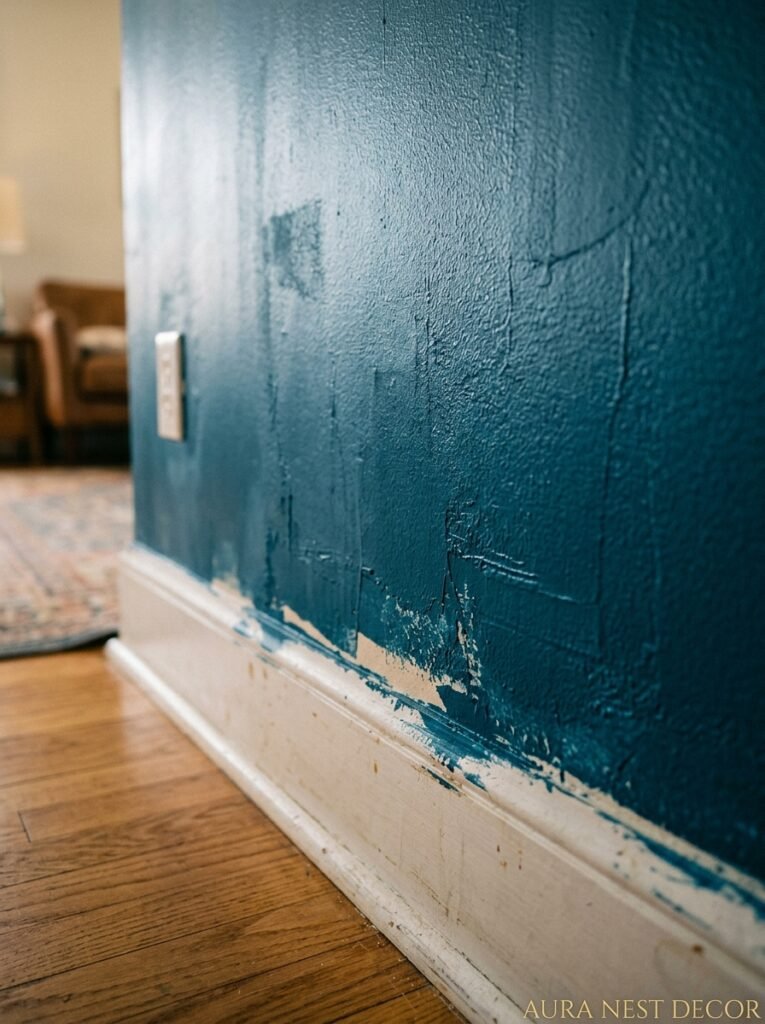
An accent wall draws the eye on purpose. You are INVITING people to look at this wall closely. Any cracks that weren’t filled, any bumps that weren’t sanded, any bits where old paint is peeling, any visible brushstrokes going in different directions — all of it gets noticed and it makes even a stunning color look like a DIY disaster.
In the US, most living rooms have fairly smooth drywall, so prep is fairly quick if the walls are in decent condition. In the UK, you’re often dealing with older plaster that has imperfections, hairline cracks, and uneven texture. Fill everything. Sand it. Use a good primer, especially if you’re going dark over a light or medium base — skipping the primer means the color looks thin and patchy and you’ll need three coats instead of two.
Two coats of a well-primed wall in good paint, applied with a decent roller (not the cheap foam ones), will look professional. One coat over a badly prepped wall with a budget roller will look shoddy no matter how beautiful the color is.
The paint is the last 20% of the job. The prep is the first 80%.
—
❓ FAQ
Q: Does an accent wall make a room look bigger or smaller? A: It depends entirely on which wall you choose and the color. A dark accent wall on the far wall of a long room can make the room feel shorter and cozier. Dark paint on a side wall can make a narrow room feel wider. Lighter, warmer tones generally open a space up while still creating focus. There’s no universal rule here — it’s about how you want the room to feel.
Q: How do I know if an accent wall will suit my existing furniture? A: Pull out the main colors already in your room — sofa fabric, rug, curtains, wood tones — and look for a wall color that either echoes one of those or sits naturally within the same temperature range (warm tones with warm tones, cool with cool). Don’t pick a wall color in isolation from the rest of the room; it almost always leads to regret.
Q: Is the accent wall trend over? A: Not even close, but how it’s done has changed a lot. The bold feature wallpaper from 2010 is done. But a beautifully painted or textured single wall? That’s not a trend — that’s just how rooms work. A focal point is always going to matter.
—
💭 Final Thoughts
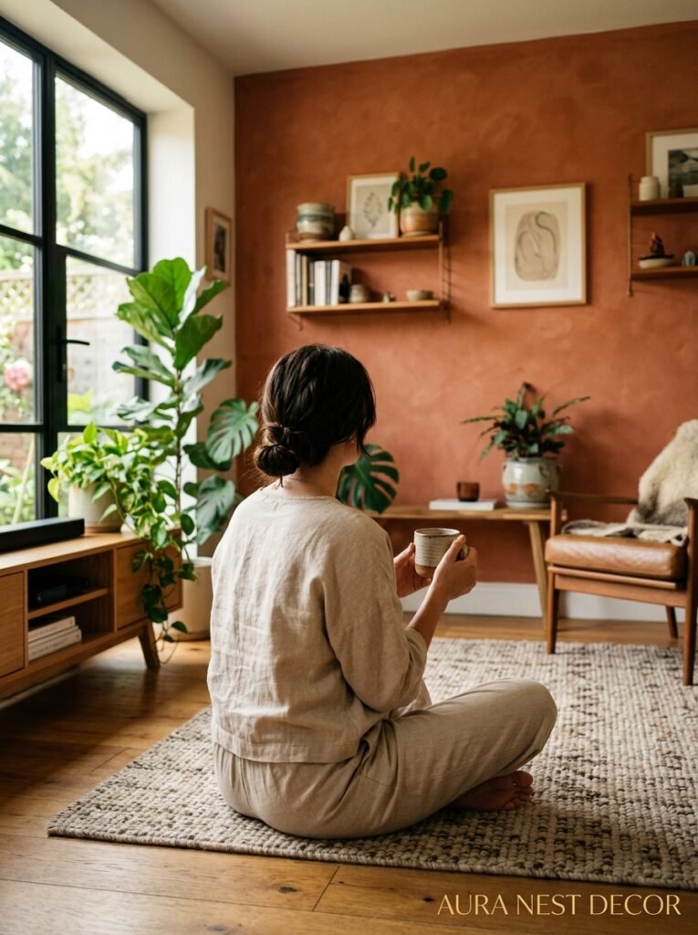
An accent wall, done right, isn’t about following a trend. It’s about deciding where you want someone’s eye to go when they walk into your living room — and then making that place worth looking at. The color, the texture, the light — it all adds up to a feeling. And that feeling is what people remember when they leave your home.
Start with the wall that already has a reason to exist. Build outward from there. What feeling do you want your living room to give people the moment they walk in?




