
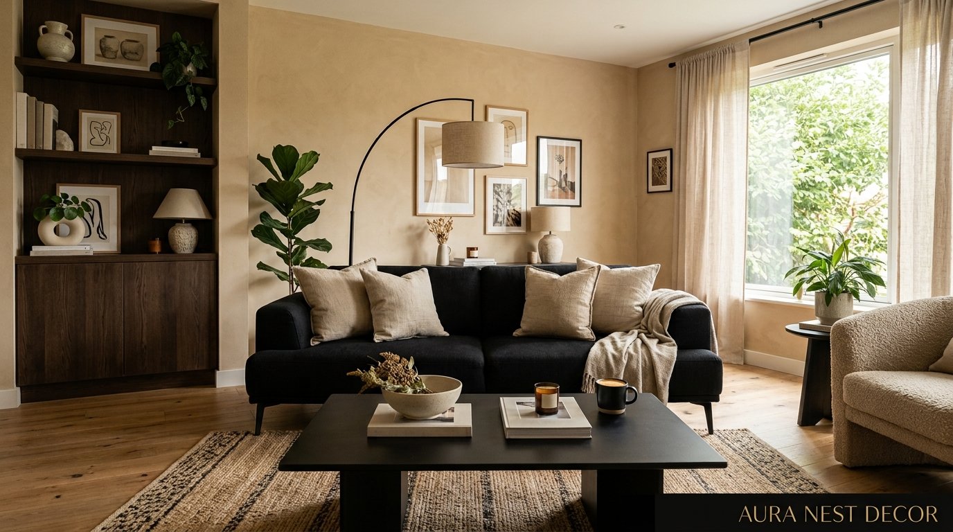
The Black and Beige Living Room Combination That Designers Keep Coming Back To
You’ve scrolled past a thousand living rooms and none of them felt quite right. Too cold. Too safe. Too much. Then you land on that room — the one with the deep black accents against those warm, creamy walls — and something clicks.
This is why black and beige won’t quit.
—
1. Why This Color Pairing Hits Different Than All the Grey Rooms You’ve Seen
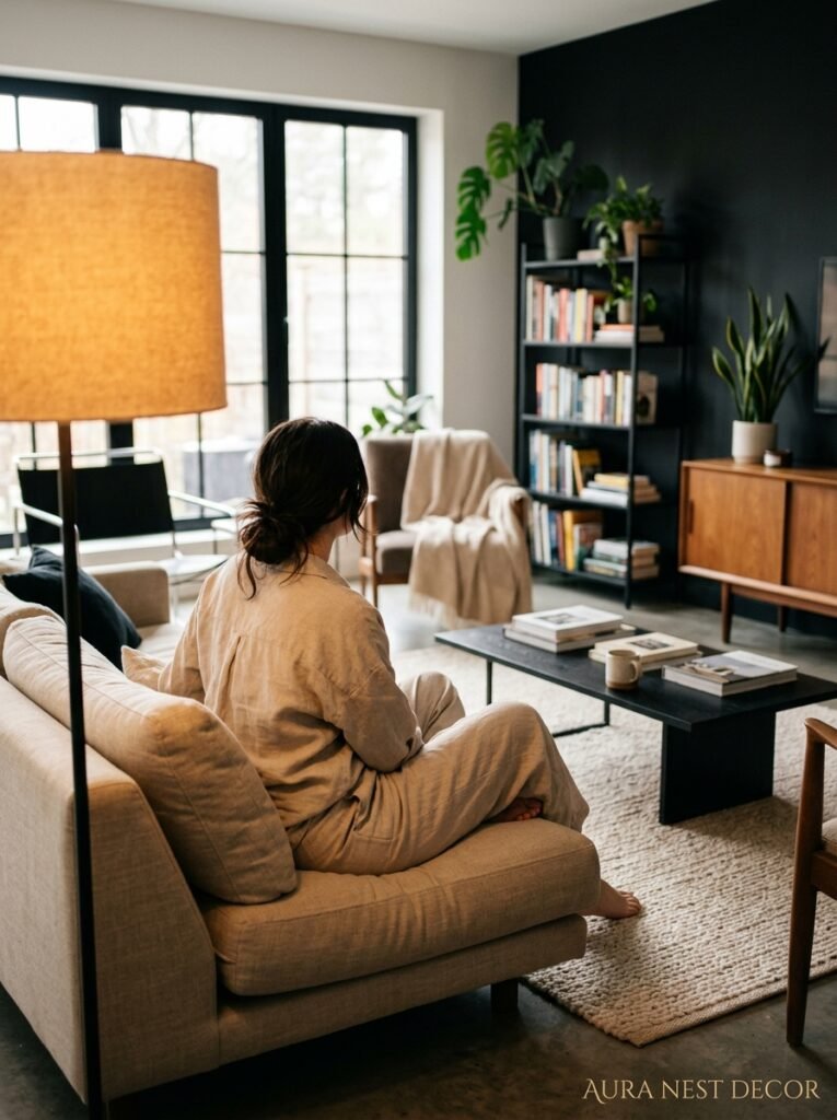
Grey had its moment. A long one, honestly. Every new build in Britain, every American flip house for about a decade — grey walls, grey sofa, grey everything until your eyes went numb. And then people started craving something with a little more soul.
Black and beige has soul.
The reason it works so well isn’t complicated. Beige — actual warm beige, not that cold off-white that still reads as grey — carries heat in it. It’s got yellow, sometimes a whisper of pink or terracotta, and it makes any room feel like the sun got there before you did. Black anchors all that warmth. Without the contrast, beige can feel like a room that hasn’t quite decided what it wants to be. With it? Suddenly there’s structure. There’s intention.
Interior designers have been quietly obsessed with this pairing for a few years now, and it’s not going anywhere. Because unlike trends that need constant updating, black and beige is fundamentally about contrast and balance — two things that never actually go out of style. You’re not chasing a mood board. You’re building a room that feels like it belongs to someone.
“Black doesn’t make a room smaller. It makes it feel finished.”
2. The Specific Shade of Beige That Actually Works (And the Ones That Don’t)
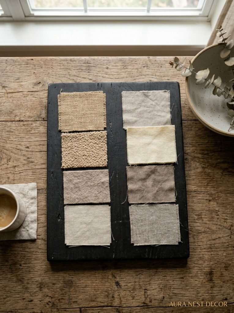
Not all beige is created equal and this is where most people go wrong.
There’s a version of beige that photographs beautifully and looks absolutely terrible in person once winter light hits. It reads almost yellow, like the walls have aged badly, and it fights with everything around it. That’s not the beige you want here.
What you’re looking for is what paint people sometimes call “greige” — a beige with just enough grey undertone that it stays neutral in changing light — or a warmer linen tone, something closer to a natural undyed fabric. In the US, Sherwin-Williams’ Accessible Beige is the one everyone’s been referencing lately. In the UK, Farrow & Ball’s Jitney or Elephant’s Breath do the work beautifully, though Elephant’s Breath does lean cooler so pay attention to your natural light situation.
Test it. Paint a big swatch, live with it for three days in different light conditions. Morning light, afternoon, lamplight at night. Because lamplight is when the magic either happens or dies — that warm amber glow at 7pm is your real test. If the beige sings then, you’ve got it right.
The one shade to avoid pairing with heavy black accents? Cream that goes almost white. Too much contrast too fast, and the room starts to feel clinical rather than curated.
3. Where You Actually Put the Black (This Is The Part Everyone Gets Wrong)
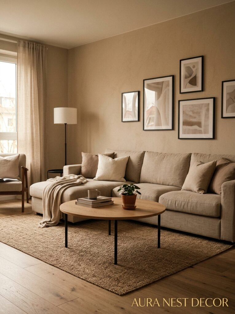
People hear “black and beige living room” and immediately think they need black walls. Maybe a dark feature wall behind the sofa. And look — that can work. But it’s not the only way, and honestly? It’s not always the most interesting way.
Think about black as punctuation. You don’t write an entire paragraph in bold — you use it to make specific things land harder. Same logic here.
Black window frames are extraordinary. If you’re renovating or replacing windows in the UK and have any say, go black metal or black-painted timber frames. They frame the outside view like a painting. American homeowners doing any kind of open-plan work — black steel-look doors, those big pivot doors, the kind of internal glazing that’s been everywhere on renovation accounts — all of that works brilliantly against warm beige walls.
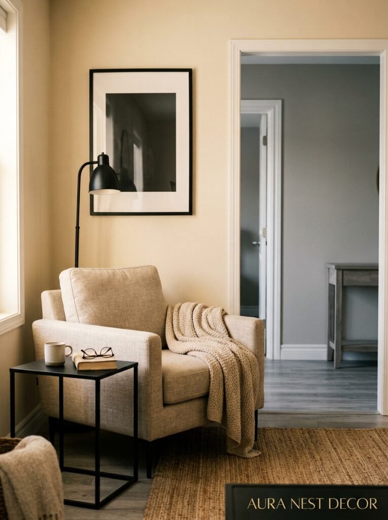
Black light fixtures are probably the easiest entry point for renters or anyone not ready to commit to much. A matte black pendant over a coffee table, a sculptural black floor lamp in the corner. Small doses, specific placements. The eye goes there first and everything else arranges itself around those fixed points.
Black furniture works too, obviously. But not ALL of it. One piece. Maybe a black sofa if you’re brave, but then everything else in the room has to breathe. Or a black lacquered console table, a black TV unit — paired with warm wood tones and lots of that beige, it won’t feel heavy.
4. Texture Is Doing 90% of the Work Here
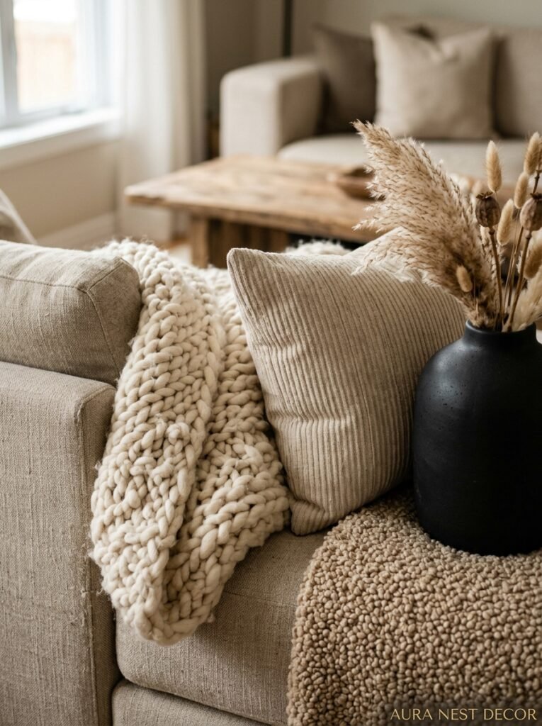
Here’s the thing about a limited color palette: when you pull back on color variety, texture has to step forward. A room in only black and beige with no texture is just flat. Kind of sad, actually.
But a room in black and beige with thoughtful texture? Genuinely extraordinary.
Think about a chunky boucle sofa in warm cream or oatmeal — that nubby surface catches light differently than smooth fabric, creates shadows within itself, makes the piece look more expensive than it is. A woven jute rug on light hardwood floors. A linen throw folded over the arm of a chair, the slight wrinkle of it. A matte black ceramic vase next to a smooth polished one. Rough plaster walls versus silk cushion covers.
The contrast doesn’t only exist between black and beige. It exists between matte and shine, soft and hard, woven and smooth. That’s the layer most living rooms are missing — the one that makes a room feel like it was put together by someone who actually thinks about these things.
“A sofa you want to sit in and a rug you want to walk barefoot on — that’s the whole assignment.”
5. The Furniture Shapes That Don’t Fight The Palette
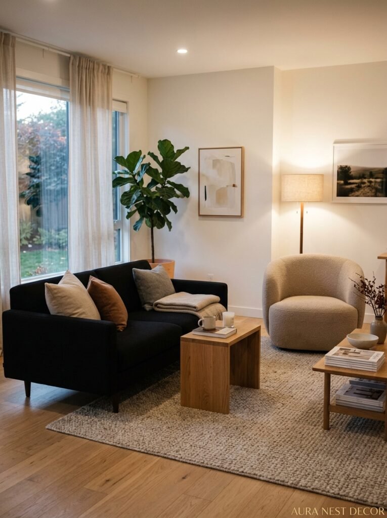
Low-profile furniture. That’s the style note here. Black and beige has a naturally sophisticated, somewhat sleek energy to it, and high-backed, heavily carved, or very ornate pieces tend to compete with that rather than complement it.
A low, long sofa with clean lines in cream or oatmeal boucle. A coffee table that sits close to the ground — natural wood, or black metal with a glass top, or even concrete if you’re feeling adventurous. Bookshelves styled loosely, not crammed, with black spines pulled forward for visual punch and warm-toned books and objects filling the rest.
The Scandinavian influence is obvious here and that’s fine because it works. That commitment to simple, purposeful forms makes every piece feel considered. But you don’t have to go full Nordic — plenty of warmer, more traditionally British or American-inflected rooms pull this off with curved sofas, rounded ottomans, arched mirrors. Curves actually work really well against flat black accents. They soften the whole thing.
Side note — an arch mirror above a console table in a black and beige room is one of those combinations that photographs so well it feels almost cliché at this point, but it’s cliché because it’s genuinely that good.
6. Lighting That Actually Makes This Palette Come Alive
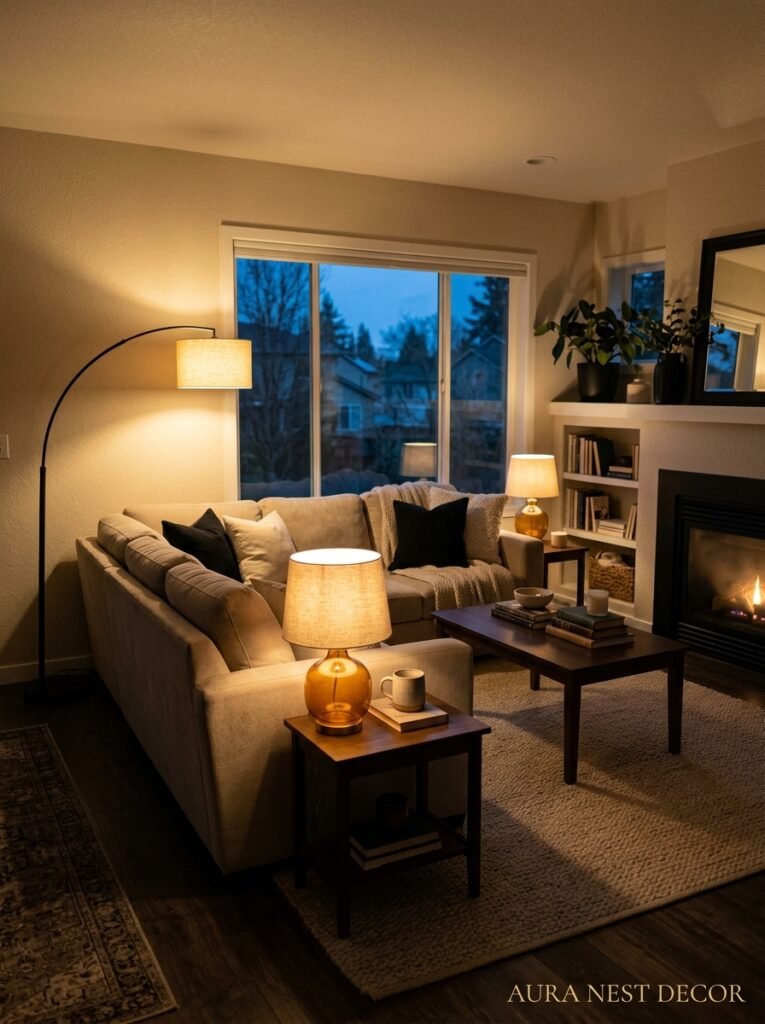
The palette only works as well as the light you put it in. This isn’t a room for overhead LED panels buzzing at full brightness. Hard no.
Layered lighting. Multiple sources, all warm-toned. Bulbs around 2700K — that’s the golden, slightly amber warmth rather than the blueish daylight range. In a black and beige living room, at night, those warm bulbs bounce off the beige walls and the whole room glows. The black accents recede slightly and act as definition rather than weight.
Table lamps are essential here. One on each side table if you’ve got them, or a floor lamp angled toward a wall so you get that indirect, bounced light effect. Anthropologie, West Elm, Soho Home in the UK — all have options in natural stone, ceramic, or aged brass that sit perfectly in this kind of room. Warm brass hardware, actually, is your best friend throughout a black and beige scheme. It’s the metallic that bridges both tones without tipping into cold silver or industrial chrome.
Candles too. Not scented ones necessarily (although, sure, your call), just the visual flicker of a real flame does something no bulb quite replicates. A cluster of pillar candles on the coffee table, different heights, uneven arrangement. That’s warmth you can feel across the room.
7. The Art You Hang and How You Hang It
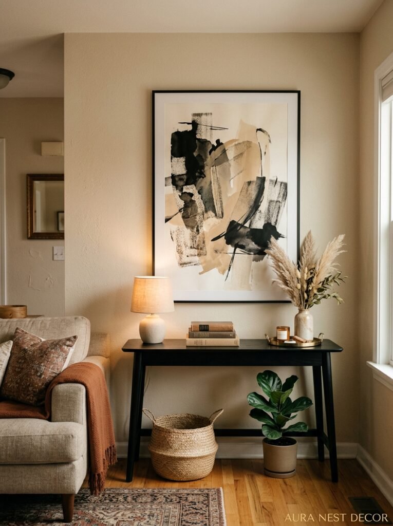
This section could go long so I’ll be direct. Black and white photography looks STUNNING in this palette. Almost unfairly good. A large-format black and white print — landscape, architectural, abstract, whatever you respond to — framed in thin matte black, hung against warm beige? That’s a Pinterest moment that actually exists in real life.
But don’t stop there. Warm-toned art — ochre, rust, terracotta, caramel — in simple frames brings heat into the color story without disrupting it. Abstract art especially. You don’t need it to match the room, you need it to feel intentional alongside the room.
The mistake people make is hanging art too high. Eye level when standing means it floats above everything and disconnects from the furniture. The bottom of the frame should roughly align with your seated eye line — around 57-60 inches from the floor for a center point is what most designers suggest, but honestly, trust your gut more than a ruler.
A gallery wall works here, but keep the frames cohesive — all black frames, or all simple wood tones, not a mix. The images can vary wildly. The frames shouldn’t.
“The art doesn’t have to match the room. It has to belong to the person who lives there.”
8. Plants in a Room That Could Look Too Serious Without Them
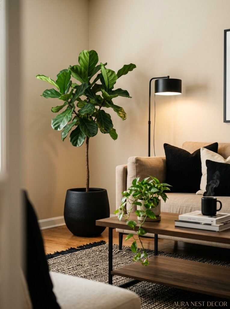
Black and beige without plant life can start to feel a bit austere. Like a very beautiful but slightly cold hotel lobby. You don’t want your living room to feel like a lobby.
Plants solve this immediately. But not fussy plants. Not the ones that drop leaves on the rug and need constant attention. Something architectural — a fiddle leaf fig if you’re willing to give it consistent light, an olive tree in a simple terracotta pot that warms against the beige walls, a big monstera for drama. In the UK, a lot of people are doing snake plants and rubber plants in dark pots against light walls and it looks brilliant with minimal effort.
The pot matters as much as the plant. Matte black pots are obvious but they work. Terracotta is arguably better — it brings warmth and organic texture, and that slight orange undertone plays beautifully against black accents. Aged stone or concrete planters are another option if you want to lean into the more minimal, architectural feel.
Don’t cluster all the plants together. Spread them through the room. A tall plant in one corner, a small one on a shelf or side table, maybe trailing ivy along a bookshelf. You want the room to feel like things grow in it, which is different from having a designated plant corner.
9. The Small Accessories That Pull Everything Together
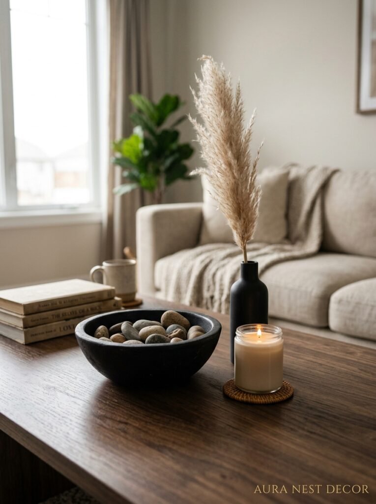
Cushions. Books stacked on the coffee table. A tray on the ottoman. A bowl on the console.
These are the things people dismiss as styling fluff and they’re actually what determines whether a room looks done or just furnished. There’s a difference and you can feel it.
In a black and beige scheme, the accessories are where you can introduce pattern without the room getting busy. A geometric cushion in black and cream. A subtle stripe. A graphic check — very British living room energy, very right here. Just keep the base colors consistent.
Layer your cushions in odd numbers. Three usually, or five if you have a large sofa. Different sizes, same color family. A pop of warm rust or olive green in one cushion won’t break the scheme — it’ll keep it from looking like a showroom.
Books with their covers turned to show the pages — those uniform cream-white spines — have been everywhere on Pinterest for a reason. It’s simple and it looks good. You can alternate with the covers showing for books that have beautiful jacket art in your color range.
10. What British vs American Black and Beige Rooms Look Like Differently
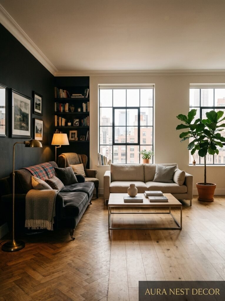
This is interesting, actually. The same palette lands differently depending on which side of the Atlantic you’re working with.
British black and beige rooms tend to lean into heritage texture more — linen, wool, aged wood, Victorian fireplaces painted in a dark tone with a cream chimney breast above. There’s often something slightly worn, something old mixed with new. A Georgian terrace flat with black steel windows, exposed brick painted the palest sand. The whole thing feels like it has history.
American interpretations often have more space to play with and the furniture scale shifts accordingly. Larger sofas, wider coffee tables, higher ceilings in many newer builds that suit those big dramatic pendants. The tendency is slightly sleeker, more influenced by California or New York design Instagram — which means more concrete, more metal, clean edges.
Neither is better. Both are good. But knowing which direction your space naturally leans will help you style within it rather than against it.
11. The Biggest Mistakes People Make With This Palette and How to Dodge Them
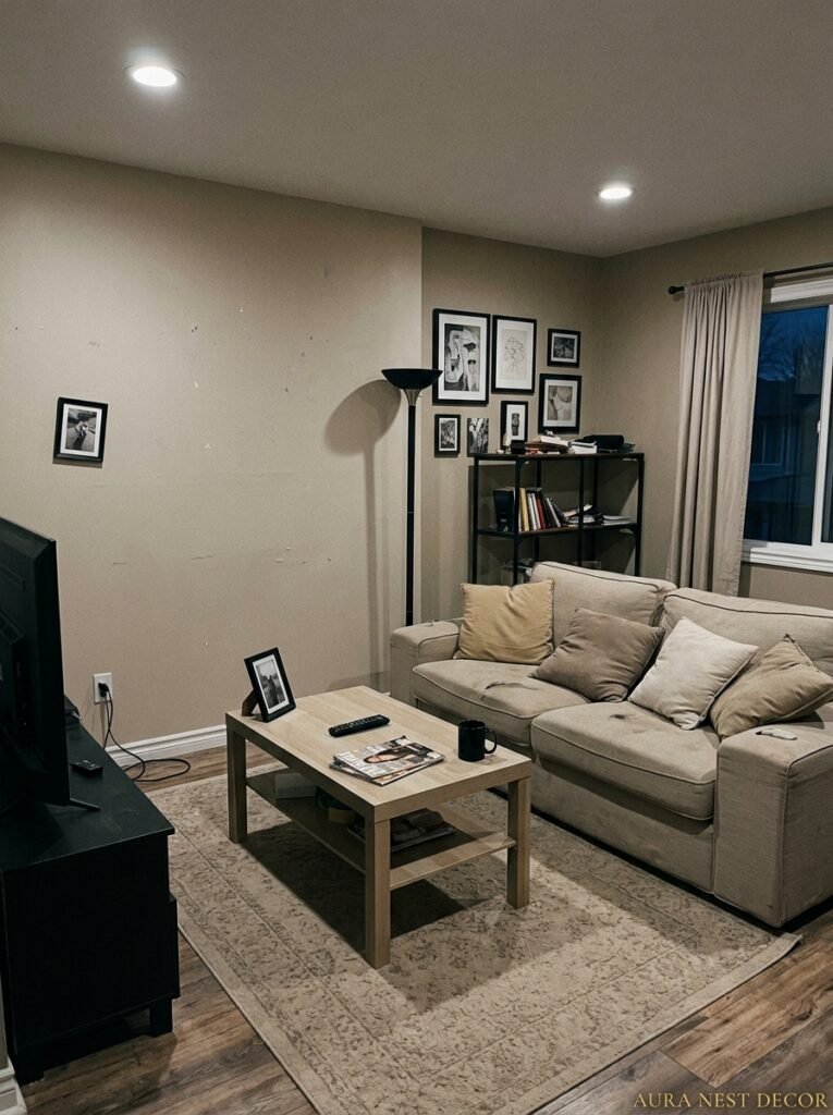
Going too dark too fast. People get excited, paint everything, buy the black sofa AND the black coffee table AND the black shelving unit, and end up with a cave. The ratio matters. Black should be the accent, not the dominant. If you’re visually measuring it, you want roughly 70% warm neutrals to 30% black or close to it. Maybe less black than that.
Choosing cold beige. Said it before, saying it again because it’s the most common error. Cold beige with black reads as monochrome and stark. Warm beige with black reads as intentional and inviting. The yellow or amber undertone in the beige is doing critical work.
Forgetting about the floor. A dark room with a dark floor and black accents is just dark. If you’ve got dark wood floors, layer a warm, light-toned rug over a significant portion of the room — it lifts everything. Sisal, jute, cream wool, pale oatmeal. Something that gives the eye somewhere to rest.
Buying everything at once. The most beautiful black and beige rooms I’ve seen look like they accumulated over time, because they did. Don’t try to create the whole thing in one IKEA run. Get the bones right, then add slowly. The imperfection of things arriving separately is actually what makes a room feel personal.
12. The Version of This Room You Can Actually Do Right Now for Under $500 / £400
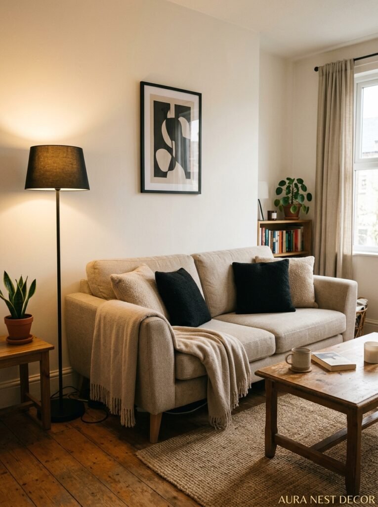
You don’t need a renovation.
Paint is the highest-impact, lowest-cost change. One wall in a warm beige — or repaint the whole room if it’s a small space — and you’ve shifted the entire energy. Tester pots first, always. Then commit.
From there: one matte black pendant light if your existing one is generic (Amazon and H&M Home have decent options in both countries without needing to spend serious money), two or three black photo frames with prints you download and print yourself, a jute or sisal rug in a neutral warm tone, and boucle cushions — Primark, IKEA, TJ Maxx, all have them now.
That’s genuinely it. Those five things against warm beige walls and whatever furniture you already own will get you 80% of the way to that Pinterest room you’ve been saving for two years.
The rest — the perfect sofa, the lighting upgrade, the art — you do over time. As you find things you love, not things that just fill a gap.
—
❓ FAQ
Q: Will black in my living room make it feel smaller? A: Not if you use it as an accent rather than a dominant color. Black window frames, one dark furniture piece, or a few black accessories against warm beige walls will add depth without shrinking the space. It’s when black takes over every surface that a room starts to feel enclosed.
Q: What color sofa works best in a black and beige living room? A: A warm cream or oatmeal sofa — especially in boucle or textured fabric — is the classic choice and it genuinely works. That said, a black sofa can be stunning if the rest of the room stays light. Warm camel or tan leather also sits beautifully in this palette and adds a rich, lived-in dimension.
Q: Can I add color to a black and beige room without ruining the look? A: Absolutely, and you probably should. Warm earthy tones — terracotta, rust, olive green, warm mustard — slip into this palette without disrupting it. Think of them as seasonings rather than main ingredients. A rust cushion, a terracotta pot, a mustard throw. One or two is plenty.
—
💭 Final Thoughts
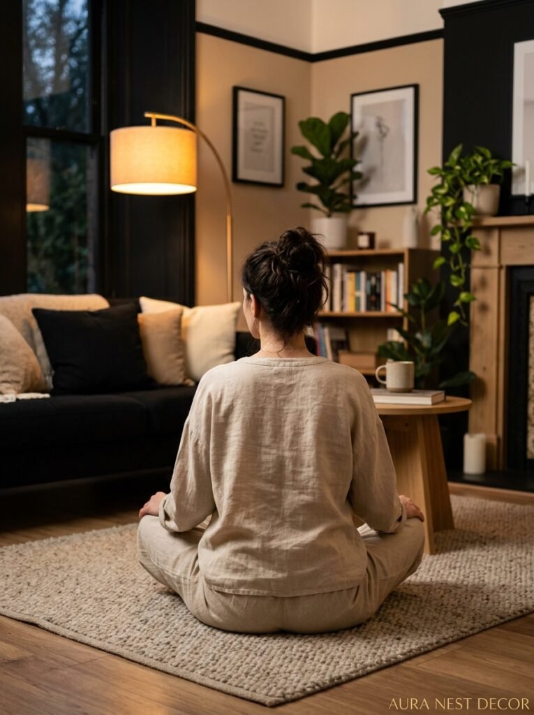
Black and beige isn’t a trend you need to hurry and catch before it passes. It’s a palette that rewards patience — rooms that look like this tend to get better as they layer up over months and years, not weekends. Start with the wall color, get the lighting right, and let the rest arrive when it arrives.
The best living room you’ll ever have is the one that looks like you actually live there. Does yours feel like that yet?




