
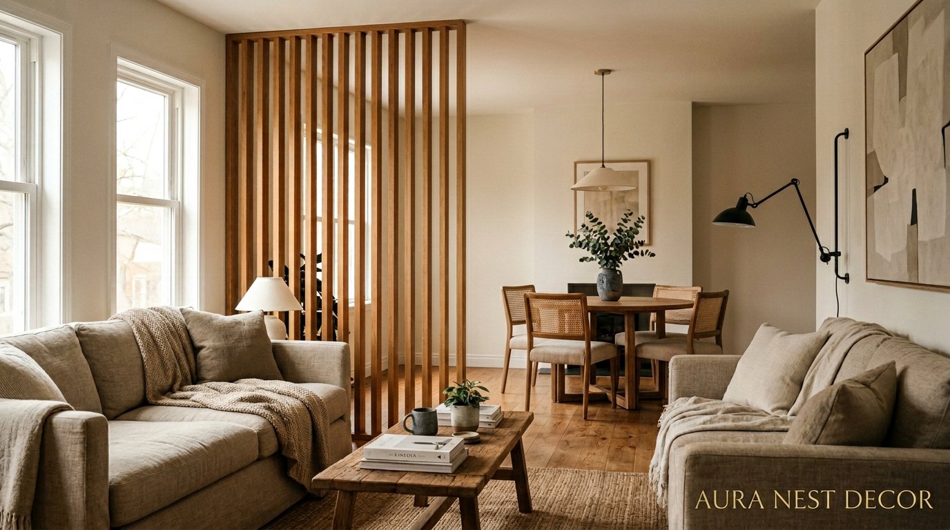
The Divider That Made My Open-Plan Living Room Feel Like Two Actual Rooms
You know that feeling when your living room and dining area are technically separate but also… not? Everything bleeds into everything. The sofa faces the dinner table. Your relaxing space is also your eating space and also somehow the place the kids do homework. I fixed that. And it didn’t cost what I thought it would.

—
1. Why “Open Plan” Started Feeling Like a Problem, Not a Feature
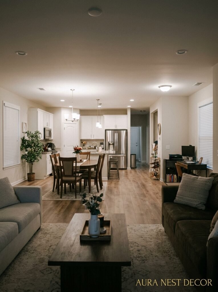
Here’s the thing nobody says out loud about open-plan living: it’s EXHAUSTING. Not visually, necessarily. But mentally. There’s no sense of arrival when you walk into a room. No shift in atmosphere. Everything is just… there, all at once, at the same time.
I loved my open-plan layout for about two years. Then I started noticing I never truly relaxed on my sofa because I could always see the dinner dishes from where I was sitting. And when we had people over, the living area felt awkward — kind of waiting to be used, kind of already in the way of the dining table. It’s hard to describe unless you’ve lived it, but it felt like a stage set, not a home.
That’s when I started looking at living room dividers. Not walls. Not renovations. Just… a way to suggest that two different things are happening in two different parts of the room.
And honestly? The change was immediate. Like, day one, I could feel it. Sitting on the sofa suddenly had a “this is its own space” quality that it never had before. The divider didn’t block anything dramatic. It just created an edge — and edges, it turns out, are what make a room feel intentional.
—
2. The Bookshelf That Does More Work Than Any Wall Could
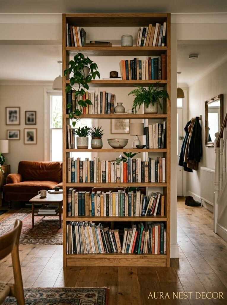
This is probably the most popular living room divider and for good reason. A freestanding bookcase — especially one that’s open on both sides — does something genuinely clever: it defines space without cutting off light.
I’m specifically talking about the kind that’s maybe 5 or 6 feet tall and open all the way through. Not a solid cabinet. The ones where you can style both faces, where light passes through the gaps, where you can see through it just enough to feel connected to the rest of the room.
What I love about this option is the styling potential. On the living room side, you do the pretty stuff — the art books, the little ceramic bowl you brought back from a market somewhere, the trailing pothos that’s threatening to take over the whole shelf. On the dining side? Maybe something more functional. Candles, table linens folded neatly, the actual books you read rather than the ones you display.
It’s doing two different jobs for two different spaces. Same piece of furniture. That’s genuinely satisfying to pull off.
The trick — and I cannot stress this enough — is don’t fill it completely. Overstuffed shelves just read as clutter. Leave gaps. Let light come through. Let the eye rest somewhere. The empty spaces are doing as much work as the things you put on the shelves.
“The bookcase isn’t the divider. The negative space inside it is.”
—
3. Curtains That Hang From the Ceiling and Change Everything
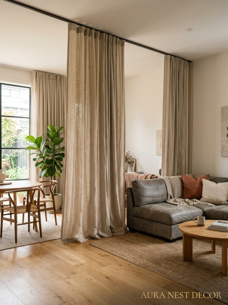
This one surprises people every time. A curtain panel — or two, hung from a ceiling-mounted track — can completely transform how a living room feels. And it costs almost nothing compared to any furniture solution.
The reason it works so well is the drama. Ceiling-height curtains make every ceiling feel taller. They draw the eye up. And when you pull them closed — or even just halfway — the effect is immediate. You’ve created a room. Out of fabric.
Linen is the BEST material for this, by the way. Not heavy velvet, not cotton canvas. Linen. It filters light rather than blocking it, which means even when it’s “closed,” there’s still a soft glow on both sides. It doesn’t feel like a wall. It feels like a veil. In a good way.
The practical side: ceiling tracks aren’t as complicated to install as they look. You can get curtain track systems that drill straight into the ceiling joist — one afternoon, some patience, done. In the UK, you can find them at most decent DIY stores. In the US, IKEA does a version that’s genuinely good for the price.
Side note — if you’re renting and can’t drill, there are tension rod systems designed for exactly this. They work. They’re not perfect. But they work well enough that you won’t be sad about it.
—
4. The Plants-as-a-Divider Trick That Actually Looks Intentional
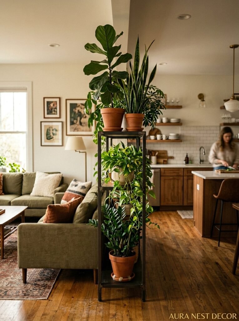
Okay this sounds a little chaotic but bear with me.
A row of tall plants — we’re talking fiddle-leaf figs, tall snake plants, or even those gorgeous rattan-pot olive trees — placed in a loose line between living and dining zones creates a divider that feels completely organic. Not designed. Just… there, the way plants are.
The key word there is “loose.” Three plants in a perfectly spaced straight line looks like you tried too hard. Three plants at slightly different heights, slightly different distances apart, with maybe a smaller trailing plant at one end — that looks like your plants just happen to live there and also happen to be creating a zone. Which is exactly what you want.
Or maybe it’s the opposite, honestly. Maybe you DO go all-in with a proper shelf planter — the kind that’s basically a planting table you can fill with herbs or low-growing plants and use as a physical room divider. These are beautiful. They’re high-maintenance. But if you’re the kind of person who finds watering plants meditative rather than a chore, this might be the option that makes you actually excited to be in your room.
The light consideration: plants need light to live, which means you can’t plonk them against a north-facing wall and call it done. Think about where your windows are. Plants want to be near light, which means your divider’s position is somewhat dictated by your windows — and that’s actually a good design constraint to work with.
“A row of tall plants isn’t a wall. It’s a suggestion. And suggestions are often more powerful.”
—
5. What a Slatted Screen Does to a Room’s Light at 4pm
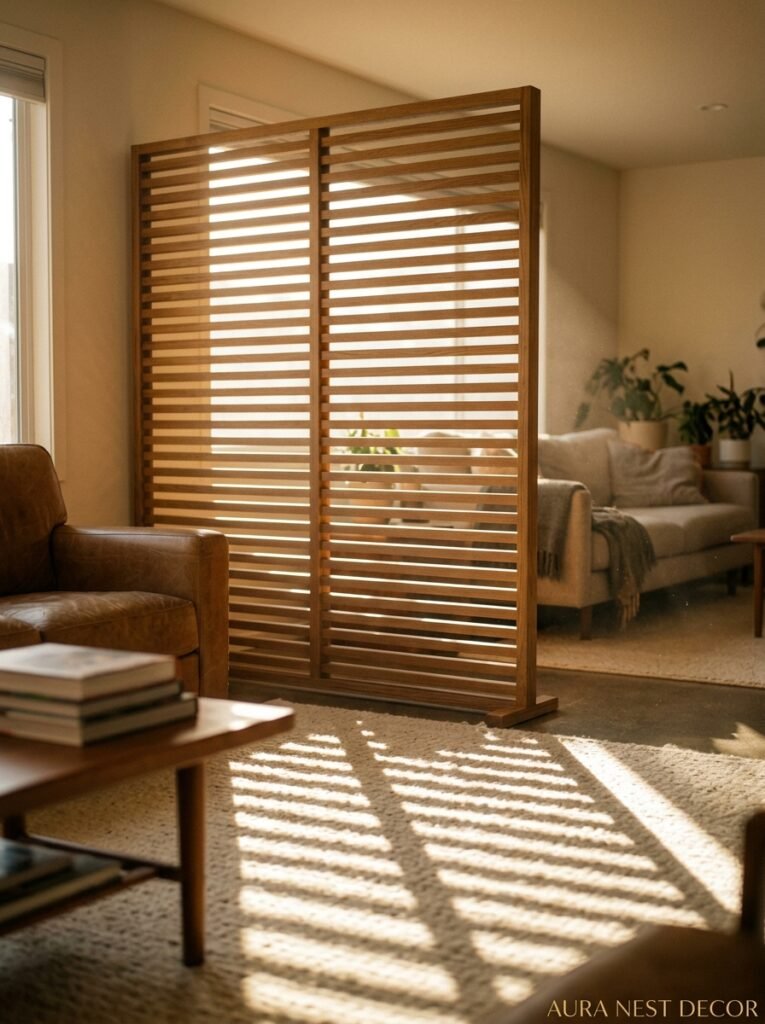
Slatted room dividers — the kind with vertical or horizontal wooden slats — are having a major moment right now. And the reason, I think, is the shadows.
At certain times of day, the light coming through a slatted screen casts these gorgeous striped shadows across the floor and furniture. It’s not just a functional piece — it’s making the room more beautiful by being in it. And that feels different from most furniture, which just takes up space.
Natural wood tones work brilliantly in this context. Warm oak, pale ash, something that brings texture without weight. The slats let air and light pass through so the room never feels divided in a heavy, closed-off way. More like… edited.
The British readers among you might be familiar with the Japanese-influenced design movement that’s been filtering into UK interiors over the last few years — that whole idea of shoji screens and negative space. Slatted dividers are a Western interpretation of that sensibility. They don’t overwhelm. They frame.
For Americans with more square footage to play with, these work especially well in larger open-plan spaces where the living area really does need a physical edge. A slatted screen that’s 6 or 7 feet tall becomes an architectural feature, not just an accessory.
—
6. The Sofa Back Method That Nobody Talks About Enough
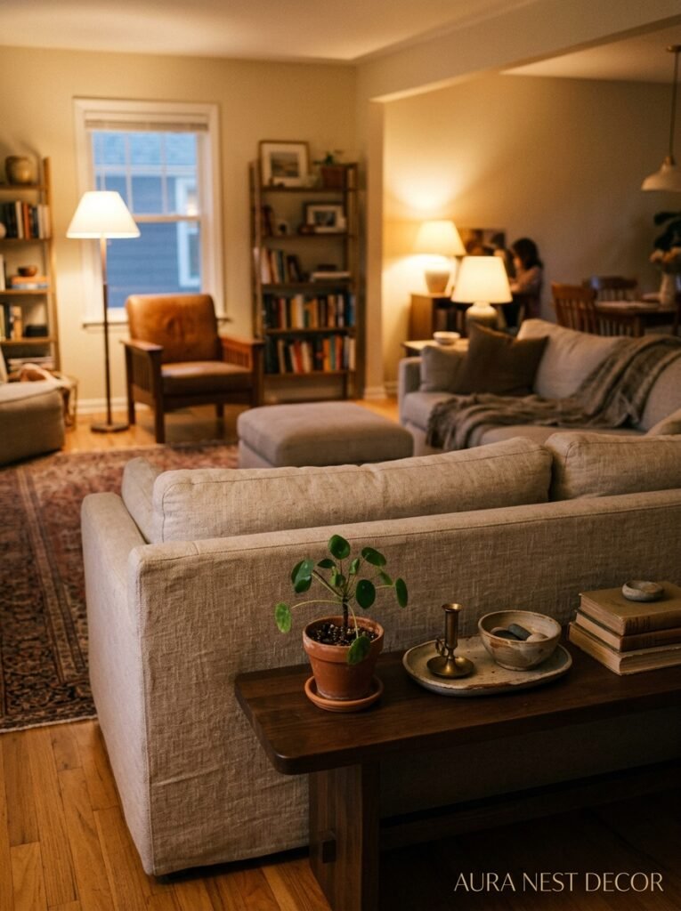
I want to say something about this because it’s so OBVIOUS once you see it and yet people spend thousands on other solutions when this is right there.
Your sofa’s back is a wall.
If you position your sofa so that it faces INTO the living space — back pointing toward the dining area or kitchen — it creates a natural division. The low “wall” of the sofa back tells you where the living room starts. You don’t need a shelf or a screen or anything else. You just need to rotate the furniture.
Most people push their sofas against a wall. Always. Every room, every flat, every house — sofa against the wall. But floating a sofa in the middle of a room and letting its back face outward is one of those rearrangements that makes you feel slightly clever for about three weeks until you forget you ever did it any other way.
The only caveat: this works best when you have console table height something — even a slim $40 console from a charity shop — running along the back of the sofa. It makes the “wall” feel finished rather than abandoned. And it gives you a surface for a lamp, which brings me to the light point. The amber glow of an Edison bulb at 7pm on a console table behind your sofa? That’s the shot. That’s the Pinterest photo you’re trying to create.
—
7. Archways Built From Nothing: The Pillar-and-Beam Trick
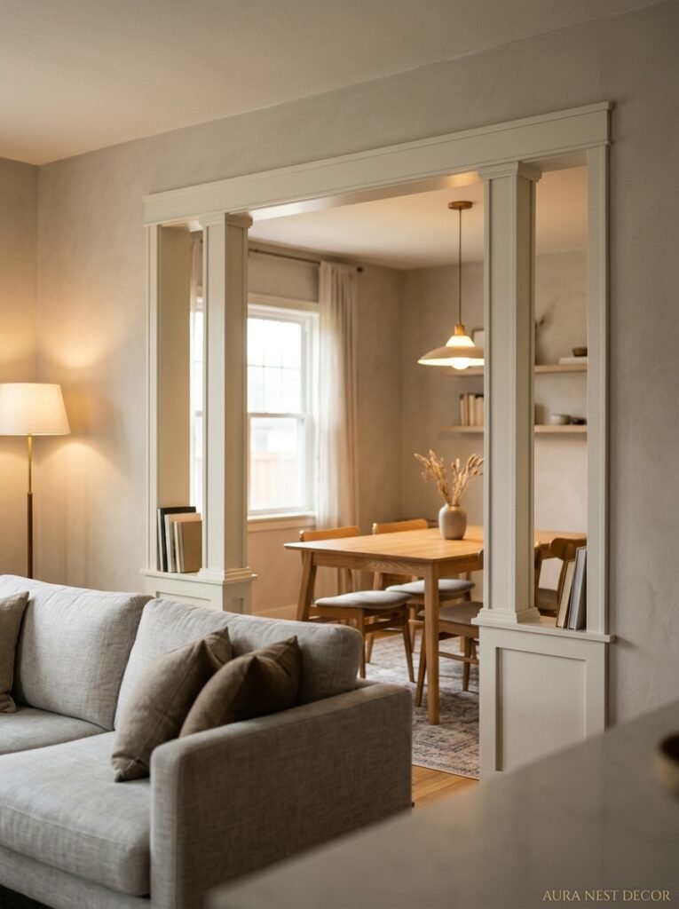
Okay I know this sounds more involved, but it’s genuinely not structural work.
You can buy or build freestanding “archway” structures — basically two thin pillars connected by a beam overhead — that sit between spaces without being attached to anything. They’re more common in the US right now but they’re starting to appear in UK interiors too, particularly in Victorian terraces that have had walls knocked through between rooms.
These work because of what the human eye does with archways: it reads them as doorways. As thresholds. Walk through an arch and something in your brain registers a room change even if everything is technically the same continuous space. It’s a psychological trick and it’s incredibly effective.
Paint the arch the same color as your wall and it looks architectural, like it was always there. Paint it an accent color — a dusty terracotta, a deep sage — and it becomes a focal point. Either approach works, and choosing between them is mostly a question of how much attention you want it to draw.
“The archway doesn’t divide the room. It tells your brain to divide the room.”
—
8. Rattan, Cane, and the Natural Materials That Add Warmth Without Weight
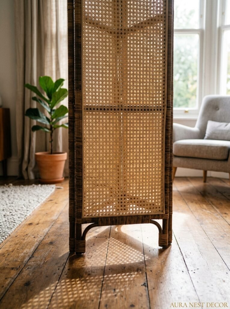
Right now — and I mean RIGHT now, as in this is the material of the current decor moment in both the US and UK — rattan and cane are everywhere. Headboards, light fixtures, cabinet fronts. And as room dividers, they are stunning.
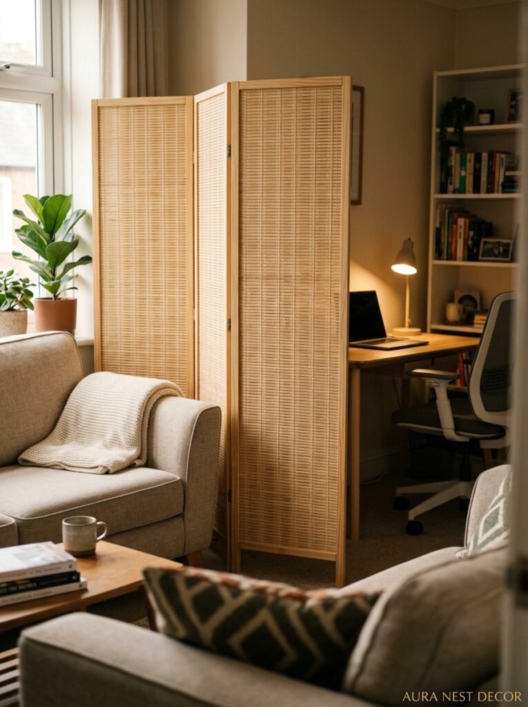
A freestanding cane screen, particularly in a warm natural tone, has this quality of being simultaneously lightweight and substantial. You can see through it slightly. Light moves through it differently depending on the angle. It adds texture to a room that’s trying to be too smooth and too beige.
For the UK reader specifically: cane dividers pair insanely well with the kind of layered, slightly maximalist interior that British homes tend to do naturally. The slightly-too-many-patterns, the mismatched cushions, the gallery wall — cane adds to that richness without competing. It’s a material that plays well with others.
For the American reader who’s working in a cleaner, more Californian aesthetic: a cane screen is actually the warmth the room might be missing. If everything is white plaster and blonde wood and you feel like something’s not quite landing, a cane divider is often the texture that makes the whole thing click.
—
9. The Rug-Plus-Divider Combination That Defines Space on TWO Levels
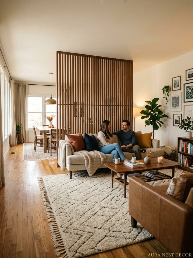
Here’s something that doubled the effect in my own space: pairing a physical divider with a rug placement that mirrors it.
So the divider creates a visual line at standing/eye level. The rug creates the same line at floor level. The two together mean the living space is defined from ceiling (or near-ceiling) all the way down to the floor. It reads as INTENTIONAL in a way that neither element achieves alone.
The living area gets its rug, which defines the seating group. The divider sits at the edge of that rug, roughly. The dining area beyond it sits on bare floor or a totally different rug. And suddenly — two rooms. You’ve made two rooms out of one, without touching a single wall.
The mistake people make: they put the rug in the center of the sofa arrangement and then place the divider somewhere unrelated to it. The two elements need to be working together. The rug’s edge and the divider’s position should be roughly aligned. That alignment is what creates the sense of a defined room rather than just furniture arranged in space.
—
10. What NOT to Do (Learned the Hard Way)
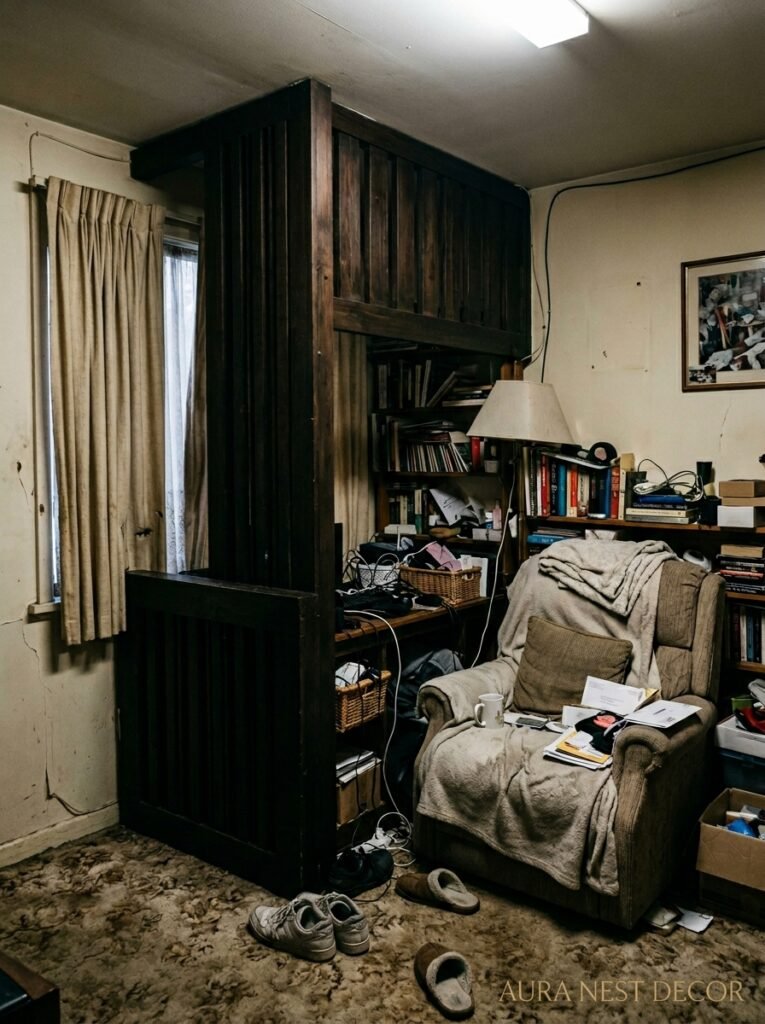
Not gonna lie, I tried a few things that didn’t work before I landed on what I have now.
First mistake: a divider that was too tall. I got a solid shelving unit that was about 7.5 feet and it felt oppressive. Cut the light. Made the living space feel like a corridor. The ceiling in my flat isn’t crazy high to start with, and anything too close to ceiling height just reads as “wall you can topple.” Not cozy. Just claustrophobic.
Second mistake: placing a divider without thinking about traffic flow. I put a beautiful slatted screen in a position that made getting from the kitchen to the sofa kind of awkward. Everyone kept sort of stepping around it. Not the energy you want in your own home.
Third thing — and this one’s more subtle — I chose a divider that was too visually similar to the other furniture in the room. Same tone, same material family, roughly the same height as the shelves on the wall. So the eye couldn’t really find it. It was physically there but it wasn’t doing any spatial work because it didn’t register as distinct.
Your divider needs to be readable as a divider. Not necessarily dramatic — but visually distinct enough that the brain processes it as an edge.
—
11. How to Style the Divider So It Looks Like It Belongs There
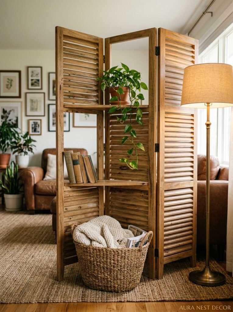
A divider that looks “placed” rather than “installed” is the difference between a finished room and a Pinterest in-progress photo.
The trick is to make it look like the divider has been there for a while. And you do that with styling that feels lived in, not curated within an inch of its life.
On a bookshelf divider, this means mixing book heights, mixing decorative objects with functional ones, maybe leaving one shelf slightly less done than the others. On a plant divider, this means letting some leaves do what leaves do — grow in unexpected directions, trail a bit, get a little wild at the edges. On a screen, maybe you hang something from it. A trailing plant. A small woven wall hanging. Something that says “this is part of the room, not a feature added to the room.”
The vibe you’re going for: like someone with really good taste lives here and this is just how their home is. Not like someone styled a room for a shoot and ran.
—
12. The Under-£100 / Under-$120 Divider That Actually Works
Budget talk. Let’s do it.
You don’t need to spend a lot. Genuinely. The most effective divider I ever used in a rented flat cost me £65 from a high street homeware store — a simple three-panel rattan screen, nothing fancy, but it was the right height and the right tone and it went in the right spot.
In the US, Target and IKEA both carry options in the $50–$100 range that are worth looking at. In the UK, H&M Home, Dunelm, and occasionally Marks & Spencer Home have screens and shelf units that punch well above their price point.
The thing to NOT skimp on: stability. A wobbly divider is a safety issue if you have kids or pets, and it also just looks cheap when it shifts every time someone walks past. If you’re buying at the budget end, check reviews specifically for wobble and weight. A divider that’s lighter than expected is almost always going to be a problem.
And if you’re buying second-hand — PLEASE consider it. A solid wood bookcase from a charity shop or Facebook Marketplace, repainted in a chalky white or a deep forest green, will look more considered than anything flat-packed and new. Hands down.
—
❓ FAQ
Q: Can a room divider work in a small open-plan living room without making it feel cramped? A: Yes — but you have to choose a divider that’s open or semi-transparent rather than solid. A slatted screen, a cane panel, or a low-profile bookcase will define the space without eating it. Anything solid and tall will make a small space feel boxed in. Think “suggestion” rather than “barrier.”
Q: What’s the best room divider for renters who can’t drill or make permanent changes? A: Freestanding options are your best friends here — bookshelves, folding screens, plant arrangements, and tension-rod curtain systems all work without touching the walls or ceiling. The floating sofa trick (pointing your sofa back toward the area you want to divide from) is completely renter-proof and costs absolutely nothing.
Q: How do I make a living room divider look intentional and styled, not just stuck in the middle of the room? A: Align it with something else in the room — the edge of a rug, a doorway, a lighting position. And then style it consistently with the rest of your room in terms of color palette and material. A divider that shares at least one tone or texture with the existing furniture reads as planned rather than added as an afterthought.
—
💭 Final Thoughts
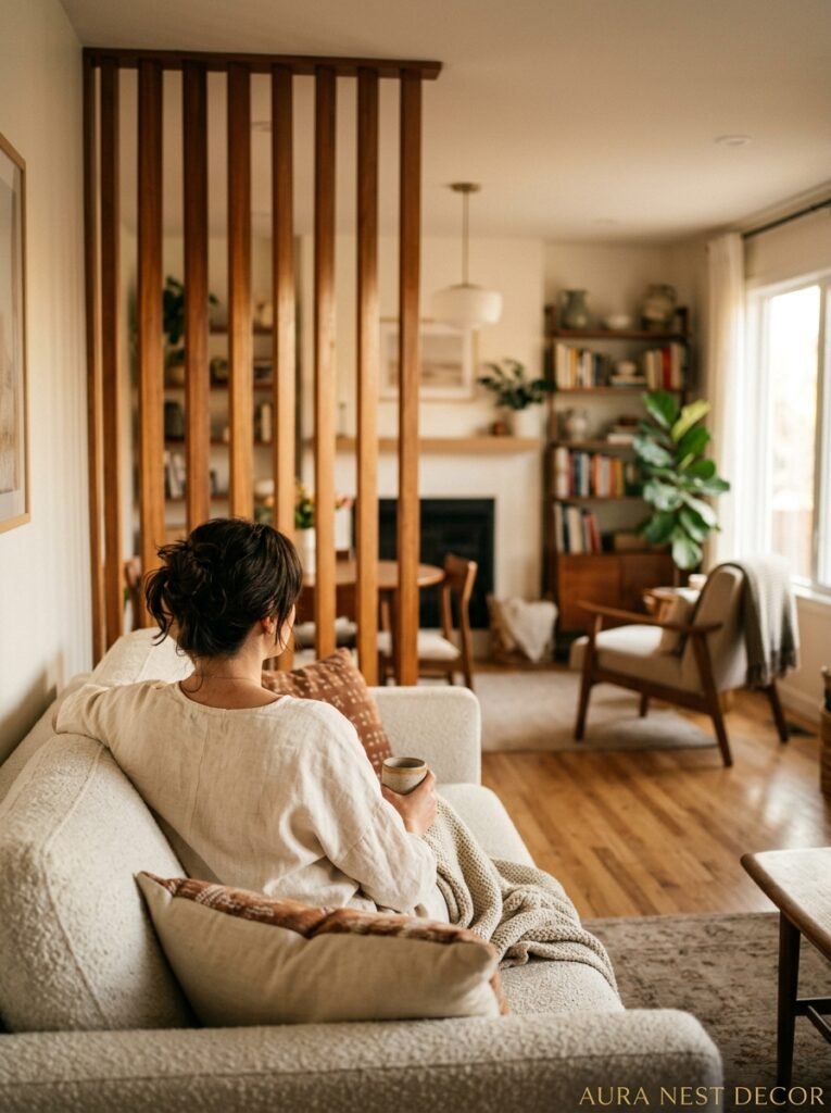
A divider doesn’t just change a room. It changes how you feel in it — and that’s the part that’s harder to explain until you’ve done it yourself. The way the living room starts to feel like a retreat, not just a space you pass through on the way to the kitchen.
It’s a small shift. But small shifts in your home tend to have this outsized effect on your day-to-day mood that nobody really warns you about. You notice the room again. You want to sit in it.
So — what’s the space in your home that’s been bothering you without you quite being able to name why?




