
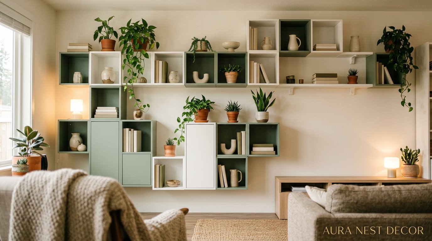
The EKET Shelf That Changed My Entire Living Room (And Costs Less Than a Nice Dinner Out)
There’s something almost embarrassing about how much I love a flat-pack shelf. But here we are. I’ve spent an unreasonable number of hours rearranging my EKET units, and honestly? I’d do it again.
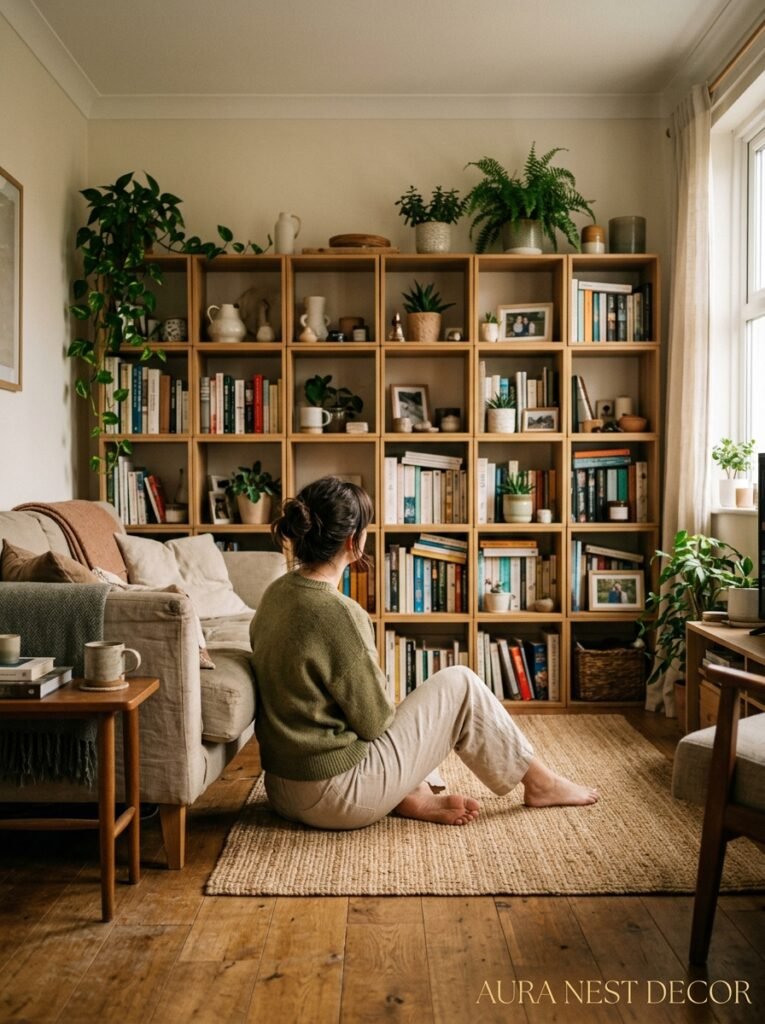
—
1. Why EKET Is Having Such a Serious Moment Right Now
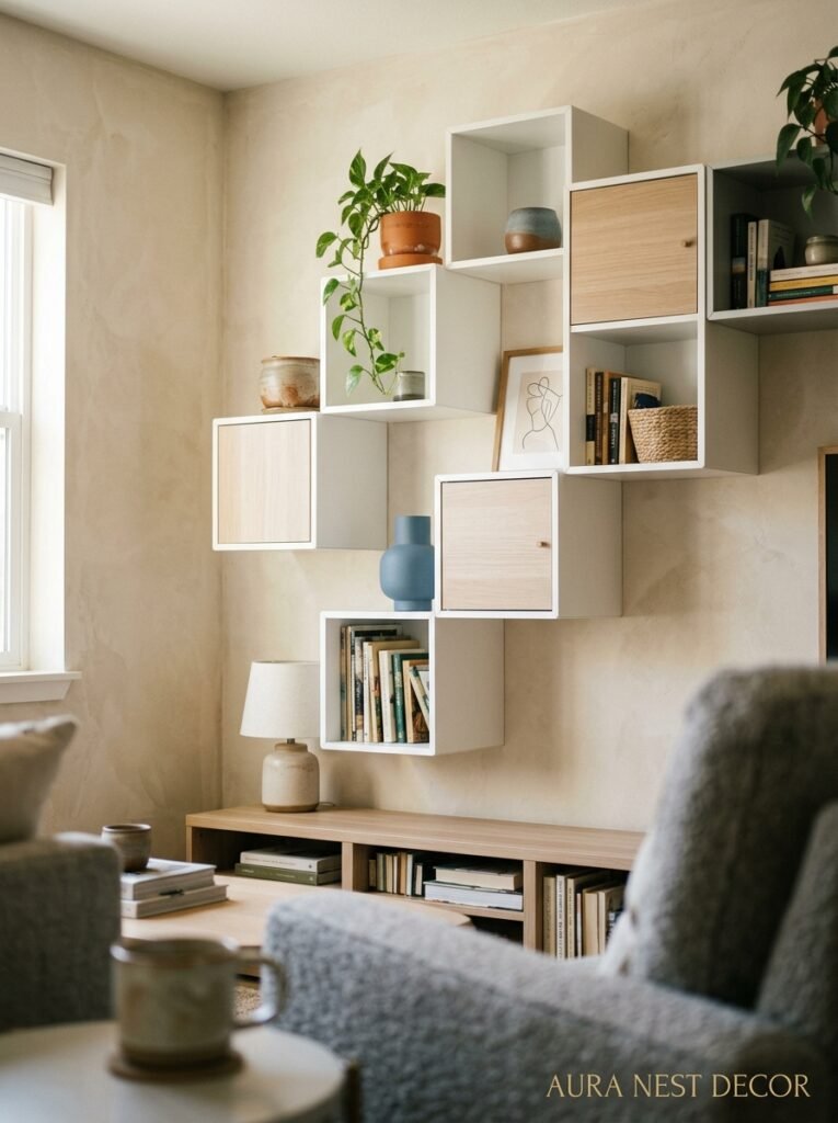
It’s not the most glamorous name. EKET. Sounds like something from a crossword puzzle. But if you’ve been on Pinterest in the last two years, you’ve definitely seen it — those clean little cubes stacked in unexpected configurations, styled with trailing plants and linen baskets and a single piece of art leaned casually against the wall.
The reason EKET keeps showing up everywhere is actually pretty simple. It’s modular, which means you can build whatever shape your room demands. Not a rectangle. Not just a square. A staircase shape, an asymmetric tower, a low credenza that runs the whole length of the wall. And because the units come in a handful of sizes — including some with doors — you get this mix of displayed stuff and hidden stuff that’s genuinely hard to pull off with most affordable shelving.
I bought my first two units on a whim. Then I bought four more. Then I spent a Sunday morning on the living room floor figuring out how to mount them so they looked like they’d always been there.
They hadn’t always been there. But now I can’t imagine the room without them.
“EKET isn’t just a shelf. It’s the first piece of furniture where the configuration IS the design.”
—
2. The Configuration That Looks Like It Came From an Architect’s House
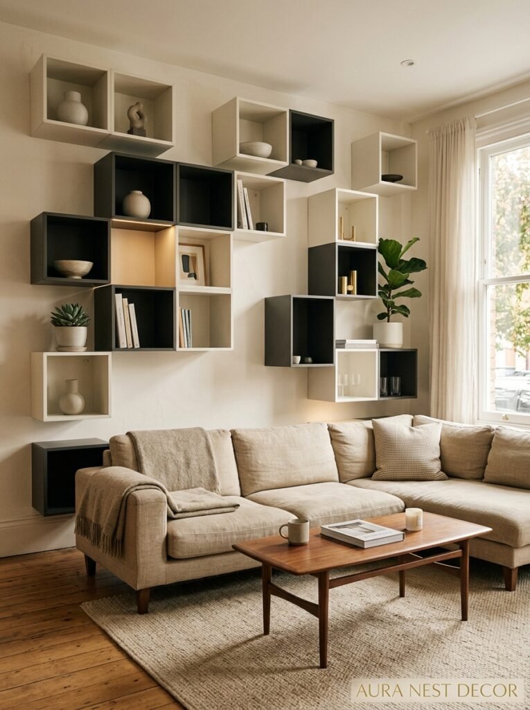
Okay so the most pinned EKET look right now — the one that gets saved ten thousand times a week — is the asymmetric wall arrangement. Not symmetrical, not centered. Off-kilter in a way that feels intentional.
Here’s how it works. You take a mix of the larger 35x35cm cubes and the smaller ones, and you arrange them so one side is taller than the other. Maybe five units high on the left, tapering down to two on the right. Or a low horizontal base with a vertical cluster shooting up from one end. The trick is to make it look like it grew there organically, not like you sat on the floor with graph paper for forty minutes.
(I sat on the floor with graph paper for forty minutes.)
You mount some units to the wall, let others sit on the floor, and then — this is the key part — you LEAVE some cubes completely empty. No styling. No plants, no books. Just the clean square shadow of an empty shelf. It sounds wrong. It looks right. The empty units make the styled ones feel more intentional, more chosen.
Paint the insides of the empty cubes a contrasting color if you’re feeling bold. A deep terracotta, a dusty sage, a near-black. One flat-painted interior changes the whole personality of the arrangement.
—
3. The Color Situation That Nobody Talks About Enough
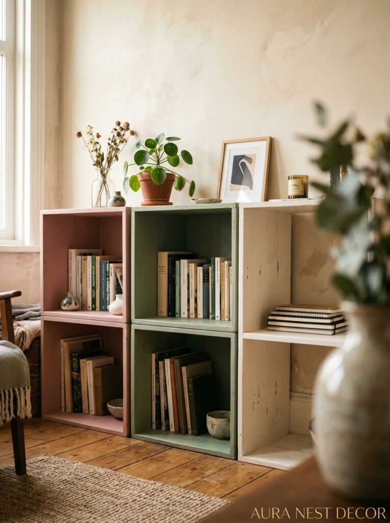
EKET comes in white. And black. And a few other colors depending on the year and your country. But here’s the thing most people miss — the color of the unit itself matters way less than what you do with it.
White EKET on a white wall disappears, and that’s actually a feature. The objects on the shelves become the art. The furniture recedes and the life in front of it comes forward. It’s a very particular kind of calm.
Black EKET on a light wall does the opposite. Suddenly the shelving IS the statement, and everything you put on it becomes a little more precious, more considered. A single white ceramic pot on a black EKET shelf looks like it’s in a gallery.
But the move I keep seeing — and keep loving — is painting the wall behind a white EKET installation. You mount the units, then paint the wall behind and around them in something dark. Forest green, inky navy, deep mocha. The shelves float in front of this painted backdrop, and the whole thing looks like built-in furniture that costs three thousand pounds. It doesn’t cost three thousand pounds.
This works in British Victorian terrace living rooms AND in American open-plan spaces, by the way. The proportions just shift a bit.
—
4. How to Style the Shelves Without Making It Look Like a Pinterest Mood Board Gone Wrong
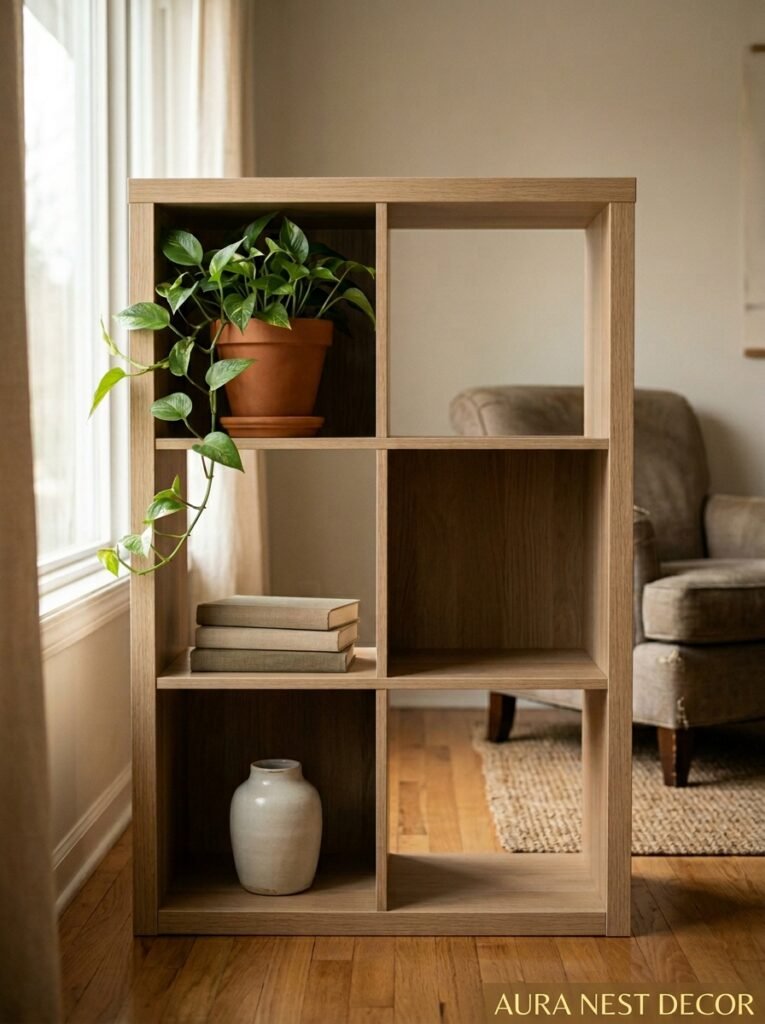
Not gonna lie, this is where most people struggle. The styling part. You’ve got all these beautiful little cubes and suddenly everything you own looks either too much or too sparse.
The rule I’ve landed on: one-third full, one-third styled, one-third empty. Ish. Not exact — that would be too precious. But roughly. Some shelves get a stack of books with a small object in front. Some get a plant, a candle, one thing. And some just stay blank.
The grouped things need to have something in common, but not in an obvious way. Not “all ceramics” or “all plants.” More like — similar materials. Or a shared color tone. Or just a similar sense of weight, the way some objects feel heavier and quieter than others even when they’re the same size.
Side note — trailing plants are doing a LOT of work in EKET installations right now. A pothos or a string of pearls spilling out of an upper cube covers a multitude of sins. If your shelves feel too sparse or too rigid, add a trailing plant and give it two weeks. Problem often solved.
“The shelf that tries to be perfect always looks the most wrong.”
—
5. The Low-to-the-Ground Configuration That Makes a Rental Feel Like a Real Home
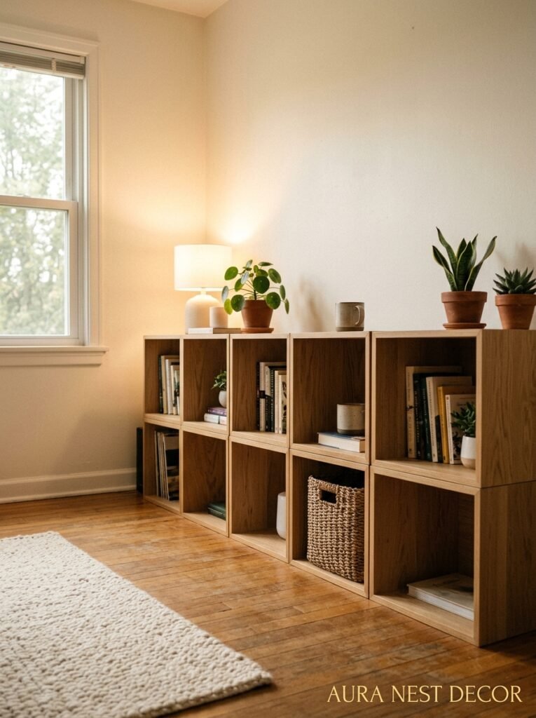
Here’s one that I think is wildly underused. Lay the EKET units low — like, really low. Three units high at most, running horizontally. Use the wider units (70x35cm) as a base and stack two or three smaller units on top.
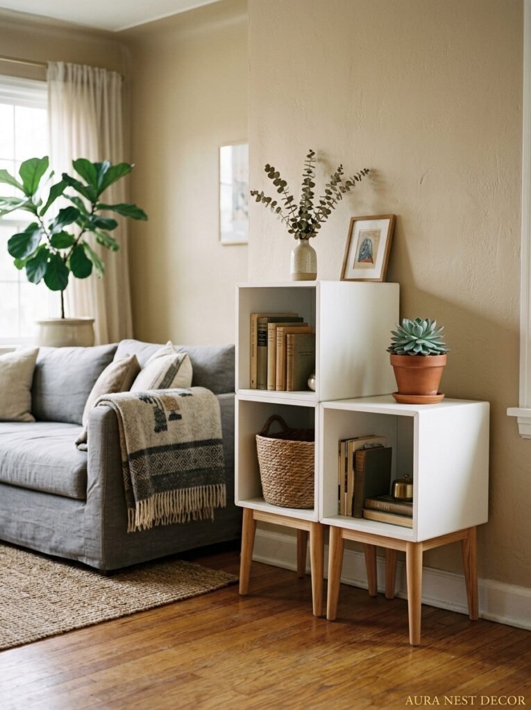
This creates a kind of bespoke sideboard or media unit that looks nothing like flat-pack furniture. Especially if you add legs. EKET doesn’t come with legs from IKEA, but there are about a thousand aftermarket leg options on Etsy — hairpin legs, tapered wooden legs, straight steel ones. You can screw them into the base unit and suddenly your EKET installation is elevated (literally) into something that reads as proper furniture.
This is HUGE for renters who can’t paint walls or do anything too permanent. A low EKET credenza with good legs, a lamp on one end, a mirror leaning against the wall behind it — that’s a living room that feels designed, not just furnished. British renters especially seem to go wild for this because the proportions work so well in smaller sitting rooms.
—
6. The Secret Door Configuration That’s All Over UK Interior Instagram Right Now
Okay so this one takes a minute to understand but stick with me.
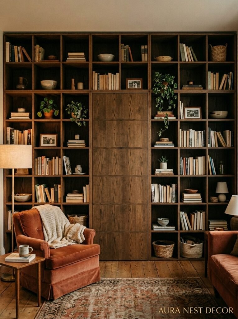
EKET makes units with push-to-open doors. Little recessed panels that click open when you press them. And people are building entire entertainment or display walls using a mix of open units and doored units, then painting the whole thing the same color — doors, frames, everything — so it looks like one continuous installation.
The effect is kind of extraordinary. You get this sculptural, textured wall of cubes that reads as art until someone walks up and opens a door to grab the TV remote or the router or the pile of things they didn’t know where else to put.
The color you choose for this matters. It reads best in matte paint, something with a bit of depth. Aged white is too flat. Something like a warm greige, a clay, a dusty olive. The slight variation in texture between the painted wood and the wall behind helps the cubes pop without being loud.
This is a real weekend project — we’re talking a Saturday and part of a Sunday, honestly. But the result is legitimately something you’d see in an interior design magazine.
—
7. What to Put on an EKET Shelf If You Don’t Own Any “Aesthetic” Objects
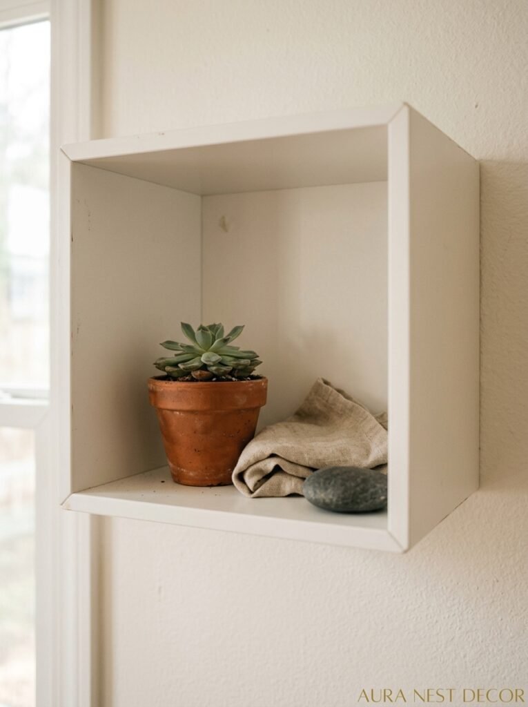
Real talk. Not everyone has the curated collection of handmade ceramics and vintage novels with beautiful spines. Some of us have normal books, miscellaneous candles, and stuff.
And that’s fine. Because the trick isn’t in the objects — it’s in the editing.
Take everything off your shelves. Put it all on the floor. Now, only put back things that have something you like about them. One thing. The color, the shape, the memory attached to it. Don’t put anything back that you’re neutral about.
What’s left is your actual palette. Books with dark spines can be faced backward (controversial but effective — a wall of cream pages is honestly beautiful). Practical items go in the doored units. Things you love get the open shelves.
“Edit like you’re curating, not decorating. There’s a difference.”
—
8. The EKET Hack That Costs Twenty Dollars and Looks Like It Cost Two Hundred
Contact paper. Hear me out.
Lining the interior backs of your EKET units with peel-and-stick contact paper is one of those things that sounds craft-projecty and looks actually sophisticated if you choose the right pattern. Marble. Cane webbing print. Linen texture. Subtle geometric. The contact paper becomes a tiny backdrop inside each cube, and if the pattern is calm enough, it reads as intentional rather than DIY.
It also means every cube becomes distinct. Even if they’re all the same size and color on the outside, the interior back panel gives each one its own little character. Especially good if you’re doing a large wall installation with a lot of empty or lightly styled cubes.
This works in US and UK homes equally because honestly contact paper is everywhere now. Peel, stick, smooth. Done in a morning. If you ever get bored of it, it comes off. Mostly.
—
9. Using EKET in a Living Room That Also Has to Be a Home Office
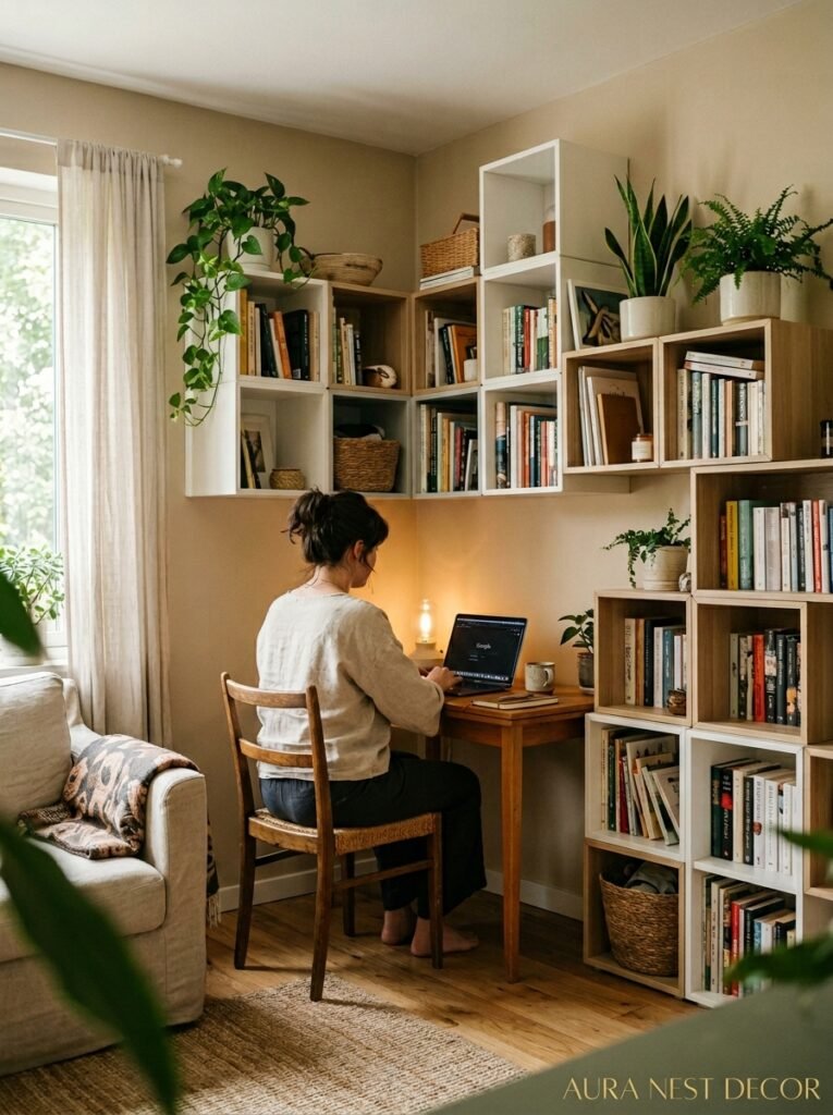
This one’s for everyone who’s been working from the sofa corner for three years and just accepted it.
EKET can actually help. A vertical tower of units next to your desk area — or even defining where the desk area starts — creates a visual boundary between “work zone” and “living room.” The shelves hold your actual work stuff in the doored units, and the open units can hold things that look nice enough to appear in video calls.
The doored EKET units are genuinely brilliant for home office storage because push-to-open means no hardware, no pulls, nothing to catch your eye. It just looks like a clean wall of cubes until you need your notebook or your ring light or whatever.
Pair this with a wall-mounted EKET arrangement on the side wall of your office nook — books, a plant, one piece of framed art — and suddenly the corner looks intentional, finished, designed. Even in a one-bed flat in London or a small open-plan in Chicago.
—
10. The Configuration That Photographs Incredibly and Why That Matters for Your Home
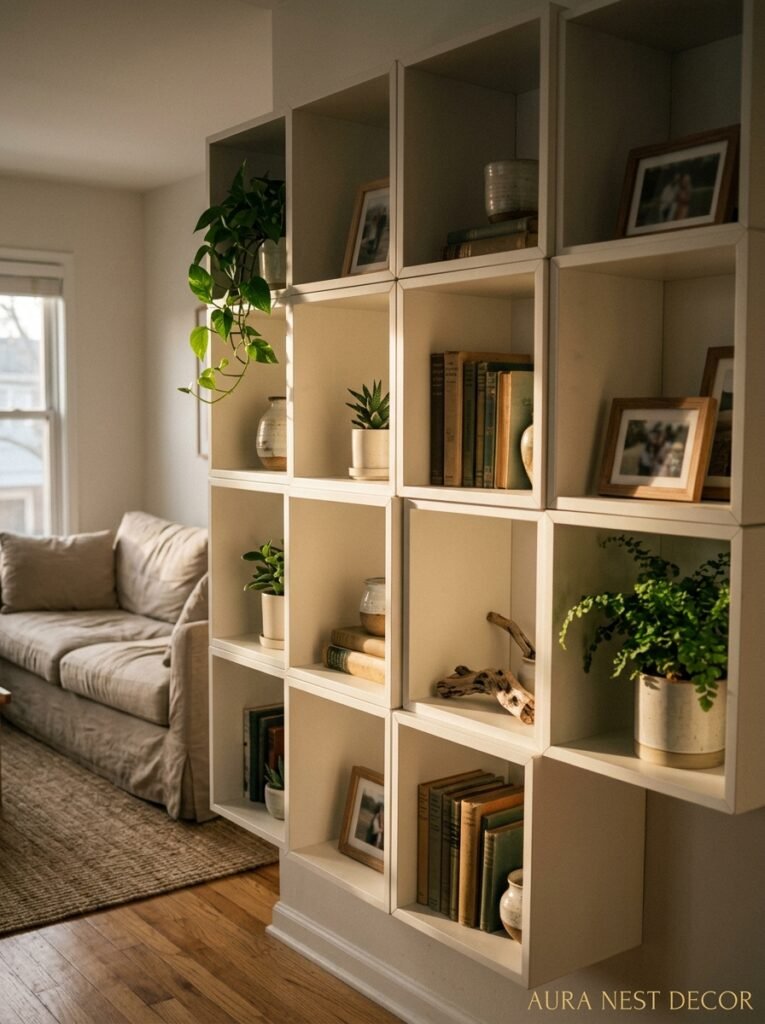
Let me be slightly shallow for a moment: some furniture just photographs well, and EKET is one of them.
The clean lines. The geometric shadow play. The way you can arrange things in those cubes so there’s depth and dimension when light hits from the side. It’s all very naturally photogenic. And if you’re someone who likes to share your home on social, or who just wants to enjoy looking at their own living room — that matters.
The best light for EKET is afternoon sun, slightly indirect. An amber glow from a table lamp at the side is even better. The shadows the cubes cast on each other become part of the aesthetic.
This is also why the asymmetric configurations always outperform the symmetrical ones in photos. Symmetry reads as flat on a screen. Asymmetry has implied movement, implied choice, implied personality.
—
11. The EKET Wall That Works in a Tiny UK Sitting Room (Without Swallowing It)
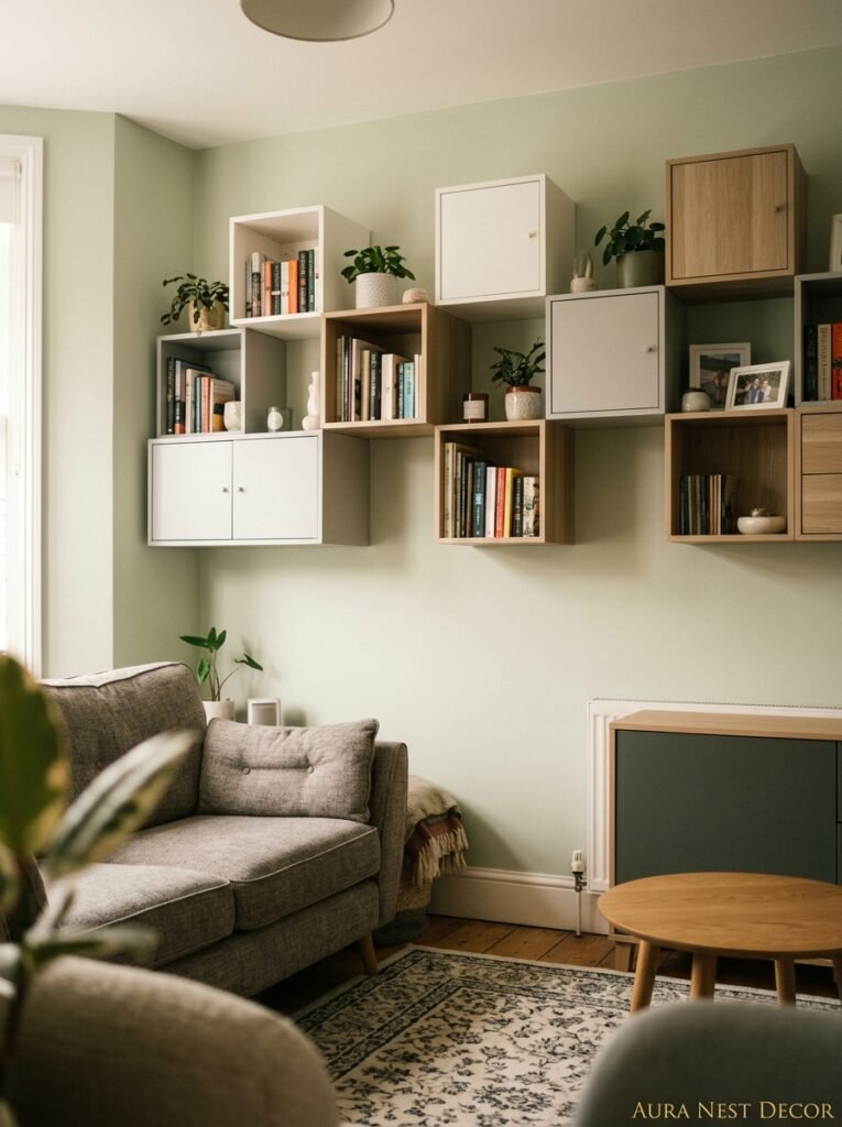
Small sitting rooms are a very specific puzzle. You want storage, you want personality, you don’t want the room to feel like a storage unit dressed up in nice colors.
The move in a small room is to go VERTICAL on one wall only. One wall, tall configuration, doesn’t cross onto any other wall. Keep the color of the units close to the wall color so the storage reads as part of the architecture rather than furniture added to the room. Then — and this is the thing — keep every other surface in the room really clean. No side tables crowded with stuff, no floating shelves on other walls.
The EKET installation becomes the focus. Everything else breathes. The room feels bigger because your eye knows exactly where to go.
In Victorian terrace houses with high ceilings, a tall EKET tower can go really high and look genuinely stunning. Just make sure it’s properly mounted — we’re talking wall studs or proper fixings, not just the backing board.
—
12. The Finishing Detail That Separates a Good EKET Installation from a Great One
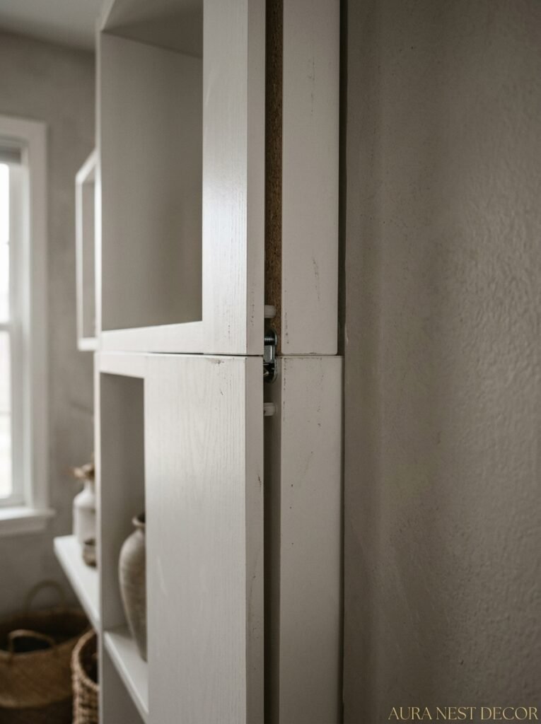
It’s the gap.
Or rather — the deliberate absence of a gap. When EKET units are properly mounted flush to each other, with no visible hardware, no misalignment, no unit sitting slightly higher than its neighbor — that’s when the whole thing clicks from “IKEA furniture” to “considered built-in shelving.”
Take your time with the mounting. Use a level. Use multiple levels. Have someone hold the unit while you step back and check it with your actual eyes, not just the tool. Align the edges precisely before drilling.
Then run a thin bead of color-matched caulk along any gaps between wall-mounted units and the wall itself. This sounds fussy. It looks like architecture. The difference is astonishing. One hour of fiddly work at the end makes the whole installation look like it was designed for that exact room.
EKET done carefully looks expensive. EKET done in a hurry looks like IKEA. That gap — or the absence of it — is the whole thing.
—
❓ FAQ
Q: Can EKET units be wall-mounted safely, and what do I need? A: Yes, and they’re designed for it — there’s a bracket system built into each unit. You’ll need to locate your wall studs (or use appropriate wall anchors for plaster walls), a level, and ideally two people for the larger configurations. Always check weight limits before loading the shelves heavily.
Q: How do I make EKET look less like IKEA and more like built-in shelving? A: Three things make the biggest difference — mounting the units flush and level with no visible gaps, painting the wall behind them in a contrasting or complementary color, and adding aftermarket legs to any floor-standing units. Caulking the seams where units meet the wall also helps dramatically.
Q: Is EKET still available in the UK and US, and what sizes does it come in? A: As of my last check, EKET is available in both IKEA UK and IKEA US stores and online, though specific colors and sizes can vary by region and stock. The core range includes 35x35x35cm cubes, a larger 70x35x35cm unit, and versions with doors. Always worth checking current availability directly on the IKEA website since stock shifts.
—
💭 Final Thoughts
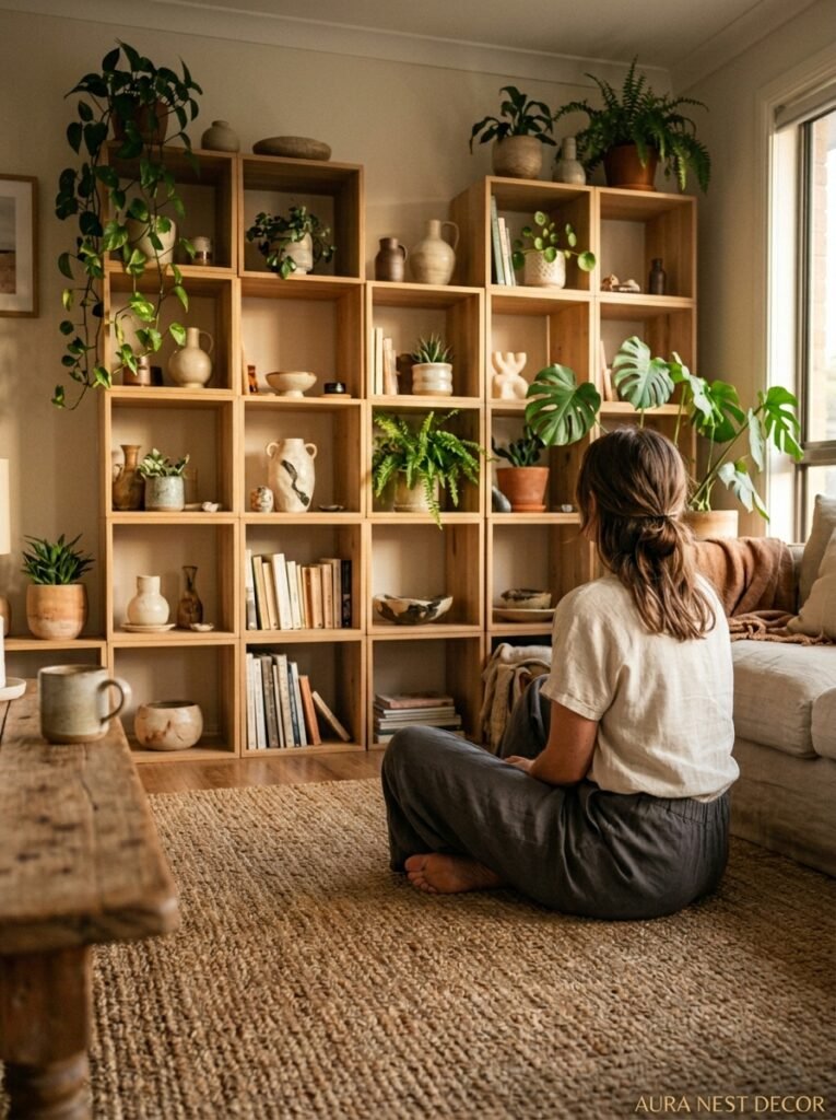
I keep coming back to EKET because it lets you change your mind. The room you needed two years ago isn’t the room you need now, and a shelf system that’s genuinely modular lets you adjust without starting over. There’s something really freeing about that.
Whatever configuration you land on — asymmetric tower, low credenza, painted cube wall — the details are what make it yours. The edited shelves, the specific color behind the units, the single empty cube you left deliberately blank.
What does your living room actually need more of right now — storage, personality, or just a little more breathing room?




