
The Drape Decision That’s Actually Kind of a Big Deal (And Most People Get It Wrong)
You hang the curtains wrong and the whole room looks off. Not ugly exactly, just… deflated. Like it never quite woke up. And most of us don’t even realize that’s the thing making the space feel smaller, darker, cheaper than it actually is.
—
1. Why Everyone’s Hanging Their Drapes Too Low and Too Short (Yes, Including You)
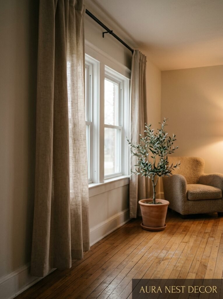
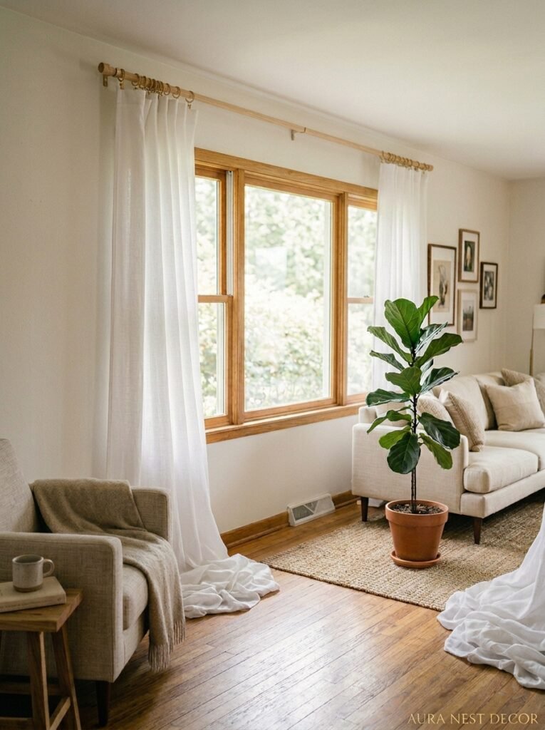
Okay, so this is the one I need you to sit with for a second. The rod goes near the CEILING. Not at the top of the window frame, not six inches above it — near the ceiling. I know. It feels wrong the first time you do it. It feels like too much. But this single shift changes a room more than almost any other decor decision you can make.
Here’s why it works: when you hang the rod close to the ceiling (usually 4 to 6 inches below it, or even at crown molding height if you have it), the eye reads the full wall height as the window. Your 8-foot ceilings suddenly feel like something out of a Parisian apartment. Not kidding. The window isn’t actually bigger, but your brain doesn’t care.
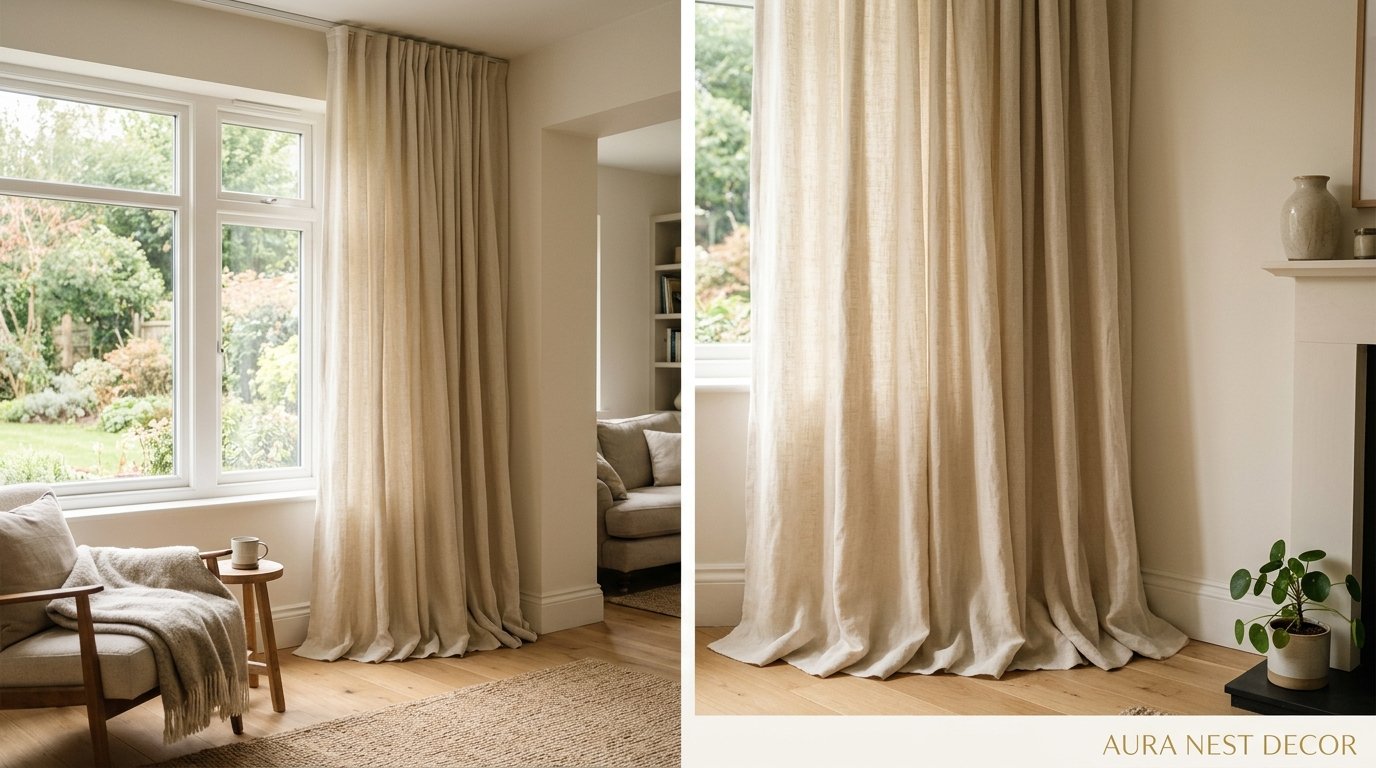
And the length. The drapes need to just kiss the floor or pool slightly. Not hover two inches above it like they’re scared. That hover is the silent room-killer nobody talks about. Linen pooling on a hardwood floor at 7pm with the Edison bulb glowing amber? That’s the look we’re going for. That’s the Pinterest photo you keep saving.
So before we even talk fabric and color — get that rod up high and get those panels long. Everything else builds on this.
“Hang the rod near the ceiling, pool the fabric on the floor. That’s the whole secret, and it costs nothing extra.”
—
2. The Fabric That’s All Over Every Beautiful Living Room Right Now
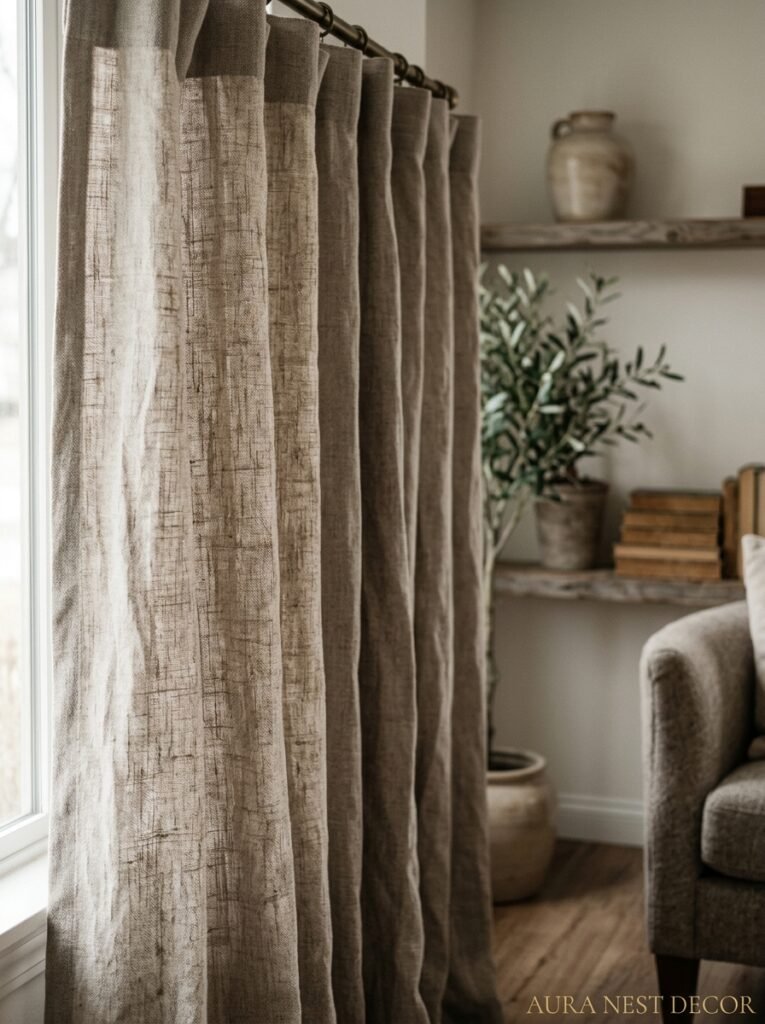
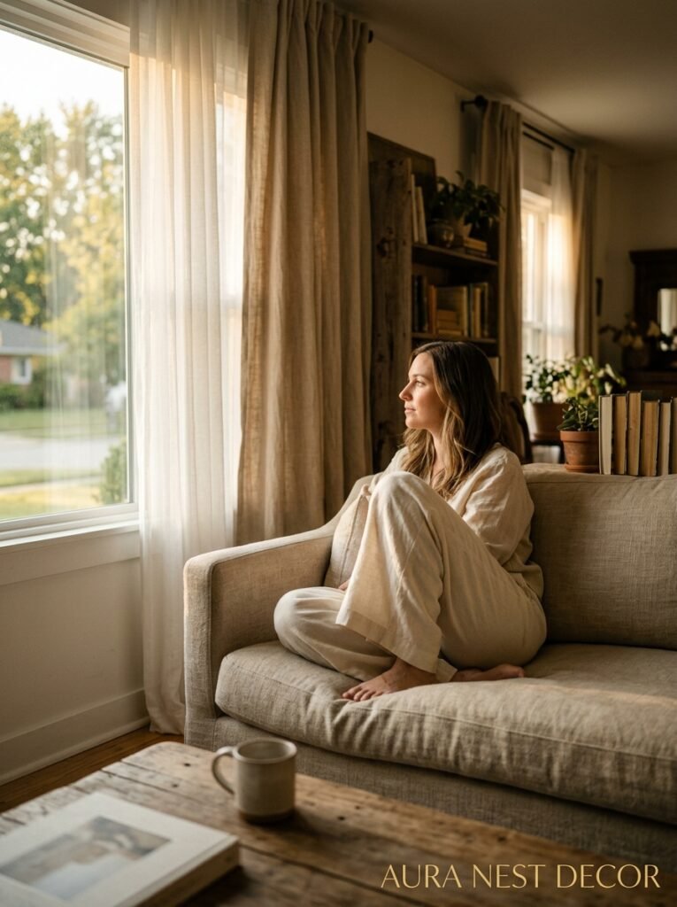
Linen. It’s linen. Or linen-look, if you’re working with a budget (and honestly, the difference isn’t as dramatic as the price tags suggest). There’s something about the way linen drapes hold light — not blocking it, not bouncing it, just sort of filtering it into something softer and more interesting than whatever was coming in before.
The texture matters too. Real linen has this slight irregularity to it, little slubs in the weave, and that imperfection is exactly what makes it feel expensive. Perfectly smooth polyester catches light in a flat way. Linen catches it in this layered, almost organic way.
Now, if you’ve got young kids or pets, I’m not going to pretend linen is practical without any caveats. It wrinkles. A lot. And some people genuinely love that — it adds to the relaxed, unfussy quality of it. Others find it drives them a bit mad. If you’re the second type, look for linen-cotton blends or even good Belgian linen with a slightly tighter weave. Still beautiful, slightly more forgiving.
Velvet is having another moment too, especially in the UK design world right now. A deep teal or dusty plum velvet drape in a living room is genuinely stunning. It’s not for everyone, not for every room, but if your space can handle the drama, it’s worth trying.
—
3. The Color No One Expects to Work But Somehow Does
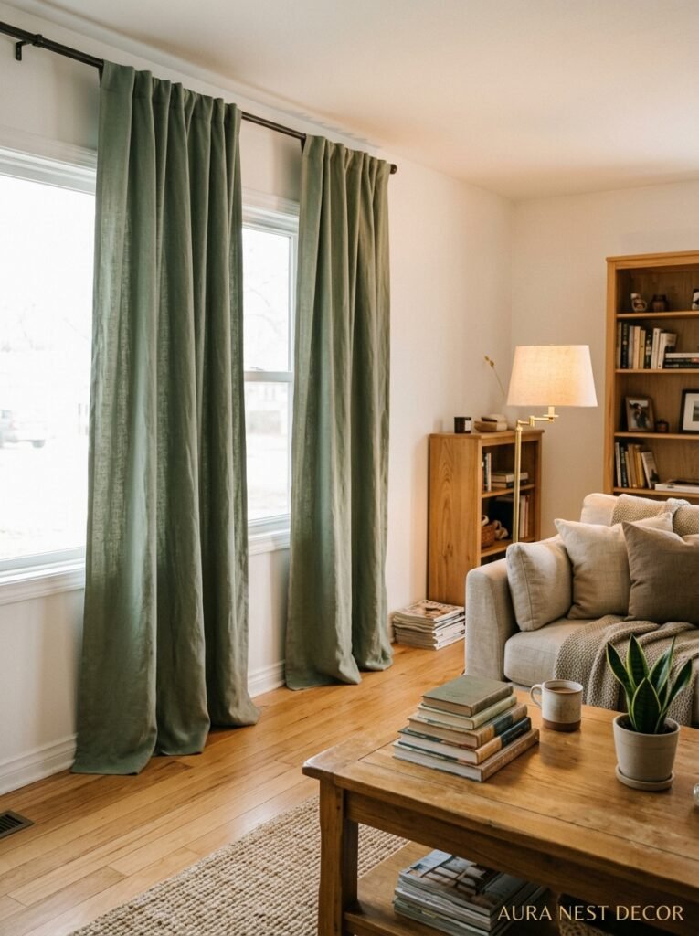
Warm white or natural oatmeal. Every time.
I know it sounds boring. I know you’re thinking, “I already have beige walls, why would I want beige curtains?” But this isn’t about matching — it’s about layering tones. A slightly warmer curtain against a slightly cooler wall creates this quiet depth that you can’t really explain in photos but you absolutely feel when you’re standing in the room.
And it works in almost every living space. Victorian terraced house in London? Yes. Open-plan ranch in Texas? Also yes. Rented flat where you can’t paint the walls? ESPECIALLY yes, because it softens whatever horrible magnolia situation you’ve inherited.
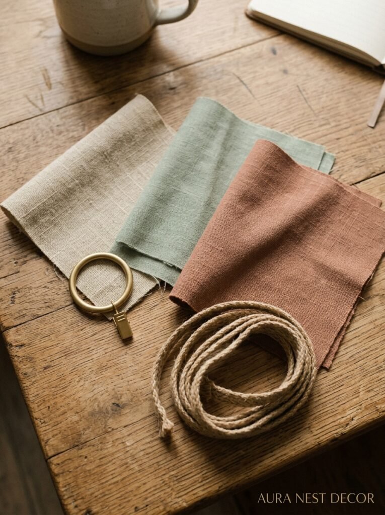
That said — don’t dismiss deep color. Charcoal drapes can absolutely anchor a room that feels scattered. Dusty sage works beautifully in rooms with wooden floors and warm-toned furniture. And an unexpected pop of terracotta against soft grey walls is the kind of thing that stops people in their tracks.
But if you’re unsure? Go oatmeal. You can build drama everywhere else.
—
4. What “Fullness” Actually Means (And Why Your Drapes Probably Don’t Have Enough)
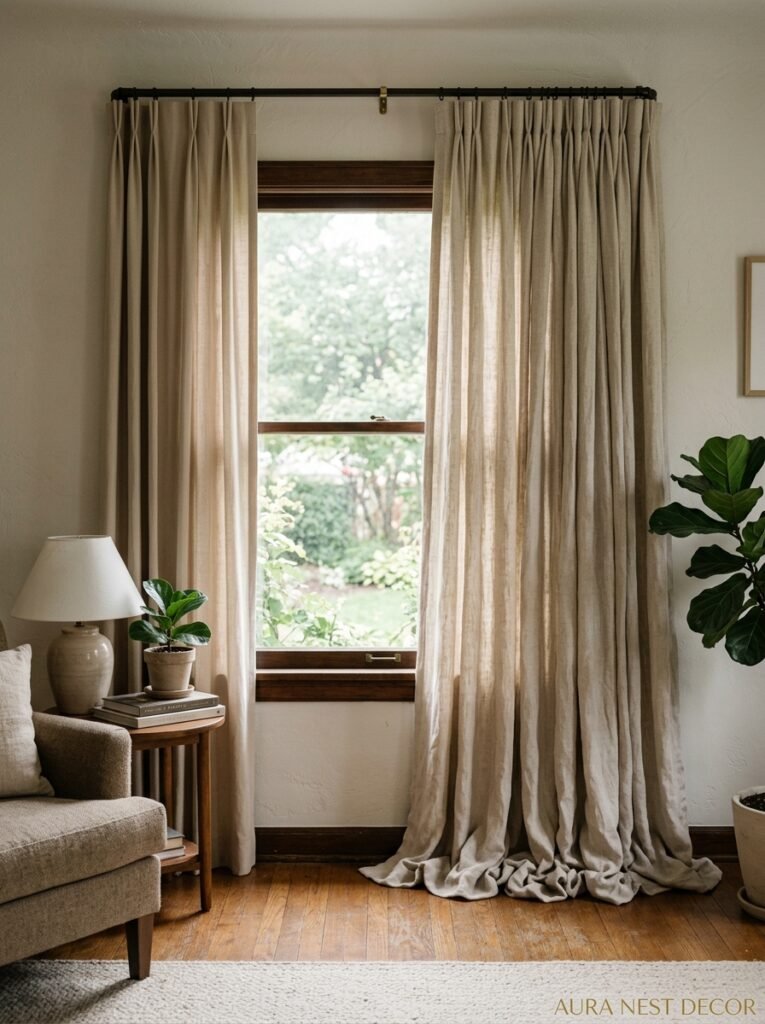
This is a word that gets thrown around in decor circles and then never explained properly, so let me just say it plainly: fullness is how much fabric you’re using relative to the width of the window, and most people don’t use nearly enough.
Standard ready-made panels give you about 1.5x fullness. So if your window is 60 inches wide, you get about 90 inches of fabric. Looks fine when closed. Looks a bit sparse and limp when open.
Good drapes — the kind that look like the inspiration photos — use 2x to 2.5x fullness. That means for a 60-inch window, you’d want 120 to 150 inches of fabric total. More fabric gathers more beautifully. When those drapes are pushed to the sides they have this lush, generous ripple to them instead of hanging flat and sad.
The fix is simple and cheap: buy more panels. Instead of two panels per window, use three or four. Push the extra fullness to the outside edges. It costs maybe 40 to 60 dollars more per window and the difference is, genuinely, enormous.
“Cheap drapes look expensive when there’s enough of them. Expensive drapes look cheap when there’s not.”
—
5. The Header Style That Dates a Room Without You Realizing It
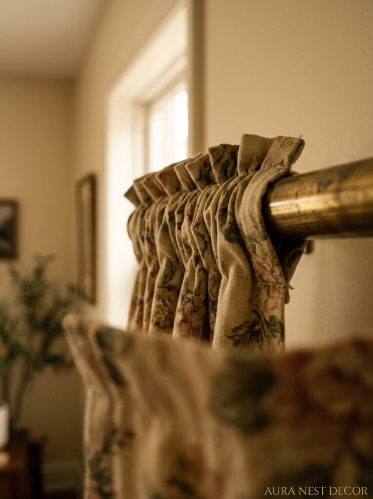
Pencil pleat is lovely, classic, very English cottage, slightly 2009. Eyelet rings are clean and modern but almost too hardware-store. And pinch pleat — specifically French or Flemish pleat — is having a serious comeback and looks beautiful in almost any living room with a slightly more considered aesthetic.
But the header I’d push you toward right now? Ripple fold. If you haven’t encountered it, ripple fold drapes hang in these consistent, even, continuous waves. Like fabric that’s permanently in a slow-motion breeze. It’s clean and modern without being cold, and it photographs incredibly well, which — let’s be honest — is part of what we’re optimizing for here.
For a more relaxed, organic room (think natural textures, rattan, lots of plants, the whole earthy-Pinterest vibe), rod pocket with slight gathering works. It’s imperfect in a way that feels intentional. The key word there is intentional. There’s a line between “relaxed” and “looks like I gave up,” and the line is mostly about the other decisions in the room.
Side note — tab top curtains. I genuinely can’t get behind them. They pull unevenly, they don’t slide smoothly, and they always end up looking slightly stretched. But if you love them, you love them.
—
6. How Lining Changes Everything (And Not Just in the Ways You’d Think)
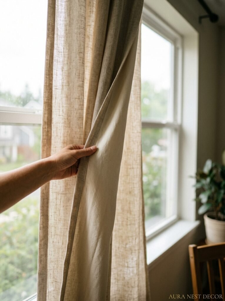
Unlined curtains look fine in the right rooms — breezy, light, casual. But lined drapes are a different category of thing entirely. The lining adds weight, and weight is what makes fabric hang properly. It’s what creates those nice long columns of fabric instead of the drapes sort of billowing out from the wall.
Thermal lining, specifically, is worth the extra cost in older homes. UK readers especially — if you’ve got single-glazed windows or draughty Victorian sash windows, thermal-lined curtains genuinely make a difference to how warm the room feels. Not a central heating replacement, obviously. But you’ll notice it.
Blackout lining in a living room is a personal call. If you work from home and need to see your screen during the day, or if afternoon sun hammers through your west-facing windows and bleaches everything, blackout is life-changing. If you love a sun-flooded room on Sunday mornings, maybe skip it here and save it for the bedroom.
Also — interlining. This is the soft, slightly fluffy layer between the face fabric and the lining that gives high-end bespoke drapes that incredibly luxurious, padded look. You can get interlined curtains at more accessible price points now, and if you can stretch to it, the effect is remarkable. The fabric hangs so heavily and so beautifully that people will ask if they’re custom.
—
7. Small Living Room? Here’s the Rule That Actually Helps
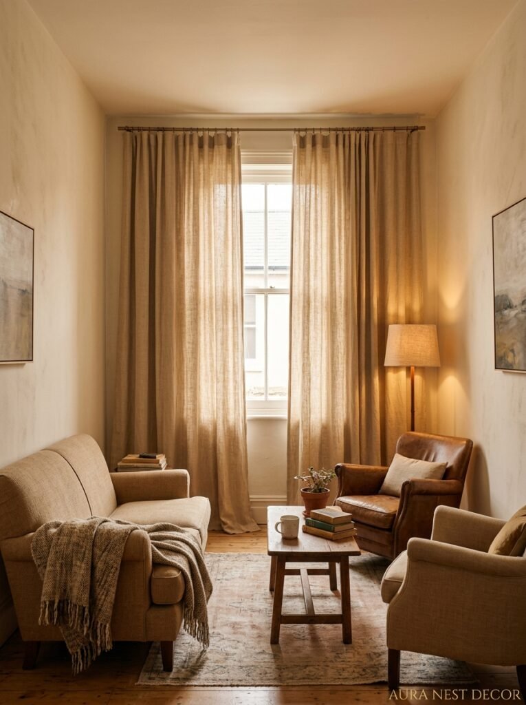
Make the drapes BIGGER.
I know every instinct says smaller room, smaller curtain. Smaller everything. But that instinct is wrong and it’s been making small rooms look cramped for decades. The solution to a small living room is to lean into grandeur, not away from it.
Floor-to-ceiling drapes make the walls feel taller. Wider drapes that extend past the window edges (so the fabric sits on the wall, not in front of the glass) make the window feel wider and bring in more light when open. Light-colored fabric keeps the room from feeling heavy. More fullness, not less.
The idea that small rooms need small, modest curtains is like saying small people shouldn’t wear long coats. It just… doesn’t follow.
And honestly? The curtains you save money on by buying shorter, narrower panels are the exact purchase you’ll regret most. Because when the room still looks small and kind of sad, you won’t immediately think “the curtains,” but they’ll probably be at least 40% of the problem.
“Small rooms don’t need modest curtains. They need the most curtains.”
—
8. The Hardware Nobody Talks About (But Everyone Notices)
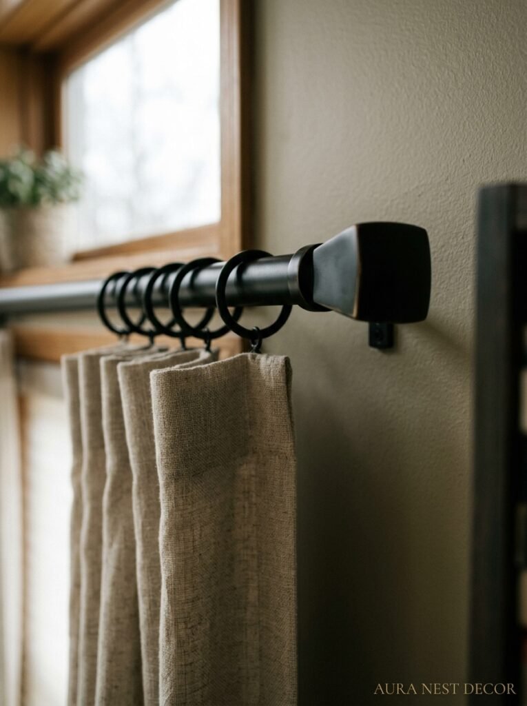
The rod matters. The finials matter. And your brackets really, really matter, because poorly fitted brackets give you that saggy middle situation that no amount of beautiful fabric can fix.
Brass is everywhere right now, and I mean everywhere. Brushed brass, antique brass, unlacquered brass that develops its own patina over time. It works with warm-toned rooms and surprisingly also with cooler, more contemporary spaces when you want to add warmth. If your living room leans Nordic or modern, a matte black rod can look genuinely stunning — especially with dark linen or textured stone-colored fabric.
Width matters more than most people account for. The rod should extend at least 6 inches past each side of the window. Some designers push 10 to 12 inches for a wider visual effect. Again, this goes back to the principle that the drape should frame the wall, not just the window.
And please, get a rod that can actually hold the weight of your drapes. I’ve seen beautiful interlined velvet panels brought down by a flimsy tension rod and it’s a small tragedy. Buy something solid. The good rods aren’t always expensive — IKEA’s RÄCKA system and its variations work well, honestly. But whatever you get, make sure the brackets are anchored into wall studs or with proper wall anchors. Sagging rods ruin everything.
—
9. Mixing Drapes With Blinds (When It Works and When It Really Doesn’t)
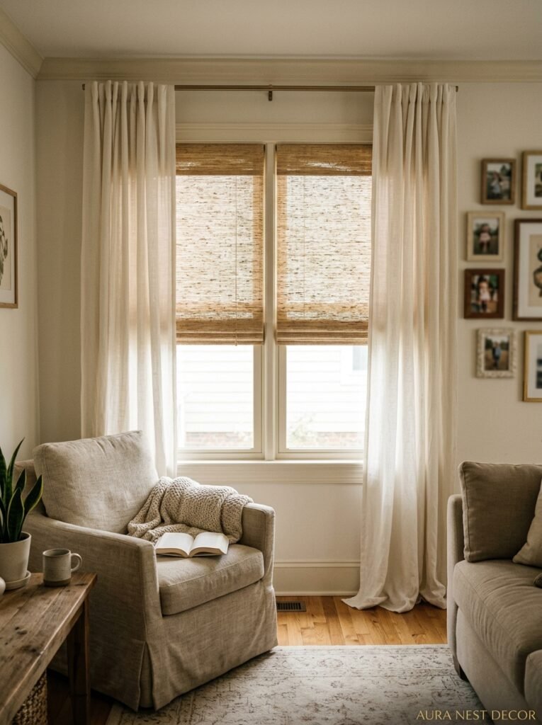
This combination is everywhere on Pinterest and for good reason — a Roman blind or roller blind for light control with drapes purely for frame and drama is actually a brilliant practical solution. The blind does the work, the drapes do the theatre.
But the pairing needs thought. A busy patterned blind plus heavily textured drapes in a similar tone is muddy. A simple, clean blind with rich-textured drapes is interesting. The rule I’d offer: one of them should be doing the visual work, and the other should be calm and supporting.
Roller blinds in a natural linen fabric paired with floor-length drapes in a similar neutral is very, very good. Roman blinds in a small geometric or botanical print with solid linen drapes is also excellent. What doesn’t work: two competing patterns trying to share the same window.
UK readers who love their shutters — and fair, plantation shutters are gorgeous — can still use drapes alongside them. The shutters handle the privacy and light, the drapes soften the room and add warmth. Hang the drapes wide and let them mostly sit open. Nobody says you have to choose.
—
10. The One Pattern Worth Considering If You’re Tired of Solid Drapes
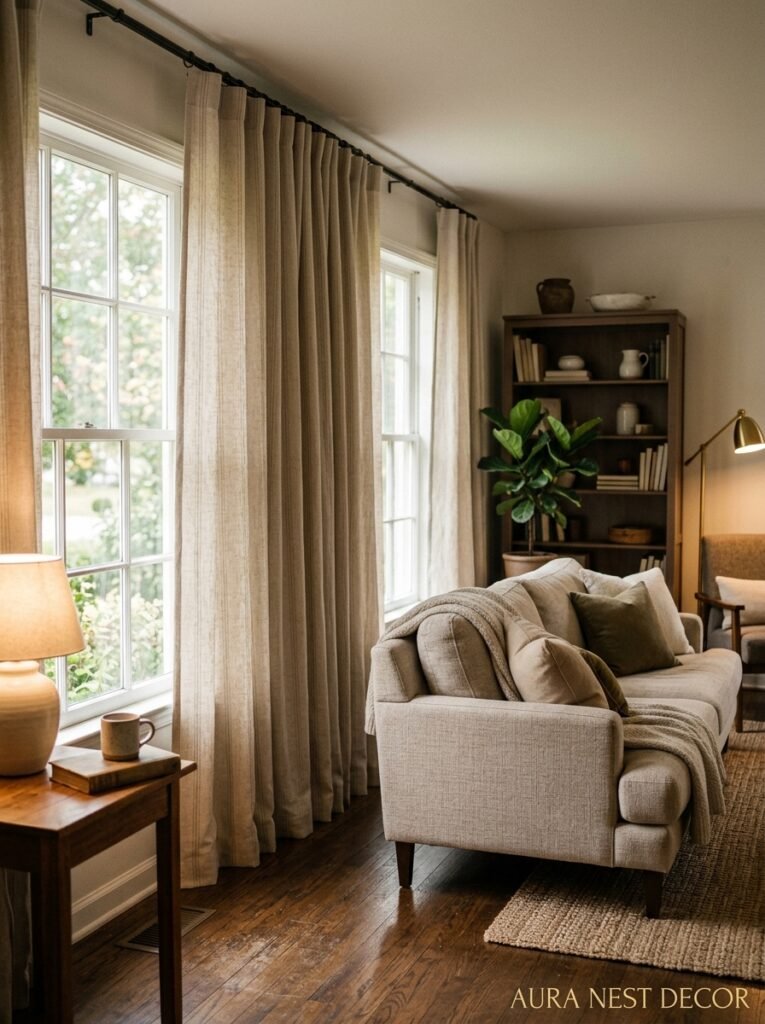
Subtle. That’s the word. Not timid — subtle. There’s a difference.
A very fine vertical stripe can add incredible height to a room without reading as “patterned” in any loud way. You see it and you don’t quite register it consciously, but the room feels pulled upward somehow. Wide stripes tend to look dated quickly. Very fine ticking stripes, or narrow pencil stripes, stay current for years.
If you want actual pattern — a print — I’d lean toward something botanical, something abstract, or something geometric with enough breathing room between motifs that it doesn’t overwhelm. Florals can be beautiful, genuinely, especially in UK living rooms where the rest of the room is fairly restrained. A William Morris-style print in muted colors on a natural linen background is an entire mood.
But the repeating challenge with pattern and drapes is scale. A pattern that looks lovely on a fabric swatch looks completely different hung in 9-foot lengths. If you’re going for print, get a sample, tape it to your window, and stand back. What you see from 12 feet away is what you’ll live with.
—
11. The Trick for Making Rental Drapes Look Like They Belong
So you can’t put holes in the walls, you’ve got horrible vertical blinds the landlord refuses to remove, and you’re working with a deposit you’d quite like back. This is a very real constraint, and I’m not going to tell you it’s easy. But it’s manageable.
Tension rods in the window recess can work for lightweight sheers. But honestly, the better solution for renters is freestanding curtain poles, which exist and are underused. You can get beautiful floor-standing curtain poles that act as room dividers or window frames without touching the wall. Niche product, but genuinely worth knowing about.
For the vertical blinds problem — just cover them. Keep them closed in the fully open position, hang your drapes wide and long in front of the whole window wall, and suddenly they disappear. You’re not removing anything, you’re just making it irrelevant.
Removable hooks and adhesive rod brackets do work for lighter-weight drapes, and Command has improved significantly in recent years. Pair with lightweight linen or sheer cotton and you’d be surprised what holds. Just don’t try it with velvet.
—
12. What I Actually Think About Curtain Trends Right Now
The “quiet luxury” direction that took over interiors in 2023 and 2024 hasn’t gone anywhere. Neutral, weighty, beautifully simple. But there’s a counter-current developing in living rooms — people bringing back color. Real color. Saffron yellow, inky navy, the kind of deep forest green that makes a room feel like you’re somewhere else entirely.
I think we’re moving toward a moment where people stop being afraid of commitment. Afraid of making a choice that’s THEIRS and not just safe. Drapes are actually the easiest place to experiment with this, because they’re not permanent. You can change them. And yet they have a bigger visual impact per square foot than almost any other element in a living room.
So my actual honest opinion? Don’t just buy what’s safest. Buy what makes you feel something when you imagine it in your room at 6pm on a Sunday with a glass of wine. That feeling matters. That feeling is the whole point of caring about your home at all.
—
❓ FAQ
Q: How much fabric do I need for living room drapes? A: As a starting rule, multiply your window width by 2 to 2.5 for the total fabric width you want. Then add 12 to 16 inches to your desired finished length for hems and header. If you’re buying ready-made panels, check the actual finished width, not just the window measurement, and buy more panels than you think you need.
Q: What’s the difference between curtains and drapes? A: Honestly, the terms get used interchangeably in everyday conversation, but technically drapes are lined, floor-length, and usually more formal than curtains. Curtains can be unlined, shorter, and more casual. For living rooms, drapes in the proper sense tend to look more finished and intentional.
Q: Can I put drapes in a living room that already has plantation shutters? A: Absolutely, and the combination can be gorgeous. Keep the drapes wide enough that they sit mostly on the wall rather than in front of the shutters when open, and use them as a framing device rather than a light-control tool — the shutters have that covered.
—
💭 Final Thoughts
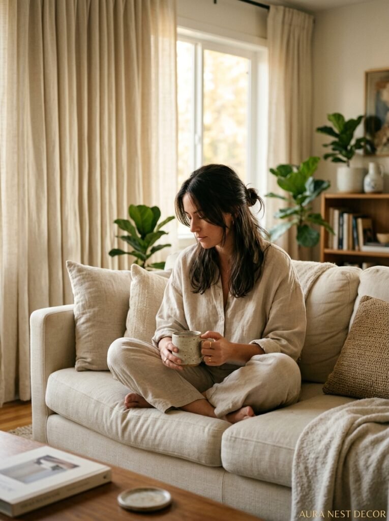
The drape decision doesn’t have to be agonizing, but it does deserve more thought than most people give it. Get the height right, get the fullness right, pick a fabric you’d actually want to touch — the rest is details. Your living room spends more hours lit by lamplight than by daylight, so hang something that looks beautiful in both.
What would you do with a room that finally felt exactly right?




