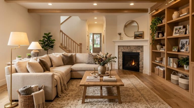
The Farmhouse Living Room Ideas That Actually Feel Lived-In (Not Like a Staged Pinterest Set)
You know the difference. There’s the farmhouse living room that looks like someone hired a photographer and then immediately left the building. And then there’s the one that makes you kick off your shoes before you even sit down. That second one? That’s what we’re going for.
—
1. Why Shiplap Is Having a Comeback — and When It Actually Works
Okay, so shiplap got a bit overused. I know. We all saw it in every house flip on HGTV for about five years straight and it kind of lost its magic. But here’s the thing — it never stopped working. We just started using it wrong.
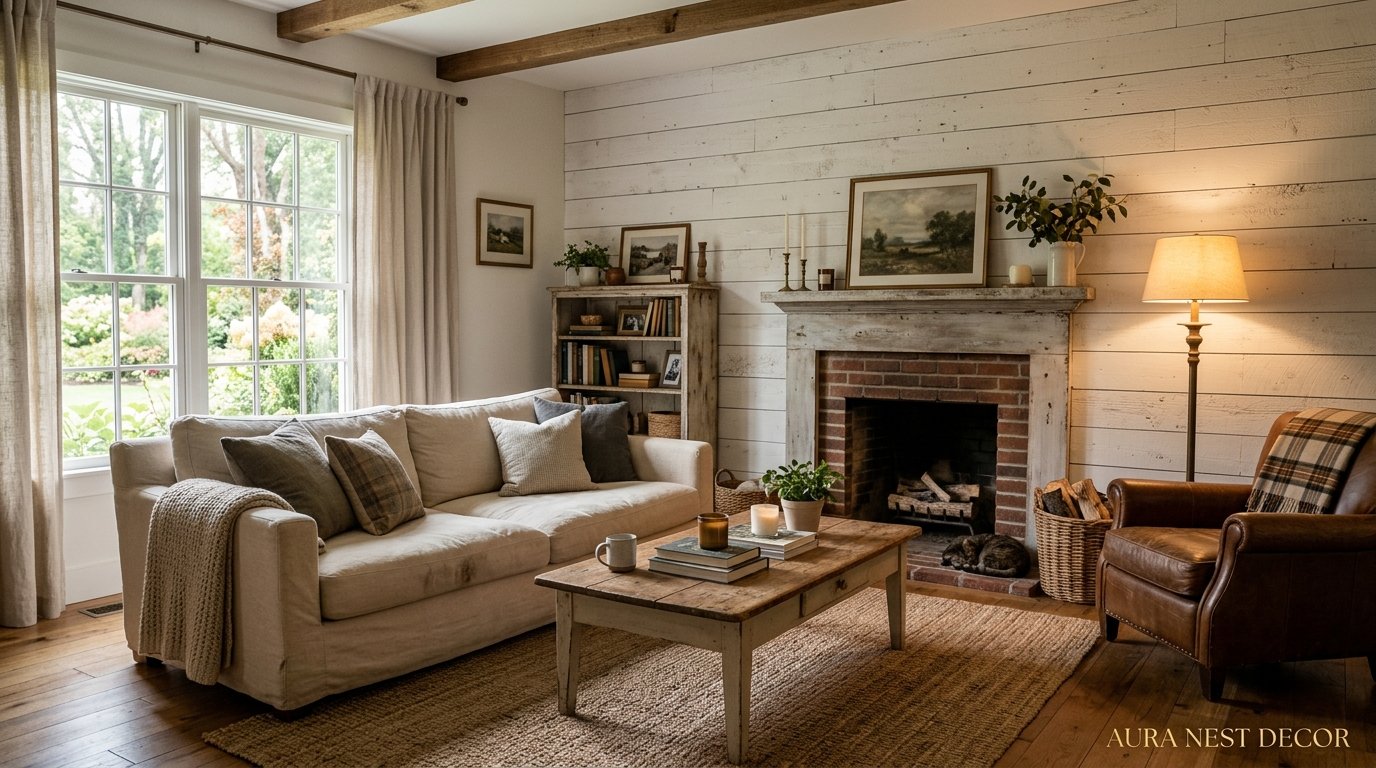
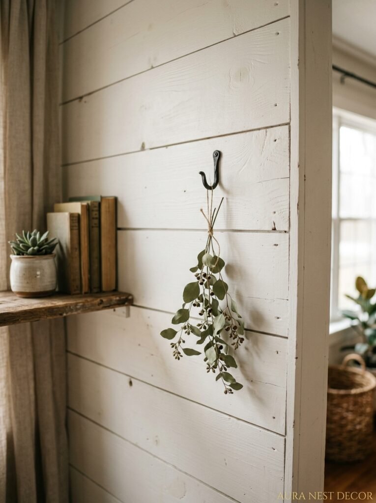
The key isn’t plastering every single wall in the room. That’s where it goes off the rails. Pick ONE wall. The wall behind your sofa, the one your eye lands on first when you walk in. Shiplap there, painted in warm white or a soft greige (Benjamin Moore’s White Dove is doing a lot of heavy lifting in farmhouse homes right now), and suddenly you’ve got texture without chaos.
In the UK especially, where period homes already come with so much character baked into the walls and cornicing, shiplap can feel a bit much if you’re not careful. But a single accent wall in a converted barn cottage or even a Victorian terrace? Done thoughtfully, it genuinely sings. The horizontal lines add this quiet rhythm to a room. They draw your eye across instead of up, which makes ceilings feel lower in the best possible way — more cocoon than aircraft hangar.
Don’t paint it bright white, by the way. Bright white reads as cold in real life, especially in British homes where the natural light is gentler. Go warm. Always go warm.
“Shiplap isn’t a trend. It’s a texture. And texture is what makes a room feel like it belongs to someone.”
2. The Sofa Color Nobody Talks About But Everyone Should Try
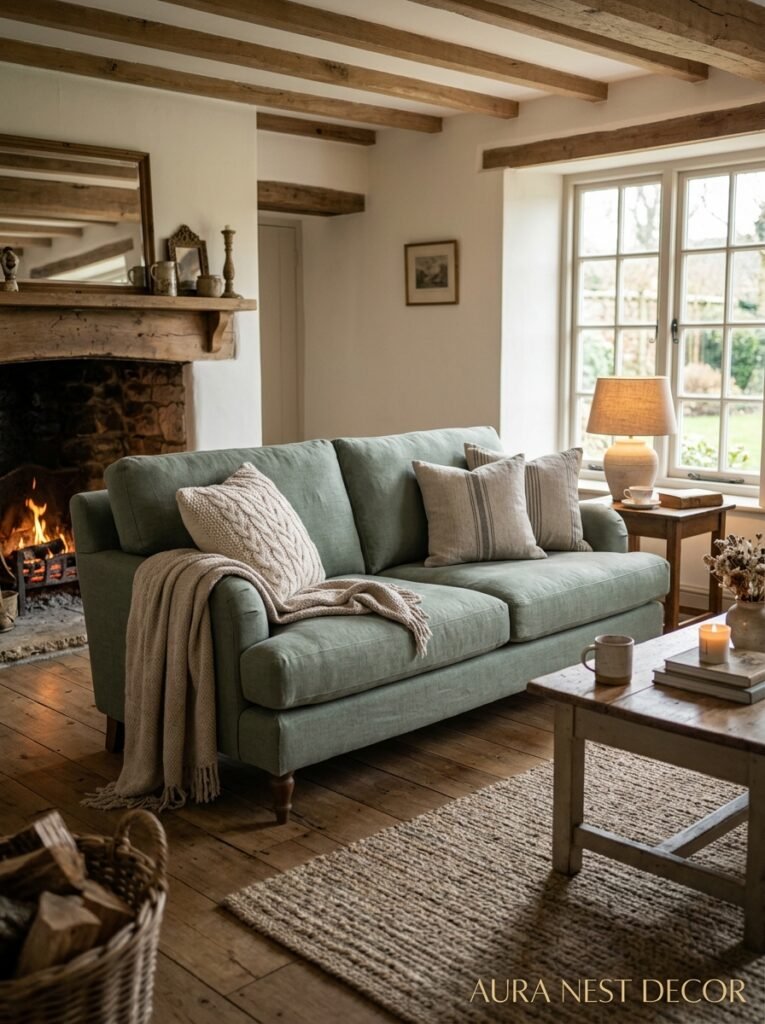
Cream. Not beige. Not ivory. Not “warm linen” or whatever fancy name a paint company gives it — just cream. A proper cream sofa in a farmhouse living room is one of those choices that sounds risky and then immediately makes sense the second you see it.
The thing about cream is it doesn’t try to hide. Every muddy handprint is a conversation, yes. But it also photographs beautifully, layers with throws like a dream, and it’s one of the only sofa colors that manages to feel both casual and genuinely elegant at the same time. Throw a chunky oatmeal knit blanket over one arm and suddenly you’ve got something people pin obsessively at midnight.
Now, if cream genuinely isn’t practical for you (dogs, kids, a husband with zero spatial awareness near red wine), go for a deep sage green. This is THE sleeper hit in farmhouse living rooms right now. It grounds the room, plays beautifully against raw wood and white walls, and it’s just surprising enough to make the space feel curated rather than assembled from a mood board someone found in 2019.
Avoid grey. I know. It’s been everywhere. But grey sofas in farmhouse rooms always read as an afterthought, like someone got cold feet at the last second. The whole point of farmhouse style is warmth, and grey fights that at every turn.
3. The One Rug Rule That Changes Everything
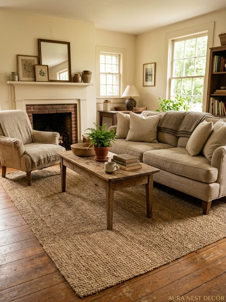
Don’t go too small.
That’s it. That’s the rule. But seriously — the number of otherwise beautiful farmhouse living rooms I’ve seen ruined by a rug that fits under only the coffee table like some kind of sad little island in the middle of the floor. You need the rug to anchor the whole seating arrangement. Front legs of every sofa and chair should sit on it, minimum.
For farmhouse specifically, natural fiber rugs are doing the most work right now. Jute especially. It’s slightly rough, it shows texture the way a good sourdough crust does, and it brings this honest, organic quality that no synthetic can fake. Layer it with a smaller Moroccan-style rug on top if you want something softer underfoot. That combination — jute underneath, something patterned and a bit worn-looking on top — is one of those things that makes people walk into a room and immediately say “oh, this is so cozy” without being able to explain why.
Side note — if you’ve got kids running around, a darker patterned rug on top does a lot of the heavy lifting stain-wise. Just saying.
4. Exposed Wood Beams: What Nobody Tells You Before You Commit
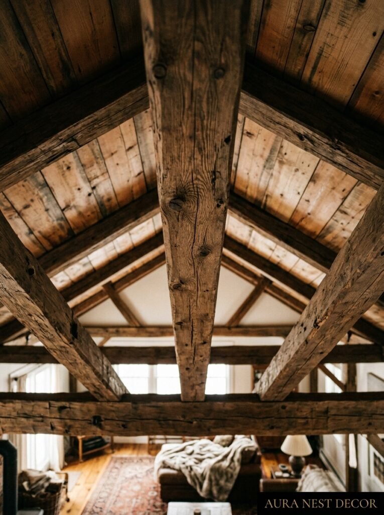
Real exposed beams are wonderful. They’re also expensive, structural, and occasionally home to things you’d rather not think about if your house is old enough. So let’s talk about faux beams, because honestly? They’ve gotten really good.
The polyurethane versions especially. You can get them pre-finished in a distressed walnut or a whitewashed pine finish, and from six feet below the ceiling, you genuinely cannot tell. The trick is in the installation — they need to look HEAVY, not like crown molding someone painted dark. Space them properly (about six feet apart is traditional), and make sure they cross the room’s width rather than running along its length, which can make a room feel compressed.
Now if you DO have real beams — lucky you, honestly — resist the urge to paint them white. I know it’s everywhere on Pinterest and it does brighten a room up. But raw, dark beams in a cream-and-linen farmhouse room create this beautiful contrast that just can’t be faked. The darkness at the top makes everything below feel warmer. It’s counterintuitive but it works every time.
In older UK homes especially, original beams should probably be left as they are. They’ve earned their color.
“The ceiling is the fifth wall. In a farmhouse room, it might actually be the most important one.”
5. Fireplace Styling That Doesn’t Look Like a Stage Set
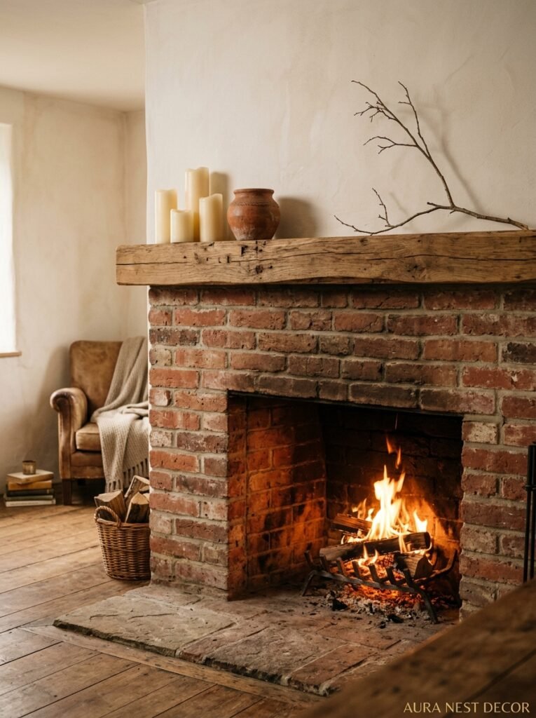
Farmhouse living rooms and fireplaces were basically made for each other. But there’s a way to style a fireplace mantel that feels real and lived-in, and there’s the way where you buy a dozen pillar candles and some cotton stems from HomeGoods and call it a day. Those are different things.
What actually works: asymmetry. Stop trying to create perfect mirror-image arrangements on either side of the mantel. Real homes don’t look like that. Real homes have a tall candlestick on one end, a small stack of books on the other, a framed print that’s maybe slightly too big, and something your kid made in art class that you couldn’t bring yourself to throw away.
That imperfection? That’s the whole point. Farmhouse style at its best is collected, not curated. The mantel should look like it’s been added to slowly over years. A vintage clock that runs slightly slow. A brass candlestick you found at a car boot sale. A piece of art you loved before you even had the house.
For the firebox itself, if you’ve got a real working fireplace, keep it stacked with actual logs even in summer. Nothing says farmhouse more than a proper stack of wood waiting to be used. If it’s decorative, a bundle of birch logs does the same job with none of the effort.
6. The Color That Keeps Showing Up in Every Beautiful Farmhouse Kitchen and Bleeding Into the Living Room
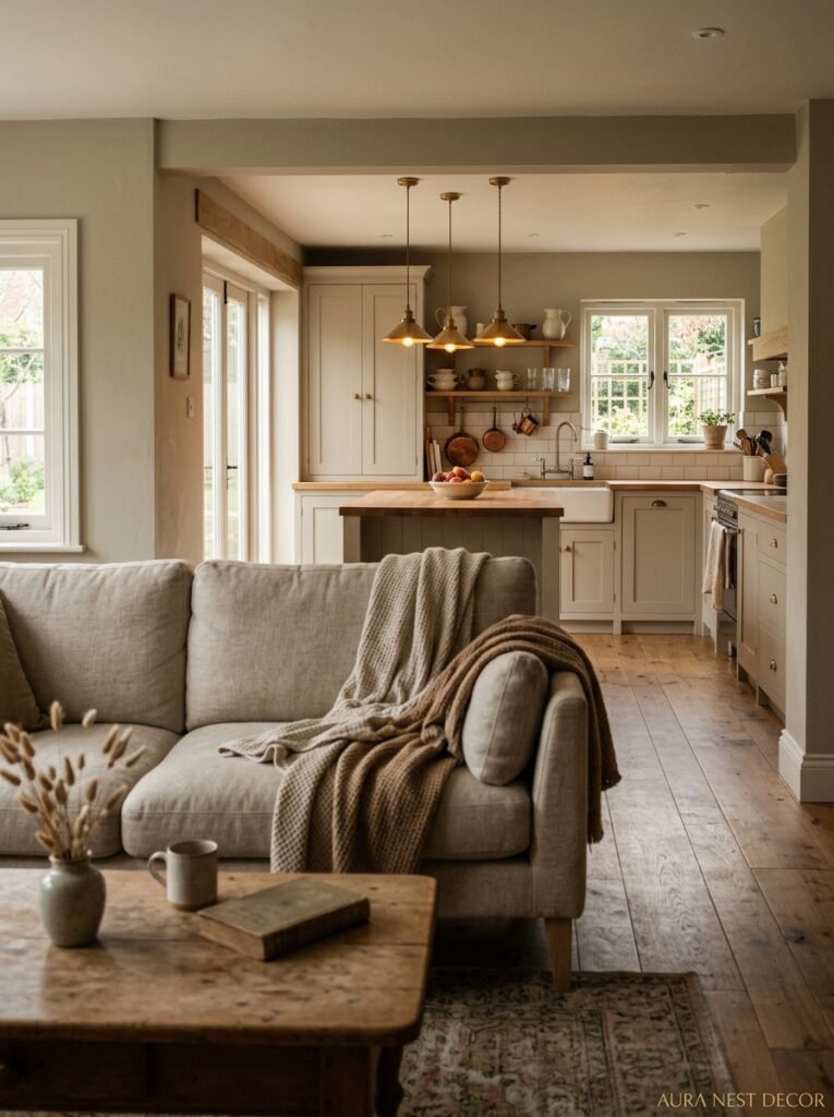
Warm white, obviously. But paired with what?
Aged brass. Full stop.
Not gold — there’s a crucial difference. Gold is shiny and a bit presumptuous. Aged brass is quiet. It’s got a slight patina, a warmth that shifts in different lights, and it reads as antique without being precious about it. In a farmhouse living room, aged brass shows up on lamp bases, curtain rod finials, picture frames, cabinet hardware if you’ve got built-ins, and those little details accumulate into something that feels genuinely layered.
The reason this works so well in farmhouse spaces is that it connects to the farming tradition of objects that are used, worn, and honestly not that fussy about it. A polished chrome finish says “just installed.” Aged brass says “been here a while, part of the family.”
In British farmhouse homes especially, this pairs beautifully with the warmer tones that older stone or brick walls throw out. It’s a little complementary alchemy that just happens.
7. Curtains That Actually Look Like They Cost More Than They Did
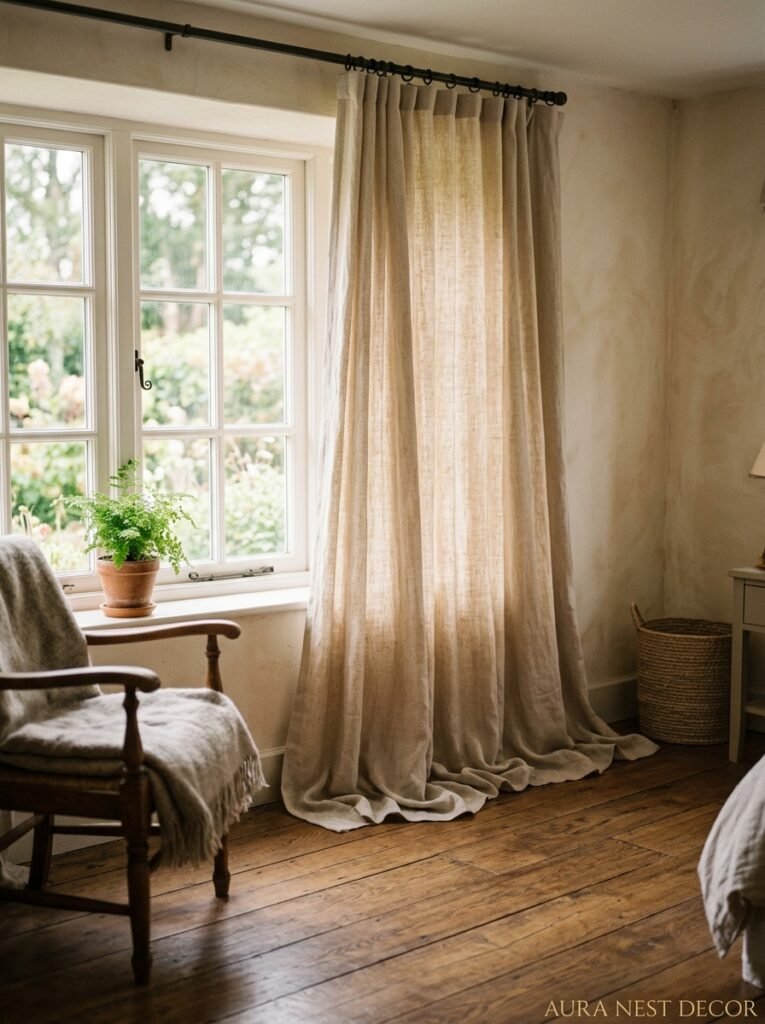
High and wide. Always. The curtain rod goes close to the ceiling, not above the window frame. The curtains pool very slightly on the floor, or at absolute minimum, kiss it.
This is not complicated but it will genuinely change how big your living room feels. Hanging curtains at window height is one of those choices that makes a room look finished from the outside but slightly awkward from the inside. Your eye wants to follow them all the way up, and when they stop at window height, there’s this visual disappointment.
For farmhouse, fabric matters enormously. Linen. Natural linen in a warm off-white or a soft oat color. It’s not cheap, but you can find good linen-look options at IKEA or even Amazon that hang beautifully once you’ve steamed them within an inch of their lives. The slight wrinkle of linen is a feature, not a bug — it’s part of the relaxed, unprecious quality that makes farmhouse rooms feel habitable.
Avoid anything shiny. Anything with a big pattern. Anything that looks like it belongs in a hotel lobby. The curtains should disappear into the room a little bit, framing everything rather than stealing the show.
“Curtains hung at window height are doing the visual equivalent of wearing trousers three inches too short. You can’t unsee it once you know.”
8. The Bookshelf Styling Trick That’s Actually About What You Take Away
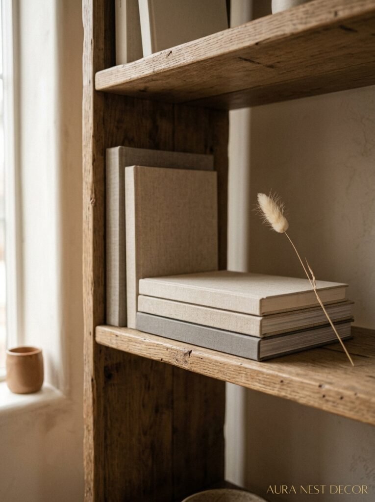
You’ve probably seen the advice about styling bookshelves — lean things, add plants, vary heights, add objects between books, blah blah. All true. But the thing that nobody says enough is this: take half the stuff off.
Whatever you have on your shelves right now, remove roughly half of it, step back, and look. The breathing room around objects is what makes them visible. When every shelf is packed to the edge, nothing registers. Your eye skims over it as visual noise.
For farmhouse specifically, the objects that work best are simple and honest. A wooden bowl. A small stack of field guides or vintage cookbooks with beautiful spines. A clay pot. A single piece of ironstone pottery. Maybe a framed black-and-white photograph, unlabeled, slightly mysterious. The editing — that intentional restraint — is what gives the shelves that “collected over time” quality that makes people stop and look.
White or cream shelves against a shiplap wall, by the way? Forget it, they’ll disappear. Go for natural wood shelving, or something in a warm tone that gives you that contrast. You want the shelf itself to be seen.
9. What Lighting Is Actually Doing in a Farmhouse Room (It’s Not What You Think)
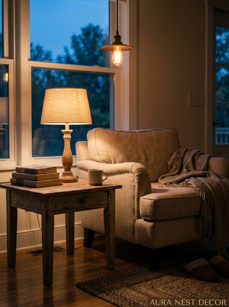
We talk about lighting in terms of fixtures — the pendant, the floor lamp, the table lamp. But in a farmhouse living room, what lighting is REALLY doing is controlling time of day.
At noon with the curtains open, your room looks like one thing. At 7pm with the overhead off, a floor lamp glowing warm in the corner, and a candle or two going on the coffee table — that’s a completely different room. Same furniture. Same everything. But the mood has shifted in a way that feels almost architectural.
This is why dimmers are non-negotiable. Every single overhead light in your living room should be on a dimmer. The cost of installing one is nothing compared to the difference it makes. The amber glow at low intensity in the evening is what makes a farmhouse room feel genuinely cozy rather than just decorated.
Layer your light sources — one overhead (dimmed low in the evenings), one or two table lamps at seated eye level, and something on the floor if the room is large. The goal is NO dark corners and NO single blaring ceiling light. Dark corners make rooms feel smaller and colder. You want the warmth to wrap the entire space.
10. The Gallery Wall That Looks Curated But Wasn’t
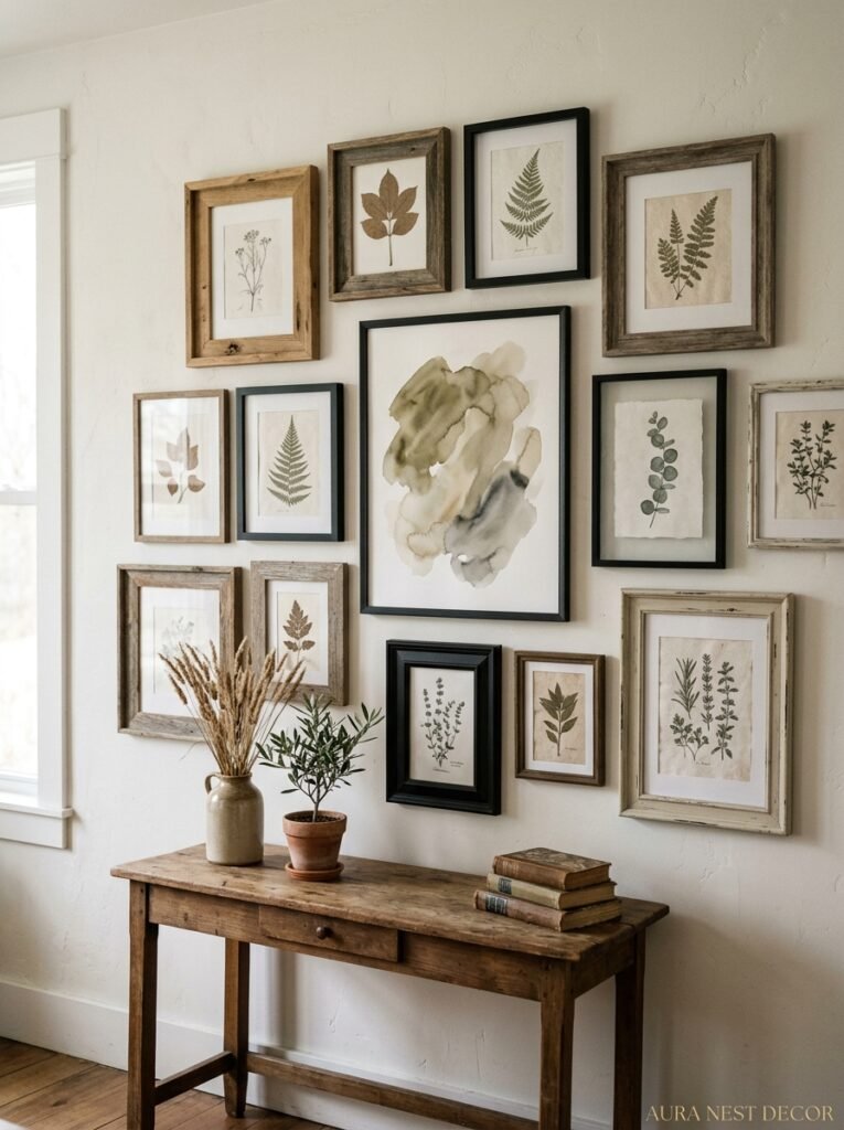
This one’s about the frames, not the art. Hear me out.
If every frame matches — same finish, same width, same vibe — the gallery wall reads as a product. Something you bought as a set. But mix your frames: a thick reclaimed wood frame next to a thin aged brass one next to a simple white one, and suddenly the wall looks like it was assembled by someone with actual taste and actual history.
The art itself can be almost anything. Old botanical prints (these are everywhere at estate sales and car boot sales and are almost free). Family photos printed in black and white. A child’s drawing in a fancy frame — this is criminally underrated, it adds so much life. A vintage map of somewhere that means something to you. A page torn from an old calendar because the image was beautiful.
The arrangement matters less than you think. An approximately rectangle-shaped grouping with the largest piece roughly centered works every time. You don’t need to plan it to the millimeter. Just hold things up, take pictures with your phone, move stuff around. It’ll tell you when it’s right.
11. Plants That Actually Survive in a Farmhouse Living Room
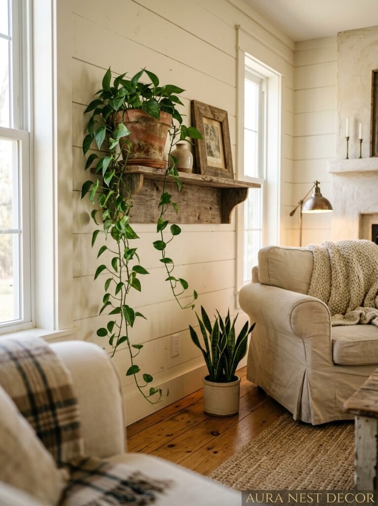
Okay, real talk — the number of people who buy trailing pothos and fiddle leaf figs for their farmhouse rooms because they look good on Pinterest and then watch them die in six weeks… it’s a lot. So let’s be honest about which plants are actually good at being plants.
Pothos: nearly impossible to kill, trails beautifully, doesn’t care much about light or water schedules. Perfect for high shelves or the top of a bookcase. Snake plants: will survive almost anything. The rigid, architectural shape is great contrast against soft farmhouse textures. Trailing ivy: smells faintly green and sweet, looks exactly right in a white pitcher or a terracotta pot, and it’s forgiving.
Dried botanicals are also completely legitimate here. A bunch of pampas grass in a tall vase, a few dried cotton stems, some preserved eucalyptus that still holds its grey-green color months after you buy it. There’s no shame in going dried — in a farmhouse room especially, there’s something fitting about plants that have completed their season and stuck around anyway.
12. The Small Detail Everyone Notices But Nobody Can Name
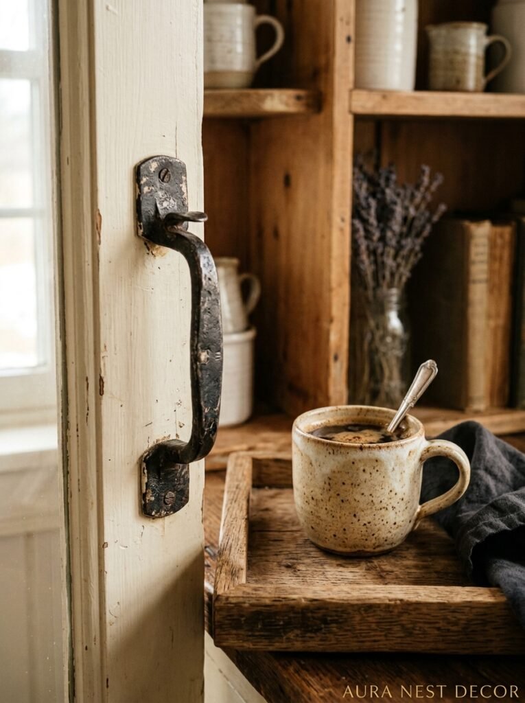
It’s the throw. Not just any throw — the right throw, placed the right way.
Not folded neatly over the arm. Not tucked in like hospital corners. Draped. Casually, the way someone actually left it. One end caught on the cushion, the other trailing slightly toward the floor. A chunky knit or a waffle-weave cotton, in oatmeal or cream or a dusty sage, and ideally with some actual weight and texture to it.
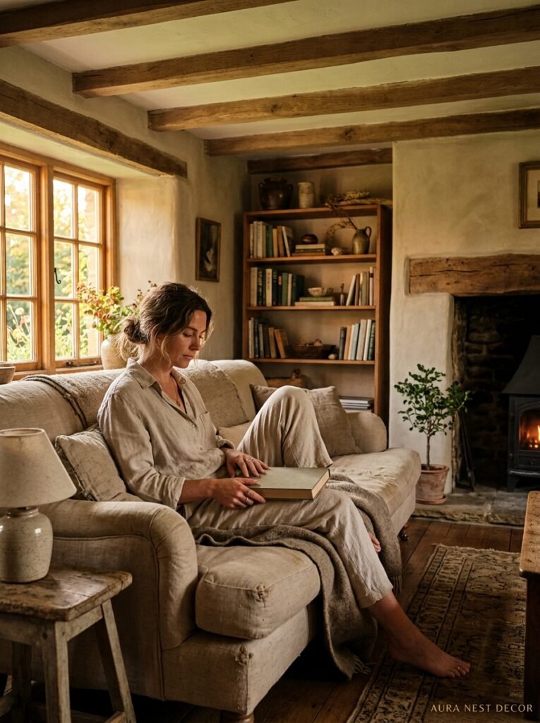
This sounds like a small thing. It IS a small thing. But it’s the difference between a room that looks like it’s waiting for a photoshoot and a room that looks like someone just got up from reading and might be back in a minute. That lived-in quality — that sense of a life actually happening inside the room — is the whole point of farmhouse style, and a single disheveled throw communicates it faster than any shiplap wall or vintage barn door ever could.
—
❓ FAQ
Q: What’s the difference between farmhouse style and cottagecore, and does it matter? A: They overlap a lot, honestly — both love natural materials, soft colors, and a kind of cozy anti-perfectionism. Farmhouse leans slightly more structured and Americana in its origins, with shiplap and galvanized metal, while cottagecore goes more floral and whimsical. In practice though? Mix them freely. Style categories are suggestions, not rules.
Q: Can you do farmhouse style in a modern apartment with low ceilings and no architectural character? A: Yes, and sometimes it’s easier than in an older home with clashing period details fighting you. Focus on textiles, lighting, and objects rather than architectural changes. A jute rug, linen curtains hung high, a wood coffee table, and some honest plants will get you most of the way there without touching a single wall.
Q: Is farmhouse style going out of fashion? A: The maximalist version with matching everything and “GATHER” signs on the wall — maybe, yeah. But the underlying approach — natural materials, warm tones, worn-in textures, rooms that look used and loved — that’s not going anywhere. Good style never really does.
—
💭 Final Thoughts
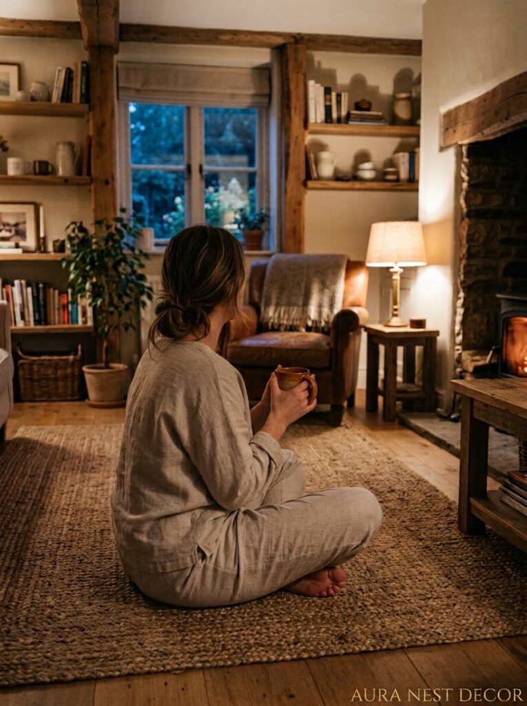
The best farmhouse living rooms I’ve ever seen all had something in common: they looked like they’d been arrived at slowly. A piece added here, something moved there, a throw that started in the bedroom and ended up staying. There wasn’t a master plan. There was just attention, over time.
That’s what’s worth chasing. Not the Pinterest-perfect grid of matching neutrals, but the room that makes you feel something when you walk in.
What’s the one thing in your living room right now that you keep meaning to change — and what’s actually stopping you?