
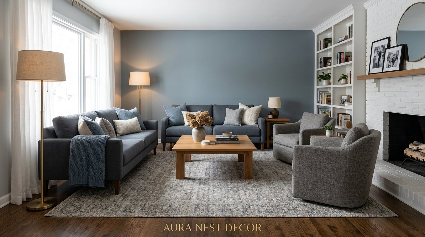
The Grey and Blue Living Room Combination That Interior Designers Keep Coming Back To (And Why It Works Every Single Time)
My neighbor redid her living room last spring, and I genuinely couldn’t stop staring at it. Not because it was flashy. Because it was just… right. Warm grey walls, navy blue throw pillows, that particular blue-grey linen sofa that looked expensive but probably wasn’t. I drove home thinking about it for twenty minutes.
—
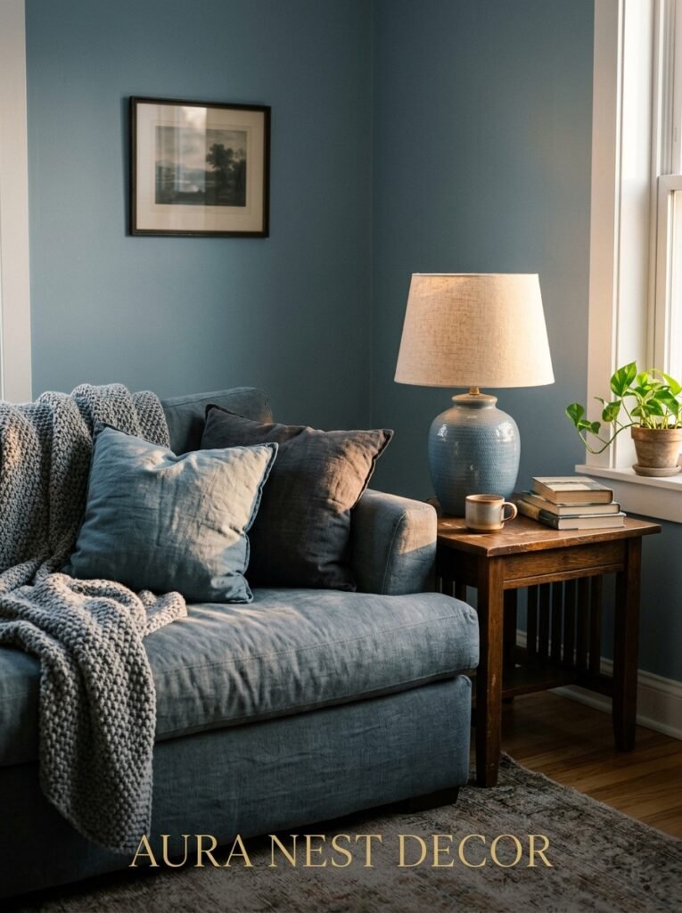
1. Why Grey and Blue Don’t Feel Cold Anymore — And What Changed
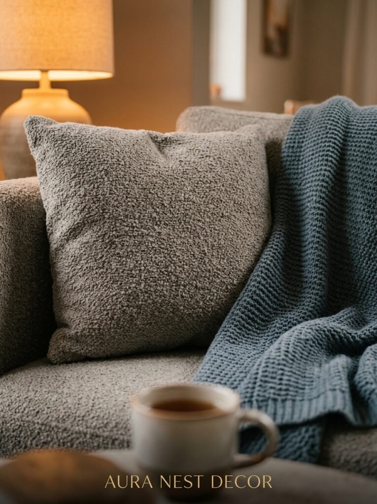
Here’s the thing. For a long time, grey and blue together had a reputation. People said it felt like a dentist’s waiting room, or a corporate lobby, or some sad rental flat in 2014 with beige carpet and no personality. And honestly? Sometimes it was.
But something shifted. Designers started pairing the right blues with the right greys — not the icy ones, not the flat ones — and suddenly the whole combination started feeling lived in. Layered. Kind of beautiful, actually.
The secret is undertones. A grey with a blue or purple undertone will pull blue accessories colder. But a grey with a green or brown undertone? That’s what warms the whole thing up. Pair that with a deep, slightly dusty blue — think cadet blue, slate, or the kind of navy that’s so dark it looks almost black in certain light — and you’ve got something that feels intentional without trying too hard.
And the thing nobody tells you is that this combination reads completely differently depending on natural light. North-facing rooms, common in UK homes especially, can make blue-grey combos feel a little flat mid-morning. But by 4pm when the indirect light softens everything? Genuinely gorgeous.
—
2. The Shade of Grey That’s Been Quietly Dominating Living Rooms Across the US and UK
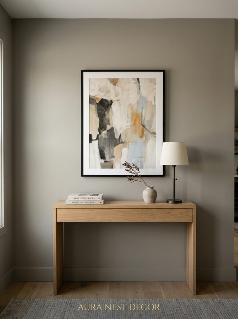
Not all greys are equal. Not even close.
The ones showing up everywhere right now — on Pinterest, in real homes, in every design magazine that’s tried to stay current — are the greiges and the blue-greys. Greige is obviously that warm grey-beige hybrid. Blue-grey is exactly what it sounds like but the right version of it is kind of soft and dusty, not stark.
Think Farrow & Ball’s Mole’s Breath. Or Benjamin Moore’s Stonington Gray, which is legitimately one of the most popular living room paints in America right now and has been for a few years running. These aren’t cold. They’re not sterile. They read as sophisticated but also kind of cozy, which is a hard balance to pull off.
“A grey that goes warm at night is worth twice what a grey that looks perfect at noon does.”
If you’re in the UK, Dulux Polished Pebble gets used a LOT. It photographs beautifully, which is probably why it goes viral on Pinterest every six months. In the US, Sherwin-Williams Repose Gray is essentially the safe choice — not boring, just reliable. It’ll work in almost any room with almost any blue accent.
Don’t go too light. A pale grey living room with pale blue cushions just looks washed out. You need contrast somewhere, and usually that means either the wall or the furniture goes deeper than you think it should.
—
3. The Blue That Actually Feels Right Here (Hint: It’s Not Baby Blue)
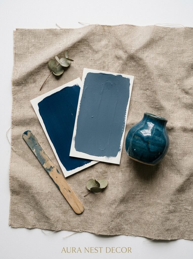
Let’s be direct. Baby blue doesn’t belong in this combination. Neither does that bright, almost-turquoise aqua that was everywhere in 2016. What works is blue that has weight to it.
Navy. Slate. Petrol blue. Indigo, if you’re feeling bold. That particular deep teal that’s hard to name but instantly recognizable when you see it on a velvet cushion.
The rule — if there is one — is that the blue should feel like it has some grey already mixed into it. Dusty, muted, a little grown up. That way it doesn’t fight with the grey walls or sofa, it just… belongs there. Like it was always going to be there.
Side note: I know people who’ve done a full navy blue sofa against grey walls and it’s one of the most elegant things I’ve ever seen in a living room. It takes confidence. But it works.
—
4. The One Piece of Furniture That Anchors the Whole Room
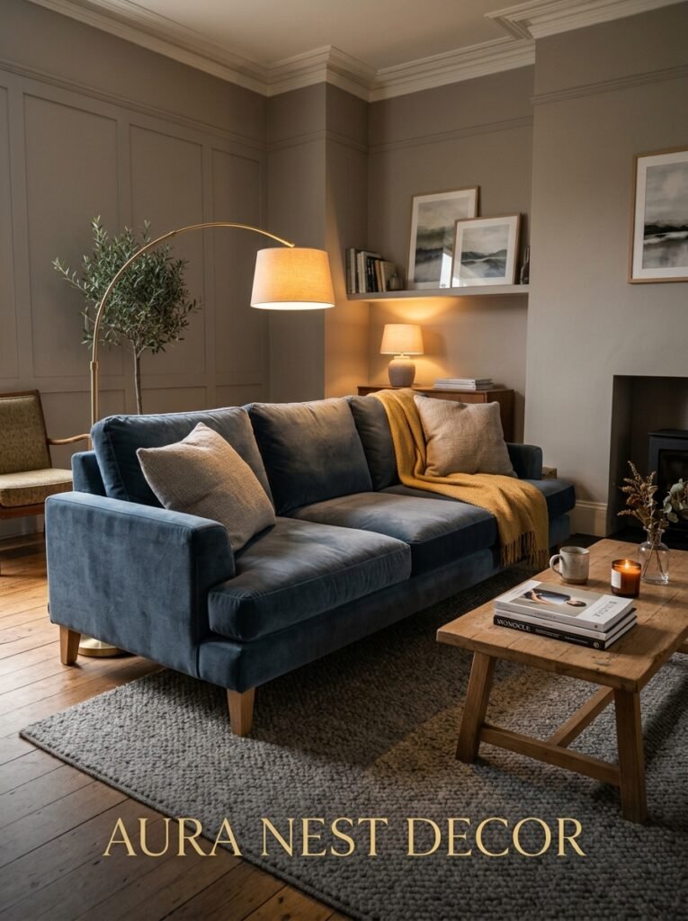
Usually a sofa, obviously. But which one?
A blue-grey linen sofa is probably the most cohesive choice because it sort of bridges the two colors. It’s not committing to either grey or blue exclusively, which means your accent pillows, your rugs, your throws — all of it has more room to breathe.
But if you want drama, go blue sofa. Deep blue velvet against light grey walls is a combination that photographs incredibly well and feels even better in person. There’s something about velvet that adds warmth to an otherwise cool palette — the way it absorbs and reflects light simultaneously, shifting between blue and almost-black depending on where you’re sitting.
“Velvet turns a cold combination warm. It’s not about the color, it’s about how the fabric catches the light.”
Alternatively, a mid-grey sofa with blue armchairs. That works really well in larger rooms, especially British sitting rooms where the proportions allow for two different seating pieces without looking crowded. It gives the eye two distinct blue moments without going overboard.
What doesn’t work: a light grey sofa AND light blue accessories with nothing deeper anywhere. It just… floats. Rooms need grounding.
—
5. The Rug Situation — And Why This Is Where Most People Go Wrong
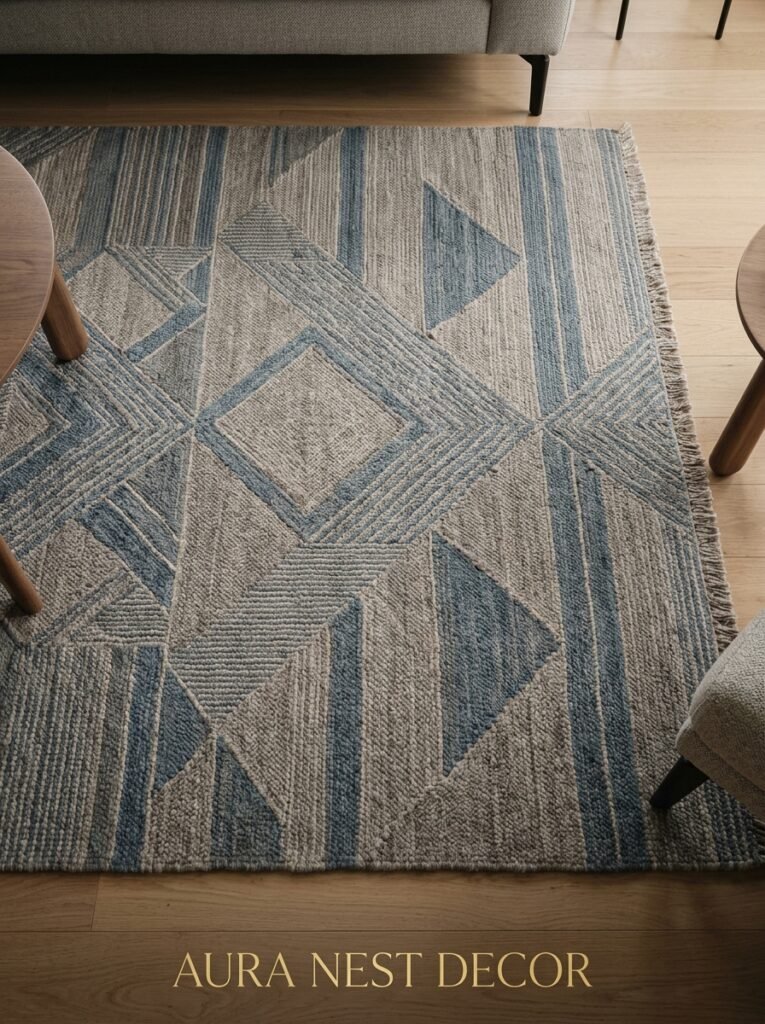
Rugs are where grey and blue living rooms either come together or completely fall apart. And people get it wrong more often than not.
The mistake is going for a grey rug with a grey sofa and grey walls. Now you’ve got a grey box, congratulations. Similarly, a fully blue rug when everything else is blue and grey can feel one-dimensional.
What actually works:
- A rug that pulls in a third color — cream, warm white, even a dusty terracotta or blush — while still having blue or grey tones in the pattern
- A geometric pattern in navy and cream for a cleaner, more modern feel
- A faded, antique-style rug in blue and gold if your room leans traditional
- A solid navy rug if everything else in the room is relatively neutral
The texture of the rug matters almost as much as the color. A chunky wool rug in off-white breaks up the blue-grey palette in a way that feels cozy and grounded. Flat-weave rugs look brilliant in contemporary spaces but can read a bit cold in rooms that are already leaning cool.
And size — always bigger than you think. The rug that’s too small is the single most common living room styling mistake. Period.
—
6. Lighting That Makes Grey-Blue Interiors Feel Warm Instead of Chilly
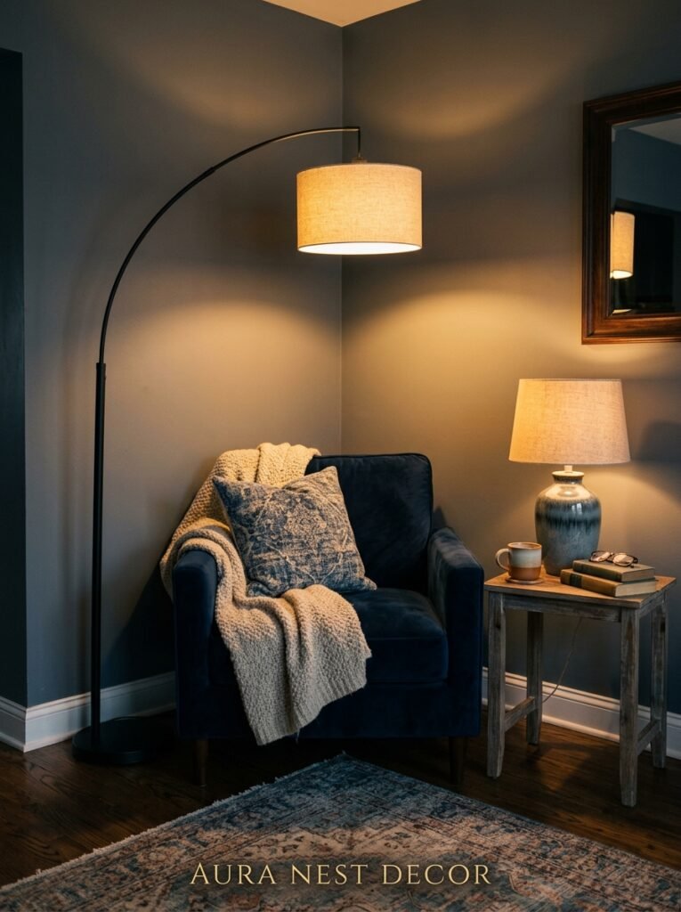
This is non-negotiable and people underestimate it constantly.
Grey and blue reflect light in a particular way. Cool-temperature bulbs — the kind that read slightly white or blueish — will push the whole room into uncomfortable territory. Everything starts looking like a hospital corridor. Not the vibe.
Warm white LED bulbs, 2700K to 3000K. That’s your range. The amber-adjacent glow they cast at 7pm completely transforms a blue-grey room — suddenly the walls look almost purple-grey in the best way, the blue cushions look richer, and the whole thing feels like somewhere you actually want to sit.
Layered lighting matters too. An overhead light alone is almost always wrong. You want floor lamps, table lamps, maybe a pair of wall sconces if your room suits them. The more sources of warm light, the more the grey-blue palette softens into something genuinely inviting.
—
7. The Color That Saves You From a Room That Feels Too Safe
So you’ve done grey walls. Blue accents. Nice rug. Good lighting. And it looks… fine. A little predictable, maybe. A little Pinterest board rather than actual room.
This is where the third color comes in. And it’s a different conversation from what you’d expect.
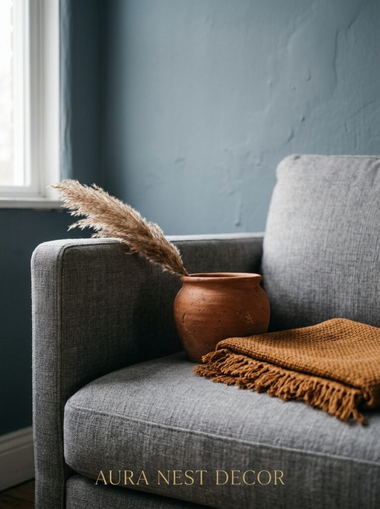
Brass. Not gold — brass. The slightly aged, slightly warm metal that’s been showing up on handles, frames, and lamp bases for a while now and genuinely doesn’t seem to be going away. Against blue-grey, it’s almost shockingly good. It adds warmth without introducing a whole new color story.
Or terracotta. Just a little. A terracotta-colored vase, a burnt orange candle, a cushion with a rust thread running through it. Against grey and blue, warm earthy orange becomes more interesting than it ever looks in isolation. It’s the contrast that does it.
Cream and warm white work too but they’re safer, less exciting. Green can be beautiful — a olive green cushion or a dark emerald plant pot against slate grey is a combination I’d defend strongly. But the brass and terracotta approach is the one that consistently makes people say “what is that combination?” in a good way.
—
8. What British Sitting Rooms Do Differently With This Palette (And Why It Works)
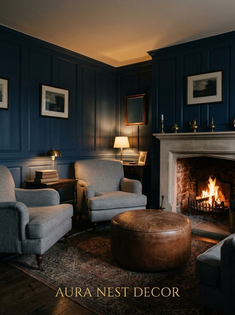
There’s something about the way grey-blue combinations tend to get styled in UK homes specifically that feels slightly different from the American approach, and it’s worth talking about.
British sitting rooms tend to lean into the coziness more heavily. You’ll see more layered textiles — thicker curtains, multiple throw blankets, cushion covers in different textures but similar tones. The whole thing feels more curated but also more lived in, if that makes sense. Less like a showroom, more like someone actually lives there and also has excellent taste.
The UK palette also tends to go darker more readily. Very dark navy walls with lighter grey furniture is a combination that shows up in British homes and magazines far more often than American ones. Maybe it’s the smaller windows, the preference for drama over airiness — I’m not sure. But it works.
American takes on grey and blue living rooms tend toward lighter walls and brighter blues, more open floor plans, bigger pieces of furniture. Less layered but broader. Both are valid approaches and they reflect genuinely different ways of inhabiting a room.
“British rooms layer. American rooms breathe. Grey and blue works beautifully in both directions.”
—
9. The One Rule About Curtains That Changes Everything
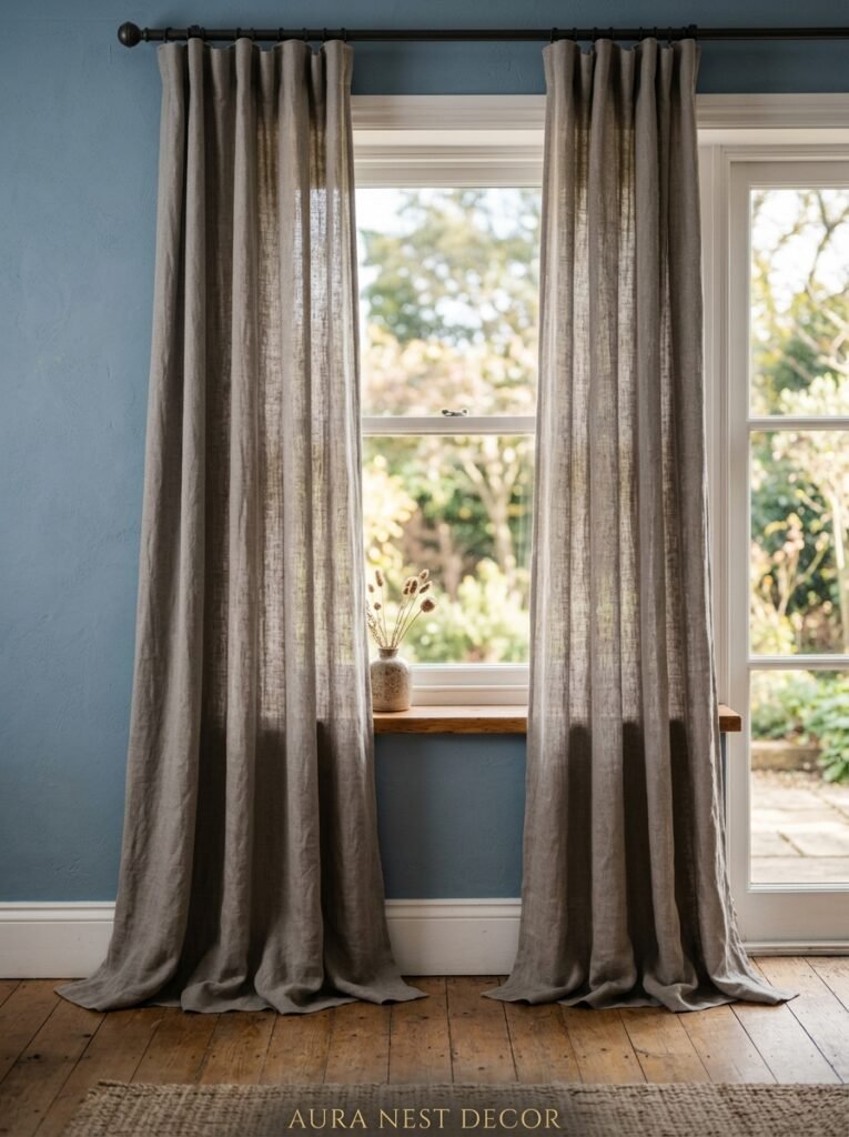
Floor-to-ceiling curtains. Always.
This sounds obvious but the number of grey and blue living rooms I’ve seen — in person, on Pinterest, in friends’ houses — where the curtains stop at the window frame is… a lot. And it’s such an easy thing to change that has such a massive visual impact.
Hanging curtain rods as close to the ceiling as possible and letting curtains drop all the way to the floor makes the walls look taller, the room larger, and the whole thing more intentional. It’s one of those tricks that’s technically free if you’re buying new curtains anyway, because you’re just choosing a different length.
For grey and blue rooms: linen curtains in cream or warm white are almost always the right choice. They soften the palette. They add texture. They photograph beautifully and they look good in real life too, which isn’t always guaranteed. Blue curtains can work — deep blue velvet curtains against grey walls is quite dramatic and beautiful — but they require more confidence and the rest of the room needs to be slightly calmer to compensate.
Avoid grey curtains against grey walls. You’ll lose the window. The whole edge of the room just disappears.
—
10. Small Grey and Blue Rooms — Why Less Space Isn’t the Problem You Think It Is
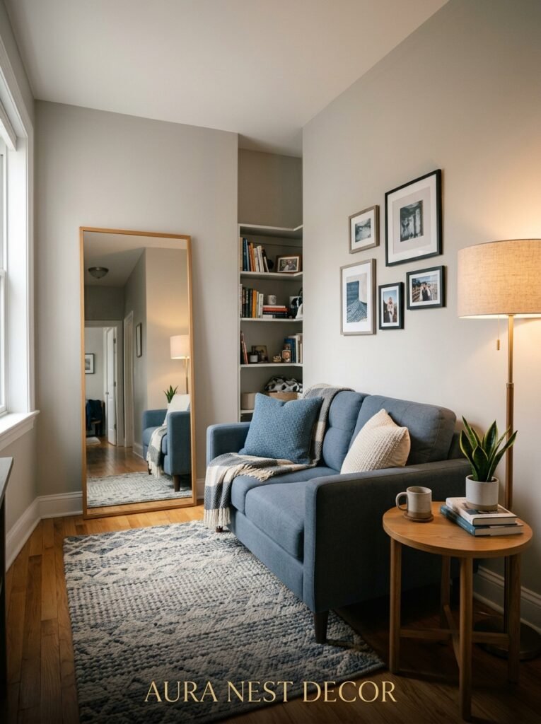
Smaller living rooms sometimes feel like they can’t carry a bold palette. That’s not quite right.
A small room in deep grey-blue is genuinely cozy in a way a small room in off-white never quite manages. The darkness doesn’t close it in — or it doesn’t have to — if you’re thoughtful about the lighter elements. A cream rug, pale curtains, mirrors, brass accents. The contrast between dark walls and light furnishings creates depth in a small space rather than compression.
In smaller UK terrace houses or American apartments especially, the temptation is to go light everywhere in the hope of “making it bigger.” But a small room that’s been thoughtfully styled in deeper tones often just feels like a room with personality rather than a room that’s apologizing for its square footage.
The actual enemies of small rooms aren’t dark colors. They’re clutter, bad lighting, and furniture that’s the wrong scale.
—
11. The Art and Accessory Choices That Pull It All Together
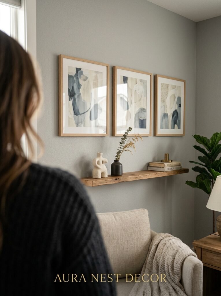
Artwork in a grey and blue living room is an opportunity people often underuse.
Abstract prints with muted blues and warm neutrals are almost a guaranteed choice — they’re easy, they work, they’re sold everywhere. Nothing wrong with them. But the rooms that feel really individual are the ones where the artwork makes you look twice.
Photography — especially black-and-white — looks incredible against grey walls. The lack of color in the image lets the grey and blue of the room do the talking, and there’s something graphic and deliberate about the contrast.
A large botanical print. A vintage map in blues and creams. Even a simple line drawing in a brass frame — the frame does as much work as the print sometimes.
Accessories: keep them to an odd number of groupings, vary the heights, and bring in natural textures (wood, ceramics, dried botanicals) to stop the room from looking too much like a mood board. The organic shapes break up the geometry that grey and blue can otherwise create.
—
12. The Exact Combination I’d Do If I Were Starting a Grey and Blue Living Room from Scratch
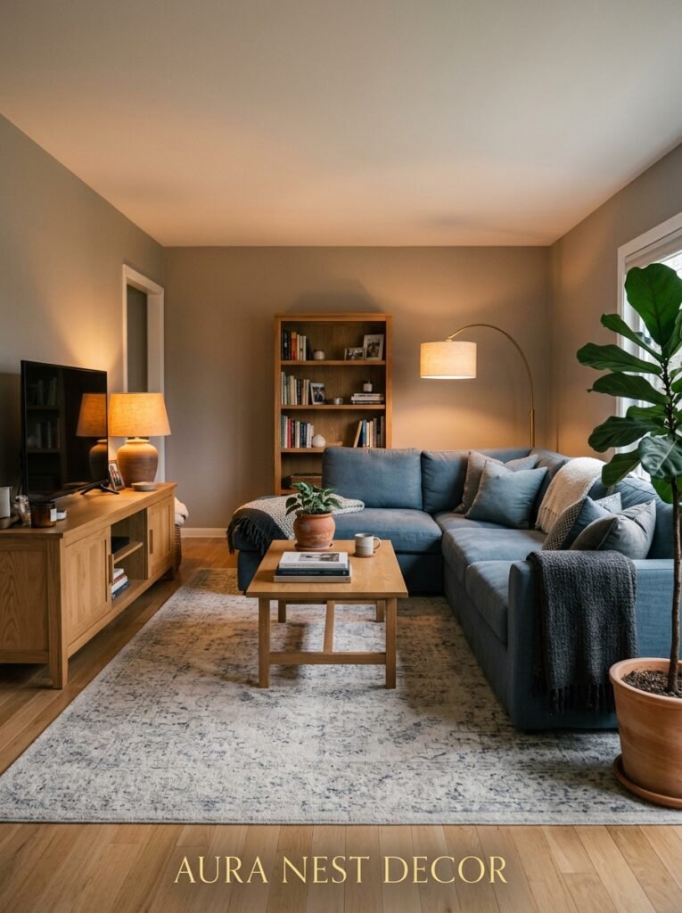
Okay, so — here’s where I’d start if I were doing this myself.
Walls: Benjamin Moore Stonington Gray (US) or Farrow & Ball Mole’s Breath (UK). Either of those warm-cool greys that shifts depending on the light.
Sofa: deep navy blue velvet. The investment piece that anchors everything.
Rug: faded antique-style in cream, navy, and a whisper of blush. Big enough.
Curtains: cream linen, floor-to-ceiling, rod mounted high.
Accessories: brass lamp, dark wood side table, terracotta vase with dried grasses, a couple of cushions in varying blue-grey tones with different textures.
Plants: always. A large leaf plant in a dark pot — the kind that takes up actual space and makes the room feel lived in.
Is it the most original combination? Maybe not. But it would look beautiful, it would feel comfortable, and it would still look right in five years, which is more than you can say for a lot of design decisions.
—
❓ FAQ
Q: Does grey and blue work in a north-facing living room with limited natural light? A: It can, but it needs help. Warm-toned bulbs (2700K) are non-negotiable, and you’ll want to bring in warmer accent colors — think brass, terracotta, or cream — more deliberately than you would in a brighter room. Going for a grey with a brown undertone rather than a blue one also helps stop the room from reading cold.
Q: What wood tones work with a grey and blue living room? A: Warm woods — walnut, oak, teak — work really well because they contrast the coolness of the palette without clashing. Very pale or washed woods can disappear against grey. Dark woods add drama and look especially good when the room is already leaning into deeper blues and charcoal greys.
Q: Can I do grey and blue in a small apartment living room without it feeling heavy? A: Definitely. Keep the furniture lighter in scale, use cream or warm white curtains, bring in a light-toned rug, and make sure the lighting is layered and warm. The grey and blue on the walls or sofa will feel grounding rather than oppressive if the surrounding elements stay airy.
—
💭 Final Thoughts
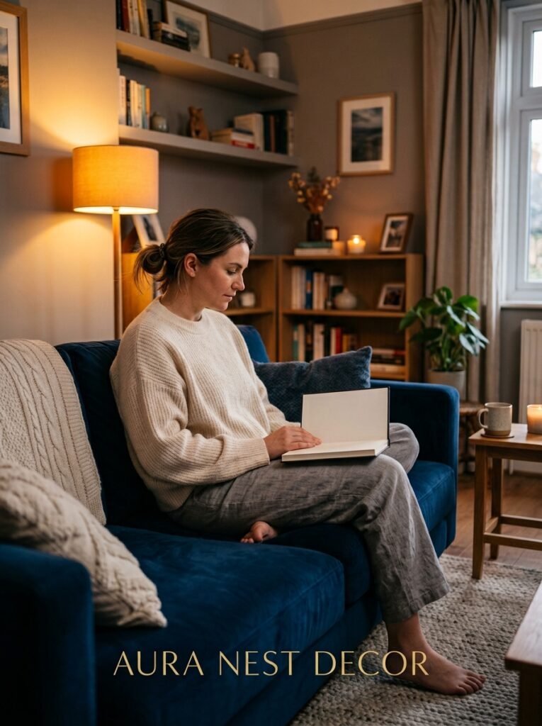
Grey and blue isn’t a trend that’s waiting to expire. It’s been around long enough — through enough design cycles — that it’s earned its place as something closer to a classic combination. The rooms that do it well aren’t the ones that follow a formula. They’re the ones where someone actually thought about which grey, which blue, what light, what texture.
It’s endlessly adaptable, which might be the whole point. Whether you’re in a Victorian terrace in Sheffield or a mid-century ranch in Arizona, the combination bends to the space.
What would you add first — the wall color or the sofa?




