
The Living Room Color Combinations That Actually Make You Feel Something
There’s a moment — you know the one — when you walk into a room and something inside you just exhales. The colors feel right. The light feels warm. You don’t want to leave. That feeling isn’t accidental. It’s designed, often with nothing more than the right combination of paint, fabric, and intention.
—
1. Why Color in Your Living Room Is Never Just About Aesthetics
Before we talk about specific palettes, let’s talk about something deeper: why color matters in the first place. Your living room is the room where you collapse after a hard week, where your kids do homework on the floor, where friends gather around candles and wine and stories that go until midnight. The colors in that room are quietly, constantly affecting how everyone in it feels.
Color psychology is a real science — and in interior design, it’s one of the most powerful tools you can use without spending a single dollar on furniture. Warm tones like terracotta, deep amber, and rust make people feel grounded and sociable. Cool tones like sage, soft navy, and slate encourage calm and clarity. Neutral tones — warm whites, greiges, creamy linens — create space for emotion to breathe without overwhelming it.
“The colors on your walls aren’t decoration. They’re the emotional backdrop for every memory made in that room.”
The most important thing to understand before choosing any living room color combination is this: you’re not just painting a wall. You’re setting an emotional tone for your entire home life.
—
2. The Classic Combination You’ve Been Overlooking: Warm White + Honey Oak + Sage Green
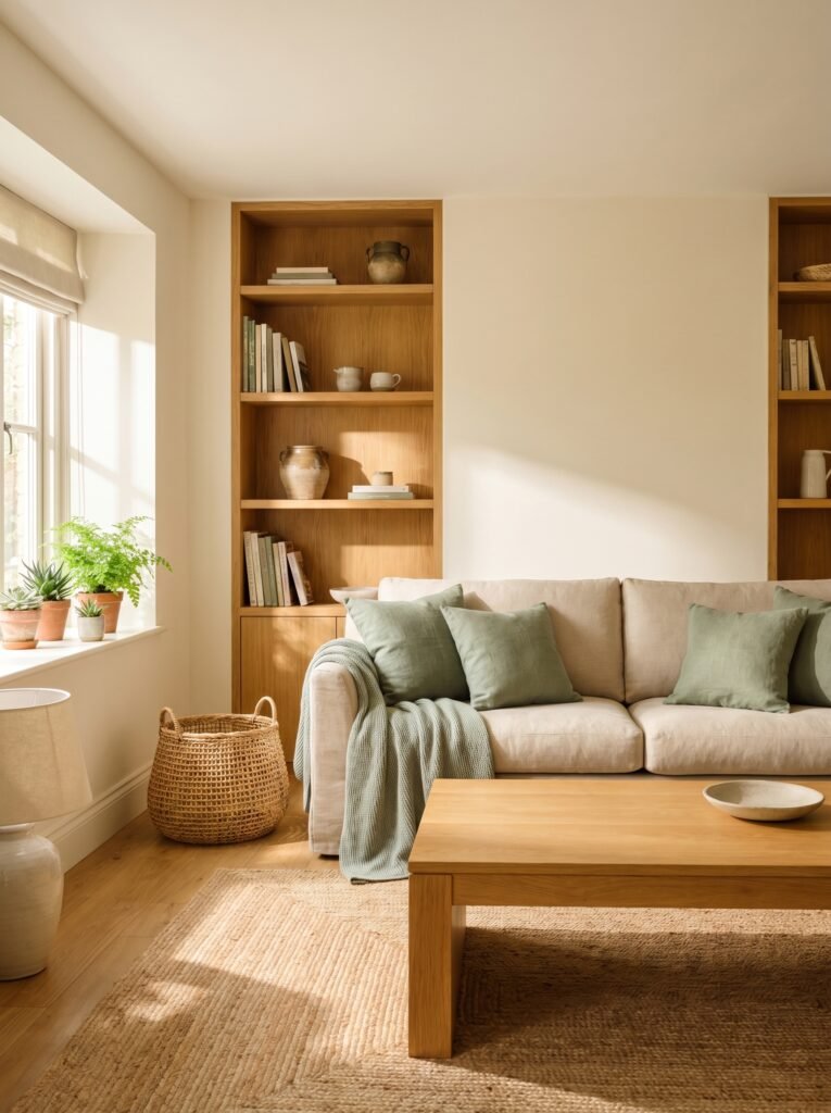
There’s a reason this trio is quietly taking over Pinterest boards in the most satisfying way. Warm white walls — not stark, bluish white, but the kind that looks like cream in afternoon light — create a soft, expansive backdrop. Pair that with honey oak wood tones in your floors, shelving, or coffee table, and suddenly the room feels like it was built into nature itself.
Now add sage green — in throw pillows, a linen sofa, or even an accent wall — and you’ve got something genuinely magical. The sage bridges the warmth of the oak with the softness of the white. It’s earthy without being heavy. It’s modern without feeling cold. For Pinterest bloggers, this is one of the most photographable combinations you can stage a living room in, because it photographs beautifully in natural light at any hour of the day.
—
3. The Drama You Didn’t Know You Needed: Deep Navy + Brass + Ivory
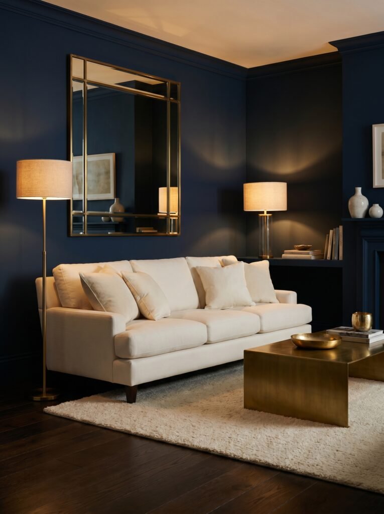
If your living room has ever felt a little… forgettable, this combination is your answer. Deep navy is a shade that carries confidence without arrogance. It’s the color of a quiet evening, of deep water, of a good library. When you pair it with brass — in lamp bases, picture frames, cabinet hardware, or a mirror — it transforms into something breathtaking.
The ivory component is what keeps this palette from feeling heavy. Ivory sofas, creamy curtains, or a light-toned rug balance the depth of the navy and warm up the coolness of the brass. The result is a living room that feels curated, intentional, and a little bit luxurious — even if you achieved it entirely on a budget. This is one of those combinations that photographs with the kind of contrast that stops the scroll.
—
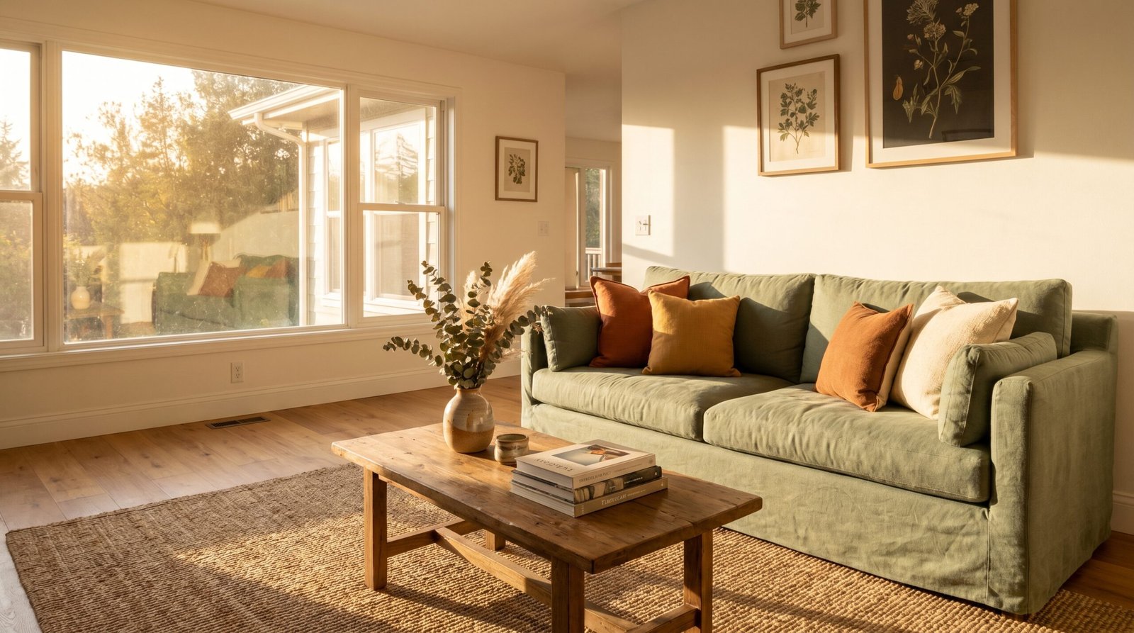
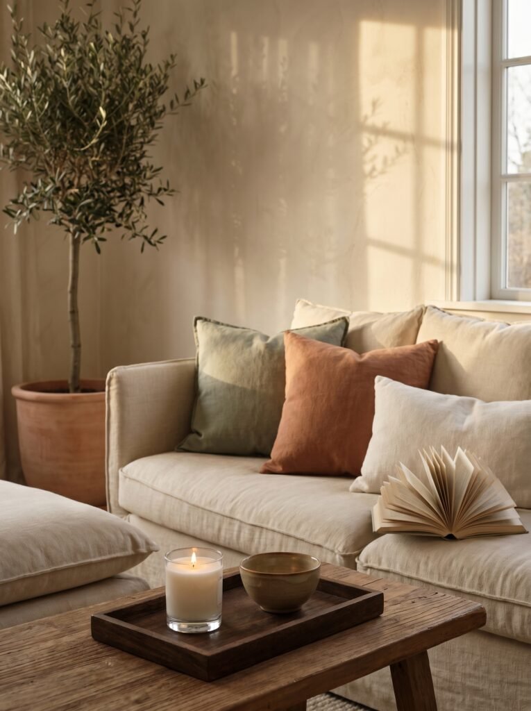
4. Earthy and Alive: Terracotta + Warm Beige + Olive Green
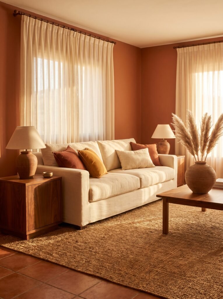
Imagine a late October afternoon. The sun is going gold. You’re sitting on a warm-toned sofa in a living room that feels like it’s been there forever, rooted and comfortable. That’s the feeling this earthy combination creates. Terracotta — once dismissed as a 70s throwback — is firmly one of the most beloved and enduring tones in modern interior design, and for good reason.
Paired with warm beige walls and olive green accents (plants, cushions, a vintage ceramic bowl on the coffee table), terracotta becomes the anchor that makes everything else feel intentional. This palette works especially well in living rooms with a lot of natural light, where the warm tones deepen throughout the day in genuinely beautiful ways. It also layers incredibly well with natural textures — rattan, jute, linen, raw wood — making it a dream palette for anyone drawn to the organic modern or bohemian design aesthetic.
—
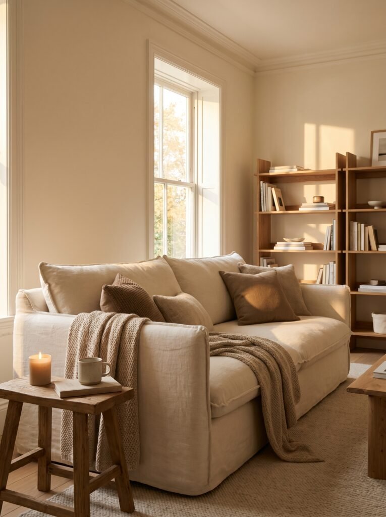
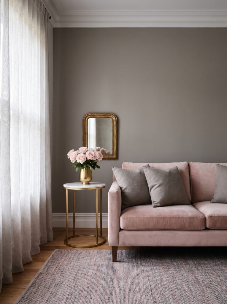
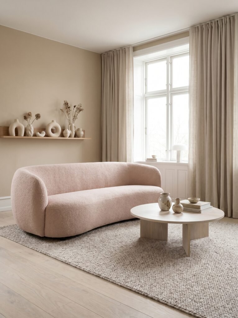
5. Softly Scandinavian: Dusty Blush + Warm Grey + Natural Wood
Scandinavian design has always understood something that louder interiors sometimes miss: restraint is its own kind of beauty. This palette takes that philosophy and makes it genuinely livable for every kind of home. Dusty blush — not bubblegum, not hot pink, but the soft, muted rose of a dried flower — adds gentle femininity without leaning into anything overly precious.
Warm grey walls (and “warm” is the critical word here — cold grey can feel sterile) create a sophisticated canvas that lets the blush and natural wood shine. The wood element is what keeps this palette grounded and human. Whether it’s a light birch side table, oak flooring, or a simple wooden picture frame gallery wall, the wood tones stop this combination from feeling too soft or without structure.
“Soft colors aren’t weak colors. In the right combination, they’re the most quietly powerful thing in a room.”
This combination is particularly effective in smaller living rooms, because the light tones visually expand the space while keeping it feeling cozy rather than empty.
—
6. Bold and Joyful: Mustard Yellow + Deep Charcoal + Warm White
This is the combination for people who want their living room to feel genuinely alive. Mustard yellow is a color with personality — optimistic, warm, a little retro, and extremely photogenic. Against deep charcoal (whether that’s a feature wall, a sofa, or dark shelving), it becomes electric. The contrast is striking without being harsh, because mustard yellow carries warmth that bridges the gap between light and dark.
The warm white element is essential here as the breathing room in the palette. White walls, light curtains, or a creamy area rug give the eye somewhere to rest between the drama of the charcoal and the energy of the mustard. For a Pinterest-worthy living room, this combination is bold, intentional, and stands out beautifully in photos — especially when you add green plants into the mix, which act as a natural fourth color that brings the whole palette to life.
—
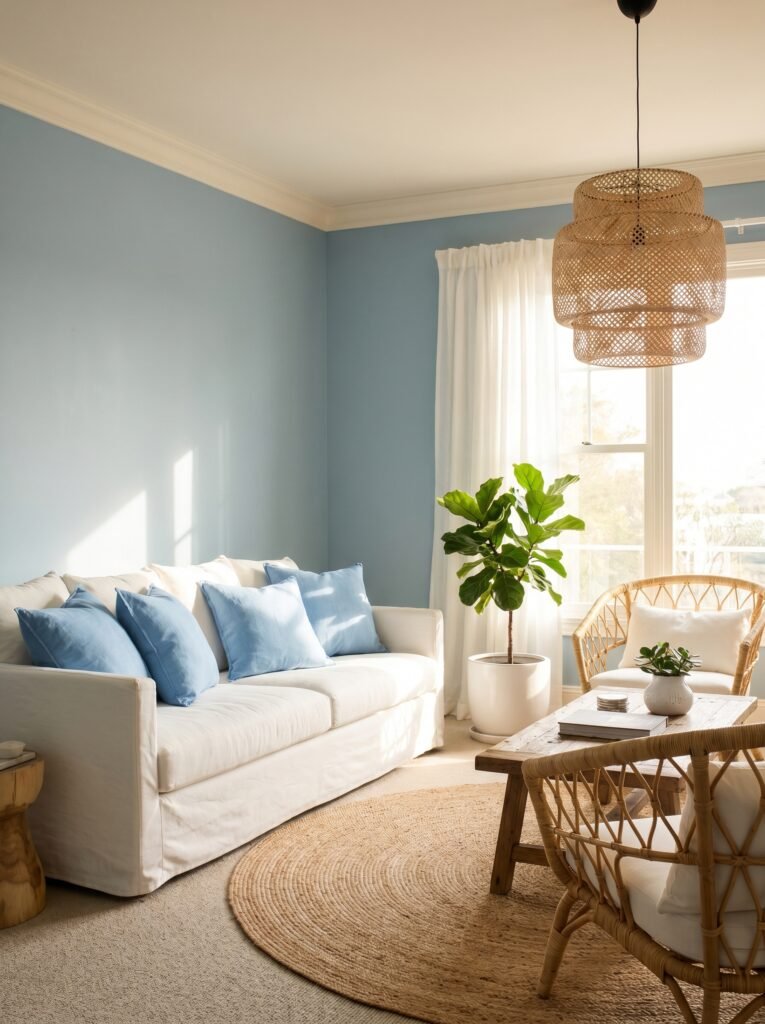
7. Coastal Without the Clichés: Soft Teal + Sandy Beige + Driftwood
The word “coastal” in interior design can sometimes conjure images of seashell collections and novelty anchors. But when executed thoughtfully, a coastal palette can be one of the most serene and beautiful ways to design a living room. The key is restraint and texture. Soft teal — not turquoise, not aqua, but the deep, muted teal of still harbor water — pairs with sandy beige in a way that feels grounded rather than themed.
The driftwood element is what elevates this beyond a beach house stereotype. Driftwood tones appear in weathered wood furniture, raw linen fabrics, stone textures, and woven baskets. This palette breathes. It’s calm. It makes a room feel like a long exhale on a warm afternoon. It’s also genuinely versatile — this combination works beautifully in apartments, suburban homes, and coastal properties alike.
—
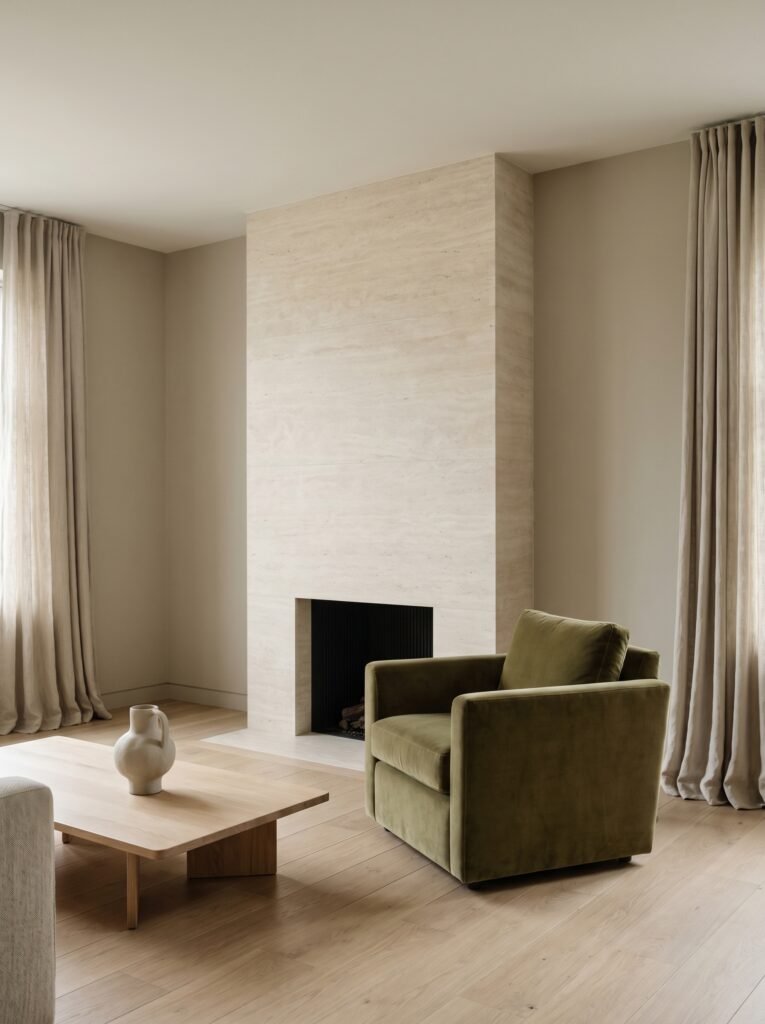
8. The Monochromatic Magic of All-Green Living Rooms
Green is having a moment, and it deserves every bit of the attention it’s getting. The reason all-green living rooms feel so extraordinary in photographs is that green exists in such a vast tonal spectrum — from barely-there sage to deep forest, from muted olive to vibrant emerald — that you can layer multiple shades of a single color and create something incredibly rich and dimensional.
The key to making a monochromatic green living room work is varying the saturation and tone. Pair a deep hunter green accent wall with a sage green sofa, olive linen cushions, and pale mint in a vase or small ceramic. Add in natural materials — jute rugs, raw wood, woven throws — and warm metallic touches in gold or bronze. The result is a room that feels like stepping into a greenhouse or a lush garden. It’s immersive, unique, and absolutely one of the most shareable living room aesthetics on Pinterest right now.
—
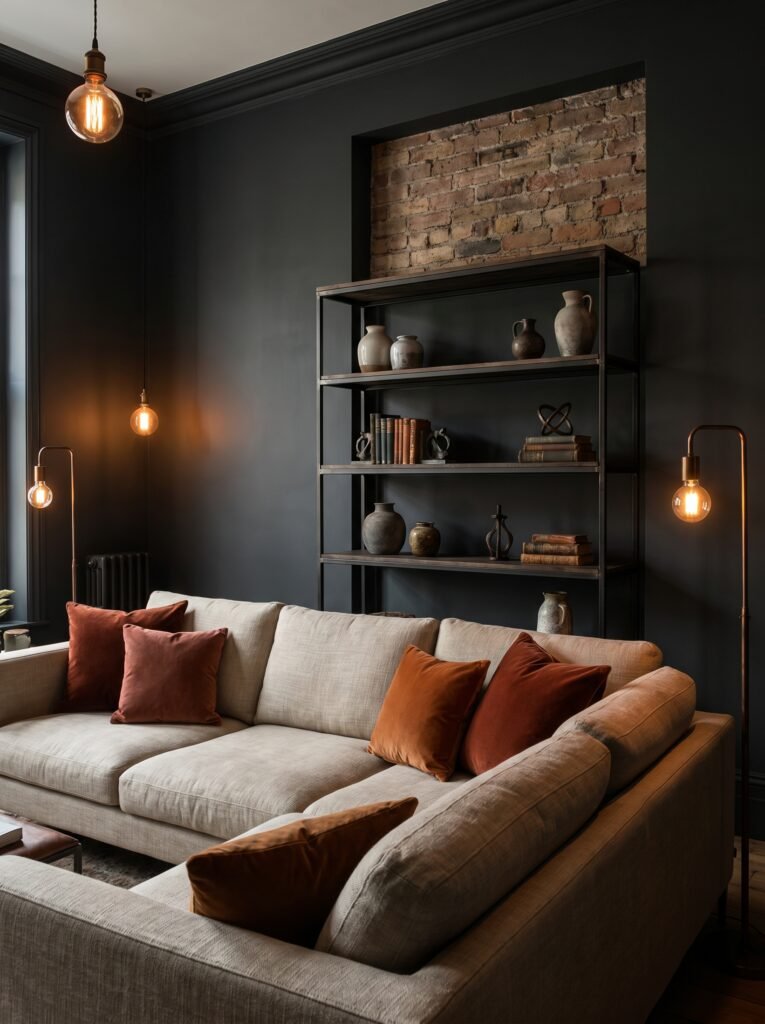
9. Modern Moody: Charcoal + Rust + Warm Bronze
If the words “moody interior” make your heart beat a little faster, you’re not alone. There’s something deeply appealing about a living room that feels sophisticated and intimate, like the kind of room that exists entirely in candlelight even when the overhead lights are on. Charcoal walls do what dark paint does best — they make everything else in the room feel more intentional, more considered, more precious.
Against charcoal, rust becomes extraordinary. It’s warm where charcoal is cool, vibrant where charcoal is subdued. The tension between them creates visual interest that you genuinely cannot replicate with lighter palettes. Warm bronze — in light fixtures, side tables, or decorative objects — ties it all together with a richness that feels earned rather than overdone.
“A moody room isn’t dark. It’s intimate. It’s a room that holds secrets and tells stories.”
The one rule with this palette: layer your lighting. Moody living rooms only work beautifully when the lighting is warm, layered, and varied — floor lamps, table lamps, candles, and dimmer switches are your best friends here.
—
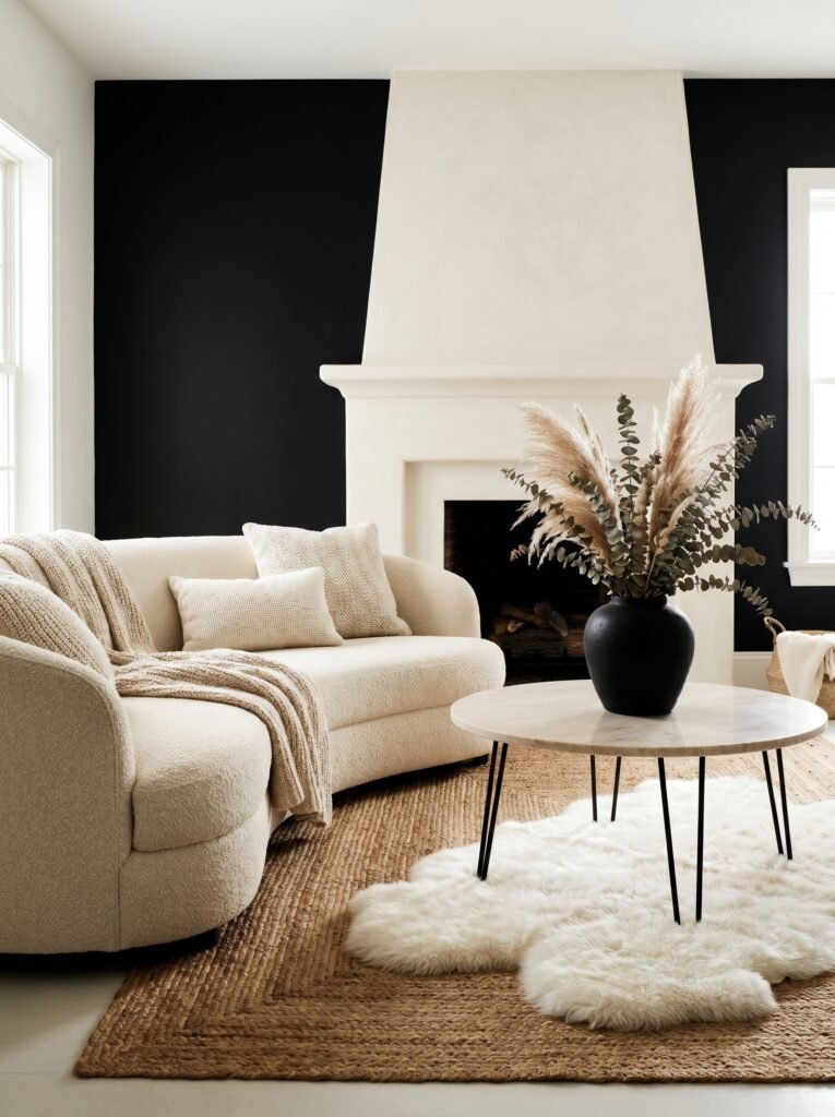
10. The Timeless Beauty of Black, White, and One Warm Accent
There is a reason black and white interiors have never — not once, in the entire history of interior design — gone out of style. The contrast is clean, the impact is immediate, and the flexibility is unmatched. A crisp white living room with black accents (picture frames, lamp bases, a graphic rug, shelving brackets) is a foundation that works with absolutely any warm accent color you bring in.
The accent is where your personality lives. A terracotta throw pillow. A deep burgundy vase. A cluster of honey-toned candles on the coffee table. Whatever warm tone you choose becomes amplified against the black and white backdrop, creating a living room that feels both timeless and completely individual. This is also one of the easiest combinations to update seasonally — simply swap out your accent accessories and the entire mood of the room shifts.
—
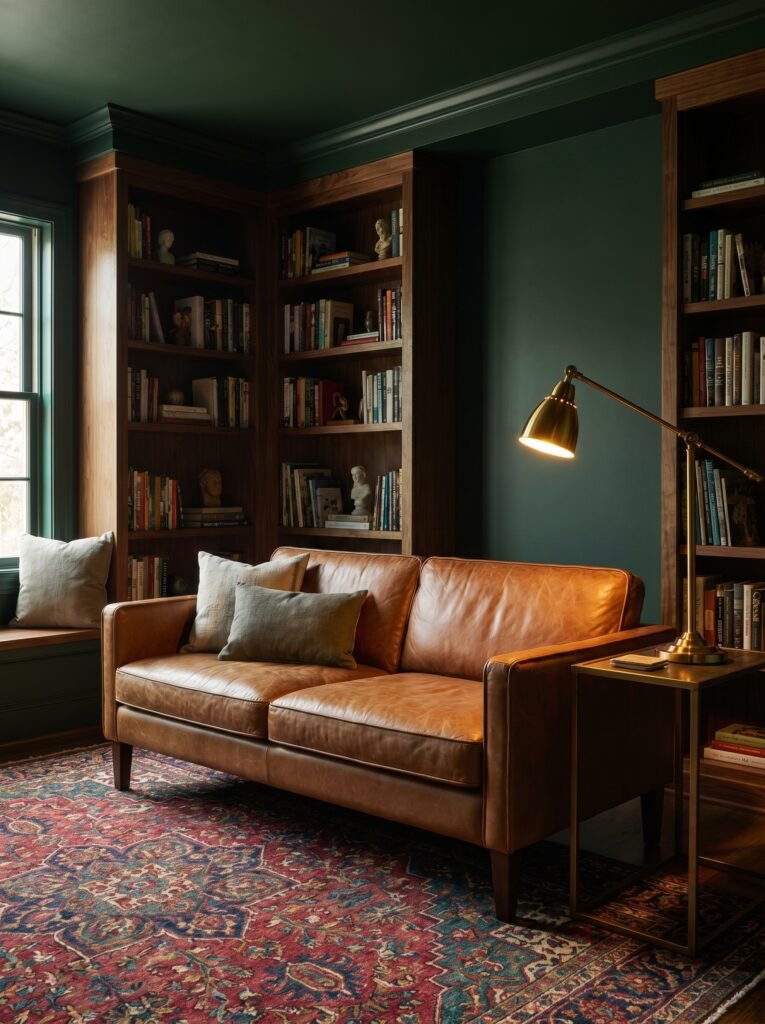
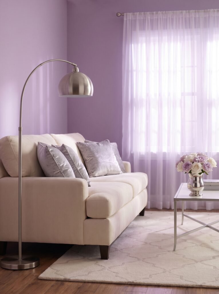
11. The Unexpected Power of Lavender + Warm Walnut + Cream
Lavender is a color most people associate with bedrooms, but used thoughtfully in a living room, it does something extraordinary — it makes the space feel genuinely unique. Muted lavender (not purple, not violet, but the soft, grey-toned lavender of a dried lavender sprig) creates an atmosphere that’s calm, creative, and unexpectedly elegant.
Warm walnut wood — in a coffee table, media console, or bookshelf — grounds the lavender with rich, organic depth. Cream pulls the whole thing together into something cohesive and livable. This palette photographs beautifully in golden hour light, and for anyone creating Pinterest content about living room design, it’s a combination that consistently draws saves and engagement because it feels both aspirational and genuinely achievable.
—
12. Making Any Color Combination Work: The 60-30-10 Rule Explained Simply
Every single palette discussed in this article becomes cohesive when you understand one rule: 60% dominant color, 30% secondary color, 10% accent. This ratio is the secret behind every professionally designed room that “just works.” Your dominant color — usually walls, large sofa, or flooring — sets the tone. Your secondary color — larger furniture pieces, curtains, a significant rug — adds depth and contrast. Your accent — cushions, throws, artwork, decorative objects — is where the personality lives.
The 60-30-10 rule works because it mirrors the way the eye naturally moves through a space. It creates harmony without monotony, variation without chaos. The next time you’re staring at a Pinterest board wondering why a certain room looks so pulled-together while yours doesn’t, check the ratios. Nine times out of ten, this is why.
—
🌿 How to Choose the Right Color Combination for Your Living Room
Choosing a color palette doesn’t have to feel overwhelming. Start by standing in your living room at different times of day and noticing the natural light — north-facing rooms need warmer tones, south-facing rooms can handle cooler shades without feeling cold. Next, look at what you already own and love — a rug, a painting, a treasured piece of furniture — and let that be your starting point rather than starting from scratch. Test paint colors by painting large swatches (at least 12×12 inches) and living with them for a few days before committing. Always buy a small test pot before a full can. Finally, trust your emotional response — if a color makes you feel something good when you look at it, that feeling is real data, not sentiment.
—
❓ FAQ
Q: What are the most popular living room color combinations right now? A: Currently, the most widely loved combinations include warm white with sage green and natural wood tones, deep navy with brass and ivory, and terracotta with warm beige and olive accents. These palettes consistently perform across Pinterest and interior design platforms because they balance warmth, contrast, and livability.
Q: How do I make a small living room feel bigger with color? A: Light, warm tones on walls — creamy whites, pale greiges, soft blush — will visually expand a small living room. Using the same tone family throughout (rather than high contrast) reduces visual interruption, which makes the eye travel further across the space. Mirrors and consistent flooring color also amplify this effect significantly.
Q: Can I use dark colors in a living room without it feeling oppressive? A: Absolutely — and beautifully so. The key is layered lighting (never rely on a single overhead source), warm accent tones that create contrast, and making sure your soft furnishings introduce texture. A deep charcoal or forest green living room with warm bronze lighting, cream textiles, and rich wood accents feels luxurious and intimate, not heavy.
—
💭 Final Thought
The living room you’ve been dreaming about — the one that feels like a warm exhale, a place where you genuinely want to spend your hours — is closer than you think. Color is the most accessible, most transformative design tool you own. It costs less than new furniture, takes less time than a renovation, and changes everything about how a room feels to live inside.
Which color combination made you feel something today, and which room in your home is quietly asking to be transformed?