
The Living Room Colour Schemes That Actually Change How You Feel in Your Own Home
There’s a moment — maybe you’ve had it — where you walk into someone else’s living room and something just shifts inside you. The tension in your shoulders drops. You breathe differently. And you find yourself thinking, why doesn’t my home feel like this? More often than not, the answer is colour.
—
1. Why Your Living Room Colour Is Doing More Than You Think
Before you dismiss colour as a purely aesthetic decision, consider this: colour psychology is one of the most studied fields in environmental design. The shades you surround yourself with every single day are actively influencing your mood, your energy levels, your stress response, and even how you interact with the people you love most.
A living room painted in a harsh, overly bright white can create low-level anxiety you can never quite name. A deep, poorly chosen navy in a north-facing room can make winter feel relentless. Meanwhile, the right warm terracotta or sage green can make an ordinary Tuesday evening feel like a slow weekend in Tuscany.
This isn’t interior design fluff. This is the science of how human beings respond to light wavelengths. And once you understand it, choosing a colour scheme stops feeling like a guessing game and starts feeling like something you can actually get right.
“Your living room colour isn’t just decoration — it’s the emotional backdrop to your entire life at home.”
—
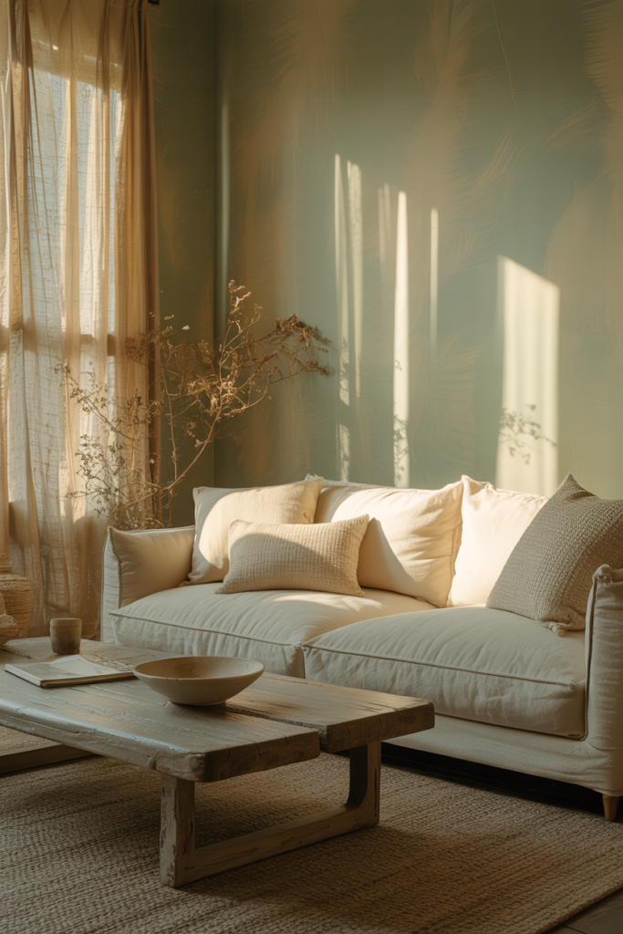
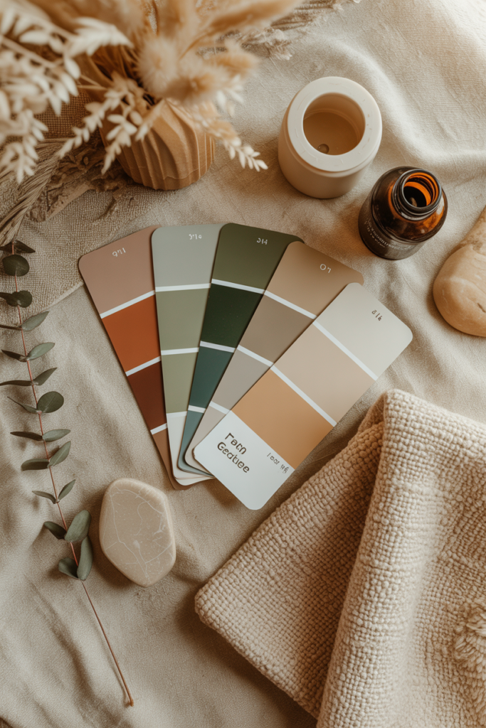
2. The Warm Neutrals That Feel Like a Long Exhale
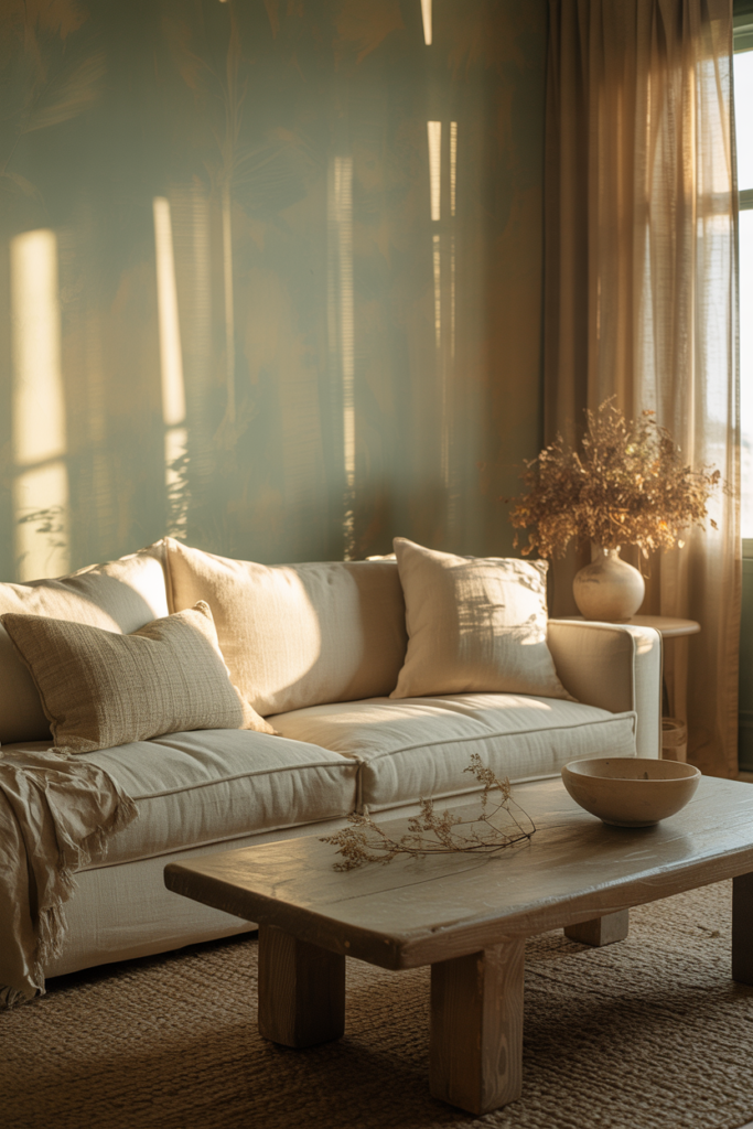
Warm neutrals are having a moment right now — and honestly, they deserve it. Think creamy whites, soft mushroom taupes, sandy beiges, warm greiges (that perfect grey-beige hybrid), and buttery off-whites. These shades work because they don’t demand anything from you. They simply hold the space while everything else — your furniture, your artwork, your people — takes centre stage.
The reason warm neutrals feel so different from cool neutrals is entirely about undertone. A warm white has yellow, pink, or golden undertones that catch natural light and glow in the evening under lamplight. A cool white leans grey or blue, which can feel clinical and flat by afternoon. If your living room gets soft morning light or warm western-facing sunshine, warm neutrals will practically sing.
Popular combinations right now include pairing warm linen walls with natural wood furniture, chunky wool textiles, and deep brown or rust accents. It’s the kind of palette that photographs beautifully and feels even better in real life — which, frankly, is the goal.
—
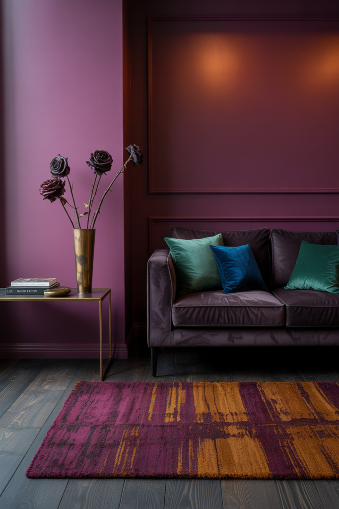
3. The Moody, Dramatic Hues That Make a Room Feel Like an Experience
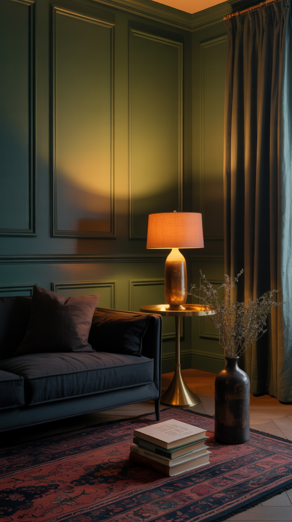
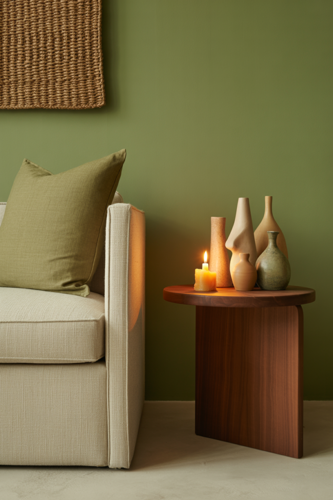
Here’s what nobody tells you about dark living rooms: they are extraordinary. There is something deeply cocooning about walking into a room painted in deep forest green, midnight navy, charcoal, or rich plum. These shades wrap around you in a way that lighter rooms simply cannot. They make lamplight look golden, candles look magical, and conversation feel more intimate.
The secret to pulling off a dramatic dark colour scheme is light layering. You need multiple light sources — floor lamps, table lamps, candles, perhaps wall sconces — rather than one overhead fixture flooding the room. The interplay between the dark walls and warm, layered light is what creates that moody, magazine-worthy atmosphere.
Dark green is arguably the most versatile of the dramatic shades. It sits at the intersection of the natural world and interior sophistication. Pair it with brass hardware, warm wood tones, cream upholstery, and botanical prints, and you have a living room that feels both rooted and refined. Terrifyingly beautiful, in the best way.
—
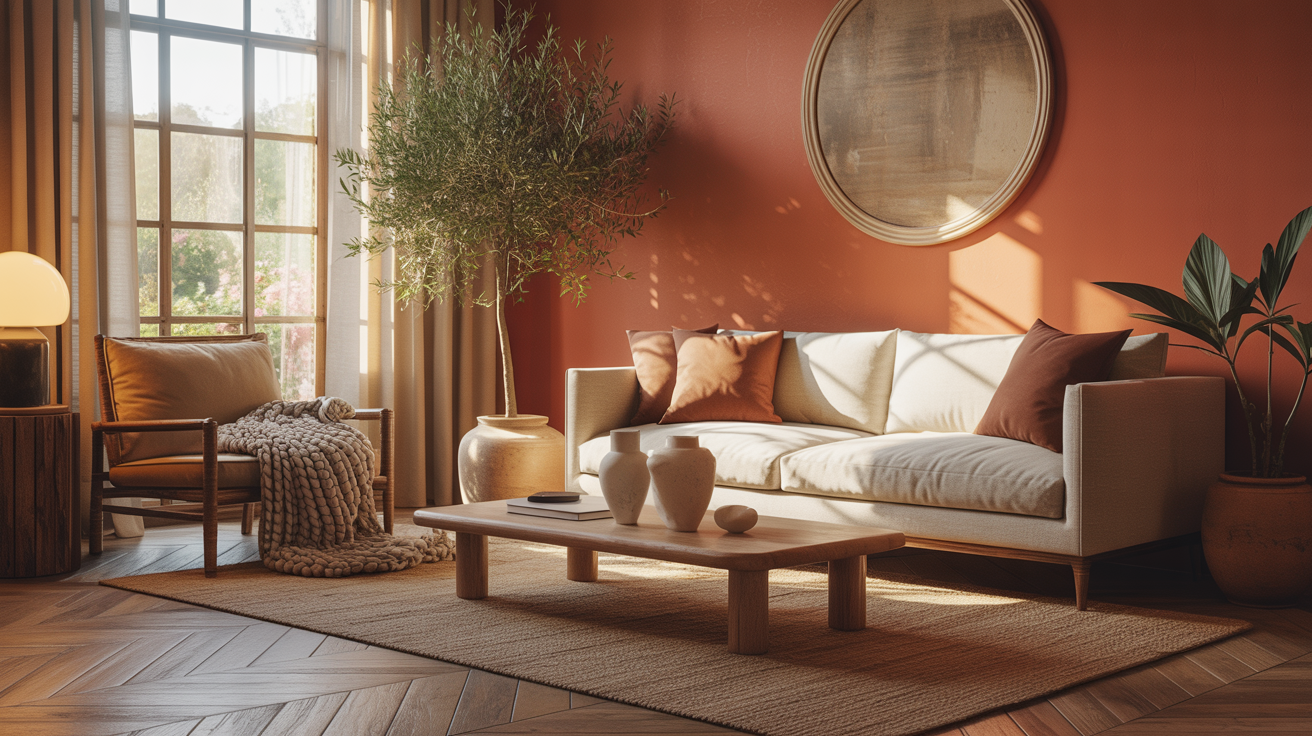
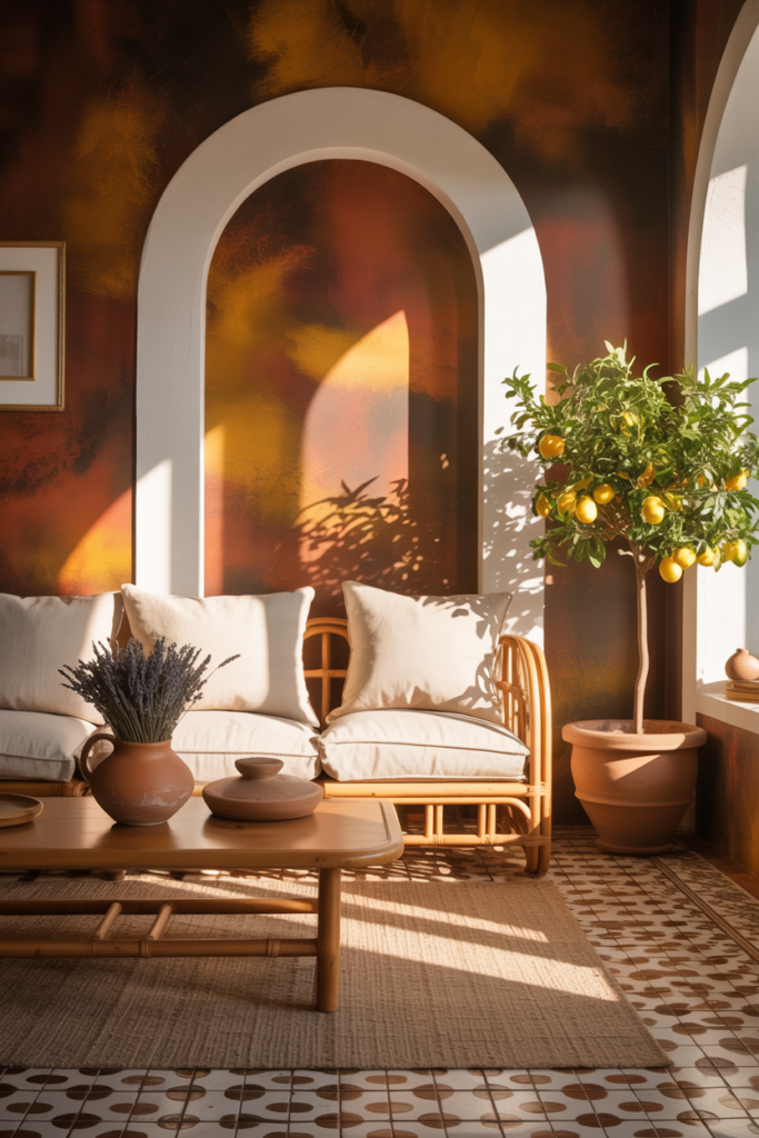
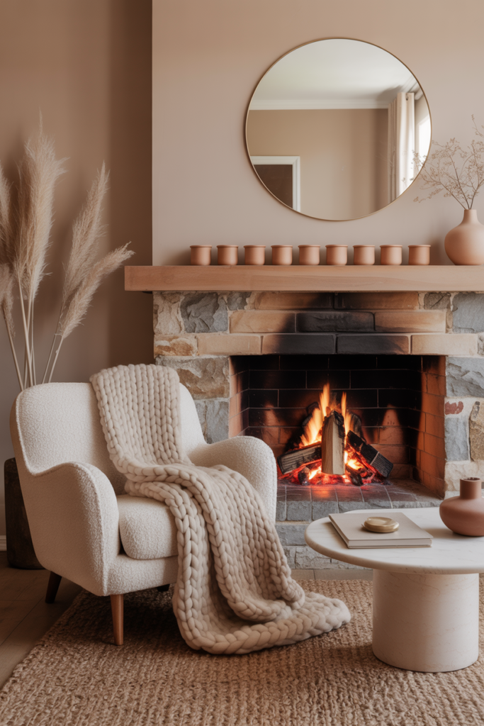
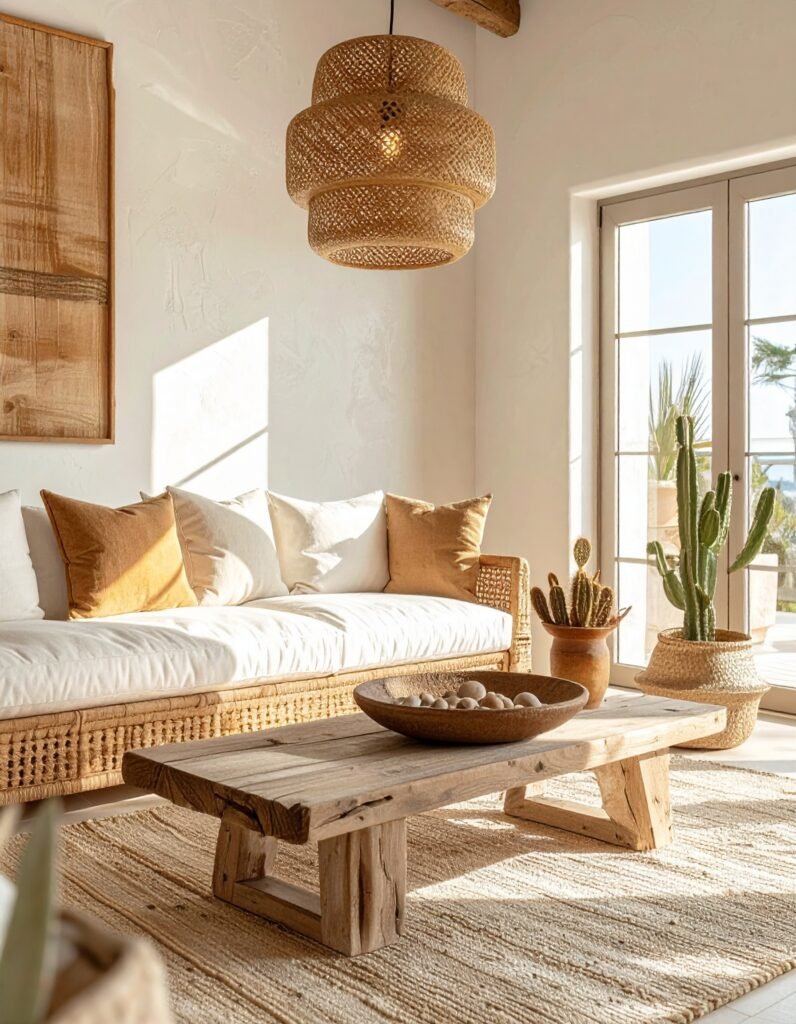
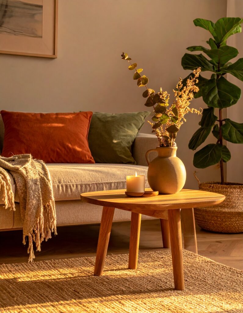
4. Earthy Terracotta and Clay Tones — The Colour Scheme That Feels Like Coming Home
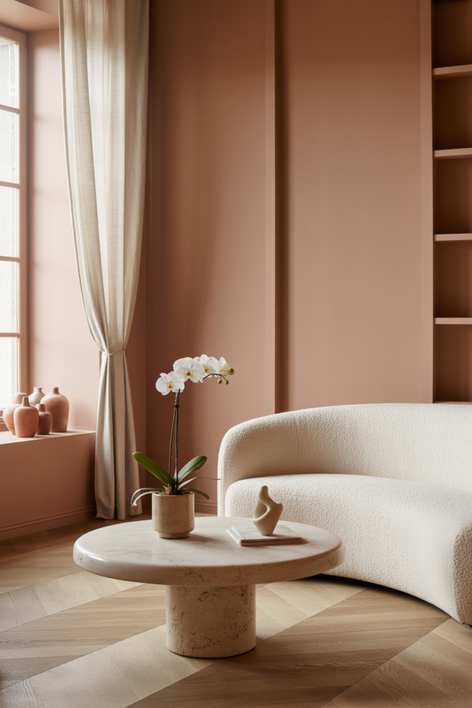
If there’s one colour story that has dominated interior design in recent years, it’s the earthy, sun-baked palette of terracottas, clay pinks, rust oranges, and sandy ambers. And the reason isn’t just trend — it’s something far more instinctive. These colours speak to something ancient in us. They reference handmade ceramics, desert landscapes, Mediterranean plaster walls. They feel made, not manufactured.
A terracotta living room doesn’t have to be overwhelming. You can bring the tone in through a single feature wall, through soft furnishings like cushions and throws, or through smaller elements like lampshades and ceramics. If you commit to a full terracotta room, balance the warmth with natural linen, undyed cotton, and plenty of greenery. Plants absolutely thrive visually against earthy tones — they look like they belong together, because in nature, they do.
This palette also happens to be deeply flattering to human skin tones in photographs and in person, which makes it a wonderful choice if your living room is a gathering space for family and friends.
“Earthy tones don’t just decorate a room — they ground it, and everyone in it.”
—
5. Sage Green and Nature-Inspired Palettes for the Soul That Needs Calm
Sage green is not just a colour. At this point, it is a lifestyle. But behind the Pinterest boards and the Instagram reels is a genuinely powerful idea: bringing the restorative quality of nature indoors through colour. Sage, olive, moss, eucalyptus, and pale pistachio are all variations on the same fundamental truth — green is calming, connecting, and deeply human.
Biophilic design — the practice of incorporating natural elements into interior spaces — is backed by substantial research. People in green-tinted environments report lower cortisol levels, improved focus, and greater feelings of overall wellbeing. So when you choose sage green for your living room, you’re not just following a trend. You’re making a choice that supports your mental health.
The beauty of this palette is in its quietness. Sage green doesn’t shout. It hums — steadily, soothingly — in the background of your life. Pair it with natural rattan, raw linen, warm wood, and white or cream trim. Add in dried botanicals, terracotta pots, and woven textiles, and you’ve built something that feels like a long, slow breath.
—
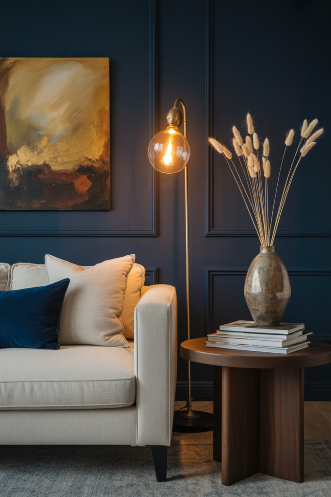
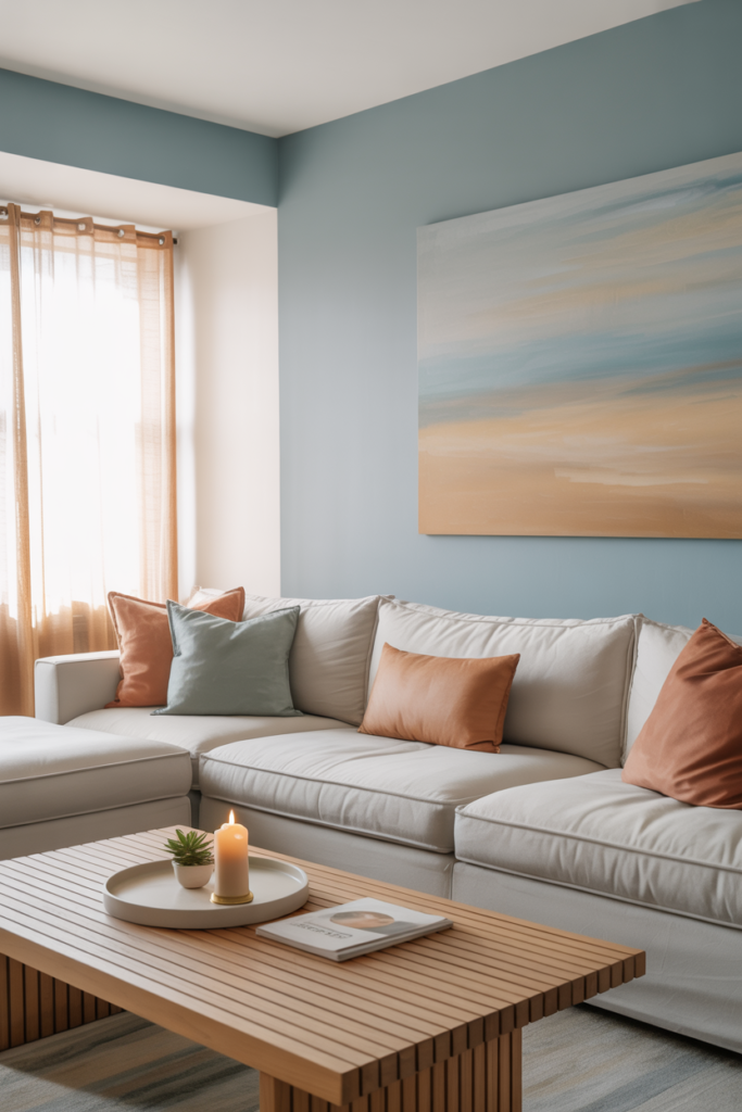
6. Blue Living Rooms — From Sky-Light to Deep Sea, Every Shade Tells a Story
Blue is the world’s favourite colour, statistically speaking. And in a living room context, it earns that title. The range within blue is extraordinary — from barely-there sky blue that makes a small room feel airy and open, to rich indigo that turns a living room into a jewel box.
Pale blues work beautifully in coastal or Scandinavian-inspired spaces. They pair effortlessly with white woodwork, natural textures, and light pine furniture. This colour scheme floods a space with perceived light, which is particularly valuable in smaller rooms or flats where natural light is limited.
Mid-range blues — think soft cornflower, denim blue, or dusty slate — are perhaps the most liveable of all. They’re calm without being cold, characterful without being demanding. Pair them with warm taupes, natural wood, and terracotta accents for a grounded, sophisticated palette that works across every season.
Deep navy and midnight blue are the dramatic cousins — bold, confident, and absolutely stunning when executed well. These shades work particularly well in larger living rooms with good light, and they create a magnificent backdrop for gold, brass, and warm white.
—
7. The Power of White — But Not Just Any White
White living rooms have never gone out of style, and they never will. But here’s the thing most people get wrong: they treat white as if it’s a single colour. It isn’t. There are hundreds of whites on any paint chart, and choosing the wrong one can make a room feel cold, flat, or oddly yellow. The right one can make your space feel expansive, luminous, and endlessly calm.
The key is to understand your light. North-facing rooms need whites with warm undertones — cream, linen, or very soft warm whites like Farrow & Ball’s All White or Dulux Timeless. South-facing rooms can handle cooler whites with more confidence. Before committing, paint large test patches and observe them at different times of day. The colour changes dramatically between 8am and 6pm, and between a sunny afternoon and an artificial-lit evening.
A white living room doesn’t have to be stark. Layer in texture — chunky knit throws, woven rugs, linen curtains, raw wood furniture — and suddenly the white becomes a canvas for richness rather than an absence of it.
—
8. Two-Tone Colour Schemes — The Trick That Makes Rooms Look More Expensive
One of the most impactful, underused techniques in living room design is the two-tone colour scheme. This involves painting the lower half of the wall (or panelling, if you have it) in a darker shade and the upper wall in a lighter, complementary tone. It instantly adds architectural interest, makes ceilings feel higher, and creates a sense of considered design that looks far more expensive than it is.
Classic combinations include deep forest green lower with warm cream above, charcoal navy lower with pale blue above, or warm rust lower with sandy beige above. The division is typically made using picture rail or dado rail height as a guide — roughly one third of the way up the wall.
This approach is particularly clever in rented spaces, where you may be nervous about committing to a dark full-room colour. Two-tone gives you the drama and depth of a bolder choice while keeping the overall space feeling open and breathable.
“A room that plays with contrast isn’t just beautiful — it’s alive.”
—
9. Colour Through Soft Furnishings — For Those Who Aren’t Ready to Commit
Not everyone is ready to pick up a paintbrush, and that’s completely fine. Some of the most colour-confident living rooms achieve their entire palette through soft furnishings alone — and this approach gives you the incredible advantage of flexibility. You can evolve your colour story season by season without touching a single wall.
Start with your largest textile: the sofa. If you have a neutral sofa — grey, cream, or beige — you have a blank canvas. From here, introduce colour through cushions, throws, curtains, and rugs. A warm terracotta cushion grouping with sage green accents and a deep rust-coloured rug can transform a plain grey sofa into something that looks entirely intentional and considered.
The sixty-thirty-ten rule is your best friend here: sixty percent neutral base, thirty percent secondary colour, ten percent accent. It sounds formulaic, but it works consistently because it mirrors how our eyes process colour — we need a resting place, a focal point, and a surprise.
—
10. How Natural Light Should Guide Every Single Colour Decision
Here is something that cannot be emphasised enough: the paint chip on the shelf is almost irrelevant. What matters is how that colour behaves in your room, with your light, at your time of day. Natural light is the silent designer of every space, and ignoring it is the single most common and expensive colour mistake homeowners make.
South-facing rooms receive warm, golden light most of the day. They can handle cool colours — pale blues, fresh greens, cool whites — that might feel chilly elsewhere. North-facing rooms receive cool, diffused light and will make cool colours feel bleak. They need warmth: creams, terracottas, warm greens, honey yellows.
East-facing rooms are bathed in beautiful morning light and become cooler by afternoon. West-facing rooms are the reverse — cool in the morning, glowing and warm by evening. Each of these orientations calls for a slightly different approach to colour selection. Once you know which way your living room faces, the entire decision-making process becomes clearer and more confident.
—
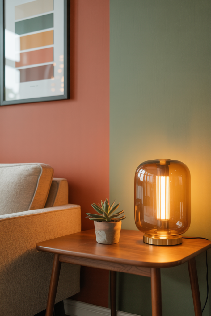
11. Accent Colours — The Detail That Ties an Entire Room Together
An accent colour is the punctuation of an interior design scheme. It’s the detail that makes the eye travel around a room, creating rhythm, interest, and cohesion. Without it, even a beautiful neutral living room can feel a little flat. With it, everything suddenly connects.
Accent colours work through repetition. If you introduce a warm brass element in a lamp, you repeat that tone in a picture frame, a candleholder, and a decorative tray. If your accent is deep terracotta, you pick it up in a cushion, a candle, a small ceramic, and perhaps a fringe on a throw. The eye sees the repeated note and reads the room as deliberately designed — even if you simply had good instincts.
The most timeless accent combinations include warm white with sage green accents, warm grey with mustard yellow, soft cream with dusty rose, and charcoal with warm brass. The key is restraint. An accent colour should feel like a carefully chosen ingredient, not an afterthought or an overload.
—
12. Building a Colour Scheme That Will Still Feel Right in Five Years
The most beautiful colour schemes are the ones that don’t just photograph well — they wear well. They grow with you. They feel as right in winter candlelight as they do on a bright summer afternoon. They don’t exhaust you or date themselves aggressively. And there is a method to achieving this kind of longevity.
Invest in the undertones, not just the surface colour. Choose shades with complex, layered undertones rather than flat, single-note hues. A great sage green will look different — and wonderful — in every light. A flat, single-note mint will feel monotonous and restrictive within months.
Choose your boldest, most personal colours in the elements you can change easily: cushions, candles, artwork, ceramics. Use those items to satisfy your love of trend or seasonal change. Let your walls, your sofa, and your major furniture pieces be the calm, considered foundation — and let them last.
—
🌿 How to Choose and Live With Your Colour Scheme
Test before you commit. Paint at least two large swatches (A5 size minimum) on different walls and watch them for a full week before buying a full tin. The colour will surprise you at different times of day.
Start with what you already love. Look at the items in your home you never want to get rid of — a rug, a piece of artwork, a favourite cushion. Build your colour scheme outward from those pieces. They already tell you what feels like you.
Don’t forget the ceiling. A ceiling painted in a very slightly warmer version of your wall colour creates a beautifully enveloping, cohesive effect. Pure brilliant white ceilings can feel disconnected in rooms with warmer palettes.
Layer your lighting before you finalise anything. Your colour scheme under overhead lighting alone is not the full picture. Add floor lamps and table lamps, light some candles, and see how the room transforms. Often, colours that feel slightly flat in the daytime become spectacular in the evening with warm layered light.
Give yourself permission to live with it. Most people need three to six months to truly settle into a new colour scheme. What feels unfamiliar at first often becomes the thing you love most. Trust the process.
—
❓ FAQ
Q: What is the most popular living room colour scheme right now? A: Warm neutrals — particularly creamy whites, warm greiges, and sandy beiges — are consistently popular because they’re versatile, timeless, and photograph beautifully. Nature-inspired palettes featuring sage green, terracotta, and warm earthy tones are also extremely on-trend and widely loved for their calming, grounded quality.
Q: How do I choose a colour scheme for a small living room? A: Light, warm neutrals will make a small living room feel larger and airier. Don’t be afraid of a bold accent wall or rich accents through soft furnishings — depth doesn’t have to mean dark. Mirrors, layered lighting, and a consistent colour palette (rather than many competing colours) will all help the space feel more expansive.
Q: Can I use more than two colours in a living room colour scheme? A: Absolutely — most well-designed rooms use three to five colours, often following the sixty-thirty-ten rule. The key is ensuring your colours share a similar undertone (all warm or all cool) so they feel cohesive rather than chaotic. Choose one dominant neutral, one secondary colour, and one to two accent shades for a balanced result.
—
💭 Final Thought
The right colour scheme for your living room isn’t the one that’s most popular on Pinterest, or the one your favourite interior designer used last season — it’s the one that makes you feel most genuinely at ease in your own home. Colour is deeply personal, and the best interiors are the ones that reflect the people living in them rather than a mood board someone else created.
Your home should feel like the best version of you — warm, layered, considered, and alive.
So tell me: what does the colour of your ideal living room feel like — and does the room you’re sitting in right now actually match that feeling?