
The Living Room Look That’s Been Quietly Dominating Pinterest All Year (And It’s Not Going Anywhere)
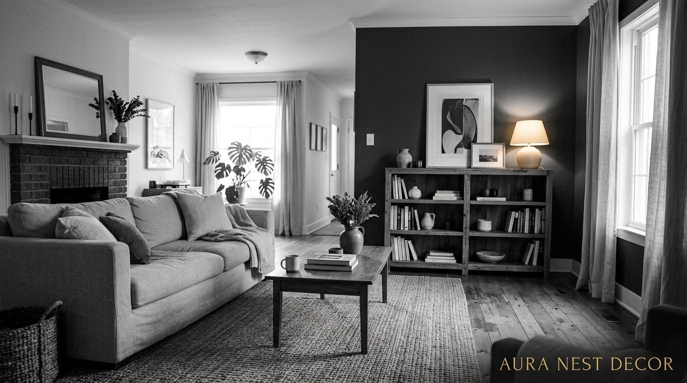
You know that feeling when you walk into a room and everything just clicks? No clutter, no confusion, just this immediate sense of calm and intention. That’s what a well-done black and white living room does to people. And honestly, it’s harder to pull off than it looks.
—
1. Why Black and White Hits Different Than Any Other Color Scheme
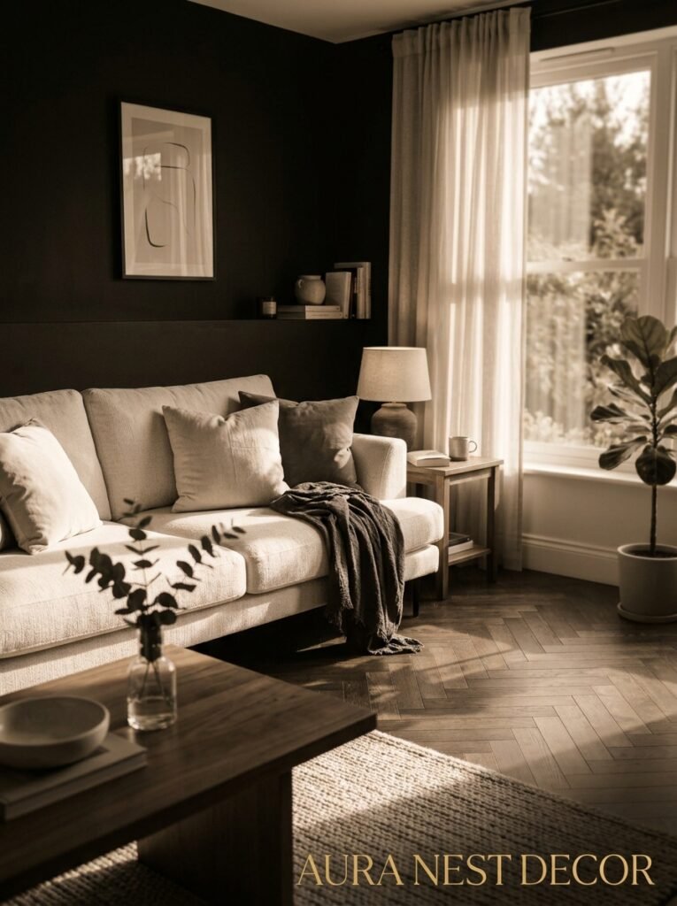
Here’s the thing about black and white that nobody talks about: it’s not a neutral. People treat it like beige’s edgier cousin, but it’s not. It’s a full-on design statement that happens to work in basically every room, every architectural style, every budget.
I’ve been obsessing over this look for a while now, and what keeps pulling me back is how ALIVE it feels. There’s this tension between the two — not conflict, just tension, the way a good photograph has tension. Black grounds. White opens. And the space in between is where all the interesting stuff happens.
It’s also one of those looks that scales weirdly well. A tiny London terrace living room done in black and white looks intentional and chic. A sprawling open-plan in the suburbs? Same energy. I don’t know why it works at every size but it does.
The mistake most people make is thinking it’s cold. That it’ll feel clinical or stark. And it can — if you do it wrong. But done right, with the right textures and proportions, a black and white living room is actually one of the coziest spaces you can create. I mean that. There’s something about the contrast that makes the whole room feel more present somehow.
“Black and white isn’t the absence of color. It’s the absence of distraction.”
—
2. The Proportion Rule Nobody Mentions in Design Magazines
Okay so before you go buying a tin of Farrow & Ball Pitch Black and painting four walls, let’s talk about proportion. Because this is where most black and white rooms either succeed wildly or crash completely.
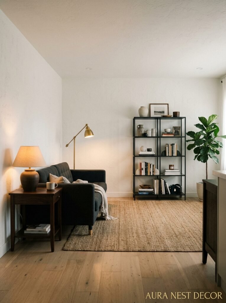
The rough ratio that actually works? Around 70% white or very light tones, 20-25% black or deep charcoal, and then that remaining 5-10% for texture and accent. Now that sounds like a recipe, and I kind of hate that it does, but the math works.
What this means in practice: your walls are probably staying white or off-white. Your bigger furniture pieces — the sofa, the shelving — are the ones that can handle the dark. And then your accessories, your cushions and ceramics and the odd throw, those are where you play.
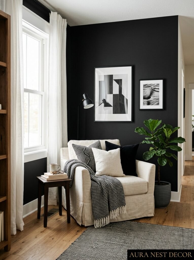
But here’s where it gets interesting. Some of the most stunning black and white rooms I’ve seen actually flip this. Dramatic dark walls, a white or cream sofa sitting against them like a statement. It works. It really does. You just need more light in the room than you think you do — both natural and artificial.
Side note — ceiling height matters enormously here. If your ceilings are low, dark walls will feel oppressive rather than dramatic. If you’ve got good height to work with? Go for it. A high-ceilinged Victorian terrace room with deep charcoal walls and white cornicing is genuinely one of the most beautiful spaces I can think of.
—
3. The Sofa Decision That Everything Else Hinges On
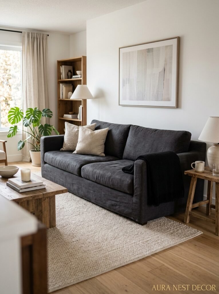
Your sofa is the first real commitment in a black and white living room. Get this right and the rest of the room sort of falls into place. Get it wrong and you’re rearranging deck chairs.
White or cream sofas get a bad reputation for being impractical, and honestly, that reputation isn’t entirely wrong. But the payoff is massive. A big, slouchy linen sofa in a warm cream against darker walls or flooring is EVERYTHING. It anchors the light side of your scheme, and it photographs beautifully, which — let’s be real — matters if you’ve spent six months putting a room together.
If white feels too precious (kids, pets, a partner who eats on the sofa, no judgment), charcoal or black is just as strong. Maybe stronger. There’s something about a deep-toned velvet sofa against white walls that feels incredibly considered. Very editorial. Very “I know exactly what I’m doing.”
What doesn’t work as well? Mid-range greys. I know that sounds counterintuitive because grey feels like the obvious bridge between the two, but in practice it often ends up looking like indecision. It muddies the contrast without adding anything. If you want grey in the room, put it somewhere smaller — a side chair, a rug, a ceramic. Not the main event.
—
4. Texture Is Doing 80% of the Work Here
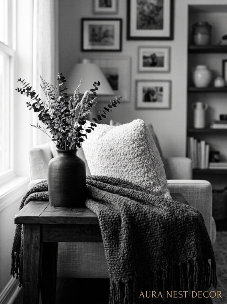
Take two rooms: both black and white, same proportions, same furniture shapes. One feels like a sterile hotel lobby, the other feels like somewhere you’d happily spend a Sunday afternoon. The difference is almost entirely texture.
Because when you strip out color, texture becomes the thing your eye reads for interest and warmth. It’s doing ALL the heavy lifting.
Chunky knit throws on a white sofa. A jute or wool rug with enough texture that you want to walk on it barefoot. Matte ceramic vases next to something with a bit of sheen. Rough linen cushion covers mixed with smooth cotton ones. This layering is what stops a black and white room from feeling cold, and once you see it you can’t unsee it.
“In a room without color, texture is the personality.”
Woven baskets in a deep near-black. A sheepskin thrown over the arm of a chair. Rough-edged stone coasters on a wooden coffee table. You’re building contrast in a completely different dimension from the color scheme, and that’s exactly what the room needs.
Plaster or limewash walls are genuinely incredible in a black and white scheme, by the way. That slight unevenness, the way the light catches it differently throughout the day — it adds so much without adding any color at all. It’s worth the cost if you’re doing a proper refresh.
—
5. The Flooring Choice That Changes the Whole Mood
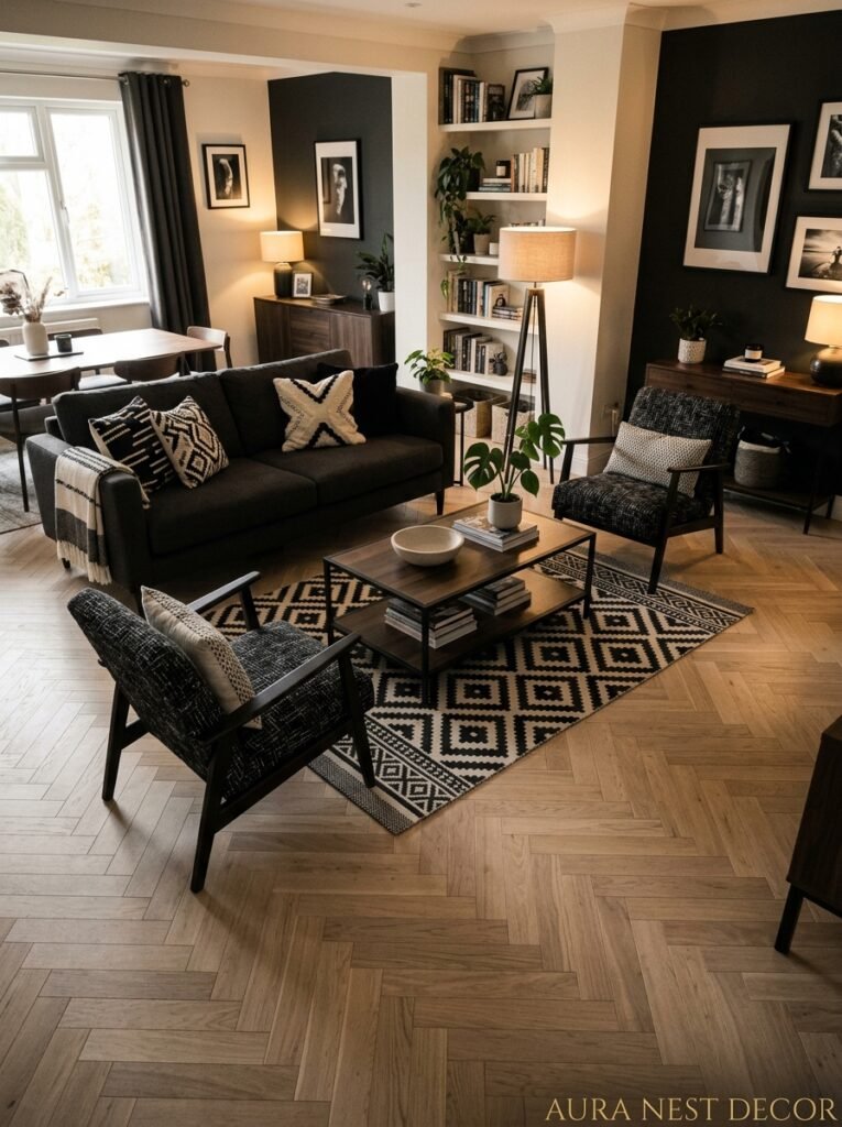
Flooring in a black and white room is one of those things that can either be a power move or a total headache, and the choice you make sets the mood for everything above it.
Geometric black and white floor tiles are having a moment — and have been, honestly, for about a decade now. And they’re not going anywhere because they’re genuinely beautiful. Encaustic-style hex tiles, classic checkerboard (in small scale for a living room, not a kitchen scale), vintage-looking patterned cement tiles. If you’ve got original Victorian or Edwardian tiles under that carpet, exposing them is an absolute gift.
But — and this is important — patterned floors need calm walls. You can’t have a loud floor and a loud wall in the same room unless you really know what you’re doing. One of them needs to step back.
If your floors are natural wood, that warm honey or walnut tone actually works beautifully against a crisp black and white scheme. It keeps things from feeling too harsh, adds that bit of organic warmth. Same goes for stone or concrete — both feel incredibly current right now, especially with a more minimal approach to the rest of the room.
Wall-to-wall carpet in soft white or warm grey? Underrated in a black and white living room, honestly. Especially in the UK where it’s cold for eight months of the year and carpet is just a sensible life choice.
—
6. The Art That Looks Like It Was Meant to Be There
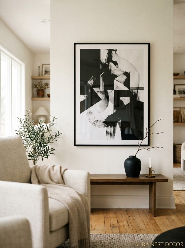
This is probably the section I care most about, not gonna lie.
Art in a black and white room is an opportunity most people miss. The instinct is to keep everything monochrome — black frames, black and white photography, graphic prints. And that works beautifully. A gallery wall of black-framed art against white walls, all different sizes, is one of those looks that’s been popular forever for good reason.
But here’s the move that really surprises people: a single piece of vivid color art in an otherwise completely black and white room. One painting. Maybe it’s a huge abstract in deep rust and terracotta, or a mid-century still life with goldenrod yellow. It hits like a record scratch. The room suddenly has this focal point that you can’t stop looking at, and the rest of the scheme makes the color pop ten times harder than it would in a regular room.
Large-scale black and white photography is having a massive moment on Pinterest right now — landscape shots, architectural photography, abstract close-ups. Printed big and framed simply, they feel incredibly contemporary. And they’re often more affordable than you’d think because you can print your own through any number of online services.
Don’t underestimate the power of a large mirror with a dark frame, by the way. Technically it’s not art but it functions like it, doubles your light, and in a north-facing room that doesn’t get a lot of natural light? It’s basically essential.
—
7. Lighting That Does What Overhead Lights Never Can
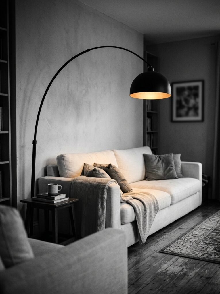
Overhead lighting in a living room is almost always a mistake. I know that’s a strong opinion but I’m standing by it.
The amber glow of a table lamp at 7pm is a completely different experience from a ceiling light that makes everyone look like they’re being interrogated. And in a black and white room, where you’ve put so much thought into how light and shadow work with your scheme, getting your lighting right is non-negotiable.
Layer it. Always layer it. A floor lamp in a dark corner, a couple of table lamps at sofa height, maybe some shelf lighting if you’ve got built-ins. The combination creates pockets of warmth that make the room feel lived-in and intentional at the same time.
“The right lamp at the right height changes a room from a space into a feeling.”
Black metal lamp bases are everywhere right now and they make so much sense in this scheme — they read as furniture rather than just functional objects. An arched floor lamp in matte black over a light sofa is one of those Pinterest images that keeps getting saved because it’s just right.
Edison bulbs or warm-toned LEDs only. Please. Cool white bulbs will kill the whole vibe you’ve built. You want warmth, especially against the white, because warm light against white walls does something magical and cool light just… doesn’t.
—
8. Plants Are Doing Something Very Specific in This Room
Hear me out on this one.
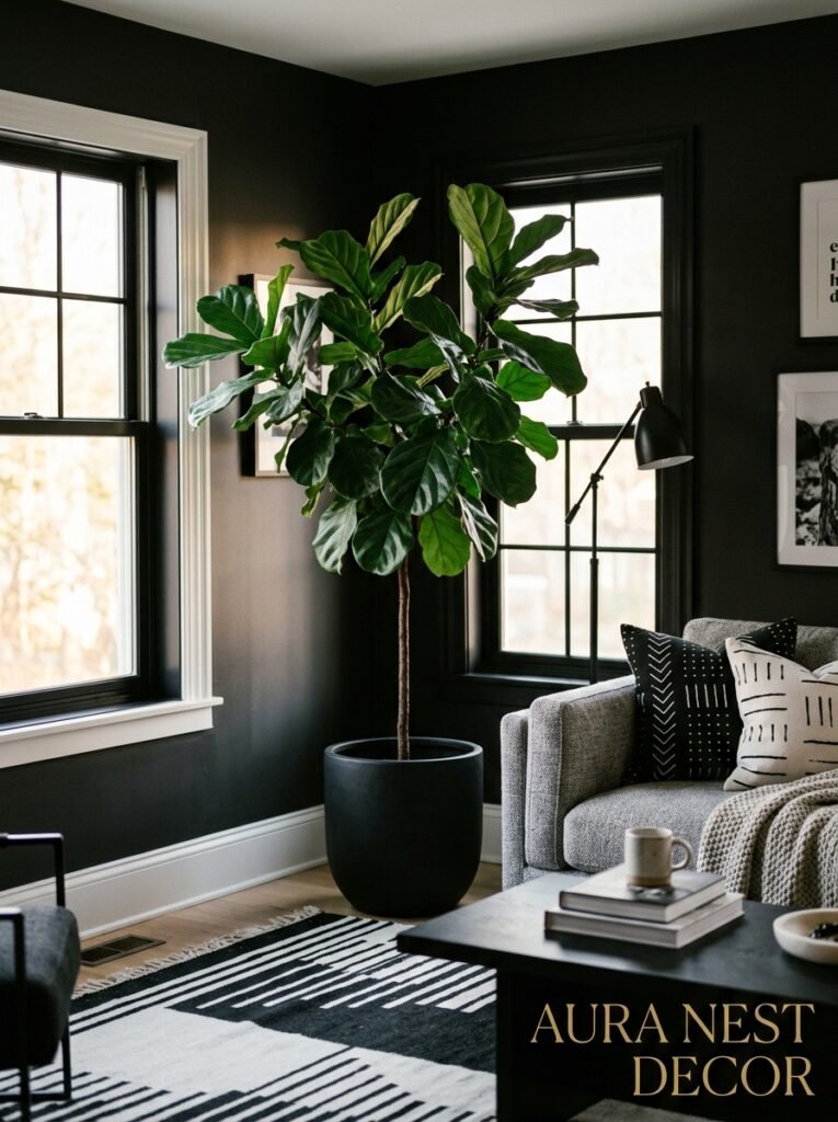
In a color-heavy room, plants are kind of just another color. Green among other greens and pinks and browns. But in a black and white room, plants become a graphic element. Every leaf, every stem is suddenly a silhouette. They’re sculptural in a way they aren’t anywhere else.
Big, structural plants work best — a fiddle-leaf fig, a large monstera, a tall snake plant that casts interesting shadows. But a collection of smaller plants grouped on a shelf or in a corner creates its own thing, this little tableau of organic shapes that the room desperately needs to feel alive.
Black ceramic pots. White pots with black drainage dishes. Even a terracotta pot works here because that earthy warm tone slots into a black and white scheme in a way it doesn’t in a more colorful room — it reads as neutral because everything around it is more stark.
Dried botanicals are having a moment in interior design and they’re perfect for this scheme. Dried pampas grass, dried seed pods, preserved eucalyptus — all that warm beige and cream works beautifully against either white walls or a dark accent.
—
9. The Small Details That Signal “This Room Was Thought About”
It’s the small things. It always is.
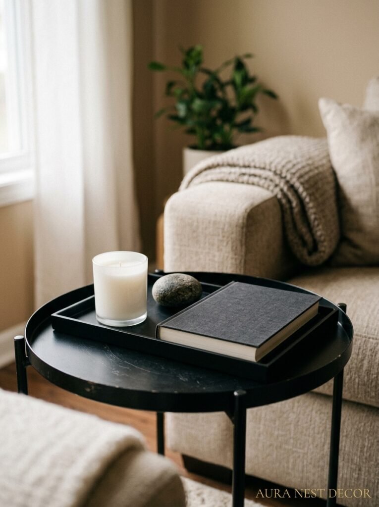
The coffee table books stacked with black spines facing out. The single architectural sculpture on a shelf. The way the cushions are slightly imperfect — one turned sideways, one on the floor — rather than rigidly arranged.
Black hardware in a living room is a detail borrowed from kitchens but it works incredibly well here. Black curtain rods, black door handles, even black cabinet or shelving hardware. These tiny touches pull the whole room into a consistent language, and guests often can’t tell you what’s different but they feel it.
White candles in black holders. Or black candles in white or marble holders. This is such a small thing but it’s one of those details that shows up in every carefully styled room and there’s a reason for that.
Cable management matters here more than it does in a colorful room, by the way. Because contrast is so high, a stray white cable snaking across a dark floor or a black cable against a white wall is incredibly visible. Worth sorting out. I know it’s annoying, but.
—
10. When to Break the Rules (And What to Break Them With)
A completely pure black and white room is a masterpiece or it’s suffocating. There’s not much in between.
Most people — and most beautiful real rooms — introduce at least one accent. The key is making it feel deliberate rather than like you lost your nerve.
Natural wood is the most foolproof addition. A walnut coffee table, wooden picture frames, an oak side table. Wood introduces warmth without introducing color in any jarring way. It belongs.
Brass or gold hardware is the choice that’s really blowing up right now and I get it. A brass table lamp base, gold picture frame edges, brass cabinet handles — these are warm and rich and they glow against both black and white in a way that feels genuinely luxurious.
Deep navy is another option. Not quite as clean as pure black and white but it lends this richness, this depth, that a purely monochrome scheme can sometimes lack. A navy velvet armchair, a navy bookcase. It keeps the restraint of the original scheme but adds a bit of life.
What I’d avoid? Bright primary accents. Red, bright yellow, Kelly green — these fight with the graphic quality of the scheme rather than complementing it. They feel like accidents. If you want color, make it muted, make it earthy, make it look like it belongs.
—
11. The Room References That Are Blowing Up on Pinterest Right Now
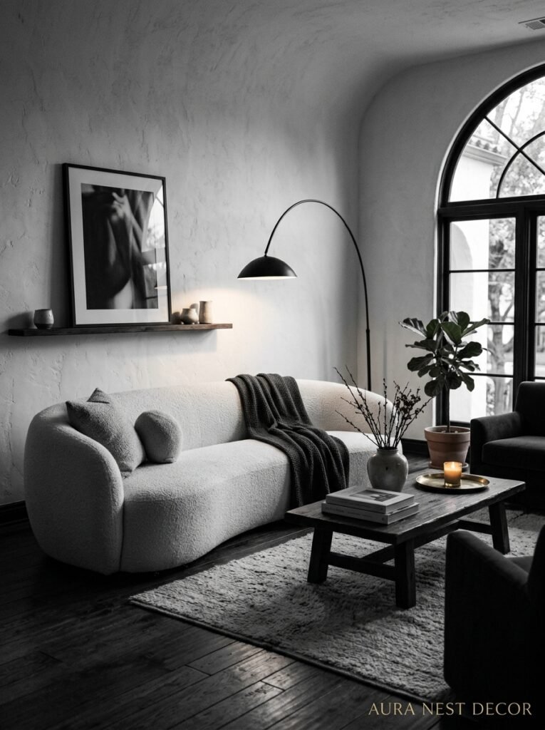
There are a few specific looks within black and white design that I keep seeing everywhere, and honestly, each of them is worth understanding on its own terms.
The Scandi-minimal take: white walls, natural wood, black metal frames, a few carefully chosen ceramics. Very calm, very considered, very “I own one beautiful thing and it’s enough.” This works especially well in smaller spaces and is very achievable on a budget.
The maximalist graphic take: bold black and white patterns — geometric wallpaper, patterned tiles, striped cushions, graphic prints — layered in a way that feels intentional rather than chaotic. This one takes more confidence but it’s incredibly high-impact.
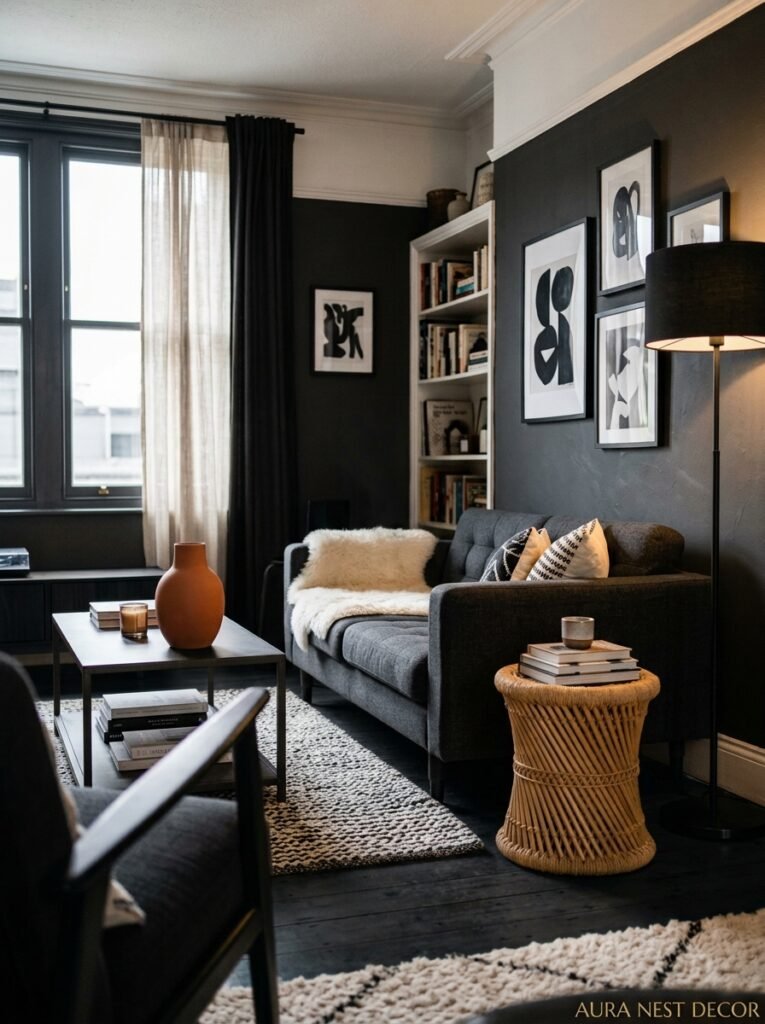
The moody, dark-wall version: deep charcoal or near-black walls, soft lighting, white and cream textiles that seem to glow against the darkness. Very dramatic, very cozy in a different way. This is the version that photographs the most beautifully at night, and it feels like a completely different room when the sun comes in during the day.
—
12. The Mistake That Kills Even the Most Expensive Black and White Rooms
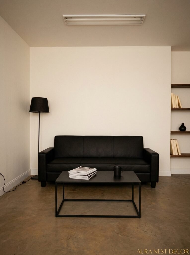
Too much. That’s the mistake. Just too much.
It’s such a graphic scheme that every single thing you add is visible in a way it wouldn’t be in a room with more visual noise from color. Every mismatched thing, every item that doesn’t belong, every “I’ll sort that later” pile — it’s all there. Exposed.
This is the room that demands editing. Not minimalism necessarily — you can have lots of things in a black and white room, but they need to feel curated rather than accumulated. There’s a difference.
The other version of this mistake is buying cheap versions of the key pieces to save money and then wondering why the room doesn’t look like the Pinterest board. Black and white is unforgiving of quality. A cheap flat-pack bookcase in faux black finish reads completely differently from a real painted wood one. A thin, stiff linen sofa cover feels nothing like a properly upholstered piece. Sometimes it’s worth waiting longer and buying fewer, better things.
—
❓ FAQ
Q: Does a black and white living room work in a small space or will it feel cramped? A: It can work really well — but the proportion of white to black matters more in a small room. Keep walls light and save the darker tones for furniture and accessories rather than large surfaces. Good mirrors and smart lighting help enormously too.
Q: How do I stop a black and white living room from feeling cold or impersonal? A: Texture is your answer. Chunky knits, woven rugs, natural wood, linen — these all add warmth without adding color. Warm-toned lighting (Edison bulbs or warm LEDs, never cool white) makes a massive difference too.
Q: Can I add color to a black and white living room without ruining the scheme? A: Absolutely, and honestly, one accent done well is often better than keeping it purely monochrome. Natural wood and brass hardware barely register as color but add warmth. If you want a real color pop, one piece of vivid art in an otherwise black and white room hits harder than a whole colorful room would.
—
💭 Final Thoughts

A black and white living room is one of those things that looks effortless when it’s done right and looks trying-too-hard when it’s done wrong, and the difference between the two is mostly just confidence and patience. Take your time with it. Edit ruthlessly. Trust the scheme.
What’s the one piece in your room that you think would anchor the whole thing — the sofa, the rug, the art?




