
The Living Room Paint Colors That Made Me Fall In Love With My Home Again
There’s something quietly powerful about paint. One Saturday afternoon with a roller and the right shade, and the room you’ve ignored for years suddenly feels like the most intentional space in your home — like it was always meant to look exactly like this.
—
1. Why Your Living Room Color Is Doing More Than You Think
Before we talk about specific shades, let’s talk about what’s really happening when you walk into a beautifully painted room. Your nervous system responds to color before your brain even registers what it’s seeing. Warm terracotta tones signal safety and warmth — they remind your body of firelight, of late afternoon sun filtering through curtains. Cool sage greens whisper slow down, breathe. Deep navy says this is a serious, thoughtful space without uttering a word.
This isn’t just design theory. It’s the reason you walk into certain living rooms and immediately want to curl up with a book, while others make you feel like you should sit up straight and not touch anything. The paint color sets the emotional baseline for every moment that happens in that room — every movie night, every hard conversation, every quiet Sunday morning with coffee.
So when you’re choosing a living room paint color, you’re not just choosing a backdrop. You’re choosing a feeling you want to live inside every single day.
“The right paint color doesn’t just change how your room looks — it changes how your home feels.”
—
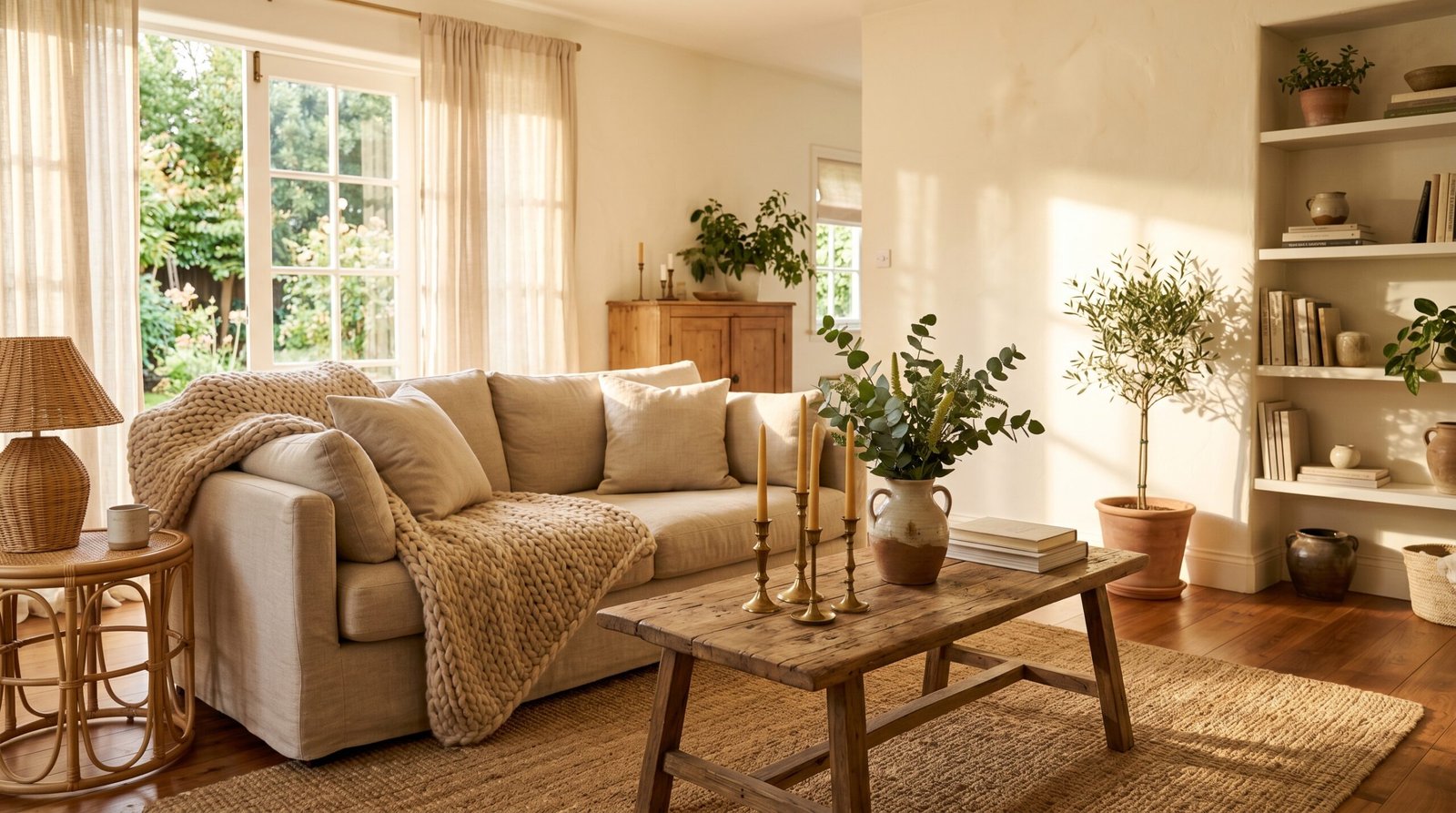
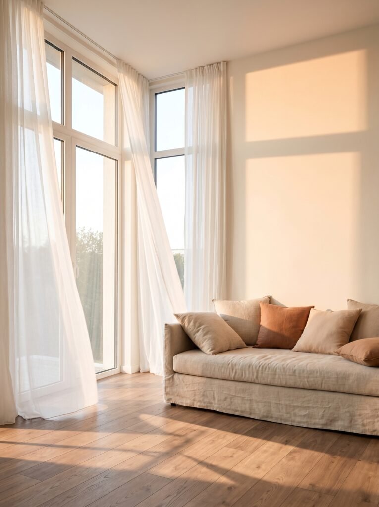
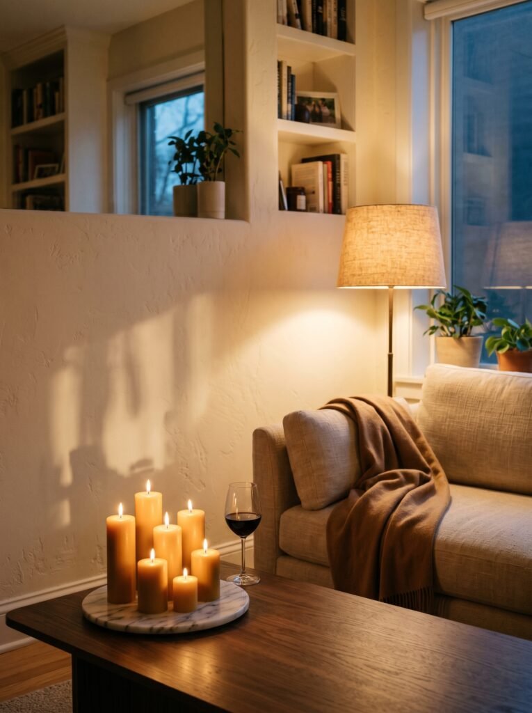
2. The Timeless Warmth of Creamy White (And Why It’s Not Boring)

Let’s start here, because creamy white gets dismissed as the “safe choice” — and that’s deeply unfair. A true creamy white, think Benjamin Moore’s White Dove or Sherwin-Williams Alabaster, is one of the most sophisticated things you can do to a living room. It’s not the stark, clinical white of a hospital hallway. It’s warm, gentle, slightly toasted — like the pages of a well-loved book.
In a living room with natural light, a creamy white shifts throughout the day. In the morning it looks almost golden. By afternoon, it softens into something almost peachy. At dusk, it turns this gorgeous warm ivory that makes candlelight look like something out of a movie. That kind of dynamic quality is rare in a paint color, and it makes creamy white endlessly interesting to live with.
The trick is layering it with textured textiles — linen curtains, a chunky wool throw, a jute rug — so the room feels cozy rather than cold. Pair it with warm wood tones and brass accents, and you’ve built a living room that looks curated, collected, and deeply livable.
—
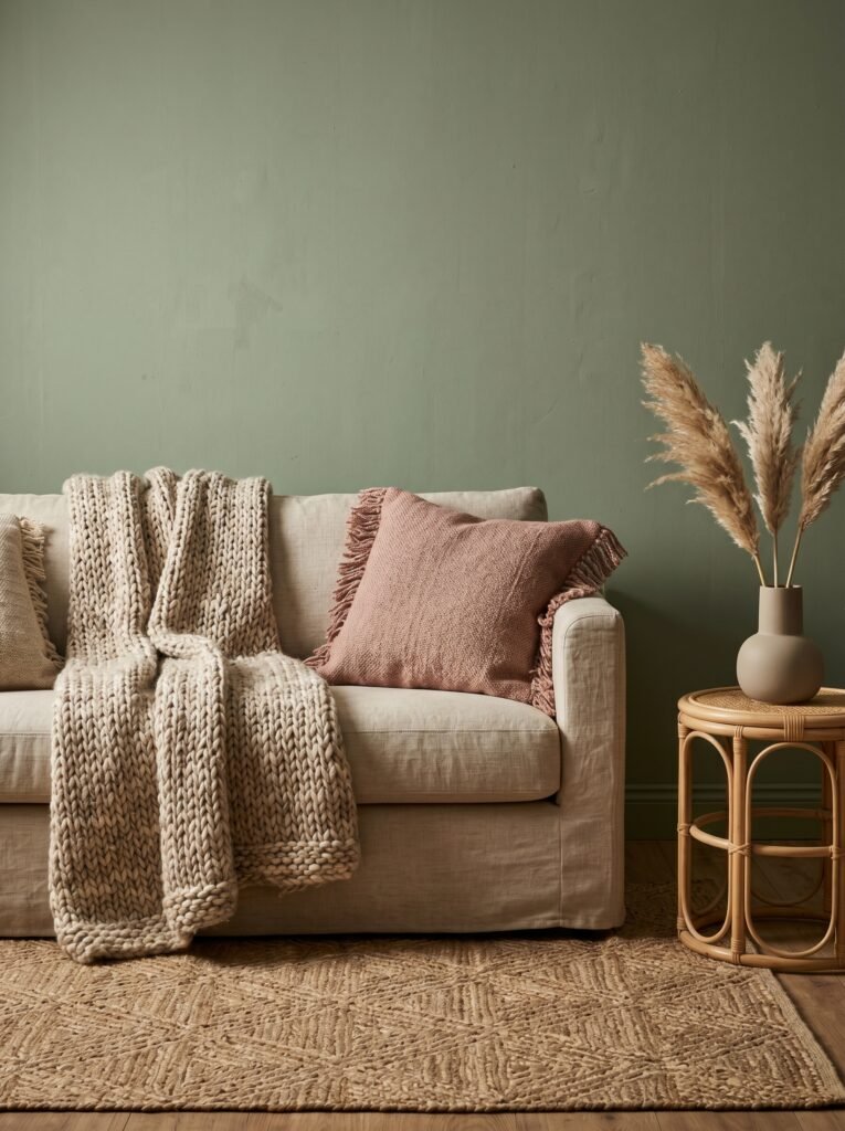
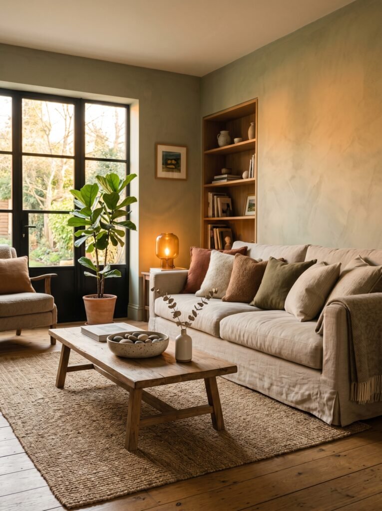
3. Sage Green: The Color That Feels Like an Exhale
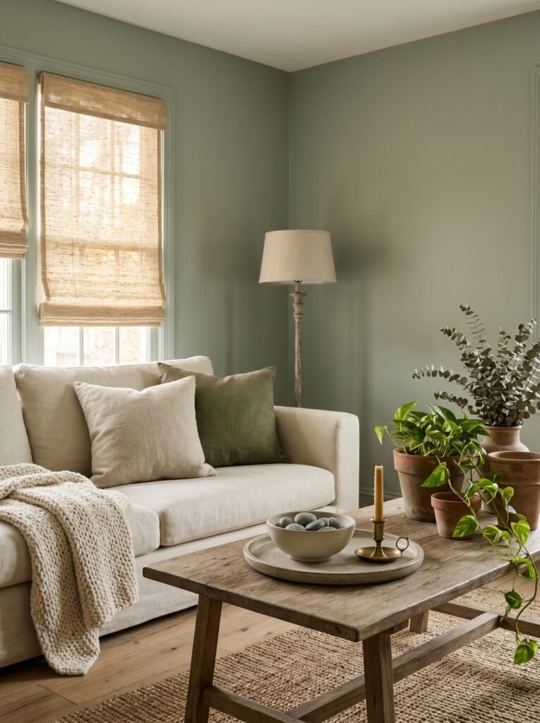
If there were a paint color that embodied the phrase “come home,” sage green would be it. It sits right at the intersection of nature and interior design — bringing the calm of the outdoors inside without making your living room feel like a greenhouse.
What makes sage so special is its neutrality. It reads as a warm green in some lights, a soft grey-green in others, and in the evening under warm lamps, it turns almost golden-olive. It’s the chameleon of living room colors, playing beautifully with everything from bright white trim to dark wood floors to terracotta accents.
Farrow & Ball’s Mizzle, Clare Paint’s Antique Jade, or Behr’s Dried Herb are all excellent starting points. The key is going slightly more muted than you think — overly saturated greens can feel jarring, but a dusty, chalky sage feels like the room has been there forever, aging gracefully like linen or raw wood.
This color works particularly well in living rooms that see a lot of family traffic. It’s forgiving, calming, and genuinely beautiful in photography — which is precisely why you’ve seen it pinned thousands of times.
—
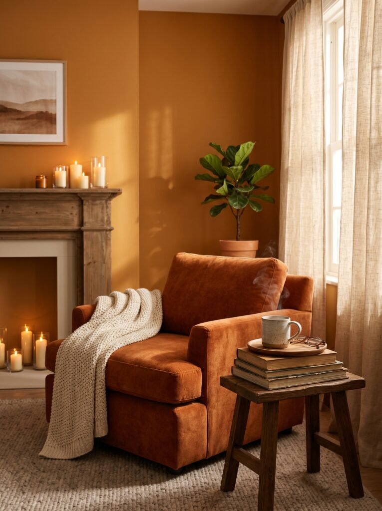
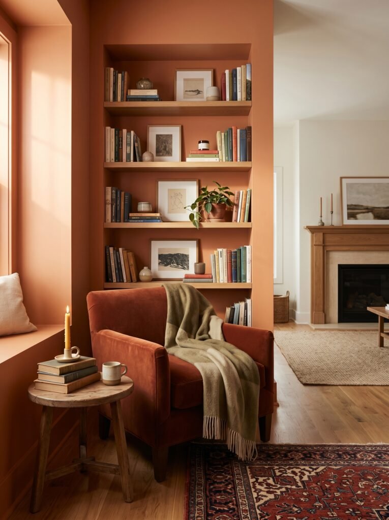
4. Warm Terracotta: The Color That Feels Like a Hug
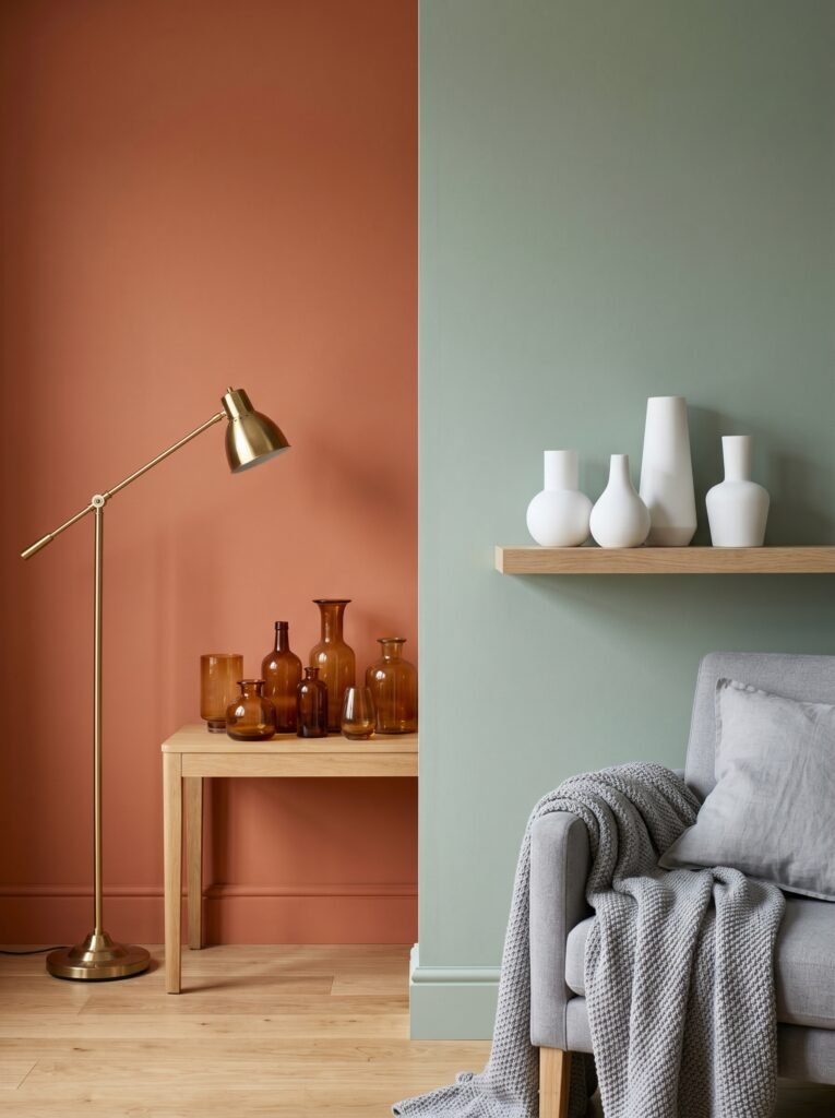
Terracotta has had a remarkable renaissance over the past few years, and it earned every bit of that attention. When done right, a warm terracotta or clay-toned living room feels like being wrapped in something soft and earthy — grounded, warm, deeply human.
The hesitation most people have with terracotta is that it might feel overwhelming, and that’s a legitimate concern if you go too orange-red. The secret is choosing muted, brown-leaning terracottas rather than vivid ones. Think Sherwin-Williams’s Fired Brick or Clare Paint’s Le Tanin — colors that reference clay pots and dusty Mediterranean walls rather than pumpkins.
Terracotta lives beautifully alongside natural linen, deep olive, antique brass, worn leather, and even touches of black iron. It’s a color that ages incredibly well inside a home — it feels richer as the light changes, and it photographs with this gorgeous warmth that makes any living room look editorial.
—
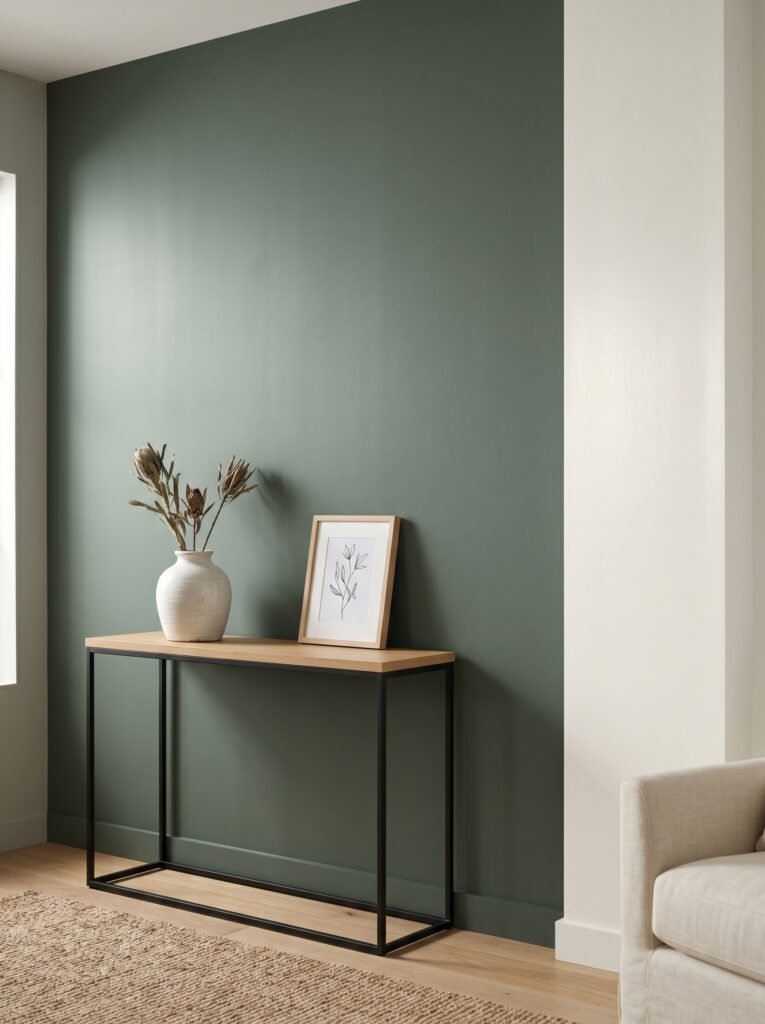
5. The Case for a Deep, Moody Blue-Green
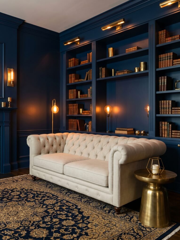
Here’s the color choice that feels scary until you commit to it — and then you can’t imagine your living room looking any other way. Deep teal, peacock blue, or a rich blue-green like Farrow & Ball’s Vardo or Benjamin Moore’s Newburyport Blue creates a living room that feels like an experience rather than just a room.
There’s something theatrical about deep, saturated color on four walls. It makes the room feel cocoon-like, intimate, intentional. Furniture floats against it differently. Art pops from it dramatically. Warm light — from candles, lamps with amber bulbs, a fireplace — turns these deep tones positively magical.
This works exceptionally well in living rooms with high ceilings or good architectural detail, because the boldness of the color needs something interesting to bounce off of. It also works beautifully in smaller living rooms where you want to lean into the coziness rather than fight it.
“A room you’re afraid to paint is often the room that ends up being your favorite.”
—
6. Greige: The Color That Goes With Literally Everything
Greige — that warm, perfect blend of grey and beige — is the workhorse of interior design, and there’s a reason it’s never truly gone out of style. It’s the great harmonizer. Every sofa looks good against it. Every art piece reads clearly against it. Every rug, every pillow, every throw — greige makes them all look intentional.
Repose Gray by Sherwin-Williams, Accessible Beige, Edgecomb Gray by Benjamin Moore — these are the colors that interior designers reach for when a client says “I want it to feel pulled together but I’m not sure how to get there.” They’re not exciting in a swatch, but they’re extraordinary on a wall, in full light, with furniture and life happening in front of them.
The warm undertones in greige prevent that cold, grey-box feeling while keeping the space visually clean and uncluttered. In living rooms with mixed furniture styles or eclectic decor, greige acts like a gracious host — it makes everyone feel welcome and nothing feel out of place.
—
7. Soft Blush: When You Want Your Living Room to Feel Like Romance
Blush is not just for bedrooms. A soft, barely-there blush on living room walls creates a warmth and softness that’s almost indescribable until you’re standing inside it. It makes skin look beautiful. It makes golden hour light look extraordinary. It makes a Sunday afternoon feel like something out of a dream.
The key is keeping it subtle — you’re not painting your living room pink, you’re painting it light. Colors like Sherwin-Williams’s Antique White with pink undertones, or Benjamin Moore’s Pale Blush, read almost neutral in most lighting but reveal their warmth in the evening and in photographs. That’s the magic of blush — it flatters everything.
Pair it with warm brass hardware, linen upholstery, light wood floors, and pops of burnt orange or rust. The result is a living room that feels genuinely romantic in the old-fashioned sense of the word — beautiful, a little soft-focus, a little dreamy.
—
8. Charcoal and Deep Grey: For the Living Room That Means Business
There is a version of living room design that refuses to be gentle about it — and charcoal walls are the backbone of that aesthetic. Deep grey, near-black tones like Tricorn Black or Graphite create a living room that feels curated to within an inch of its life. Dramatic. Confident. Impossibly chic.
What makes dark walls work in a living room is all the contrast. White trim goes from decorative to architectural. Bright textiles — a cream sofa, an ivory rug — stand out like sculpture. Plants become vivid against the depth. Art transforms into gallery pieces. Everything in the room becomes more deliberate, more visible, more considered.
This is a color choice that requires committing fully to the aesthetic, but when you do, the payoff is extraordinary. Dark living rooms photograph beautifully, feel incredibly atmospheric in person, and make guests do that thing where they stop in the doorway and say oh, wow.
—
9. Dusty Lavender: The Underrated Color That’s Having a Moment
Lavender feels polarizing until you see it done right — and then you wonder why you were ever skeptical. A dusty, muted lavender, softer and greyer than violet, is quietly becoming one of the most-saved living room color choices on Pinterest. It’s unusual enough to feel special, but soft enough to live comfortably with.
The reason it works so well is its relationship with both warm and cool tones. It harmonizes beautifully with warm creams and naturals while also sitting elegantly alongside blues and greens. In a south-facing room with warm afternoon light, dusty lavender glows with this luminous quality that’s genuinely hard to replicate with any other color.
Benjamin Moore’s Moonshine or Sherwin-Williams’s Lavender are both excellent, desaturated options that lean more grey-purple than pastel. They create living rooms that feel soft and original — not trendy, but timeless in a quirky, art-forward kind of way.
“Some colors don’t look like much in a swatch — they only reveal their beauty when they’re given a whole wall to breathe.”
—
10. Warm Mustard Yellow: Bold, Joyful, and Surprisingly Livable
There’s a specific kind of courage required to paint your living room yellow — and a specific kind of joy waiting on the other side of it. A warm, deep mustard yellow is radically cheerful without being aggressive. It’s the color of old honey, late summer sunflowers, aged French linen.
Mustard works best when it’s given room to express itself fully: four walls, ideally with natural wood floors or warm-toned rugs. Pair it with black iron accents, dark green plants, and deep blue or teal textiles for a living room that feels both maximalist and deeply intentional.
This is a color that will make you happy every single time you walk into the room. That’s not a small thing. Living with a color that genuinely lifts your mood is one of the quieter luxuries of a well-designed home.
—
11. Warm Off-Black: The Sophisticated Choice Nobody Expects
Off-black — that deep, warm almost-black that carries hints of green, brown, or plum — is one of the most sophisticated color choices you can make in a living room. Farrow & Ball’s Down Pipe or Studio Green, or Benjamin Moore’s Black Forest Green, create walls that feel like they’ve absorbed centuries of warmth and history.
Unlike true black, which can feel harsh under certain lighting, off-black has this extraordinary quality of depth — it looks different at every hour, in every season, under every lamp. In the morning, it’s dramatic. By evening, with warm lamp light, it becomes something closer to cozy. Against it, a velvet sofa in deep emerald or burgundy looks extraordinary.
This is the color choice that makes your living room feel like it belongs in a magazine editorial, but also like a real, breathing, beautifully lived-in home.
—
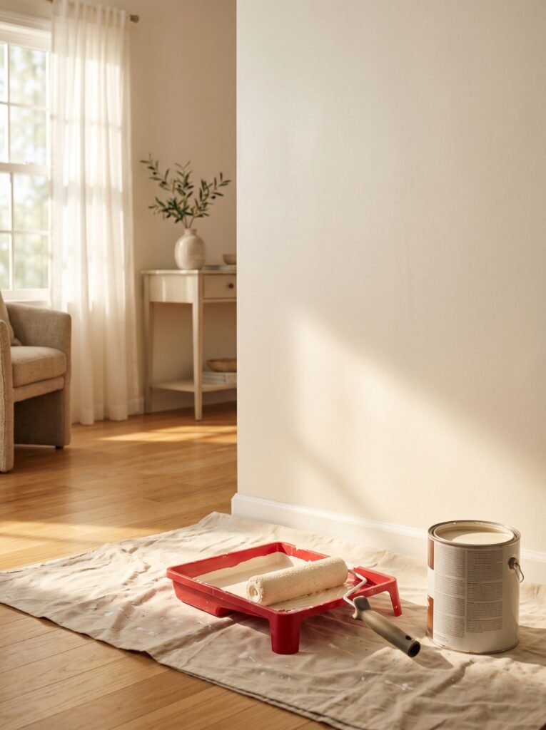
12. How to Choose the Right Shade for Your Living Room
After all of this, the most important advice is the most human one: paint a large sample on your actual wall — at least a 12 by 12 inch square — and watch it for three days before you commit. Look at it in the morning light, afternoon light, and with your evening lamps on. Take photos at different times. Let it sit.
Every color behaves differently in different rooms because of ceiling height, window placement, what’s outside those windows, and the existing furniture. A sage that looks perfect in a north-facing room can look muddy in a south-facing one. A terracotta that photographs beautifully in someone else’s apartment might look orange in yours.
Your living room has its own personality — a specific quality of light, a particular relationship with the outside world. The right paint color doesn’t fight that. It honors it.
—
🌿 How to Take Care of Your Painted Living Room Walls
Once you’ve made the investment of time and money in a beautiful paint job, protecting it is simpler than most people realize.
First, always keep a small amount of the leftover paint in a labeled container — living room walls get scuffed, and touch-ups are infinitely easier when you have the exact color on hand. Use a small artist’s brush for precise touch-up work rather than a roller, which creates visible texture differences.
Second, clean painted walls gently using a soft, barely damp cloth and a tiny drop of dish soap for marks. Avoid abrasive sponges — they dull the finish, especially on eggshell or matte paint. For high-traffic areas, consider a satin or eggshell finish rather than flat matte, as it holds up to gentle cleaning far better.
Third, protect your paint from furniture. Keep sofas and chairs a few inches from the wall when possible — fabric rubbing against paint over years creates gradual discoloration that’s frustratingly difficult to touch up seamlessly. A small furniture pad on any piece that leans against the wall makes a meaningful difference.
Finally, repainting every five to seven years keeps your living room looking genuinely fresh rather than just “fine.” Color also shifts subtly as paint ages, and a fresh coat reminds you just how good the right color can make you feel.
—
❓ FAQ
Q: What is the most popular living room paint color right now? A: As of recent trends, warm neutrals like greige and creamy white remain consistently popular for their versatility, while sage green and terracotta have seen a significant surge in interest, particularly on Pinterest and design platforms. Deep, moody colors like charcoal and off-black are also having a major moment for people willing to commit to a bolder living room aesthetic.
Q: Should all the walls in a living room be the same color? A: For most living rooms, painting all four walls the same color creates a cohesive, intentional feeling — especially with deeper or more saturated colors where an accent wall can feel unfinished. That said, an accent wall in a slightly deeper shade of the same color family can add beautiful dimension without feeling chaotic or dated.
Q: How do I know if a paint color will look good in my living room before I commit? A: The most reliable method is to buy sample pots and paint large swatches — at least 12 inches by 12 inches — directly on your actual walls. Observe them over two to three days at different times and in different lighting conditions. Never make a final decision based on a small chip under store lighting; colors behave radically differently in your specific space.
—
💭 Final Thought
Your living room is the room where real life happens — where you gather, rest, celebrate, recover, and just exist. The color on those walls is doing quiet, constant work to shape how all of that feels. It deserves more than a rushed decision or a “safe” choice made out of fear.
Paint something that makes you feel something. The right color is out there, and when you find it, you’ll know — because you’ll walk into your own living room and feel, for the first time in a long time, like you’re exactly where you belong.
What’s the one color you’ve always been too afraid to try in your living room?