
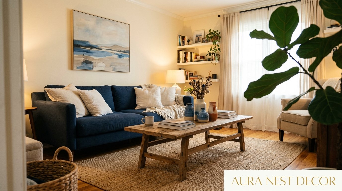
The Living Room That Looks Like a Vacation Every Single Day
You know that feeling when you walk into a room and your shoulders just drop? Like the tension literally leaves your body? That’s what a well-done blue and white living room does. And I’ve been a little obsessed with figuring out exactly why — and how to steal that feeling for your own home.
—
1. Why Blue and White Never Actually Goes Out of Style (And I’ve Tested This Theory)
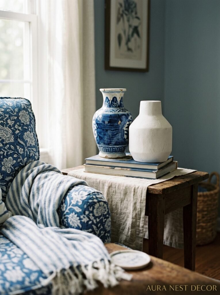
I’ve redecorated my living room three times in six years. Terracotta phase. Very dark green phase. The phase I don’t talk about that involved a lot of exposed brass and jute. And every single time, I end up gravitating back toward blue and white. Not because it’s safe — it isn’t, actually, when you do it right — but because there’s something almost neurologically soothing about it.
Here’s what I think is happening. Blue is the color of open sky and deep water. Two things humans have been finding calming for, I don’t know, the entirety of human history. White gives everything room to breathe. So when you put them together in a living room, you’re not just decorating. You’re kind of manipulating the nervous system in the best possible way.
And the style references are ENDLESS. Coastal New England. Greek island blue doors. British country homes with their blue-grey painted woodwork. Dutch Delftware. Chinoiserie. There are so many ways into this color story that it can genuinely work in a tiny London terrace or a sprawling home in the Carolinas.
The key is committing. Half-hearted blue and white just looks washed out. Go in.
“Blue and white isn’t a color scheme. It’s a decision about how you want a room to feel.”
2. The Shade of Blue That’s Actually Living in Everyone’s Beautiful Living Room Right Now
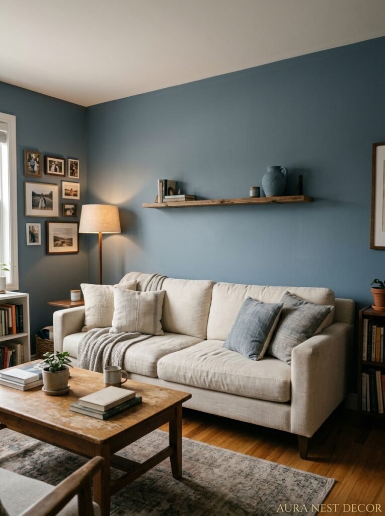
Not all blues are equal. Not even close. And this is where a lot of people go wrong — they pick one blue, live with it, and wonder why the room feels off.
The blue having an absolute moment right now? It’s that slightly greyed, slightly dusty mid-tone. Think faded indigo. Think old denim that’s been washed a hundred times. Not baby blue, not navy, and definitely not the kind of electric blue that belongs in a sports logo. It’s the blue that looks like it’s been in the sun for a while, in the best possible way.
In the US, Benjamin Moore’s “Van Deusen Blue” keeps showing up in rooms that stop me mid-scroll. In the UK, Farrow & Ball’s “Stiffkey Blue” is having an actual moment right now — it’s moody without being overwhelming, and it photographs like a dream.
But here’s the thing I keep saying to anyone who’ll listen: the blue you choose needs to LIVE in your light, not someone else’s. A northern-facing room in Yorkshire and a south-facing room in Charleston are different beasts entirely. Get the sample pot. Paint a big square. Look at it at 8am and again at 9pm. The color will be two different things, and you need to be okay with both of them.
3. White Is Doing So Much More Work Than You’re Giving It Credit For
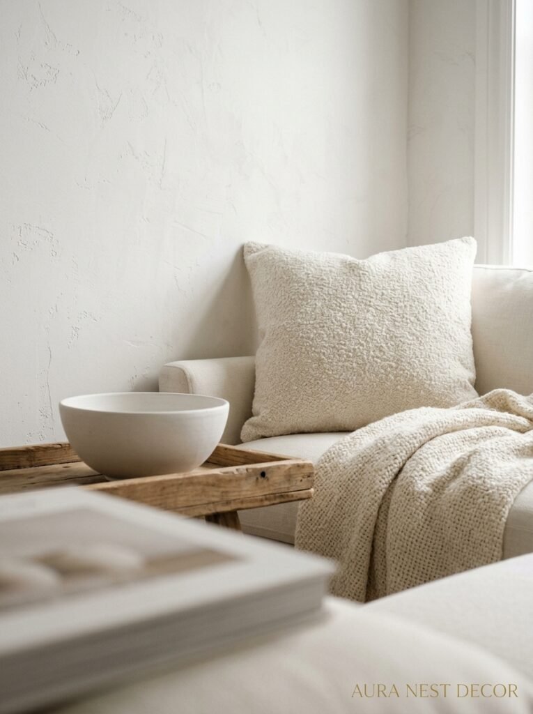
White walls feel like a default. Like the lack of a decision. But in a blue and white room, white is pulling serious weight and most people don’t realize it.
There’s warm white, which has yellow or pink undertones — it makes the blues feel cozier, more livable, more “weekend morning.” Then there’s cool white, which is crisper and a bit more stark — it makes the blues pop and gives the room a cleaner, more graphic quality. The choice between those two is honestly the difference between a room that feels like a cozy cottage and one that feels like a beautifully designed apartment in Copenhagen.
I personally can’t do cool white. It makes my rooms feel like I’ve left a window open in February. But I’ve seen it work BRILLIANTLY in rooms with good light and warm wood floors — the contrast is just stunning.
And then there’s the third option that nobody talks about enough: off-white. A chalky, barely-there cream. It sits between warm and cool and gives blue rooms this incredibly soft, slightly vintage quality. If you’re going for a more collected, layered look — think blue-and-white china on open shelves, linen everything, worn wooden floors — off-white is your answer.
Don’t skip the trim either. Glossy white trim on matte blue-grey walls is a look that has no business being as good as it is.
4. The Furniture Ratio That Keeps Blue Rooms From Feeling Cold
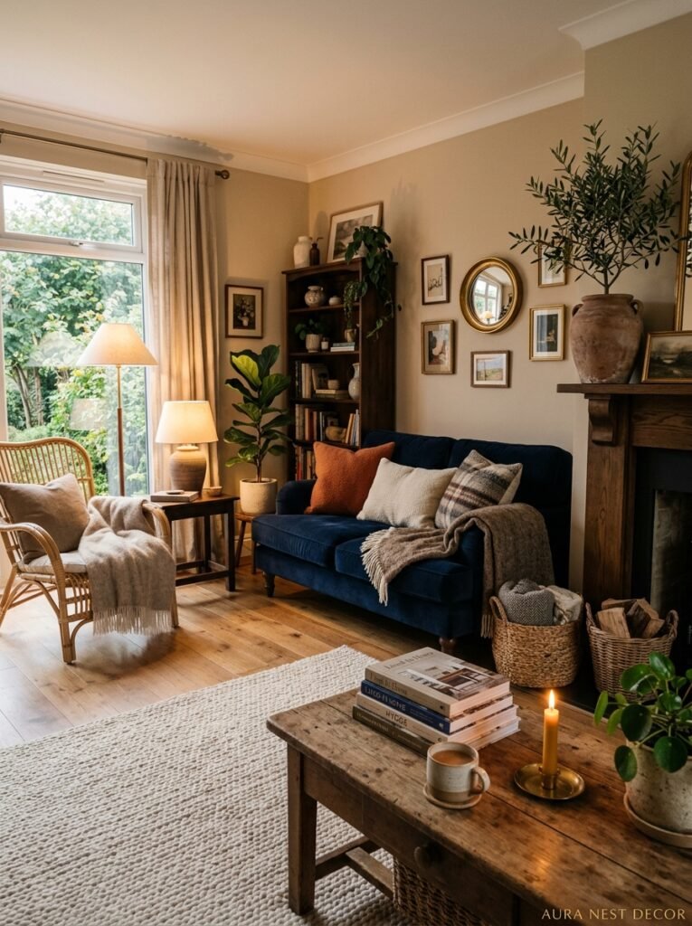
Cold is the risk with blue. The magazine rooms always look warm and lived-in, and then you try to replicate it and your living room looks like a waiting area. Here’s why that happens.
Blue reads as receding. It pushes back. So if you’ve got blue walls AND a blue sofa AND blue cushions, everything is competing to disappear and the room has no anchor. You end up with a space that feels thin, kind of empty, even if there’s furniture everywhere.
The fix is warmth, and warmth usually comes from your big upholstered pieces. A linen sofa in warm white or natural oat. A leather armchair in caramel or cognac — not black, not grey, CARAMEL, because that golden-brown note against blue is genuinely one of the best combinations in decorating. A worn wooden coffee table that’s not trying to be too perfect.
One blue element of furniture is usually enough. One deep blue velvet chair. Or a pair of navy blue side chairs. The rest of the furniture should play warm or neutral so the blue in the walls (or the rug, or the textiles) has something to push against.
And please — don’t be afraid of a patterned rug. A blue and white geometric, or a faded kilim with blue tones running through it, will do more for your living room floor situation than almost anything else. Rugs are where you can get a little messy with the pattern without committing to it structurally.
“The warmest blue living rooms almost always have at least one thing that’s the color of honey.”
5. Texture Is the Secret Ingredient Nobody Pins but Everyone Notices
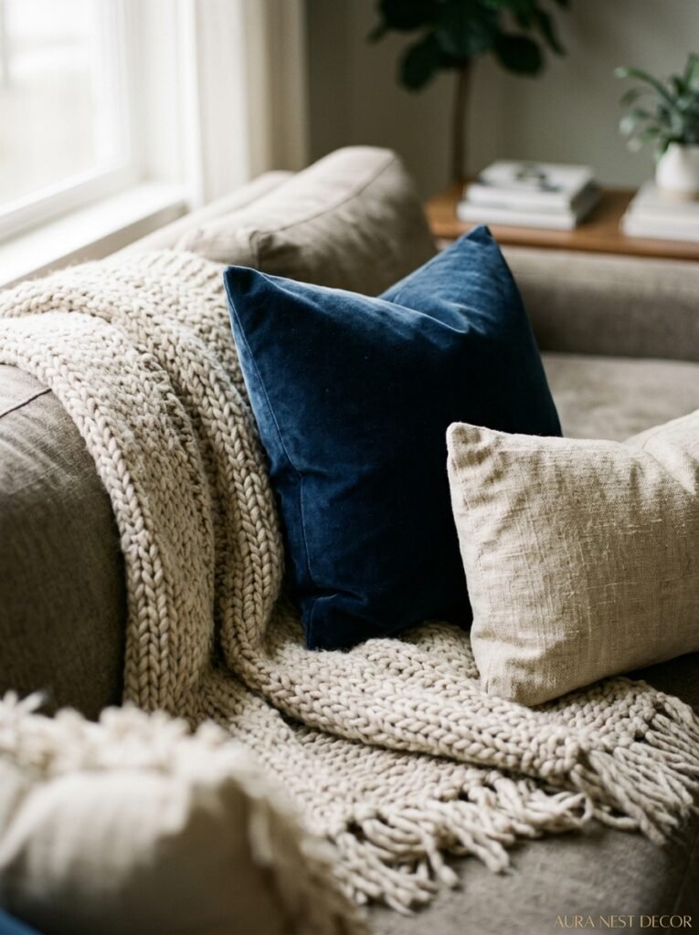
Walk into a flat, textureless blue and white room and you’ll feel vaguely unsatisfied without knowing why. Walk into one with texture layered all over it and you’ll feel like you never want to leave.
Texture in a blue and white room is what separates “nice” from “wow.” Chunky woven throws. Linen cushions with visible slubs in the fabric. Ceramic lamps with an uneven glaze. A jute or seagrass rug if the wood floors are smooth and sleek. A velvet cushion next to a cotton one. The contrast is everything.
Blue has this interesting quality where it can look completely different depending on the material. Blue velvet is moody and rich. Blue linen is casual and sun-washed. Blue ceramic has this cool, earthy solidity. Blue painted wood feels cottage-y and classic. You can use all of these in one room — in fact, you should — because each one is adding a different note to the same color story.
In the UK especially, I see a lot of blue and white rooms that nail the color but forget the texture. Everything is flat, everything is cotton, and the room ends up looking a bit like a show home. Which is fine if that’s the vibe, I guess. But most of us want to actually live there.
6. The Blue-and-White China Thing: Leaning In vs. Going Full Maximalist
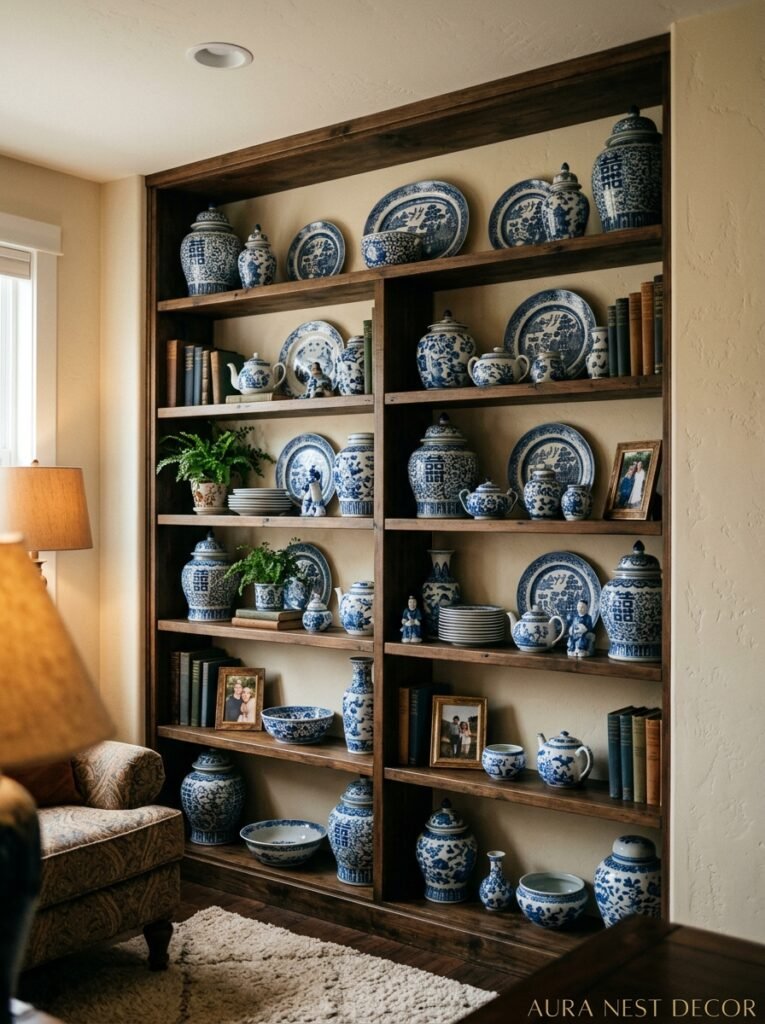
Okay. We need to talk about the china situation.
Blue and white rooms and blue and white ceramics go together like — well, I don’t want to use an overused simile, but you get it. They just work. There’s a reason Delftware tiles have been showing up on kitchen walls for four hundred years. The relationship between this color combination and ceramics is ancient and it’s not going anywhere.
But there’s a line between “curated collector energy” and “your gran’s cabinet exploded.” And the line is actually easier to navigate than you’d think.
Rule one: group things together. Five blue and white pieces clustered on one shelf read as an intentional collection. Five blue and white pieces scattered around a room read as stuff. Don’t scatter.
Rule two: vary the scale. One big statement vase or pot anchors a grouping. Then medium pieces around it. Then a few smaller ones. When everything is the same size, nothing has weight.
Rule three — and this one’s important — mix the patterns. Don’t try to match. A Delft-style piece next to a Japanese-inspired one next to a simple striped mug is interesting. Three pieces all from the same set trying to coordinate is boring. Mismatched blues and patterns and origins is the whole point.
7. What British Country Style and American Coastal Style Actually Have in Common (More Than You’d Think)
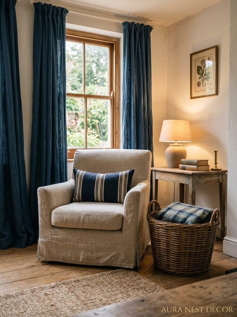
I find it interesting that blue and white works in two aesthetics that feel very different on the surface. British country — think stone cottages, muddy boots by the door, the smell of a wood fire — and American coastal — think wraparound porches, bleached wood, something that tastes like salt in the air. Different vibes entirely. And yet the same color palette shows up in both.
Here’s why, I think. Both styles are fundamentally about a relationship with the outdoors. Both of them prize things that feel a bit worn, a bit used, a bit natural rather than precious. And blue and white, in the right hands, feels like it came from the natural world — water, sky, stone, chalk. It doesn’t look manufactured. Even when it’s obviously been designed, it feels like it just… happened.
The difference is in the execution. British country blue and white is slightly muddier — those dusky Farrow and Ball blues, the aged whites, the mix of antique pieces. American coastal is slightly crispier — brighter whites, more contrast, cleaner lines. Both are valid. Both are beautiful. And honestly, mixing the two is secretly the best option.
“The rooms that stop me mid-scroll are never all one thing. They’re the ones that can’t quite decide if they’re coastal or country — and they’re better for it.”
8. Lighting Changes Everything, Especially in a Blue Room
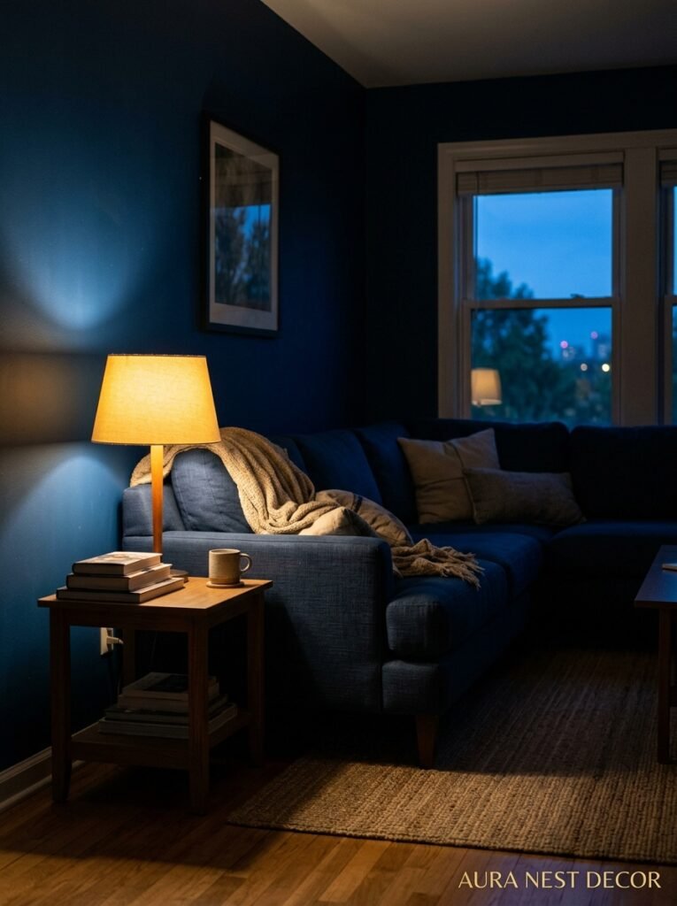
The amber glow of an Edison bulb at 7pm in a blue room is almost unfairly beautiful. That warm, slightly golden light hits the blue and just — softens everything. The room goes from daytime-sharp to evening-cozy in a way that feels like the room itself is settling in.
This is important because blue rooms are particularly sensitive to light quality. Harsh overhead lighting will make a mid-blue look cold and grey. Natural morning light will make it feel clean and clear. Late afternoon sun through warm curtains will make it look almost golden at the edges. You need to think about ALL of these moments, not just how it looks when you’re standing in it with the overhead lights blasting.
My honest advice: ditch the single ceiling light wherever you can. Layer it. Table lamps at different heights. A floor lamp in the corner. Candles on the coffee table when it’s that kind of evening. Multiple light sources at lower levels will always, ALWAYS make a room feel better — but especially a blue room, where the wrong light can tip it from “seaside retreat” to “slightly sad office.”
If you’ve got a north-facing room and you’re worried about blue reading cold — warm-toned bulbs are non-negotiable. Like, don’t even consider cool-white LEDs. Go 2700K or warmer, get some lamps on, and watch the room completely change after about 4pm.
9. Plants, Books, and the Other Stuff That Makes Blue and White Rooms Feel Lived-In
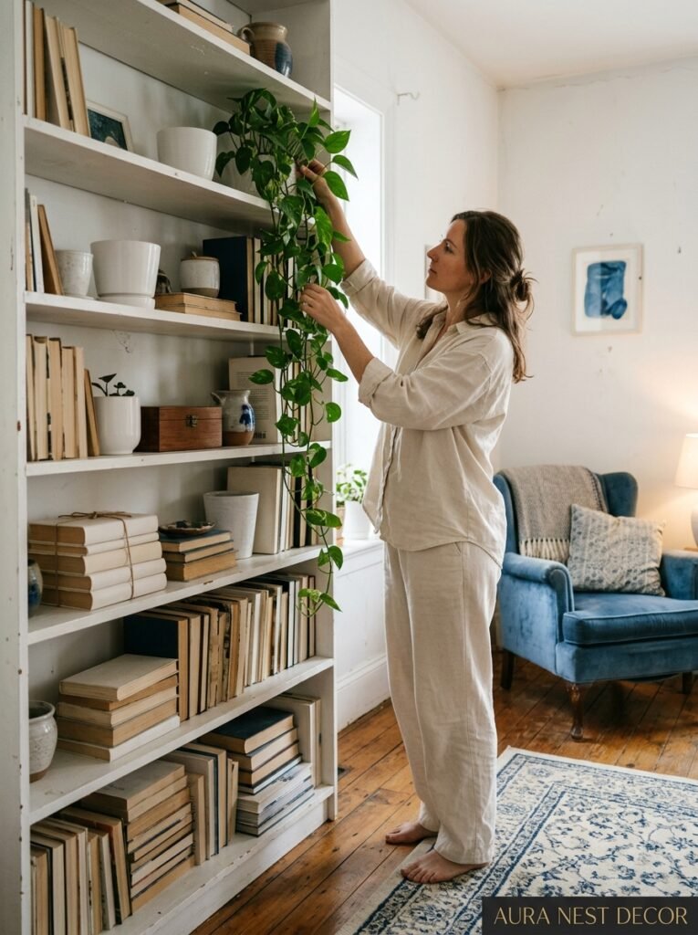
A blue and white room with nothing else in it looks like a concept. It needs life.
Plants are the obvious answer and yes, they work incredibly well — the green against blue is fresh and vivid without being loud. But the TYPE of plant matters. Trailing plants that drape softly feel right. Big-leafed things like ferns or fiddle leaf figs have real presence. Tiny cacti don’t quite fit the mood unless you’re going for something more graphic and modern.
Books are underrated. Genuinely. A stack of books on the coffee table, a few shelved spine-out alongside the ceramics, the odd one left open on a side table — it signals that humans actually live here and have thoughts and interests. I know that sounds obvious but you’d be surprised how many styled rooms feel like nobody has ever actually sat down in them.
Side note — white-spined books on shelves in blue rooms look very intentional and very Pinterest. If you’ve got them, use them. But if you’re considering actually turning your books backwards to hide the spines, just… don’t do that. You’ll never find anything and it’ll stress you out every single day.
Personal objects matter too. A framed photo. Something your kid made. A candle in a scent that means something. The room should have a story and the blue and white is just the backdrop.
10. The One Pattern That Works in Almost Every Blue and White Room
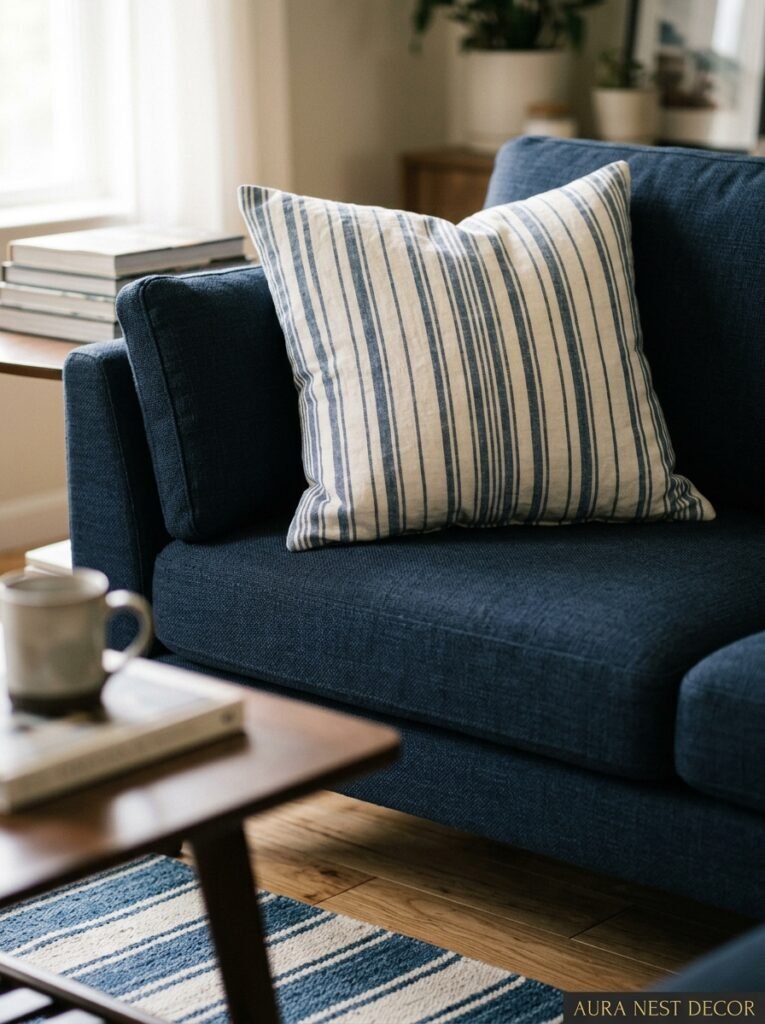
Stripes. Specifically, navy and white stripes, and specifically in unexpected places.
Not just throw pillows. I mean on a roman blind. Or a bench cushion in the bay window. Or even a single striped accent chair in an otherwise mostly plain room. The graphic quality of a good stripe cuts through the softness of blue and white in a way that just works.
Breton stripes have been around forever for a reason. They’ve got this nautical, slightly French quality that feels both casual and intentional — hard combination to pull off. And the proportions of the stripe matter way more than people realize. A very narrow stripe is crisp and a bit formal. A wide stripe is bolder, more graphic, more casual. Medium stripes are kind of the vanilla option — safe but not super exciting, honestly.
If you’re nervous about pattern, a stripe is the right gateway drug. And if you’re already deep into the blue and white pattern world, a stripe is the thing that calms everything down when the Delftware and the cushions and the kilim rug are all competing for attention. It’s neutral enough to rest the eye but interesting enough to pull its weight.
11. How to Make Blue and White Work in a Tiny Living Room Without Making It Feel Like a Box
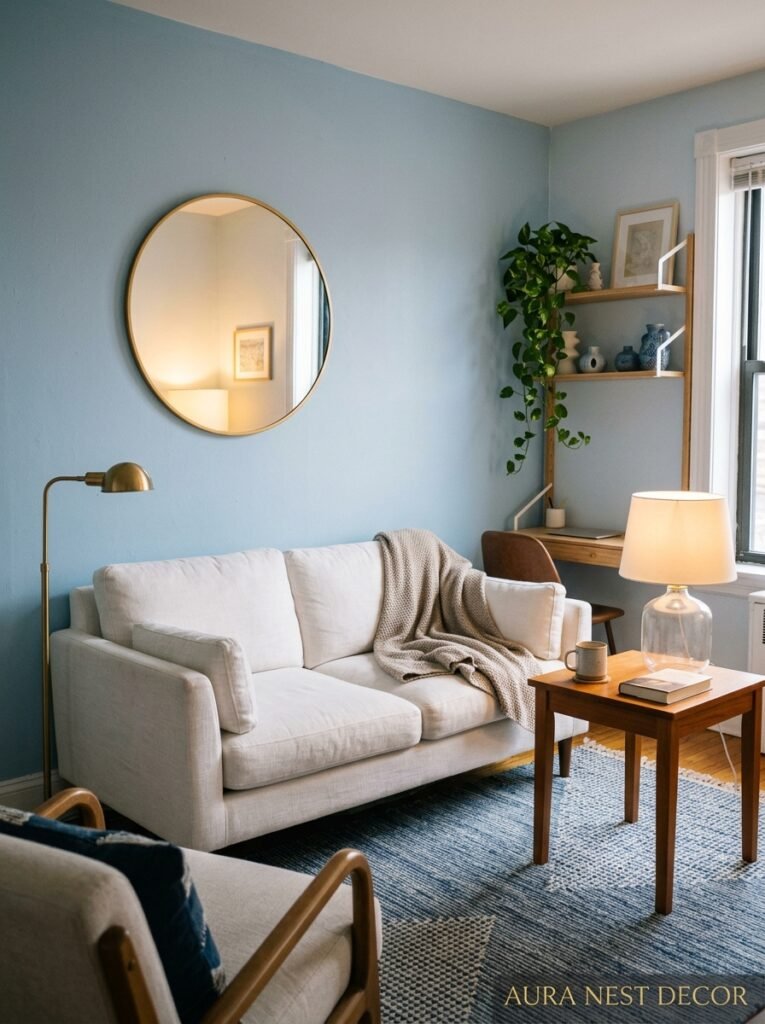
Small rooms and strong color have a complicated relationship. A lot of people assume blue walls in a small room will shrink it. But here’s the thing — a badly decorated large room feels smaller than a thoughtfully done small one.
The trick isn’t avoiding dark or saturated blues in small spaces. The trick is about visual flow. Keep the trim white and crisp so the eye has a clear boundary. Keep the floor light if you can — pale wood, white-painted boards, or a light-toned rug. Let the ceiling go white or very pale blue-grey to lift it visually.
Then go bold on ONE wall. A single deep blue wall behind a sofa, with the rest of the room in white, creates depth rather than closing things in. You’re actually making the room feel larger because you’re adding dimension. The eye goes into that dark blue, rather than bouncing back off a flat pale surface.
British terrace living rooms are often genuinely narrow, and the best ones I’ve seen have embraced the cozy proportions rather than fought them. Deep blue on the end wall, pale floor, good lighting, a beautifully upholstered sofa that fits the scale of the room. Small doesn’t have to mean compromised. It can just mean concentrated.
12. The One Mistake That’s Killing Beautiful Blue and White Rooms (And It’s Really Easy to Fix)
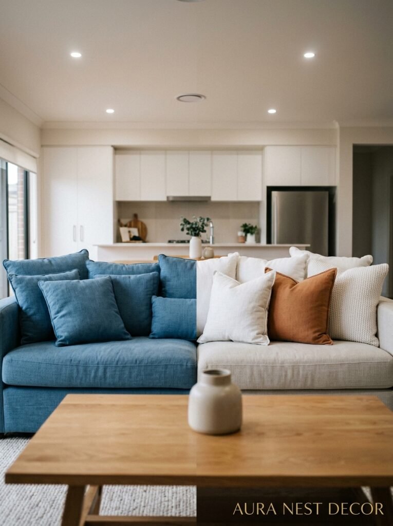
No green. I see this everywhere and it makes me a bit sad every time.
Not plants — those are fine, those are great — I mean green in the actual palette. Green cushions. A green throw. The olive lamp that you picked up because it was on sale and you told yourself it would “work with anything.” It doesn’t work here. The moment green enters a blue and white room, the whole mood shifts and not in a good way. The room loses its clarity. It starts to feel muddy and confused.
The colors that actually work beautifully alongside blue and white are the warm neutrals — natural linen, warm white, caramel leather, pale wood, and a little bit of black if you need an edge. Gold and brass hardware is gorgeous. Even terracotta can work in very small doses as an accent — one terracotta pot, not a whole cushion.
But keep the green for a different room entirely. Your blue and white living room will thank you.
Actually, I take that back slightly — very dark, almost-black-green like deep eucalyptus can work in a botanical kind of way, but you need to know what you’re doing. If you’re asking whether it’ll work, it probably won’t. Leave it.
—
❓ FAQ
Q: Can I use navy blue in a small living room or will it make it feel too dark? A: You can, genuinely — but use it strategically. Navy on a single feature wall or in upholstery, with white walls and pale floors to balance it, will add depth rather than closeness. It’s all-over navy in small rooms that starts to feel heavy, not navy itself.
Q: What wood tones go with blue and white? A: Warm, light-to-medium tones are your best friends — natural oak, washed pine, bleached ash, anything that reads golden rather than red-brown or very dark. Mahogany and dark walnut can work but they push the room toward a more traditional feel, which is great if that’s what you’re after.
Q: Is blue and white too trendy — will I regret it in five years? A: Honestly? No. Blue and white has been a core color story in interior design for centuries — from 17th century Dutch pottery to every coastal home in the Hamptons to every British country kitchen you’ve ever pinned. It’s not a micro-trend. It’s not going anywhere. You might want to update the shade or the style eventually, but the foundation of blue and white is never a decision you’ll cringe at.
—
💭 Final Thoughts
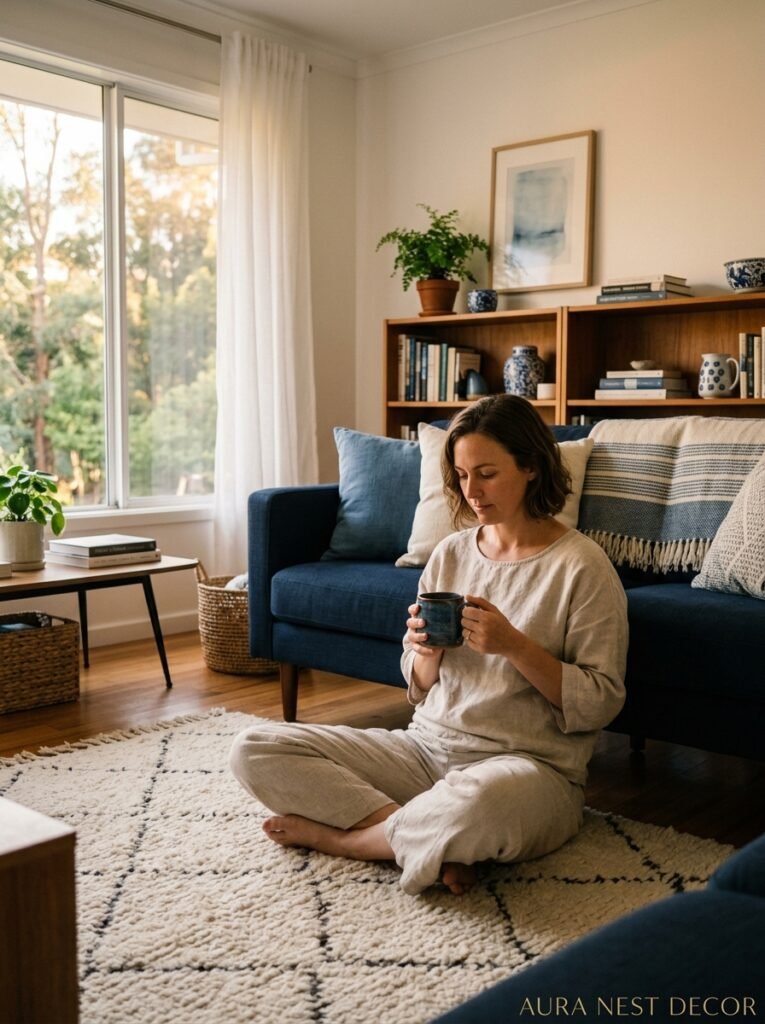
Blue and white rooms are so much more than pretty — they’re the kind of rooms that make you want to stay home, make a cup of tea, and just exist there for a while. Getting the shade right, the warmth right, the texture right — it takes a bit of thought. But the end result is a living room that genuinely feels like a retreat, every single day.
Have you started pulling your blue and white living room together already, or are you still standing in the paint aisle, sample pot in hand, wondering if you’re brave enough to commit?




