
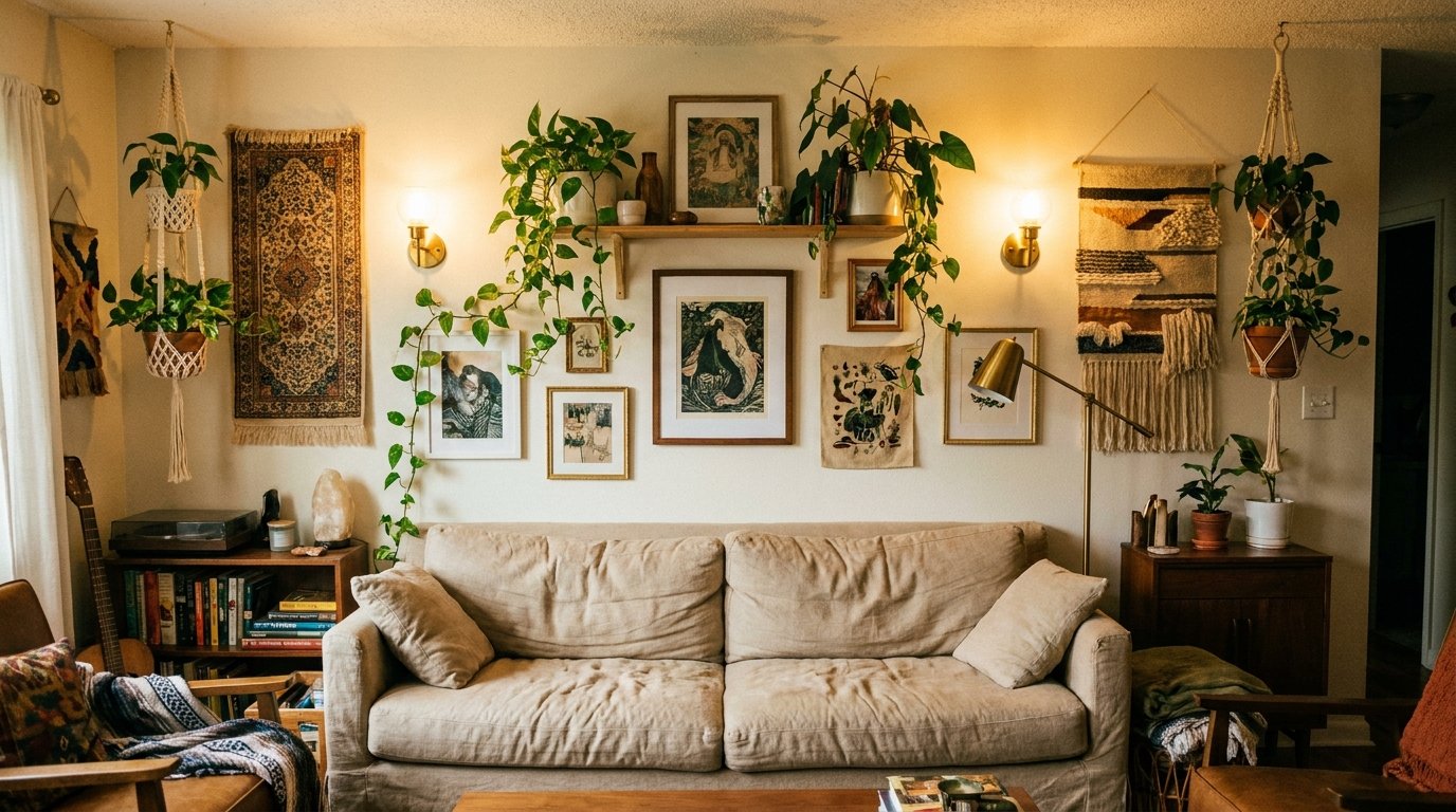
The Living Room Wall Mistake Most People Make (And What Actually Works Instead)
My friend called me last year in a mild panic. She’d just painted her entire living room wall a gorgeous slate blue, bought a gallery frame set from a home store, hung twelve photos in a grid, and it looked — she said — like a hotel corridor. “It’s perfectly symmetrical,” she told me. “That’s the problem, isn’t it?”
Yeah. That was the problem.
—
1. Why “Perfectly Symmetrical” Is the Fastest Way to Kill a Living Room Wall
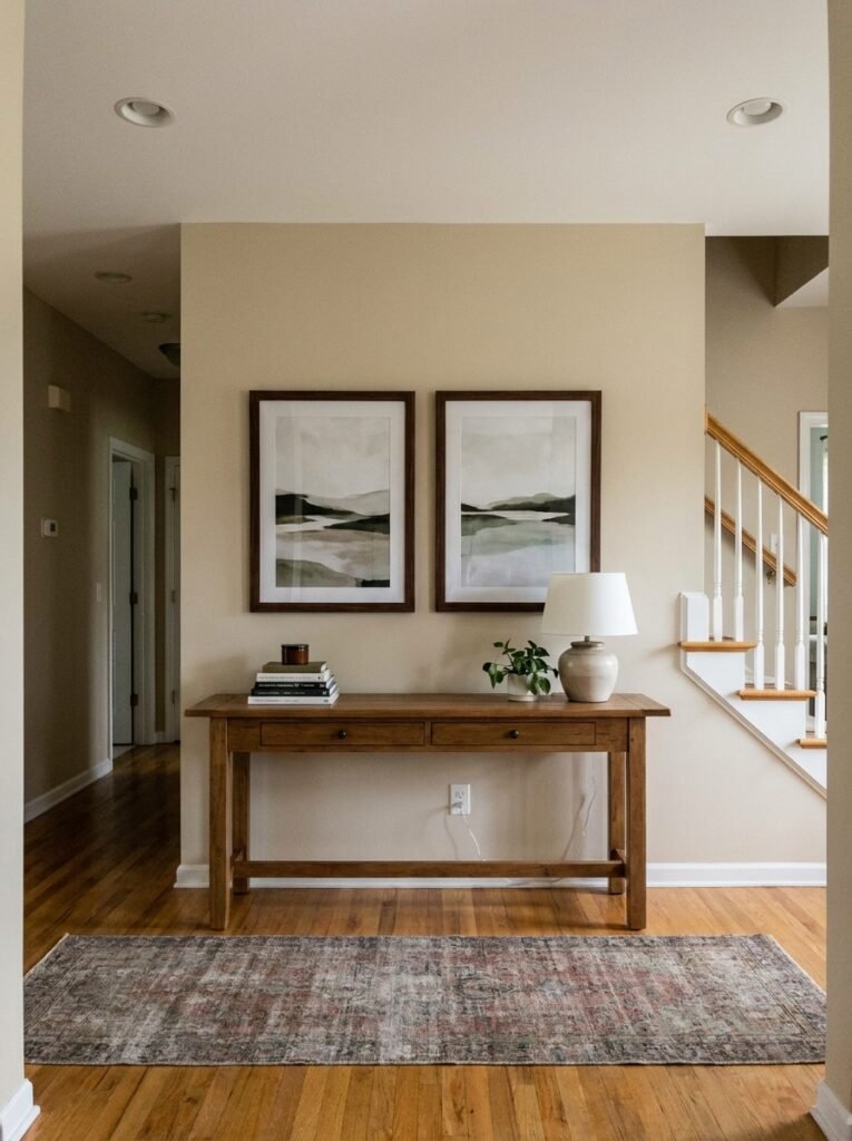
Here’s the thing nobody tells you when you’re standing in the frame aisle at the home shop: symmetry isn’t the same as beauty. Symmetry is what you do in corporate lobbies. In a living room — the place where you’re supposed to feel like a person — it reads cold.
Real rooms have weight. They have a slightly heavier cluster over here, a gap that feels intentional over there, one piece that’s clearly the anchor and everything else sort of breathing around it. That’s what makes it look designed rather than installed.
And it doesn’t take more money. It takes a different way of thinking about the wall — not as a surface to fill, but as something with actual visual gravity. Some spots want more. Some want less. A bit like furniture placement, honestly, but vertical.
The good news? Once you understand this, you can’t unsee it. And re-doing a wall arrangement costs almost nothing.
—
2. The One Question That Changes How You Choose Wall Art Completely
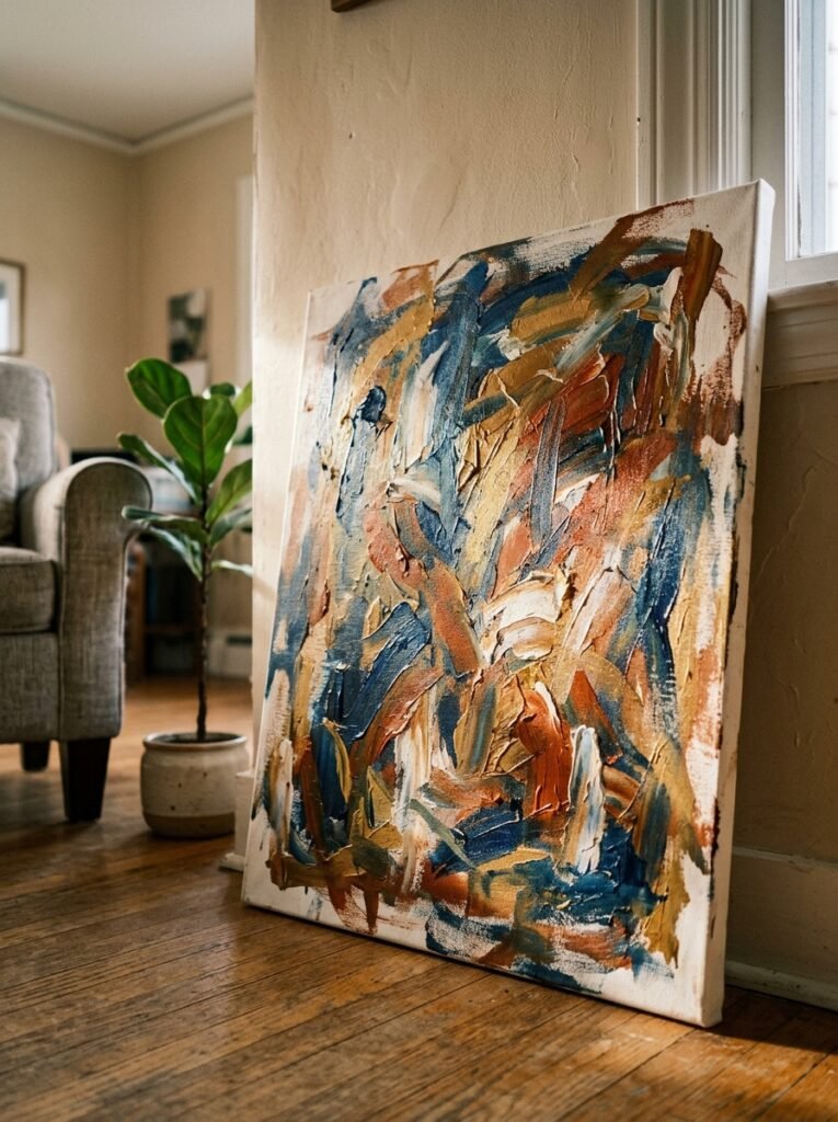
Before anything goes on the wall, ask yourself this: what do I want to feel when I walk into this room?
Not what style. Not what color palette. FEEL.
Because a moody charcoal-and-rust abstract print gives you something totally different than a faded botanical pressed into an antique frame, which gives you something totally different than a raw linen canvas with a single curved line on it. Same wall. Same room. Wildly different emotional experience.
“Your living room wall is doing emotional labor every single day. Make it feel intentional, not incidental.”
I think a lot of people skip this step because they go straight to browsing, and then they buy things they love individually that don’t add up to anything together. It’s a really easy trap. I’ve done it. You end up with a beautiful print next to a family photo next to a decorative mirror and you’re like… why does this feel like a car boot sale?
So. Stop before you start browsing. Give yourself five minutes to actually think about the feeling. Then shop.
—
3. The Color That Keeps Showing Up in Every Beautiful Living Room Wall Right Now
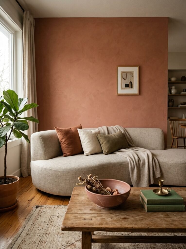
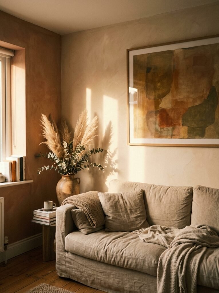
Okay so I’ll just say it — warm off-white is everywhere and it’s not leaving anytime soon, and I’m not even annoyed about it because it’s EARNED its place.
Not stark white. Not cream. That specific shade that’s basically white with just enough beige or blush or grey in it that it glows differently depending on the light — at noon it’s clean and bright, at 7pm under warm bulbs it goes almost amber at the edges. That one.
It works because it doesn’t compete. Your art, your textiles, your furniture — they all get to be the thing. The wall just holds space without taking up space, if that makes sense.
In the UK especially, where a lot of older homes have lower ceilings and north-facing rooms that can go quite grey and flat in winter, a warm off-white does something genuinely useful. It holds onto light rather than reflecting it bluntly. Worth thinking about if you’ve been staring at a wall that feels gloomy for six months.
Side note — if you’ve got coving or ceiling roses, this shade makes them beautiful rather than stark. Just saying.
—
4. Gallery Walls That Don’t Look Like a Mistake: The Floor Test Nobody Skips
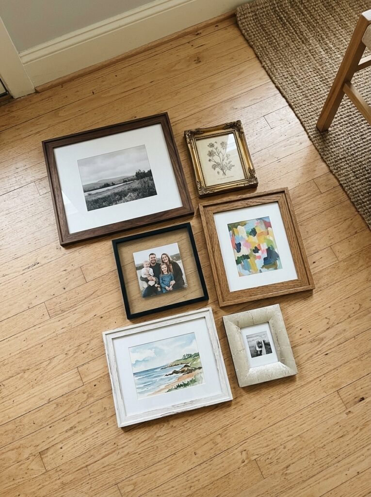
I’m going to give you the single best piece of advice I’ve ever received about gallery walls, and it’s embarrassingly simple.
Put everything on the floor first.
Everything. Every frame, every print, every little decorative plate or sculptural element you’re considering. Lay them all out on the floor in front of the wall. Move things around. Live with it for a day. Sleep on it. Come back the next morning and see if you still like the arrangement.
Because the floor is forgiving and the wall is not.
And while you’re there on the floor, look for:
- Whether there’s a visual anchor — one piece that’s clearly larger or bolder than the rest, that everything else is in conversation with.
- Whether there’s enough variety in frame size — a mix of very small, medium, and one or two large pieces almost always looks more intentional than a bunch of same-sized frames.
- Whether anything is competing — two very bold colorful pieces next to each other often cancel each other out.
Once the floor arrangement feels right, take a photo of it. Then use that photo as your guide when you’re up the ladder with the hammer.
—
5. The Surprising Case for a Single, Oversized Piece of Art
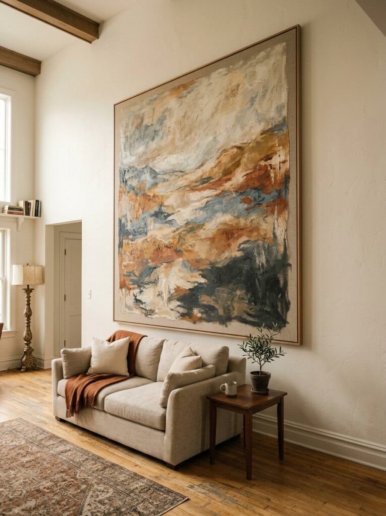
Not everyone wants a gallery wall. Good. Because honestly, a single oversized piece — one that takes up the better part of a sofa-length wall — can be DRAMATICALLY more effective and infinitely easier to pull off.
The resistance to this is usually about cost. Big art feels expensive. And yes, commissioned pieces can be. But large canvases from independent artists, overscale prints made to order, even a very large piece of fabric or textile hung on a wooden dowel — these don’t have to cost the earth.
What matters is that it’s the right scale. The most common mistake with single-piece wall art in a living room is going too small. A piece that’s the right scale for a bedroom will look tentative and lost above a sofa. You want something that fills the visual space, that commands the wall rather than politely occupying a corner of it.
“Big art isn’t extravagant. Timid art in a big room is what looks wrong.”
If you’re not sure what size you need, cut out sheets of newspaper and tape them to the wall. Stand back. Add more. You’ll almost always realize you need to go bigger than you thought.
—
6. What Textured Walls Actually Do to a Room (That No One Talks About Enough)
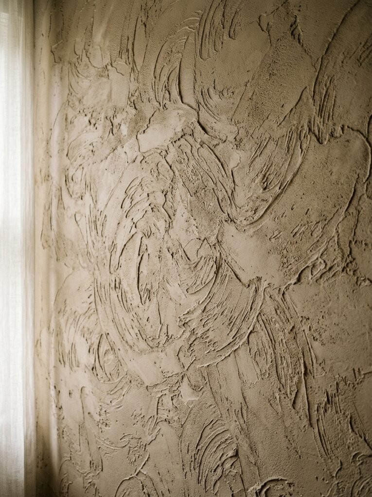
Texture on walls is one of those things that photographs terribly but feels incredible in person, and I think that’s why it’s underrated in the Pinterest age.
Limewash, plaster effects, grasscloth wallpaper, simple Venetian plaster — none of them look like much in a flat image. But walk into a room where one wall has a hand-applied limewash finish? You feel it before you consciously notice it. There’s warmth there. Depth. The light hits it differently at every hour of the day and the wall is never quite the same twice.
It’s especially effective in older UK homes where the walls have natural imperfections anyway — leaning into that rather than plastering everything flat can save you money and give you a more interesting result.
And you don’t have to do the whole room. One wall. The chimney breast. Behind the sofa. That’s enough.
—
7. The One Rule That Makes a Tiny Living Room Wall Feel Intentional
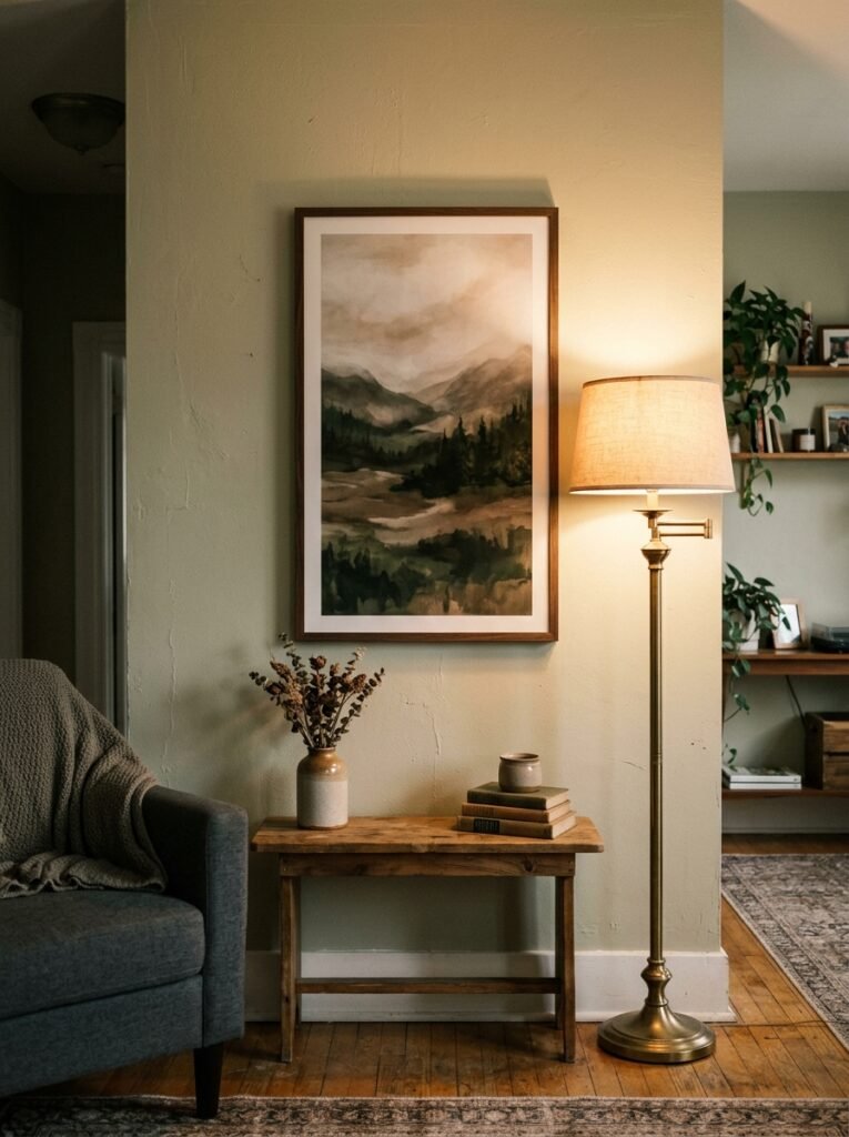
Small rooms are not a problem. Cramped thinking is.
The biggest mistake people make with small living room walls is going small with everything on them — small art, small shelves, small mirrors — thinking it’ll “fit better.” It doesn’t. It makes the room feel proportionally jumbled.
One large mirror positioned thoughtfully, or one oversized print, actually makes a small room breathe. I know that sounds backwards. But it tricks the eye into thinking there’s more space than there is, and more importantly, it gives the room a focal point, which makes it feel curated instead of cluttered.
A narrow wall between two windows? That’s not dead space. That’s the perfect spot for a tall, slim piece of art — something vertical that draws the eye up. Which, speaking of, is always the move in a low-ceilinged room. Vertical. Up. Always.
—
8. Styling Shelves as Wall Decor (Without Making Them Look Like a Furniture Showroom)
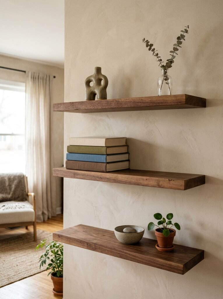
Floating shelves as a living room wall feature — fantastic idea, widely misunderstood in execution.
The showroom mistake is stuffing them with Things That Match. All white ceramics. All rattan. All the same height. You end up with a shelf that looks like a product display and has no actual life to it.
Real shelves — shelves that look good — have:
- Something tall, something short, something horizontal (a stack of books laid flat works perfectly)
- A plant, or even just a single stem in a small vessel, at least once per shelf
- One thing that’s clearly personal — a photo, a found object, something that doesn’t “match” but means something to you
The gap matters too. Don’t pack everything in. Let some things breathe.
“Negative space on a shelf isn’t emptiness. It’s what makes everything else on it look chosen.”
And for US readers — your ceilings tend to be higher, which means you can go taller with shelf arrangements without it feeling overwhelming. Use that. A floating shelf at a higher-than-expected height can be genuinely striking.
—
9. Sconces, Picture Lights, and the Art of Lighting a Wall at Night
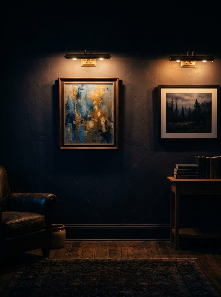
This might be the most overlooked element of a living room wall, full stop.
You can have the most beautiful art, the most thoughtful arrangement, the perfect paint. And at night, under the wrong lighting, the whole thing dies. Flat overhead lighting is the enemy. It flattens everything, washes out texture, makes art look dull and two-dimensional.
Wall sconces on either side of a sofa give you that lower, warmer light that actually lets the room exist in the evening. A picture light mounted above a large canvas does something genuinely beautiful — it creates a pool of amber light that makes even a print feel like a painting. And if you don’t want to hardwire anything, battery-operated picture lights have gotten really good. Not gonna lie, I wasn’t convinced until I tried one. Now I have two.
The goal is to light the wall the way a gallery would. Not to illuminate it uniformly, but to make it glow.
—
10. The Plants-on-Walls Trend That’s Actually Worth Trying
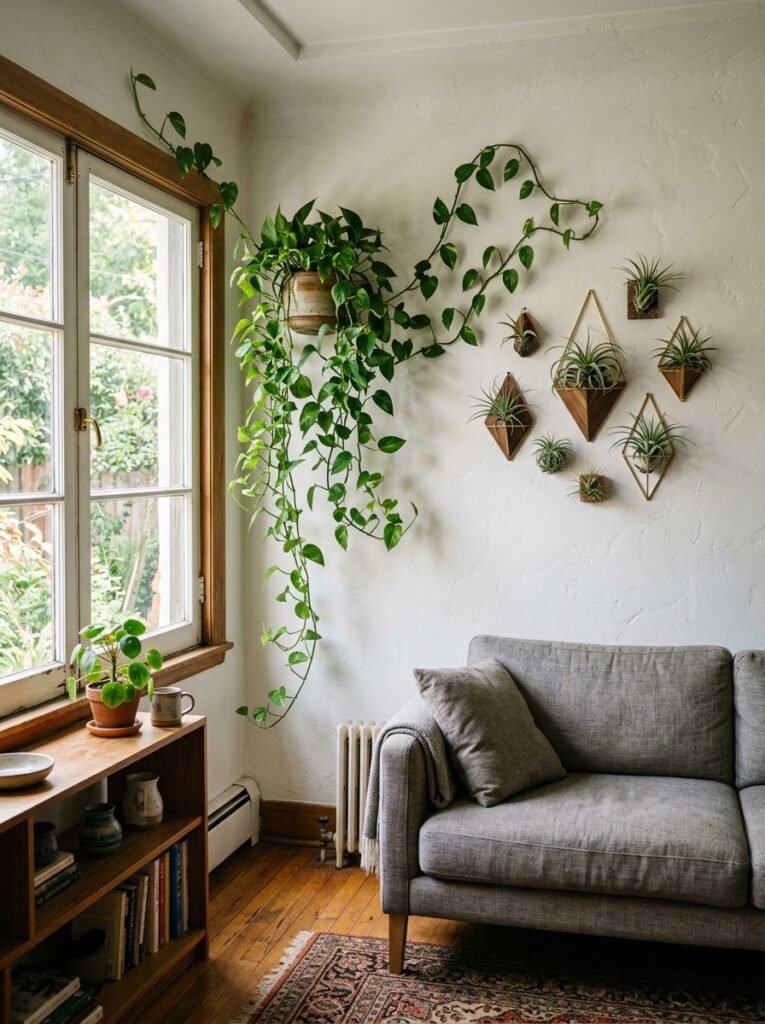
Not a living wall, before you panic. I know. Complicated, high maintenance, more HGTV than real life.
I mean hanging a single trailing plant — a pothos, a philodendron, something that genuinely wants to trail — in a simple wall-mounted planter or even a well-hung macramé holder, at a height where it has room to drape.
Done right, it adds something that no art print can: movement. Living texture. The way a long vine shifts slightly when someone walks past it. There’s something about it that makes a room feel genuinely inhabited, in the best way.
The key is making sure it’s at the right height — you want trailing plants to start high enough that the cascade is the feature, not the pot. Eye level is usually too low. Think a foot or two above eye level and let it come down to meet you.
It’s an inexpensive addition, and it’s the kind of thing guests notice without knowing why.
—
11. The Trim and Molding Detail That Makes Walls Look Expensive for Almost Nothing
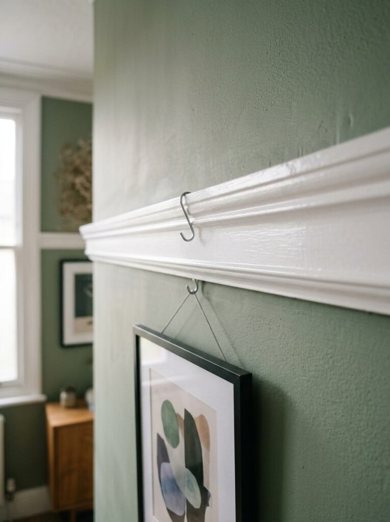
This one’s for the people who don’t want to hang anything or paint anything but still want their walls to look like they tried.
Picture rail molding. Panel molding. Even a simple dado rail used in an unexpected way — like running it at 2/3 height rather than the traditional 1/3 — can completely change how a living room wall reads.
In older UK homes, you might already have these features and just haven’t made the most of them. In newer US construction, adding simple MDF molding strips to create the suggestion of wall panels is a weekend project that costs almost nothing and photographs beautifully.
Paint the panels a slightly different sheen than the surrounding wall — the same color, just one in eggshell and one in flat — and you get depth without contrast. It’s subtle. But it’s the kind of subtle that makes visitors say “this room feels really put together” without being able to say exactly why.
That’s sort of the whole goal, isn’t it.
—
12. The Last Thing to Go On the Wall (That Most People Put On First)
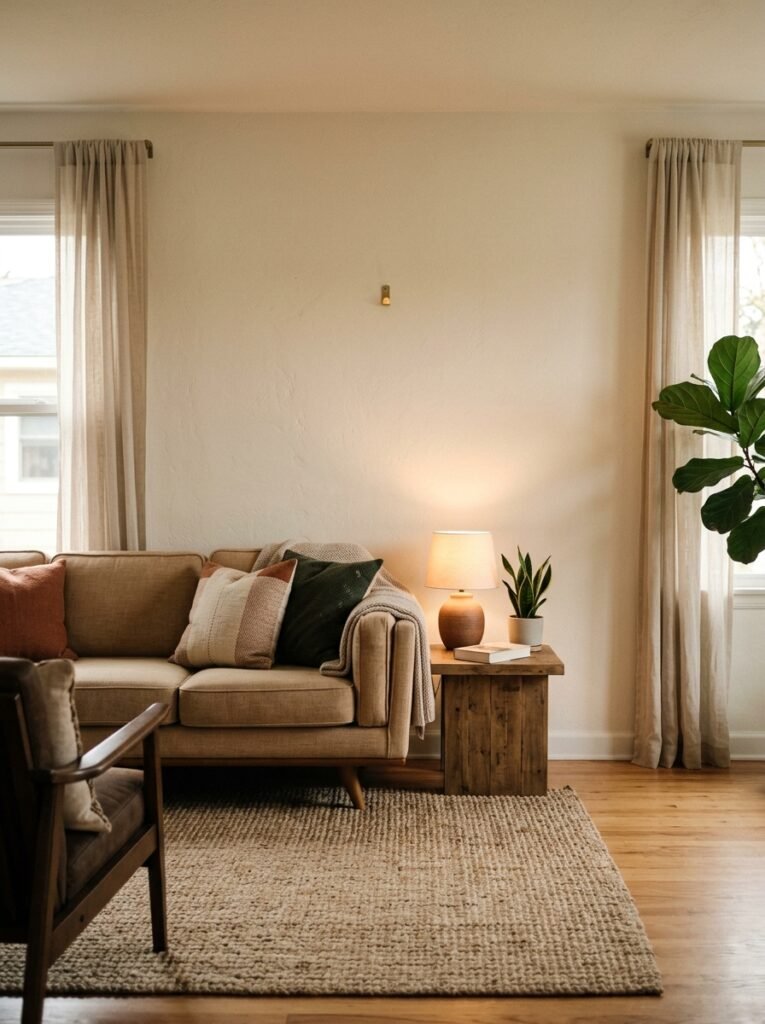
The clock. The mirror. The “statement piece” you bought before you even knew what else would be in the room.
I see this all the time and I understand the impulse — you find a gorgeous circular rattan mirror or a sunburst clock and you think great, that’s my jumping-off point. And sometimes that works. But more often, it becomes the thing everything else has to awkwardly justify, and the room ends up feeling like it was decorated around a single impulsive purchase.
The move that actually works? Build the room first. Furniture, textiles, paint. Live in it for a few weeks. THEN look at the wall and ask what it actually needs.
You’ll find the answer so much clearer when the rest of the room is already telling you something. Sometimes the wall needs an anchor and you’ll know immediately. Sometimes you’ll realize it was already doing its job and it only needs one small thing — a single shelf, one framed print, the right sconce. Maybe nothing.
But you can’t see that until the rest is in place. The wall is the last sentence, not the first.
—
❓ FAQ
Q: How high should I hang art in a living room? A: The standard guidance is to center art at around 57–60 inches from the floor, which puts it roughly at eye level when standing. But if the art is going above a sofa, aim for 6–8 inches above the sofa back rather than following the eye-level rule — otherwise it can look too high and disconnected from the furniture below it.
Q: What’s the best wall color for a small, dark living room in the UK? A: Counter-intuitively, going slightly deeper rather than defaulting to white can actually make a dark room feel more intentional. A rich warm tone — think soft terracotta, dusty sage, or a warm taupe — leans into the moodiness rather than fighting it. Warm off-whites work too, but avoid cool or blue-white tones, which will just highlight the greyness.
Q: How do I make a gallery wall look cohesive without everything matching? A: Pick one consistent element — it could be frame color (all black, all natural wood, all antiqued gold), or one repeating color within the prints themselves, or a shared aesthetic (all line drawings, all vintage-style). You only need one thread of consistency for the whole thing to feel intentional. Everything else can vary.
—
💭 Final Thoughts
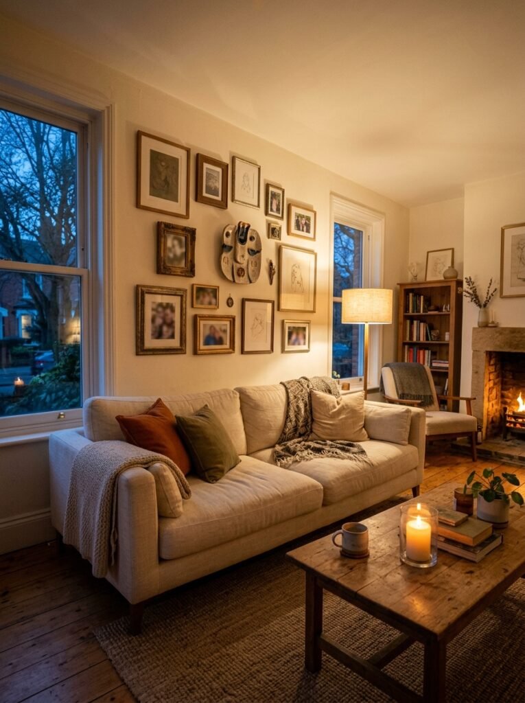
There’s something quietly personal about a living room wall — more than any other surface in the house, it’s the one that actually shows who you are. Not your budget. Not your taste in trends. Just you, the things you’re drawn to, the way you want the room to feel at 9pm with a drink in your hand.
Get that feeling right and the specifics almost take care of themselves.
So what does your living room wall say about you right now — and is that still the thing you want it to say?