
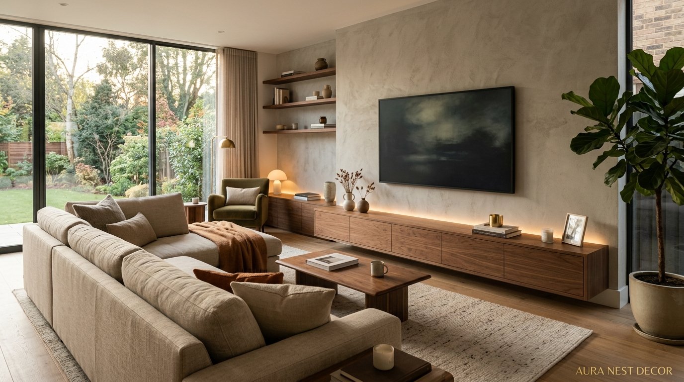
The TV Unit Designs That Interior Designers Are Actually Recommending Right Now (And the Ones They’re Quietly Retiring)
You open Pinterest, you save forty-seven pictures, and somehow your living room still looks like a furniture showroom. Sound familiar? The problem isn’t your taste — it’s that most TV unit advice online is either hopelessly generic or five years out of date. Let’s fix that.
—
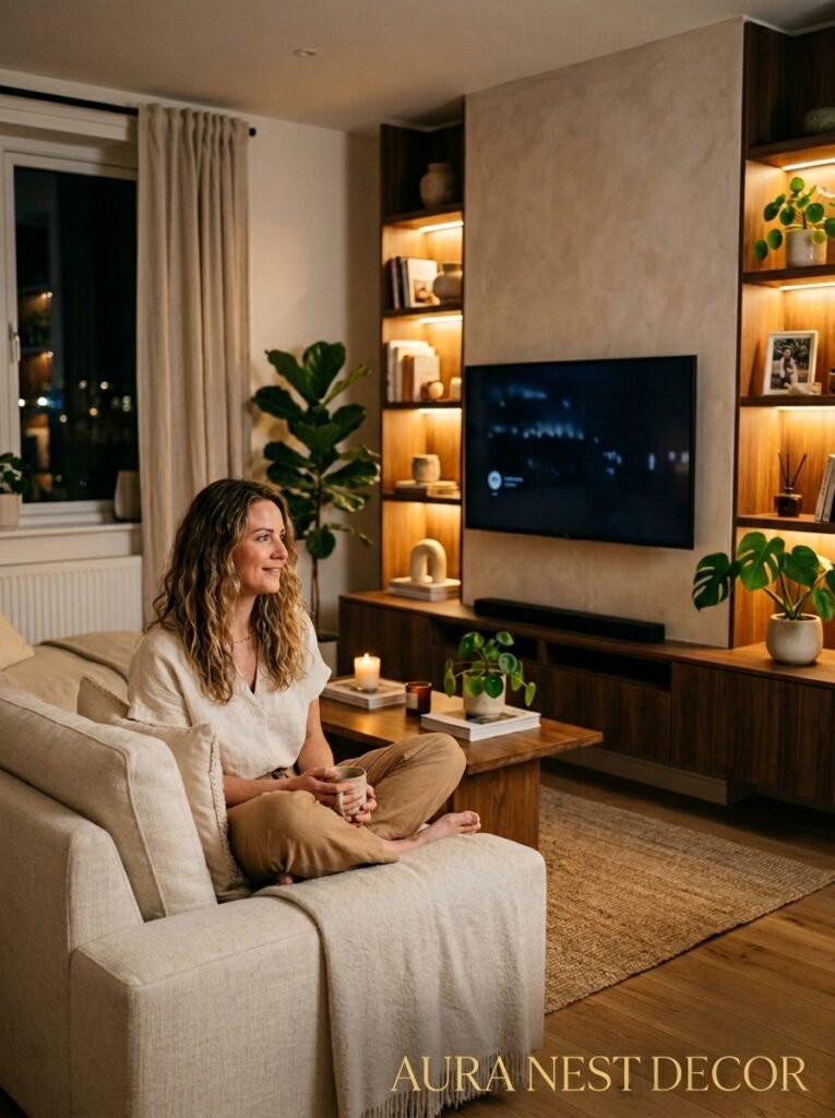
1. Why Your Current TV Unit Might Be Making the Whole Room Feel Off
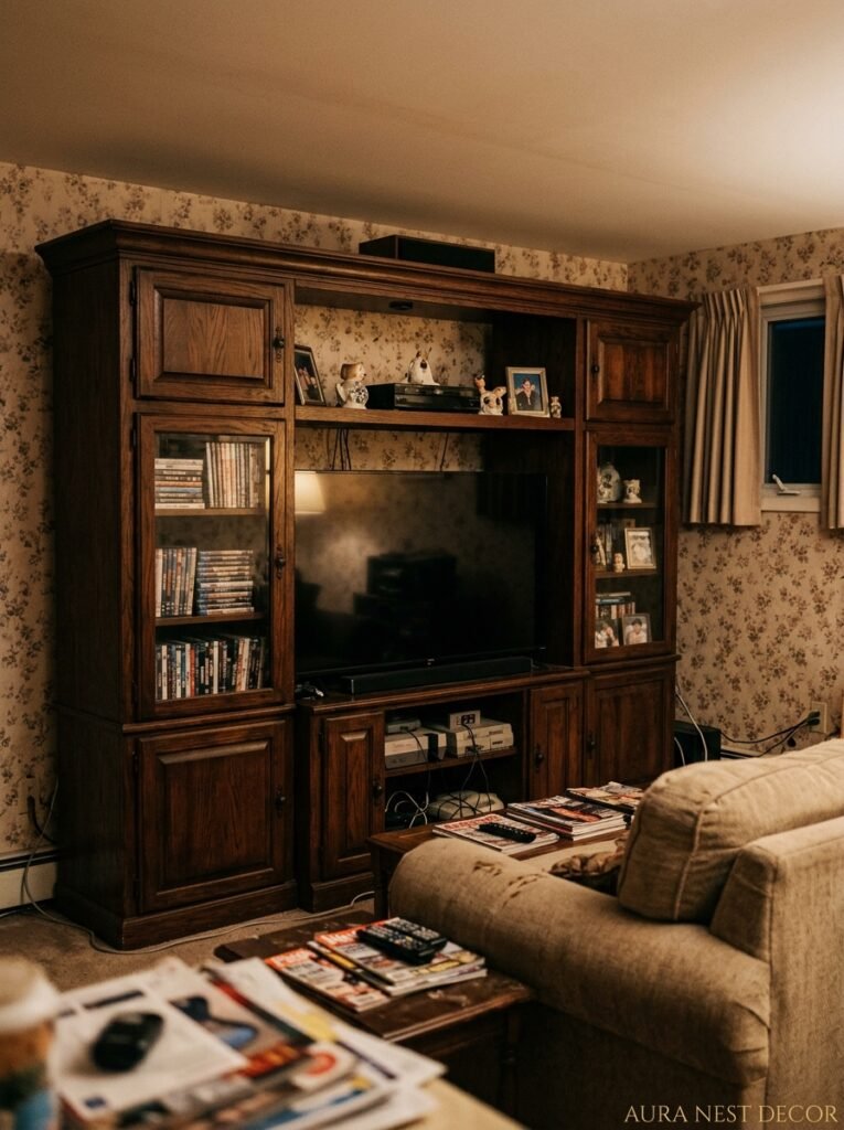
Here’s the thing nobody says out loud: a bad TV unit doesn’t just look boring. It throws the ENTIRE room off balance. And I don’t mean in some vague, hard-to-pin-down way — I mean you’ll walk in, feel like something’s wrong, and spend forty minutes rearranging cushions trying to solve a problem that’s actually sitting right there on your wall.
The TV unit is almost always the visual anchor of a living room. Your eye goes there first, whether you want it to or not. So when it’s clunky, or too tall, or weirdly proportioned, or crammed with stuff that doesn’t belong there — the whole room inherits that feeling. It’s messy before you’ve even scattered a single magazine on the coffee table.
What I’ve noticed, honestly, is that most people shop for a TV unit by thinking about storage first and design second. And I get it — cable chaos is real, and nobody wants their Sky box sitting on display like a little grey brick of shame. But leading with storage needs means you end up with something boxy and defensive-looking. Something that says “I am hiding things” rather than “I was chosen.”
The units that actually work — the ones that make a room feel considered and calm — those are designed with proportion in mind first. Storage is solved quietly, invisibly, within a shape that was already worth looking at.
—
2. The Low-Profile Look That’s Completely Taken Over (And Why It Works)
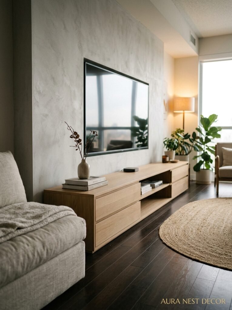
Low-line TV units. I know, I know, they’ve been around for a while. But the version that’s everywhere right now isn’t your early-2010s IKEA Besta situation. It’s different. Warmer. More intentional.
The current obsession is with units that sit somewhere between 12 and 18 inches off the floor — low enough to feel effortlessly calm, high enough that you’re not craning your neck into your lap every time Netflix autoplays the next episode. Paired with a TV mounted at the right height on the wall above, the visual effect is genuinely good. The room breathes. There’s space above and around everything, and that space does a lot of heavy lifting.
What makes this version feel more 2024 than 2013 is the materiality. Walnut veneer with visible grain. Fluted fronts in matte white or sage. Rattan panels that break up the flatness without trying too hard. These aren’t the high-gloss, handle-less, aggressively minimal units that dominated for a decade. They have texture. They have a bit of personality.
And the proportions matter more than you’d think. A low unit that’s too narrow for your room looks like furniture that got lost. It needs to span — not necessarily wall-to-wall, but close enough that it anchors the wall with confidence. Sort of like how a sofa needs to relate to the coffee table in front of it. It’s all about relationship, not just individual pieces.
“A TV unit that’s too small for the wall is just expensive clutter with legs.”
—
3. The Color That Keeps Showing Up in Every Beautiful Living Room Right Now
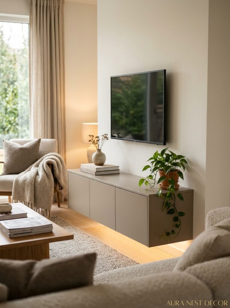
Not grey. Not white. Not the cold navy that felt so fresh about three years ago. It’s warm. Earthy. And it’s showing up in the most specific, unexpected shades — think moss, mushroom, aged terracotta, the kind of olive green that looks different at noon than it does at 8pm.
What’s interesting is that these colors work on TV units in a way they haven’t always worked on other furniture. Because the TV unit is already a dark focal point — screens are black rectangles and there’s not much you can do about that — bringing warm, muted color to the unit itself actually softens the whole setup. The screen stops being the only thing you see. It becomes part of a composition.
I’ve seen this done brilliantly with a matte terracotta lacquered unit, warm brass handles, and a travertine top. And it sounds like a lot on paper, but in person it looks incredibly settled. Like the room decided what it was and committed.
For anyone nervous about color on something this large and permanent-feeling, here’s the move: go for a bespoke or modular unit where the carcass is a neutral (oak, greige, off-white) and just the door fronts carry the color. You get the warmth without the full commitment. It works, I promise.
—
4. Built-In vs. Freestanding — The Real Honest Answer
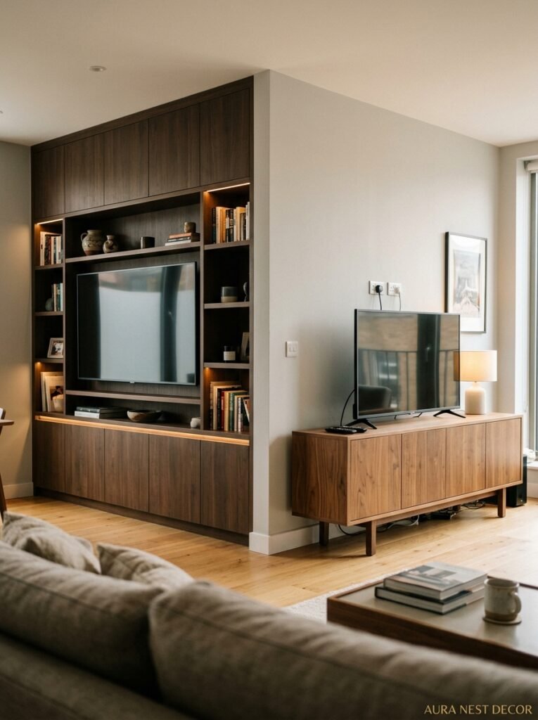
Everyone asks this. And the honest answer is: it depends, but probably built-in if you own your home and plan to stay a while.
Built-in units — running wall-to-wall, with a mix of open shelving and closed cabinetry, maybe flanking a fireplace or running the full width of the chimney breast — those look genuinely architectural. They make a living room look finished in a way that no freestanding unit ever quite achieves. When it’s done well, the whole wall becomes the feature rather than just the TV. That’s a big deal.
The downside is obvious: cost, commitment, and you’re leaving it behind if you move. In the UK especially, where people tend to move house more frequently than Americans, this is a real consideration. Nobody wants to spend two thousand pounds on custom joinery and then hand it to whoever buys the house.
But here’s the thing — built-in doesn’t have to mean bespoke and expensive. IKEA’s Billy and Besta systems, done cleverly with custom fronts from companies like Superfront or Reform, can look surprisingly architectural. You plan the layout, use a combination of heights, add some beading or fluted details, paint it all one color, and suddenly it reads as built-in even though it absolutely isn’t. Huge trend in the UK right now. Catching on in the States too.
Freestanding works brilliantly when you either rent, move often, or genuinely want something that feels like a piece of furniture rather than an installation. The key is choosing something with enough presence to hold the wall. And not shoving it into a corner where it looks apologetic.
“The best built-in units don’t look like cabinetry — they look like the wall decided to become useful.”
—
5. The Floating Unit Thing: Gimmick or Actually Genius?
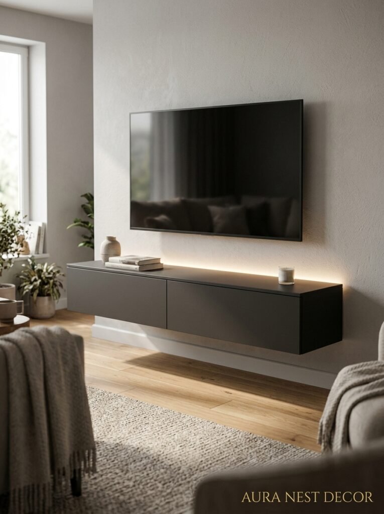
Floating TV units — the kind that are wall-mounted and appear to hover above the floor — have been a thing for years. And they still divide people pretty cleanly into two camps. Either you love the clean, space-making effect or you think they look a bit corporate. Like something from a hotel room in 2009.
Here’s where I’ve landed on it: floating units are brilliant in smaller rooms and genuinely transformative — sorry, wait, I said I wouldn’t use that word. They make a big difference in smaller rooms. The floor running under and behind the unit makes the room feel wider and longer, which matters enormously in a standard UK terrace living room or a smaller American apartment. It’s not a trick exactly, it’s just optics working in your favor.
The issue is when people mount them too high. I cannot stress this enough. Too high and the whole thing looks like a floating shelf that lost the plot. The sweet spot is 16-24 inches from the floor, depending on your sofa height and where you sit. Sit on your actual sofa, measure where your eyes rest naturally, and work backward from there. Don’t just guess.
Material-wise, the floating units that look best right now are either solid oak with visible grain, or matte lacquered in a deep color — forest green, charcoal, a dusty plum if you’re feeling brave. The ones that look worst are the high-gloss black or white ones that were everywhere circa 2015. They show fingerprints, they look cold, and they date fast.
—
6. What to Put ON the TV Unit (The Edit That Most People Get Wrong)
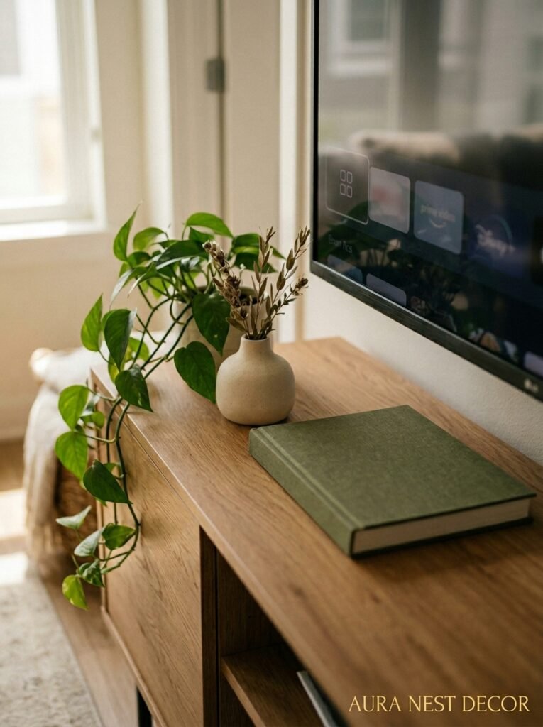
The styling is where people go wrong more than anywhere else. It’s easy to style badly because instinct says: fill it up. You’ve got all those surfaces, all those shelves, and the impulse to populate them is strong.
Don’t.
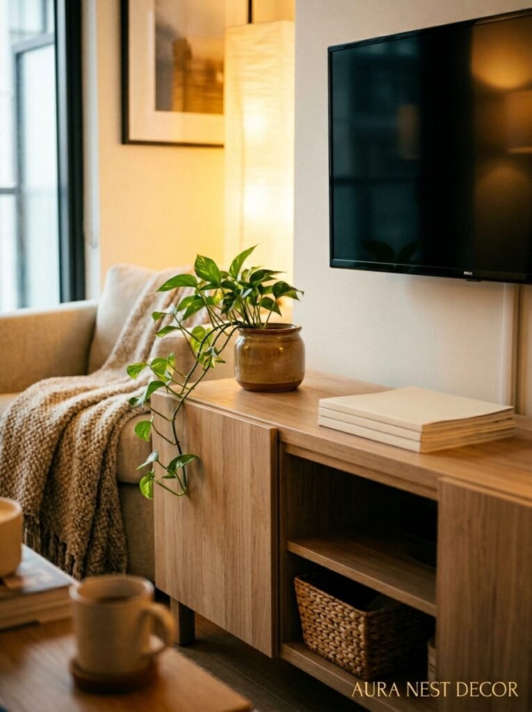
The units that look best on Pinterest — the ones you save at midnight and think about for days — they’re all edited to within an inch of their life. A few books stacked horizontally, not a full row standing upright. One or two objects with actual visual weight: a sculptural vase, a small piece of art leaning against the wall, a ceramic bowl. A plant, but a specific one — a trailing pothos or a compact olive tree in a terracotta pot, not a sad fake ficus in a wicker basket.
The other thing: try to keep the stuff on top of the unit related in height. Mixing a tall vase with a tiny candle holder creates visual noise. You want the eye to move across the surface comfortably, not ping around trying to find a resting place.
And cable management — I know it’s boring but it has to be said — ruins everything if you ignore it. One cable dangling from a wall-mounted TV undoes hours of careful styling. Cable raceways painted to match the wall, in-wall cable kits, or a unit with integrated cable management built into the back panel. Sort it out. You’ll thank yourself.
—
7. The One Design Rule That Makes Small Living Rooms Look Intentional
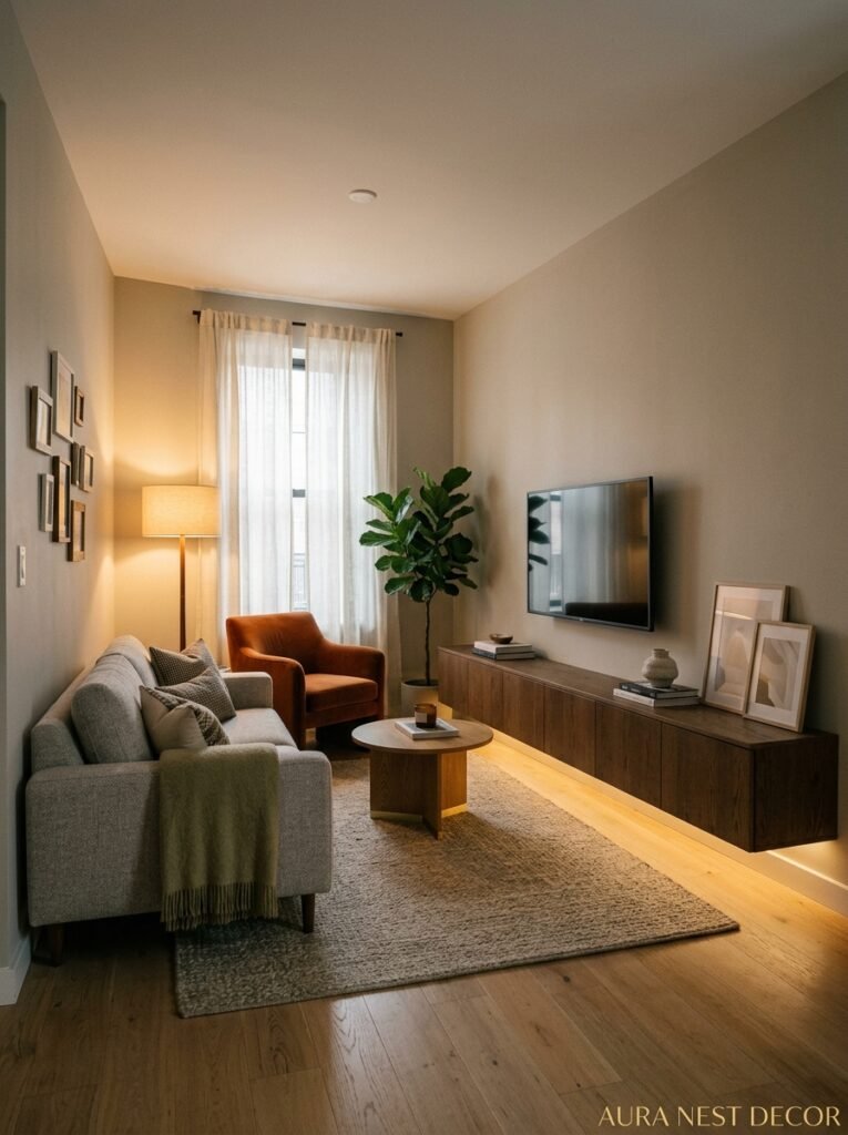
Keep the TV unit low AND light in color. That’s it. That’s the rule.
In a smaller room — a standard UK sitting room, a New York apartment, a cozy American ranch house with a modest lounge — you don’t want the TV unit to compete with the ceiling for attention. Heavy, dark, tall units in small rooms feel like furniture that arrived from somewhere else and never quite settled. They crowd the space visually even when they’re not physically taking up much of it.
A pale oak low-line unit, or a white-painted built-in that blends with the wall, does the opposite. It sits quietly. The room feels less interrupted. And because the unit isn’t fighting for attention, everything else — your rug, your sofa, your lighting — gets to land more clearly.
Side note: this also means being careful with the AMOUNT of stuff you put on the shelves in a small room. In a big open-plan space, full shelves read as cozy. In a small room, full shelves read as cluttered. Open shelves should be maybe 50-60% full at most. Leave breathing room.
“In a small room, the best TV unit is the one you almost don’t notice.”
—
8. The Surprising Comeback Material You’re About to See Everywhere
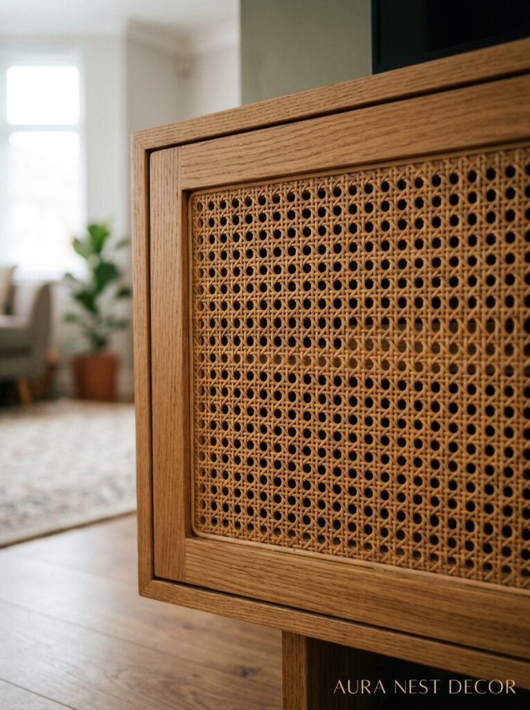
Cane. Or rattan. Or wicker — depending on who you ask and how specific they’re being about the weave pattern, which, honestly, I’m not going to get into.
The point is: woven natural material on furniture fronts is absolutely everywhere right now, and it doesn’t look bohemian anymore. It looks considered. It looks expensive, done right. The key is how it’s framed — woven panels inset into a clean-lined, matte-finished carcass in white, black, or a warm neutral look genuinely sophisticated. The natural texture against the smooth painted or lacquered frame is what makes it work.
For a TV unit specifically, rattan-front doors on the closed sections are GREAT because they hide the chaos (streaming sticks, game controllers, the pile of remote controls you can never throw away) while still letting a bit of visual warmth through. It’s practical in a way that also happens to look good in photographs, which, on Pinterest, matters.
This material works in both American and British homes because it doesn’t require a particular architectural style to make sense. It’s worked in a Victorian terrace in Bristol. In a mid-century bungalow in California. In a brand new build in Nashville. It’s genuinely flexible in a way that, say, a very specific handmade ceramic handle isn’t.
—
9. When to Let the TV Wall Become the Feature (Instead of Fighting It)
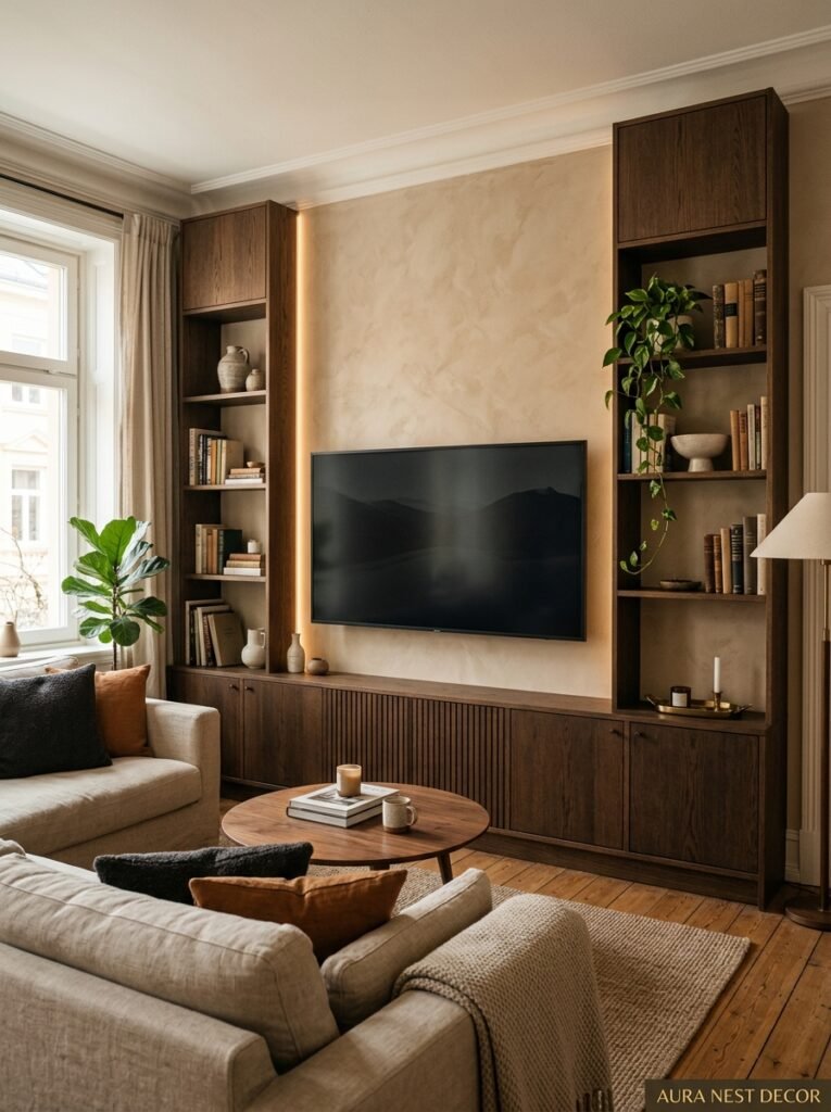
Most people treat the TV wall as a problem to be minimized. Black rectangle, ugly cables, general eyesore — you deal with it, you hide it as best you can, you put some nice things around it and hope nobody looks too closely.
But there’s another approach and I find it genuinely more interesting: lean into it. Make the TV wall the actual statement in the room.
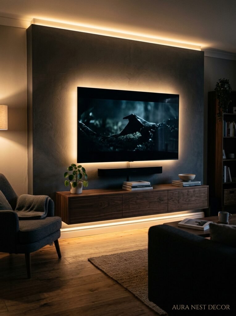
This can mean a lot of things. A dramatic fluted plaster panel behind the unit that runs floor to ceiling, painted in a moody deep tone. A full gallery wall that the TV lives within, treating the screen as just another framed element. A built-in alcove with dramatic backlighting — warm amber LED strip behind the unit casting a soft glow — so the wall itself has a presence at night that’s almost cinematic.
The thing about committing to the TV wall as a feature is that it removes the apologetic quality that most TV setups have. You stop trying to hide the fact that there’s a TV there. Everyone knows there’s a TV there. Own it, style it, make it beautiful.
—
10. The Handle (or No Handle) Decision That’s More Important Than You Think
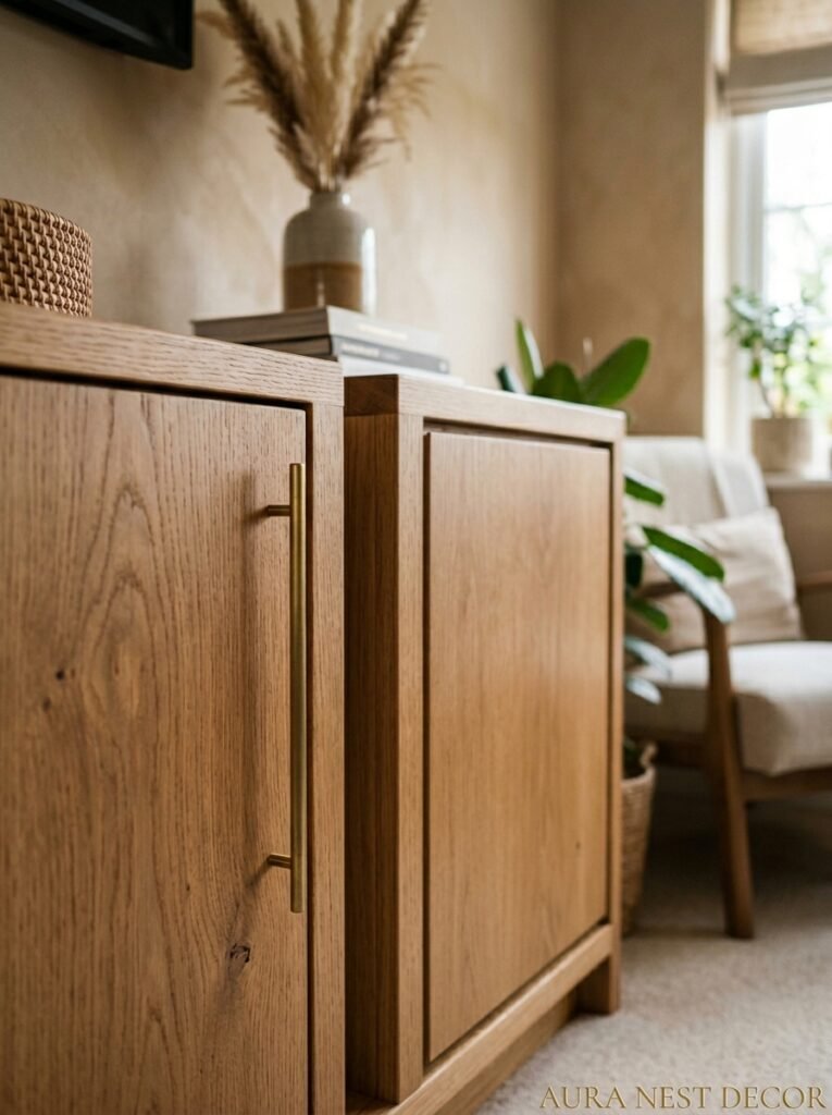
Handleless. Handle. Knob. Recessed grip. This decision changes the whole personality of the unit and people don’t spend nearly enough time thinking about it.
Handleless units — where the drawer or door has a small J-pull profile or push-to-open mechanism — look clean and intentional. They work well in more modern, minimal spaces. But in a cozy, layered living room with a lot of texture and warm tones, handleless can feel a little cold. Like the furniture is holding its breath.
Handles and knobs warm everything up. Brass is the dominant choice right now and honestly it’s dominant for a reason — it photographs beautifully, ages in an interesting way, and pairs with almost every warm wood and painted finish. But I’ve also seen ceramic knobs in a creamy white that looked genuinely lovely on a sage unit. And matte black handles on a light oak carcass that was very satisfying.
The mistake people make is buying the cheapest handles they can find, because they feel like a small detail. They’re not. They’re one of the things your hand touches every single day, and they’re one of the first things a visitor’s eye lands on. Spend the extra money. Get the weight right.
—
11. Lighting Around the TV Unit: The Detail That Separates Good Rooms from Great Ones
This section might be the most important one in the whole article. I mean that.
LED strip lighting tucked behind a floating unit or running along the back of open shelves does something to a room at night that’s almost impossible to fully explain until you see it in person. It separates the unit from the wall slightly, creates depth, and makes the whole setup look like something from an architectural magazine. And it costs about thirty dollars or twenty pounds in parts plus an hour of effort.
Warm white is the only temperature that works for this. Anything cool or neutral looks clinical and slightly depressing at 9pm. You want it to feel like candlelight that’s been automated. The amber glow of a strip set to roughly 2700-3000K at around 7pm on a grey October evening — that’s the look. That’s the vibe entire Pinterest boards are built around.
Beyond the backlighting, think about accent lighting on the shelves themselves. A small puck light inside a closed cabinet with glass fronts, or a directional LED spot angled at an object on a shelf — these little moments of deliberate light make the room feel lived-in and considered in the best possible way. You’re not just lighting the room. You’re lighting the room’s best features.
—
12. The TV Unit Budget Breakdown Nobody Talks About Honestly
Let’s be real for a second. Because the gap between “this looks achievable” and “this costs how much” is genuinely frustrating and most design content pretends it doesn’t exist.
Here’s a rough, honest breakdown based on what things actually cost right now in both countries.
Budget end (under £500 / under $600): IKEA Besta system, customized with aftermarket fronts and decent handles. Done thoughtfully, it can look genuinely good. Not amazing, but good. Don’t underestimate it.
Mid-range (£500-£1,500 / $600-$2,000): this is where things get interesting. You can get a genuinely well-made solid wood unit from smaller UK or US furniture makers, or a semi-custom built-in from a local joiner if you’re keeping the spec simple. This is the sweet spot for most homeowners who want quality without bespoke pricing.
High end (£1,500+ / $2,000+): full bespoke joinery, custom paint finish, integrated cable management, soft-close everything. Worth it if you’re planning to stay in the house long-term and you want the unit to feel architecturally integral. Not worth it if you’re going to move in three years.
The one place not to save money, regardless of your budget: the finish. A cheap unit with a properly done paint finish and good hardware looks better than an expensive unit with a budget finish. Invest in the surface.
—
❓ FAQ
Q: What height should a TV unit be for comfortable viewing? A: The center of your TV screen should sit roughly at eye level when you’re seated — which for most sofas works out to around 42-48 inches from the floor. A low TV unit combined with a TV mounted on the wall above it usually hits this range naturally, but measure from your sofa before you commit to anything.
Q: Is it better to have open or closed storage on a TV unit? A: Honestly, a mix works best for most people. Closed storage for the stuff you don’t want to look at (cables, remotes, gaming gear), open shelving for the things that are actually worth displaying. All-open looks great when it’s perfectly styled and feels chaotic the rest of the time. All-closed can look very storage-heavy. Split the difference.
Q: Can a TV unit work in a small living room without making it feel cramped? A: Yes, absolutely — the key is keeping it low, choosing a lighter color or natural wood finish, and not overstyling the surfaces. A wall-mounted floating unit in a small room is often the best call because it keeps floor space visually open, which makes the whole room feel bigger than it is.
—
💭 Final Thoughts
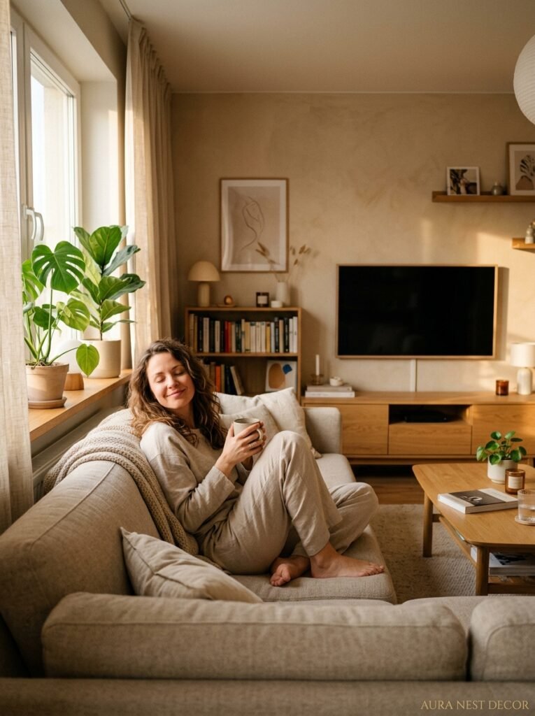
The perfect TV unit isn’t the most expensive one, or the trendiest one, or even the most Pinterest-worthy one — it’s the one that makes your specific room feel like it was always meant to look this way. That thing where you walk in and nothing jars, nothing pulls at you, and you just… relax. That’s the goal. Always has been.
So — what’s the one change to your current TV setup that you’ve been putting off making?




