
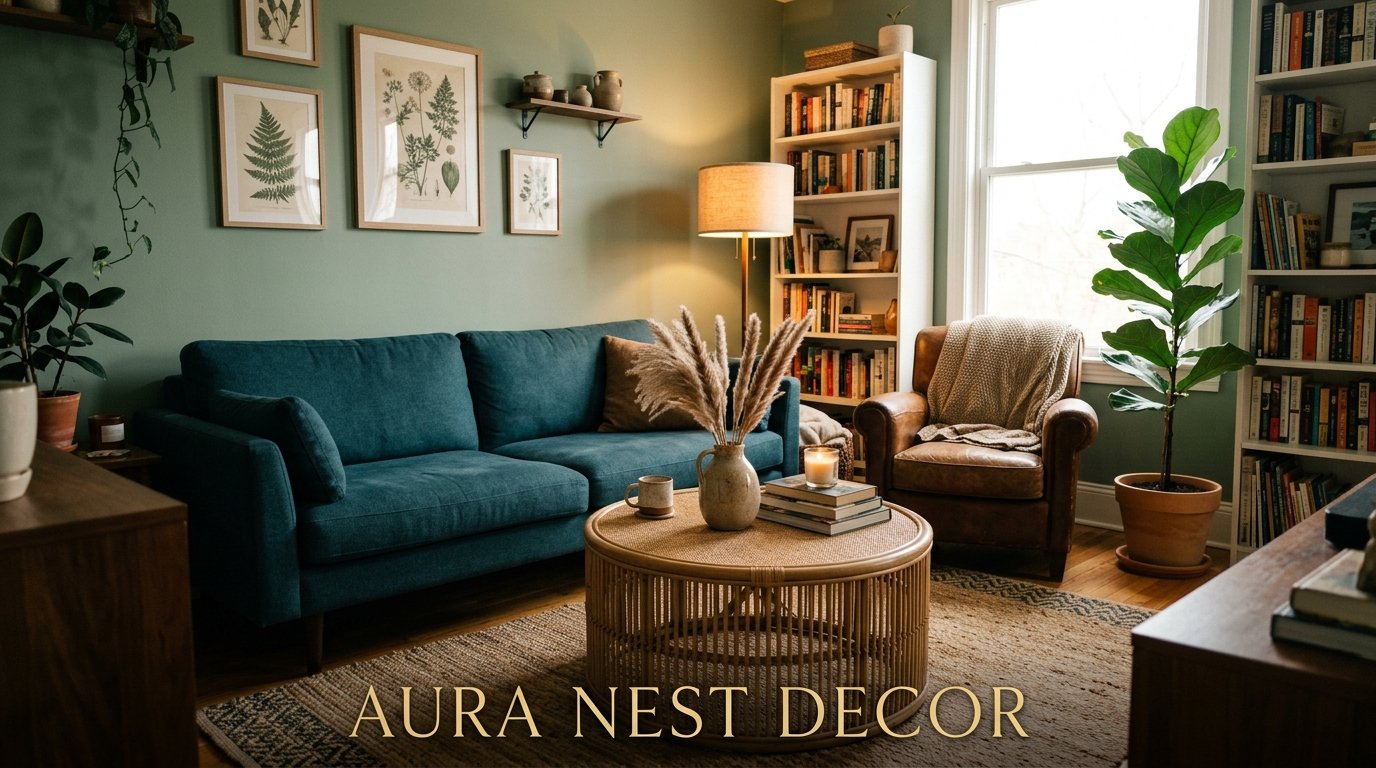
Why Blue and Green Living Rooms Are Having a Major Moment (And How to Actually Pull It Off)
My friend called me last month, mildly panicked. She’d just painted her living room walls a deep teal and her husband was convinced it looked like a dentist’s office. She wanted permission to fix it. I told her: don’t touch a thing. Add the right pieces and it’ll look incredible. She didn’t believe me. She does now.
—
1. The Color Combination Everyone’s Suddenly Talking About (And Why It Took This Long)
Blue and green together used to feel risky. Like, genuinely risky. Interior designers for decades pushed the idea that they clashed — two cool tones fighting for dominance, neither winning. But here’s the thing: that was always wrong, and the rooms flooding Pinterest right now are proving it.
What changed isn’t the colors. It’s our confidence with them.
We’ve collectively gotten braver about interiors. Beige had its run, grey had its decade, and now people are finally asking what they ACTUALLY love. And a lot of them love the feeling of being near water, near trees, near that specific kind of light you get on a clear morning in early autumn. Blue and green together do that. They bring the outside in without trying too hard.
The rooms that are working right now aren’t the ones doing a 50/50 split like a children’s book cover. They’re the ones where blue and green have a relationship — one leads, one follows, and they meet somewhere in the middle in a way that feels completely natural.
—
2. The Version That Actually Belongs in Living Rooms (Not Bedrooms)
Here’s where I’ll push back on half the inspiration boards I’ve seen: not every blue-green combo works in a living room specifically.
Pale duck egg blue with sage green? That belongs in a bathroom or a bedroom. It’s gentle in the wrong way. Too quiet. A living room needs presence.
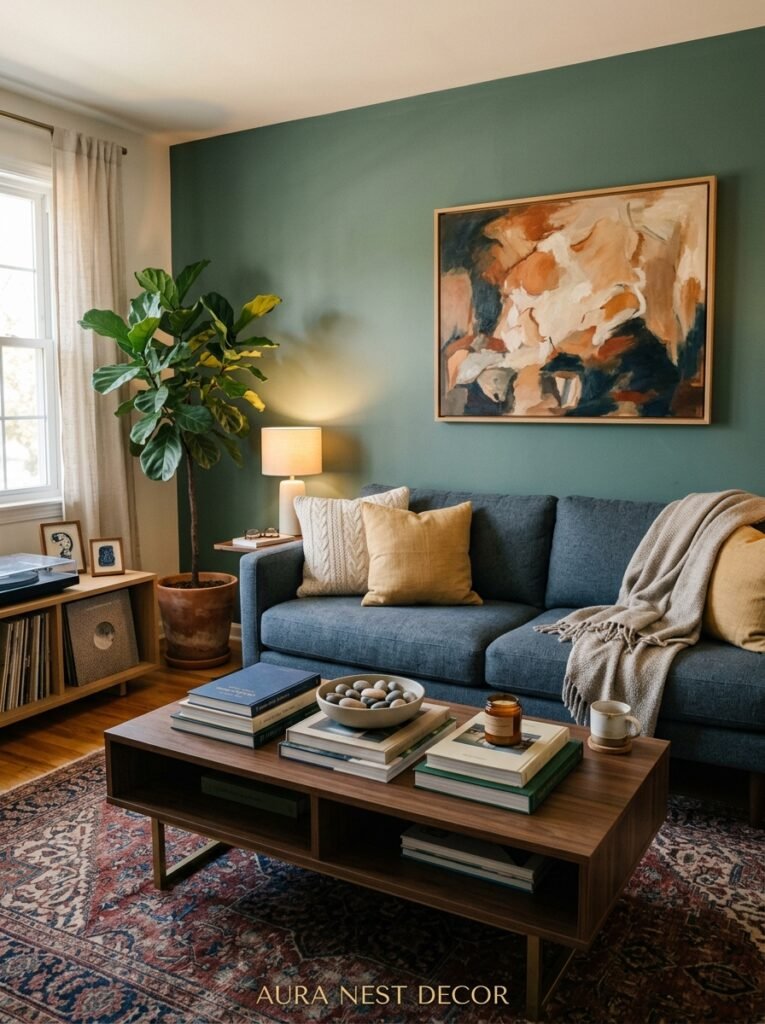
What you want instead is something with weight. Navy with forest green. Cobalt blue with deep olive. Slate blue with a mossy, slightly grey-toned green. These combinations have enough depth to anchor furniture, hold artwork, and still feel alive at 9pm under low lighting. Because the light test MATTERS. A living room sees morning sun, afternoon shadows, and evening lamplight all in one day. Whatever you choose has to survive all three, and pale dusty combinations often just… wash out.
“Whatever you choose has to survive morning sun, afternoon shadows, and evening lamplight — pale combinations often just wash out.”
The sweet spot for most living rooms is one deep anchor color — usually the blue — and a slightly lighter, earthier green to balance it. That contrast is what creates depth instead of flatness.
—
3. The Ratio That Changes Everything (And Nobody Talks About It Enough)
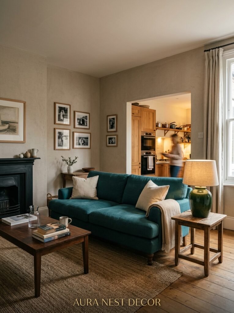
Okay so here’s the thing that nobody is saying clearly enough: it’s not just WHICH colors, it’s HOW MUCH of each one.
The 60-30-10 rule gets thrown around a lot in design circles, but I prefer thinking about it differently. Start with a dominant color — let’s say blue — and use it for your biggest surface. Wall, sofa, or both. Then bring in green at a secondary level: throw pillows, a chair, curtains, a rug with green tones. Everything else — your wood tones, your metals, your neutrals — acts as breathing room.
What kills most blue-green rooms is equal amounts of both. When they’re perfectly balanced, neither reads as intentional. It looks like you couldn’t decide, not like you designed something. Give one color the lead.
Side note — if you’re working with a rented space or you’re genuinely not ready to commit to bold walls, the ratio rule still applies. Just apply it to your soft furnishings instead. A navy sofa with green cushions and a sage throw is still a blue-green living room. The walls don’t have to do the work.
—
4. The Specific Shade of Green That Keeps Appearing in Every Beautiful Room
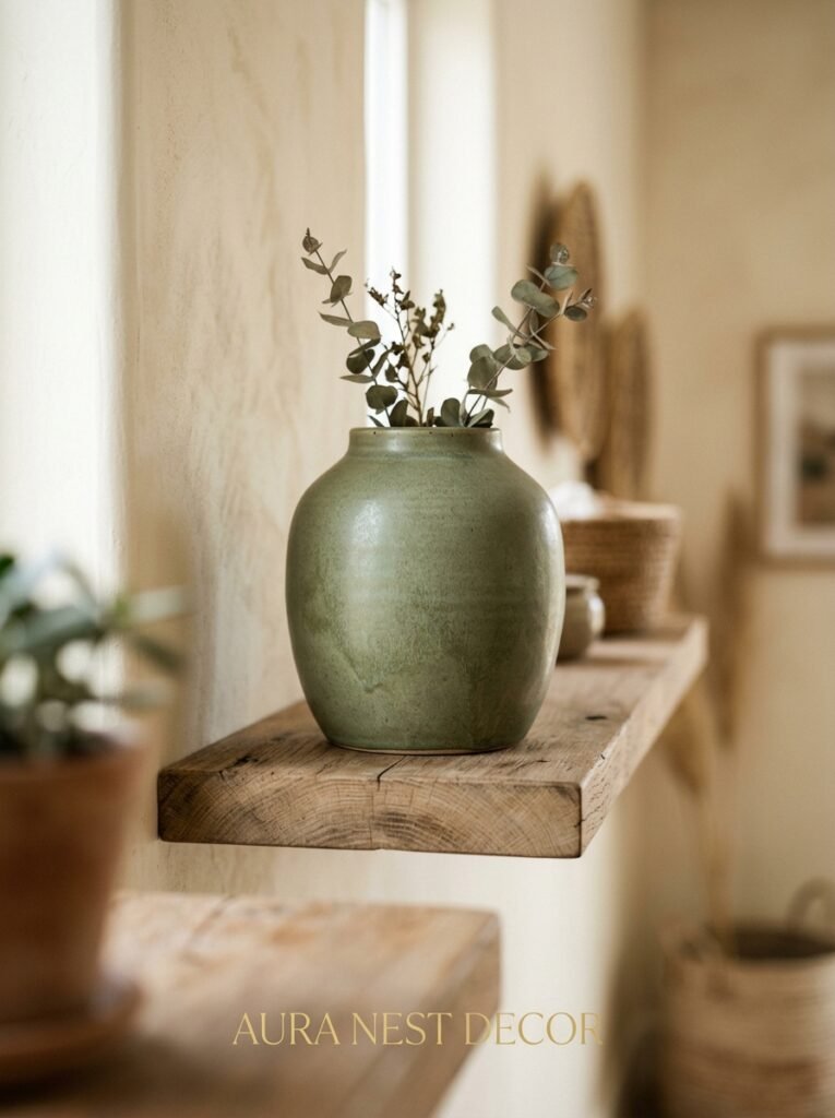
I’ve been keeping a mental note of the green shades that show up in living rooms that stop me scrolling, and it’s almost always the same category: greens with a yellow or brown base, not a blue base.
Emerald is gorgeous but it’s cool. It fights with blue rather than harmonizing. But olive green, sage with warm undertones, cypress, fern — these all have enough warmth in them to stop a blue-heavy room from feeling cold.
There’s a specific shade I’d describe as “late summer hedge” — not quite olive, not quite moss, kind of the colour of something that used to be brighter. That green, next to a warm navy? Genuinely stunning. Add natural wood and you’ve got a room that looks expensive without actually being expensive, which is sort of the goal, isn’t it.
I’ve seen this exact combination work in a tiny terraced house in Bristol and a huge open-plan apartment in Chicago and honestly it scaled perfectly both times.
—
5. What to Put On the Walls When You’re Not Ready for Bold Paint
Some people need to see it before they believe it. Fair enough.
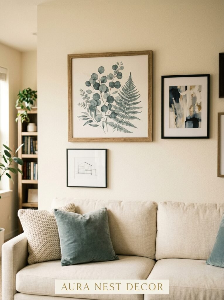
Wallpaper is the lower-commitment version of this whole look, and it happens to be EVERYWHERE right now. Botanical prints — big leaves, trailing vines, abstract watercolor florals — are doing a lot of heavy lifting on blue-green aesthetics without requiring you to repaint a single surface. One accent wall with a dark navy-and-green botanical pattern can set the entire color direction for a room. Your cushions, your throws, your artwork — suddenly they all have something to respond to.
If wallpaper feels like too much of a commitment (it’s not, it really isn’t, but anyway), consider art. A single large canvas with deep ocean blues bleeding into forest green tones will shift the whole mood of a neutral room. Seriously, one large piece can do what repainting a room does, if it’s the right scale. Don’t go small here. Small art in a living room is the number one way to make the room look unfinished.
—
6. The Sofa Decision That Determines Everything Else
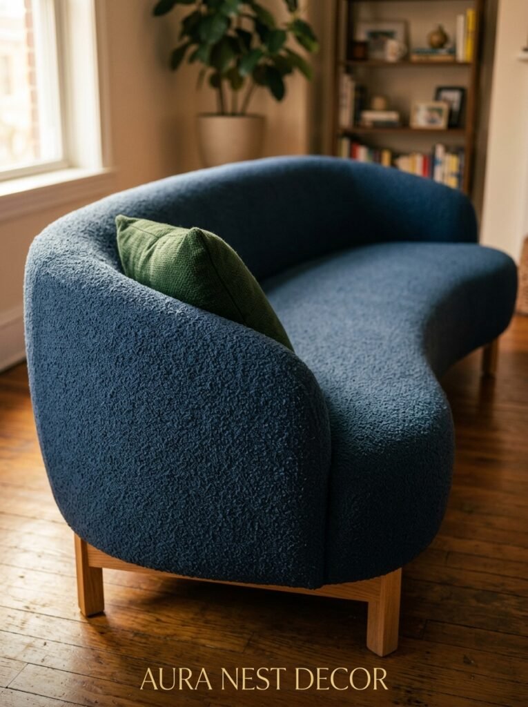
I’m going to be direct about this. Your sofa choice will make or break the entire concept.
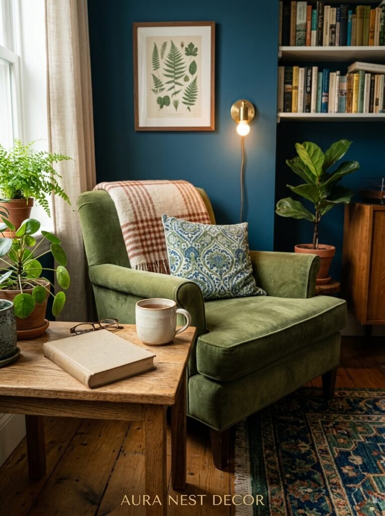
In a blue-green living room, sofas generally fall into two camps. First: you lean into the palette and get a sofa in one of your key colors. Navy velvet is the obvious classic and it earns that reputation — it photographs beautifully, it ages well, and it makes a room look like it was designed on purpose. A deep teal or petrol blue sofa does the same.
The second camp: you go neutral with the sofa and let everything else carry the color. Warm oatmeal linen, aged leather in a tan or cognac tone, even a warm off-white boucle. This works well if your walls are already doing a lot, or if you want the flexibility to change the accent direction without replacing major furniture.
What doesn’t work? A cool grey sofa. I know it feels safe. It isn’t. Cool grey pulls the warmth right out of a blue-green room and makes the whole thing feel clinical. Same goes for pure white in most spaces — it reads too stark against deep jewel tones.
“A cool grey sofa feels safe. It isn’t. It pulls the warmth right out of a blue-green room.”
Warm neutrals only. Trust the process.
—
7. Natural Materials Are Doing More Work Here Than You Think
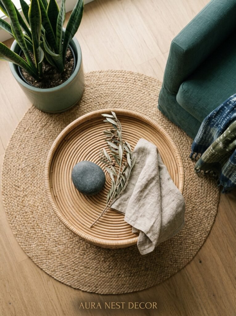
This is the part that separates a Pinterest-worthy blue-green room from a room that just has blue and green in it.
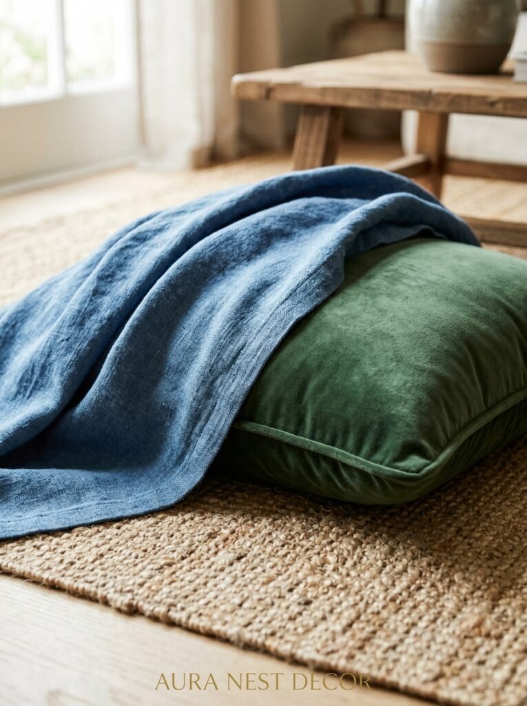
Natural materials are the antidote to the “chilly” problem. Rattan, wicker, jute rugs, raw linen, unfinished wood — these textures add warmth that no throw pillow can fully replicate. And in a room anchored by cool colors, you genuinely need that counterbalance.
A weathered oak coffee table in a navy room isn’t just decorative. It’s functional in a color sense. It’s telling your eye: this is a warm space. You can relax. Same thing with a chunky jute rug under a velvet sofa. The contrast in texture does something interesting — it makes the colors feel richer, not flatter.
This is also why indoor plants are borderline essential in a blue-green living room. Not because they add more green (you’ve already got green), but because they add a specific KIND of green that can’t be replicated in paint or fabric — an organic, imperfect, living green. A large fiddle leaf fig in the corner. A trailing pothos on a high shelf. They connect the whole room to something real.
—
8. The Lighting Rule That Changes Blue and Green After Dark
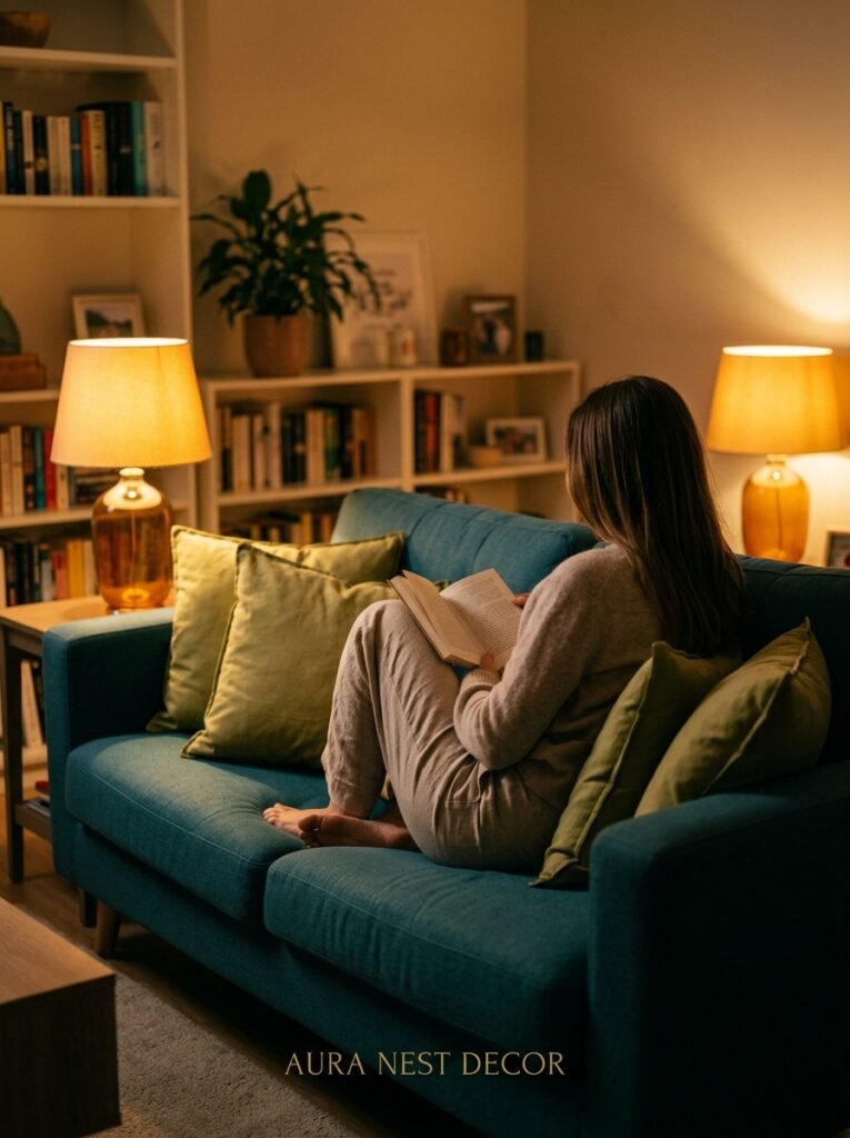
Evening light is the enemy of poorly planned color schemes.
Blue and green living rooms can turn cold and slightly sad looking under the wrong artificial light. Cool white bulbs are the main culprit. If you’ve got a blue-green room and it feels off at night, I’d bet everything on the lighting being the issue before I’d question the paint.
What you want: warm white bulbs, ideally around 2700K. That amber cast they throw brings out the warmth in blue-green tones rather than draining it. The difference is dramatic — same room, same furniture, completely different feeling.
Lamplight over overhead lighting, always. If your main source is a central ceiling fixture, you’re starting at a disadvantage. Add floor lamps, table lamps, wall sconces if you can. The lower the light source, the cosier the room feels, and cosiness is EXACTLY what a blue-green living room should offer.
—
9. Metals and Accents: The One That Actually Works and the One That Doesn’t
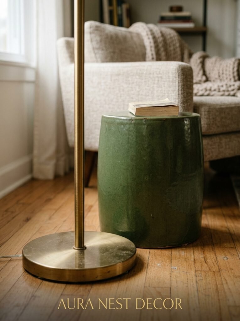
Brass. That’s the answer. Warm, slightly unlacquered, honey-toned brass.
I know gold and brass have been popular for a while and some people are feeling done with it. I understand the fatigue. But in a blue-green room specifically, warm brass doesn’t just work — it’s kind of the only metal that fully does the job. It bridges the cool tones of the blue and the organic quality of the green in a way that chrome, nickel, and even matte black don’t.
Matte black can work but it tends to make rooms feel heavier. Sometimes that’s what you want, especially if you’re going for a moody, dramatic reading-room aesthetic. But for a room that’s meant to feel alive and warm and slightly outdoorsy, brass is it.
One brass floor lamp, some cabinet hardware, a few picture frames — you don’t need much. Accents don’t have to shout.
—
10. The Small Room Version That Actually Looks Bigger
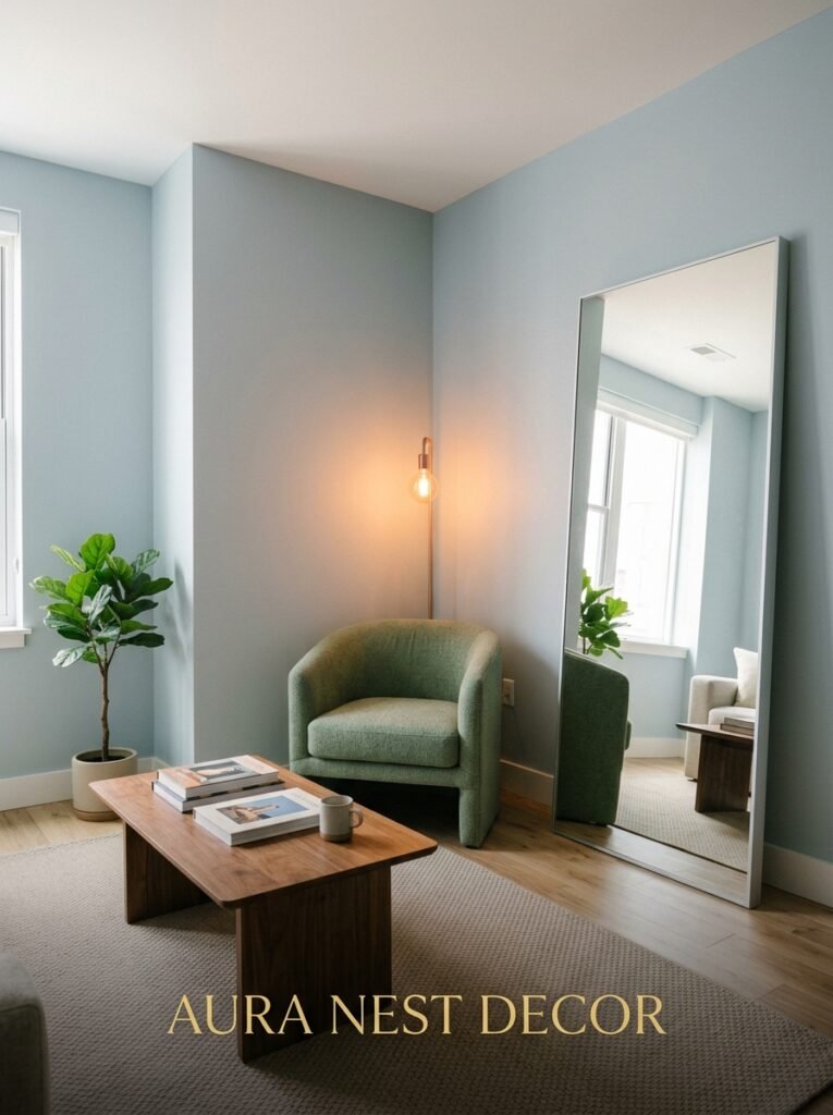
Here’s the rule I give people with smaller living rooms who are nervous about going dark: use your deepest, most saturated color on ALL the walls. Ceiling included if you’re brave.
I know it sounds counterintuitive. It’s not. When a small room has one color wrapping all its surfaces, the eye can’t easily read where the walls end and the ceiling begins. The boundaries blur. The room doesn’t expand exactly, but it stops feeling like a box.
A small sitting room in a deep teal with a warm linen sofa, a brass floor lamp, and a couple of trailing plants can feel genuinely cosy rather than cramped. Dark colors don’t shrink rooms — contrast shrinks rooms. Remove the contrast between walls and ceiling and the whole space breathes differently.
This is more common in British interiors, to be fair — UK homeowners tend to be slightly less afraid of dark paint than their American counterparts — but the principle works everywhere.
—
11. Pattern Mixing Without It Becoming a Disaster
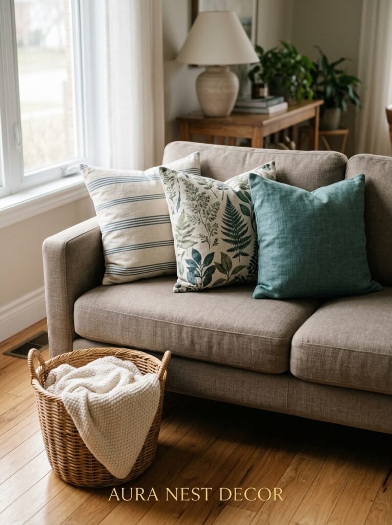
Mixing patterns in a blue-green room is one of the things I see go wrong most often, so let’s talk about it.
The safest approach: vary the SCALE of your patterns, not necessarily the style. A large-scale botanical print on curtains works with a smaller geometric on cushions because the eye processes them at different distances. They don’t compete.
What creates chaos is competing scales in the same visual field — two medium-size patterns side by side. That’s where it starts to feel busy rather than layered.
Stick to one pattern that carries the blue-green palette as its main colors, then pull in solids in those same tones for everything else. A single patterned element can carry a lot of visual interest. You don’t need to stack patterns three deep to make a room feel rich.
“A single patterned element can carry a lot of visual interest. You don’t need to stack patterns three deep to make a room feel rich.”
Also — and this is a separate point but related — stripes are underrated in this palette. A thin nautical stripe in navy and cream on a cushion or chair adds movement without looking chaotic, and it plays well with the natural, slightly coastal feeling that blue-green rooms tend to have.
—
12. The One Mistake That Keeps Blue-Green Rooms From Looking Like the Inspiration Photos
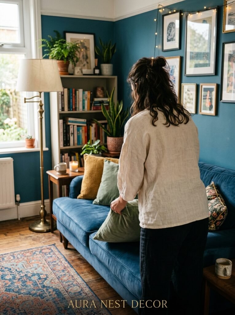
You’ve got the colors right. The sofa’s great. The plant’s there. And somehow it’s still not clicking. What is it?
Usually, it’s the lack of contrast. Specifically: not enough warm, light contrast.
Blue and green are both mid-to-dark in their richest forms, and a room full of jewel tones with no lightness anywhere starts to feel heavy rather than dramatic. A cream linen cushion. A natural wood shelf against a dark wall. A pale ceramic vase catching the afternoon light. White or off-white window trim against deep green walls.
These aren’t compromises. They’re the moments that make the room. The small patches of light that make the dark shades look MORE saturated, not less. Without them, you’re essentially fighting the room’s own richness.
This is the bit people skip because they’re worried about disrupting the palette. But the palette needs it. The contrast IS the design.
—
❓ FAQ
Q: Can you mix blue and green in a small living room without it feeling overwhelming? A: Absolutely — in fact, a small room with one deep, consistent color can feel more intentional than a small room in safe neutrals. The key is keeping your furniture and textiles lighter and warmer so the dark walls don’t pull everything down with them. Oatmeal, natural linen, warm wood tones — these balance the depth really well.
Q: What neutral colors work best alongside a blue and green palette? A: Warm ones, always. Cream, oatmeal, camel, cognac, warm sand. Avoid cool greys and pure whites — they fight with jewel tones rather than softening them. Natural wood is also technically neutral in the context of a color scheme and it’s one of the best additions you can make to a blue-green room.
Q: Does blue and green work in a north-facing living room that doesn’t get much light? A: It can, but you’ll want to be careful. North-facing rooms tend to read cooler, so I’d lean toward greens with warm undertones (olive, sage, fern) rather than going heavily into blue-dominant territory. Lots of warm artificial lighting matters even more here. And if you want the full deep jewel tones, make sure your lighting is doing serious compensatory work — warm bulbs, layered sources, nothing fluorescent.
—
💭 Final Thoughts
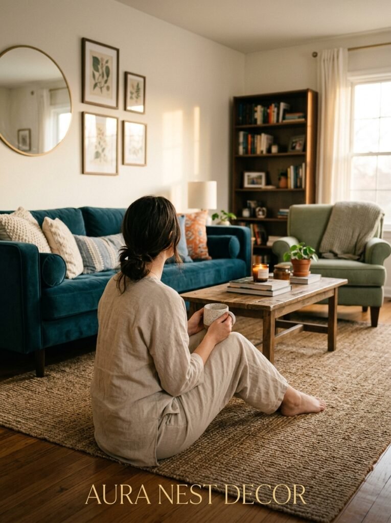
There’s something about a blue-green room that feels genuinely lived in, in the best way. Like it didn’t try too hard. Like the person who put it together just knew what they loved and leaned into it.
It’s not a trend that’ll be embarrassing in five years. These are nature’s own colors — they’ve been working together longer than interior design existed as a concept. And when you get the balance right, the light right, the textures right, there’s nothing quite like walking into that room at the end of a day.
So: would you go bold with a full navy wall, or ease in with a velvet sofa first?




