
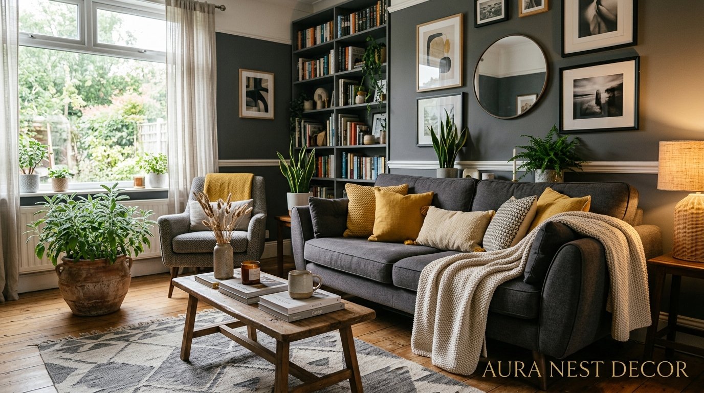
Why Grey and Yellow Living Rooms Are Having a Serious Moment (And How to Not Get It Wrong)
You’ve seen it on Pinterest. That perfect living room with the slate-grey sofa, the mustard throw, and somehow it all just works. You close the app and look at your own space and think — okay, I could do that. But where do you actually start?
Here’s the thing. Grey and yellow is one of those combinations that looks effortless when it’s done right and painfully off when it’s not. The difference usually comes down to a few small decisions most people don’t know about.
—
1. The Grey That Actually Makes Yellow Sing (It’s Not the One You’re Thinking)
Most people reach for a mid-tone grey. Neutral, safe, versatile. And that’s exactly why so many grey and yellow rooms end up looking a bit flat, a bit “showroom”, a bit nothing.
The grey that actually works? It’s either very warm or very cool. Committed. You want a grey that has an opinion about itself.
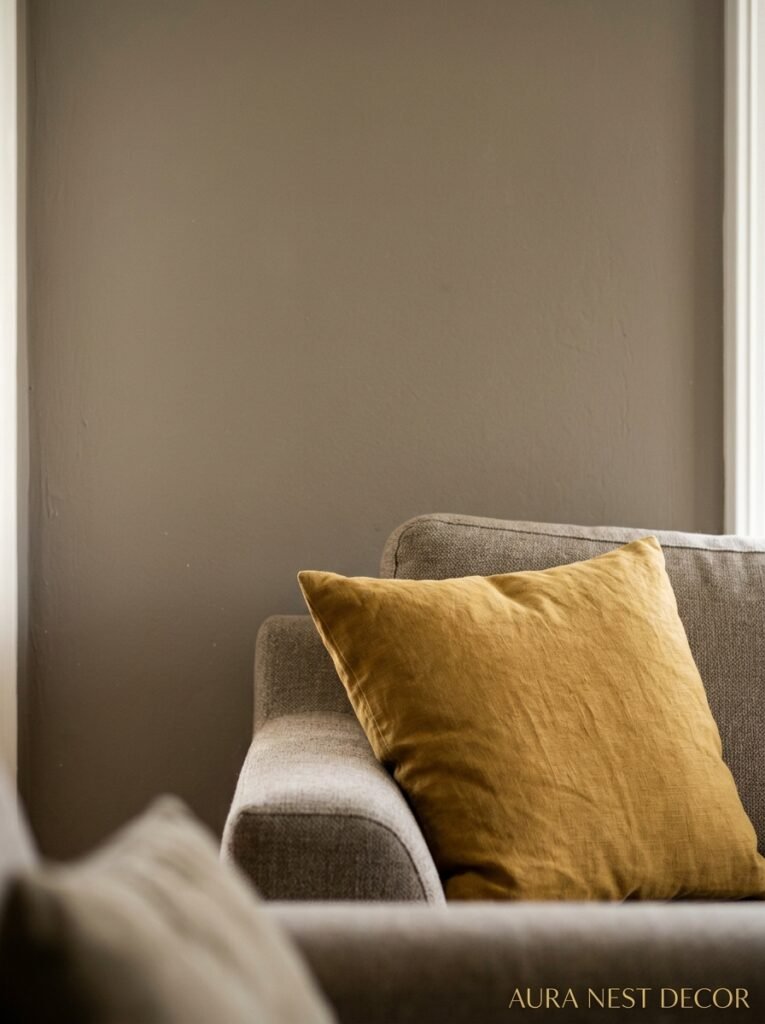
Warm greys — the ones that lean slightly greige or have a hint of brown undertone — make yellow feel rich and grounded. Think the colour of old stone walls or a winter sky just before it actually snows. These greys sit beautifully with ochres and mustards because there’s a shared warmth between them. The room doesn’t fight itself.
Cool greys — the ones with blue or purple undertones — go the other direction and it’s STUNNING when you lean into it. Suddenly your yellow isn’t warm and cozy anymore, it’s graphic. Sharp. More editorial. A cool charcoal wall with a sharp butter-yellow accent chair is a completely different vibe than a soft greige sofa with a mustard throw, and both are gorgeous, they’re just different rooms, different moods.
What you’re trying to avoid is the middle. The flat, slightly-greenish grey that doesn’t lean anywhere. In the store it looks perfectly grey. On your walls it looks like someone gave up halfway through. Go warm or go cool, but pick a side.
“Commit to your grey. A grey with an opinion is worth ten that don’t.”
2. Why Mustard Does Things Butter Yellow Simply Can’t
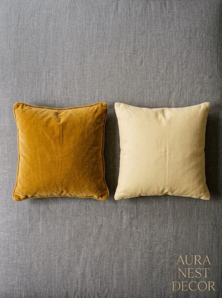
This is a hill I’ll die on. Pale yellow in a living room almost never works the way you want it to. It looks dated somehow, or worse — it looks like someone spilled something on white walls and just left it.
Mustard, though. Ochre. That deep, slightly moody yellow that belongs on a Moroccan tile or a 1970s velvet armchair. That’s the one.
There’s something about the way mustard interacts with grey that feels intentional. It’s a yellow with depth. It’s got warmth and richness and when the afternoon light hits a mustard cushion on a grey sofa it honestly looks like something out of a magazine spread. Not in a try-hard way. In a “this person actually knows what they’re doing” way.
Butter yellow is fine. It’s pretty. But it doesn’t have enough presence to hold its own against a strong grey. It gets lost. Mustard doesn’t get lost — it shows up, it makes itself comfortable, it anchors the whole palette. And crucially, it works in both bright modern rooms and darker, cosier spaces, which makes it genuinely useful.
Side note — if you love the idea of a softer yellow, try warm cream instead. It functions similarly but has better manners in a grey room. Just a thought.
3. The Sofa Decision That Changes Everything Else
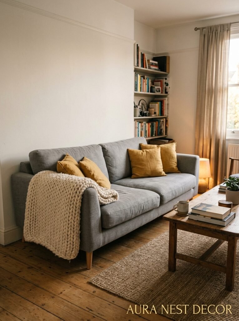
Here’s where people get stuck. Should the sofa be grey and the accents yellow? Or the other way around?
Honest answer: the grey sofa route is easier but the yellow sofa route is more interesting.
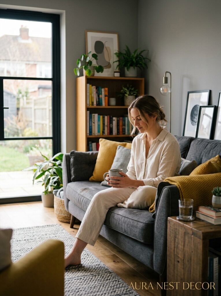
A grey sofa is the workhorse. It’s practical, it goes with everything, and it gives you enormous flexibility to play with mustard and ochre in cushions, throws, art, lamps, vases — all the stuff that’s cheap and easy to swap out when you get bored. This is the sensible choice and there’s nothing wrong with it. A lot of beautiful rooms are built exactly this way.
But if you want the room to have personality — real, undeniable, scroll-stopping personality — consider a mustard or deep ochre sofa as your main piece. Pair it with grey walls. Use grey in the rug. Let the sofa be the thing the room is built around rather than a placeholder you decorate over.
It sounds scary. It isn’t, not really. Yellow sofas have been in design conversations for years now and they’re not going anywhere. A velvet mustard sofa is one of the most Pinterest-worthy pieces of furniture that exists right now, not gonna lie. And because it’s such a strong statement, the rest of the room actually gets to be simpler. Grey walls. Textured grey rug. Simple white or natural wood accessories. Done.
4. The Color That Quietly Holds the Whole Room Together
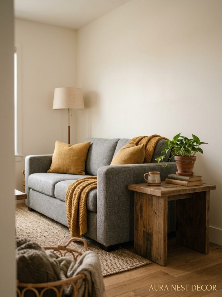
Nobody talks about this one enough. It’s not grey. It’s not yellow. It’s the third colour.
Every great grey and yellow room has a third colour doing a lot of quiet, invisible work. Something that ties the two together so the room doesn’t look like a design exercise. The most common one you’ll see is white, and it’s common for a reason — white ceilings, white trim, and white accessories give the grey and yellow something to breathe around.
But there are better options depending on the feel you’re going for.
Warm terracotta, just a touch of it, makes a grey-and-mustard room feel lived in and warm. It doesn’t compete. It just adds humanity. A single terracotta pot, a few small clay accessories, some earthy tones in a woven throw.
Deep forest green works surprisingly well. It sounds wrong but it isn’t. Grey, yellow, and green is almost a natural palette — you’re basically describing an overcast autumn morning. A few green plants (real ones, please, this is not the place for fake ivy) go a long way.
Navy is the bold third option. It makes the whole palette feel graphic and modern and a little bit masculine if that’s what you’re after. Grey, mustard, and navy in a living room is confident. It knows what it’s doing.
“The third colour in a room is doing more work than the other two. Don’t ignore it.”
5. Texture Is Doing 40% of the Heavy Lifting Here
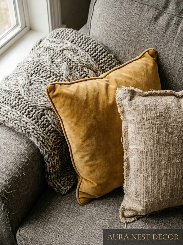
Grey is a colour that really, really needs texture. Without it, a grey room looks like a waiting area. Functional but not particularly welcoming.
Yellow helps break that up, but texture is what makes the whole space feel warm and human. Think about layering different materials throughout the room — a linen sofa or linen curtains, a chunky wool throw, a woven jute rug, some velvet cushions. None of these things need to cost a fortune but they need to be there.
The combination of grey and yellow actually benefits from texture more than most palettes because both colours can look flat and synthetic if they’re not given something to do. A mustard velvet cushion has about three times more visual impact than a mustard cotton one. A grey wool blanket draped over the back of a sofa adds warmth that a grey felt one just doesn’t.
This is also where natural wood comes in. Pale wood — ash, light oak, blonde wood — is incredible in a grey and yellow room. It’s warm without being heavy. It softens the grey, complements the yellow, and it doesn’t compete with either. Dark mahogany in a grey and yellow room tends to pull focus in a way that feels a bit off. Stick with lighter tones.
6. The Lighting Situation That Most People Get Completely Wrong
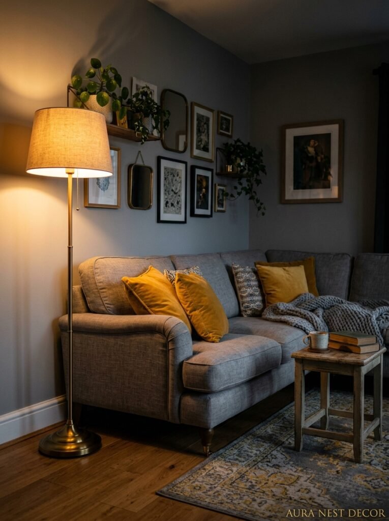
Cold lighting in a grey and yellow room is a disaster. I’ve seen it. It’s awful. The grey goes flat and slightly greenish, the yellow goes wan and sad, and the whole room looks like it’s disappointed in you.
You want warmth. Specifically you want bulbs somewhere around 2700K — that soft, amber-ish glow that makes a room feel like it’s wrapped in something. Edison-style bulbs work beautifully here, and they’re everywhere right now in pendant lights and floor lamps.
Layered lighting matters too. Overhead lighting alone makes any living room feel interrogated rather than inhabited. You want a floor lamp in the corner, maybe a table lamp on the side table, perhaps some candles or LED tea lights in the evening if you’re not anti-candle. The goal is creating pools of warm light that make the grey look rich and the yellow look golden.
During the day, natural light is your best friend and also potentially your worst enemy depending on which direction your room faces. North-facing rooms (common in UK homes especially) can make grey look really cold and blue. If that’s you, go warmer on your grey shade and be generous with the yellow. South-facing rooms get beautiful warm afternoon light that makes practically any grey and yellow palette look gorgeous. Lucky you, if that’s what you’ve got.
7. What Pinterest Gets Wrong About This Palette
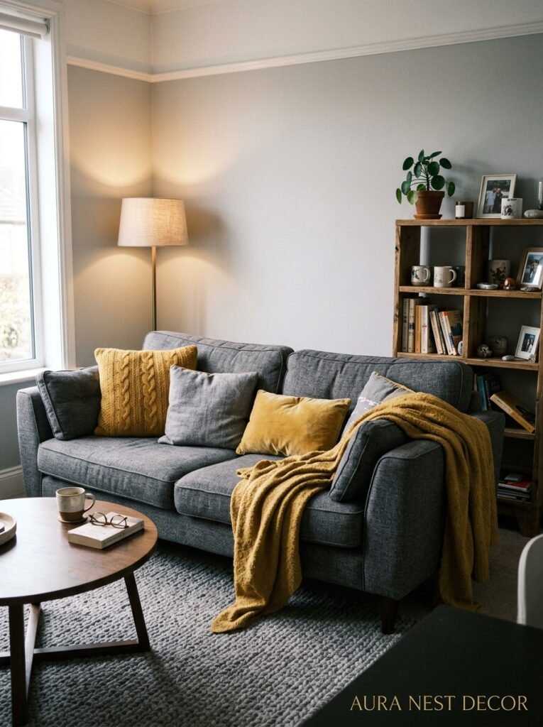
Pinterest will show you about fifteen thousand grey and yellow living rooms and they will all look perfect. Some of them will look perfect in a way that doesn’t really apply to actual human living rooms where actual humans live.
Here’s what the styled photos don’t show you: the massive amounts of natural light flooding in from a professional photography setup. The strategically placed cushions that no one actually sits against. The complete absence of a television, charging cables, kids’ toys, dog beds, or the general archaeology of daily life.
The grey and yellow rooms that look the best in REAL life aren’t the ones that are most styled. They’re the ones that are most considered. There’s a difference.
It means choosing fewer things but better things. One excellent mustard cushion instead of five mediocre ones. A genuinely beautiful grey throw you actually want to wrap around yourself, not a purely decorative one you’d never actually touch. Art on the walls that you actually care about rather than generic prints in matching frames.
Or maybe it’s the opposite, honestly — sometimes a bit of joyful clutter in the right shades is what makes a room feel real and loveable rather than like a set. You know your space. Trust yourself.
“The rooms that stop people mid-scroll aren’t the tidiest ones. They’re the truest ones.”
8. Small Grey and Yellow Rooms: The One Rule That Changes Everything
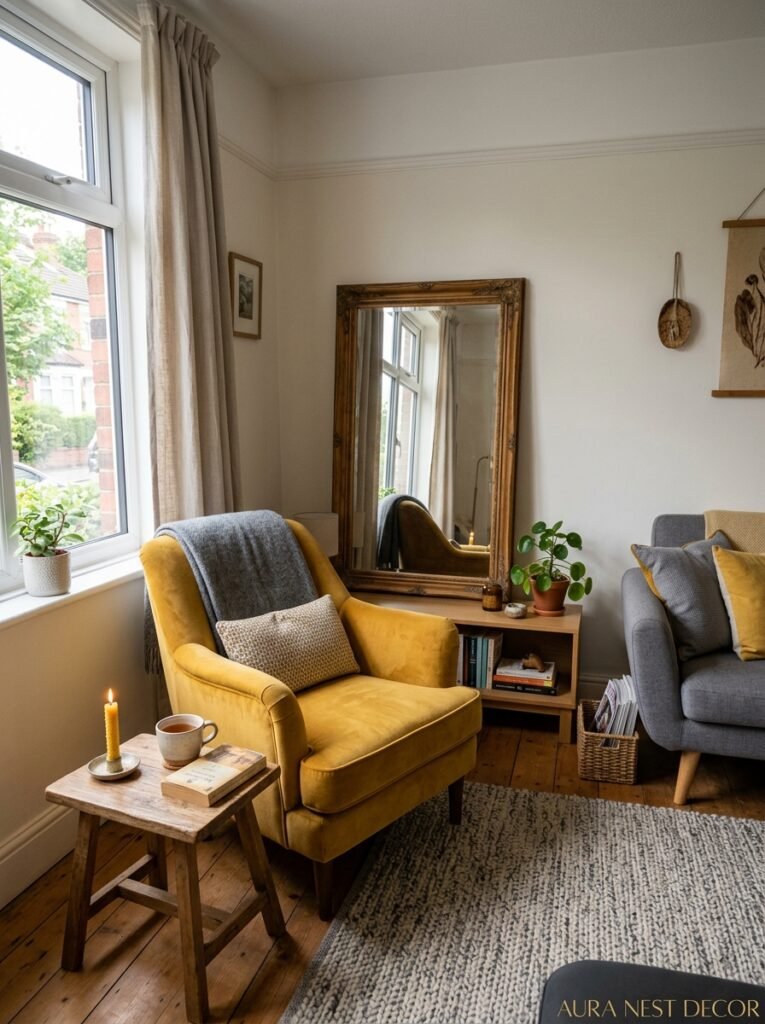
Small room, nervous about grey and yellow feeling claustrophobic? Here’s the rule: keep the grey on the smaller surfaces.
This sounds counterintuitive because grey is the “safer” choice and you might think you want it everywhere to unify the room. But in a small living room, too much grey can actually shrink the space further. It closes in. It gets heavy.
Instead — yellow walls, or a very light warm grey on the walls, with the grey anchored in the sofa, the rug, a few accessories. The lighter-coloured walls push out visually. The grey grounds the space. And honestly, yellow walls in a small room are one of the most cheerful, clever design decisions you can make. The room suddenly feels sunny regardless of the actual weather outside. In a typically grey British winter, that matters.
Mirrors with grey or gold frames add light. Light curtains in near-white or pale linen rather than heavy drapes. And don’t push furniture against the walls — it’s a small-room instinct but it actually makes rooms feel smaller, not bigger.
9. The Rug Question No One Answers Properly
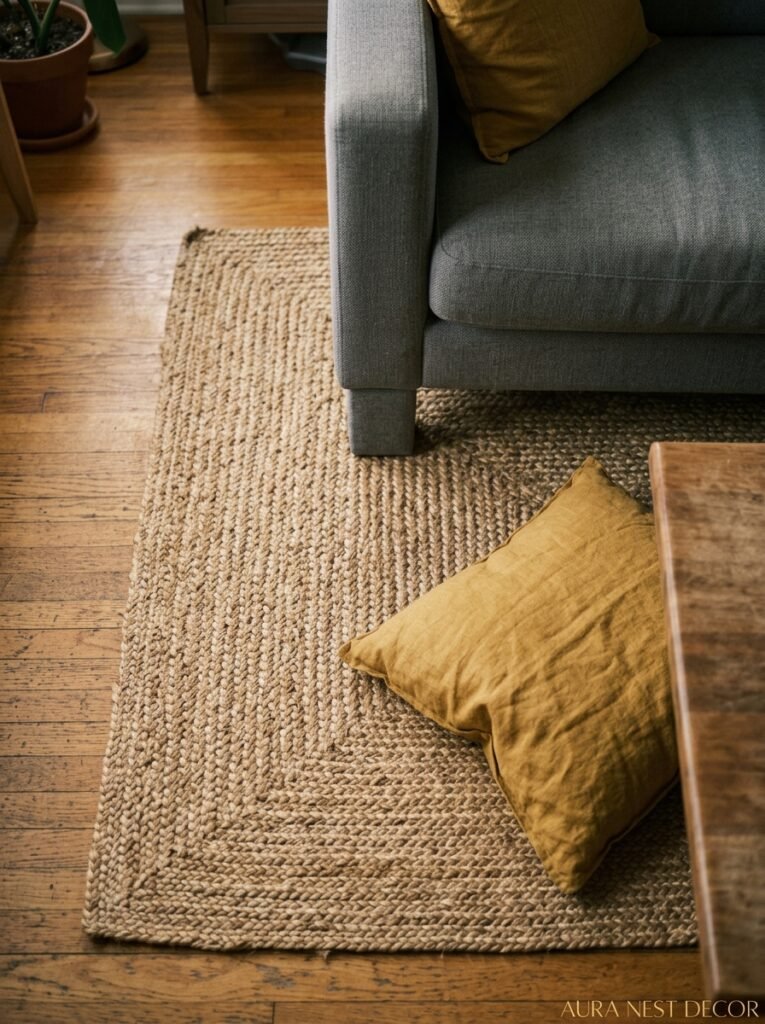
What colour rug goes in a grey and yellow living room? Everyone asks, few people give a useful answer.
Best option: a rug with both colours in it. Not a pattern that’s screaming grey and yellow — more like a muted geometric or an abstract design that contains those tones among others. It doesn’t have to match perfectly. It just needs to belong. A rug that bridges the palette means you don’t have to choose between a grey rug (practical, a bit dull) or a yellow rug (fun, potentially overwhelming).
Second best option: natural. A jute rug, a sisal rug, a flat-woven cotton rug in oatmeal or warm cream. These are neutral in a warm way, they add texture, and they let the grey and yellow in the rest of the room do the talking without the rug competing.
Third option that people don’t consider enough: a deep navy or forest green rug. Goes back to that third-colour theory. The rug becomes the grounding element and suddenly the grey walls and mustard cushions feel like a complete, deliberate room.
What to avoid: a very pale yellow rug (gets dirty, gets lost, doesn’t have enough presence) or a stark white rug unless you genuinely have no children, no pets, and extraordinary self-discipline.
10. Artwork That Actually Works in This Palette
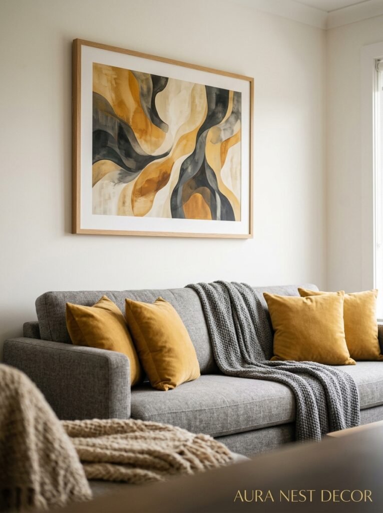
Here’s what doesn’t work: generic abstract prints in exact shades of grey and yellow. They always look like you ordered them specifically to match the room, which is because you did, and it shows.
Real art or prints that contain grey and yellow among other colours — those work. A botanical print with warm ochre and grey-green leaves. A landscape where the sky is a moody grey and there’s warm yellowy light somewhere in it. Abstract art that’s mostly grey and yellow but has other shades threading through. Imperfect, real, a bit unpredictable.
Photography works well here too. Black and white photography in simple frames adds a graphic quality that plays off the yellow beautifully.
And honestly — don’t overdo the art. One or two considered pieces, hung properly at eye level, are worth more than a gallery wall of mediocre prints. Though if you love gallery walls, a grey gallery wall (a mix of frames in grey, white, and natural wood tones) with yellow accents scattered around the room is genuinely beautiful.
11. The High Street Buys That Punch Incredibly Above Their Weight
Not everything needs to be expensive. A few specific buys make a disproportionate difference in a grey and yellow room.
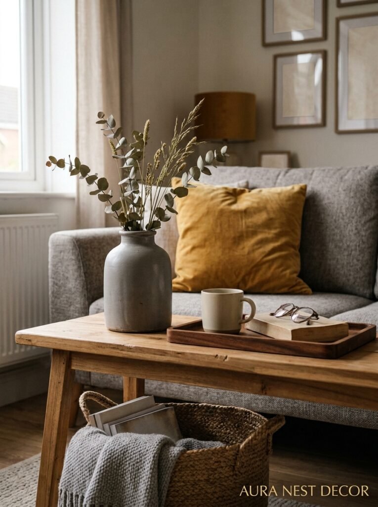
Cushions from IKEA or H&M Home in mustard or ochre velvet. Simple. Cheap. Genuinely look great. Replace them every year or two when they go flat and you’re still ahead of what a luxury version costs.
A good linen throw in a warm grey or soft yellow. Linen photographs beautifully, lasts forever, gets better with washing, and draping it over a sofa arm takes about four seconds and transforms the space.
Plants. Always plants. A large floor plant — a fiddle leaf fig, a rubber plant, a large monstera — in a simple pale pot brings in the green third-colour tone and adds height and life. A smaller snake plant or a trailing pothos on a shelf. They don’t cost much and they make every room better.
Candles in amber glass holders. When they’re lit in a grey and yellow room it looks extraordinary. When they’re not lit they still look good. Worth it.
12. The Version of This Room That’ll Still Look Good in Ten Years
Trends move fast. Grey and yellow has had a long arc — it was everywhere around 2011-2013, then it felt dated, and now it’s back with a more refined, considered version of itself.
The rooms that aged badly were the ones that leaned into the trend version: graphic, flat, cartoon-ish grey paired with a very saturated yellow. Bright and bold in a way that looked great for a year and then suddenly felt like a time capsule.
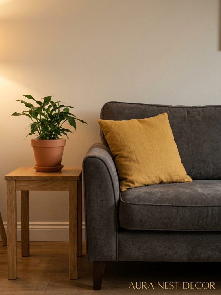
The version that ages well? Muted. Textured. A grey that feels like a natural material. A yellow that feels like something in nature — honey, harvest wheat, old brass, dried flowers. These rooms don’t look trendy. They look as if someone who knew what they liked put them together slowly over time, adding pieces that mattered. And ten years from now they’ll look exactly the same way.
That’s the goal, isn’t it. A room that feels like it belongs to you, not to this particular moment on Pinterest.
—
❓ FAQ
Q: Does grey and yellow work in a dark, north-facing living room? A: It can, but you need to be strategic. Go with a warm-toned grey (one that leans greige rather than blue) and push toward deeper, richer mustard rather than bright yellow — warm tones compensate for the lack of natural light. Add as many warm-glow light sources as possible.
Q: What wood tones work best with a grey and yellow living room? A: Light to medium warm woods are your best bet — pale oak, ash, walnut on the lighter end. They complement both the grey and the yellow without pulling focus. Very dark or very cool-toned wood can feel disconnected from the palette.
Q: Is grey and yellow too trendy to invest in? A: Only if you do the trendy version. Saturated graphic yellow with flat mid-grey does feel of-the-moment. But warm charcoal walls with deep ochre accents and natural textures throughout? That’s a room that’ll look good for a long time. The specific combination matters more than the general palette.
—
💭 Final Thoughts
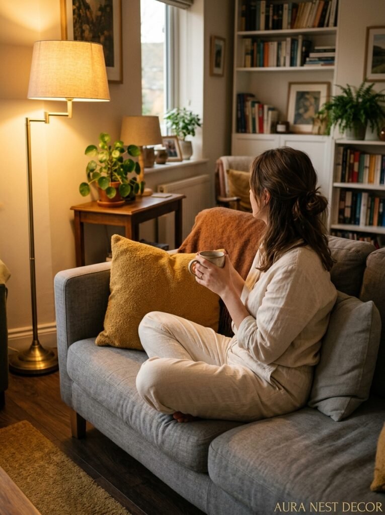
Grey and yellow done right is one of the most genuinely liveable colour combinations there is. It’s warm when you need it to be, graphic when you lean into it, and it has this quality of making a room feel like someone actually made a decision rather than just defaulting to beige.
The main thing is to commit. Pick a grey with an opinion, pick a yellow with depth, and let the textures and light do the rest of the work.
And here’s the question I keep coming back to, honestly — if you stripped out everything in your living room and started from scratch, knowing what you know now, which would feel more like you: the grey sofa in a mustard room, or the mustard sofa in a grey one?




