
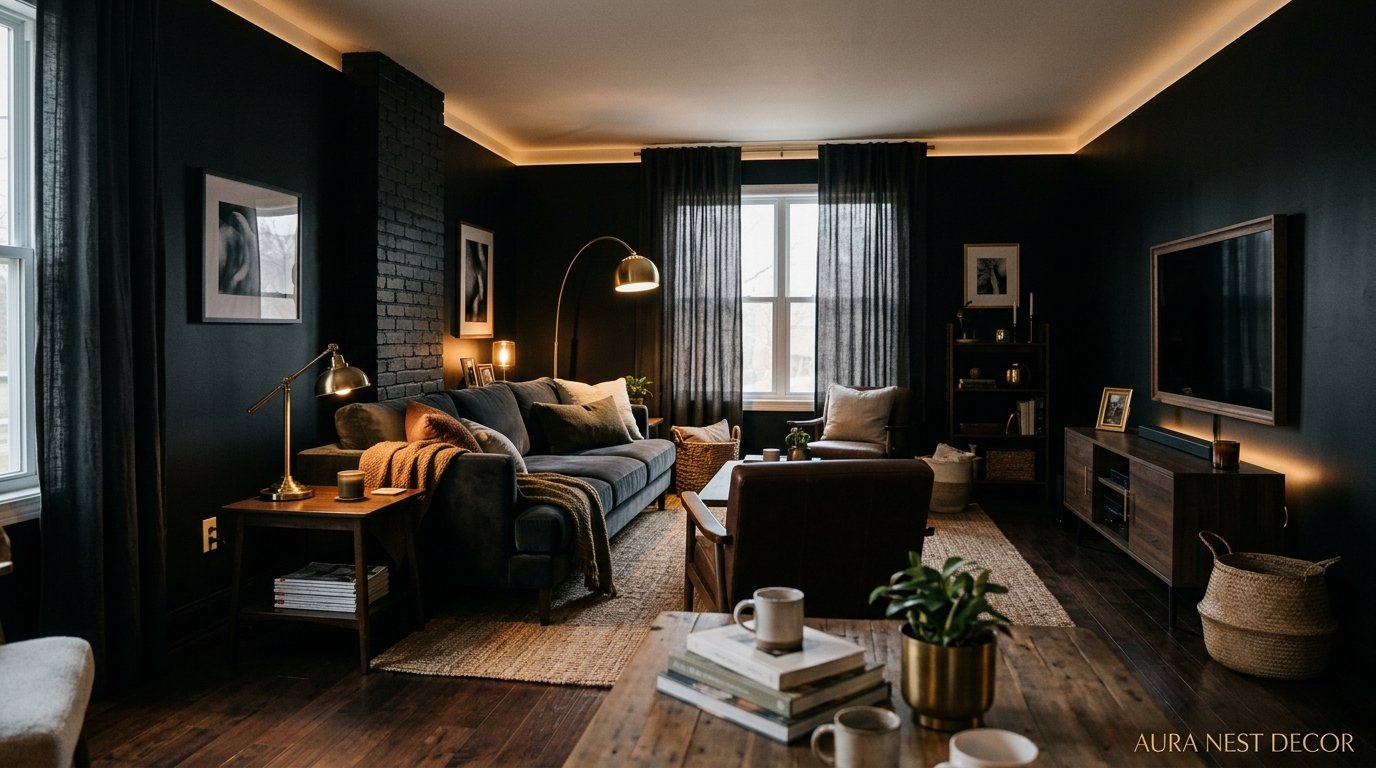
Why the Boldest Living Room I’ve Ever Seen Was Almost Entirely Black
There was a moment, standing in my friend’s apartment in East London, where I just stopped talking mid-sentence. The walls were near-black. The sofa was charcoal. Even the ceiling was painted a deep, almost-navy shade she called “off-black.” And it felt… like the coziest room I’d ever been in.
That was three years ago. I’m still thinking about it.
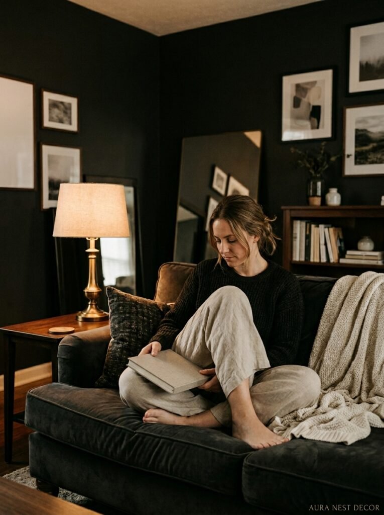
—
1. The Fear Nobody Talks About When You Consider Going Dark
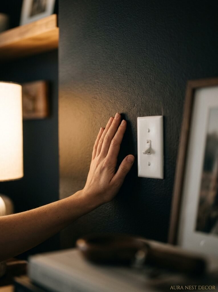
Let’s be real. The moment you start Googling black living rooms, there’s this little voice in the back of your head that says what if it’s too much. What if guests walk in and feel like they’ve entered a cave? What if it makes the whole house feel smaller, heavier, like you’re living inside a mood?
That fear is completely normal. And it’s also based almost entirely on nothing.
Here’s what I’ve noticed from studying hundreds of these rooms: the ones that feel oppressive aren’t black rooms done wrong, they’re beige rooms where someone panicked halfway through and stopped before any real commitment happened. Half-measures look worse than bold ones. Always. A white living room that somebody dropped a single dark rug into looks more confused than a room where someone just went for it from floor to ceiling.
The fear is the thing stopping you from having the most visually interesting room in your neighborhood. And I don’t say that lightly, because I’ve seen a lot of beige living rooms that were trying so hard.
Black commits. That’s the whole point.
“A white room somebody half-committed to looks more confused than a black room done on purpose.”
—
2. What “Black” Actually Means — Because It’s Not Just One Color
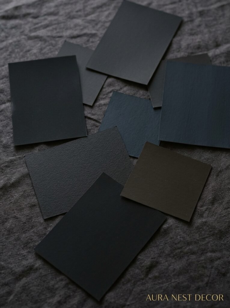
Okay, this is important. When people say black living room, they’re almost never talking about matte, flat, absolute black the way a marker cap is black. Real interior black is messier and richer than that.
There’s Farrow & Ball’s Railings — which is more of a very dark blue-green that looks black in dim light. There’s their Off-Black, which reads almost as a warm dark grey in the afternoon sun. Benjamin Moore has Wrought Iron, which is somewhere between slate and midnight. Then there’s Graphite, and Inkwell, and all these paint names that make you feel like a Victorian poet just naming them.
The undertones matter ENORMOUSLY. A black wall with blue undertones in a north-facing room in Manchester is going to feel very different from the same wall in a south-facing living room in Austin, Texas catching afternoon light. Warm undertones — the browns and reds — tend to feel cozier, more library-like. Cool undertones feel more modern, a little more dramatic.
My honest advice? Get the samples. Like, more samples than you think you need. Paint big patches, not little ones. Live with them for a week. The color you thought was going to be too intense sometimes softens completely by day three, once your eyes adjust.
—
3. The Ceiling Question That Divides Interior Designers Right Down the Middle
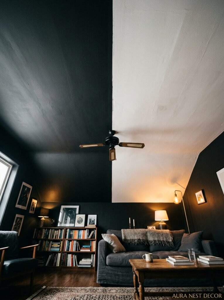
Paint the ceiling. I said what I said.
I know this sends some people into a spiral. The conventional wisdom — the rule that’s been passed down through every home magazine and design show for decades — is that dark ceilings make rooms feel smaller. And yes, technically, that’s not wrong. But here’s the thing: smaller doesn’t automatically mean worse.
A black or near-black ceiling does something genuinely remarkable. It closes the room in, and by doing that, it creates this incredible sense of envelopment. You feel held by the space. It’s not like being in a small room, it’s more like being in a room that knows what it is. A room with a personality.
My friend in East London — the one with the apartment I mentioned — her ceilings were maybe nine feet. Not low, not high. She painted them that same off-black as the walls. And the effect was that the room felt like a single cohesive space instead of a box with a lid. Honestly, her white-walled spare bedroom felt smaller by comparison, because at least the living room had intention.
Side note — pendant lights in a dark-ceilinged room? Completely different vibe than in a white room. The shadow they throw becomes part of the design.
—
4. The Furniture Mistake Even Confident Decorators Make
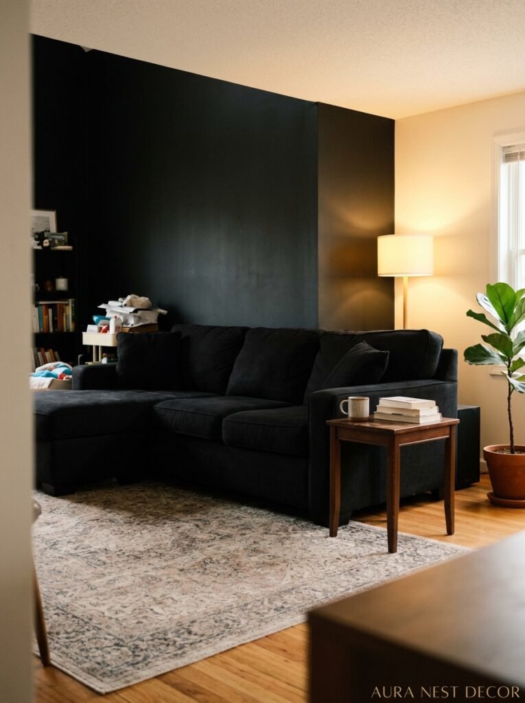
You’d think the obvious move is to double down — black room, black furniture, the whole monolith look. Some people do this successfully. But most people who end up with a black room that feels flat rather than rich made exactly this choice.
The magic of a dark room is contrast. And contrast doesn’t mean slapping a white sofa in there (though honestly, white sofa on dark walls? Stunning. I can’t lie). It means thinking about texture and material variation way more carefully than you would in a lighter room.
Natural wood is your best friend here. A honey-toned oak coffee table against matte black walls doesn’t just sit there, it practically glows. Brass and gold fixtures catch the light in a way they just don’t in a white room — there’s nothing competing with them. Terracotta, rust, deep olive green. These colors don’t disappear in a dark room, they come forward.
The mistake is choosing furniture that matches the darkness. A dark leather sofa against dark walls creates depth, sure, but you lose the furniture in the room. You want some pieces to float forward visually. A natural linen cushion. A rattan side chair. Something that says yes, this room is bold, and it also has layers.
“Natural wood in a black room doesn’t just sit there — it practically glows.”
—
5. Why Lighting Isn’t an Afterthought — It’s the Whole Game
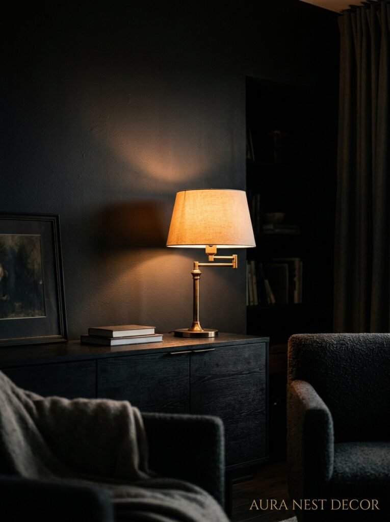
Okay, I’ll be honest. Before I really got into dark-room design, I thought lighting was sort of a finishing touch. You know, you pick your paint, buy your furniture, then figure out the lamp situation.
In a black living room, that approach will absolutely ruin everything.
Light sources in a dark room are dramatic in a way they’re not anywhere else. The amber glow of an Edison bulb at 7pm against charcoal walls creates something that looks genuinely cinematic. But harsh, cool overhead lighting in the same room? It turns the whole thing cold and kind of grim. You don’t want grim. You want moody.
So: multiple light sources, always. Never rely on a single ceiling fixture. Table lamps, floor lamps, sconces if you can manage them, candles for evenings. The goal is to layer the light so different parts of the room catch it differently. A warm pool of light on the reading chair. The soft backglow of a lamp behind the sofa. Candlelight on the coffee table at night.
Dimmer switches. Non-negotiable. Just do it.
The color temperature of your bulbs matters more than the wattage. Warm white (around 2700K) is what you want. Anything cooler and you’ve made a very expensive decision that now feels like a dentist’s waiting room.
—
6. The One Textile Move That Changes Everything in a Dark Room

Okay here’s the thing nobody really tells you. You can have the perfect paint, the right furniture, even great lighting — and the room can still feel like it’s missing something. And nine times out of ten, what it’s missing is the right textiles.
Not more. Not necessarily heavier. Just warmer.
In a black living room, natural fibers do something synthetic ones don’t. A chunky wool throw looks like it belongs. A faded Persian rug in dusty rose and cream against matte black walls is one of the most genuinely beautiful combinations in residential interior design, I’ll die on this hill. Linen curtains that puddle slightly on the floor. A sheepskin draped over the arm of a chair.
The room needs softness to balance all that dark surface. Without it, everything reads as intentional-but-cold. With it, the room feels like someone actually lives there and loves it.
Velvet is worth mentioning separately because velvet in a dark room is incredible. A deep teal or forest green velvet sofa against black walls? Come on. That’s a room that stops people mid-sentence.
—
7. How British vs. American Homes Handle This Differently — and What Each Can Learn From the Other
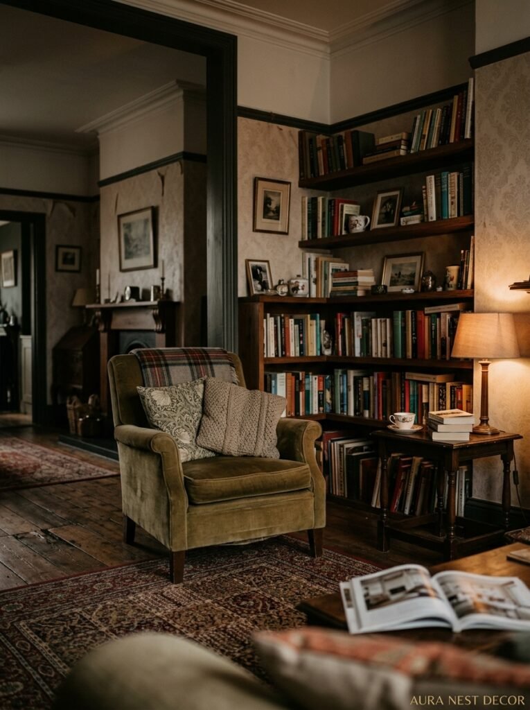
This is genuinely interesting to me. British homes — especially in cities — tend to go darker more naturally. The architecture lends itself to it. Victorian terraces with their smaller windows and period fireplaces, the kind of rooms that were literally designed to be lit by candlelight and firelight. Dark walls in those rooms don’t fight the bones of the space, they lean into them.
American homes, especially those built post-1970, often have completely different proportions. Open plan. Bigger windows. Higher ceilings in some cases. And culturally there’s more hesitation around going dark — probably because so much US home design advice has been about making spaces feel “bright and airy” for so long.
But here’s what American rooms often have that British ones don’t: better natural light. And natural light in a dark room is extraordinary. The way bright Texas or California afternoon sun hits a near-black wall is almost sculptural. You get these sharp light-and-shadow plays that a grey-sky Manchester afternoon simply won’t give you.
Conversely, British designers are often braver with color saturation and more comfortable with rooms that feel contained rather than expansive. American rooms can sometimes be so committed to openness that they feel unfinished, like nobody decided what the space was actually for.
“Natural light in a dark room isn’t a problem to solve — it’s the whole point.”
—
8. The Plants That Actually Work (And the Ones That Get Lost)
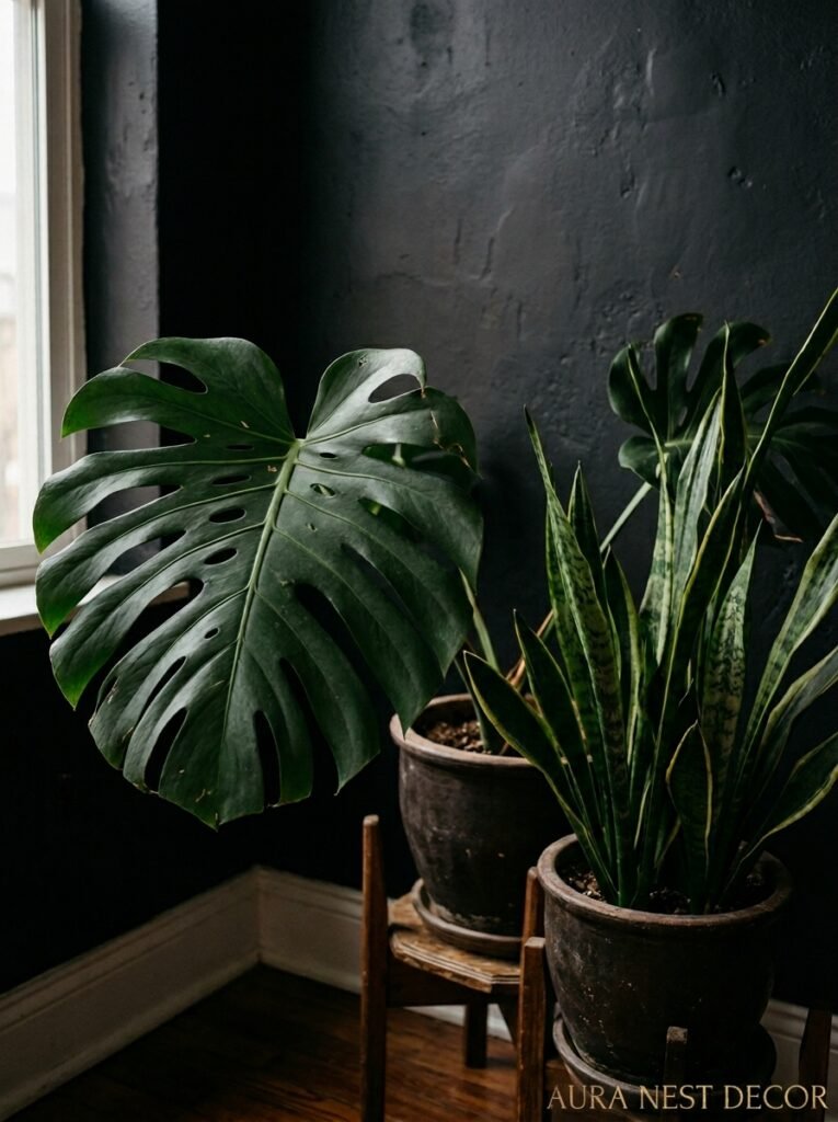
You might think plants don’t belong in a black living room. Too much going on. Too much visual noise. But actually the opposite is true — a well-chosen plant in a dark room can be stunning, because the contrast between green and near-black is one of nature’s own favorite combinations.
Big, structural plants work best. A large fiddle leaf fig with those glossy, wide leaves. A monstera deliciosa that’s reached an almost ridiculous size. A tall olive tree in a terracotta pot. These read as shapes as much as plants, and shapes are exactly what a dark room wants.
What gets lost? Small, fine, wispy plants. Delicate ferns and trailing vines that look beautiful in a white room tend to disappear against dark walls. You can’t see the detail. You just see a vague greenish shape, and that doesn’t do either the plant or the room any favors.
Light matters here too, obviously. Most plants need light, and dark rooms can be tricky. If natural light is limited, go for ZZ plants or cast iron plants, which are basically indestructible and genuinely love a shady corner.
—
9. Art Framing Rules Are Completely Different in a Black Room
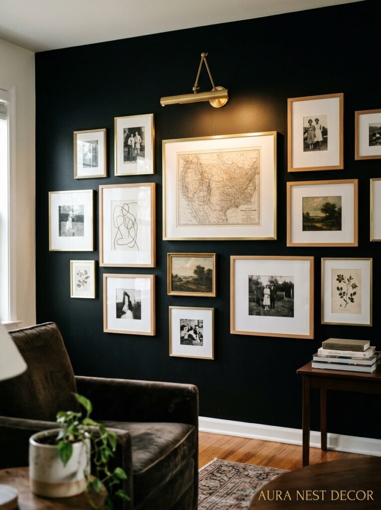
In a white room, black frames are a classic, safe choice. Everybody knows this. But the moment you put a black frame against a black or very dark wall, the frame disappears and suddenly the artwork is just… floating there. Which can look incredible, or completely wrong, depending on the piece.
For a dark room, the frame often needs to be lighter than you’d instinctively choose. Natural wood frames, antique gold, brass, oxidized silver, warm white. These pull the art forward instead of letting it sink into the wall.
Gallery walls in dark rooms work differently too. You don’t need as many pieces, because each one has more visual weight. Three or four pieces, spaced a bit more generously than you would in a bright room, often looks better than an overwhelming grid. The darkness of the wall does some of the work for you.
One thing I love is large single-piece photography prints in dark rooms. A big black-and-white photograph with a wide warm wood frame against a near-black wall has this incredible museum energy. Quiet but confident.
—
10. The Question of Wood Floors — Dark, Medium, or Light?
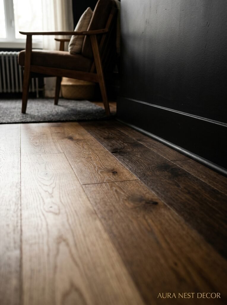
People agonize over this. Do you go dark floors to match the walls, or light floors to contrast them?
Honestly? Light to medium wood floors almost always win in a black-walled room. For the same reason natural wood furniture works — it breaks up the darkness and gives the eye somewhere warm to land. Very dark floors with very dark walls can veer into a space that feels genuinely heavy, especially if you don’t have great lighting.
Pale oak is probably the most versatile option. It works with cool-toned blacks and warm-toned ones, and it photographs beautifully if you’re going for that Pinterest aesthetic (which, if you’re reading this, you probably are).
That said — I’ve seen dark floors with dark walls done incredibly well when the ceiling is lighter, and when there’s enough contrast in the furniture and textiles. So it’s not a hard rule. More of a starting point.
—
11. The Room That Doesn’t Get Enough Credit: The Black Rental Makeover
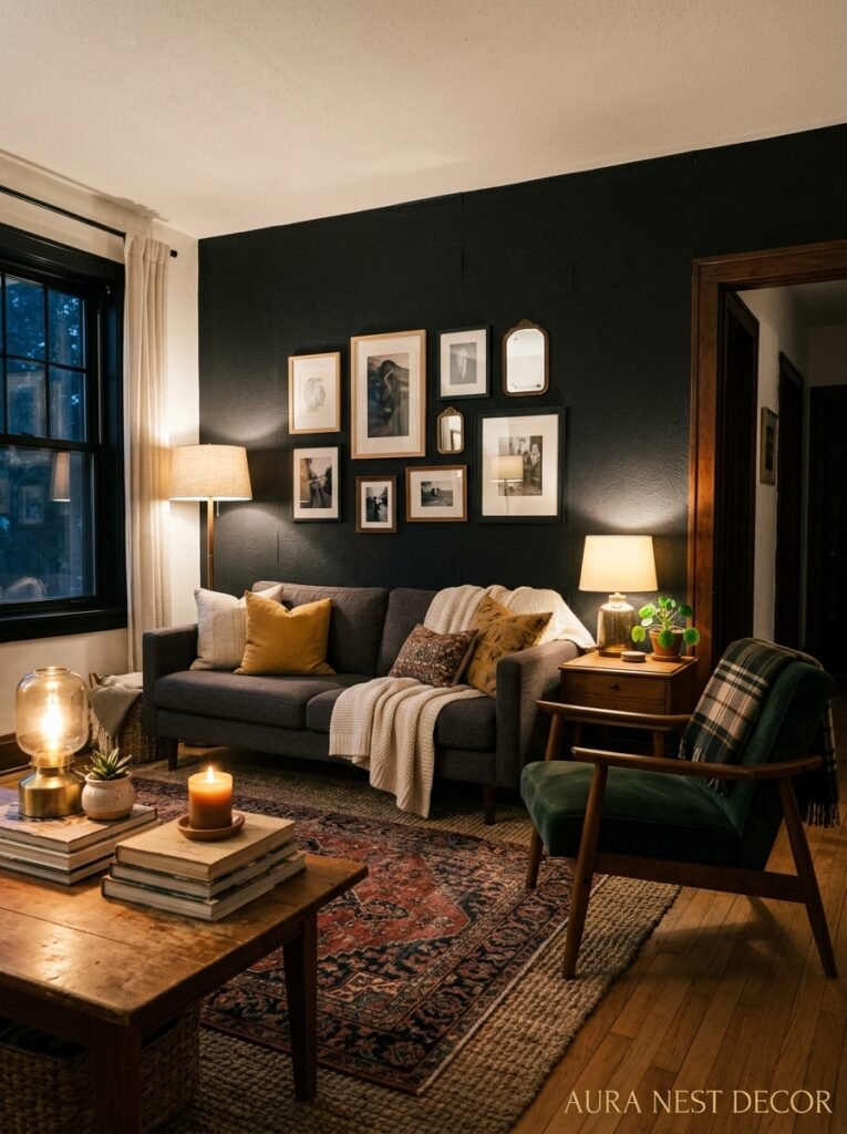
Can’t paint? Renting? Living in a place where the landlord would rather fold themselves in half than let you touch the walls?
This section’s for you. And I won’t just tell you to “use removable wallpaper” and call it a day.
Dark furniture is the fastest route to the black room feeling without touching a wall. A near-black sofa. Dark coffee table. Black bookcase or media unit. When the furniture is dark and the textiles are layered warmly — lots of texture, some natural materials, warm lighting — you get a significant part of the aesthetic without ever opening a paint tin.
Curtains make a bigger difference than anyone ever admits. Floor-to-ceiling dark curtains, even in a room with light walls, dramatically change the feeling of a space. They frame the room differently. They make it feel taller and more intentional.
And honestly — the rug situation. A very dark, richly patterned rug anchors a room in a way that reads as committed to a look even when the walls are landlord beige. It sets the whole tone from the floor up.
—
12. When to Know You’ve Actually Nailed It
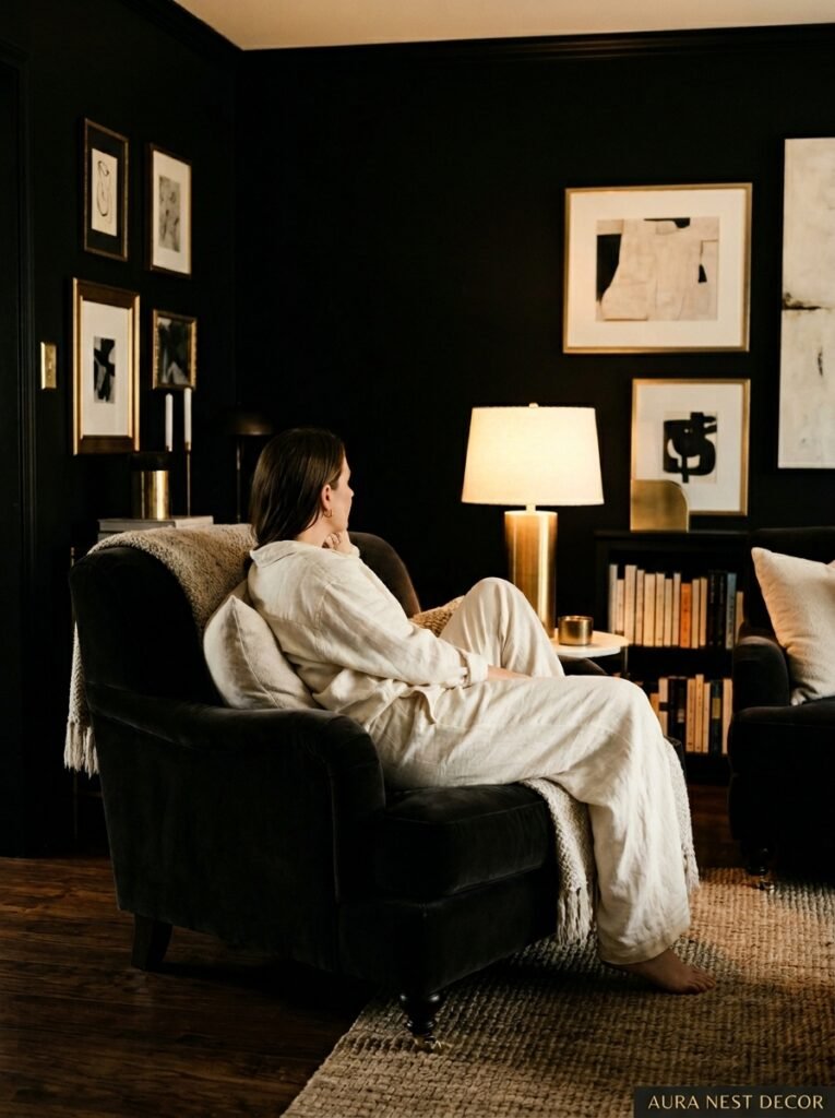
There’s a particular moment in a well-executed black living room. You come in from outside, maybe it’s evening, and you switch on the lamps but not the overhead light, and the room sort of breathes. Warm pockets of light, deep shadow in the corners, the texture of everything catching the glow differently.
It doesn’t feel gloomy. It feels like somewhere you’d choose to be.
That’s the benchmark. Not whether it photographs well (though it will). Not whether guests say “wow, you’re brave” (they will). But whether you walk in at the end of a long day and the room feels like it’s on your side.
When you’ve done it right, it does. A black living room done well is one of the most genuinely comfortable spaces you can create, because everything in it has been chosen with intention and every single thing you put in there earns its place.
And isn’t that the whole point?
—
❓ FAQ
Q: Will a black living room make my space feel smaller? A: It can make a room feel more enclosed, but that’s not the same thing as smaller — and for a lot of people, that enclosed feeling is exactly what they’re after. A dark room with the right lighting and warm textiles reads as cozy and intentional, not cramped. North-facing rooms with limited natural light are worth thinking about more carefully; south-facing rooms are usually completely fine.
Q: What paint brand makes the best black for living rooms? A: Farrow & Ball’s Railings and Off-Black are the most talked-about for a reason — they have incredible depth and change beautifully in different light. In the US, Benjamin Moore’s Wrought Iron and Black Panther are both worth sampling. If you’re watching the budget, Sherwin-Williams Tricorn Black is excellent for the price.
Q: How do I stop a black living room from looking goth or depressing? A: Warm tones and natural textures. Full stop. Honey-colored wood, warm white linen, terracotta, brass accents, greenery. And dimmer switches, absolutely. The difference between a cozy dark room and a gloomy one is almost always about lighting temperature and material warmth, not the paint itself.
—
💭 Final Thoughts
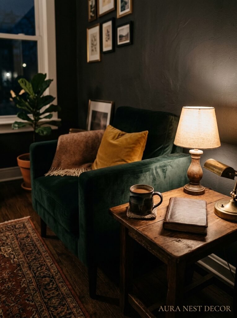
A black living room asks something of you. It asks you to commit, to choose things carefully, and to trust that the room will give something back if you do. And it will.
The rooms I keep thinking about — the ones I save obsessively and come back to and reference when I’m designing anything — almost always have darkness in them somewhere. There’s something about a room that isn’t trying to look bright and airy that just feels like it belongs to someone.
What’s the boldest color choice you’ve been too scared to make in your own home?




